Crystal Ball

February 25, 2024

by Stephen Stofka

This week’s letter is about the public’s expectations of inflation. The interest rate setting committee of the Fed indirectly controls the borrowing costs on our mortgages, credit cards and auto loans. The committee pays attention to public expectations of inflation because we respond now to what we see as potential threats. A fear of “making a mistake” in a job interview can make us nervous, increasing the chances that our behavior will decrease our chance of securing that position. A consumer who expects higher gas prices next year may buy a more fuel efficient vehicle this year.

Consumers must anticipate their future circumstances and income when they decide between different consumption bundles. Should they spend more on housing and live closer to work or get more house for their dollar and have a longer commute? Invest time and money in college, including the loss of income while attending school. Consumers must decide how much to spend and how much to save. Despite the difficulty of such decisions, many consumption choices are made on a shorter time scale than the suppliers who provide those goods and services. To survive, a business must live in the future, anticipating the trends of customer behavior that shape demand for its products or services. Since the pandemic, the shift to work at home has hurt many downtown businesses that depend on foot-traffic. There aren’t enough office workers to support some types of businesses.

In his General Theory published in 1936, John Maynard Keynes gave a prominent role to investor expectations. John Muth (1961) presented a more formal model that he termed “rational expectations.” In the 1970s, Thomas Sargent and Robert Lucas developed more extensive models to understand how people responded to the stagflation of the 1970s. The formation of expectations is an important economic variable and remains a hotly debated topic among economists.

Each month the New York branch of the Federal Reserve surveys a rotating sample of 1300 people to gauge their expectations of overall price changes as well as principle expenses like housing, food and gas (questionnaire pdf here). The Fed provides data on the past decade of surveys which allows us to assess changes in public expectations. As I explored this data with graphs, I was surprised at how closely expectations conformed to a textbook model that students are taught in an intermediate macroeconomics class. Macro is hard because there are few natural experiments to test theories and models. The pandemic led to a series of events that provided such a natural experiment.

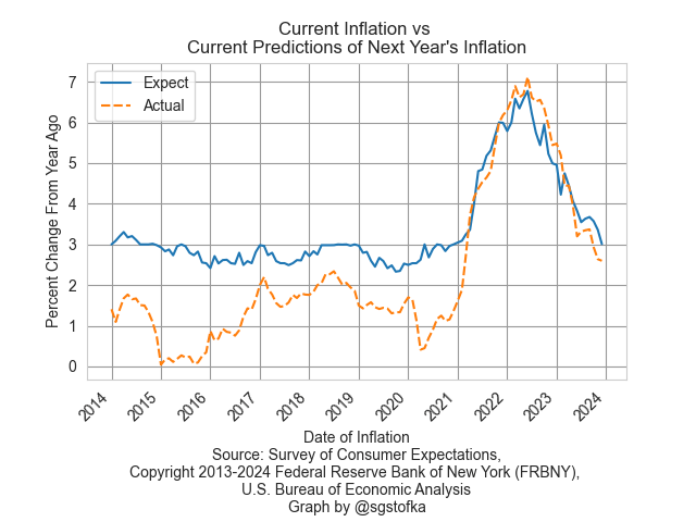
I’ll begin by comparing actual inflation to public expectations of inflation a year earlier. The first graph is actual inflation and the predictions of that inflation from a year earlier. From 2014 to 2020, the median value of expected inflation, the blue line, stayed anchored in the 2.5% to 3% range even when actual inflation, the orange dotted line, was below that. Lower inflation was not a threat to people’s pocketbooks so there was little reason to revise their estimates downward. We have a well-studied risk aversion, meaning that we place greater weight on loss than we do on gains. In this case, lower than expected inflation is a gain. Economists and the general public were both caught off guard when inflation surged higher in 2021.

As soon as inflation rose above long-term averages, as it did in 2021, survey respondents revised their estimates of next year’s inflation. Higher inflation is a threat to our finances, so we pay greater attention. However, survey respondents based their estimates of next year’s inflation on this year’s actual inflation. Is that a good estimating procedure? Maybe not, but estimating trends requires knowledge, practice and error checking to improve our skills. Many times we use shortcuts, called heuristics, instead. I will leave a textbook explanation of the formation of inflation expectations in the notes.

How do we survive using shortcuts? One of those shortcuts is our degree of uncertainty. There are fewer traffic accidents at roundabout intersections because they introduce a degree of uncertainty that causes us to be more cautious. The median percent of uncertainty jumped in March 2020 when pandemic restrictions were announced. When Biden took office a year later uncertainty remained at this elevated base. As the economy reopened in the spring of 2021, supply disruptions became apparent. “When are you going to get more of these in stock” was met with “We don’t know. They’re on a boat somewhere in the Pacific.” While people sat at home during the pandemic, they bought a lot of goods from online retailers like Amazon. The reopening of service-oriented businesses caused another price shock as the economy transitioned from goods-heavy back to one that relied heavily on services.

The peak of uncertainty occurred in mid-2022, shortly after the Fed began a series of consecutive interest rates increases that would lift the benchmark lending rate by 5%. The uncertainty of survey respondents decreased in reaction to the Fed’s intention to keep increasing rates until rising inflation was tamed. I’ll zoom in on the past three years of uncertainty and the Fed’s “get serious” campaign of interest rate increases.

Despite criticism of the Fed, its intentions were credible to the public. Expectations are as difficult to measure as animal pheromones but they are real. They cause responses. Surveys are an imperfect gauge of expectations but they will have to do until someone invents an expectarometer that detects the mental disturbances in the sub-ether caused by expectations. That’s a world similar to Philip K. Dick’s Minority Report and I’m not sure we want that.

////////////////////

Photo by Jan Huber on Unsplash

Keywords: federal funds rate, inflation, expectations

Note on inflation expectations: A textbook explanation is

πet = (1- θ)π̅  + θπt-1, or in words
πet   is current expectations of future inflation,
π̅   is average inflation,
θ is the weight people give to recent inflation πt-1 (Blanchard, 2017, p. 162).
From 2014-2020, survey respondents gave little weight to recent inflation, such that θ was close to 0 and expectations of inflation were close to a long-term average. As soon as inflation rose above the long-term average, θ went quickly to 1, resulting in an equation that looked like πet = (1-1)π̅ + 1π̅t-1   which simplifies to the most recent reading of inflation.

Blanchard, O. (2017). Macroeconomics (Seventh ed.). Boston, MA: Pearson Education.

Muth, J. F. (1961). Rational Expectations and the Theory of Price Movements. Econometrica, 29(3), 315-33512

Cycle of  Expectations

January 28, 2024

by Stephen Stofka

This week’s letter is about the decisions people make in connection with their compensation. Guided by the strength of the job market and expectations of inflation, employees seek higher compensation by switching jobs or by wage and benefit demands. Like fish in the sea, these individual decisions form schools that follow and shape the currents of economic growth and inflation.

There are two main components to employee compensation. The first category includes wages or salary, some of which is reduced by income and FICA taxes. The amount left over is called disposable income. The second component of compensation is loosely categorized as benefits that are already dedicated to a single purpose and are non-disposable. These include paid time off, pension plan contributions and health care. They also include government mandated taxes that the employer pays for the employee. These include workers’ compensation, unemployment insurance and the employer’s half of FICA taxes. Except for paid time off, employees do not pay income taxes on benefits.

As I noted last week, the Bureau of Labor Statistics calculates an Employment Cost Index (ECI) that includes both wages and benefits. This composite can give us different insights than tracking the growth of wages alone. Comparing the ratio of the wages portion to the total index allows us to spot trends when wages grow more than benefits or benefits grow faster than wages. I’ll call this the Wage Ratio.

In the chart below, we can see three distinct periods: 2001 through 2007, 2008 through 2015, and 2016 through 2023. In the first and third periods, wages grew faster than benefits but their growth patterns are distinct. In the first period growth was coming into balance with benefit growth. In the third period, wage growth was accelerating. In both periods there was a strong correlation between the wage ratio and an inflation measure that the Fed uses called PCE inflation (see notes).

When inflation is low, employees may desire more of their compensation in benefits. Most of these are tax-free so employees get more “bang” for each dollar of benefit. In the second period, there was a rebalancing of wages and benefits. As the nation recovered from the housing and financial crisis, low inflation reduced the pressure to seek higher wages. During the last year of Obama’s second term in 2016, that inflation rate began to rise from near zero to 2%. The Fed raised its key interest slightly above zero, happy to finally see inflation nearing the 2% target rate that the Fed considers healthy for moderate growth.

The Fed also has a target for its key interest rate that is 2% or above. For eight years it had kept that interest rate near zero to help the economy recover after the financial crisis. The Fed knows that such a low rate has two disadvantages. It gives the Fed less room to respond to economic crises because they cannot adjust rates lower than the Zero Lower Bound (ZLB). Secondly, sustained near-zero rates lead to high asset valuations, or bubbles, which are disruptive when they pop. The housing crisis was a recent example of this.

During the first three years of the Trump presidency, inflation leveled out near that 2% target rate as the Fed continued to raise rates in small increments, finally ending near 2.5%. In 2018, Trump went on a tirade against the Fed, accusing it of sabotaging his Presidency. Low interest rates had fueled an annual rise in housing prices from 5% at the end of Obama’s term to 6.4% in the first quarter of 2018. Trump was not the first President who wanted a subservient Fed willing to enact policy that enhanced the Presidential political agenda. Because a President wins a general election, they may convince themselves that their desires reflect the general will. They do not. Congress gave the Fed a twin mandate of full employment and stable prices to separate Fed policy from Presidential control. It did so after several episodes where Fed policy served the desires of the President rather than the public welfare.

In 1977, Biden was in the Senate when Congress enacted the legislation that gave the Fed a twin mandate. Unlike Trump, Biden has not pounded his chest like a belligerent gorilla as the Fed raised rates by five percentage points within a year. The results of the Republican primaries in Iowa and New Hampshire make it likely that this year’s election will be a repeat contest between Biden and Trump. The Fed has hinted that they might lower rates this year if inflation indicators remain stable and the unemployment rate remains low. That would be the proper response and in accordance with the Fed’s mandate.

Should the Fed lower rates even a small amount, Trump will certainly complain that the Fed is helping Biden win re-election. He will protest that “the system” is opposed to him and his MAGA supporters. If Republicans can gain control of both houses of Congress and the Presidency this November, Trump will likely pressure McConnell to change the cloture rule so that Senate Republicans will need only a majority to pass a bill making the Fed an agency subject to Trump’s control. In 2022, seven Republican Senators introduced a bill to condense the number of Federal Reserve banks and make their presidents subject to Senate approval. Should the Fed lose its independence from political control, we can expect the high inflation that has afflicted Venezuela and Argentina, countries where a political leader has used monetary policy to win political support. Workers will demand higher wages to cope with rising prices and those demands will help fuel the inflationary cycle. We actualize our expectations.

/////////////////

Photo by Erlend Ekseth on Unsplash

Keywords: inflation, wage growth, housing prices, Fed policy, monetary policy

Correlation: In the eight year period from 2001thru 2008 when wage growth was high but declining, the correlation between inflation and wages was -.63. From 2016 through 2023, as the wage ratio was rising, the correlation was .85.

An Alternative Monetary Rule

August 27, 2023

By Stephen Stofka

This week’s letter is a prediction that house price growth will decline to near zero in the coming few years based on historical trends of price growth and the 30-year mortgage rate. The pattern is similar to that in the late 1970s and mid-2000s. In each case the Fed kept its key interest rate below the annual rate of home price appreciation to achieve a broad economic growth. In each case that accommodating monetary policy helped fuel a bubble that led to severe recessions when the economy corrected.

This week the National Association of Realtors (NAR) reported another drop in existing home sales, the fourth drop in the past five months. At the same time, the Commerce Department reported that new single family home sales in July were up 31% over the same month last year. At first glance, that seems excessive but this past quarter was the first positive annual gain in single family home sales since the second quarter of 2021. Existing homeowners are interest rate bound to their homes until mortgage rates come down. New homes are filling the inventory gap.

Residential investment, which includes new homes and remodeling costs, contributes only 3-5% to GDP, according to the National Association of Home Builders. It varies by several factors. Homebuilders rely on the crystal ball predictions of the banking industry for financing. Homeowners’ remodel plans depend on the growth in home equity and interest rates available for financing. The pandemic sparked a shift in consumer preferences for existing homes. During the pandemic, new home sales decreased but remodeling increased. In this recovery period, the opposite has occurred. Home Depot has reported two consecutive quarters of negative sales growth, the first time since the housing crisis 15 years ago.

Let’s look at two previous periods when monetary policy was a major contributing factor to a subsequent decline in home prices and a recession. In the chart below (link to FRED chart is here), the red line is the average 30-year mortgage rate. The green line is the annual change in a broad home price index. As soon as the green line gets above the red line, homebuyers are making more in price appreciation than they are paying in interest, a form of arbitrage. That signals that monetary policy is too accommodating. The dotted line in the graph is the effective federal funds rate (FRED Series FEDFUNDS). Mortgage rates follow the Fed’s lead. In the mid-2000s, home price growth, the green line in the graph, rose up above the red mortgage interest line. As it did in the late 1970s, the Fed was watching other indicators and was slow to raise interest rates.

The period between the mid-1980s and the financial crisis is called the Great Moderation. From the end of the 1982 recession until the late 1990s, the Fed kept its key interest rate (dotted line) higher than home price appreciation and lower than the 30-year mortgage rate, a moderating balance. Since 2014, home price growth has been above the 30-year mortgage rate. When this latest period of arbitrage unwinds, the effects will disturb the rest of the economy. When will that moment come?

Asset bubbles leave an economy vulnerable to shocks. In an interconnected global economy, disturbances from malinvestment can cascade through one prominent economy to test the strength of institutions and businesses in other countries. The U.S. financial crisis demonstrated that process. The foundations of companies like AIG and Goldman Sachs, thought to be financial fortresses, cracked and threatened a collapse that would bring other large companies down with them.

One of the roles of a central bank is to curb the heady expectations that fuel asset bubbles. In a 1993 paper John Taylor introduced a rule, now called the Taylor rule, to guide the Fed’s setting of interest rates. His rule was based on the actual decisions that had guided Fed policy during the decade that followed the severe 1982 recession, part of a period called the “Great Moderation.”

In their textbook on money and banking, Cecchetti & Schoenhoeltz (2021, 498) describe the rule succinctly: Taylor fed funds rate = Natural rate of interest + Current inflation + ½ (Inflation gap) + ½ (Output gap). I’ll leave the equation in the notes at the end. This policy rule was meant as a guideline so the equals sign should probably be read as an approximately equals sign. John Taylor originally used 2% as the natural rate of interest. To simplify the calculation and understand the relationships, the authors present a simple scenario. If the inflation rate is 2% and the target inflation rate is 2%, then there is no inflation gap. If real (i.e. inflation-adjusted) GDP growth is 2% and potential output is also estimated to be 2%, then there is no output gap. I’ll note the calculation in table format below:

The Congressional Budget Office (CBO) estimates potential GDP based on a full utilization of the economy’s resources. Here’s a screenshot of the two series since the financial crisis. Real potential GDP is the red line. Real actual GDP is the blue line. The financial crisis in 2007 – 2009 had profound and persistent effects on our economy. The graph is drawn on a log scale to show the difference in percent. As a guideline, the gap for 2012 is about 3%.

I propose using the inflation in house prices as a substitute for the inflation part of the calculation. I’ve included the equation in the end notes. Presumably, home price growth implicitly includes the neutral rate of interest so I exclude that from this alternative measure. The price of a home includes a decades-long stream of owner equivalent rent priced in current dollars. It incorporates estimates of housing consumption and long-term wealth accumulation. Home prices include evolving community characteristics and public investment like the quality of schools, parks, transportation, employment and personal safety. They are a broad market consensus. This particular series is compiled quarterly but follows the trend of the monthly Case & Shiller National Home Price Index, giving the central bank timely home price trends.

Fifty years ago, Alchian and Klein (1973) proposed that central banks include asset prices in their formulation of monetary policy. They wrote that a composite index of many types of assets would be an ideal measure but difficult to calculate. A broad stock index like the S&P 500 would capture the current price of capital stock but stocks can overreact to interest rate changes by the central bank (p. 180, 183). The S&P500 index is relatively volatile, with a 10-year standard deviation of 14.88%. The 30-year metric is 15%. The home price index is stable, with a 40-year standard deviation of just 4.74%, slightly above the 4.07% deviation of the Federal funds rate itself.

During the early years of the Great Moderation, this alternative policy rule was approximately the interest rate policy that the Fed adopted. In the graph below is the alternative rule in red and the actual Fed funds rate in blue. Notice the sharp divergence just before the 1990 recession. In the aftermath of the Savings and Loan crisis, the annual growth in home prices fell from 7% in 1987 to 2.5% in the fall of 1990. This was below the 4% long-term average of home price growth, signaling a call for a more accommodating monetary policy. The Fed did not recognize the economic weakness until it was too late and the economy went into a mild recession. For several years following the recession, the labor market struggled to regain its footing and this slow recovery contributed to President H.W. Bush’s defeat in his 1992 re-election bid.

The employment slack of the first half of the 1990s might have been lessened by a monetary easing. In the second half of that decade, the alternative rule called for a tighter monetary policy, which would have curbed the enthusiasm in the stock and housing markets. The divergence between the alternative rule and the actual Fed funds rate grew as the housing bubble developed. By the time the Fed started raising interest rates in 2004-2005, it was too late.

I will finish up this analysis with a look at the past decade. The alternative rule and the Taylor rule would have called for a higher policy rate. Persistent low rates helped fuel a growing price bubble in the housing market. The pandemic accentuated that trend. High home prices have contributed to unaffordable housing costs in popular coastal cities, sparking a surge in homelessness.

 Exiting an asset bubble is painful. Expansion plans are put on hold. As investment decreases, hiring growth declines and unemployment rises among those most vulnerable in the labor force. Withholding taxes decline, reducing revenues to state and federal governments who must carry the additional burden of benefit programs that automatically stabilize household incomes.

Housing costs constitute 18% of the core price index that the Fed uses to gauge inflation, but accounts for 40% of core price inflation. Because housing is a major component of household expenditures, home prices can act as a stable measure of inflation. Home prices capitalize the future flows of those expenses. Persistently low interest rates can distort those calculations, promoting malinvestment and an asset bubble. This alternative rule incorporates that signal into policymaking and should help the Fed make more timely course changes before the disturbances spread throughout the economy.

/////////////////

Photo by Tierra Mallorca on Unsplash

Keywords: Savings and Loan Crisis, Financial Crisis, Inflation, Federal Funds Rate, Taylor Rule, Home Price Index

(1) FFR = NRI +πt + α(πt – πt*) + ß(γt – γt*), where
π is the annual change in the Personal Consumption index (FRED Series PCEPI).
NRI is set at 2.0%.
γ is the natural log of real GDP (FRED Series GDPC1) and
γ* is real potential GDP (FRED Series GDPPOT).
α and ß coefficients are the degree of concern and should add up to 1. If inflation is more of a concern then α would be higher than ½. If output is more of a concern ß would be more than ½.

(2) Alternative Taylor Rule: FFR = hpi +  α(hpi – avg30(hpi)) + ß(γt – γt*), where
hpi = the annual percent change in the All-Transactions House Price Index (FRED Series USSTHPI).
avg30(hpi) is the 30 year average of the hpi.

Alchian, A. A., & Klein, B. (1973). On a correct measure of inflation. Journal of Money, Credit and Banking, 5(1), 173. https://doi.org/10.2307/1991070.

Cecchetti, S. G., & Schoenholtz, K. L. (2021). Money, banking, and Financial Markets. McGraw-Hill.

Home Prices and Monetary Policy

July 30, 2023

by Stephen Stofka

This week’s letter is a proposal for an alternative measure to guide the Fed’s monetary policy. In 1978, Congress passed the Full Employment and Balanced Growth Act which gave the Fed a dual mandate – giving equal importance to price stability and full employment. The Canadian central bank has a hierarchical mandate with price stability as a priority. As with most Congressional mandates, the legislation left it up to the agency, the Fed, to determine what price stability and full employment meant. The Fed eventually settled on a 2% inflation target. Full employment varies between 95-97% and is hinged on inflation.

For its measure of inflation, the Fed relies on the Bureau of Labor Statistics (BLS) who conducts monthly surveys of consumer expenditures.  The BLS compiles a CPI based on the its price surveys of hundreds of items. The Fed prefers an alternative measure based on the Consumer Expenditure Survey, but the weakness in both measures is the complexity of the methodology and the inherent inaccuracy of important data points.

According to the BLS, housing costs account for more than a third of the CPI calculation. Twenty-five percent of the CPI is based on an estimate of the imputed rental income that homeowners receive from their home. This estimate is based on a homeowner’s response to the following question:   “If someone were to rent your home today, how much do you think it would rent for monthly, unfurnished and without utilities?” How many owners pay close attention to the rental prices in their area?  The BLS also surveys rental prices but tenants have six to 12 month leases so these rental estimates are lagging data points. The BLS tries to reconcile its survey of rents with homeowners’ estimates of rents using what it admits is a complex adjustment algorithm. 

The BLS regards the purchase of a home as an investment, not an expenditure so it must make these convoluted estimates of housing expense. There is a simpler way. Buyers and sellers capitalize income and expense flows into the price of an asset like a house. The annual growth in home prices would be a more reliable and less complex measure of inflation. Federal agencies already publish monthly price indexes based on mortgage data, not homeowner estimates and complex methodology. An all-transactions index includes refinancing as well as purchases. Bank loan officers have a vested interest in monitoring local real estate prices so their knowledge is an input to the calculation of a home’s value when an owner refinances.

The Federal Housing Finance Agency (FHFA) publishes the All-Transactions House Price Index based on the millions of mortgages that Fannie Mae and Freddie Mac underwrite. From 1990 – 2020, home prices rose by an average of 3.5% per year. A purchase only index that does not include refinances rose almost 3.9% during that period. As an aside, disposable personal income rose an average of 4.6% during that period.

The Fed does not need authorization from the Congress to adopt an alternative measure of inflation to guide monetary policy. As its strategy for price stability, the Fed could set a benchmark of 4% – 5% home price growth, near the 30 year average. If house prices are rising faster than that benchmark, monetary policy is too accommodating and the Fed should raise rates. Since the onset of the pandemic, home prices have risen 11% per year, three times the 40 year average. This same growth marked the peak of the housing boom in 2005-2006 before the financial crisis. The Fed did not begin raising interest rates until the spring of 2022. Had it used a home price index, it would have reacted sooner.

The annual growth in home prices first rose above 4% in the second quarter of 2013. The Fed kept interest rates at near zero until 2016, helping to fuel a boom in both the stock market and housing market. Since 2013, house prices have stayed above 4% annual growth, helping to fuel a surge in homelessness. Let’s look at several earlier periods when using home prices as a target would have indicated a different policy to monetary policymakers at the Fed.

In 1997, the annual growth of home prices rose above 4% and remained elevated until the beginning of 2007 when the housing boom began to unravel. In 2001, home prices had risen almost 8% in the past four quarters but the Fed began lowering its benchmark Federal Funds rate from 5.5% to just 1% at the start of 2004. The Fed was responding to increasing unemployment and a short recession following the dot-com bust. Near the end of that recession came 9-11. By lowering rates the Fed was pushing asset capital that had left the stock market into the housing market where investors took advantage of the spread between low mortgage rates and high home price growth.

In 2004, home price growth was over 8% and accelerating. Had the Fed been targeting home prices, it would have acted sooner. However, the Fed waited until the general price level began rising above its target of 2%. In the 2004-2006 period, the Fed raised rates by 4%, but it was too late to tame the growing bubble in the housing market. In 2005, home prices grew by 12% but began responding to rising interest rates. By the first quarter of 2007, home price growth had declined to just 3.3%.

The Fed models itself as an independent agency crafting a monetary policy that is less subject to political whims. However, the variance in their policy reactions indicates that the Fed is subject to the same faults as fiscal policy. If the Congress is crippled, then the Fed feels a greater pressure to react and is helping to fuel the boom and bust in asset markets. Let’s turn to the issue of full employment.

The condition of the labor market is guided by two surveys. The employer survey measures the change in employment but does not capture a lot of self-employment. The household survey captures demographic trends in employment and measures the unemployment rate. The BLS makes a number of adjustments to reconcile the two series. The collection of large datasets and the complex adjustments needed to reconcile separate surveys naturally introduces error.

The labor market has experienced large structural changes in the past several decades. Despite that, construction employment remains about 4.5 – 5.5% of all employment so it is a descriptive sample of the condition of the overall market. Declines in construction employment coincide with or precede a rise in the unemployment rate. In the past 70 years, the construction market has averaged 1.5% annual growth. During the historic baby boom years of the 1950s and 1960s, the growth rate averaged 2%. The Fed might set a target window of 1.5% – 2.5% annual growth in construction employment. Anything below that would warrant accommodative monetary policy. Anything above that would indicate monetary tightening. In 1999, the growth rate was 7%, confirming the home price indicator and strongly suggesting that fiscal or monetary policy was promoting an unsustainable housing sector boom.  

If the Fed had adopted these targets, what would be its current policy? The FHFA releases their home price data quarterly. The growth in home prices has declined in the past year but was still 8.1% in the first quarter of 2023. However, the S&P National Home Price index tracks the FHFA index closely and it indicates a slight decline in the past 4 quarters. Growth in construction employment has leveled at 2.5%, within the Fed’s hypothetical target range. The combination of these two indicators would signal a pause in interest rate hikes. This week, the Fed continued to compound its policy mistakes and raised interest rates another ¼ percent.  

////////////

Photo by Rowan Heuvel on Unsplash

A Hook or a Bend

May 16, 2021

by Steve Stofka

Eight-year-old Gwen shot out the back door, soccer ball in hand. “Dad!” she yelled. He released the safety handle on the mower as she ran across the yard to him. “Mom said she’ll take me to the game but you need to help me warm up.” When her dad bounced the ball to her, Gwen made a series of estimates of the ball’s trajectory, then corrected her estimates with the actual path of the ball as it bounced along the ground to her. As the ball neared her, she made a final OLS estimate of the ball’s destination, planted her feet and swung one foot at the ball. The side of her toe grazed the surface as it skittered past her and rolled toward the backyard fence. “Darn!” she said.

The Federal Reserve has had a lot of experience at estimating the trajectory of inflation. Just as everyone gets better with practice, so has the Fed. Gwen’s use of statistical methods is instinctive and unconscious; the Fed’s approach is quite deliberate and focused on the medium term. Unlike the Fed, the stock market acts with a short-term focus. Trading algorithms trained to react in milliseconds to key words in a data release make buy and sell orders. Human traders follow their lead, not wanting to be caught out in the open. If a trader makes a wrong turn but is among a crowd of traders that have made the same turn, they are less likely to come under scrutiny. While the market jogs along the beach, the Fed cruises offshore, watching for larger trends.

Because of the shutdown last April, economists estimated a strong uptick in prices as many states and localities began lifting sanctions and people spend money. Survey estimates of April’s inflation was high, about 3.6%, but the actual report showed an increase of 4.15%. By comparing the index this year to the index in April 2019, the rise over the two years was 4.3%, an average of 2.1% per year, exactly the average inflation since the year 2000. The rise was entirely due to “base effects,” a comparison of a data point with a previous data point that was abnormally low. On a vacation trip we slow down from 60 MPH to 30 MPH as we go through a town. When we speed up again on the other side of town, we have doubled our recent speed, but have returned to our average speed.

Our inflation expectations have stabilized over the past twenty years because we have been going the same 2.1% speed averaged over each quarter. For twenty years beginning in 1980, inflation began to decline .1% per quarter. It was like riding a bike on an almost level street with a barely noticeable decline. The pedaling lessens just a bit. Since 2000, the average quarterly change in inflation is a big fat zero. Any change becomes alarming.

Inflation has increased 3% over the past three months. A similar uptick occurred in the 4th quarter of 2009 as the economy emerged from a deep recession. The Fed computes a probability of inflation being greater than 2.5% and it rose to 60% this month, an increase from 20% last month (Series STLPPM). A similar jump occurred in April 2000 and April 2005.

A mainstream economic model depends on the assumption that workers estimate price changes and respond to their estimates with higher wage demands. Karl Marx, the 19th century economist, regarded this assumption as a fanciful notion. We pay attention to prices just as Gwen pays attention to the soccer ball, but the precision of our estimates degrade over longer periods of time. Every spring we remark on the increase in gas prices. Gas prices go up in the spring every year when refineries switch over to summer gas, which is more expensive to make. Really, we ask? Funny, I don’t remember that. Next year we will forget again. We lead busy lives and don’t have the mental storage to keep track of seasonal changes. It’s why we need multiple reminders about the tax filing deadline every year.

The Fed has a lot of data and a long memory. The Fed has adopted a wait and see approach to assess whether upward price pressures are due to base effects, supply bottlenecks and price surges typical in the initial recovery. Is this a jig and a jag of the coastline or a true bend in the land? Alan Greenspan, the second longest serving Fed chairman, reacted quickly – too quickly and too strongly – to inflationary pressures in 2004-2005 after the long slump of 2001-2003. He did not want to relive the slow recovery of a decade earlier after the 1990 recession. Those policy choices helped create the financial environment that led to the financial crisis. The Fed has more effective tools and data than it did then. Experience is a good teacher.

/////////////////

Photo by Jeremy Bishop on Unsplash. Coastline of O’ahu, U.S.

Interest Rate Ceiling

June 23, 2019

by Steve Stofka

After the Federal Reserve meeting this week, traders are betting on a cut in interest rates in July and the market hit all-time highs. Is a cut in interest rates warranted at this time? Such an action is usually taken in response to weak employment numbers, a decline in retail sales or sluggish GDP growth. Let’s review just how good the economy is.

Unemployment is at 50-year lows. The percent of people unemployed more than fifteen weeks is near the lows of the late 1990s. At almost 18 million vehicles, auto sales are near all-time highs. Real retail sales continue to grow more than 1% annually. In the first quarter of this year, real GDP growth was over 3%. Ongoing tariffs may cause real GDP to decline one percent but a growth rate above 2% is above average for this recovery after the financial crisis.

Corporate profits have been strong. In fact, that may account for the volatility of the past two decades. The chart below is after tax corporate profits (CP) as a percent of GDP. The multi-decade norm is in the range of 5-8% but the past twenty years have been above that trend except for the plunge in profits and GDP during the GFC.

Companies have paid part of those extra profits as dividends to shareholders who tend to be cautious pension funds or older, wealthier and more cautious individuals.  Some profits have been used to buy back shares and boost the return to existing shareholders.

Despite the above average profits, investors still have a strong thirst for lower yielding government debt. Why? The Federal Reserve has kept interest rates below a market equilibrium, which is currently about 3.8%, far above the current 2.4% federal funds rate (Note #1). As with any price ceiling, the below-market price creates a shortage. In this case, the shortage is in the capital investors want to supply to governments to meet the demand for capital. Consequently, investors have been searching for alternative substitutes or near-substitutes. That distortion is being reflected in stock market prices.

Despite a strong economy and corporate profits, the SP500 has gained less than 5% from its peak high in February 2018 after the passage of the 2017 tax cuts. Including dividends, the SP500 has gained just 5.7% in 16 months. If we turn the clock back a few weeks to the end of May, the total return of the SP500 during the past fifteen months was a big, flat zero. Those gains of the past sixteen months have come in the past three weeks on the hope and the hint of rate cuts.

An intermediate bond ETF like Vanguard’s BIV has returned 5.2% in the same period. On a scale of increasing risk 1-5, with 1 being a safe investment, BIV is rated a 2. The SP500 is rated a 4. Investors buying the broad stock market have not been rewarded for the additional risk they are taking.  How long will this situation persist? For as long as the Fed keeps a price ceiling on interest rates.

///////////////////

Notes: A popular model of equilibrium interest rates is the Taylor rule proposed in 1993 by John B. Taylor, a member of the Council of Economic Advisors under three presidents. The Atlanta Fed has a utility that calculates the current rate and allows the reader to change the parameters. Click on the graph icon, accept the default parameters and the utility graphs the equilibrium rate and the historical Fed funds rate.

Intervention

August 27, 2017

Pew Research surveyed four generations of Americans, from the oldest Americans who are part of the Silent Generation, those who grew up during the Great Depression, to the Millennials, those born between the years 1983 – 2002. Pew asked the respondents to list ten events (not their own) or trends that happened during their lifetime that had the most influence on the country. 9-11 was at the top of the list for all four generations. Obama’s election, the tech revolution and the Iraq/Afghanistan war were the other events common on each list. Some differences among the generations were understandable. Some were a surprise to me. The Great Recession/Financial Crisis of 2008 was only on the Millennials list. Many in this generation were in the early stages of their careers when the recession began. Here is a link to the survey results. Perhaps you would like to make your own list. Keep in mind that the events must have happened during your lifetime.

I don’t think that the Boomer generation understands the long-term impact of the Great Recession. In another decade, many will discover how vulnerable the financial crisis left all of us, not just the Millennials. As we’ll see below, the crisis may be over but the response to the crisis is ongoing.

One of the trends common to each generation’s list was the tech revolution, which has reshaped much of the economy just as the last tech revolution did in the 1920s. The widespread use of electricity, radio and telephone in that decade transformed almost every sector of the economy and accelerated the mass migration of the labor force from the farm to the city.

Like today, a small number of people made great fortunes. Like today, the top 1% of incomes accounted for about 15% of all income (Saez, Piketty). The GINI index, a statistical measure of inequality of any data set, has risen significantly since 1967 (Federal Reserve). The GINI index ranges from 0, perfect equality, to 1, perfect inequality. Incomes in the U.S. are more equal than South Africa, Columbia and Haiti (Wikipedia) but we are last among developed countries.

For several decades, Thomas Piketty and Emmanuel Saez have collected the aggregate income and tax data of developed countries. Piketty is the author of Capital in the Twenty-First Century (Capital), which I reviewed here.  A recent NY Times article referenced a report from Piketty and Saez comparing the growth of after-tax, inflation-adjusted incomes from 1946-1980 (gray line labeled 1980) and 1980-2014 (red line labeled 2014). I’ve marked up their graph a bit.

IncomeGrowth1947-2014
The authors calculated net incomes after taxes and transfers to determine the effect of tax and social policies on income distribution. Transfers include social welfare programs like Social Security, TANF, and unemployment. Census Bureau surveys of household income include pre-tax income and it is these surveys which form the basis for the calculation of the GINI index and other statistical measures of inequality.

I am guessing that Piketty and Saez used their database of IRS post-tax income data then adjusted for transfer income based on Census Bureau surveys. The Census Bureau notes that people underreport their incomes on these surveys.  Is the IRS data more reliable?  Probably, but people do hide income from the IRS. Both Piketty and the Census Bureau note that the data does not capture non-cash benefits like food stamps, housing subsidies, etc.

From 1947 to the early 1960s, the very rich paid income tax rates of 90% so that would seem to explain the after-tax income data from Piketty and Saez. The federal government took a lot of money from the very rich, paid off war debts, built highways, flew to the moon and built a big defense network to fight the Cold War.  Those infrastructure projects employed the working class at a wage that lifted them into the middle class. So that should be the end of the story. High taxes on the rich led to more equality of after-tax income.

But that doesn’t explain the pre-tax income data from the Census Bureau. The very rich simply made less money or they learned how to hide it because of the extremely high tax rates.  In the Bahamas and Caymans, there grew a powerful financial industry devoted to hiding income and wealth from the taxman. In the first years of his administration, President Kennedy, a Democrat, understood that the extremely high tax rates were hurting investment, incentives and economic growth.  He proposed lowering both individual and corporate rates but could not get his proposal through the Congress before he died.  Johnson did push it through a few months after Kennedy’s death. The rate on the top incomes fell from 91% to 70%, still rather high by today’s standards.

An important component of income growth in the post war period from 1947-1970 was the lack of competition from other developed countries who had to rebuild their industries following World War 2. These two decades were the first when the government began collecting a lot of data, and this unusual period then became the base for many political arguments. Liberal politicians like Bernie Sanders and Elizabeth Warren advocate policies that they promise will return us to the trends of that period. It is unlikely that any policies, no matter how dramatic, could accomplish that because the rest of the world is no longer recovering from a World War.

We could enact a network of social support policies that resemble those in Europe but could we get used to a 10% unemployment rate that is customary in France? For thirty years beginning in the early 1980s, even Germany, the powerhouse of the Eurozone, had an unemployment rate that exceeded 8%. At that rate, many Americans think the economy is broken. Despite 17 quarters of growth, unemployment in the Eurozone is still 9.1%. Half of unemployed workers in the Eurozone have been unemployed for more than a year. In America, that rate of long term unemployed is only 13% (WSJ paywall).

The post-war period was marked by high tax rates and high federal spending, a period of robust government fiscal policy.  The federal government intervenes in the economy via a second channel – the monetary policy conducted by the central bank.  The Federal Reserve lowers and raises interest rates, and adjusts the effective money supply by the purchase or sale of Treasury debt.

The 1940s, 1970s and 2000s were periods of high intervention in both fiscal and monetary policy. The FDR, Truman, Eisenhower, Johnson and Nixon administrations exerted much pressure on the Fed to help finance war campaigns and the Cold War. In 1977, the Congress ensured more independence to the Federal Reserve by setting two, and only two, clear objectives that were to guide the Fed’s monetary policy in the future: healthy employment and stable inflation.

A rough guide to the level of central bank intervention is the interest rate set by the Fed. When rates are less than inflation, the Fed is probably doing too much in response to some acute or protracted crisis.

EffFundsRate-Infation

Let’s look at an odd – or not – coincidence. I’ll turn to the total return from stocks to understand the effects of central bank policies. There are two components to total return: 1) price appreciation, and 2) dividends. When price appreciation is more than 50% of total return, economic growth and company profits are doing well. Future profit growth looks good and more money comes into the market and drives up prices. When dividends account for more than half of total return, as it did in the 1940s and 1970s, both GDP and company profit growth are weak. Both decades were marked by heavy central bank and government intervention in the economy.

Here’s a link to an article showing the total return on stocks by decade. During the 2000s, the total return from stocks was below zero. An average annual return of 1.5% from dividends could not offset an annual loss of 2.4% in price appreciation. Hubris and political pressure following 9-11 led Fed Chairman Alan Greenspan to make several ill-advised interest-rate moves in the early 2000s that helped fuel the housing boom and the ensuing financial crisis. His successor, Ben Bernanke, continued the policy of heavy intervention. Following the financial crisis, the Fed kept interest rates near zero for nine years and has only recently begun a program of gradually increasing its key interest rate.

The price gains of the 2010s have lifted the average annual return of the past 18 years to 7.4%, and the portion from dividends is exactly half of that, at 3.72% per year.  It has taken extraordinary monetary policy to rescue investors, to achieve balanced returns  that are about average from our stock investments.  Some investors are betting that the Fed will always come to the rescue of asset prices.  That same gamble pushed the country to the financial crisis when the government did not rescue Lehman Brothers in September 2008.

The financial crisis should have been on each generation’s list.  Within ten years it will be.  It is still crouched in the tall grass.

///////////////////////////

Debt

Happy days are here again.  Yes, girls and boys, it’s time to raise the debt ceiling!  By the end of September, the Treasury will run out of money to pay bills unless the debt ceiling is raised. This past week, President Trump hinted/threatened that he would not sign a debt increase bill unless it included money to build the wall between the U.S. and Mexico.

The Congress has not had a budget agreement in several years and is unlikely to enact one this year. People may sound tough on debt but a Pew Research study
showed that a majority do not want to cut government programs, including Medicaid.

Liberal economists insist that government debt levels don’t matter if the interest on the debt can be paid. This article from Pew Research shows the historically low rate on the federal debt. However, Moody’s reports that the U.S. government pays the highest interest as a percentage of revenue among developed countries. As a percent of GDP, we are 4th at 2.5%.

How Much Is That Doggie In the Window?

June 22, 2014

This week I’ll look at interest rates and various models of evaluating both the stock market and housing.

*****************

GDP Growth Revised

This past Monday, the International Monetary Fund (IMF) cut estimates for this year’s economic growth in the U.S. to 2% from 2.8%.  IMF cited a number of headwinds: the severe winter, weakness in housing, some fragility in the labor market.  It recommends that the central bank keep rates low through 2017.  Expectations were that the Federal Reserve would begin raising interest rates in mid 2015.  Some recommendations in the report will be met with antipathy or a polite “thanks for letting us know”: raising the minimum wage and gasoline taxes.

******************

Fed Don’t Fail Me Now

As expected, the Federal Reserve decided to leave the target interest rate at the extremely low range of 0% to .25% that it has held in place since the beginning of 2009.  Congress has given the Fed a dual mandate:  keep inflation reasonable and promote full employment.  It is this second half of the mandate that presents some problems as the FOMC looks into their crystal ball.  The Labor Force Participation Rate is the percentage of those working to those old enough to work.  It has declined from 66% at the beginning of the recession to less than 63% today.

As economic conditions improve and job prospects brighten, how many of those who have dropped out of the labor force will return?  If workers return to the labor force, actively seeking work, that increased supply of labor will naturally curb wage increases and reduce upward pressure on inflation.  However, if the decline in the participation rate is more or less permanent for several years to a decade, then a stronger economy will create more demand for workers, who can demand more money for their labor, which will contribute to inflation.

**********************

401K Retirement Plans

The Financial Times reported projections  of negative cash flows in 401K plans by 2016 as boomers convert their pension plans to IRAs when they retire.  Retirees tend to have a much more conservative stock/bond allocation and may force institutional money managers to liquidate some equities to meet the outgoing cash flows.  An ominous speculation at the end of the article is that regulations could be put in place to slow the conversion of 401Ks to IRAs.  Whenever the finance industry needs a friend in Washington, they can be sure to find one.

*********************

Stock Market Valuation

It has been 32 months without a 10% correction in the SP500 market index.  The post World War 2 average is 18 months. Is the stock market overvalued?  I will review a common metric of value and develop an alternative model of long-term value.

Probably the most widely used metric of stock valuation is the Price/Earnings, or PE, ratio.  If a stock sells for $100 and its annual earnings are $6, then the P/E ratio is 100/6, or a bit above 16.  The average PE ratio is 15.5 (Source).  Companies do not pay all of those earnings in the form of dividends to investors.  That is another metric, called the Price Dividend, or P/D ratio, that I wrote about last year.

Fact Set provides an analysis of the past quarter’s earnings of the SP500 companies, as well as projections of current  and next year’s earnings. Earnings growth estimates for this year range from 30% (yikes!) for the telecom sector to a bit over 3% for utilities. The health care sector tops estimates of revenue growth at about 8%, while the energy sector is projected to have negative growth.  The basic materials sector tops the 2015 list of earnings growth at 18% and the utilities sector again takes the bottom rung on the ladder with almost 4% growth.

The SP500 is priced at 15.6x forward 12 months earnings, which is above the five year and 10 year averages of less than 14x (Fact Set Report page)  but just about the 100 year average of 15.5.

Robert Shiller, a Yale economist and co-developer of the Case-Shiller housing index, uses a smoothing technique for calculating a Price Earnings ratio and makes his data spreadsheet available.  His team calculates the 10 year average of real, or inflation-adjusted, earnings and divides the inflation adjusted price of the SP500 by that average to arrive at a Cyclically Adjusted Price Earnings, or CAPE, ratio.

Using this methodology, the market’s CAPE  ratio is 25, above the 30 year ratio of 22.91 and the 50 year ratio of 19.57.  In 1996, the market was trading at this same ratio, prompting then Fed Chairman Alan Greenspan to make his infamous comment about “irrational exuberance.”  The market continued to climb till it reached a nosebleed CAPE ratio of 43 in early 2000.  It took another 7 months or so before the SP500 began its descent from 1485 to 900, a drop of 40%, over the next two years.  There is no automatic switch that flips when a market becomes overvalued.  People just get up from their seats and start to leave the theater.

In most decades, this methodology works well to arrive at a longer term perspective of the market’s price.  However, some argue that when severe downturns occur, this methodology continues to factor in the downturn’s impact long after it they have passed.  In 2008 and 2009, SP500 index annual earnings crashed from above $80 down to $60, a precipitous decline that is still factored into the ten year framework of the CAPE method.

So I took Mr. Shiller’s earnings figures and did some magic on them.  I took away most of the downturn in earnings during a 3 year period from 2008 – 2010.

Bye, bye earnings dive.  Hello, stagnating earnings.  The chart shows a slight downturn in earnings, then flat-lines in the pretend world of 2008 – 2010, where the steep recession never happened.

Instead of a deep crater formed in the markets by the financial panic in late 2008, the stock market slid downward over several years before rising again in early 2012.  Can you hear the soft sounds of flutes echoing in the mountain meadows of this pretend world?

Using this pretend data, I recalculated today’s CAPE ratio at 22, below the actual 25 CAPE ratio.  What should be the benchmark in this pretend world?  The 100 year average includes the Great Depression of the 1930s and World War 2, which naturally lowered PE ratios.  A 50 year average includes the Vietnam War and high inflation, particularly during the 1970s and early 1980s.  As such, it is less comparable to today’s environment marked by low inflation and the lack of major hostilities.

So, I ran a 30 year average of our pretend world, from 1984-2013, and calculated a 30 year average of 23, close to the real 30 year average of 22.9!  It shows the relatively small effect that even momentous events have on a long term average of the CAPE ratio, which is why Robert Shiller advocates its use to calculate value and establish a comparison benchmark within a longer time frame.  In the real world, the market’s CAPE ratio of 25 is above that 30 year average.

Let’s put aside the world of soft market landings and mountain meadows and look at what I call the time value of the market.  I picked January 1980, a point almost 35 years in the past, as a starting point.  Then I divided the SP500 index by the number of months that have passed since that starting point.  This gives me a ratio of value over time. If an investor buys into the market when its value is above a long-term average of that ratio, we can expect a lower long-term rate of return.

The 20 year average is 3.98, just a shade above the 20 year median of 3.91, meaning that the highs and lows of the average pretty much cancel out.  Note also that it is only in the past year that the market value has risen above the 20 year average of this ratio.

But we cannot look at a time value of any investment without considering inflation, which erodes value over time.  When we add the Time Value Ratio and the Consumer Price Index (CPI), we find that the current market is priced slightly lower than both the 20 year and 30 year averages.

Historically, as this ratio has risen more than 25 – 30% above its long-term average,  the market peaked.  Today’s ratio is just about average.

So, is the market overvalued?  Based on CAPE methodology, yes.  Fairly valued?  Based on expectations of earnings growth this year and next, yes.  Undervalued?  Probably not.

Common Sense recently published the best and worst 10 and 20 year returns on a 50/50 stock/bond portfolio mix.  This balanced approach had a 2 – 3% annualized gain even during the Depression years when the stock market lost 80 – 90% of its value.  It should be a reminder to all investors that trying to assess the true value of the stock market is perhaps less important than staying diversified.

************************

The P/E of Housing

Home builders broke ground on almost 1.1 million private residential units in April, a 13% increase over last year.  Called Housing Starts, the series includes both multi-family units and single family homes. The pace slowed a bit in May but still broke the 1 million mark.  As a percent of the population, we just aren’t building as many homes as we used to.

For most of us, our working years are about 60% of our lifespan.  Hopefully, our parents took care of our income needs for the first 20% of our lifespan. During our working years, we hope to save enough to generate a flow of income for the last 20% of our lifespan.  Those savings, which include private pensions and Social Security, are like a pool of water that we accumulate until we start turning on the spigot to start draining the pool.    We turn a stock or pool of savings into a flow of income.

The Bureau of Labor Statistics uses a metric called Owner Equivalent Rent (OER) in their calculation of the Consumer Price Index.  This concept treats a home as though it were generating a phantom income equivalent to the rents in that local real estate market.  We can use this concept to value a house.  The future flows from a stock can be used to generate an intrinsic current value for the house.

As an example:  a house which would generate a net $12000 a year in income, whether real or phantom, after taxes and other expenses, is worth about 16 times that net income, according to historical trends calculated by the ratings agency Moodys.  In this case, the house would be worth about $200K.

Coincidentally, this is the average P/E ratio of the stock market.  Historically, stocks have been valued so that the price of the company’s stock has been about 16 times the earnings flow from the company’s activities.  If a primary residence generates 6% in tax free income and 3% in appreciation, the total annual return on owning a house free and clear is more than the average annual return of the stock market.  The housing boom and bust may have given many younger people the impression that home ownership is a debt trap.  It may take a decade for the housing industry to recover from this perception.

**************************

Takeaways

The Fed is likely to keep interest rates low past mid-2015 but is watching the Labor Participation Rate for early indications that rising wage pressures will spur rising inflation.
The stock market is slightly overvalued or fairly valued depending on the metric one uses.
On average, a house has a value multipler that is similar to the stock market but generates a higher after tax income.

Next week I’ll take a look at some long term trends in education spending and tuition costs.

The Outcome of Income

October 13th, 2013

“Use words not fists” a parent might say to a child.  For the second weekend during the government show down – I mean shut down, the children – er, representatives – in Washington have taken that to heart.  In a contest of dueling podiums, members of each party in both houses of Congress assure the public that their party is the reasonable one.  On Thursday, the market shot up on the news that – no, not a deal – but the likelihood that the two parties might talk to each other instead of mouthing platitudes and principles at their separate podiums.  About three weeks ago, speculative talk of a government shut down began to surface and where was the market after Friday’s close?  Back where it started three weeks ago and just 1.5% below the high on September 19th.

 In the Washington Irving tale, Rip Van Winkle fell asleep for twenty years only to wake up to a new United States of America.  In this version of the tale, an investor goes to sleep for three weeks, wakes up and there’s a whole new United States of Closed For Remodeling.  In a townhome association I belonged to many years ago, the tenants argued for several months over the choice of roofing contractor, color and style of roof for the townhomes.  A large Federal government may take a while longer.   In fact, it has been years since the Congress passed an actual budget.  The Treasury department used up the debt limit last May and has been running on fumes since then, grateful that the housing loan agencies Fannie Mae and Freddie Mac have been paying back some of the cash they “borrowed” from the taxpayers a few years back.

Because of the shut down there have been few government reports.  Commodities traders have been buying and selling in the dark,  guesstimating what the weekly and monthly government reports on the sales and production of corn and other commodities would have been if there had been an actual report.  We can only hope that traders have been fairly accurate.  If there are some notable surprises, duck.

There have been some private reports, one of them the monthly manufacturing and services reports from the Institute for Supply Management (ISM).  I updated the combined weighted index (CWI) that I have been showing the past few months.  Unlike the environment during the August 2011 budget negotiations, business activity shows strength this year and the resilience of the S&P500 index reflects that underlying strength.  Although 10 of 14 trading days were down, the index lost only about 4% from the recent high.

The CWI has been in expansion territory since the summer of 2009, which coincided with the NBER’s official call of the recession’s end.  You’ll notice that there is a rolling wave like movement to the index since then, an ebb and flow of strong and not so strong growth.  Since this is a coincident indicator of the fundamental strengths in the economy, it might not be a good predictor of short term market swings but has been a reliable predictor for the longer term investor.   Despite the recent highs in the market index, the market has been in a downtrend since the highs of thirteen years ago.  It is approaching the high set in 2007, a sign of renewed optimism.

The Federal Reserve recently posted up Census Bureau median household – not individual – income figures for the past thirty years.  Continuing on our theme from last week – the story we tell depends on how we adjust for inflation.  In this case, neither story is particularly cheerful.  Median household income adjusted for inflation using the Personal Consumption Expenditure measure has fallen  to 1998 levels, declining 7% from 2007 levels.

In 1983, the Bureau of Labor Statistics changed their methodology for computing the cost of owning a home, or owner equivalent rent.  Over the years, some economists and financial writers have made the case that the official measure of inflation, the CPI, overstates inflation.  This tells an even bleaker story: a decline of almost 9% from 2007 levels, an annual growth rate over 28 years  of just 1/4% per year.

Now, let’s compare the two.  Does the CPI overstate income by 5% or does the PCE Deflator understate inflation by the same amount?

The methodology influences many people in this country, from seniors on Social Security to working people who rely on cost of living increases.  Yet there will be more debate about whether the manager of a baseball team should put in a fastball pitcher who sometimes struggles with accuracy or go with a pitcher who throws less hard but has good location and change up.  There are political consultants who spend late night hours trying to figure out how to present the problem to the public so that they can understand it and get passionate about it.

The slow growth in household incomes arises because there is a greater supply of people who want work than employers offering work that people can or want to do.  Slow growth in the economy means less demand for labor, which puts downward pressure on the wages that workers can demand.  Smoothing the quarterly percent change in GDP growth for the past thirty years gives a clear picture of this less than robust growth.

While that may be the chief reason for slow income growth, the negative real interest rate of the past five years has played some role, I think.  When the economy is in a recessionary funk,  the Federal Reserve keeps the interest rate low to spur growth.  In the past two recessions, the Fed kept interest rates low for a considerable period of time after GDP growth began to rise.  Now it is easy to look in the rear view mirror at GDP growth, which is revised several times and may be revised again a year later as more information becomes available.  The Federal Reserve has to guess what the growth is and lately they have been overestimating the growth in the economy.

As long as the Fed keeps interest rates low, banks can make easy, safe profits in the spread between buying Treasury bonds and borrowing from the Fed and other banks.  There is less incentive for banks to take the additional risk of investing in business loans.  Although climbing up from the trough of several years ago, business loans in real dollars are still below the levels of mid 2008.

During the past twenty-five years, the rise and fall of commercial loans has become more pronounced.  Have the banks become that much more cautious at each recession, are businesses circling the wagons at the first hint of a downturn, and what part do low interest rates play?

This past week President Obama confirmed his pick of Janet Yellen as the new chairwoman of the Federal Reserve.  Larry Summers had been Mr. Obama’s first choice but Summers withdrew after learning that he would have a difficult confirmation process.  Although very smart, Summers is not a concensus builder.  Many in Congress and the market preferred Yellen to Summers.  Ms. Yellen takes a dovish stance, meaning that she is likely to further the current policy of low interest rates for the near future.  A cautious investor might want to rethink rolling over that 5 year CD that comes up for renewal in the next few months.  Rates are currently 1.5 – 2%, so that after inflation an investor is losing a little money.