September 11, 2016
Fifteen years ago almost three thousand people lost their lives when the twin towers crumpled from the kamikaze attack of two hijacked airplanes. Over the fields of rural Pennsylvania that morning, the passengers of a another hijacked plane sacrificed their own lives to rush the hijackers and prevent an attack on Washington. We honor them and the families who endured the loss of their loved ones.
/////////////////////////
Purchasing Managers Index
Each month a private company ISM surveys the purchasing managers at companies around the country to assess the supply chain of the economy. Are new orders growing or shrinking since last month? Is the company hiring or firing? Are inventories growing or shrinking? How timely are the company’s suppliers? Are prices rising or falling? ISM publishes their results each month as a Purchasing Managers Index (PMI), and it is probably the most influential private survey.
ISM’s August survey was disappointing, especially the manufacturing data. Two key components of the survey, new orders and employment, contracted in August. Both manufacturing and service industries indicated a slight contraction.
For readers unfamiliar with this survey, I’ll review some of the details The PMI is a type of index called a diffusion index. A value of 50 is like a zero line. Values above 50 indicate expansion from the previous reading; below 50 shows contraction. ISM compiles an index for the two types of suppliers, goods and services, manufacturing and non-manufacturing.
The CWPI variation
Each month I construct an index I call the Constant Weighted Purchasing Index (CWPI) that blends the manufacturing and non-manufacturing surveys into a composite. The CWPI gives extra weight to two components, new orders and employment, based on a methodology presented in a 2003 paper by economist Rolando Pelaez. Over the past two decades, this index has been less volatile than the PMI and a more reliable warning system of recession and recovery, signaling a few months earlier than the PMI.
Weakness in manufacturing is a concern but it is only about 15% of the overall economy. In the calculation of the CWPI, however, manufacturing is given a 30% weight. Manufacturing involves a supply chain that produces a ripple effect in so many service industries that benefit from healthy employment in manufacturing. Because there may be some seasonal or other type of volatility in the survey, I smooth the index with a three month moving average. Sometimes there is a brief dip in both the manufacturing and non-manufacturing sides of the data. If the downturn continues, the smoothed data will confirm the contraction in the next month. This is the key to the start of a recession – a continuing contraction.
History of the CWPI
The contraction in the survey results was slight but the effect is more pronounced in the CWPI calculation. One month’s data does not make a trend but does wave a flag of caution. Let’s take a look at some past data. In 2006 there was a brief one month downturn. In January 2008, the smoothed and unsmoothed CWPI data showed a contraction in the supply chain, and more important continued to contract. The beginning of the recession was later set by the NBER at December 2007. ( Remember that these recession dates are determined long after the actual date when enough data has been gathered that the NBER feels confident in its determination.) The PMI index did not indicate contraction on both sides of the economy until October 2008, seven months after the signal from the CWPI. During that time, from January to October 2008, the SP500 index lost 30% of its value.
The CWPI unsmoothed index showed expansion in June 2009 and the smoothed index confirmed that the following month. The PMI did not show a consistent expansion till August 2009. The NBER later called the end of the recession in June 2009.
The Current Trend
Despite the weak numbers, the smoothed CWPI continues to show expansion but we can see that there is a definite shift from the wave like pattern that has persisted since the recovery began.

With a longer view we can see that an up and down wave is more typical during recoveries. A flattening or slow steady decline (red arrows) usually precedes an economic downturn. The red arrows in the graph below occurred a year before a recession. The left arrow is the first half of 2000, a year before the start of the 2001 recession. The two arrows in the middle of the graph point to a flattening in 2006, followed by a near contraction. A rise in the first part of 2007 faltered and fell before the recession started in December 2007. The current flattening (right arrow) is about six months long.

New Orders and Employment
Focusing on service sector employment and new orders, we can see the weakness in this year’s data.
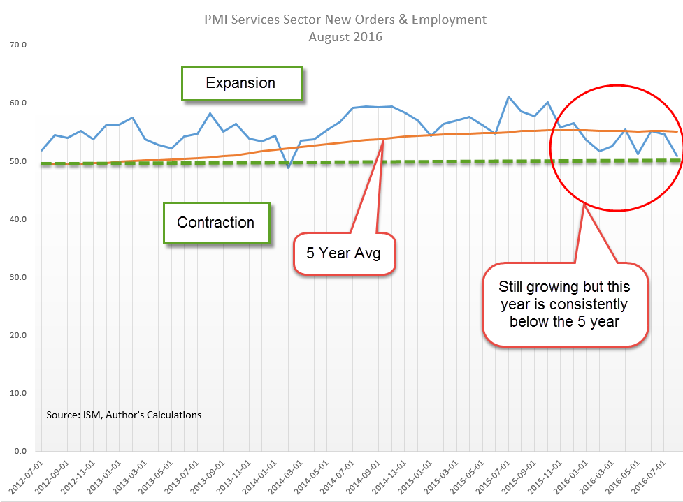
With a long view, a smoothed version of this-sub indicator signals weakness before a recession starts and doesn’t shut off till late after a recession’s end. The smoothed version has been below the 5 year average for seven months in a row. If history is any guide, a recession in the next year is pretty certain.
The 2007-2009 Recession
In August 2006 this indicator began consistently signaling key weakness in the service sectors of the economy (big middle rectangle in the graph below). Stock market highs were reached in June 2007 and the recession did not officially begin till December 2007, a full sixteen months after the signal started. That signal didn’t shut off till the spring of 2010, about eight months after the official end of the recession.

The 2001 Recession, Dot-Com Bust and Iraq War
The recession in 2001 lasted only six months but the downturn in the market lasted three years as equities repriced after the over-investment of the dot-com boom. The smoothed version of this indicator first turned on in January 2001, two months before the start of the recession in March of that year. Although, the recession officially ended in November 2001, the signal did not shut off till June 2003 (left rectangle in the graph above). Note that the market (SP500) hit bottom in September 2002, then nosedived again in the winter. Weak 4th quarter GDP growth that year fueled doubts about the recovery. Concerns about the Iraq war added uncertainty to the mix and drove equity prices near that September 2002 bottom. In April 2003, two months before the signal shut off, the market began an upward trajectory that would last over four years.
No one indicator can serve as a crystal ball into the future, but this is a reliable cautionary tool to add to an investor’s tool box.
//////////////////////////////
Stocks, Interest Rates and Employment
There are 24 branches of the Federal Reserve. This week, presidents of two of those banches indicated that they favored an interest rate hike when the Fed meets later this month (Investor’s Business Daily article). On Friday, the stock market dropped more than 2% in response. One of those presidents, Rosengren, is a voting member on the committee (FOMC) that sets interest rates. I have been in favor of higher interest rates for quite some time so I agree with Rosengren that gradual rate increases are needed. However, Chairwoman Janet Yellen relies on the Labor Market Conditions Index (LMCI) to gauge the health of the labor market.

Despite an unemployment rate below 5%, this index of about 20 indicators has been lackluster or negative this year. There are a record number of job openings but employees are not switching jobs as the rate they do in a healthy labor market. This is the way that the majority of employees increase their earnings so why are employees not pursuing these opportunities?
The Federal Reserve has a twin mandate from Congress: “maximum employment, stable prices, and moderate long-term interest rates.” (Source) There is a good case to be made that there are too many weaknesses in the employment data, and that caution is the more prudent stance. The FOMC meets again in early November, just six weeks after the upcoming September meeting. Although the Labor Report will not be released till three days after the FOMC meeting, the members will have preliminary access to the data, giving them two more months of employment data. Yellen can make a good case that a short six week pause is well worth the wait.
Stuck in the Mud
In 18 months, the SP500 is little changed. A broad index of bonds (BND) is about the same price it was in January 2015. The lack of price movement is a bit worrying. There are several alternative investments which investors may include in their portfolio allocation. Since January 2015, commodities (DBC) have lost 15%, gold (GLD) has gained a meager 1%, emerging markets (VWO) are down 5%, and real estate (VNQ) is literally unchanged. A bright note: international bonds (BNDX) have gained almost 6% in that time and pay about 1.5%. 1994 was the last time several non-correlated assets hit the pause button. The following six years were good for both stocks and bonds. What will happen this time? Stay tuned.