October 13th, 2013
“Use words not fists” a parent might say to a child. For the second weekend during the government show down – I mean shut down, the children – er, representatives – in Washington have taken that to heart. In a contest of dueling podiums, members of each party in both houses of Congress assure the public that their party is the reasonable one. On Thursday, the market shot up on the news that – no, not a deal – but the likelihood that the two parties might talk to each other instead of mouthing platitudes and principles at their separate podiums. About three weeks ago, speculative talk of a government shut down began to surface and where was the market after Friday’s close? Back where it started three weeks ago and just 1.5% below the high on September 19th.

In the Washington Irving tale, Rip Van Winkle fell asleep for twenty years only to wake up to a new United States of America. In this version of the tale, an investor goes to sleep for three weeks, wakes up and there’s a whole new United States of Closed For Remodeling. In a townhome association I belonged to many years ago, the tenants argued for several months over the choice of roofing contractor, color and style of roof for the townhomes. A large Federal government may take a while longer. In fact, it has been years since the Congress passed an actual budget. The Treasury department used up the debt limit last May and has been running on fumes since then, grateful that the housing loan agencies Fannie Mae and Freddie Mac have been paying back some of the cash they “borrowed” from the taxpayers a few years back.
Because of the shut down there have been few government reports. Commodities traders have been buying and selling in the dark, guesstimating what the weekly and monthly government reports on the sales and production of corn and other commodities would have been if there had been an actual report. We can only hope that traders have been fairly accurate. If there are some notable surprises, duck.
There have been some private reports, one of them the monthly manufacturing and services reports from the Institute for Supply Management (ISM). I updated the combined weighted index (CWI) that I have been showing the past few months. Unlike the environment during the August 2011 budget negotiations, business activity shows strength this year and the resilience of the S&P500 index reflects that underlying strength. Although 10 of 14 trading days were down, the index lost only about 4% from the recent high.

The CWI has been in expansion territory since the summer of 2009, which coincided with the NBER’s official call of the recession’s end. You’ll notice that there is a rolling wave like movement to the index since then, an ebb and flow of strong and not so strong growth. Since this is a coincident indicator of the fundamental strengths in the economy, it might not be a good predictor of short term market swings but has been a reliable predictor for the longer term investor. Despite the recent highs in the market index, the market has been in a downtrend since the highs of thirteen years ago. It is approaching the high set in 2007, a sign of renewed optimism.

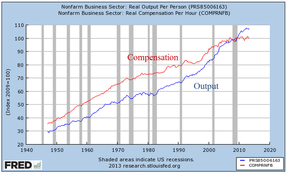
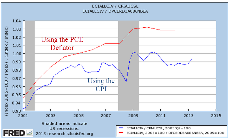
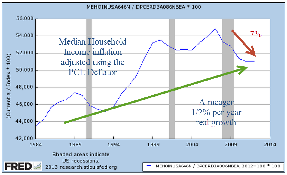
The Federal Reserve recently posted up Census Bureau median household – not individual – income figures for the past thirty years. Continuing on our theme from last week – the story we tell depends on how we adjust for inflation. In this case, neither story is particularly cheerful. Median household income adjusted for inflation using the Personal Consumption Expenditure measure has fallen to 1998 levels, declining 7% from 2007 levels.
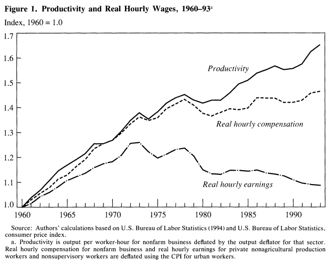
In 1983, the Bureau of Labor Statistics changed their methodology for computing the cost of owning a home, or owner equivalent rent. Over the years, some economists and financial writers have made the case that the official measure of inflation, the CPI, overstates inflation. This tells an even bleaker story: a decline of almost 9% from 2007 levels, an annual growth rate over 28 years of just 1/4% per year.

Now, let’s compare the two. Does the CPI overstate income by 5% or does the PCE Deflator understate inflation by the same amount?

The methodology influences many people in this country, from seniors on Social Security to working people who rely on cost of living increases. Yet there will be more debate about whether the manager of a baseball team should put in a fastball pitcher who sometimes struggles with accuracy or go with a pitcher who throws less hard but has good location and change up. There are political consultants who spend late night hours trying to figure out how to present the problem to the public so that they can understand it and get passionate about it.
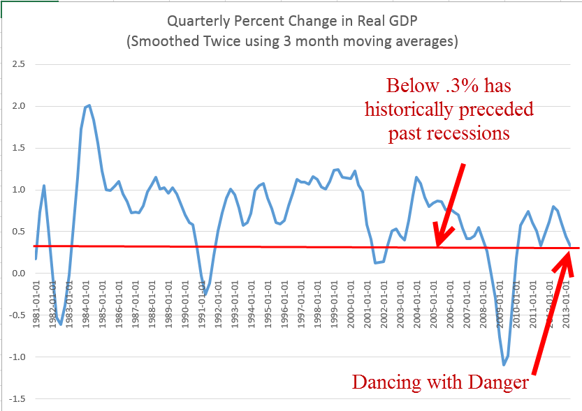
The slow growth in household incomes arises because there is a greater supply of people who want work than employers offering work that people can or want to do. Slow growth in the economy means less demand for labor, which puts downward pressure on the wages that workers can demand. Smoothing the quarterly percent change in GDP growth for the past thirty years gives a clear picture of this less than robust growth.
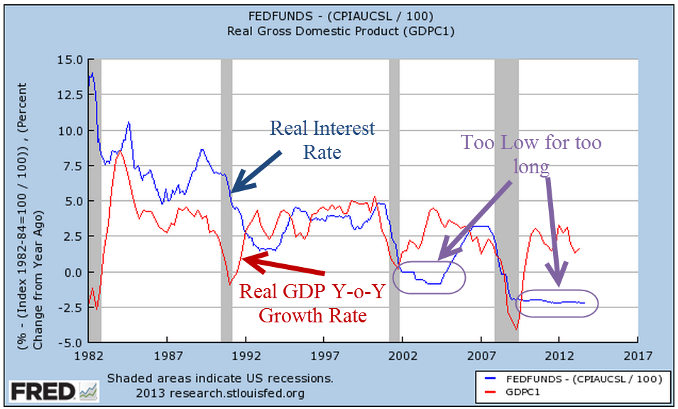
While that may be the chief reason for slow income growth, the negative real interest rate of the past five years has played some role, I think. When the economy is in a recessionary funk, the Federal Reserve keeps the interest rate low to spur growth. In the past two recessions, the Fed kept interest rates low for a considerable period of time after GDP growth began to rise. Now it is easy to look in the rear view mirror at GDP growth, which is revised several times and may be revised again a year later as more information becomes available. The Federal Reserve has to guess what the growth is and lately they have been overestimating the growth in the economy.
As long as the Fed keeps interest rates low, banks can make easy, safe profits in the spread between buying Treasury bonds and borrowing from the Fed and other banks. There is less incentive for banks to take the additional risk of investing in business loans. Although climbing up from the trough of several years ago, business loans in real dollars are still below the levels of mid 2008.

During the past twenty-five years, the rise and fall of commercial loans has become more pronounced. Have the banks become that much more cautious at each recession, are businesses circling the wagons at the first hint of a downturn, and what part do low interest rates play?
This past week President Obama confirmed his pick of Janet Yellen as the new chairwoman of the Federal Reserve. Larry Summers had been Mr. Obama’s first choice but Summers withdrew after learning that he would have a difficult confirmation process. Although very smart, Summers is not a concensus builder. Many in Congress and the market preferred Yellen to Summers. Ms. Yellen takes a dovish stance, meaning that she is likely to further the current policy of low interest rates for the near future. A cautious investor might want to rethink rolling over that 5 year CD that comes up for renewal in the next few months. Rates are currently 1.5 – 2%, so that after inflation an investor is losing a little money.