Targets of Taxation

April 28, 2024

by Stephen Stofka

The subjects of this week’s letter are home prices, household income and property taxes. The policy of using property tax revenue to fund public education has provoked controversy since the 19th century. Like other social species we are watchful of threats like freeloading to our group’s cohesion, however we determine “our” group. Newcomers to an area are often regarded with suspicion as being freeloaders who get from the group before they have contributed to the common welfare. This suspicion often underlies the heated debates that erupt at local council meetings. I will begin with property valuations, the basis of property taxation.

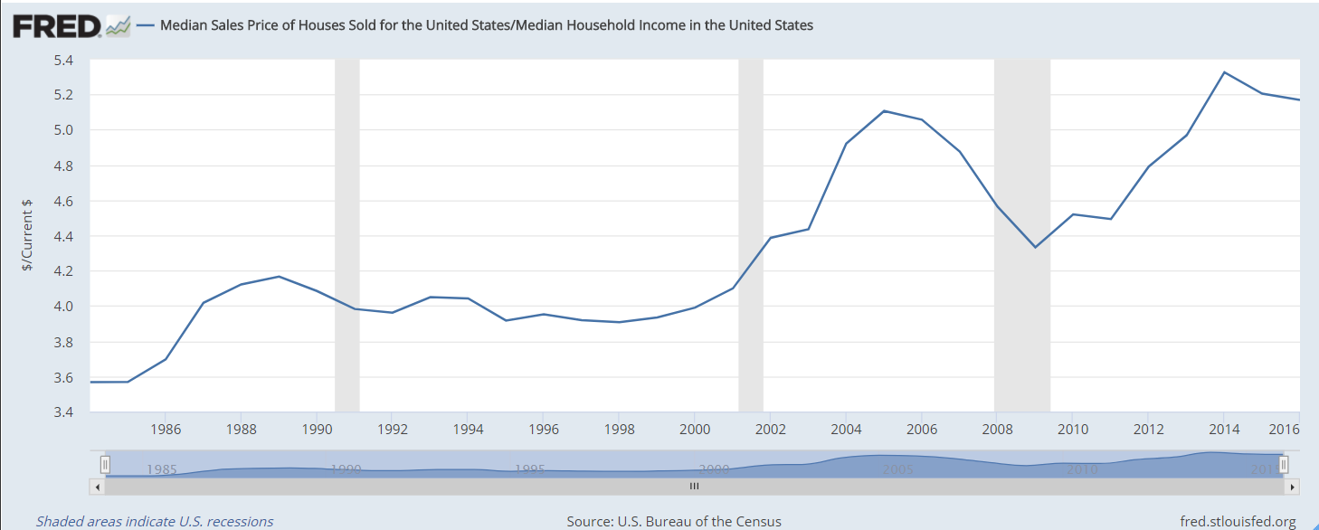
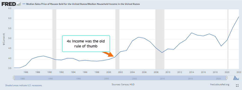
As a young man I was taught not to buy a home that was priced more than four times my income. In 2022, families paid more than six times the median household income, as shown in the chart below. Despite the high prices, mortgage debt service is a tame 10% of the household disposable personal income. Almost 40% of homeowners have a fully paid mortgage, according to Axios. Many homeowners hold mortgages at the historically low rates of the last decade. If higher mortgage rates persist for several years, we may see greater delinquency rates as recent buyers cope with payments that stretch their budget.

Graph shows an increasing ratio of home prices to median household income since 2000.

The Center for Microeconomic Data at the NY Federal Reserve has tracked household finances for more than twenty years. The highest percent of total household debt continues to be mortgage debt at 68% to 70%. Mortgage debt has grown at an annual rate of 3.9%, slightly more than the 3.7% annual increase in owner equivalent rent that I discussed last week. A low 3% of mortgages are more than 30 days delinquent, down from 11% to 12% during the 2008-2009 financial crisis. Only 40,000 people are in foreclosure, less than half the number in 2019. The numbers today are the lowest on record except for the pandemic years of 2020 and 2021 when many foreclosures were halted.

As I discussed last week, property prices reflect the anticipated cash flows from the house during a 30-year mortgage, a process called capitalization. The home buyer replaces the seller in the stream of cash flows from the house. Because property taxes are based on the appraisal values, the taxing authority implicitly bases property taxes on cash flows that a homeowner has not received yet. Each state sets an assessment rate that is a percent of the appraised value of the home. Each taxing authority within the state then charges a dollar amount – the mill value – per thousand of that assessed value. A home with an appraised value of $500,000 and an assessment rate of 8% would have an assessed valuation of $40,000. If the mill levy were $100 per $1000 of assessed value, then the homeowner’s property tax bill would be $4000. The effective property tax rate would be $4000 divided by $500,000, or 0.8%. Investopedia has a longer explanation for interested readers.

Each state taxes property at different rates. Colorado charges ½% of the appraised property value, one of the lowest in the nation. California averages ¾%. Texas averages a whopping 1.74% of home property values but has no income tax. Families earning the median household income and owning a house valued at the median house price in Texas and Colorado pay the same combined property and income tax of $5883 and $5669, respectively. Colorado has a cheaper tax burden despite having an income tax and far higher median house values. The same family living in California would pay $8256, largely because their property tax bill would be about the same as in Texas because the home values are more than double those in Texas. I will leave data sources in the notes.

Many districts give seniors a discount on their property taxes, effectively throwing a higher burden on working homeowners. Some argue that these exemptions should be means tested, effectively lessening or eliminating the discount for seniors with higher incomes. A wave of seniors may move to an inter-urban area that features lower home prices yet is within an hour of vital medical services like a hospital. The higher demand drives up home prices for others who have lived in the area for decades. Secondly, seniors consume more medical services and public accommodations. That requires more public spending, which is shared by the entire community and leads to resentments and contentious public meetings at the local town hall.

The majority of property taxes are used to fund public schools, and it is the largest line item on an individual homeowner’s property tax statement. This system of funding raises principled objections from childless couples and those who privately school their children, but are expected to share the burden of funding public schools. Homeowners have often resented having to fund the schooling of recently arrived immigrants. In the 19th century a wave of immigrants from Catholic Ireland, then Catholic Italy prompted many states with Protestant majorities to pass laws that excluded public funding for schools run by Catholics. Since the 16th century, the two main branches of Christianity had fought bloody civil wars in Europe and Britain. Those who colonized America brought those antagonisms with them.

During the 1970s, the number of encounters at the southern border increased almost ten times, according to the CBP. High inflation and migration of Amerians to western states caused a surge in property valuations and higher property taxes. In 1978, a taxpayer revolt in California led to the passage of Proposition 13 limiting property tax increases. In some school districts, undocumented parents had to pay a fee to enroll their children in public school.

In a 1982 case Plyler v. Doe, a slim 5-4 majority on the Supreme Court ruled that undocumented immigrant children did not have to pay a fee to go to school. The court reasoned that the equal protection clause of the 14th Amendment extended protection to “persons,” not “citizens.” Therefore, a state could not provide public benefits to one child in a school district and not another child because their parents were undocumented. The court interpreted “protection” to include public benefits, a construction that the Connecticut Constitution made explicit in 1818 with the phrase “exclusive public emoluments or privileges from the community.” The conservative majority on the Supreme Court overruled an interpretation of the due process clause in the 14th Amendment that justified the 1972 Roe v. Wade decision. This court might revisit this interpretation of the equal protection clause of the 14th Amendment as well.

Districts with lower property valuations struggle to raise adequate taxes to meet minimum educational standards. They may have to tax homeowners at a higher rate than a neighboring district, raising legal questions about uniformity and proportionality. The disparity in valuation was the subject of the 1997 Claremont decision by the New Hampshire Supreme Court. At the time, local districts provided 75% to 89% of funding for elementary and secondary education. The state’s general fund provided only 8% of school needs. The decision forced the state to distribute tax revenues among districts to meet adequate education standards for all children in the state. A 2017 analysis found that states now provide almost half of public education funding, relying on income tax revenue to smooth disparities in income among districts within each state.

People do not like paying taxes but grudgingly accept them. People elect local officials to decide on spending priorities yet some homeowners object to the way their taxes are spent. On my property tax bill are eleven items which include funding for schools, the city’s bonds, police, fire, libraries and flood control. Homeowners might prefer a questionnaire of thirty categories of spending which allowed them to allocate their tax dollars by percentage when they paid their property tax each year. In my district, a half-percent goes to affordable housing, three percent to social services. Some might prefer 5% or more. A homeowner paying online could elect to answer the questionnaire online. Would homeowners respond? Next week I will begin an exploration of various aspects of consumption, the chief component of our economy.

///////////////////////////

Photo by Museums Victoria on Unsplash

Keywords: housing, home prices, mortgage, property tax

Property taxes by zip code and state can be found at Smart Asset
Median home prices by state are at Bank Rate
Median Sales Price of Homes Sold in the U.S. is FRED Series MSPUS at https://fred.stlouisfed.org/ Median Household Income in the U.S. is series MEHOINUSA646N. The ratio of mortgage payments to disposable personal income can be found here. The home price to property tax ratio can be found here

The Power in Our Pockets

September 17, 2023

by Stephen Stofka

This week’s letter is about wages and income and the real purchasing power in our pockets. The auto workers’ union (UAW) went on strike limited to three auto plants while they continued negotiations with the auto companies. Nurses at Kaiser Permanente have voted to go out on strike by September 30th if they cannot resolve outstanding differences with Kaiser’s management. Executive compensation at the auto companies is now more than 300 times the average worker’s pay, the UAW points out, claiming that workers have as much right to share in the profits as executives and shareholders.

Legislation passed after the financial crisis required that publicly held companies report their CEO-to-Worker pay ratios. A recent analysis of companies in the SP500 estimated a pay ratio of 272-1 in 2022. The auto industry is part of the consumer cyclical industry, whose median executive compensation in 2021 was $13.7 million, as reported by Equilar. In 1965, the pay ratio was approximately 20-1. In the 1980s, the Reagan administration adopted a relaxed regulatory stance to corporate mergers and companies have grown much larger in the past decades. The pay ratio, however, has grown out of all proportion to the growth in corporate size.

A combination of factors contribute to high relative CEO pay. Thomas Greckhamer (2015) identified six paths – configurations of various factors – that are present in countries with high CEO pay and those without high CEO pay. He found that the relative pay of CEOs is high in countries where equity markets are well developed and highly liquid. Ownership is widely dispersed so that the CEO enjoys more power relative to stock owners and can negotiate higher compensation packages. CEOs do not have high relative pay in high welfare states where there are strong worker rights. A cultural acceptance of inequality and hierarchical authority, termed “power distance” by Geert Hofstede in 1980, contribute to high relative CEO pay. Here is a quick explainer. As a comparative example, the power distance factor in the American culture is low, half that of Mexico.  

Companies today derive their revenue and profits globally. For that reason it is not accurate to divide corporate profits by the number of employees in the U.S. I am going to do it anyway just to show the profound change that has taken place since the 1970s, a benchmark decade often cited as the beginning of growing inequality in the pay ratio. In the chart below I have adjusted after-tax corporate profits (FRED Series CP) for inflation, then divided that by the number of employees reported by the BLS (FRED Series PAYEMS). The trend is more important than the actual figures. Even though the 2010s were relatively flat the level of profits per employee was about double the level of the 1990s. Let’s compare that to worker incomes.

Since 1992, median household income adjusted for inflation has risen 23%, a level that is far below the rise in profits per worker. The chart below shows the gain on a log scale. Real incomes have gained less than 1% per year.

A few weeks ago I proposed adjusting prices by a broad index of house prices instead of the CPI. Two-thirds of American households own their home and home values reflect the discounted flow of housing services that we get from a home during our lifetimes. Housing costs are already almost half of the CPI and trends in home prices capture the feel of inflation on household budgets more accurately than the many CPI measures economists currently use.

During the 1980s and 1990s, housing prices increased 4% annually. The chart below describes the median household income adjusted by the all-transactions home price index (FRED Series USSTHPI). Notice that household incomes during those two decades stayed on an even keel.

Had the Fed structured their monetary policy to keep home price growth at the same level as the 1980s and 1990s, real incomes would be near the level of the green line, 10% higher today. Instead, workers feel as though they are on the path of the red line, regardless of what official measures of real household income indicate. The red line reflects a sense of discomfort and tension in many American households that plays out in our politics. The trend began with housing and finance policies enacted by both parties in Congress across five Presidential administrations.  

///////////////////

Photo by Charles Chen on Unsplash

Keywords: home prices, labor unions, wages, income, household income

Greckhamer, T. (2015). CEO compensation in relation to worker compensation across countries: The configurational impact of country-level institutions. Strategic Management Journal, 37(4), 793–815. https://doi.org/10.1002/smj.2370

Home Prices and Monetary Policy

July 30, 2023

by Stephen Stofka

This week’s letter is a proposal for an alternative measure to guide the Fed’s monetary policy. In 1978, Congress passed the Full Employment and Balanced Growth Act which gave the Fed a dual mandate – giving equal importance to price stability and full employment. The Canadian central bank has a hierarchical mandate with price stability as a priority. As with most Congressional mandates, the legislation left it up to the agency, the Fed, to determine what price stability and full employment meant. The Fed eventually settled on a 2% inflation target. Full employment varies between 95-97% and is hinged on inflation.

For its measure of inflation, the Fed relies on the Bureau of Labor Statistics (BLS) who conducts monthly surveys of consumer expenditures.  The BLS compiles a CPI based on the its price surveys of hundreds of items. The Fed prefers an alternative measure based on the Consumer Expenditure Survey, but the weakness in both measures is the complexity of the methodology and the inherent inaccuracy of important data points.

According to the BLS, housing costs account for more than a third of the CPI calculation. Twenty-five percent of the CPI is based on an estimate of the imputed rental income that homeowners receive from their home. This estimate is based on a homeowner’s response to the following question:   “If someone were to rent your home today, how much do you think it would rent for monthly, unfurnished and without utilities?” How many owners pay close attention to the rental prices in their area?  The BLS also surveys rental prices but tenants have six to 12 month leases so these rental estimates are lagging data points. The BLS tries to reconcile its survey of rents with homeowners’ estimates of rents using what it admits is a complex adjustment algorithm. 

The BLS regards the purchase of a home as an investment, not an expenditure so it must make these convoluted estimates of housing expense. There is a simpler way. Buyers and sellers capitalize income and expense flows into the price of an asset like a house. The annual growth in home prices would be a more reliable and less complex measure of inflation. Federal agencies already publish monthly price indexes based on mortgage data, not homeowner estimates and complex methodology. An all-transactions index includes refinancing as well as purchases. Bank loan officers have a vested interest in monitoring local real estate prices so their knowledge is an input to the calculation of a home’s value when an owner refinances.

The Federal Housing Finance Agency (FHFA) publishes the All-Transactions House Price Index based on the millions of mortgages that Fannie Mae and Freddie Mac underwrite. From 1990 – 2020, home prices rose by an average of 3.5% per year. A purchase only index that does not include refinances rose almost 3.9% during that period. As an aside, disposable personal income rose an average of 4.6% during that period.

The Fed does not need authorization from the Congress to adopt an alternative measure of inflation to guide monetary policy. As its strategy for price stability, the Fed could set a benchmark of 4% – 5% home price growth, near the 30 year average. If house prices are rising faster than that benchmark, monetary policy is too accommodating and the Fed should raise rates. Since the onset of the pandemic, home prices have risen 11% per year, three times the 40 year average. This same growth marked the peak of the housing boom in 2005-2006 before the financial crisis. The Fed did not begin raising interest rates until the spring of 2022. Had it used a home price index, it would have reacted sooner.

The annual growth in home prices first rose above 4% in the second quarter of 2013. The Fed kept interest rates at near zero until 2016, helping to fuel a boom in both the stock market and housing market. Since 2013, house prices have stayed above 4% annual growth, helping to fuel a surge in homelessness. Let’s look at several earlier periods when using home prices as a target would have indicated a different policy to monetary policymakers at the Fed.

In 1997, the annual growth of home prices rose above 4% and remained elevated until the beginning of 2007 when the housing boom began to unravel. In 2001, home prices had risen almost 8% in the past four quarters but the Fed began lowering its benchmark Federal Funds rate from 5.5% to just 1% at the start of 2004. The Fed was responding to increasing unemployment and a short recession following the dot-com bust. Near the end of that recession came 9-11. By lowering rates the Fed was pushing asset capital that had left the stock market into the housing market where investors took advantage of the spread between low mortgage rates and high home price growth.

In 2004, home price growth was over 8% and accelerating. Had the Fed been targeting home prices, it would have acted sooner. However, the Fed waited until the general price level began rising above its target of 2%. In the 2004-2006 period, the Fed raised rates by 4%, but it was too late to tame the growing bubble in the housing market. In 2005, home prices grew by 12% but began responding to rising interest rates. By the first quarter of 2007, home price growth had declined to just 3.3%.

The Fed models itself as an independent agency crafting a monetary policy that is less subject to political whims. However, the variance in their policy reactions indicates that the Fed is subject to the same faults as fiscal policy. If the Congress is crippled, then the Fed feels a greater pressure to react and is helping to fuel the boom and bust in asset markets. Let’s turn to the issue of full employment.

The condition of the labor market is guided by two surveys. The employer survey measures the change in employment but does not capture a lot of self-employment. The household survey captures demographic trends in employment and measures the unemployment rate. The BLS makes a number of adjustments to reconcile the two series. The collection of large datasets and the complex adjustments needed to reconcile separate surveys naturally introduces error.

The labor market has experienced large structural changes in the past several decades. Despite that, construction employment remains about 4.5 – 5.5% of all employment so it is a descriptive sample of the condition of the overall market. Declines in construction employment coincide with or precede a rise in the unemployment rate. In the past 70 years, the construction market has averaged 1.5% annual growth. During the historic baby boom years of the 1950s and 1960s, the growth rate averaged 2%. The Fed might set a target window of 1.5% – 2.5% annual growth in construction employment. Anything below that would warrant accommodative monetary policy. Anything above that would indicate monetary tightening. In 1999, the growth rate was 7%, confirming the home price indicator and strongly suggesting that fiscal or monetary policy was promoting an unsustainable housing sector boom.  

If the Fed had adopted these targets, what would be its current policy? The FHFA releases their home price data quarterly. The growth in home prices has declined in the past year but was still 8.1% in the first quarter of 2023. However, the S&P National Home Price index tracks the FHFA index closely and it indicates a slight decline in the past 4 quarters. Growth in construction employment has leveled at 2.5%, within the Fed’s hypothetical target range. The combination of these two indicators would signal a pause in interest rate hikes. This week, the Fed continued to compound its policy mistakes and raised interest rates another ¼ percent.  

////////////

Photo by Rowan Heuvel on Unsplash

The Ghost of the Past

December 25, 2022

by Stephen Stofka

Merry Christmas and Happy Holidays! This last letter of the year will be about choices and wishes, about means and ends. Aristotle distinguished between choice as a means and a wish as an end. A wish can be an illusion of choice, but it is not a choice. A choice is a path toward a wish. A wish is the reason for making a choice. Understanding the role of choice and wish in our lives can help us become more prudent investors.

A principle of economics is that choice involves an opportunity cost, the giving up of one thing for another. A child who wishes to be a basketball star soon learns that this requires many hours of layups and passing drills, shooting foul shots and other exercises that are the means to achieve that wish. The time spent doing those activities cannot be spent on some other activity and is an opportunity cost. An opportunity cost is a sunk cost that should not factor into our next decision but people have a natural aversion to loss. Investors are cautioned not to “marry” their investments, meaning that we shouldn’t stick with an investment simply because we don’t like taking a loss.

A post hoc analysis of a series of events may yield little useful information that will guide us in future choices because the pattern of events and choices will likely not be repeated. A seasoned executive of a bankrupt company may make a post-mortem comment, “We expanded too fast for our target market.” When we spend time analyzing a chain of decisions within a unique set of circumstances we do not spend time doing something else. We are lured by the illusion that the ghosts of past events can communicate with the ghosts from our future, that we can learn from the past. Most of the time, we can’t.

“I should have sold this spring when it was near 50 and rates were low,” a guy in front of me in the checkout line remarked to his friend, then they stepped forward to one of the self-checkout machines. I guessed they were talking about Bitcoin and mortgage rates. We judge the quality or accuracy of our choices by the information or insight we gain later. We can drive ourselves crazy with this type of time travel.

During the past two decades, the median sales price of a home has increased 4.7% per year. Disposable (after tax) personal income has risen only 4.1% per year. House prices in relation to disposable income is near the height of the 2000s housing bubble, as shown in the chart below.

A 20% down payment on a conventional house mortgage is a wish that takes a long reach. Choices include an FHA loan with a smaller down payment, cutting back on expenses or working an extra job for additional income. To some, Bitcoin was another choice, an asset whose value would increase faster than the average 10% annual gain in stocks or the paltry interest paid by savings accounts during the past decade. A $10,000 purchase of Bitcoin might grow to the size of a conventional down payment in just a few years. Even though Bitcoin’s price has fallen dramatically from the heady levels of $65,000 in November 2021, the price is still double its $8,000 price in January 2020. That is an annualized gain of almost 20%, double the 9.45% average annual gain of the SP500 total return (2022).

Each year is an unfolding narrative with no dress rehearsals. To alleviate the uncertainty, we look to the past and extrapolate into a future guaranteed to be unlike the past in significant ways. We wish we could predict the future, but our choices help construct our future. We can only look in front of us.

/////////////////////////

Photo by Kalen Emsley on Unsplash

S&P 500 Total Return Index, [SP500TR], retrieved from https://finance.yahoo.com/quote/%5ESP500TR/history?period1=1041292800&period2=1671753600&interval=1mo&filter=history&frequency=1mo&includeAdjustedClose=true, December 23, 2022.

U.S. Census Bureau and U.S. Department of Housing and Urban Development, Median Sales Price of Houses Sold for the United States [MSPUS], retrieved from FRED, Federal Reserve Bank of St. Louis; https://fred.stlouisfed.org/series/MSPUS, December 24, 2022.

U.S. Bureau of Economic Analysis, Disposable household income [W388RC1A027NBEA], retrieved from FRED, Federal Reserve Bank of St. Louis; https://fred.stlouisfed.org/series/W388RC1A027NBEA, December 24, 2022.

U.S. Census Bureau, Household Estimates [TTLHHM156N], retrieved from FRED, Federal Reserve Bank of St. Louis; https://fred.stlouisfed.org/series/TTLHHM156N, December 24, 2022.

Price Tides and Cultural Waves

This week I’ll look at the week’s events within a broad context of several centuries so make sure your seat belt is secure! Two weeks ago I wrote about two reliable indicators of recession, the annual acceleration in unemployment and in real retail sales. Since World War 2, an upward tick in unemployment and a downward movement in real retail sales has always preceded a recession. The unemployment report came out last week ending July 10th. The acceleration in the unemployed has remained negative, not confirming a high likelihood of a recession in the presence of weak retail sales.

The latest reports on inflation and retail sales were released this week. Although retail sales showed an increase, inflation adjusted retail sales decreased from last year. The deceleration in real retail sales is severe at -26%, indicating the dramatic consumer response to inflation and higher interest rates. Whether economists declare an official recession or not, consumers are feeling the pain and uncertainty. Here is an update on a graph I showed two weeks ago.

(FED, BLS, 2022)

In 2011, we saw a similar pattern – a plunge in retail sales but not an annual rise in the unemployment rate. There was a budget battle, a looming government shutdown and the stock market dropped 20% in anticipation of a recession that did not materialize. In the first quarter of 2012, the stock market began another historic climb, rising 60% in 30 months.

Each week we are reminded of rising food and energy prices but the rise in the cost of housing has been the most dramatic. According to Redfin (2022), a national real estate brokerage, a townhome in LA had a typical mortgage of almost $2400 in February 2021. In June 2022, they estimate a monthly mortgage cost of $4000, making it more expensive to own a townhome than to rent.

In David Hackett Fischer’s (1996) book The Great Wave he wrote about four centuries where prices continued to rise even during economic downturns. He dubbed these periods of sustained inflation “price revolutions.” The approximate dates are the 1200s, 1500s, 1700s, and 1900s (p. 6). The current price revolution began after World War 2, with prices falling only three times. Despite the severe recessions of 1974 and 1982, prices continued to rise.

Price revolutions create class conflict. The prices of life sustaining commodities like food, basic commodities, energy and shelter go up, having a greater impact on people with lower incomes. There are higher returns to property and capital owners. The price movements of manufactured goods are more tame but these benefit those with higher incomes, exacerbating class tensions (p. 86).

According to the Dept of Agriculture (USDA, 2022), the cost of food at home has fallen in only two of the last fifty years – in 2016 and 2017. There have been nine recessions since WW2, but the cost of shelter has fallen in only one year – 2010 (BLS, 2022). In a period of sustained price increase, people need more money. Since 1960, the per person quantity of a broad measure of money called M2 has declined in only two years – 1993 and 1995 (BOG, BEA, 2022).

Fischer identified seven causes of inflation (p. 279-280). Let’s review these in light of the rise in the cost of shelter. The first is an expansion of the money supply. A textbook example is the 1920s in Weimar Germany when people carted money in wheelbarrows to buy groceries. Today the Federal Reserve increases the money supply by lowering interest rates. People demand more credit and the banks increase the money supply. Low mortgage rates increase housing debt and the demand for housing.

A second cause  of inflation is an increase in aggregate demand. An extreme example is the surge in military spending during WW2. In this case we are focused on one sector – housing. According to the Case-Shiller Home Price Index (S&P, 2022), home prices have risen at last 5% each year in the past decade. China’s rapid industrialization since 2000 has elevated global demand for building supplies. A third cause of inflation is a contraction in supply. The pandemic caused supply bottlenecks in the supply of lumber and other building materials. A fourth cause is rising input costs, or “cost push inflation.” This is sometimes associated with rising wages as happened in the 1960s, but real wages in the decade before the pandemic rose only 5%, according to the BLS (2022). In that same ten year period, the costs of building materials rose 26% and jumped 50% in the second quarter of 2021 (BLS, 2022).

A fifth cause of inflation are administered prices, or oligopolies and monopolies created by government action or as part of an international pact. A good example is the alliance of oil exporting countries known as OPEC. This has not been a factor in the latest rise in home prices. A sixth cause is “bubble inflation” like the tulip mania of 1634 or the more recent surge in home prices during the 2000s. People bought homes in the expectation of a rapid rise in home asset values and they paid little attention to the home’s affordability.

The seventh cause of inflation is more applicable to the recent surge in home prices and current Fed policy – inflationary expectations. Anticipating higher prices of goods and services, people buy now, increasing demand and prices. The expectation starts a chain of events that fulfills the expectation. The late 1970s is a good example of this. Anticipating a 25% increase in the price of stereo in the coming year, a consumer would buy now on an installment plan, paying 15-20% interest. They were saving money and getting to use the stereo free for a year! It is that kind of thinking that the Fed wants to contain because those expectations continue to fuel inflation. Each of these inflationary factors adds to the persistence of inflation. Five of the seven causes are clearly present in this latest bout of inflation but the pandemic is the culminating event of decades of inflation.

In previous price revolutions, a crisis event led to a fundamental transformation of society, attitudes and thinking. The plague of 1348 ended the price revolution of the 1200s and early 1300s. In its aftermath,  humanism emerged and the serfdom of the Middle Ages declined. The price revolution of the 1500s was followed by the Thirty Years War and the founding of the nation state that persists to this day. The Age of Enlightenment accompanied the price revolution of the 1700s. Napoleon’s defeat at Waterloo in 1815 marked the beginning of the Modern Age, a revolution in travel, communications and industrial production. Will historians mark this pandemic as the end of the price revolution of the 1900s and the start of a new age?  

////////////////////

Photo by Silas Baisch on Unsplash

Board of Governors of the Federal Reserve System (US), M2 [M2SL], retrieved from FRED, Federal Reserve Bank of St. Louis; https://fred.stlouisfed.org/series/M2SL, July 15, 2022.

Federal Reserve Bank of St. Louis, Advance Real Retail and Food Services Sales [RRSFS], retrieved from FRED, Federal Reserve Bank of St. Louis; https://fred.stlouisfed.org/series/RRSFS, July 15, 2022.

Fischer, D.H. (1996). The Great Wave. Oxford University Press, NY.

Redfin. (2022, June). Data center. Redfin Real Estate News. Retrieved July 15, 2022, from https://www.redfin.com/news/data-center/. Note: at the bottom of the page is Redfin Monthly Rental Market Data. Enter the market and type of housing you are interested in.

S&P Dow Jones Indices LLC, S&P/Case-Shiller U.S. National Home Price Index [CSUSHPINSA], retrieved from FRED, Federal Reserve Bank of St. Louis; https://fred.stlouisfed.org/series/CSUSHPINSA, July 15, 2022.

U.S. Bureau of Labor Statistics, Consumer Price Index for All Urban Consumers: All Items in U.S. City Average [CPIAUCSL], retrieved from FRED, Federal Reserve Bank of St. Louis; https://fred.stlouisfed.org/series/CPIAUCSL, July 15, 2022.

U.S. Bureau of Labor Statistics, Consumer Price Index for All Urban Consumers: Shelter in U.S. City Average [CUSR0000SAH1], retrieved from FRED, Federal Reserve Bank of St. Louis; https://fred.stlouisfed.org/series/CUSR0000SAH1, July 15, 2022.

U.S. Bureau of Labor Statistics, Producer Price Index by Industry: Building Material and Supplies Dealers [PCU44414441], retrieved from FRED, Federal Reserve Bank of St. Louis; https://fred.stlouisfed.org/series/PCU44414441, July 15, 2022.

U.S. Bureau of Labor Statistics, Employed full time: Median usual weekly real earnings: Wage and salary workers: 16 years and over [LES1252881600Q], retrieved from FRED, Federal Reserve Bank of St. Louis; https://fred.stlouisfed.org/series/LES1252881600Q, July 15, 2022.

U.S. Bureau of Labor Statistics, Unemployment Rate [UNRATE], retrieved from FRED, Federal Reserve Bank of St. Louis; https://fred.stlouisfed.org/series/UNRATE, July 15, 2022.

U.S. Bureau of Economic Analysis, Population [POPTHM], retrieved from FRED, Federal Reserve Bank of St. Louis; https://fred.stlouisfed.org/series/POPTHM, July 15, 2022

USDA. (2022, June 24). Food price outlook. USDA ERS – Food Price Outlook. Retrieved July 15, 2022, from https://www.ers.usda.gov/data-products/food-price-outlook/

S&P Dow Jones Indices LLC, S&P/Case-Shiller U.S. National Home Price Index [CSUSHPINSA], retrieved from FRED, Federal Reserve Bank of St. Louis; https://fred.stlouisfed.org/series/CSUSHPINSA, July 15, 2022.

To Buy Or Not To Buy

October 28, 2018

by Steve Stofka

In ten years, the number of households that own their homes has grown by only 2-1/2%. Renting households have grown by 20%.

Should you buy a home? Home prices are sky high in some cities. Mortgage rates are rising. Is 2018 a repeat of 2006? Many bought homes at high prices only to see the price fall by a third or half over the following years.

Time to discover your inner owner investor who is going to buy the house. You are going to rent the home from your owner investor. Let’s compare the annual Net Operating Income (NOI) to the purchase price of the home. To keep the math simple, let’s say the owner investor can charge the renter $2000 a month in rent for the home. Let’s say that you, the renter, are going to bear the monthly cost of utilities. You, the investor, must pay $2000 in property taxes and other city charges like garbage collection. Your annual net income from the property is $2000 x 12 = $24,000 – $2000 taxes and costs = $22,000. Let’s say that the all-in cost of the home is $360,000. $22,000/$360,000 = 6.1%. That is the cap rate of the property.

Home pricing, like many assets, behaves in a cyclic manner, as the graph below shows. In the past thirty years, the average annual growth of the Case-Shiller home price index in Los Angeles is 5.6%. The rate of the past three years is slightly above that thirty-year average, meaning that prices in the L.A. area have stabilized relative to the long-term growth average.

HPILA

Rents have risen almost 5% so the two growth rates are fairly close. Let’s subtract an inflation rate of 2.6% from that to get a real capital gains rate of 3%. Add the two rates together to get a combined rate of 9.1%. For an average home in the L.A. area, this is a pretty good total rate of return.

Let’s look at another area: Denver. The thirty-year average of annual growth in home prices is 4.9%. During the past five years, population growth in the Denver area has been robust. Home prices have risen more than 7.5% during each of the past five years, topping 10% in 2015. In 2017, rents rose an average of 5.33%, not enough to keep pace with the growth in prices. An investor would be buying at an above average price.

In a hot market like Denver, a family might think “I am saving 8% a year by buying now.” They assume that above average price growth will continue. The law of averages indicates the opposite – that price growth is more likely to fall below average, and even turn negative.

In making a decision, understand where current prices are in the cycle (Note #1).  Understand where current rental growth is in the cycle and compare the two (Note #2). Here is a graph comparing the two series in Denver. Note the large divergence between home prices and rents in the late 1980s, 1990s and again in the 2000s. Rental prices were much more stable.

HPIvsRentDenver

Imagine that the home purchase is a cash investment and estimate a total return on that investment, as I showed above. Some familes pick a home in a price range based on the leverage of their income and down payment. A real estate agent may present home buying choices based on the amount of house a family can qualify for. But – is the house a good deal? These rates of return are an important factor to consider in making a wise decision.

////////////////////////////////

Notes:

  1. You can search for “FRED home prices [large city name here]” to get the Case-Shiller Home Price Index for that city. Click Edit Graph button in upper right and change the units to “Percent Change From Year Ago”. To get an average, click the Download button above the Edit Graph button to download an Excel spreadsheet.
  2. You can search for “FRED cpi rent residence [large city name here]” to get the index of rental prices for that city. As above, click Edit Graph button and change units to “Percent Change From Year Ago

/////////////////////////////////

Stocks

The recent downturn in the market was overdue. Since the election almost two years ago, the year over year total return of the SP500 has been above the 10% historical average.

SP500TRYOY

The longest above average streak under Obama’s Presidency was almost three years. In the dot-com boom under Clinton, the market had above average returns for almost 3-1/2 years. After a two-month stumble in 1998 due to the Asian Financial Crisis, the streak continued for another twenty months. Such a long period of exuberance was sure to fall hard. During the following three years, the market lost half its value. Reagan and Eisenhower enjoyed the next longest streaks of almost 2-1/2 years. The 1987 crash ended the streak under Reagan.

Trade Wind Turbulence

April 8, 2018

Remember the clip of Jack Nicholson In the 1980 movie The Shining? Jack hacks his way through a door with an axe, then presses his face to the jagged hole and announces, “It’s Johnny!” Substitute “Trade Wars” and we get a dramatic portrayal of the stock market this past week. On several days, the Dow swung 700+ points, or more than 2%, in response to fears of a tariff feud between the U.S. and China.

The share of global commodities that China consumes far exceeds its share of the world’s population (1/5) or the global economy (1/6). Here’s a chart from Visual Capitalist.

On Thursday, the market opened almost 2% down in response to comments from the chief Tweety Bird in the White House. Later that morning, Larry Kudlow, Trump’s new NEC Director, did a quite effective job of easing market jitters. Kudlow has been a host of CNBC and his own radio program for many years and is savvy to shifting sentiments. No, he said, Trump is a free trader in disguise. This is just a bargaining tactic. The market started the day 500 points down and finished up 240 points.

This is a trader’s market. Much of the price action is taking place in the last hour of the trading day. Each price recovery since mid-March has failed, so the overall sentiment is negative and Friday’s trading was near the 200-day average. For an investor who has not yet made their 2017 IRA contribution, buying now is somewhat equivalent to dollar cost averaging over the past nine months. For those with shorter time horizons, cash looks good till the market finds its head.

The Labor Report for March showed job gains of just 103,000. This was below the 175,000 anticipated gains and far below ADP’s 240,000 estimate of job gains. Mid-March weather on the east coast may have had a negative effect on this month’s survey. The average of the BLS and ADP surveys is 172K, and I find that average to be a more accurate long-term estimate.

The BLS recently released a report on unemployment rates and weekly earnings classified by degree. This chart is a dramatic picture of the advantages of higher education.

UnemplEarnByDegreeBLS
VividMaps released a map showing the income needed to buy an average home in each state. Because the data uses average house prices, the map overstates the affordability problem for many families but does reveal the underlying trend. Why do I say overstates? The average home price is far above the median price because extremely expensive homes raise the average.

First quarter earnings to be released in the next two weeks are expected to show strong annual growth. Will the confirmation of rosy expectations overcome the darker fears of a global trade war? Stay tuned.

Taxes, Bitcoin, and Housing

December 24, 2017

by Steve Stofka

Merry Christmas! Because of the holidays, I’ll keep it short. A few notes on the tax bill passed this week and some odds and ends I’ve collected.

In the final version of the tax bill, the state and local tax (SALT) deduction was limited to $10,000.  This limitation will hurt those in the coastal “blue” states.  As a group, these states already pay more in Federal taxes than they receive in various Federal programs.  The limit on the SALT deduction will take even more money from blue states and give it to red states. There is a second transfer taking place intra-state.

There are several components to SALT: income, sales and property taxes. According to the Census Bureau’s American Community Survey, almost 50 million households own a home with a mortgage.  Under current tax law, they get to deduct whatever mortgage interest they pay. Rich homeowners take the bulk of the mortgage interest deduction on their million-dollar homes.  50 million households rent. They get to deduct zilch.

For decades, homeowners have been in a protected class and able to deduct their property taxes. Renters have enjoyed no such deduction.  The owner of the building gets the deduction.  Think the owner is sharing that tax largesse by lowering rents?  No. For years, renters have effectively subsidized the tax deduction for their homeowning neighbors. The new tax bill transfers some of that tax burden from renters back to homeowners, putting both types of households on a more even level.

The density of coastal populations requires more infrastructure supplied by states, cities and towns.  Unless there is a natural resource like oil that can be taxed, local jurisdictions need higher taxes to pay for the added infrastructure. Secondly, the population density leads to more competition for land and housing, which causes higher property prices.  Even if New Jersey and Colorado charged the same property tax rate, the higher home prices in New Jersey would result in higher taxes.  But the two states don’t charge the same rate.  New Jersey averages almost twice the property tax rate charged by counties and towns in Colorado.

If you would like to compare property taxes in your state, county, or zip code with others, you can click here (https://smartasset.com/taxes/new-jersey-property-tax-calculator)

Democrats have long championed a graduated income tax, and the more graduated the better. The limit on the SALT deduction effectively levies more tax on those with higher incomes. That is the core principle of a graduated tax. Isn’t that what Democrats want?

//////////////////////////

Bitcoin Bumps

After surging more than 2000% this year, bitcoin has fallen 40% this week, but is still up more than 1400% for the year. 80% of the trading volume this year has come from Asia. Japanese men have turned from leveraged forex trading to bitcoin and other digital currencies. (WSJ article)

As an exchange of value, currencies should be stable. When they are not, they have failed, and it is invariably due to a failure of government policy. Venezuela is a current example. From 2007-2009 Zimbabwe’s currency failed, and even today, they use the U.S. dollar. Germany in the 1920s is probably the most egregious example of a failed currency.

Bitcoin is not a currency. Bitcoin is an asset but barely that. Buyers of bitcoin and other digital “currencies” are buying a share in the “greater fool” theory. Yes, the concept is brilliant. Ledger transaction chains solve many problems in international exchange. But digital transactions take too much energy to serve as a currency. In the time that it takes to validate the transfer of one bitcoin, hundreds of credit card transactions take place.

Bitcoin is not secure. A South Korean bitcoin exchange went bankrupt this month when it was hacked, and its reserves stolen. (CNN article) . Mt. Gox is the most well-known bitcoin hack victim, but there are others (Top 5 Bitcoin Hacks ).

//////////////////////////

Housing Prices to Income Ratio

New home sales in October were 10% above estimates. The average price of a new home hit an all-time high of $400K. The median price is $316K, more than five times the median household income. Here’s a graph of that housing price/income ratio for the past thirty years.

HomePriceIncomeRatio

The ratio first broke above 4 in 1987 and steadied for the next 13 years. During the housing bubble in the 2000s, the ratio rose swiftly and crossed above 5. As the bubble popped in 2007 and millions of people defaulted on their loans, the ratio fell as fast as it rose. Since the Financial Crisis, low interest rates have helped fuel another bubble.

The recent Case-Shiller housing index was higher than expected. Home prices are going up 6% per year, twice the rate of increase in incomes.

/////////////////////////

I’ll have more next week on long-term trends in income and inflation. Have a merry and take care of year ending stuff this week! Those with high SALT deductions might consider paying 2018 property taxes in 2017 but there is some question whether the IRS will allow the deduction. See this L.A. Times article.

Storage Costs

August 6th, 2017

Last week I discussed the concepts of present and future money. This week I’ll look at the costs involved in storing our money for future use. When I store my fishing boat over the winter, I pay storage costs. When I store money for the future I also pay storage costs. Some of these costs are outright fees. If I have a financial advisor, I may pay them a percentage based on the amount of money they manage for me. All mutual funds charge a fee which is clearly stated in the fund’s prospectus. Pension funds charge fees as well and that is not always as clearly stated.

In addition to fees, there are implied costs. My bank lowers the interest rate they pay me for savings and CD accounts to take care of their operating costs and profits. I could put my future money under my pillow but inflation eats away at my store of future money like rats in a granary bin.

Let’s turn to another cost that is more of a packaging cost– income taxes. But wait, taxes come out of my present money, my income. How can that be a cost of my future money? In the progressive income system that we have in this country, my income is taxed. If I make more money than my neighbor, I will pay a higher rate. My neighbor may pay an effective tax rate of 5% and I pay 15%.

We pay taxes on our leftover income – what we could put away into our store of future money. Let’s say that the median household income is $50K and my family makes $70K. The difference is $20K more than the median. It’s money that I could put into my store of future money. On the other hand, my neighbor’s household makes $40K, or $10K less than the median. Part of my family’s income that I could have put away for the future is going to be taken by the government in taxes.  Some of it will be used as a fee to pay for today’s common expenses like defense, police and courts, research, and infrastructure. Part of it will be given to my neighbor as a transfer payment. My future money becomes my neighbor’s present money.

How did I get my present money, my income? Invariably, it came from someone else’s future money which was previously saved and invested in a business that either hired me or contracted with me. All this money is on a merry go round of time.

Now let’s turn to the prospects for my future money. This article lists 22 reasons for not investing more money in equities at current valuations. I have mentioned several points covered in this article. One is the percentage of household wealth that is invested in the stock market. This past month, that percentage surpassed the level at the peak of the housing boom in 2006-2007.

StocksPctFinAssets201706

Maybe this time is different but I won’t count on it. The heady peaks of the dot-com boom in the late 1990s shows that this can go on for some time before the whoosh! comes.

Housing prices continue to grow above a sustainable trend line. I’ve marked out a 3% annualized growth rate on the chart below. This housing index is for home purchases only and does not reflect refinances.

PurchaseOnlyHPI201706

Check out the growth in commercial real estate loans.  The 10% annual growth of 2015 and 2016 has cooled somewhat in the first two quarters of 2017 but is still a torrid 7.6%.  (Source)

CommlRELoans

Several years ago, I thought that real estate pricing would not get frothy again for several decades. We had all learned our lesson, hadn’t we? Maybe I was wrong. The worth of an asset is what the next buyer will pay for it.  Zillow tells me I am growing richer by the day but there’s a problem.  If I did sell my home, what would I buy?  Everywhere I look, housing prices are so expensive.  Now I come back full circle to another storage cost – storing the future me.

Merry Christmas

December 21, 2014

In preparation for today’s solstice, the market partied on in a week long saturnalia.  The week started off on a positive note.  Industrial production increased 1.3% in November, gaining more than 5% over November of 2013.

Capacity utilization of factories broke above 80%, a sign of strong production.  Production takes energy.  I’ll come to the energy part in a bit.

The Housing Market Index remained strong at 57, indicating that builders remain confident.  Tuesday’s report of Housing Starts was a bit of a head scratcher.  After a strong October, single family starts fell almost 6%.  Multi-family starts fell almost 10% in October, then rebounded almost 7% in November.  Combined housing starts fell 7% from November 2013.

The market continued to react to the change in oil prices.  For the big picture, let’s go back a few years and compare the SP500 (SPY) to an oil commodity index (USO).  For the past five years, USO has traded in a range of $30 to $40, a cyclical pattern typical of a commodity.  In October, the oil index broke below the lower point of that trading range.

On Tuesday, oil seemed to have found a bottom in the high $50 range.  USO found a floor at $21, about a third below its five year trading range.  Beaten down for the past three weeks, energy stocks began to show some life (see note below).

Encouraging economic news helped lift investor sentiment on Tuesday morning. Some bearish investors who had shorted the market went long to close out their short positions. Growth in China was slowing down, Japan was in recession, much of Europe was at stall speed if not recession and the continued strength of the U.S. dollar was making emerging markets more frail.  While the rest of the world was going to hell in a hand basket, the U.S. economy was getting stronger.  Thee Open Market Committee at the Federal Reserve, FOMC, began its two day meeting and traders began to worry that the committee might react to the strengthening U.S. economy with the hint at an interest rate increase in the spring of 2015.  This helped sent the market down about 2% by Tuesday’s close.

Wednesday’s report on the Consumer Price Index (CPI) was heartening.  Falling gas prices were responsible for a .3% fall in the index in November, lowering inflation pressures on the Fed’s decision making about the timing of interest rate hikes.  The core CPI, which excludes the more volatile energy and food prices, had risen 1.7% over the past year, slightly below the Fed’s 2% target inflation rate.  Traders piled back into the market on Wednesday ahead of the Fed announcement Wednesday afternoon.  Back and forth, up and down, is the typical behavior when investors are uncertain about the short term direction of both interest rates and economic growth.

The Fed’s announcement that they would almost certainly leave interest rates alone till mid-2015 gave a further 1% boost upwards on Wednesday afternoon.  Twelve hours later, the German market opened  up at 3 A.M. New York time.  Early Thursday morning, the price of SP500 futures began to climb, indicating that European investors were reacting to the Fed’s decision by putting their money in the U.S. stock market.  Those of you living in the mountain and pacific time zones of the U.S. might have caught the news on Bloomberg TV before going to bed.  Maybe you got your buy orders in before brushing your teeth and putting your nightgown on. Very difficult for an individual to compete in a global market on a 24 hour time frame.  On Thursday, the market rose up as high as 5% above Wednesday’s close, before falling back to a 2.5% gain.

Still, a word of caution.  Both long term Treasuries, TLT, and the SP500, SPY, have been rising since October 2013.

As long as inflation remains low and the Fed continues its zero interest rate policy (ZIRP), long term Treasuries and stocks will remain attractive.   Something has to break eventually.  ZIRP  helps recovery from the aftermath of the last crisis but helps create the next crisis.  Abnormally low interest rates over an extended period are bad for the long term stability of both the markets and the economy.

**********************
Sale – Energy Stocks – Limited Time Only

(Note: this was sent out to a reader this past Tuesday.  Energy stocks popped up 4 – 5% the following day, a bit more of rebound than I expected. The week’s gain was almost 9% and the ETF closed above its 200 week average.)

As oil continues its downward slide, the prices of energy stocks sink.  XLE, a widely traded ETF that tracks energy stocks,  has dropped below the 200 week (four years!) average.  (A Vanguard ETF equivalent is VDE).  Historically, this has been a good buying opportunity. In the market meltdown of October 2008, this ETF crashed through the 200 week average.  A year later, the stock was up 38% and paid an additional 2% dividend to boot.  Let’s go further back in time to highlight the uncertainty in any strategy. The 2000 – 2003 downturn in the market was particularly notable because it took almost three years for the market to hit bottom before rising up again.  The 2007 – 2009 decline was more severe but took only 18 months. In June 2002, XLE sank below its 200 week average.  A year later, the stock had neither gained nor lost value. While this is not a sure fire strategy – nothing is – an investor  is more likely to enjoy some gains by buying at these lows.

****************************

Emerging Markets Stocks

Also selling below the 200 week average are emerging market (EM) stocks.  These include the BRICs (Brazil, Russia, India, China) as well as other countries like Mexico, Vietnam, Turkey, Indonesia and the Philipines. When a basket of stocks is trading below its four year average, there are usually a number of good reasons. Several money managers note the negatives  for EM.   Also included are a few voices of cautious optimism.  Sometimes the best time to buy is when everyone is pretty sure that this is not the right time to buy.  Another blog author recounts two strategies for emerging markets: a long term ten year horizon and a short term watchful stance.  The long term investor would take advantage of the low price and the prospect for higher growth rates in emerging economies.  The short term investor should be cognizant of the fickleness of capital flows into and out of these countries and be ready to pull the sell trigger if those flows reverse in the coming months.

******************************

Welfare

What are the characteristics of TANF families?  When the traditional welfare program was revised in the 1990s, lawmakers coined a new name, Temporary Assistance to Needy Families, to more accurately describe the program.  The old term carried a lot of negative connotations as well. Two years ago Health and Human Services (HHS) published their analysis of a sample of 300,000 recipients of TANF income in 2010.  Although the recession had officially ended in 2009, the unemployment rate in 2010 was still very high, above 9%.  It is less than 6% today.

There were 4.3 million recipients, three-quarters of them children, about 1.4% of the population. By household, the percentage was also the same 1.4% (1.8 million families out of 132 million households).  In 2013, the number of recipients had dropped to 4.0 million, the number of families to 1.7 million (Congressional Research Service)

In 2010, average non-TANF income was $720 per month, or about $170 a week.  To put this in perspective, this was about the average daily wage at that time The average monthly income from TANF averaged $392. Recipients were split evenly across race or ethnic background: 32% were white, 32% black, and 30% Hispanic. For adult recipients only, 37% were white, 33% black, and 24% Hispanic.

Rather surprising was how concentrated the recipients were. 31% of all TANF recipients in 2010 lived in California.  43.3% of all recipients lived in either New York, California or Ohio.  The three states have 22% of the U.S. population and almost 44% of TANF cases.

HHS data refutes the notion that welfare families are big.  50% of TANF families had only one child.  Less than 8% of TANF families had more than 3 children.  82% of TANF families also receive SNAP benefits averaging $378 per month.

In 2014, Federal and State spending on the TANF program was less than $30 billion, about 1/2% of the $6 trillion dollars in total government spending.  The Federal government spends a greater percentage on foreign aid (1%) than the TANF program. Yet people consistently overestimate the percentage of spending on both programs (Washington Post article).  The average estimate for foreign aid? A whopping 28%.  Cynical politicians take advantage of these public misperceptions.

**********************

Omnibus

Aiming to overhaul the health care insurance programs throughout the country, the Affordable Care Act (ACA) was a big bill.  No, it wasn’t 2700 pages as often quoted by those who didn’t like it.  The final, or Reconciled, version of the bill was “only” 900 pages.  The House and Senate versions were also about 900 pages each; hence, the 2700 pages.

At 1600 pages in its final form, the recently passed Omnibus Spending bill makes the ACA look like a pamphlet.  As  specified in the Constitution, all spending bills originate in the House.  Past procedure has been to pass a series of 12 spending bills.  Majority leader John Boehner has found it difficult to get his fractious members to agree on anything in this Congress so all 12 bills were crammed into this behemoth bill just in time to avoid a government shutdown.  Just as with the ACA, most members of the House and Senate did not have adequate time to digest the details of the bill.  The bill is sure to hold many surprises for those who signed it and we, the people, who must live under the farcical law-making of this Congress.  Here is a primer on the budget and spending process.

**********************

Home Appraisals

They’re back!  A review of 200,000 mortgages between 2011 and 2014 showed that 14% of homes had “generous” appraisals, inflating the value of the home by 20% or more.  Loan officers and real estate agents are putting increasing pressure on appraisers to adjust values upwards.

**********************

Personal Income

You may have read that household income has been rather stagnant for the past ten years or more.  In the past fifty years household formation has increased 78%, far more than the 50% increase in population.  The nation’s total income is thus divided by more households, skewing the per household figure lower.  During the past thirty years, per person income has actually grown 1.7% above inflation each year.  Inflation adjusted income is now 66% higher than what it was in 1985.

In 2013, the Bureau of Economic Analysis released median income data for the past two decades. Median is the middle; half were higher; half were lower.  This is the actual dollars not adjusted for inflation.  Except for the recession around the time of 9-11 and the great recession of 2008 – 2009, incomes have risen steadily.

The 3.7% yearly growth in median incomes has outpaced inflation by almost 25%.

Why then does household income get more attention?  A superficial review of household data paints a negative picture of the American economy. Negative news in general tugs at our eyeballs, gets our attention.  The majority of the evening news is devoted to negative news for a reason. News providers sell advertising in some form or another.  They are in the business of capturing our attention, not providing a balanced summary of the news.  In addition, a story of stagnating incomes helps promote the agenda of some political groups.

***********************

Merry Christmas and Happy Chanukah!