The Poor and the Not Poor

October 15, 2017

No worries. Among the 25 OECD countries, Americans have historically had the lowest percentage of their financial assets in cash and savings deposits. After the financial crisis, we became the second lowest, just ahead of Chile. The percentage for the most recent available year (2015) was 13.5%.

In the heady optimism of the dot-com boom in 1999-2000, Americans had less than 10% of their assets in cash and savings. In the long downturn from 2000 – 2003, Americans bumped up their percentage in safe assets to almost 13%. As the economy recovered, that need for safety declined slightly but not to the levels of the 1990s. The financial crisis in 2008 caused Americans to reach for safety. Safe assets rose to 14.3% of total financial assets and we have still not recovered the level of confidence we once had.

You can click on this OECD link to see a comparison of current percentages. On the bottom right below the chart you can drag the year slider and look at some historical data.

Below the chart on the left is a category labeled “Perspectives.” Select “Total” to see total financial assets, which does not include home equity. Americans have the second highest total, just below Switzerland.

On the other hand, the U.S. has a comparatively high poverty rate of 17.5% using the OECD standard,  a simple measure that an economist would use.The poverty threshold is half the median income.

The U.S. publishes a poverty rate that is several percent lower because it uses a complex definition first set in 1963 when families spent an estimated 1/3 of their income on food. The complexity of the definition hints that politicians had a hand in crafting the definition but it is attributed to one person in the Social Security Administration, who based her standard on a combination of foods that the Department of Agriculture thought would meet minimum nutritional needs. The history of this standard and its many revisions is an interesting read.

The threshold is set at three times the cost of this 1960s era minimum food diet. Efficiencies in food production over the past 50 years have dramatically lowered food costs for U.S. families. In 1978, the BLS estimated that the average family spent only 18% of their income on food. In 2014, it was a bit more than 14% (BLS).

Using food costs as the basis for measuring poverty has enabled politicians in this country to claim success in lowering poverty over the past half century. In 1978, the calculation of the U.S. poverty threshold produced one that was slightly more than the OECD standard. Today, the U.S. threshold is 16% less than the OECD standard.

Let’s look at a family of four making $28K in 2016. They were above the official U.S. poverty threshold of $24,300 for a family of four. By the OECD definition, that American family was below half of the median $59K in income and would be counted as poor.

Housing costs are higher in urban areas, where half of the U.S. population lives. That family of four living in Chicago might pay $15000 per year for a 2 BR apartment in Chicago. Further south in the same state, Springfield, IL, they might pay $11,000. That $4000 difference in housing cost is not calculated into the poverty rate that the U.S. publishes. In effect, poverty is undercounted in urban areas and overcounted in rural areas.

The simplicity of the OECD standard better captures poverty among both urban and rural low-income families because it is based on median income. So why doesn’t the U.S. adopt this much clearer standard? We can turn to the last sentence of the previous paragraph for a clue. Politicians in rural areas want a standard that overcounts poverty in their districts. A higher headcount of poverty equals more subsidies for their constituents. When this standard was set, rural areas in the southern states were primarily Democratic and Democrats dominated the Congress under a Democratic President, Lyndon Johnson. Those politicians wanted the adoption of a food based standard that overcounted those voters.

Today, most rural areas are predominantly Republican and the standard works to the advantage of Republicans and the disadvantage of Democrats. As a rule of thumb, whenever we see excessive complexity in rule-making, there’s usually a very sound political reason for that obfuscation. Former President John Adams lamented this unfortunate characteristic of lawmaking in the crafting of the Constitution itself.

The intentional lack of clarity in lawmaking ensures that any nation’s population will be at odds with each other. A small and smart part of the population makes money from conflict and confusion. People argue on Facebook; Facebook makes money. Trump did what? There’s a video. Got to see that, right? Click bam boom, Google makes money by placing some ads next to the video.  Controversy is profitable. Politics as carnival show.

Crown Publishing, a division of Random House, publishes both the fringe right author Ann Coulter, and the way out on the left author and MSNBC host, Rachel Maddow. Worried that the liberals are taking over the country? Frightened that the conservatives will destroy the very institutions that have made America the greatest nation on earth?  Crown has something for you.

On the other hand, the record low volatility of the stock and bond markets in the past year have made it difficult for financial firms who depend on controversy to make a good profit.  Active fund managers have struggled to outperform their benchmark indexes.  The volume of derivatives and other products that insure against volatility have fallen.  People are not worried enough.  That’s the problem.  We need to worry about not being worried.

And those poor families?  If we lower the poverty threshold even more, we won’t have to worry about those poor people as much.

Storage Costs

August 6th, 2017

Last week I discussed the concepts of present and future money. This week I’ll look at the costs involved in storing our money for future use. When I store my fishing boat over the winter, I pay storage costs. When I store money for the future I also pay storage costs. Some of these costs are outright fees. If I have a financial advisor, I may pay them a percentage based on the amount of money they manage for me. All mutual funds charge a fee which is clearly stated in the fund’s prospectus. Pension funds charge fees as well and that is not always as clearly stated.

In addition to fees, there are implied costs. My bank lowers the interest rate they pay me for savings and CD accounts to take care of their operating costs and profits. I could put my future money under my pillow but inflation eats away at my store of future money like rats in a granary bin.

Let’s turn to another cost that is more of a packaging cost– income taxes. But wait, taxes come out of my present money, my income. How can that be a cost of my future money? In the progressive income system that we have in this country, my income is taxed. If I make more money than my neighbor, I will pay a higher rate. My neighbor may pay an effective tax rate of 5% and I pay 15%.

We pay taxes on our leftover income – what we could put away into our store of future money. Let’s say that the median household income is $50K and my family makes $70K. The difference is $20K more than the median. It’s money that I could put into my store of future money. On the other hand, my neighbor’s household makes $40K, or $10K less than the median. Part of my family’s income that I could have put away for the future is going to be taken by the government in taxes.  Some of it will be used as a fee to pay for today’s common expenses like defense, police and courts, research, and infrastructure. Part of it will be given to my neighbor as a transfer payment. My future money becomes my neighbor’s present money.

How did I get my present money, my income? Invariably, it came from someone else’s future money which was previously saved and invested in a business that either hired me or contracted with me. All this money is on a merry go round of time.

Now let’s turn to the prospects for my future money. This article lists 22 reasons for not investing more money in equities at current valuations. I have mentioned several points covered in this article. One is the percentage of household wealth that is invested in the stock market. This past month, that percentage surpassed the level at the peak of the housing boom in 2006-2007.

StocksPctFinAssets201706

Maybe this time is different but I won’t count on it. The heady peaks of the dot-com boom in the late 1990s shows that this can go on for some time before the whoosh! comes.

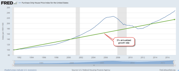
Housing prices continue to grow above a sustainable trend line. I’ve marked out a 3% annualized growth rate on the chart below. This housing index is for home purchases only and does not reflect refinances.

PurchaseOnlyHPI201706

Check out the growth in commercial real estate loans.  The 10% annual growth of 2015 and 2016 has cooled somewhat in the first two quarters of 2017 but is still a torrid 7.6%.  (Source)

CommlRELoans

Several years ago, I thought that real estate pricing would not get frothy again for several decades. We had all learned our lesson, hadn’t we? Maybe I was wrong. The worth of an asset is what the next buyer will pay for it.  Zillow tells me I am growing richer by the day but there’s a problem.  If I did sell my home, what would I buy?  Everywhere I look, housing prices are so expensive.  Now I come back full circle to another storage cost – storing the future me.

Inauguration 2017

January 22, 2017

Mr. Trump’s inauguration marks the first time in almost a hundred years that a business person assumes the highest political position in the country.  His cabinet choices share that same characteristic. There will be an inevitable clash of cultures.  Many civil servants are lifers, drawn to the generous benefits of government service, and the stability of employment.  Some may be drawn to the work because it gives them a sense of self-worth.

Many have little experience in private industry and distrust the motives of business owners.  Former President Obama was one of these.  An inspirational figure to some, his antipathy to business interests of all sizes antagonized political foes who challenged him for most of his two terms.

Mr. Trump has a similar weakness – his antipathy to and unfamiliarity with the insular culture of civil servants who work in a massive bureaucracy characterized by a thicket of rules and a lack of transparency.

Work in the private sector is characterized by competition, a striving for efficiency, the changing winds of people’s preferences, and the quality of the services and products we provide.  Employment in the public sector requires patience with burdensome procedure, a tolerance of a heirarchy of both the competent and the undeserving, and a willingness to work in a system that relies less on merit and more on seniority.

What will happen when these two diametrically opposed cultures mix?  Stay tuned.

/////////////////////////////////

Obamacare Kaput?

Since FDR began the custom, Presidents have signed executive orders on their first day in office to signify that they are on the job for that portion of the American electorate that put them in office.  One of the highlights of Mr. Trump’s campaign was the repeal of Obamacare.  Shortly after his inauguration President Trump signed an order stating his intention to repeal the ACA.  The order freezes any further promulgation of rules and regulations pertaining to the act.   I thought it would be appropriate to republish a blog I wrote in April 2011, a year before the Supreme Court ruled that most of the ACA was constitutional.  Like Social Security, ACA premiums and penalties were a tax.

The problems of providing health care and the insuring of that care have not gone away: rising costs, more sophisticated and expensive therapies, more demand for care from an aging population.  The problem is a knotty one:  how to distribute health care costs.  We all benefit from the availability of medical resources, yet these resources are very expensive.  The 24 hour care and equipment that stays idle in an urban hospital must be paid for with funds from other parts of the health care system.

It might surprise readers that more than 50% of the $3.5 trillion in Federal outlays is for Social Security benefits ($930B), Medicare ($600B) and Medicaid and Community health programs ($500B).  Eighty years ago, FDR initiated a new role for the Federal Government: an economic support system. To do that, FDR had to threaten and cajole a Supreme Court reluctant to stretch the meanings of several clauses in the Constitution.

Even FDR would be appalled to learn that the Federal Government has become an insurance company whose chief function is the collection of insurance premiums through taxes in order to pay insurance claims in the form of Social Security, Medicare and Medicaid Benefits.

Readers who would like to read more on a pie chart breakdown of government spending can visit the Kaiser Family Foundation’s fact sheet. Dollar amounts are from the latest White House budget.

//////////////////////////

MM Bash

I’m about to bash criticize some of the reporting in mainstream media (MM) publications, whose budgets rely on viewership.  When that audience was more predictable, flagship publications like the NY Times, Washington Post and Wall St. Journal could wait to verify facts before running a story.  In the current 24 hours news cycle and the rush to print, fact checking sometimes comes after the story is published online – if at all.

MM channels rested on their decades old reputations for thorough journalism and were willing to cut off at the knees any reporter compromising that reputation.  More than a decade ago, Dan Rather lost his anchor job with CBS for running with a story about George Bush that had not been properly vetted. News (fact-checked) and opinion (not checked) were clearly defined when they were in separate sections of the newspaper. In this new age when most information is delivered digitally, we are quoting blogs or other opinions that are not fact checked as reputable news sources without verifying the information.

A lie travels around the world by the time the truth gets its boots on. Something like  that.  In today’s lightning fast world of information flow, an apocalyptic news item that can move markets can be tweeted, webbed, facebooked, and retweeted.  “China fires on U.S. destroyer in South China sea!”  “N. Korean missle hits Alaska!” Sell, sell, sell, buy, buy, buy signals can flash instantly to world markets.

Later, it’s no, China didn’t fire on a U.S. destroyer.  China said it would fire if fired on by a U.S. vessel in the S. China Sea.  No, the North Koreans didn’t actually fire a missle.  Instead they said that they had a missle that could fire a nuclear payload on Alaska.  They’ve been saying that for several years.  Most defense analysts remain skeptical.  Oops, nevermind stock and bond markets.

We can not prevent this, nor can we hide our savings under a mattress.  We can prepare by making sure that we have some emergency funds in place.  Most financial advisors recommend six months replacement income.  Only after those funds are in place should we consider that boat we want on Craigslist or the down payment on that house we want to flip.  Don’t just plan to have a plan.  Have a plan.

//////////////////////////

Household Net Worth Ratio

The zero interest rates for the past eight years are not natural and have created distortions in business and residential investment as well as stock market valuations. Let’s look at the residential side of the picture.  Below is a sixty year chart of the percentage of household net worth to disposable income.

The majority of the net worth of households is in their home.  The value of stocks and bonds comes second.  One or both of the two factors in that ratio is mispriced.  Perhaps disposable income has not grown to match the growth in asset valuations.  When reality doesn’t match predictions for a time, assets reprice.

What affects the pricing of these assets? The stock market rises on the prospect of sales and profit growth.   Salaries and wages rise as businesses compete for workers in a faster growing marketplace.  Disposable income rises.  Home prices rise on the prospect that more workers can afford to buy a home.

Now, what happens when disposable incomes, the divisor or bottom number in this ratio, don’t rise as much as predicted?  Yep, the ratio goes up, just as it did in 1999-2000 and 2006-2008, the peaks in the graph.

Follow The Money

June 14th, 2014

This week I’ll take a look at some near-term trends in small business, labor, oil and housing and a few long-term trends in income and debt.

***********************
Small Business

Huzzah, huzzah!  The monthly survey of small business owners by the National Federation of Independent Businesses (NFIB) broke through the 96 level after cracking the 95 level last month.  Sentiment has not been this good since mid-2007.  Hiring plans have been on the rise for the past several months and owners are reporting rising sales.

**********************

JOLTS (Job Openings and Labor Turnover Survey)

The Job Openings report from the Bureau of Labor Statistics (BLS) has a one month delay so the data released this past week was for April.  The number of job openings was 40,000 higher than expected, coming in close to 4.5 million.  As a percent of the workforce, job openings are approaching pre-recession highs.

The decline in construction job openings is a disappointment.  We are near the same level as 2003, a weak year of economic growth.  We should expect to see an uptick in job openings in next month’s report, confirming that projects put on hold during the severe winter in the eastern part of the country are again on track.  Further declines would indicate a spreading malaise.

************************

Gross Domestic Income

On a quarterly basis Gross Domestic Income, GDI, and Gross Domestic Product, GDP, differ somewhat but over the long run closely track each other.  Following up on two previous posts on Thomas Piketty’s book Capital in the 21st Century, I wondered what percent of GDI goes to pay employee compensation.  As we can see in the chart below, total compensation for human labor has been dwindling to post WW2 levels.

This is total compensation, including benefits.  Wage and salary income as a percent of total national income has declined steadily.

As a percent of total income, employee benefits have more than tripled since the end of World War 2 and now comprise more than 10% of the country’s income.

Demographic shifts have contributed to the decline of labor income.  The post war boomer generation, 80 million strong and 25% of the population, contributes to the trend as they save for retirement. As capital gains, interest and dividend income increase, this reduces the share of wage and salary income.

Economic changes have been a major factor in the decline of labor income.  Capital investments in technology, both in hardware and software, have reduced the need for labor for a given level of production.  Capital investment demands income to pay back the investment. For most of the 20th Century, machines replaced human muscle in farming, manufacturing and construction.  In the past two decades, machines are increasingly replacing mental muscle.

How we count labor income has changed.  Tax law changes in 1986 and 1993 reduced the amounts that are included as compensation but the overall effect of these changes is relatively minor.

If we divide the country’s total employee compensation by the number of employees, we might ask “What recession?”  Average annual compensation has climbed from $38-54K in a dozen years.  That’s almost a 50% raise for every employee!

Of course, everyone has not had a 50% increase in income over the past 12 years.  Human capital, the educational and technical training that an employee has to offer, has earned an increasing premium in the past three decades. Those with more of this capital have captured more benefit from the dwindling pool of labor needed for the nation’s production.

Average disposable income tells a more accurate story of the majority of people in this country.  Disposable income is what’s left over after taxes.  The trend is downward.

How do we cope with flat income growth?  Charge it!  It’s the Amurikin way! Per capita Household Debt has increased 75% in the past 13 years.  After a decline from the rather high levels before the recession began in late 2007, per capita debt has leveled off in the past two years.

Rising house prices and stock market values have increased net worth.  As a percent of net worth, household debt has declined to the more sustainable levels of the 1990s.

The percentage of disposable income needed to service that debt is at thirty year lows, meaning that there is room for growth.

In response to the hostilities in Iraq, oil prices have been on the rise.  Historically, a rise in oil prices leads to a rise in prices at the pump which takes an extra bite out of disposable income and puts a damper on consumer spending growth.

***********************

Oil Prices

A blog by Greg McIsaac at the Washington Monthly in May 2012 presents an interesting historical summary of oil prices and production.  The American love of simplicity leads many to credit one man, the President, for the rise and fall in gasoline prices, although the President has little, if any, influence on oil pricing. McIsaac notes The combination of lower energy prices and increased energy efficiency in the 1980s reduced US expenditures on energy by nearly 6 percent of GDP.  Deregulation of energy prices begun under the Carter Administration were largely credited to the Reagan administration.   He writes “crediting Reagan with falling energy prices of the 1980s exaggerates the roles of both Reagan and deregulation and obscures the larger influence of conservation and increased production outside the US.”  Production actually fell for several years after regulatory controls were lifted.

Further increases in oil prices will no doubt be blamed on this President.  The one thing that each outgoing President bequeaths to the newcomer before the inauguration is the Presidential donkey suit.

***********************

Housing

Redfin Research Center reports a sharp decline in the number of houses sold through May. After a 7.6% year-over-year decline in April, home sales slid 10% from May 2013 levels.  Real estate agents are reporting a shift from a seller’s market to a buyer’s market.

***********************

Takeaways

Small business accounts for approximately 60% of new jobs and optimistic sentiment among small business owners is growing.  The labor market continues to show continuing strength in the number of job openings and a decline in new unemployment claims.  Disposable income growth is flat but the portion of income needed to service debt is very low.  Rising oil prices and a slowing housing market will crimp economic growth.
Next week I’ll look at a complex topic – is the stock market fairly valued?  

Net Worth, Labor Productivity And Political Pay

May 10th, 2014

This week I’ll look at some short term mixed signals in economic activity, and long term trends in labor productivity and household net worth.  In advance of the mid term election season in the U.S., I’ll look at several aspects of the money machine that drives elections.

*****************************
CWPI

For almost a year, I’ve been tracking a composite index, a Constant Weighted Purchasing Index, based on the Purchasing Manager’s Index produced by the Institute for Supply Management (ISM).  Based on key elements of ISM’s manufacturing and non-manufacturing monthly indexes, it is less erratic than the ISM indexes and gives fewer false signals of recession and recovery.  After reaching a low of 53.5 last month, the CWPI of manufacturing and service industries is on the rise again.  During this recovery this index of economic activity has shown a regular wave pattern.  If that continues, we should expect to see four to five months of rising activity before the next lull in late summer or early fall.  Any deviation from that pattern would be cause for concern if falling and optimism if rising.

The winter probably prolonged the recent downturn in the index.  In the manufacturing sector, new orders and employment are strong.  In the services sector, which comprises most of the economy, new orders are strong but employment growth has slowed to a tepid pace.

This week the Bureau of Labor Statistics released their estimate of Productivity growth for the first quarter.  One of the metrics is the per hour growth in productivity, which is key to the overall growth of the economy.  As seen in the chart below, the last time annual productivity growth was above 2% was in the 3rd quarter of 2010.  To show the historical trend, I took the 3 quarter moving average of the year over year growth rate.  We can see a remarkable shift downward in productivity.

Recovery after recessions are marked by a spike in growth above 3% simply because the comparison base during the recession is so weak. What the chart shows is the shift from steady growth of 3% to a much weaker growth pattern since the 2008 recession.  In testimony before the Senate Finance Committee, Fed chairwoman Janet Yellen stated that we may have to adjust our expectations to continuing slow growth.  The erosion of productivity growth has probably prompted concerns in the Fed Open Market Committee.

***************************

JOLTS – Job openings

Continuing on from labor productivity, let’s look at a trend in job openings.  With a month lag, the Bureau of Labor Statistics (BLS) reports on the number of job openings around the country. Preceding a recession, the number of job openings begins to decline.  Recovery is marked by an increase in openings. March’s report showed a slight increase in job openings, near the high of the recovery and closer to late 2005 levels.

When we look at the ratio of job openings to the unemployed, the picture is less encouraging.  The unemployed do not include discouraged job seekers.  If we included those, we the readers might get discouraged.  Almost five years after the official end of the recession, we are barely above the low point of the recession of the early 2000s.

When Fed chairwoman Janet Yellen speaks of weaknesses in the labor market that will require continued central bank support, this is one of the metrics that the Fed is no doubt keeping an eye on.

*****************************

Household Net Worth

For many of us, our net worth includes family, friends, pets, interests and passions but the Federal Reserve doesn’t count these in its quarterly Flow of Funds report.  In early March, the Fed released its annual Flow of Funds report, which includes estimated net worth and debt levels of households, business and governments in the U.S.  Below is a chart of household, business and government debt levels from that report.

Rising stock prices and recovering home values have boosted the net worth of households.

As you can see in the chart below, the percent change in net worth has only significantly dipped below zero in the last two recessions.

The severity of this last dip was due to the falls in both the housing and stock markets.  The curious thing is why earlier stock market drops in the 1970s and early 1980s did not produce a significant percentage drop in household net worth. In those earlier periods, increases in home prices were about 4%, similar to the level of economic growth, and not enough to offset significant drops in the stock market.

So what has changed in the past two recessions?  The introduction of IRA accounts in the 1980s prompted individuals to put more of their savings in the stock market instead of bonds, CDs and savings accounts. Downturns in the stock market in the past two recessions affected household balance sheets to a greater degree.  Inflation was greater during the 1970s, 80s and 90s, raising the value of all assets.  China’s growing dominance in the international market was not a factor in the stock market drop in 2000 – 2003.  It was only admitted to the World Trade Organization in 2001.  In an odd coincidence, the past twenty years and particularly the past 15 years are marked by a growing and pervasive inflence of the internet in all aspects of our lives.

If we chart the change in a broad stock market index like the SP500 along with the percent change in net worth over the past seven years, we see a loose correlation using 40% of the change in the stock market.  Rises and falls in the stock market produce a material change in the paper net worth of households and can significantly lead to a change in “mood” among consumers, something the economist John Maynard Keynes called “animal spirits.”

Because the swelling demographic tide of the Boomer generation has a significant part of their retirement nest egg in the stock market, price movements in the markets have probably had a greater effect on total net worth in the past decade.

************************

Party Favors

Now for everyone’s favorite dinner topic – political contributions.  Who contributed the most to the 2012 Presidential campaign?
a) the evil Koch Bros
b) gambling king Sheldon Adelson who almost single-handedly bankrolled the Newt Gingrich campaign
c) hedge fund billionaire George Soros, the  “Octopus” of liberal causes
d) the socialist commie labor unions.

Answer:  Whatever answer suits your political message or opinion.

On the one hand, campaign contributions can be what economists call a “rich” data set so that an analyst can tease out several conclusions or summaries, sometimes contradictory, from the data set.  On the other hand, some “social welfare” organizations do not have to reveal donor lists.  An investigator wishing to discover the myriad channels of political contributions must don their spelunking equipment before descending into the caverns of political finance.   In some cases private IRS data is released by accident, revealing dense networks linking moneyed individuals.

The Federal Election Commission (FEC) maintains a compilation of individual and group contributions to political campaigns.  OpenSecrets.org , a project of the Center for Responsive Politics, summarizes the data.  There we find that Sheldon and Miriam Adelson contributed $30 million through the Republican Restore Our Future PAC  and $20 million to the Republic PAC American Crossroads.

The Democratic PAC Priorities USA did not have a single donor as generous as the Adelsons.  George Soros ponied up $1 million along with many others, including Hollywood movie mogul Steven Spielberg, but the most generous donor contributed only $5 million, punk change when compared to the Adelson’s commitment to Republican causes and candidates.

In the 2012 Presidential race, the Obama campaign drew in so many more individual contributions than the Romney team that outside spending by political action groups was the only way to close the money gap.  Pony up they did, outspending the Obama campaign $419 million to $131 million. The NY Times summarized the outside spending with links to the various groups.

Despite their relatively low percentage of the work force, labor unions are major contributors to the Democratic effort.  A WSJ article in July 2012 revealed the extent of their political activity.  The bulk of union campaign spending is not reported to the FEC but is  reported to the Labor Dept. In total, unions disclosed that they spent over $200 million per year from 2005 – 2011.  54% of the spending reported to the Labor Dept was on state and local campaigns.

As a block then, are unions the largest contributors to Democratic campaigns?  Some “napkin math” would get us to a guesstimate of  $90 to $100 million a year on national campaigns, so surely they are at the top, aren’t they?  Not so fast, you conclusion jumper, you.

As transparent as the unions are, contributors to Republican causes are not.  Corporate political spending like that of the private U.S. Chamber of Commerce are not disclosed, as are many other corporate political and lobbying efforts.  These are some of the largest corporations in the world with vast resources and a strongly vested interest in policy decisions that will affect their bottom line.  Most of those contributions are hidden.

As this midterm election approaches rest assured, gentle reader, that you can confidently say – no matter what your political persuasion – that you have data to back up your opinion that the other side is buying the election.  You can hold your head high, confident in the soundness of your opinions.  And don’t we all sleep better at night, knowing that we are right?

Investing, New Orders, Small Business

December 4th, 2013

This will be a mid-week post of various items I thought were interesting.  The private payroll processor ADP is showing private employment growth 215,000, about 15% above expectations.  This weekend, I’ll cover the employment situation and some long term trends.

***************************
When we buy bonds, we are buying someone’s debt. Really what we are buying is the likelihood that they will pay that debt.  When we buy stocks, we are buying someone’s profits – or the future prospects of those profits.  The S&P500 is an index of the 500 largest domestic corporations.  The BEA tracks the profits of all domestic corporations, not just the 500 largest, before tax adjustments. It is rather interesting to look at the ratio of the SP500 index to corporate profits, in billions.

Using this metric, the exuberance of the internet bubble is striking, far surpassing the housing bubble of the 2000s. It was a time when investment was high in the new digital economy.  The ingenuity of man had finally overcome the business cycle.   The ratio of stock prices to profits didn’t matter because profits were about to go through the roof, man!

Well, it would take a while but eventually profits did go through the roof.  It took a few years.  As a percentage of the nation’s GDP, corporation profits are near 11%.

So pick the story you want to tell.  1) Stocks are undervalued based on historical ratios of prices to profits.  2) Stocks are going to crash because corporate profits are too much a percentage of the economy, an unsustainable situation.  Both narratives are out there in the business press.

*************************************************

New orders for non-defense capital goods excluding aircraft has been declining of late.

Below is a chart showing the year over year percent gains in new orders and the SP500 index.  There is a loose correlation.  The stock market is usually responding to predictions of future activity as well as political and financial news.   I modified the changes in the SP500 by a little more than half to show the overall trend.

******************************************

In 2012, households finally surpassed 2007 levels of net worth.   In the past five years, household assets have risen by a third, more than $14 trillion dollars. More than half of that increase is the rise in stock asset values. In that same period, liabilities have decreased slightly from the $20 trillion.  All of the decrease and more is in mortgages.  This table shows the unsustainable growth in net worth during the housing boom.

Check out the growth in household debt during the housing boom.  Over 10% per year!  Now look at the growth in Federal debt.  There are only two years where it falls below 5%.  Someone once said something like “What can’t go on forever, won’t”.  How long can a government increase its debt 4x, 5x, 10x the rate of inflation or the rate of economic growth?

***********************************

A short and very informative book on investing by William Bernstein.

Deep Risk: How History Informs Portfolio Design (Investing for Adults)
William Bernstein

*************************************

Words of caution:

“A government big enough to give you everything you want is a government big enough to take from you everything you have.” – Gerald Ford

****************************************

Gallup’s survey of consumer spending in November was the strongest November in 5 years.  On the other hand, early reports of the y-o-y gains in retail spending over the 4 day Thanksgiving weekend indicated a meager 2.3%, barely above inflation.  Same store sales at department stores declined -2.8% in the Thanksgiving/Black Friday week, although they are up 2.5% year over year.  As I wrote about two weeks ago, online shopping is now a significant portion, 20%, of total retail sales.  A more complete feel for the consumer’s mood must include sales on Cyber Monday, the Monday after Thanksgiving.  These showed exceptional gains of 17% over last year’s numbers.

****************************************

ISM’s Manufacturing index was 57.3, the strongest in 2-1/2 years.  I’ll update the CWI after I input today’s numbers from the non-manufacturing report.  I was expecting a slight tapering in the composite.  As we saw a few weeks ago, there has been a positive wavelike action and it appeared as though the economy had hit a crest in October.

****************************************

In 2010, the Census Bureau reported that there were 5.7 million employers (those with payroll, as opposed to sole proprietors), a decrease of 300,000 from the 6 million employers the Census Bureau counted in 2007.  About 5.1 million employers had less than 20 employees and accounted for 14% of the $5 trillion in payroll. Those small to mid-size companies with 20 to 99 employees accounted for another 14% of payroll.  Mega-employers, those with 500 or more employees, paid out about 57% of total payroll in 2010 and constitute a little more than half of private employment.  These large employers naturally have more influence on policy makers in Washington and in state capitols throughout the nation.

 *****************************************

The National Federation of Independent Businesses’ (NFIB) recent monthly survey reported a fairly sharp decline in sentiment among small business owners. A hopeful sign in this report is the improvement in expectations for future sales.  Sentiment was particularly depressed over the shenanigans in Washington and pessimism towards the regulatory environmnent is near all time highs. A blend of small cap stocks has risen about 36% in the past year.  Small cap value stocks have soared 40%.

*****************************************
An interesting historical note from the Social Security administration.  As  preamble, Social Security taxes are collected and put in a “separate” accounting fund before they are immediately “borrowed” for the general spending needs of the Federal government.

 President Roosevelt strenuously objected to any attempt to introduce general revenue funding into the program. His famous quote on the importance of the payroll taxes was: “We put those payroll contributions there so as to give the contributors a legal, moral, and political right to collect their pensions and unemployment benefits. With those taxes in there, no damn politician can ever scrap my social security program.” 

In 1937, the Supreme Court ruled that the Social Security Act was constitutional.  The majority opinion, penned by Justice Cardozo: “The hope behind this statute [the Social Security Act] is to save men and women from the rigors of the poor house as well as from the haunting fear that such a lot awaits them when journey’s end is near.”

**************************************

Quite often, our auto or homeowner’s insurance company changes insurance plans on us.  The insurance company sends us a notice that, due to legislative changes or revised company policy, there is a new codicil to all insurance contracts.  Premiums may go up.  The insurance company’s liability may be reduced. Your old plan is being cancelled and reissued with a “-1A” after the policy number. Some of us may skim read the new changes, most of us shrug and sign the new contract and that is the end of the story.  Imagine the headlines: “MINIMUM DEDUCTIBLE RAISED TO 1% OF HOME’S VALUE.  ALL HOMEOWNERS’ INSURANCE CONTRACTS CANCELLED.”  This is what happens.  The old insurance contract is no longer available.

What is the response when the same thing happens to private health insurance  plans under Obamacare?  “Obamacare Forces over 800,000 in N.J. to change insurance plans” is the bold caption of one news story.  People who are unsympathetic to the new health care law will not make the distinction between “insurance plan” and “insurance carrier.”