March 31, 2024
by Stephen Stofka
This week’s letter is about housing, the single largest investment many people make. The deed to a home conveys a certain type of ownership of physical property, but the price reflects a share of the surrounding community, its economy, infrastructure, educational and cultural institutions. We purchase a chunk of a neighborhood when we buy a home.
These are network effects that influence demand for housing in an area. They are improvements paid for by tax dollars or business investment that are capitalized into the price of a home. Take two identical homes, put them in different neighborhoods and they will sell for different amounts. When elements of this network change, it affects the price of a home. Examples of negative changes include the closing of businesses or an industry, a decline in the quality of schools, the presence of graffiti or increased truck traffic. Positive changes might include improved parks and green zones, better schools and alternative transportation like bike lanes and convenient public transportation.
Zoning is a critical tool of a city’s strategic vision. Zoning controls the population density of an area, the available parking and the disturbance from commercial activities. Many cities have some kind of long-term plan for that vision. Los Angeles calls it a General Plan. In Denver it is called Blueprint Denver (pdf). Homes built in the post-war period in the middle of the twentieth century were often smaller. They feature a variety of building styles whose distinctive character and lower prices invite gentrification. As properties are improved, their higher appraisal values bring in more property tax revenue from that city district and the process of building an improved neighborhood network begins.
A representative for that district can argue for more spending on public amenities to enhance the neighborhood. This further lifts property values and increases tax revenues. Developers get parcels rezoned so that they can convert a single-family property into a two-family unit. This may involve “scraping” the old structure down to its foundation, then expanding the footprint of the structure to accommodate two families. As this gentrification continues, there is increased demand for rezoning an area to allow the building of accessory dwelling units, or ADUs, on a property with a single-family home. Here is a brief account of a rezoning effort in Denver in 2022.
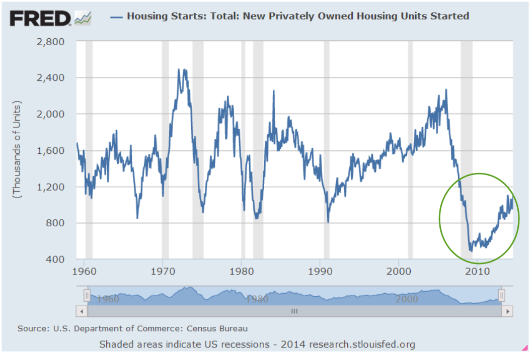
In the past decade, the 20-city Case-Shiller Home Price Index (FRED Series SPCS20RSA) has almost doubled. The New York Fed has assembled a map with video showing the annual change in the index for the past twenty years. Readers can click on their county and see the most recent annual price change. Millennials in their late twenties and thirties feel as though some cruel prankster has removed the chair just as they started to sit down. Analysts attribute the meteoric rise in prices to lack of housing built during and after the financial crisis fifteen years ago.
Each generation faces a set of crises that stifle their ambitions. In the 1970s, just as the first Boomers were entering their late twenties, mass migration from the eastern U.S. to the western states and high inflation doubled home prices in some areas within just a few years. The decade is a comparison tool as in “How bad is it? Well, it’s not as bad as the ’70s.” The 1980s began with high interest rates, the worst recession since the Great Depression and high unemployment. Boomers had to buy houses with mortgage rates over 10%. Following that recovery was another housing scandal and the savings and loan crisis that restricted any home price growth. A homeowner who bought a home in 1980 might have seen no price appreciation by 1990. Gen-Xers who bought a home during the 2000s had a similar experience, leaving some families underwater or with little equity for a decade. Equity growth from homeownership helps support new business start-ups.
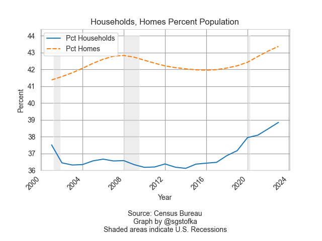
Despite the insufficient supply of affordable housing, there are more homes than households. In the graph below are the number of homes (orange line) and households (blue line) as a percent of the population. The difference is only a few percent and contains some estimate error, but represents many more homes than the number of households.

Household formation, the blue line in the graph above, is a key feature of the housing market. In 1960, 3.4 people lived in each household, according to the Census Bureau (see notes). By 1990, that number had steadily declined to 2.6 persons and is slightly under that today. The supply of homes naturally takes longer to adjust to changes in household formation. That mismatch in demand and supply is reflected in home prices.
During the financial crisis household formation declined as unemployment rose. Home prices fell in response to that change in demand for housing and a come down from the “sugar high” of easy credit and sloppy underwriting. The percent change in the Home Price Index, the red line in the graph below, fell below zero, indicating a decline in home prices, an event many homeowners had never experienced. The fall in home values crippled the finances of local governments who depended on a steady growth in the property taxes based on rising home values.

The thirty-year average of the annual growth in home prices (FRED Series USSTHPI) is 4.5% and includes all refinancing. We can see in the chart above that the growth in home prices (red line) is near that long-term mark. However, rising wages and low unemployment have encouraged more household formation, the rising blue line in the first chart. Those trends could continue to keep the growth in home prices above their long-term average. Millennials with mortgages at 6-7% are anxiously waiting for lower interest rates, a chance to refinance their mortgages and reduce their monthly payments. Strong economic growth and rising incomes will continue to put upward pressure on consumer prices, slowing any decisions by the Fed to lower interest rates. These trends are self-reinforcing so that they take a decade or more to correct naturally. Too often, the correction comes via a shock of some sort that affects asset prices and incomes. Millennials have endured 9-11, the financial crisis and the pandemic. “Go ahead, slap me one more time,” this generation can say with some sarcasm. The challenge for those in each generation is to try harder and endure.
Next week I will look at the cash flows that a property owner receives from their home investment.
////////////////////
Photo by Scott Webb on Unsplash
Keyword: interest rates, mortgages, mortgage rates, housing, households
Notes on series used in the graphs. The total housing inventory is FRED Series ETOTALUSQ176N divided by Total Population Series POPTHM. Total Households is TTLHHM156N divided by the same population series. These are survey estimates so some of the difference between the two series can be attributed to a normally distributed error. The all-transactions Home Price Index is FRED Series USSTHPI. The FRED website is at https://fred.stlouisfed.org/


