A Debate On Rent Control

November 24, 2024

by Stephen Stofka

This is part of a continuing series of debates on economic and political issues. Substack users can find last week’s debate on climate change here. WordPress and other  users can visit my web site innocentinvestor.com here. Wishing everyone a good Thanksgiving this next week.

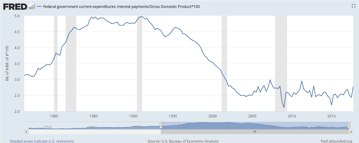
This week’s letter is about the price system, continuing an imagined conversation that began with last week’s letter. What is a price? Is it a measure? If so, it is not a good one because prices keep changing from year to year. Let’s imagine a haircut from the same stylist that costs 5% more in 2024 than in 2023. Did the quality of the haircut change? No. the service delivered is the same but not the price. So, what is price? It must be a good in and of itself – a commodity like wheat. A good that “evaporates” like water in the sun. The CPI calculator at the Bureau of Labor Statistics indicates that a $1 in 2024 buys what $0.50 did in 1995. Any interest earned on savings has barely compensated for the loss of buying power (see notes).

And now the conversation between Abel and Cain continues:

After the usual pleasantries, Abel said, “Last week I pointed out market failures where the price system in a free market does not control a negative externality like pollution. Another flaw in the pricing system is its inability to cope with social justice issues. Your group favors policies that emphasize growth. You claim that more growth will benefit everyone, including minorities. What about rent control? Land can’t grow. In densely populated cities like New York, the only way to grow the housing market is to build up. Zoning policies restrict the height of many residential areas, and the current residents prefer it that way.”

Cain replied, “Rent control is a price control and our group does not favor price controls in any form. They distort the supply and demand dynamics of a market. Rent control encourages landlords to make only those repairs which will avoid regulatory fines from housing authorities. The quality of the housing stock declines and that only contributes to the problem. Housing authorities must devote more resources to inspect properties, handle tenant complaints and regulate landlords.”

Abel interrupted, “So what’s your suggestion? In crowded markets like New York, the housing supply is too rigid, so it doesn’t shift to meet demand like in a supply demand model. If prices were allowed to find an equilibrium on their own, many working people would be priced out of the market. They would have to move further away from the city and drive long distances to get to work. This would choke an already overtaxed traffic and transit system. What’s your group’s answer? Let people move to another state? The tri-state area has already become a giant metropolis because families have tried that solution. The problem persists.”

Cain nodded. “Yes, there are choke points where circumstances or political interests constrict supply. The first question politicians should ask is ‘How can we adapt the price system to help manage this particular market?’ If we look at improperly maintained housing as a pollutant, perhaps policymakers could use a permit system or tradeable credits, the same system that has been successful with some pollutants.”

Abel asked, “How would that work? Make available a number of permits to not maintain housing units to safe health and safety standards? Housing can’t be turned into a lab experiment.”

Cain responded, “Each city may devise different pricing solutions. Some may work better than others, allowing competing policy frameworks to be tested in different circumstances. The point is that regulations and rent control should not be the first tool that policymakers reach for.”

Abel asked, “Has anyone used an incentive-based strategy using the price system to tackle the problem of affordable housing in a dense urban area?”

Cain replied, “Not that I am aware of.”

Abel argued, “Proves my point. Some issues cannot be resolved through the price system. People tolerate many inconveniences in a big city because there are many factors that induce them to stay.” Abel ticked them off on each finger, “Jobs, family, public transportation and infrastructure, civic associations with people having similar interests, schools for the kids, sports teams, the availability of internet, public institutions like libraries, internet, parks, museums.”

When Abel paused to take a breath, Cain interjected, “I get your point. A home of some sort in a city gives people access to amenities that are not available in a rural district with 2,000 residents. People want availability to all that stuff and pay as little as possible.”

Abel interrupted, “Are you saying that working people who spend half of their income on a place to live in New York City are freeloaders? It’s the upper income people that employ them who are freeloading. The rich are getting labor at an affordable rate. If working people could charge enough to cover their living expenses, they would get paid a lot more than they do.”

Cain argued, “It’s the rich people who are paying most of the state and local taxes that pays for all those amenities. The rich are subsidizing these institutions that the working class take advantage of.”

Abel said, “The median rent in the Bronx is 60% higher than the national average, according to an analysis by Zumper. The average monthly rent for a 2-BR apartment is almost $3500 and the  Bronx is one of the more affordable of the five counties in New York City. The national median annual wage for warehouse workers is $38,000, according to the BLS. That’s almost $3200 a month. A couple working two blue collar jobs would be spending more than half their gross income on rent. A prudent percentage is 30%, or less than a third of gross income. If New York City policymakers were to require employers to pay 60% above the national average, those warehouse workers would make almost $61,000 a year, or $5100 a month. Two incomes at that wage would total over $10,000 and that $3500 median rent in the Bronx would be about 34% of income.”

Cain dismissed Abel’s argument. “Those New York City employers wouldn’t be able to compete with other companies in surrounding regions with lower costs. They would leave or go out of business. There would be fewer warehouse jobs. That couple would have to compete with others for blue collar jobs. The increased supply of labor competing for jobs would further lower the market wage and make the couple dependent on social welfare programs. The city would have less tax revenue because those warehouse employers have left the city. Less property tax, less income tax, less tax on business income. The city could not afford to pay more benefits and might declare bankruptcy like it did in the mid 1970’s. A complex negative feedback loop. Policymakers who tinker with natural market forces only make the problem worse.”

Abel objected, “If that couple followed the signal of those market forces, they would move to a lower cost area in a nearby state. There would be fewer workers in New York City, driving up wages. As the couple tried to find work, they would drive wages down further in that nearby state. Those lower costs would enable employers to reduce their prices and put the New York City companies out of business.”

Cain responded, “In order to survive, those New York companies would also leave the city. Anyway, capital relocates faster than people. As soon as policymakers announced a law mandating that employers pay premium wages, a lot of blue-collar companies would relocate out of the city. Our blue-collar couple would be out of a job. Just as with a previous scenario, the couple would be dependent on the government for aid. The price system promotes independence.”

Abel protested, “Paying higher rents than the national average does not promote worker independence. A dense housing market is a seller’s market, a landlord’s market. Without some laws in place to protect renters, they would be entirely at the mercy of landlords. Market prices in a dense housing market like New York only promote independence for those with capital and access to capital like landlords.”

Cain shook his head. “Once again, your group and mine can’t agree. Your group blames capitalists for everything.”

Abel replied, “That’s overstating our objections. Capitalists promote a dynamic economy that responds to changing circumstances. But capitalists can’t operate only in the framework of the pricing system. In some markets, price dynamics often make the problem worse. As Keynes and other economists have shown, an unguided free market system can settle at equilibrium points that are below the productive capacity of a nation’s people and businesses. There is no automatic mechanism to move an economy to an optimal equilibrium of productivity.”

Cain turned to go. “Well, our group disagrees. The free-market system promotes growth, and it is growth that generates a productive equilibrium.”

Abel replied, “I know your group believes that, but belief doesn’t make it so. The housing market in New York City is just one example of market failure, the inability of prices to allocate resources. It is one of many.”

Cain replied, “Maybe we should talk about market failures next time we meet. Behind every market failure is a policy failure, believe me.”

Abel responded, “See you next time.”

///////////////////

Photo by Shehan Rodrigo on Unsplash

Buying power note: Inflation has averaged 2.76% annually since 1995. The interest on a 1-year Treasury note (FRED Series DGS1) is similar to a 36-month CD rate and has averaged 2.6%.

Pocketbook Ratios

January 21, 2024

by Stephen Stofka

Thanks to an alert reader I corrected an error in the example given in the notes at the end.

This week’s letter is about the cost of necessities, particularly shelter, in terms of personal income. Biden’s term has been one of historic job growth and low unemployment. Inflation-adjusted income per capita has risen a total of 6.1% since December 2019, far more than the four-year gain of 2.9% during the years of the financial crisis. Yet there is a persistent gloom on both mainstream and social media and Biden’s approval rating of 41% is the same as Trump’s average during his four-year term. Even though there are fewer economic facts to support this dour sentiment, a number of voters are focusing on the negatives rather than the positives.

I will look at three key ratios of spending to income – shelter, food and transportation – to see if they give any clues to an incumbent President’s re-election success (a link to these series and an example is in the notes). Despite an unpopular war in Iraq, George Bush won re-election in 2004 when those ratios were either falling, a good sign, or stable. Obama won re-election in 2012 when the shelter ratio was at a historic low. However, the food and transportation ratios were uncomfortably near historic highs. These ratios cannot be used as stand-alone predictors of an election but perhaps they can give us a glimpse into voter sentiments as we count down toward the election in November.

A mid-year 2023 Gallup poll found that almost half of Democrats were becoming more hopeful about their personal finances. Republicans and self-identified Independents expressed little confidence at that time. As inflation eased in the second half of 2023, December’s monthly survey of consumer sentiment conducted by the U. of Michigan indicated an improving sentiment among Republicans. The surprise is that there was little change in the expectations of Independents, who now comprise 41% of voters, according to Gallup. There is a stark 30 point difference in consumer sentiment between Democrats and the other two groups. A recent paper presents  evidence that the economic expectations of voters shift according to their political affiliations. A Republican might have low expectations when a Democrat is in office, then quickly do an about face as soon as a Republican President comes into office.

Shelter is the largest expense in a household budget. Prudential money management uses personal income as a yardstick. According to the National Foundation for Credit Counseling, the cost of shelter should be no more than 30% of your gross income. Shelter costs include utilities, property taxes or fees like parking or HOA charges. Let’s look at an example in the Denver metro area where the median monthly rate for a 2BR apartment is $1900. Using the 30% guideline, a household would need to gross $76,000 a year. In 2022 the median household income in Denver was $84,000, above the national average of $75,000. At least in Denver, median incomes are outpacing the rising cost of shelter. What about the rest of the country?

The Bureau of Labor Statistics (BLS) calculates an Employment Cost Index that includes wages, taxes, pension plan contributions and health care insurance associated with employment. I will use that as a yardstick of income. The BLS also builds an index of shelter costs. Comparing the change in the ratio of shelter costs to income can help us understand why households might feel pinched despite a softening of general inflation in 2023. In the graph below, a rise of .02 or 2% might mean a “pinch” of $40 a month to a median household, as I show in the notes.

Biden and Trump began their terms with similar ratios, although Biden’s was slightly higher. Until the pandemic in early 2020, housing costs outpaced income growth. Throughout Biden’s first year, the ratio stalled. Some states froze rent increases and most states did not lift their eviction bans until the end of July 2021. In 2022, rent, mortgage payments and utility costs increased at a far faster pace than incomes. Look at the jump in the graph below.

An economy is broader than any presidential administration yet voters hold a president accountable for changes in key economic areas of their lives. Food is the third highest category of spending and those costs rose sharply in relation to income.

Transportation costs represent the second highest category of spending. These costs have risen far less than income but what people notice are changes in price, particularly if those changes happen over a short period of time. In the first months of the pandemic during the Trump administration, refineries around the world shut down or reduced production. A surge in demand in 2021 caused gas prices to rise. Despite the rise, transportation costs are still less of a burden than they were during the Bush or Obama presidencies.

Neither Biden nor Trump were responsible for increased fuel costs but it happened on Biden’s “watch” and voters tend to hold their leaders responsible for the price of housing, gas and food. In the quest for votes, a presidential candidate will often imply that they can control the price of a global commodity like oil. The opening of national monument land in Utah to oil drilling has a negligible effect on the price of oil but a president can claim to be doing something. Our political system has survived because it encourages political posturing but requires compromise and cooperation to get anything done. This limits the damage that can be done by 535 overconfident politicians in Congress.

Voters have such a low trust of Congress that they naturally pin their hopes and fears on a president. Some are single-issue voters for whom economic indicators have little influence. For some voters party affiliation is integrated with their personal identity and they will ignore economic indicators that don’t confirm their identity. Some voters are less dogmatic and more pragmatic, but respond only to a worsening in their economic circumstances. Such voters will reject an incumbent or party in the hope that a change of regime will improve circumstances. Even though economic indicators are not direct predictors of re-election success they do indicate voter enthusiasm for and against an incumbent. They can help explain voter turnout in an election year. A decrease in these ratios in the next three quarters will mean an increase in the economic well-being of Biden supporters and give them a reason to come out in November.

///////////

Photo by Money Knack on Unsplash

Keywords: food, transportation, housing, shelter, income, election

You can view all three ratios here at the Federal Reserve’s database
https://fred.stlouisfed.org/graph/?g=1ejaY

Example: A household grosses $80,000 income including employer taxes and insurance. They pay $24,000 in rent, or 30% of their total gross compensation. Over a short period of time, their income goes up 8% and their rent goes up 10%. The ratio of the shelter index to the income index has gone up from 1 to 1.0185 (1.10 / 1.08). The increase in income has been $6400; the increase in annual rent has been $2400. $2400 / $6400 = 37.5% of the increase in income is now being spent on rent, up from the 30% before the increase. Had the rent and income increased the same 8%, the rent increase would have been only $1920 annually, not the $2400 in our example. That extra $480 in annual rent is $40 a month that a family has to squeeze from somewhere. They feel the pinch.    

Unfolding Story

February 13, 2022

by Stephen Stofka

Trying to find the cause of inflation is like looking for a car in a big parking lot. Science is a process of ruling out causes. The latest release of the Employment Cost Index (ECIWAG) from the BLS rules out higher wages and salaries as a key driver of rising prices. During the financial crisis wages fell below trend and have stayed below the trendline for 12 years until this past year.

The average pay increase this past year has been 4.0%. Workers who have gained the most in this past year have been those with lower wages. Customer facing workers in leisure and hospitality workers are up 8% and retail workers have gained 6.3%. Other service jobs and whole sales are up over 5%. Industries with the lowest increases are in education 2.5%, state and local government (2.5%), utilities 3.0%, and financial activities 3.2%.

Two times a year the Philadelphia Federal Reserve (2022) surveys a number of economic forecasters and publishes the consensus outlook for inflation over the next decade. The current projection is 2.5%. Expectations for inflation among the public are on a shorter time frame. Once a month the University of Michigan publishes their survey of customer inflation expectations. December’s reading was 4.8%.

Housing costs could be a culprit for rising prices. The vacancy rate is very low at 5.6% and that has helped support a 5.7% increase in housing costs (CPIHOSSL). The growth rate has been swift in the past year, an aftereffect of the pandemic. For several years, the growth rate of housing costs had been about 2.7%, then fell to 2% during the pandemic. This erratic growth of the past months is unlikely to last.

The lack of new car inventory has led to sharp increases in used car prices, with smaller cars leading the pack. When the pandemic hit, auto manufacturers canceled their orders for semiconductors. As the tech factories in Asia resumed production, the auto manufacturers dedicated what chips they could get to larger SUVs and trucks with the highest profit margins. That has left a severe shortage of smaller cars. That has resulted in sharply higher prices for the used models.

The pandemic has been an experiment that would be unethical if done by anyone other than mother nature. For decades economists will try to understand the interlocking price and supply mechanisms. Economists still argue about the causes of the stagflation of the 1970s, almost fifty years ago. Human society and our interactions are at least as complex as the human mind. As economists sort through the dynamics of evolving relationships they can only hope to understand what is not true.

//////////////////

Photo by Evergreens and Dandelions on Unsplash

Federal Reserve. (2022). First quarter 2022 survey of professional forecasters. Federal Reserve Bank of Philadelphia. Retrieved February 13, 2022, from https://www.philadelphiafed.org/surveys-and-data/real-time-data-research/spf-q1-2022

Budget Perspective

June 2, 2019

by Steve Stofka

How does your spending compare with others in your age group? Working age readers may compare their budgets with widely published averages that are misleading because they include seniors as well as those who are still living at home with their parents or are going to college. Let’s look at spending patterns classified by working age consumers 25-65 and seniors whose spending patterns change once they retire.

The Bureau of Labor Statistics collects data on consumer behavior by conducting regular surveys of household spending (Note #1). These surveys provide the underlying data for the computation of the CPI, the Consumer Price Index. Social Security checks and some labor contracts are indexed to this measure of inflation.

The BLS also provides an analysis of consumer purchasing by household characteristics, including age, race, education, type of family, and location (Note #2). Spending and income patterns by age contained some surprises (Note #3). The average income of 130,000 people surveyed in 2017 was $73K. Seniors averaged $25K in Social Security income. Younger workers aged 25-34, the mid-to-late Millennials, earned $69K, near the average of all who were surveyed. Following the Great Financial Crisis, this age group – what were then the early Millennials in 2010 – earned only $58K, so the growing economy has lifted incomes for this age group by 20% in seven years.

Home ownership is around 62% for the whole population, but far above that average for older consumers. 78-80% of people 55 and older own their own homes. More than 50% of those have no mortgage but too many seniors do not have enough savings. In many states, property taxes are the chief source of K-12 education funding and older consumers have the fewest children in school. Older consumers on fixed budgets resist higher property taxes to fund local schools and they vote in local elections at much higher rates than younger people. Since 2000, per pupil spending has grown more than 20% but most of that gain came in the 2000s.  In the past twelve years, real per pupil spending has barely increased (Note #4). Below is a chart from the Dept. of Education showing per pupil inflation adjusted spending.

Graph link: https://nces.ed.gov/fastfacts/display.asp?id=66

Saving is an expense and working age consumers aged 25-65 are saving 9-12% of their after-tax income, twice as much as the 5.6% average. Wait – isn’t saving the process of not spending money? How can it be an expense?  Call it the imaginary expense, as fundamental to our life cycle as i, the imaginary square root of -1, is to the mathematics of cyclic phenomena. Let’s compare today’s savings percentage with the panic years of 2009-10 just after the financial crisis. Workers in the 25-34 age group – who should have been spending money on furniture and cars and eating out – were saving 20% of their after-tax income (Note #5). That age group will probably carry the lessons – and caution – learned as they began their working career after the financial crisis.

Workers 25-65 spend 28-32% of their after-tax income on housing. Until they are 65, people spend a consistent 12% of their income on food, both at and away from home. Seniors spend less on food but most of that change is because they spend less money eating out at restaurants. Working age consumers spend more on transportation than they do on food – a consistent 15% of after-tax income.

People 65 and older are entitled to Medicare but they spend more on health insurance than working people and the dollar amount of their spending on health care rises by 50%. As a percent of after-tax income, seniors spend 15% while people of working age spend about 6%. Ouch. I’m sure many seniors are not prepared for those additional expenses.

Those of working age should compare their budget averages to other workers, not to the national averages, which include older people and those under 25. Summing up the major expense categories: workers are averaging 30% for housing, 15% for transportation, 12% for food, 11% for personal insurance, pensions and Social Security contributions, 10% for savings and 6% for healthcare.

As Joey on the hit TV show Friends would often say, “So how you doin’?”

///////////////////

Notes:

  1. Explanation of Consumer Expenditure Survey
  2. Consumption patterns – list Table 1300
  3. The most recent detailed analyses available are for 2017.
  4. Dept of Ed data
  5. Spending and income levels for those aged 25-34 2009-2010.

Debt and Housing

March 18, 2018

by Steve Stofka

Republicans used to care about yearly budget deficits when Obama was President. Since Obama left office, the budget deficit is up 20%. As a percentage of GDP, 2017’s deficit was above the forty-year average of deficits (Treasury Dept press release).  At the end of the Obama term, the gross federal debt was 77% of GDP. In ten years, the Congressional Budget Office estimates that percentage will be over 90%. (Spreadsheet ) That estimate does not include the lower revenues from the tax cuts passed in December.

During the two Bush terms, Republican deficit hawks, genuinely concerned about budget deficits, were overruled by a majority of Republicans who paid only political lip service to common sense budgeting.

The Federal Government’s fiscal year runs from October to September. At the end of February, the fiscal year was five months old. According to the Treasury’s monthly budget statement, this fiscal year’s deficit has gone up 10%. Because of the tax cut passed in December, payroll tax collections are down. Because of higher interest rates, the government paid an extra $40 billion on the federal debt in the first five months of this fiscal year, which began October 2017. $40 billion is half of the food stamp program. Debt matters. The government is going into more debt to pay the interest on the existing debt.

The government paid $550 billion in interest last year and is estimated to pay over $600 billion this year. That is just a $100 billion less than the defense budget. Because interest rates are historically low, the interest as a percent of GDP is low. We cannot expect that they will remain low.

InterestPctGDP

Interest rates were low in the 1950s. By 1970, they were over 7% and had climbed to 14% by 1980. Since the financial crisis ten years ago, central banks in China, Europe and the U.S. have been buying government debt. Central banks don’t demand higher interest. As their role diminishes, price-sensitive buyers like pension funds and households will demand higher interest rates (Bloomberg article). Recent Treasury debt auctions have been lightly subscribed, and the Fed is having to step in as a buyer to artificially make a market. Remember, the Fed is just another pants pocket of the Federal Government. In essence, the Federal Government is buying its own debt.   What can’t continue forever, won’t.

///////////////////

Housing

Have you gotten the impression that the housing market is going gangbusters? As a percent of GDP, housing investment is double what it was at the lows of the recession. The bad news is that current levels are near the historic lows of the post WW2 economy.

ResInvest

On the other hand, housing affordability has hit all time lows. A prudent rule of thumb is that a person or family should not spend more than 25% of their income on housing. A corollary of that rule is that a household should not buy a home that is more than 4 times their annual income. At 5.2, the current ratio is far above a prudent rule of thumb.

HousingIncomeRuleOf4

Government debt levels make the government, and us, vulnerable to any loss of confidence.  Low housing investment makes the economy less resilient.  High housing costs make it more difficult for families to save.  In a downturn, more families must turn to government for benefits.  Saddled with high debt levels and interest payments, government is less able and willing to extend benefits. The cycle turns vicious.


The Un-Crash

February 18, 2018

by Steve Stofka

The stock market did not go down 4% this past Wednesday.  It could have. The annual inflation reading for January was above expectations and confirmed fears that inflation forces are heating up. January’s retail sales report was also released Wednesday. It showed the second weakest annual increase in the past two years. If consumers are moderating their spending a bit, that would counteract inflation pressures.  Instead of dropping 2 – 4% on Valentine’s day, the SP500 went up 2.7%.

The labor report and the retail sales report each month have a significant sway on the market’s mood because they measure how much people are working and getting paid, and how much they are spending.

On a long-term basis, I think (and hope) that consumers will remain relatively cautious in their use of credit. Families today carry a higher debt burden relative to their income. By 2004, household debt levels had surpassed their annual level of income. As housing prices continued to rise, many families overextended themselves further and paid a horrible price when jobs and housing prices declined during the recession.

Families during the 1960s and 1970s carried far less debt relative to their income. People saved their income and bought many items when they could afford it. High inflation in the late 1970s and more relaxed lending standards in the 1980s helped cause a shift in thinking. Why wait? Charge it. Businesses learned that consumers are more likely to spend plastic money than real money. Consumers were encouraged to take another credit card. Buy that new car. Your family deserves it. We have a good interest rate for you.

Following the recession, families have kept the ratio of debt to income at a steady level, so that their debt is slightly below the level of their annual income. Prudent consumers will help keep inflation in check.  Here’s a chart of the debt to income ratio.  See how low it was during the decades after World War 2.

BuyingPower

/////////////////////

Housing

In the past year, tenant groups in California have been lobbying to loosen rent control laws in that state. You can read about it here (Sacramento Bee). To illustrate the economic pressures on many middle-class California residents, I’ll show you a few graphs. The first one is per capita income in six cities. All of them are above the national average. San Francisco and New York top the income list, followed by Denver, Chicago, Los Angeles and Dallas.

PerCapIncomeMSA

Now I’ll divide these income figures by an index of housing costs, the largest expense in most household budgets. In the past few years Chicago has edged into the top spot.  San Francisco is still in the top 3, but has shifted downward as housing costs have climbed.  The housing adjusted income of Los Angeles has dropped even further below the national average.

PerCapitaIncomeHousingMSA

Feeling the fatigue of keeping up with escalating costs, some Angelenos are reaching out to their local politicians for help. Some have thrown up their hands and left the state.

Home Sweet Asset

April 3, 2016

Normally we do not include the value of our home in our portfolio.  A few weeks ago I suggested an alternative: including a home value based on it’s imputed cash flows.  Let’s look again at the implied income and expense flows from owning a home as a way of building a budget.  The Bureau of Labor Statistics and the Census Bureau take that flow approach, called Owner Equivalent Rent (OER), when constructing the CPI, and homeowners are well advised to adopt this perspective.  Why?

1) By regarding the house as an asset generating flows, it may provide some emotional detachment from the house, a sometimes difficult chore when a couple has lived in the home a long time, perhaps raised a family, etc.

2) It focuses a homeowner on the monthly income and rent expense connected with their home ownership.  It asks a homeowner to visualize themselves separately as asset owner and home renter. It is easy for homeowners to think of a mortgage free home as an almost free place to live. It’s not.

3) Provides realistic budgeting for older people on fixed incomes.  Some financial planners recommend spending no more than 25% of income on housing in order to leave room for rising medical expenses.  Some use a 33% figure if most of the income is net and not taxed.  For this article, I’ll compromise and use 30% as a recommended housing share of the budget.

A fully paid for home that would rent for $2000 is an investment that generates an implied $1400 in income per month, using a 70% net multiplier as I did in my previous post. Our net expense of $600 a month includes home insurance, property taxes, maintenance and minor repairs, as well as an allowance for periodic repairs like a new roof, and capital improvements.

Using the 30% rule, some people might think that their housing expense was within prudent budget guidelines as long as their income was more than $2000 a month.  $600 / $2000 is 30%.

However, let’s separate the roles involved in home ownership.  The renter pays $2000 a month, implying that this renter needs $6700 a month in income to stay within the recommended 30% share of the budget for housing expense.  The owner receives $1400 in net income a month, leaving a balance of $5300 in income needed to stay within the 30% budget recommendation. $6700 – $1400 = $5300.  Some readers may be scratching their heads.  Using the first method – actual expenses – a homeowner would need only $2000 per month income to stay within recommended guidelines.  Using the second method of separating the owner and renter roles, a homeowner would need $5300 a month income. A huge difference!

Let’s say that a couple is getting $5000 a month from Social Security, pension and other investment income.  Using the second method, this couple is $300 below the prudent budget recommendation of 30% for housing expense.  That couple may make no changes but now they understand that they have chosen to spend a bit more on their housing needs each month.  If – or when – rising medical expenses prompt them to revisit their budget choices, they can do so in the full understanding that their housing expenses have been over the recommended budget share.

This second method may prompt us to look anew at our choices.  Depending on our needs and changing circumstances, do we want to spend $2000 a month for a house to live in?  Perhaps we no longer need as much space.  Perhaps we could get a suitable apartment or townhome for $1400?  Should we move?  Perhaps yes, perhaps no.  Separating the dual roles of owner and renter involved in owning a home, we can make ourselves more aware of the implied cost of our decision to stay in the house.  A house may be a treasure house of memories but it is also an asset.  Assets must generate cash flows which cover living expenses that grow with the passage of time.

/////////////////////

The Thrivers and Strugglers

“Bravo to MacKenzie. When she was born, she chose married, white, well-educated parents who live in an affluent, mostly white neighborhood with great public schools.”

In a recent report published by the Federal Reserve Bank at St. Louis, the authors found that four demographic characteristics were the chief factors for financial wealth and security:  1) age; 2) birth year; 3) education; 4) race/ethnicity.

While it is no surpise that our wealth grows as we age, readers might be puzzled to learn that the year of our birth has an important influence on our accumulation of wealth.  Those who came of age during the depression had a harder time building wealth than those who reached adulthood in the 1980s.

Ingenuity, dedication, persistence and effort are determinants of wealth but we should not forget that the leading causes of wealth accumulation in a large population are mostly accidental.  It is a humbling realization that should make all of us hate statistics!  We want to believe that success is all due to our hard work, genius and determination.

//////////////////////

Employment

March’s job gains of 215K met expectations, while the unemployment rate ticked up a notch, an encouraging sign.  Those on the margins are feeling more confident about finding a job and have started actively searching for work.  The number of discouraged workers has declined 20% in the past 12 months.

Employers continue to add construction jobs, but as a percent of the workforce there is more healing still to be done.

The y-o-y growth in the core workforce, aged 25-54, continues to edge up toward 1.5%, a healthly level it last cleared in  the spring of last year.

The Labor Market Conditions Index (LMCI) maintained by the Federal Reserve is a composite of about 20 employment indicators that the Fed uses to gauge the overall strength and direction of the labor market.  The March reading won’t be available for a couple of weeks, but the February reading was -2.4%.

Inflation is below the Fed’s 2% target, wage gains have been minimal, and although employment gains remain relatively strong, there is little evidence to compel Chairwoman Yellen and the rate setting committee (FOMC) to maintain a hard line on raising interest rates in the coming months.  I’m sure Ms. Yellen would like to get Fed Funds rate to at least a .5% (.62% actual) level so that the Fed has some ability to lower them again if the economy shows signs of weakening.  Earlier this year the goal was to have at least a 1% rate by the end of 2016 but the data has lessened the urgency in reaching that goal.

ISM will release the rest of their Purchasing Manager’s Index next week and I will update the CWPI in my next blog.  I will be looking for an uptick in new orders and employment.  Manufacturing lost almost 30,000 jobs this past month – most of that loss in durable goods.  Let’s see if the services sector can offset that weakness.

///////////////////////////

Company Earnings

Quarterly earnings season is soon upon us and Fact Set reports that earnings for the first quarter are estimated to be down almost 10% from this quarter a year ago.  The ten year chart of forward earnings estimates and the price of the SP500 indicates that prices overestimated earnings growth and has traded in a range for the past year.  March’s closing price was still below the close of February 2015.  Falling oil prices have taken a shark bite out of earnings for the big oil giants like Exxon and Chevron and this has dragged down earnings growth for the entire SP500 index.