The Wrong Medicine

August 23, 2020

by Steve Stofka

During this pandemic, the Federal Reserve has been supportive of the asset markets and the government’s stimulus and relief programs. It’s immediate response was to lower interest rates, a boon for home buyers. This week we learned that home sales had rebounded 25% in July and are up 7% over last year at this time. Low interest rates have benefited homebuyers but penalized savers and pension funds who must generate a current income flow from their savings base.

During the 1930s Depression, the economist John Maynard Keynes argued that, because people want to hoard during a downturn, a central bank should maintain an interest level sufficient to induce people to deposit their money in banks (Keynes, 1936). Government-insured savings accounts helped solve that confidence problem. Keynes’ language and sentence construction are laborious, leading some people to think that Keynes argued for a policy of ultra-low rates during economic declines. He did not. Low interest rates are not a Keynesian solution.

Despite the low rates, the amount of savings has doubled since the financial crisis in September 2008. There is a distinctive change in savings behavior at that important point.

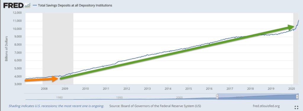
With a savings base of $11 trillion, every 1% decrease in interest rates is a transfer of income of $110 billion from savers to borrowers. Who is the largest borrower? The government. Aren’t low interest rates good for businesses? No, Keynes argued rather unartfully in Chapter 15. Borrowing is a long-term decision, and subject to error. When interest rates are particularly low, like 2%, there is no wiggle room for error in the expectations of businesses who might borrow. For homebuyers, expectations of future business conditions are a small factor.

During an economic decline, people and businesses are guided more by short-term decisions. When interest rates are low like today, banks don’t want to lend because they aren’t confident in the flow of deposits to maintain their liquidity. Banks need that flow of deposits to meet the outflow of money when they make loans (Coppola, 2017). Entrepreneurs are reluctant to borrow for expansion because they are not confident in the accuracy of their long-term expectations. They borrow to pay back more predictable future obligations, particularly current and future stock grants to their key employees. Borrowing money to fund stock grants does not create jobs but helps inflate stock prices.

Keynes badly underestimated the political forces that guide a central bank’s decision making. As it did a decade ago, the Federal Reserve has lowered interest rates to near-zero, the opposite of Keynes’ prescription. Low interest rates do not benefit bank stocks, which have declined by 25% and more. A select group of technology stocks are booming as people consume more digital services at work and play. Borrowing by businesses jumped in response to the CARES act but many businesses kept those borrowed funds liquid to avoid insolvency during this crisis. We can expect slow growth as consumers and businesses continue to make short-term decisions, and asset markets are warped by central bank policy.

//////////////

Notes:

Photo by Christina Victoria Craft on Unsplash

Coppola, F. (2017, November 01). Bank Capital And Liquidity: Sorting Out The Muddle. Forbes Magazine. Retrieved August 15, 2020, from https://www.forbes.com/sites/francescoppola/2017/10/31/bank-capital-and-liquidity-sorting-out-the-muddle/

Keynes, J. M. (1936). The general theory of employment interest and money (p. 124). New York, NY: Harcourt, Brace & World.

A Pause On the Road

August 30, 2015

For the past few weeks, the volatility in the stock market has been front and center.  I finished last week’s blog with a note that the market would be conducting a vote of confidence in the coming weeks.  In the opening minutes last Monday morning, the Dow Jones index dropped a 1000 points, almost 6%.  No doubt many investors had spent the weekend worrying and put their sell orders in the night before.  By Friday’s close, however, the SP500 had gained almost 1% for the week.

A few weeks ago the Dow Jones index, composed of just 30 large company stocks, marked a death cross. The death cross is the crossing of the 50 day price average below the 200 day average.  See last week’s blog if you are unfamiliar with this.  This week the broader SP500 index, composed of the largest 500 U.S. companies, marked it’s own death cross.

Two weeks ago, I noted the attitude of one Wall St. Journal reporter to the dreaded death cross. In one word: blarney.  In two words: hocus-pocus.  So why do some investors and the press give this any attention?  Used as a trading system in the broader SP500 the death cross (sell) and it’s companion golden cross (buy) signal have produced a winning trade 4 out of 5 times.  Where do I sign up?, you might be thinking.  In an almost sixty year period of the SP500, however, the extra annual return is slight – about  8/100ths of a percent, or 8 basis points  – over no timing strategy, i.e. buy and hold.  To the average small investor, taxes and other fees more than offset this negligible advantage.

In contrast to any technical stock market price indicators, the fundamentals of the U.S. economy are mostly strong or expanding. Consumer Confidence rose above 100 this past month, surpassing the optimism of the benchmark set in 1985.  The second estimate of GDP growth released this past week was above some of the high estimates.  After inflation, real GDP growth continues at 2.65%.

Corporate profits are growing at 7.3%, home prices are up 5%.  Real, or inflation-adjusted, consumption spending and income is  growing at more than 3%, equaling the heights of pre-recession spending and income growth in early 2007.

Housing prices are increasing for a good reason.  Inventory of homes for sales is relatively low.  In the middle of the 2000s, prices rose even though inventory of homes for sale were going up, a sign of a speculative bubble.  Ah, things look so clear in the rear view mirror.

New jobless claims remain at historically low levels and job growth has been consistently solid.  There are more involuntary part-timers than we would like to see and the participation rate is low.  Gloom and doomers will tend to focus on the relatively few negative points in an otherwise optimistic economic panorama.  Gloom and doomers think that those who disregard  negative signs are Pollyannas.  Eventually, years later, the gloom and doomers are right.  “My timing was off but, see, I was right!” they exclaim. The lesson of the death cross and the golden cross are this: a person can be right most of the time.  The secret to successful investing is knowing when we are wrong and acting on it.

For the individual investor, signals like the death cross can be calls to check our assets and needs.  Older investors may depend on some stability in their portfolio’s equity value for income, selling some equities every quarter to generate some cash.   Financial advisors will often recommend that these investors keep two to five years of income in liquid, low volatility investments.  These include cash, savings accounts, and short to medium term corporate bonds and Treasuries.  Younger investors may see this price correction as an opportunity to put some cash to work.

Stock and Housing Valuations

March 1, 2015

There are several popular methods to evaluate stocks.  The P/E ratio is probably the most quoted metric.  This is a stock price divided by its current earnings.  A conservative variation of this popular methodology is Professor Shiller’s Cyclically Adjusted Price Earnings (CAPE) ratio.  The basis for this metric is the observation that all data reverts to its mean.  Professor Shiller’s method adjusts the past ten years of reported earnings for inflation, then averages those earnings and divides the current price by that average to get a CAPE ratio.

Any well-regarded valuation method has its detractors. This Economist blog points out objections to the Shiller CAPE ratio. In a 2014 blog I tackled an objection to Shiller’s methodology: a ten year average can include a severe downturn in earnings that does not reflect current conditions. I massaged away the 2008 to 2010 downturn to show that Shiller’s CAPE ratio was little changed by the downturn.

Some object that the CAPE ratio uses reported earnings, which includes depreciation (lowers earnings) and interest (increases or decreases earnings).  Operating earnings exclude these items and more accurately reflect the profits generated by ongoing operations.   Operating earnings may be a valid basis for evaluating a single company and Warren Buffet uses this method, among others, to get a sense of sustainable earnings.

Some prefer to use forward operating earnings, which are estimates of profits for the next twelve months.  These estimates come in two varieties: top down and bottom up.  Top down estimates are calculated by estimating a growth percentage of profits for the coming year and applying that percentage to the sum of current profits.  Bottom up estimates are painstakenly compiled by taking the forward earnings guidance given by each company.  Top down estimates tend to be optimistic and are usually revised downward with the passage of time.

I prefer Shiller’s method as a more realistic approach for a long term investment in a stock index like the SP500.  Successful businesses should be able to generate enough profit in their operating margins to account for depreciation, which is included in reported earnings.

Another valuation method is the flip side of the Price Earnings or P/E ratio – an E/P ratio, or earnings yield.  As of a week ago, the current earnings yield was 5.02%.  This is then compared to the 10 year Treasury rate, 2.13%, as of Feb. 20, 2015.  The difference between the earnings yield of stocks and a risk-free investment like U.S. Treasuries – currently about 3% – is called the risk premium for owning stocks.  Often, this risk premium is quoted in basis points, which are 100ths of a percent.  So 3% = 300 basis points.  In 2007, the risk premium was over 4%.  The average from 2002 – 2006 was about 2% as stocks climbed out of a prolonged slump following the dot com bust and 9-11.  So, using this method, we could say that stock valuations are somewhere in the middle, neither frothy or pessimistic.

************************
Housing

Sales of New Homes remained brisk at just under 1/2 million.  The supply of new homes on the market indicates historically strong demand.

The latest Case-Shiller home price index increased 4.3% year-over-year, below the 4.7% growth curve of the past forty years.  From 1975-2000, home prices increased 5.5% annually.  During the boom years of the 2000s housing prices surged above that growth curve only to fall swiftly in the crash of 2008.  The bust in the housing market has more than taken out the excess, bringing the forty year growth curve to 4.7%.

The home price index does not take into account the larger homes being built over the past two decades.  The median square footage of new homes has grown from 1555 SF in 1975 to 2457 SF in 2013. (Census Bureau data)

A greater percentage of today’s homes include air conditioning, extra bathrooms and other amenities that the homes of forty years ago did not have, skewing the long term effective growth curve even lower.  While some metropolitan areas on both coasts may be overvalued, national averages suggest that housing prices are fairly valued.

***********************

Economic Summary

Twice a year the chair of the Federal Reserve testifies before the Senate Banking Committee.  Chair Janet Yellen’s testimony this past week was a concise distillation of economic trends.  Investors bombarded with an avalanche of articles and blogs may sometimes find it difficult to synthesize all the information they absorb.  Ms. Yellen’s initial summary cuts through the clutter:

The unemployment rate now stands at 5.7 percent, down from just over 6 percent last summer and from 10 percent at its peak in late 2009. The average pace of monthly job gains picked up from about 240,000 per month during the first half of last year to 280,000 per month during the second half, and employment rose 260,000 in January. In addition, long-term unemployment has declined substantially, fewer workers are reporting that they can find only part-time work when they would prefer full-time employment, and the pace of quits–often regarded as a barometer of worker confidence in labor market opportunities–has recovered nearly to its pre-recession level. However, the labor force participation rate is lower than most estimates of its trend, and wage growth remains sluggish, suggesting that some cyclical weakness persists. In short, considerable progress has been achieved in the recovery of the labor market, though room for further improvement remains.

At the same time that the labor market situation has improved, domestic spending and production have been increasing at a solid rate. Real gross domestic product (GDP) is now estimated to have increased at a 3-3/4 percent annual rate during the second half of last year. While GDP growth is not anticipated to be sustained at that pace, it is expected to be strong enough to result in a further gradual decline in the unemployment rate. Consumer spending has been lifted by the improvement in the labor market as well as by the increase in household purchasing power resulting from the sharp drop in oil prices. However, housing construction continues to lag; activity remains well below levels we judge could be supported in the longer run by population growth and the likely rate of household formation.

CPI and Wages

Dec. 24th, 2012

Merry Christmas, Everyone!

This is part two of a look at the CPI, comparing the price index to wage growth.  Part 1 is here

In the years 1947-1980, the average hourly earnings of production workers rose 6.08% annually while the CPI grew 4.03% (Source)  In effect, earnings rose 2% higher than prices.   Since 1980, earnings have risen 3.55% annually as the CPI rose 3.29%, giving workers a real growth rate of less that a 1/3rd of 1%.

The rise in worker productivity fueled gains in worker compensation until the past fifteen years.  Below is a chart of real, that is inflation-adjusted, compensation and productivity.

Increased Productivity means more profits.  For several decades in the post-WW2 economy, workers shared in those profits.  After the recession of 1982-1984, workers’ share of the increase in output slowly decreased.  As incomes barely kept up with inflation, workers tapped the equity in their houses.

Low interest rates, poor underwriting standards, lax regulations and a feeding frenzy by both home buyers and banks fueled a binge in home prices, followed by the hangover that started in 2007.  Only now is the housing market struggling up out of a torpor that has lasted for several years.

Before the housing bust, magical thinking led many to believe that the rise in home equity was a sure fire way to riches.  Over a century’s worth of data shows that housing prices tend to rise about the same as the CPI.  Housing prices have finally bottomed out at about the same level as the long term trend line of CPI growth.

The boom and bust upended the lives of a lot of people and the repercussions of that “hump” will continue as banks continue to foreclose on home owners whose incomes have flattened or declined. The recovery in the housing market will help some home owners but the real problem is unemployment, underemployment and the decreasing share of workers’ share of the profits from productivity gains.  Until the labor market heals, the housing market will not fully heal.

Those who do have savings have become cautious.  Since 2006, investors have taken $572 billion out of stocks and put $767 billion in bonds, a move to safety – or so many retail investors think.  For decades, home prices never fell – until they did.  For over thirty years, bond prices have been rising, giving many retail investors the feeling that bonds are safe – until they are not.

Companies have been selling record amounts of corporate bonds into this cheap – for companies – bond market.  As this three decade long upward trend in bond prices begins to turn, bond prices can fall sharply as investors turn from bonds to stocks and other investments.  We are approaching the lows of interest yields on corporate bonds not seen since WW2.  Investors are loaning companies money at record low rates and companies are sucking up all that they can while they can.  Sounds a lot like home buying in the middle of the last decade, doesn’t it?

Y’all be careful out there, ya hear?

Housing: Satellite View

A few weeks ago, Standard and Poors released their monthly Case-Shiller index, showing continued weakness in the housing market.   The graph on page 1 charts the year over year percent change in housing prices for 20 cities in the U.S.  After rising above 0 in the early part of 2010, the index has now taken a dive below 0, indicating increased price pressures from foreclosures and a labor market that is still far from healthy.

Let’s step back and look at another data series, an index of housing prices from the Federal Housing Finance Agency, which compiles data from Fannie Mae and Freddie Mac purchases and refinances.  The large volume of mortgages guaranteed by these two quasi-governmental agencies provides an annual data set of more than a million mortgages, 60 times larger than the Case-Shiller data set that usually makes headlines.

Courtesy of the FRED database at the Federal Reserve in St. Louis, we can see below a 35 year history of housing prices in California (Source)  From this multi-decade viewpoint, we can see the real estate spike that occurred during the past decade. (Click to enlarge in a separate tab)

Spotting trends in stock prices or housing prices is more art than science.  Below I’ve drawn my guesstimation of the 40 year and 20 year trend lines in the California housing index.

As a comparison, let’s look at a more even tempered state, Colorado.(Source)  Here we can see a more sustainable growth pattern in prices. Again, I’ve drawn a trendline in red to show a guesstimation of the long term trend.

A comparison graph of the two states reveals just how strongly the California index shot up during the past decade.  The scales are different for each state but reveal interesting historical patterns and a caution to California homeowners. 

Colorado experienced little growth in housing prices during the 80s.  For Californians, their slow growth period was from the late 80s to the late nineties. During the late nineties and early part of the 2000s, the growth pattern was similar to Colorado.  After the recession of 2002-3, California housing prices exploded upward while Colorado prices maintained the same growth pattern.  During the past two years and over the next several years, California prices will continue a painful return to the long term trend.  Colorado homeowners will see the same flatlining of prices that they experienced during the 80s but that is far better than the rollercoaster ride that California homeowners are currently on.

House of Fear

Today the National Association of Realtors (NAR) released their monthly estimate of existing home sales.  The market was expecting a decline but the decline of 27% was far below the expected 10% decline.  This, in turn, prompted another down day on Wall Street.

Fear has two parts:  the logical part – caution, and the illogical part – panic.  So what panicked Wall Street this morning?  In the  NAR Press release was this from NAR’s chief economist:

“Even with sales pausing for a few months, annual sales are expected to reach 5 million in 2010 because of healthy activity in the first half of the year. To place in perspective, annual sales averaged 4.9 million in the past 20 years, and 4.4 million over the past 30 years.”

Yes, you read that right.  NAR is projecting existing home sales this year to slightly exceed the 20 year annual average and to easily outpace the 30 year average.  In a down economy, above average is bad?  The report also noted an increase in housing prices.

Crude oil prices have fallen to a price near $70 but the price of a gallon of gas is 7 cents more than it was a year ago, showing that oil companies have seen a slight pickup in demand for gasoline.

The market is like a driver in a car with no rear view mirror.  Shoulders hunched, head thrust forward over the steering wheel, the market focuses only on the mountainous gravel road that is the near future. When the market is rising, it discounts bad news as a small speed bump in the road up the mountain of riches.  When the market is falling, it discounts good news as a small braking in the headlong rush into the valley of the poor.