A Home Is More Than a Home

March 31, 2024

by Stephen Stofka

This week’s letter is about housing, the single largest investment many people make. The deed to a home conveys a certain type of ownership of physical property, but the price reflects a share of the surrounding community, its economy, infrastructure, educational and cultural institutions. We purchase a chunk of a neighborhood when we buy a home.

These are network effects that influence demand for housing in an area. They are improvements paid for by tax dollars or business investment that are capitalized into the price of a home. Take two identical homes, put them in different neighborhoods and they will sell for different amounts. When elements of this network change, it affects the price of a home. Examples of negative changes include the closing of businesses or an industry, a decline in the quality of schools, the presence of graffiti or increased truck traffic. Positive changes might include improved parks and green zones, better schools and alternative transportation like bike lanes and convenient public transportation.

Zoning is a critical tool of a city’s strategic vision. Zoning controls the population density of an area, the available parking and the disturbance from commercial activities. Many cities have some kind of long-term plan for that vision. Los Angeles calls it a General Plan. In Denver it is called Blueprint Denver (pdf). Homes built in the post-war period in the middle of the twentieth century were often smaller. They feature a variety of building styles whose distinctive character and lower prices invite gentrification. As properties are improved, their higher appraisal values bring in more property tax revenue from that city district and the process of building an improved neighborhood network begins.

A representative for that district can argue for more spending on public amenities to enhance the neighborhood. This further lifts property values and increases tax revenues. Developers get parcels rezoned so that they can convert a single-family property into a two-family unit. This may involve “scraping” the old structure down to its foundation, then expanding the footprint of the structure to accommodate two families. As this gentrification continues, there is increased demand for rezoning an area to allow the building of accessory dwelling units, or ADUs, on a property with a single-family home. Here is a brief account of a rezoning effort in Denver in 2022.

In the past decade, the 20-city Case-Shiller Home Price Index (FRED Series SPCS20RSA) has almost doubled. The New York Fed has assembled a map with video showing the annual change in the index for the past twenty years. Readers can click on their county and see the most recent annual price change. Millennials in their late twenties and thirties feel as though some cruel prankster has removed the chair just as they started to sit down. Analysts attribute the meteoric rise in prices to lack of housing built during and after the financial crisis fifteen years ago.

Each generation faces a set of crises that stifle their ambitions. In the 1970s, just as the first Boomers were entering their late twenties, mass migration from the eastern U.S. to the western states and high inflation doubled home prices in some areas within just a few years. The decade is a comparison tool as in “How bad is it? Well, it’s not as bad as the ’70s.” The 1980s began with high interest rates, the worst recession since the Great Depression and high unemployment. Boomers had to buy houses with mortgage rates over 10%. Following that recovery was another housing scandal and the savings and loan crisis that restricted any home price growth. A homeowner who bought a home in 1980 might have seen no price appreciation by 1990. Gen-Xers who bought a home during the 2000s had a similar experience, leaving some families underwater or with little equity for a decade. Equity growth from homeownership helps support new business start-ups.

Despite the insufficient supply of affordable housing, there are more homes than households. In the graph below are the number of homes (orange line) and households (blue line) as a percent of the population. The difference is only a few percent and contains some estimate error, but represents many more homes than the number of households.

Graph showing homes and households as a percent of the population.

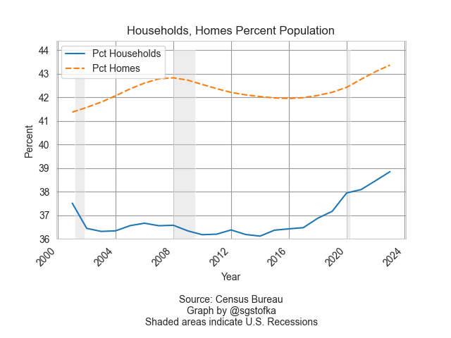
Household formation, the blue line in the graph above, is a key feature of the housing market. In 1960, 3.4 people lived in each household, according to the Census Bureau (see notes). By 1990, that number had steadily declined to 2.6 persons and is slightly under that today. The supply of homes naturally takes longer to adjust to changes in household formation. That mismatch in demand and supply is reflected in home prices.

During the financial crisis household formation declined as unemployment rose. Home prices fell in response to that change in demand for housing and a come down from the “sugar high” of easy credit and sloppy underwriting. The percent change in the Home Price Index, the red line in the graph below, fell below zero, indicating a decline in home prices, an event many homeowners had never experienced. The fall in home values crippled the finances of local governments who depended on a steady growth in the property taxes based on rising home values.

Graph containing two lines: 1) the percent difference between homes and households as a percent of the population, 2) the home price index. There is a large gap where the two series diverge during the financial crisis.

The thirty-year average of  the annual growth in home prices (FRED Series USSTHPI) is 4.5% and includes all refinancing. We can see in the chart above that the growth in home prices (red line) is near that long-term mark. However, rising wages and low unemployment have encouraged more household formation, the rising blue line in the first chart. Those trends could continue to keep the growth in home prices above their long-term average. Millennials with mortgages at 6-7% are anxiously waiting for lower interest rates, a chance to refinance their mortgages and reduce their monthly payments. Strong economic growth and rising incomes will continue to put upward pressure on consumer prices, slowing any decisions by the Fed to lower interest rates. These trends are self-reinforcing so that they take a decade or more to correct naturally. Too often, the correction comes via a shock of some sort that affects asset prices and incomes. Millennials have endured 9-11, the financial crisis and the pandemic. “Go ahead, slap me one more time,” this generation can say with some sarcasm. The challenge for those in each generation is to try harder and endure.

Next week I will look at the cash flows that a property owner receives from their home investment.

////////////////////

Photo by Scott Webb on Unsplash

Keyword: interest rates, mortgages, mortgage rates, housing, households

Notes on series used in the graphs. The total housing inventory is FRED Series ETOTALUSQ176N divided by Total Population Series POPTHM. Total Households is TTLHHM156N divided by the same population series. These are survey estimates so some of the difference between the two series can be attributed to a normally distributed error. The all-transactions Home Price Index is FRED Series USSTHPI. The FRED website is at https://fred.stlouisfed.org/

Pocketbook Ratios

January 21, 2024

by Stephen Stofka

Thanks to an alert reader I corrected an error in the example given in the notes at the end.

This week’s letter is about the cost of necessities, particularly shelter, in terms of personal income. Biden’s term has been one of historic job growth and low unemployment. Inflation-adjusted income per capita has risen a total of 6.1% since December 2019, far more than the four-year gain of 2.9% during the years of the financial crisis. Yet there is a persistent gloom on both mainstream and social media and Biden’s approval rating of 41% is the same as Trump’s average during his four-year term. Even though there are fewer economic facts to support this dour sentiment, a number of voters are focusing on the negatives rather than the positives.

I will look at three key ratios of spending to income – shelter, food and transportation – to see if they give any clues to an incumbent President’s re-election success (a link to these series and an example is in the notes). Despite an unpopular war in Iraq, George Bush won re-election in 2004 when those ratios were either falling, a good sign, or stable. Obama won re-election in 2012 when the shelter ratio was at a historic low. However, the food and transportation ratios were uncomfortably near historic highs. These ratios cannot be used as stand-alone predictors of an election but perhaps they can give us a glimpse into voter sentiments as we count down toward the election in November.

A mid-year 2023 Gallup poll found that almost half of Democrats were becoming more hopeful about their personal finances. Republicans and self-identified Independents expressed little confidence at that time. As inflation eased in the second half of 2023, December’s monthly survey of consumer sentiment conducted by the U. of Michigan indicated an improving sentiment among Republicans. The surprise is that there was little change in the expectations of Independents, who now comprise 41% of voters, according to Gallup. There is a stark 30 point difference in consumer sentiment between Democrats and the other two groups. A recent paper presents  evidence that the economic expectations of voters shift according to their political affiliations. A Republican might have low expectations when a Democrat is in office, then quickly do an about face as soon as a Republican President comes into office.

Shelter is the largest expense in a household budget. Prudential money management uses personal income as a yardstick. According to the National Foundation for Credit Counseling, the cost of shelter should be no more than 30% of your gross income. Shelter costs include utilities, property taxes or fees like parking or HOA charges. Let’s look at an example in the Denver metro area where the median monthly rate for a 2BR apartment is $1900. Using the 30% guideline, a household would need to gross $76,000 a year. In 2022 the median household income in Denver was $84,000, above the national average of $75,000. At least in Denver, median incomes are outpacing the rising cost of shelter. What about the rest of the country?

The Bureau of Labor Statistics (BLS) calculates an Employment Cost Index that includes wages, taxes, pension plan contributions and health care insurance associated with employment. I will use that as a yardstick of income. The BLS also builds an index of shelter costs. Comparing the change in the ratio of shelter costs to income can help us understand why households might feel pinched despite a softening of general inflation in 2023. In the graph below, a rise of .02 or 2% might mean a “pinch” of $40 a month to a median household, as I show in the notes.

Biden and Trump began their terms with similar ratios, although Biden’s was slightly higher. Until the pandemic in early 2020, housing costs outpaced income growth. Throughout Biden’s first year, the ratio stalled. Some states froze rent increases and most states did not lift their eviction bans until the end of July 2021. In 2022, rent, mortgage payments and utility costs increased at a far faster pace than incomes. Look at the jump in the graph below.

An economy is broader than any presidential administration yet voters hold a president accountable for changes in key economic areas of their lives. Food is the third highest category of spending and those costs rose sharply in relation to income.

Transportation costs represent the second highest category of spending. These costs have risen far less than income but what people notice are changes in price, particularly if those changes happen over a short period of time. In the first months of the pandemic during the Trump administration, refineries around the world shut down or reduced production. A surge in demand in 2021 caused gas prices to rise. Despite the rise, transportation costs are still less of a burden than they were during the Bush or Obama presidencies.

Neither Biden nor Trump were responsible for increased fuel costs but it happened on Biden’s “watch” and voters tend to hold their leaders responsible for the price of housing, gas and food. In the quest for votes, a presidential candidate will often imply that they can control the price of a global commodity like oil. The opening of national monument land in Utah to oil drilling has a negligible effect on the price of oil but a president can claim to be doing something. Our political system has survived because it encourages political posturing but requires compromise and cooperation to get anything done. This limits the damage that can be done by 535 overconfident politicians in Congress.

Voters have such a low trust of Congress that they naturally pin their hopes and fears on a president. Some are single-issue voters for whom economic indicators have little influence. For some voters party affiliation is integrated with their personal identity and they will ignore economic indicators that don’t confirm their identity. Some voters are less dogmatic and more pragmatic, but respond only to a worsening in their economic circumstances. Such voters will reject an incumbent or party in the hope that a change of regime will improve circumstances. Even though economic indicators are not direct predictors of re-election success they do indicate voter enthusiasm for and against an incumbent. They can help explain voter turnout in an election year. A decrease in these ratios in the next three quarters will mean an increase in the economic well-being of Biden supporters and give them a reason to come out in November.

///////////

Photo by Money Knack on Unsplash

Keywords: food, transportation, housing, shelter, income, election

You can view all three ratios here at the Federal Reserve’s database
https://fred.stlouisfed.org/graph/?g=1ejaY

Example: A household grosses $80,000 income including employer taxes and insurance. They pay $24,000 in rent, or 30% of their total gross compensation. Over a short period of time, their income goes up 8% and their rent goes up 10%. The ratio of the shelter index to the income index has gone up from 1 to 1.0185 (1.10 / 1.08). The increase in income has been $6400; the increase in annual rent has been $2400. $2400 / $6400 = 37.5% of the increase in income is now being spent on rent, up from the 30% before the increase. Had the rent and income increased the same 8%, the rent increase would have been only $1920 annually, not the $2400 in our example. That extra $480 in annual rent is $40 a month that a family has to squeeze from somewhere. They feel the pinch.    

The Change Changed

November 13, 2022

by Stephen Stofka

October’s CPI report released this week indicated an annual inflation of 7.7%, down from the previous month. Investors took that as a sign that the economy is responding to higher interest rates. In the hope that the Fed can ease up on future rate increases, the market jumped 5.5% on Thursday. Last week I wrote about the change in the inflation rate. This week I’ll look at periods when the inflation rate of several key items abruptly reverses.

Food and energy purchases are fairly resistant to price changes. Economists at the Bureau of Labor Statistics (BLS) construct a separate “core” CPI index that includes only those spending categories that do respond to changing prices. It is odd that a core price index should exclude two categories, food and energy, that are core items of household budgets.

Ed Bennion and other researchers (2022) at the BLS just published an analysis of inflationary trends over several decades. Below is a chart of the annual change in energy prices. Except for the 1973-74 oil shock, a large change in energy prices led to a recession which caused a big negative change in energy prices.

We spend less of our income on food than we did decades ago so higher food prices have a more gradual effect, squeezing budgets tight. Lower income families really feel the bite because they spend a higher proportion of their income on food. In the graph below a series of high food price inflation often precedes a recession. Unlike energy prices, there is rarely a fall in food prices. Following the 2008 financial crisis, food prices fell ½% in 2009. It is an indication of the economic shock of that time.

Let me put up a chart of the headline CPI (blue line) that includes food and energy and the core inflation index (red line) which does not. Just once in 75 years, during the high inflation of the 1970s, the two indexes closely matched each other. Following the 1982-83 recession, the core CPI has outrun the headline CPI.

A big component of both measures of inflation is housing. The Federal Reserve (2022) publishes a series of home listing prices calculated per square foot using Realtor.com data. You can click on the name of a city and see its graph of square foot prices for the past year. You can select several cities, then click the “Add to Graph” button below the page title and FRED will load the graph for you. Here’s a comparison of Denver and Portland. They have similar costs.

The pandemic touched off a sharp rise in house prices in both cities. Denver residents have attributed the big change to an influx of people from other areas. However, Census Bureau data shows that the Denver metro area lost a few thousand people from July 2020 to July 2021 (Denver Gazette, 2022). In the decade after the financial crisis, there simply wasn’t enough housing built for the adults that were already here.

The surge in home buying has not been in population but in demographics. As people approach the age of 30, they become more interested in and capable of buying a home. The pandemic helped boost home buying because interest rates plunged from 5% in 2018 to 2.6% in 2021.

Record low interest rates enabled Millennials in their 20s and 30s to buy a lot more home with their mortgage payment. That leverage caused housing prices to rise. A 30-year mortgage of $320K has a monthly mortgage payment of $1349 at 3%. At 5%, it is $1718 and at 7% it rises to $2129. Ouch!

Rising rental costs and home prices drive lower income families to less expensive areas in a metro area or entirely out of an area. Declining public school enrollment has forced two Denver area counties to announce the closing of 26 schools and transfer them to other schools (Seaman, 2022). As the number of students decreases, the schools infrastructure costs do not change, increasing the per student costs. Buses have to be maintained, drivers paid, schools staffed with guards, cafeteria staff, janitors and administrative personnel. Once schools are shuttered, the building may be sold and converted to other uses, either residential or commercial. The public schooling system is like a large ship that takes some time to change course.

During our lifetimes we experience many changes. They can happen quickly or emerge over time. The effects may be short lived or last decades. Families are still living with the consequences of the financial crisis fourteen years ago. Carelessly planned urban development isolates the residents of a community. The social and economic effects can last several generations. As we grow older, we learn to appreciate William Faulkner’s line, “The past is never dead. It’s not even past.”

/////////////////////

Photo by Davies Designs Studio on Unsplash

Bennion, E., Bergqvist, T., Camp, K. M., Kowal, J., & Mead, D. (2022, October). Why inflation matters. U.S. Bureau of Labor Statistics. Retrieved November 11, 2022, from https://www.bls.gov/opub/btn/volume-11/exploring-price-increases-in-2021-and-previous-periods-of-inflation.htm

Denver Gazette. (2022, March 25). Denver joins big city trend with pandemic population slip. Denver Gazette. Retrieved November 11, 2022, from https://denvergazette.com/news/local/denver-joins-big-city-trend-with-pandemic-population-slip/article_65c6393d-2a4d-5b91-837c-f8c3efce3778.html

Federal Reserve. (2022). Median listing price per square feet:Metropolitan Areas. FRED. Retrieved November 11, 2022, from https://fred.stlouisfed.org/release/tables?eid=1138280&rid=462

Seaman, J. (2022, November 10). Schools targeted for closure in Denver, Jeffco have disproportionately high numbers of students of color, data shows. The Denver Post. Retrieved November 11, 2022, from https://www.denverpost.com/2022/11/10/dps-jeffco-school-closures-students-of-color/

////////////////////

Housing Affordability

August 14, 2022

by Stephen Stofka

The National Association of Realtors (2022) publishes a Housing Affordability Index (HAI) that measures median housing prices, mortgage rates and median family income to determine a ratio of housing costs to family income. June’s index was the lowest affordability since 1989. Since the Fed began raising rates this year, affordability has fallen by a third. In the notes I’ll include some comments on the methodology behind the HAI.

With technological progress, we expand our definition of what is a necessity. We argue whether government has a responsibility to ensure that each family has a certain level of sustenance – adequate housing, food, a source of income and access to educational resources. Those in neighborhoods with single family homes resist efforts to build affordable multi-family housing. A real estate developer earns a higher profit building expensive townhomes than affordable housing units. Should a developer be compensated if required to build affordable housing? City councils would prefer not to bring up the subject of using tax money to compensate a developer for doing less.

We disagree about who should pay, who should get and how much. Several decades ago, the homeless were less visible, a huddle of a human being lying under a tree or on a park bench, occupying about 18 square feet. In destination cities like Denver, Portland, L.A and other western states, encampments of homeless in colorful pop-up tents line downtown sidewalks and along streams and rivers that course through the town. Depending on the size of the tent each person may occupy up to 50 square feet. Like the rest of us, they are taking up more space per person. Are there more homeless or are they simply more visible?

The reasons why people are homeless are numerous and varied but the dynamics of housing supply and demand are key factors. Where demand for rental housing is low, landlords of affordable units may skip a criminal background or credit check. When demand is high, rents are higher and landlords are more discriminating. They may require higher security deposits as a tool to screen out renters. The annual change in rental costs was 6.3%, below the 7.3% increase in housing costs but workers’ wage increases have not kept pace in the past year. (I’ll put the series identifiers and index numbers in the notes at the end). Over a long time period, have earnings kept up with housing costs?

I began with 1973, the year that the U.S. and most of the world adopted floating exchange rates between currencies. This allowed capital more freedom to move around the world. Several economists mark that as a turning point when the returns to labor began to lag behind the returns to capital. Today’s workers make $612 for every $100 that workers made in 1973, a 6:1 ratio. Housing costs have risen even faster. The Bureau of Labor Statistics calculates that a person spends $888 for shelter today for each $100 spent in 1973. In computing the CPI, the Bureau of Labor Statistics (2022) and the Census Bureau include mortgage payments, taxes and insurance – PITI – to determine the cost of shelter itself (32% of income), about 5% for utilities and another 5% for maintenance and repairs. Together they make up more than 40% of a family’s income.

We measure things in order to compare qualities. An example might be measuring the width of a bookcase and the width of a space in the living room where we want to put the bookcase. Comparing total housing costs across five decades is difficult. We prefer to live in bigger spaces and in far greater comfort than we did 50 years ago. Today’s new homes average 2600 SF. The thirty year average is 1800 SF. Moura et al (2015) estimated that each of us has twice the space of a person living in 1900. Total housing costs may have grown almost 50% faster than wages but per capita housing space has grown at least as much. Adjusting for the larger personal space, we could conclude that wages have kept up with total housing costs. But that’s not how many of us perceive affordability. More space and comfort has become our standard.

Changing standards and expectations cause a shift in definitions and benchmarks. The BLS includes the cost of cell phones, computers and internet access under Information and Information Processing. Many families consider these to be utility expenses as necessary as the heating and electric bill. The BLS estimates a family spends 3.5% of their income on these modern day necessities – about $3000 a year. TV cable subscriptions add another 1%. Five decades ago, a family had a $0 monthly cost for these. Together that cost represents $320 per month that impacts housing affordability. The cars we drive today are safer, more mechanically reliable and more fuel efficient but we spend more of our income on transportation costs. In the post-war period, food and clothing were almost half of a typical family’s expenses. Today those items make up just 13% of a family’s spending (BLS, 2014). We live in bigger homes because other items that used to take up a lot of space in our budget have shrunk.

News media often puts current economic measures in historical context – the highest since and the lowest since – but these quantitative measures are not adjusted for improvements in the qualities of goods. On a hot summer’s day five decades ago, there might have been several overheated cars on the drive home from work. Changing a flat tire on the side of the road was common. Automobile deaths were far higher. Older people died from heat exhaustion in uncooled apartments and homes. Our standards and expectations have changed.

Each month economists measure thousands of data points – as numerous as the stars in the night sky. Economists and politicians connect those dots using different paths of reasoning, motivation and perspective. We may cling to a particular doctrine that clouds our interpretation of the data. In the end economic issues are personal. Have our earnings kept up with our housing costs?

////////////////

Photo by Tierra Mallorca on Unsplash

BLS. (2014, April). One Hundred Years of price change: The consumer price index and the American Inflation Experience : Monthly labor review. U.S. Bureau of Labor Statistics. Retrieved August 12, 2022, from https://www.bls.gov/opub/mlr/2014/article/one-hundred-years-of-price-change-the-consumer-price-index-and-the-american-inflation-experience.htm

BLS. (2022, February 11). Relative importance of components in the Consumer Price Indexes: U.S. city average, December 2021. U.S. Bureau of Labor Statistics. Retrieved June 17, 2022, from https://www.bls.gov/cpi/tables/relative-importance/2021.htm

Lautz, J. (2022, January 7). Tackling home financing and down payment misconceptions. http://www.nar.realtor. Retrieved August 12, 2022, from https://www.nar.realtor/blogs/economists-outlook/tackling-home-financing-and-down-payment-misconceptions

Moura, M. C., Smith, S. J., & Belzer, D. B. (2015). 120 years of U.S. residential housing stock and floor space. PLOS ONE, 10(8). https://doi.org/10.1371/journal.pone.0134135

National Association of Realtors (2022). Housing affordability index. http://www.nar.realtor. Retrieved August 12, 2022, from https://www.nar.realtor/research-and-statistics/housing-statistics/housing-affordability-index. As constructed, an affordability index of 100 should be affordable. However, the NAR calculates a mortgage payment that is not typical. They base their calculation on a 20% down payment. The average down payment is only 10%. First time buyers typically put down only 7% (Lautz, 2022). This raises the mortgage payment and lowers the affordability. After adjusting for this, an HAI reading of 140 is probably a better benchmark of affordability.

 U.S. Bureau of Labor Statistics, Consumer Price Index for All Urban Consumers: Housing in U.S. City Average [CPIHOSSL], retrieved from FRED, Federal Reserve Bank of St. Louis; https://fred.stlouisfed.org/series/CPIHOSSL, August 13, 2022. July’s annualized increase was 7.3% and climbing.

U.S. Bureau of Labor Statistics, Consumer Price Index for All Urban Consumers: Rent of Primary Residence in U.S. City Average [CUUR0000SEHA], retrieved from FRED, Federal Reserve Bank of St. Louis; https://fred.stlouisfed.org/series/CUUR0000SEHA, August 13, 2022. July’s annualized increase was 6.3% and climbing.

U.S. Bureau of Labor Statistics, Consumer Price Index for All Urban Consumers: Shelter in U.S. City Average [CUSR0000SAH1], retrieved from FRED, Federal Reserve Bank of St. Louis; https://fred.stlouisfed.org/series/CUSR0000SAH1, August 12, 2022. Note: Total cost of shelter was 39.90 in April 1973 and in 2022 it is 354.45, an 8.88 ratio.

U.S. Bureau of Labor Statistics, Average Weekly Earnings of Production and Nonsupervisory Employees, Total Private [CES0500000030], retrieved from FRED, Federal Reserve Bank of St. Louis; https://fred.stlouisfed.org/series/CES0500000030, August 12, 2022. In July 1973 the index was 153.14. In July 2022 937.38. A 6.12 ratio.

Price Acceleration

June 19, 2022

by Stephen Stofka

There are several series of inflation and each offers a different perspective on annual price changes. Each month the Bureau of Labor Statistics publishes a headline number CPI-U, or Urban index, which estimates the annualized price change for urban dwellers of all ages. It also publishes a CPI-W or Worker index, which is focused on the spending priorities of working families. Yet another series is an index that the Federal Reserve uses to establish a longer term trend for price changes. This week the Fed enacted a rate increase of .75%, its strongest response to inflation since 1994, to counter the acceleration in price changes.

Working families and the general urban population differ in their spending priorities in transportation costs, household expenses and health insurance (BLS, 2021). Out of every $100 of income, working families spend about $2.40 less on maintaining a household, but $3.80 more on transportation. Being younger, they spend less on health insurance, about $1.50. The difference between the two series indicates which part of the population is bearing the weight of price changes. When transportation costs rise more than housing costs, the difference between the Workers and Urban index is positive.

In 2015-16, increases in senior housing costs caused the difference to go deeply negative. Starting in mid-2021, rising costs for new and used cars produced a positive difference, the highest since WW2. The Russian attack on Ukraine in February accelerated increases in gas prices and working families have borne more of that burden. Rising food costs have an almost equal impact, although working families tend to spend more eating out.

Just as we feel changes in our car speed, we feel changes in inflation. We expect some variation up and down around an average, but expect a balance of up and down. We are sensitive to acceleration, the change in speed, and become alert to too much up or down. Since mid-2021, the monthly acceleration in price changes have been mostly up.

Because pandemics only come along once a century and strangle the global economy, it was hard to tease out the underlying trend. Look at the negative drop in inflation in April 2022 on the far right side of the graph. The acceleration in price changes seemed to be easing up. In May 2022, the acceleration turned positive again and that prompted the Fed’s strong move this week.

Price changes in energy and food are both seasonal and volatile. To understand the trend, the Fed looks at yet another CPI index that excludes food and energy. Before the pandemic, the variation around the trend was small.

After the pandemic the variation in inflation was as severe as the early 1980s. Supply chains had been shut down, goods were stacking up at US ports, people were getting vaccinated and were spending money. With a shortage of new cars because of a chip shortage, used car prices increased a historic 45% in June 2021. Veterans in the industry shook their heads in disbelief. What should the Fed do? It has a double mandate of full employment and stable prices. Unemployment was still high at 6% in the spring of 2021. They maintained a zero-interest rate policy. As unemployment fell below 5% in September 2021, they probably should have increased interest rates a little.

Russia’s invasion of Ukraine and China’s month-long shutdown of Shanghai factories this spring threw yet another wrench in the forecast. Families abruptly switched their spending from household to more social spending, services and travel. Airline fares increased 38% in May. The change in spending patterns caught the buying managers at Target, Home Depot and Wal-Mart by surprise and these retail outlets now have excess inventory.

The housing market is experiencing declines as people respond to rising interest rates. The real estate giant Redfin just reported that home sales fell 10% y-o-y in May 2022, down 3% in one month from April (Ellis, 2022). Rising rates will curb the volatility in price changes but they usually cause a recession. Investment spending, both commercial and residential, responds first and that causes a decline in economic activity. Over the past few months the Atlanta Fed has revised their 2022 GDP forecast from over 2% annualized growth to 0%. Each revision has been negative.

During the pandemic, households reduced their spending and have stored up a lot of spending power. There is a lot of untapped equity in homes as well. Higher interest rates will slow residential and commercial investment spending. Inflation may stay elevated if consumption spending remains strong and offsets that decline.

////////////////

Photo by Piret Ilver on Unsplash

BLS. (2022, February 11). Relative importance of components in the Consumer Price Indexes: U.S. city average, December 2021. U.S. Bureau of Labor Statistics. Retrieved June 17, 2022, from https://www.bls.gov/cpi/tables/relative-importance/2021.htm

Ellis, T. (2022, June 17). Home sales post rare May decline as mortgage rates rise. Redfin Real Estate News. Retrieved June 17, 2022, from https://www.redfin.com/news/housing-market-may-home-sales-decline/

Home, Sweet Home

April 3, 2022

by Stephen Stofka

Interest rates belong to the world of money assets where changes can happen as fast as a keystroke. Prices are “sticky,” moving slower in the concrete world of real goods and services. This week the 30-year mortgage rate rose to 4.67% (MORTGAGE30US), but home prices are still high, reflecting the higher demand for homes at low interest rates. Denver was 11th in the country with an annual price increase of more than 20%, according to the Case Shiller index for January (DNXRSA see note). Six months ago, a 30-year rate was 2.87%, near a historic low. The difference in monthly payments on a 30-year $240K mortgage is $245.

When we buy a home, we leverage our down payment into a stable asset and become our own landlord. When the BLS computes the CPI inflation index, they include an item called Owner Equivalent Rent (OER) and it contributes 25% to the CPI index, the largest component of that index. Based on a survey of actual rental housing, OER represents the opportunity cost of renting our home to ourselves rather than to someone else at the going market price. While this might seem contorted, it reminds us that a home represents consumption capital, an investment whose benefits we consume during the time we own the asset. A home is the largest component of most household wealth.

The Federal Reserve charts changes various components of household wealth (Fed, 2022). Our homes represent a stable base of change, as the chart below shows.

The light green shaded area is the change in our home equity. You can visit the site and play with the time controls. Because the change is so stable, people’s expectations became anchored until the housing and financial crisis when the change in housing equity turned negative. People were shocked that such a thing could happen on a broad national scale. It is not unusual for home prices to turn down in a local area, usually in response to a substantial shift in the economic base of an area. Home prices in some Midwest cities experienced substantial losses as manufacturing went to other countries with lower labor costs. In the 1980s, the decline in oil prices made investments in oil shale on Colorado’s western slope unprofitable. Thousands lost their jobs and the prices of working class homes in Denver experienced a 10% decline (DNXRLTSA). Over several decades across the entire country, home prices are sure to rise but the probability of regional economic declines is equally sure.

The blue bars in the graph above represent the volatile changes in stock market equity. Compare that volatility to the stable changes in bond equity (orange). That’s why financial advisors recommend a growing portfolio allocation to bonds as we grow older. The small deviations in bond and real estate prices help anchor the large deviations in stock market wealth.

As mortgage rates rise, people can afford less home and the decrease in demand should relieve the upward momentum of rising home prices. There are those who play momentum in stock prices, buying and selling to take advantage of short term changes in sentiment. The graph above highlights the difference in deviations of stocks and homes. Playing the real estate market like it was the stock market got a lot of people in trouble during the 2000s. A home is an investment in stability, not a raffle ticket to riches.

////////////////////

Photo by Scott Webb on Unsplash

Home Price, Denver Note: Even affordable homes in Denver have experienced sharp prices increases, rising 19.6% in January (DNXRLTSA).

Fed. (2022, March 10). Board of governors of the Federal Reserve System. The Fed – Chart: Changes in Net Worth: Households and Nonprofit Organizations, 1952 – 2021. Retrieved April 2, 2022, from https://www.federalreserve.gov/releases/z1/dataviz/z1/changes_in_net_worth/chart/

Dueling Dancers

December 13, 2020

by Steve Stofka

As I read and listen to arguments on both sides of an issue, they fall into two categories: the ontological and the utilitarian. Those terms make our arguments sound erudite and rational. In the wrestling match of ideas and opinions, we need shorter names that will fit on a wrestler’s robe: the Onts and the Utis. This fight has been going on a long time.

If you are an Ont, you argue about the nature of things. Most of the time, you try to gain the upper hand in defining an issue. If someone is new to this country and is hungry or homeless, you might argue that people who have just arrived here are not entitled to government benefits. They may be human beings, but you narrowly describe them as free riders, something which is of great interest to Onts, who see everyone else’s free riding, but not their own.

The Ont does not think city governments should tolerate homeless people on downtown streets. Onts have characterized homeless people as drug addicts and self-indulgent people who should get a job or sit in jail making license plates. Homeless people command a lot of city services, particularly visits to the local emergency room. Taxes support the well-being of free riders, a divisive issue with Onts.

Onts are concerned about moral hazard, the inducement to take on more risk when a person doesn’t have to suffer the consequences. If an Ont gave a homeless person some money, that person would probably spend it on drugs, putting themselves further at risk. The Ont is doing a noble act by not encouraging the ruinous behavior of a homeless person.

If you are a Uti, you think that the practical solution is the right solution in an imperfect world. You care about the homeless person because you care about yourself and can’t stand the thought that you live in a society that would permit such human tragedy. Do you go downtown and hand out some of your savings to those homeless people to show you care? Well, maybe that wouldn’t be practical, you tell yourself.

A Uti recognizes moral hazard but doesn’t crusade against it the way that an Ont does. People put themselves at risk because they don’t bear the consequences of their risky behavior. Yes, we’d like to minimize that, but we don’t want to put others at even more risk because the community ultimately bears the consequences of their risky behavior.

A Uti lives in the real world, an imperfect version of the imagined utopia of the Ont. Yes, things are supposed to work a certain way, but “frictions” – messy entanglements – interfere with the perfect. The Uti wields his scythe, cutting the harvest while the Ont hoists his pickaxe and joins the crusade against the unholy.

A thousand years ago, Pope Urban II called on Christians in Europe to free the Holy Land from the Muslim infidels. The Pope appears on his balcony above the faithful crowds at the Vatican. At his rallies, President Trump emerges from his big plane and speaks to the devoted crowd. Think of President Trump wearing a pope hat embroidered with “MMGA” – Make Me Great Again.

Like the crusades of old, 136 Congressmen joined the army behind Texas’ attempt to get the Supreme Court to nullify the electoral votes of four battleground states. The court told them to turn in their pickaxes and go home. An Ont clings to their conviction that their solution is right even when it is not practical. If challenged, an Ont redefines the issue.

The practical problem that an Ont wants to solve is how to be right on every issue. The Ont is a Uti in disguise. The Uti use an Ont maneuver when they define the practical solution as the right solution in an imperfect world.

When both wrestlers in any argument take their robes off, it is difficult to tell them apart. As the two wrestlers circle each other, bystanders cheer on their favorite fighter but it is the bystanders who get hurt in a tangle between two political heavyweights. Media companies profit hugely; we are both the unpaid performers and the spectators of the political and cultural circus.

Who knew that philosophy could be so much fun?

/////////////////

Photo by The New York Public Library on Unsplash

The Urban Refugee Crisis

Photo by Julie Ricard on Unsplash

September 13, 2020

by Steve Stofka

In popular urban areas, affordable housing has been a persistent problem. Housing costs can consume 50% or more of a working person’s pay. Urban residents have become refugees in their own city, living in tents on downtown sidewalks.

Homeless tent “cities” in urban areas were already a problem, and the Covid crisis has exacerbated the situation. The tent areas are a breeding ground for 19th century diseases like cholera and typhus (Gorman, 2019).

The free market has not been able to solve this problem. Wanting to maximize his return on a property investment, a developer has more incentive to build luxury units than lower cost condos or apartments. Are they greedy and rapacious? Let’s take the developer out of the equation. Imagine telling a farmer that they must dedicate part of their land to growing more affordable wheat when rye is twice the price. In front of capitol buildings in mid-west states, there would be tractor protests by farmers. So why should it be different with a developer? They have an asset, an input, and want to get the most out of that asset.

Cities have tried several solutions with poor results. Santa Monica, a destination city in California, passed a rule that 30% of new multi-family housing had to be affordable units. Residential building has come to a halt (SCAG, 2019).

The city and state of California have passed funding laws to support affordable housing, but it is expensive (Camner, 2020). In popular coastal states where taxes are already high, a proposal of affordable housing subsidies to developers arouses ugly passions.

Affordable housing is a negative externality, a cost not borne by the developer or the buyer of a upclass condo or townhome. Perhaps there should be a fee on each unit? The cost of the externality is so expensive that the high per unit fee would limit sales of new units and raise little revenue to build affordable housing.

Let’s suppose that a couple buys a new condo from a developer. The couple has paid in the 75th percentile of housing prices in that area, but they enjoy ocean views and the cultural and social amenities of the neighborhood. In front of their new condo complex, several homeless people pitch tents on the public sidewalks. The couple is outraged. For the price they have paid, they reason that they should not have to endure the sights and behaviors of the homeless. The couple complains to the developer and the city. An urban economist would understand that the couple shares some tiny responsibility for the homeless problem but they, and their fellow residents, are bearing the costs out of proportion to their responsibility.

If there were a way to cut up and distribute the homeless problem among all the residents of an area, the problem might not be so noticeable. Fortunately, we live in a society that does not dismember human beings to achieve a perfectly equitable distribution of society’s costs. There will always be what biologists call a “clustered” distribution of homeless people.

Planned refugee camps have better health conditions than tents thrown up on a sidewalk. Should a city like Santa Monica accept the clustering problem and house their homeless in urban refugee camps? The city could provide better sanitary conditions and perhaps build a clinic at the refugee camp that would relieve downtown emergency rooms of attending to the many medical needs of the homeless.

In want of a perfect solution, our society has created an ever worsening problem. If the homeless can abide living clustered together with little privacy and no sanitation on a public sidewalk, then they would certainly abide a tented refugee camp with a bit more order, sanitation and medical facilities nearby.

/////////////

Notes:

Camner, L. (2020, February 10). Santa Monica’s affordable housing policies have failed -. Retrieved September 11, 2020, from https://www.smdp.com/housing-policies-have-failed/185877

Gorman, A. (2019, March 11). Medieval Diseases Are Infecting California’s Homeless. Retrieved September 11, 2020, from https://www.theatlantic.com/health/archive/2019/03/typhus-tuberculosis-medieval-diseases-spreading-homeless/584380/

Southern California Association of Governments (SCAG). (2019). Profile of the City of Santa Monica, p. 12. Retrieved from https://www.scag.ca.gov/Documents/SantaMonica.pdf

Growth Periods

July 28, 2019

by Steve Stofka

Did you know that housing costs double every twenty years? The predictability surprised me. Both rents and home prices double. Based on the last forty years of data the average annual increase is about 3-1/2% (Note #1).

House prices can only get ahead of earnings for so long before a correction occurs. Take a look at the chart below. Yes, low interest rates reduce mortgage payments so people can afford more home. That’s what we said in the 2000s. This trend does not look sustainable to me.

I was doing some work on potential GDP and wondered which president since World War 2 has enjoyed the longest and strongest run of real (inflation-adjusted) GDP above potential. Potential GDP is estimated as a nation’s output at full employment.

I won’t start with the #1 award because that would be no fun. Nixon came in fourth place with a run of strong economic growth from 1971 – 1973. The oil embargo that followed the Arab-Israeli War of 1973 sent this country into a hard tailspin that ended that growth spurt.

Ronald Reagan comes in third with a cumulative total of 24.5% growth above potential GDP. The expansion began in the third quarter of 1983 and ran through the second quarter of 1986. These strong growth periods seem to last two to three years.

Second place goes to President Truman with a short (less than two years), sharp 25.2% gain that ended with the beginning of the Korean War.

And the award goes to…the envelope please…Jimmy Carter. Wha!!? Yep, Jimmy Carter. The growth streak began in 1976, the year Carter was elected, and ended in 1979 when Iran overthrew their Shah, oil production sank, and oil prices doubled. At its end, the expansion had totaled 25.5% above potential GDP. In less than two years, the nation soured on Carter and put Reagan in office.

What about other Presidential administrations? We might remember the late 1990s as a heady time of skyrocketing stock prices during the second Clinton administration. The output above potential was only 11.5% but is the longest period of strong growth, lasting almost four years, from the first quarter of 1996 through the last quarter of 1999.

George Bush’s growth streak was only slightly higher at 12.8% but is the second longest growth period, beginning in the third quarter of 2003 and ending in the last quarter of 2006. A year later began the Great Recession that lasted more than 1-1/2 years.

Barack Obama’s presidency began with the nation deep in a financial crisis. By the time he took office fourteen months after the recession began, the economy had shed 5 million jobs, 3.6% of the employed. Employment was more than 6 million jobs below trend. The economy did not start growing above potential until the first quarter of 2010. The growth period ended in the third quarter of 2012, but employment did not regain its 2007 pre-recession level until May of 2014, 6-1/2 years after the recession began. It is the weakest strong growth period of the post-WW2 economy.

President Trump’s streak of strong growth began in the last few months of Obama’s term and is still ongoing with a cumulative gain of 7.5%. Unlike other growth periods, this one is marked by steadily accelerating growth above potential.

I’ve charted the cumulative growth above potential and the period length for each president.

As the economy shifted away from manufacturing in the 1980s, the days of 20-plus percent growth ended. Manufacturing is more cyclic than the whole economy. The manufacturing sector contributes to strong growth in recovery and pronounced weakness at the end of the business cycle each decade. In the 1980s, economists and policy makers in both government and the Federal Reserve welcomed this shift away from manufacturing. They dubbed it the Great Moderation and it ended twenty years later with the Great Recession.

President Trump is on a mission to begin another “Great” period – the resurgence of manufacturing in America. It is a monumental task because manufacturing depends on a supply chain that is presently located in Asia. In 2013, Apple tried to manufacture and assemble its high-end computer, the Mac Pro, in Texas. Production faltered on the availability of a tiny screw (Note #2). Six years later, the Trump administration is levying 25% tariffs on Apple products to encourage them to manufacture computers again in Texas.

The widespread use of tariffs usually leads to fewer imports. As other countries retaliate, exports decrease. Slowing global growth poses additional challenges to repatriating manufacturing to this country. If Trump can realize his passion, we may again return to those days of heady growth and more severe business cycle corrections.

////////////////////

Notes:

  1. The Case-Shiller home price index (HPI) for home prices. The Consumer Price Index’s rent of a primary residence.
  2. A NY Times account of Apple’s last attempt to manufacture in the U.S.A.

Grandma’s Kids

May 27, 2018

by Steve Stofka

The birth rate has touched a 30-year low, repeating a cycle of generational boom and bust since World War 2. The first boom was the Boomer generation born in the years 1946-1964 (approx). They were followed by the baby bust Generation X, born 1964-1982. The Millennials, sometimes called Generation Y and born 1982 – 2001, surpassed even the Boomers in numbers. Based on the latest census data, Generation Z, born 2002- 2020, will be another low birth rate cohort.

These numbers matter. They form the population tide that keeps the entitlement system afloat. Social Security and Medicare are “pay as you go” systems. Older generations who receive the benefits depend on taxes from younger generations for those benefits. As the population surge of Boomers draws benefits, the surge of Millennials is entering their peak earning years.

To maintain a steady population level, each woman needs to average 2.1 births. During the Great Recession, the birth rate for native-born Hispanic and Black women fell below that replacement level. White and Asian women fell below that level during the recession following the dot-com boom in the early 2000s. Foreign born Hispanic and Black women are averaging a bit more than 2-1/2 births. The average of foreign born White and Asian women is just about replacement rate.

Around the world, birth rates are falling. Social welfare programs depend on inter-generational transfers of income. When a smaller and younger generation must pay for a larger and older cohort, there is an inevitable stress.

I will distinguish between social welfare programs and socialist welfare programs with one rule: the former require that a person pay into the program before being entitled to the benefits from the program. In this regard, they are like insurance programs except that private insurance policies are funded by asset reserves held by an insurance company. Government “insurance” programs are “pay as you go” systems. Current taxes pay for current benefits. The Social Security “reserve” is an accounting fiction that the Federal government uses to track how much it has borrowed from itself.

Examples of social welfare programs that require the previous payment of dues are: Social Security, Medicare, Unemployment and Workmen’s Compensation Insurance. Although the latter two are paid directly by employers, they are effectively taken out of an employee’s pay by reducing the wage or salary that the employer pays the employee. Employers who fail to understand this go out of business early in the life of the business. I have known some.

Examples of socialist welfare programs that are based on income, or need: Medicaid, TANF (Welfare), WIC, Food Stamps, Housing and Education Subsidies. There is no requirement that a person pays “dues” into a specific program before receiving benefits.

Health care in America is primarily a social welfare program with socialist elements. The Federal government does subsidize all employer provided health insurance and most private insurance through the tax system or the Affordable Care Act. However, most beneficiaries must pay some kind of insurance to access benefits. Under the 1986 EMTALA act, emergency rooms are notable exceptions to this policy. They are required to treat, or medically stabilize, all patients insured or not.

As Grandma begins to draw benefits from Social Security and Medicare, she relies on the earnings of her kids who form the core work force aged 25 – 54. Grandma has paid a lifetime of dues into the social welfare programs and wants her benefits. Grandma votes.

Her grandkids want government subsidies for educational needs and job training. They depend on socialist welfare programs with no dues. The grandkids don’t vote.

The kids are caught in a generational squeeze.  Their taxes are paying for both their parent’s benefits and their kid’s benefits.

/////////////////////////

Housing Trends

In the spring of 2008, there was an eleven month supply of existing homes on the market.
2010 – 8-1/2 months
2012 – 6-1/2 months
2014 – 5-1/2 months
2016 – 4-1/2 months
2018 – 4 months

In some cities, a median priced home stays on the market less than 24 hours.

Here is another generational shift.  Grandma and Grandpa now own 40% percent of home equity, up from 24% in 2006. Their kids, the age cohort 45 – 60, own 45%. Those under 45 have only 14% of home equity, down from 24% in 2006.

//////////////////////

Brave New World

E-Commerce is now 9.5% of all retail sales, almost triple the percentage ten years ago. (Fed Reserve series ECOMPCTSA). In 2000, the percentage was less than 1%.