This week’s letter examines the deployment of the COVID-19 vaccine in 2021 and the passage of the 3rd stimulus plan on March 11, 2021, six weeks after President Biden took office. This past week Katalin Kariko and Drew Weissman were awarded the Nobel Prize in Medicine or Physiology for their work in developing the mRNA vaccine. Republicans have blamed Biden and that stimulus as being a major contributor to inflation, claiming that the government handed out too much purchasing power as the economy was recovering. We tell history in hindsight so that it has what statisticians call a survivorship bias. At each point in the narrative there were several possibilities that did not happen.
Biden came into office just weeks after protesters, spurred on by Trump’s rhetoric of “We fight like hell,” stormed the Capitol. Many businesses, deemed non-essential, remained closed. Despite two large stimulus payments and several relief plans, GDP growth in the fourth quarter was flat at just 0.56% annualized. Like any President coming into office, Biden wanted to make his mark. With narrow majorities in the House and Senate, his party could steer legislation to the finish line. A third rescue plan was politically feasible and advantageous. Was it economically prudent? In hindsight, we make judgments. Decisions are made in the fog of foresight.
In February 2021, just a few weeks after Biden took office, vaccines first became available to vulnerable populations – seniors and the immunocompromised. There are three phases – Phase 1, 2, 3 – that a drug goes through before approval. Normally, Phase 3 alone takes one – four years. In February 2021 the approved vaccines had been through all three phases in less than a year. The mRNA vaccine was an entirely new development process and had never been approved for human use. In short, there was a lot that could have gone wrong. In addition to those concerns was the possibility that the disease might mutate enough to render some vaccine varieties impotent.
More than a decade earlier Biden had been Vice-President when the administration did not push for enough stimulus. Critics on both sides of the aisle worried that further support programs after the financial crisis would spur inflation. Instead, inflation remained stubbornly low and the economy idled in low gear. Biden was not about to make the same mistake again.
What if the vaccines had not been successful or successful enough to hinder the further spread of Covid? The economy would have remain partially shuttered and people in both parties would have been grateful for the third stimulus, demanding even more stimulus payments and other relief measures. Thankfully, that didn’t happen. We often shape our memories of historical events to confirm our choices and to support our opinions. We cut out those events that contradict the coherence of our narrative. We create a history that has shared elements with others of our political persuasion but each history is unique to us alone. We bring that unique set of memories into the voting booth each election and help create our country’s history.
This week’s letter is a prediction that house price growth will decline to near zero in the coming few years based on historical trends of price growth and the 30-year mortgage rate. The pattern is similar to that in the late 1970s and mid-2000s. In each case the Fed kept its key interest rate below the annual rate of home price appreciation to achieve a broad economic growth. In each case that accommodating monetary policy helped fuel a bubble that led to severe recessions when the economy corrected.
This week the National Association of Realtors (NAR) reported another drop in existing home sales, the fourth drop in the past five months. At the same time, the Commerce Department reported that new single family home sales in July were up 31% over the same month last year. At first glance, that seems excessive but this past quarter was the first positive annual gain in single family home sales since the second quarter of 2021. Existing homeowners are interest rate bound to their homes until mortgage rates come down. New homes are filling the inventory gap.
Residential investment, which includes new homes and remodeling costs, contributes only 3-5% to GDP, according to the National Association of Home Builders. It varies by several factors. Homebuilders rely on the crystal ball predictions of the banking industry for financing. Homeowners’ remodel plans depend on the growth in home equity and interest rates available for financing. The pandemic sparked a shift in consumer preferences for existing homes. During the pandemic, new home sales decreased but remodeling increased. In this recovery period, the opposite has occurred. Home Depot has reported two consecutive quarters of negative sales growth, the first time since the housing crisis 15 years ago.
Let’s look at two previous periods when monetary policy was a major contributing factor to a subsequent decline in home prices and a recession. In the chart below (link to FRED chart is here), the red line is the average 30-year mortgage rate. The green line is the annual change in a broad home price index. As soon as the green line gets above the red line, homebuyers are making more in price appreciation than they are paying in interest, a form of arbitrage. That signals that monetary policy is too accommodating. The dotted line in the graph is the effective federal funds rate (FRED Series FEDFUNDS). Mortgage rates follow the Fed’s lead. In the mid-2000s, home price growth, the green line in the graph, rose up above the red mortgage interest line. As it did in the late 1970s, the Fed was watching other indicators and was slow to raise interest rates.
The period between the mid-1980s and the financial crisis is called the Great Moderation. From the end of the 1982 recession until the late 1990s, the Fed kept its key interest rate (dotted line) higher than home price appreciation and lower than the 30-year mortgage rate, a moderating balance. Since 2014, home price growth has been above the 30-year mortgage rate. When this latest period of arbitrage unwinds, the effects will disturb the rest of the economy. When will that moment come?
Asset bubbles leave an economy vulnerable to shocks. In an interconnected global economy, disturbances from malinvestment can cascade through one prominent economy to test the strength of institutions and businesses in other countries. The U.S. financial crisis demonstrated that process. The foundations of companies like AIG and Goldman Sachs, thought to be financial fortresses, cracked and threatened a collapse that would bring other large companies down with them.
One of the roles of a central bank is to curb the heady expectations that fuel asset bubbles. In a 1993 paper John Taylor introduced a rule, now called the Taylor rule, to guide the Fed’s setting of interest rates. His rule was based on the actual decisions that had guided Fed policy during the decade that followed the severe 1982 recession, part of a period called the “Great Moderation.”
In their textbook on money and banking, Cecchetti & Schoenhoeltz (2021, 498) describe the rule succinctly: Taylor fed funds rate = Natural rate of interest + Current inflation + ½ (Inflation gap) + ½ (Output gap). I’ll leave the equation in the notes at the end. This policy rule was meant as a guideline so the equals sign should probably be read as an approximately equals sign. John Taylor originally used 2% as the natural rate of interest. To simplify the calculation and understand the relationships, the authors present a simple scenario. If the inflation rate is 2% and the target inflation rate is 2%, then there is no inflation gap. If real (i.e. inflation-adjusted) GDP growth is 2% and potential output is also estimated to be 2%, then there is no output gap. I’ll note the calculation in table format below:
The Congressional Budget Office (CBO) estimates potential GDP based on a full utilization of the economy’s resources. Here’s a screenshot of the two series since the financial crisis. Real potential GDP is the red line. Real actual GDP is the blue line. The financial crisis in 2007 – 2009 had profound and persistent effects on our economy. The graph is drawn on a log scale to show the difference in percent. As a guideline, the gap for 2012 is about 3%.
I propose using the inflation in house prices as a substitute for the inflation part of the calculation. I’ve included the equation in the end notes. Presumably, home price growth implicitly includes the neutral rate of interest so I exclude that from this alternative measure. The price of a home includes a decades-long stream of owner equivalent rent priced in current dollars. It incorporates estimates of housing consumption and long-term wealth accumulation. Home prices include evolving community characteristics and public investment like the quality of schools, parks, transportation, employment and personal safety. They are a broad market consensus. This particular series is compiled quarterly but follows the trend of the monthly Case & Shiller National Home Price Index, giving the central bank timely home price trends.
Fifty years ago, Alchian and Klein (1973) proposed that central banks include asset prices in their formulation of monetary policy. They wrote that a composite index of many types of assets would be an ideal measure but difficult to calculate. A broad stock index like the S&P 500 would capture the current price of capital stock but stocks can overreact to interest rate changes by the central bank (p. 180, 183). The S&P500 index is relatively volatile, with a 10-year standard deviation of 14.88%. The 30-year metric is 15%. The home price index is stable, with a 40-year standard deviation of just 4.74%, slightly above the 4.07% deviation of the Federal funds rate itself.
During the early years of the Great Moderation, this alternative policy rule was approximately the interest rate policy that the Fed adopted. In the graph below is the alternative rule in red and the actual Fed funds rate in blue. Notice the sharp divergence just before the 1990 recession. In the aftermath of the Savings and Loan crisis, the annual growth in home prices fell from 7% in 1987 to 2.5% in the fall of 1990. This was below the 4% long-term average of home price growth, signaling a call for a more accommodating monetary policy. The Fed did not recognize the economic weakness until it was too late and the economy went into a mild recession. For several years following the recession, the labor market struggled to regain its footing and this slow recovery contributed to President H.W. Bush’s defeat in his 1992 re-election bid.
The employment slack of the first half of the 1990s might have been lessened by a monetary easing. In the second half of that decade, the alternative rule called for a tighter monetary policy, which would have curbed the enthusiasm in the stock and housing markets. The divergence between the alternative rule and the actual Fed funds rate grew as the housing bubble developed. By the time the Fed started raising interest rates in 2004-2005, it was too late.
I will finish up this analysis with a look at the past decade. The alternative rule and the Taylor rule would have called for a higher policy rate. Persistent low rates helped fuel a growing price bubble in the housing market. The pandemic accentuated that trend. High home prices have contributed to unaffordable housing costs in popular coastal cities, sparking a surge in homelessness.
Exiting an asset bubble is painful. Expansion plans are put on hold. As investment decreases, hiring growth declines and unemployment rises among those most vulnerable in the labor force. Withholding taxes decline, reducing revenues to state and federal governments who must carry the additional burden of benefit programs that automatically stabilize household incomes.
Housing costs constitute 18% of the core price index that the Fed uses to gauge inflation, but accounts for 40% of core price inflation. Because housing is a major component of household expenditures, home prices can act as a stable measure of inflation. Home prices capitalize the future flows of those expenses. Persistently low interest rates can distort those calculations, promoting malinvestment and an asset bubble. This alternative rule incorporates that signal into policymaking and should help the Fed make more timely course changes before the disturbances spread throughout the economy.
Keywords: Savings and Loan Crisis, Financial Crisis, Inflation, Federal Funds Rate, Taylor Rule, Home Price Index
(1) FFR = NRI +πt + α(πt – πt*) + ß(γt – γt*), where π is the annual change in the Personal Consumption index (FRED Series PCEPI). NRI is set at 2.0%. γ is the natural log of real GDP (FRED Series GDPC1) and γ* is real potential GDP (FRED Series GDPPOT). α and ß coefficients are the degree of concern and should add up to 1. If inflation is more of a concern then α would be higher than ½. If output is more of a concern ß would be more than ½.
(2) Alternative Taylor Rule: FFR = hpi + α(hpi – avg30(hpi)) + ß(γt – γt*), where hpi = the annual percent change in the All-Transactions House Price Index (FRED Series USSTHPI). avg30(hpi) is the 30 year average of the hpi.
Alchian, A. A., & Klein, B. (1973). On a correct measure of inflation. Journal of Money, Credit and Banking, 5(1), 173. https://doi.org/10.2307/1991070.
Cecchetti, S. G., & Schoenholtz, K. L. (2021). Money, banking, and Financial Markets. McGraw-Hill.
This week’s letter is about expectations – how we form them and why they are essential to our survival. This is a broad topic that encompasses several disciplines, from psychology to neuroscience and economics. Each field of study informs those in associated fields so the debate in economics is enriched by discoveries and theories in these other fields. I can only touch on a few aspects as I introduce yet another complication that might resolve some of the contradictions between theory and data.
We gain the ability to form expectations at an early age. Infants less than one year old learn what is called object persistence. If a toy falls out of their crib, they look over the edge to the floor below to see where the toy went. But object persistence is a primitive form of expectation. True expectation is a weighting of possibilities based on some criteria.
Instinctual responses often involve a primary measure of threat or satisfaction. We see this if we walk by a squirrel near a tree. If we are across the street, the squirrel may pause, poised to flee. If we draw nearer, the squirrel runs to the safety of the trunk as we approach. How far up the tree the squirrel goes depends on the distance we are from the squirrel. It would like to keep us in sight but if we get uncomfortably close, the squirrel must choose. It can hide on the side of the trunk opposite to our approach but it loses sight of us. It can go further up the tree, keeping us in sight and staying out of reach. That is a short term expectation formed in response to an immediate threat or stimulus. It is an instinctual rather than a rational expectation, the kind that economists consider.
Rational expectations are formed about the environments that produce events, or data samples, more so than the events themselves. For more than sixty years economists have been debating whether consumers have enough data and patience to construct a rational expectation. Richard Curtin (2022) reviewed the history of this debate as he argued for a theory that embraces both reason and passion as inseparable components of human decision making. In 1959, Herbert Simon protested that inadequate data does not invalidate the idea that consumers are trying to make decisions that improve their satisfaction – that’s the rational part – within the bounds of the data available to them. Simon called this bounded rationality. A few decades later Daniel Kahneman and Amos Tversky explored the biases in our decision making and their work became the foundation of behavioral economics.
Survey data reveals that consumers’ expectations of inflation overestimate actual inflation, according to Henry et al. (2023), economists at the Richmond branch of the Federal Reserve.The basis for that assertion is the University of Michigan (2023) survey of inflation expectations. The inaccuracy is fairly consistent and persistent, meaning that consumers are slow to correct their expectations as new data is released. Richard Curtin (2022) notes that as many as 40% of consumers are not aware of recent government data releases on the inflation rate, the unemployment rate and the growth rate of GDP.
Consumers cannot survive if they consistently and persistently form inaccurate expectations. There is an alternative explanation: economists and consumers are measuring two different things. Economists form their inflation expectations by measuring changes in the prices of goods and services. Consumers form their expectations in part by estimating their loss of purchasing power, their ability to satisfy their wants and needs. If consumers feel that their income gains are not keeping up with the change in prices, they may raise their estimate of future inflation.
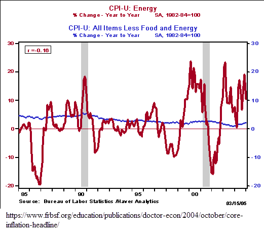
The prices of frequently purchased items like food and energy guide our expectations of changes to our purchasing power. Our purchases of food and energy don’t respond quickly to changes in our income. In economist speak, these items are price inelastic. We still need to drive to work and eat. Secondly, we buy food and gas frequently so our expectations of future prices depends on an averaging of the most recent prices and the last purchase we made. It is unlikely that we will form an expectation of next year’s gas prices based on a ten year average of gas prices. Thirdly, energy prices are quite volatile. I might buy gas as frequently as I go to the movies if I like movies but the price of a movie ticket does not vary as much as the price of gas. To summarize, our expectations of inflation are guided by frequency, recency and volatility.
Energy prices are particularly volatile. In this 2004 article the Federal Reserve graphed the annual changes in energy prices (red) and the broad CPI price index (blue). The difference is startling.
The wild swings in energy prices are noise. Because of that volatility, the Bureau of Labor Statistics excludes food and energy items when it computes an index of core inflation. Core inflation is the inflation signal that economists use to predict next year’s prices.
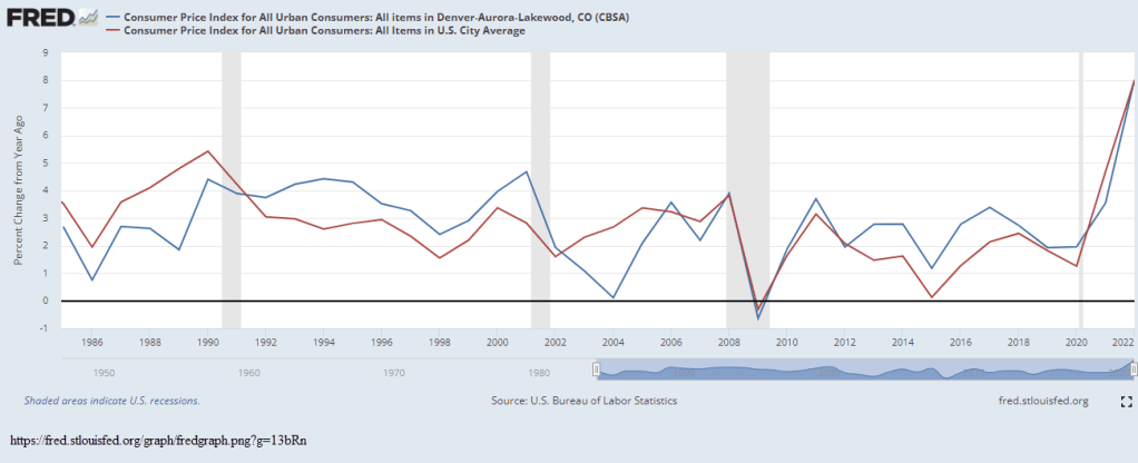
Consumer expectations of inflation include estimates of changes to their personal utility. As Richard Curtin (2022) has noted, it is not practical or possible to measure inflation at such a personalized level so economists average consumer expectations across the entire country. They collect price data at a broad metro area, or MSA. These urban areas can vary a lot from national inflation averages. In the chart below is a comparison of inflation in the Denver metro area and the nation as a whole. Rarely do the two series move together. When economists compile such a variety of consumer expectations into one national average, that average is less likely to accurately reflect individual or sub-regional expectations.
So economists are measuring changes in prices and consumers are estimating the change in their purchasing power. In his General Theory Keynes referred to the marginal efficiency of capital and the animal spirits of investor expectations of that efficiency that could be measured by the direction of market prices. Using that as a template, consumers’ purchasing power would be the marginal efficiency of income. We can gauge the animal spirits of consumers by the direction of total consumer purchases, which are continuing to outpace inflation. That is the best indicator of purchasing power expectations.
University of Michigan, University of Michigan: Inflation Expectation [MICH], retrieved from FRED, Federal Reserve Bank of St. Louis; https://fred.stlouisfed.org/series/MICH, May 4, 2023.
This week’s letter is about health care spending and its effect on inflation. Economists construct a composite price index number out of many components of the economy. While that construction may have a rigorous methodology we struggle to make causal inferences from the data because price movements in an economy are complex.
In 1965 President Johnson signed the law creating the Medicare and Medicaid programs. At that time, health care spending was 6% of total consumer spending. The radical reformers of that age wildly underestimated Medicare’s costs, particularly for inpatient hospital costs. Since the government now paid for the first 90 days of a hospital stay, doctors were encouraged to take a cautious approach and keep a patient in the hospital if there was a chance of infection or accident at home. The deep pockets of the federal government incentivized medical and pharmaceutical companies to develop new drugs and equipment. Hospitals expanded their surgery and rehabilitation units. Doctors increasingly turned to specialization and their numbers tripled from near 90,000 in 1965 to 284,000 in 1990, according to the National Center for Health Workforce Analysis. In 25 years, healthcare spending (https://fred.stlouisfed.org/graph/?g=12f9k) more than doubled as a percent of consumer spending, coming close to 15% of the total. It has risen to 17% in the past decade and now is 16%. Here’s a chart showing the growing contribution of healthcare spending to total consumer spending (blue line) and healthcare inflation’s impact on overall inflation (red line).
Healthcare spending has a large effect on inflation through two channels: first, during recessions healthcare spending does not decline as much as overall consumer spending; second, prices for health care services have grown faster than the prices of many other goods because the demand for healthcare services remains strong and constant. Since 1990 the prices for all goods and services have increased 81%, far less than the 131% of healthcare prices.
During recessions, total consumer spending falls and that puts downward pressure on inflation. But the healthcare component resists that downward pressure. The Federal Reserve, whose job it is to keep prices stable, might delay lowering interest rates because healthcare spending is keeping the price index elevated above the level of all other goods and services. This in turn could prolong the after effects of a recession: less lending and slower gains in employment. This is what happened after the 1990 and 2001 recessions. During the 1990 recession, inflation (the annual change in price) actually rose a bit before falling, spurred on by an 8.5% increase in healthcare prices. By the first quarter of 1991, healthcare was contributing 40% to overall inflation, rising up from 13% in 1989. The same pattern repeated in the 2000-2002 period.
Even though both recessions lasted less than a year, job recovery was slow. The lingering effect of a recession surely cost President George H.W. Bush a chance at a second term. In 1992, both Bill Clinton and Independent candidate Ross Perot reminded voters that the economy was sluggish and it was time for a change of direction. In the 2000s, Bush’s son, George, learned from his father’s misfortune. He urged the passage of tax cut packages and the Medicare Drug program, which helped secure his victory in the 2004 election despite disapproval of the conduct of the war in Iraq.
The ACA, or Obamacare, capped the growth of inpatient Medicare payments at 2% and this helped keep healthcare inflation (https://fred.stlouisfed.org/graph/?g=12f9b) at or below 2%. Medicaid expansion doubled the contribution level of healthcare prices to overall inflation, but because healthcare inflation was restrained, that helped to contain overall inflation.
The pandemic showed the enduring influence healthcare has on the general price level. When consumer spending had a sharp decline, healthcare prices remained strong. During the 3rd quarter of 2020, healthcare inflation was 2.9% and was responsible for nearly all of the general inflation rate of 1.1%. But here, the paths diverged. As the economy reopened and the general rate of inflation rose during 2021 and 2022, healthcare inflation decreased. That divergence describes the nature of the current overall inflation. It is procyclical, driven by short-to-medium term events, not a fundamental change in the economy.
In a 2017 Federal Reserve Economic Letter, Tim Mahedy and Adam Shapiro (2017) assigned spending categories into two buckets, procyclical and acyclical. Procyclical components that make up 42% of spending are those whose demand and prices vary with the business cycle and changes in employment. These include housing, recreation, food services and some nondurable goods. Acyclical components account for 58% of spending and include healthcare, financial services, many durable goods and transportation. The authors don’t mention energy specifically but I presume that it is an acyclical component of both housing and transportation services.
The pandemic caused shifts within and between these two buckets. During the pandemic demand soared for housing services, but declined for recreation and food services – an example of a shift within the procyclical bucket. We used a lot less energy in our cars but a lot more electricity and gas at home – a shift within the acyclical bucket. We bought a lot of durable goods – a shift between buckets.
I think it is the between shifts that had the most disruption. Supply chains for acyclical goods and services function on a less flexible timeline that does not anticipate sudden changes. Global shipping rates soared, ports were clogged with traffic, parts inventories were depleted, leading to manufacturing delays and an opportunity for companies to raise prices to make up for decreased profits due to shrinking volumes. With long delays from overseas suppliers, big retailers like Wal-Mart and Target increased their orders. As pandemic restrictions lifted, people shifted their spending again from acyclical durable goods to procyclical recreation and food services.
Each of us constructs an instinctive index based on our individual buying habits and circumstances. An American who lives for a while over in Europe has to learn to convert Centigrade temperatures to Fahrenheit. Like the CPI price index, there is methodology for making that conversion. However, it is much easier to remember that 0°C is cold, 10°C is cool, 20°C is comfortable, 30° is hot, and 40° is hell. Much of the time we navigate our daily lives without precision, relying on professionals when we do need exactness. Sometimes the professionals can tell us why something is the way it is but sometimes even they can only guess. Complexity is the result of an interlocking causality that is harder to solve than a Rubik’s cube.
This week I’ll look at things that are hard to measure and their effect on our lives. Much of human activity is recursive, meaning that the outcome of one action becomes the input to the next iteration of that same action. When we get nervous we may breathe fast and shallow which changes our body chemistry increasing our anxiety and we continue breathing fast and shallow, amplifying the effect. Because of that cyclic process prominent thinkers like Aristotle, Adam Smith, David Ricardo, Karl Marx, and Joseph Schumpeter, among others, have proposed circular models of human behavior.
The 19th century economist David Ricardo modeled the industrial process as a profit cycle. Increasing or decreasing profits mark the division between two phases of the cycle. The first phase is a series of more and higher –
rising profits, more investment, leading to more output, an increased demand for labor, a rise in wages, a rise in population and consumption, an increasing use of less efficient inputs, higher prices, then higher interest rates, and lower profits.
The decline in profits signals the end of the expansion and begins the downward phase, a cycle of less and lower of each of those elements – less investment, output, less demand for labor, lower wages in aggregate, etc. Ricardo assumed that workers received subsistence wages so an individual worker might not work for wages any lower. Like his friend Thomas Malthus, Ricardo assumed that higher incomes would lead to an increase in population. In the early 19th century, less efficient inputs meant less fertile land. As our economy has transitioned to become almost entirely service oriented, the less efficient inputs are labor. It is difficult for a hairdresser or therapist to become more productive.
Since the pandemic companies have been rewarded for raising prices, a strategy Samuel Rines, managing director of the research advisory firm Corbu, called “price over volume” on a March 9th Odd Lots podcast. With this strategy, companies like Wal-Mart keep pushing prices higher, willing to accept lower volume as long as total revenue and profits are higher. After-tax corporate profits (CP) have risen more than 40% from pre-pandemic levels, according to the Federal Reserve.
In Ricardo’s model of the profit cycle, higher prices lead to higher interest rates as investors increase their demand for money to take advantage of the higher prices. In our economy, the Fed controls the Federal Funds interest rate that other rates are based on. As prices continued to rise, the Fed began to lift rates and has raised them more than 4% in the past year. As the Fed raises rates, bank loan officers tighten lending standards, beginning with small firms (DRTSCIS) and credit card loans (DRTSCLCC). The FRED data series identifiers are in parentheses. In the past year, banks have increased their lending standards by more than 50% for small firms and 43% for credit card loans. However, all commercial loans have increased by 15% in the past year and delinquency rates have not changed since the Fed started raising rates. This is part of Ricardo’s model. Investment does not decrease until profits decline. Profits (CP) still grew at 2.25% in the 3rd quarter of 2022. We are not there yet.
In the 4th quarter of 2022, real GDP grew at less than 1% on an annual basis. We won’t have an estimate of 1st quarter numbers until the 3rd week of April but employment remains strong. Since 1980, the population adjusted percent change in employment goes negative or approaches zero just before recessions. In the chart below, notice how closely the employment (blue line) and output series move in tandem. The red line is the annual percent change in real GDP.
We may be approaching the pause point but the point of decline could be six months to a year away. Although the Fed let up on the “gas pedal,” raising rates by ¼% rather than ½%, they showed their commitment to curbing inflation as long as the employment market stays strong. If the Fed had not raised rates this past week, they would have set expectations that they were done raising rates. For now we can look for these signs that the expansion of the business cycle in Ricardo’s model is coming to a close.
Inflation is a cat’s cradle of mechanisms and motivations as mysterious as time, a simple and puzzling concept that controls our lives. Our minds are caged by this thing that is objectively invariant – a second is a second – but experienced so differently by each of us. It begins when we are very young and ask a parent when we can go to the beach or an amusement park. “Next week,” we are told, and our eyes glaze over. How far away is next week? Albert Einstein was the first to understand time as a distance. Stephen Hawking, one of the most fertile minds of the last century, wrestled with the beginning of cosmological time. Many of us struggle to knit two concepts together – time and money. To many of us the net present value of a future flow of moneylooks like something inside of a tangled ball of fishing line.
Several banks blew up recently because they mismanaged their exposure to time risk. Inflation is the experience that time is moving faster than our money. It’s like our money is running on a treadmill when someone starts increasing the speed of the treadmill. The Fed cannot directly affect the speed of the treadmill so it raises interest rates, the equivalent of adding weight to our money. More often than not, the Fed damages the treadmill, sending the economy into recession.
I’ll include some background on the relationship between inflation and interest rates. Irving Fisher was an influential economist in the early half of the 20th century whose ideas continue to influence economic thinking. Several of these are the Quantity Theory of Money, a way of computing a price index, and a hypothetical relationship between inflation and unemployment that later became known as the Phillips Curve. Fisher hypothesized that interest rates rise in a lockstep response to inflation – an idea known as the Fisher Effect. Fisher reasoned that lenders would demand higher interest rates if they anticipated that a dollar would buy less in the future. For the same reason, depositors would demand higher interest rates on their savings. Fisher died in 1947, just after World War 2. In the decades after his death, the data did not support a simple one-for-one relationship between interest rates and inflation.
Despite the lack of a simple relationship, the Fed has limited tools to achieve – by law – two counterbalancing targets, full employment and stable prices. For several decades, its policy objective has targeted a 2% inflation rate as a quantitative mark of stable prices. To counter inflation, the Fed initiates a Fisher Effect by being the first bank to raise the interest rate it pays to all the other banks. The reasoning is that banks will charge higher interest on their loans to cover the higher cost of their funds. That should slow loan demand. Secondly, the Fed reasons that banks will raise the interest rate they pay on deposits. A higher rate should induce people to save more and spend less, thus slowing down the treadmill.
Fisher’s Quantity Theory of Money (QTM) is built on the assumption – an “if” – that interest rates stayed constant. Since interest rates were lowered to near zero during the financial crisis in 2008, there has been little movement in interest rates. This became a natural experiment that Fisher had imagined – a world where interest rates remained constant. As the Fed pumped more money into the economy during the 2010s, the QTM predicted that prices would rise. They didn’t. Just as economists had discovered that the relationship between interest rates and prices was complicated, so too was the relationship the quantity of money and prices.
Banking is the art and discipline of managing the speed and weight of money when an individual bank has no control over either the speed or the weight. Anything that stays still for long becomes invisible or at least minimizes their risk. Cats instinctively know this as they wait still and patient in the hope that a wary bird will relax its guard. The long lack of movement in interest rates tempted those at Silicon Valley Bank to take concentrated risks based on the assumption that interest rates would continue to stay low.
Retail investors are cautioned not to load up on long-term bonds just to get a higher interest rate return. From October 2021 to October 2022 Vanguard’s long-term bond index BLV lost almost 30% in value. Professional bankers broke that cautionary rule. Former Fed Chairman Alan Greenspan admitted his mistake in judgment as the 2008 financial crisis unfolded: “I made a mistake in presuming that the self-interests of … banks … were such that they were best capable of protecting their own shareholders and their equity in the firms.” By holding interest rates low for so long, some banks lost their sense of prudent risk management. The cat pounced.
This experience should guide our own choices of investment, savings and risk management. We can be lulled into thinking that some factor in our lives will stay constant. Some factors are personal – a job, a marriage, our health and the health of our family. Some factors belong to the wider community we are a part of – the local economy, the housing market and the weather. Other factors are macro – interest rates, inflation, state and federal policies. We can do what Silicon Valley Bank did not do – diversify.
/////////////////////
Some have likened the run on SVB to the D&D model presented in a 1983 paper. Douglas Diamond and Philip Dybvig (D&D) won the 2022 Nobel Prize for their model demonstrating the efficiency and appropriateness of government deposit insurance. Douglas Diamond was interviewed this past Tuesday on the podcast Capital Isn’t. Diamond says that the bank run on SVB was not like the ones they presented in their model. In that model the depositor base was much wider and diverse, more like a random sample than the depositors of SVB who were primarily businesses in the tech industry.
The week’s letter is about the relationship between savings and inflation. On Tuesday, Jay Powell, the Chairman of the Fed, announced that they would continue raising rates to get inflation under control. The market dived a few percentage points. There are no shortage of explanations for persistent inflation. Despite an inflation rate above 5% for the past year, the employment market remains strong, a puzzle to economists. I will take a look at how changes in savings affect inflation.
There are times when we coordinate our behavior for apparent reasons. The weather and seasons synchronize the activities of farmers. The harvest comes at a particular time and farmers need to rent more harvesting equipment, storage capacity, rail cars and trucks for transporting their crops. Suppliers are on a different time schedule than their customers. Supplying anything takes planning, investment and time.
Suppliers rely on the fact that buyers coordinate their buying decisions according to the seasons. Clothes, gardening and Christmas gifts are easy examples. Forty percent of homes are sold during the spring months. Except for big purchases, a buying decision takes less planning and this can create anomalies that suppliers are not prepared for. Sometimes it is a popular toy at Christmas or a clothes style made popular by a celebrity.
What causes asset buyers to coordinate their behavior? The economist John Maynard Keynes was particularly interested in that question. He attributed the phenomenon to “animal spirits,” an infectious rush of pessimism or optimism that affects the prices of assets first, then spreads to the purchases of goods. Normally, some of us are saving more than usual for something, while some of us are spending that savings, or borrowing to buy things. There is a balance of savers and borrowers. However, sometimes a general prudence causes everyone to save more than average and what emerges is a paradox, the Paradox of Saving. If everyone saves, then economic activity declines, unemployment rises, people spend down their savings and the economy finds a new equilibrium at a much lower growth rate.
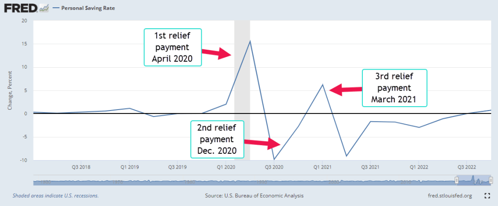
In the spring of 2020, a surge of Covid deaths in Italy and New York City prompted the closing of many businesses. City morgues were overwhelmed, forcing hospitals to rent refrigerated trucks to store the bodies. The NY health department supervised several mass burials. Residents in rural areas who were unable to catch their breath were flown to distant hospitals with the equipment and personnel capable of bringing the patients some relief. Because many workers had abruptly lost their income, the government issued relief payments to households throughout the country. With many entertainment venues closed, many of us increased our rate of savings. Below is a graph of the quarterly change in the personal savings rate.
The savings rate shot up 15%, a historic rise. Even during the high inflation of the 1970s, the savings rate rose by only 2.5% in 1975. Such an abrupt change in savings did have an effect on prices. When the change in the savings rate is negative, people are buying stuff with their savings. Companies could take advantage of supply chain bottlenecks and raise prices. This helped make back what they had lost in profits in 2020. The quarterly change in prices began to rise, as the red line in the chart below indicates. Note that inflation is the annual, not quarterly, change in prices.
Look on the right side of that chart and you will see the blue savings line turning positive. A steadily higher savings rate should exert some calming effect on prices. I then ran a statistical regression on the annual change in both prices, i.e. inflation, and the savings rate for the past 35 years. The effect of a 1% rise in the savings rate is about a 1% decrease in the inflation rate and explains 21% of the movement in inflation.
What can you do with this information? Quick erratic changes in savings have an effect on prices. Immediately after 9-11 there was an abrupt rise and fall in savings but the change was much less than the pandemic shock, which was truly historic. In 2008 came another shock, an abrupt shift in savings and an accompanying rise in prices in the summer of 2008 before the Lehman meltdown in September and the economy tanked in the 4th quarter of 2008. These changes in savings rates don’t occur very often, but when they do we should pay attention.
This week’s letter is about money and a natural resource like water. The nature of money, its origin and history have long been a subject of lively debate. What similarities and differences does money have with water? Does an analogy help uncover some less apparent characteristics of money? I’ll start with the three purposes of money that every economics student learns: a medium of exchange, a store of value and a unit of account. Coincidentally, water has three phases, gas, solid and liquid, and in each of those phases has some of the characteristics of money. The quantity of money can expand. The volume of water in all its phases is fixed.
Ice stores the energy of water the way that money stores value. As freezing water locks together in a crystal lattice, it becomes its own container. Oddly enough, most ice exhibits a hexagonal form, an efficient material transformation in response to changes in temperature. Only 2.5% of the world’s water is freshwater and most of that is locked up in glaciers. Money’s store of value is contained within assets.
In Part 5, Chapter 3 of the Wealth of Nations, Adam Smith noted that people tend to hoard their capital, to lock it away from a government which has little respect for individual property – what he called a “rude state of society.” If merchants and manufacturers have confidence in a government, they are willing to lend it money because the debt of that government can be traded in the market as though it were money. It is an interest bearing money. He lamented the fact that too many governments borrowed money to finance war and taxed people to build infrastructure. He suggested that governments do the opposite – borrow as much idle capital as possible to enhance the productivity of a country and tax people to finance wars. There would be less war and more progress.
Like money, water vapor is a medium of exchange between sky and ocean, between sky and earth. It is in constant motion within the atmosphere because its density quickly changes in response to changes in heat. It carries the water from the ocean and drops it onto the land in a conveyer belt system called the hydrological cycle. When all the earth came together in one supercontinent called Pangea 250 million years ago, water vapor transported little moisture from the oceans to the interior of the vast continent and the land was mostly desert (Howgego, 2016). When businesses around the world closed their doors at the onset of the pandemic in March 2020, we became very aware that our society, not just our economy, depends on a cycle of exchange.
Money is a unit of account, a common denominator to add up all the various goods and services in an economy. We add up tons of wheat and corn and millions of hours of labor in terms of money. . While we often think of fractions as “this divided by that,” economists understand fractions as “this in relation to that.” A social scientist might question whether it is a good idea for people to think of their labor in relation to money, the common denominator. Sadly, our society judges our worth to society in relation to that common denominator, money.
Water has a density like money has a purchasing power. Water is at its most dense – its weight per unit of volume – at 39°F and that benchmark is standardized at 1 in the metric system. The density of water at 39°F is like the benchmark price that economists use when they compute real GDP. Its volume expands as it gets colder or hotter than that temperature, so it’s density declines. The most measurable changes come at higher temperatures; at 200°F, the density is .963. We often use the language of heat when talking about inflation. The economy is overheating, for example. When there is hyperinflation¸ society itself begins to change state, just as water does at the boiling point.
Changes in the market value of our assets can have a material effect on our sense of safety. We work hard and save only a small portion of what we earn. When the value of an asset declines, it seems to melt away as though it were a block of ice on a sunny day. We may get a sense of helplessness or anxiety similar to the feeling we have when we lose electricity and worry that we will have to replace all the food in our fridge.
Readers may have other insights into money based on this water analogy. Just as equations can expose relationships that we did not understand before, analogies can do the same.
Divergent paths rejoin. This week’s letter revisits a correlation between movements in oil prices and the general price level. On July 10th of last year, I noted a divergence between the change in oil inflation and price inflation. The chart graphed the change – or momentum – in oil and price inflation, not the inflation itself. Transportation is a fundamental component and cost of our economy and companies must factor in shifts in price momentum in their pricing decisions. Here’s that chart.
At the time I had thought it likely that the change in broad price inflation – the red line in the chart – would moderate toward the momentum change in oil prices, the blue line. It did. Here is a chart with the most recent data through the end of 2022.
As I was writing last July, the momentum in general price inflation had already peaked and would start declining throughout the rest of the year. Think of momentum as a strong dog on a leash. Where it pulls, general price inflation will follow. Here’s a monthly comparison of inflation and its momentum.
At just a hint that inflation was moderating, the broad market began a rally in late October but it fizzled out in early December for a few reasons. The labor market was strong despite the Fed’s interest rate hikes and market participants correctly anticipated another 0.75% rate hike. In addition, Christmas retail sales were slow, increasing the likelihood that earnings gains would decrease. The broad market has rallied 7% since the beginning of the year.
A last note for those of you who are working on taxes and reviewing your portfolio, the investment advisor Edward Jones (2023) has a nice chart titled Investment Performance Benchmarks at the bottom of the page showing the 1, 3, and 5-year returns on various asset classes within the cash, bonds, and stocks categories. Despite the 18% drop in large cap stocks last year, the five-year performance is 9%, close to the decades long averages. The tech sector lost almost 30% in value last year but its 5-year return is almost 16%. During volatile years, relatively passive investors should keep their sights on the long-term averages.
This week’s letter is about money, a peculiar thing invented by people that has no intrinsic value unless exchanged between people. Unlike other goods, the consumption of money satisfies no human wants. Price is the thing on the left side of an equation. On the right side can be a physical quantity like a haircut or a quart of milk, or a less physical good like the satisfaction of a debt owed, or the title of ownership to a car. Money is the equal sign of that equation, the channel that connects the price information to real goods and services.
Many goods have two types of value – subjective and objective. A tomato’s subjective value depends on the needs, preferences, and resources – the circumstances – of the consumer. These circumstances vary with time. A consumer who is hungry and who likes the taste of tomatoes values a tomato more than a consumer who is not hungry or who doesn’t like tomatoes. The subjective value depends on a consumer’s resources. A consumer with a fridge can preserve a tomato longer and might value a tomato more than someone who has no cool place to store a tomato. A further element of subjective value is the intended use for the good. A consumer who wants to eat a fresh tomato might have different quality standards than someone who wants to puree the tomato for a soup or sauce.
The second type of value is objective, an intrinsic value of the good itself – the nutrients and calories a tomato provides, the chemical changes that it undergoes, the pests that the tomato harbors within its skin. Just as the circumstances of the consumer vary with time, the benefits or dangers of a good’s consumption can vary with time.
Like the values of goods, the value of money has a subjective and objective component. The objective component is a decay in the exchange value of money on the left side of millions of exchange transactions. Economists measure thousands of prices each month and determine an average weighted price for a set of goods – a consumer price index. The annual, or year-over-year, percent change in that index is called inflation. It compares this month’s price index with the price index one year ago. Economists also measure the change in that percent change and the two sometimes get lumped together by the financial press. Inflation is like the odometer in a car. If I travel 50 miles in an hour, I have averaged 50 MPH but it is the speedometer that tells me my current speed, not the average over an hour. Too often the arguments on social media mix the two together. Imagine getting pulled over by a patrol car for speeding and explaining to the officer that your average speed for the past 15 minutes has been less than the speed limit. The officer cares only about your acceleration – the near instantaneous speed.
The value of money has a subjective component that depends on the user’s circumstances. Today-Money is that which is needed to satisfy current needs. Future-Money is savings. As prices go up, people tend to hold more money as a percent of their income to pay for living expenses. If a household spends 90% of their income on current needs, then much higher inflation rate might cause them to spend 100% of their income on expenses. A higher income household might spend only 60% of its income on expenses. The effect of inflation is lower for higher income households.
Savings is an exchange between two people in time, between a person today and that same person in the future. “You got to pay you,” we may be told when encouraged to save some of our paychecks. The first you is Today-You. The second you is Future-You, who will be grateful that Today-You was prudent. Future-You does no work yet enjoys all the sacrifices that Today-You makes, the extra work, the enjoyment of things not consumed in order to save. Future-You is truly the child of Today-You.
The financial system facilitates the exchange of money-value through time. In countries with a poor financial system, people place their savings in things, animals and children whose work or usefulness will provide for a person when they become less vigorous in their old age. A child may grow up with the moral and financial burden of having to care for their parents. In these pastoral societies, a child is considered a form of wealth.
Children in an area far from home or in a foreign country are expected to send a substantial part of their paychecks home to their parents or extended family. This moral burden drives young people to immigrate to another country where they can earn more money. Part of their earnings form the international flow of remittances which increased by almost 5%, according to the Migration Data Portal (2023). India, Mexico, and China were the top recipient countries in 2022, accounting for $310 billion of the $690 billion in remittances. This sum does not include informal or illegal transfers of goods and services between countries.
Money acts like a radio wave, conveying price information about the relative values of goods and services. It requires institutions to broadcast and relay that wave as it travels around the globe and through our lives.


