April 6th, 2013
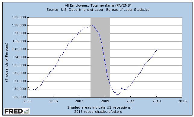
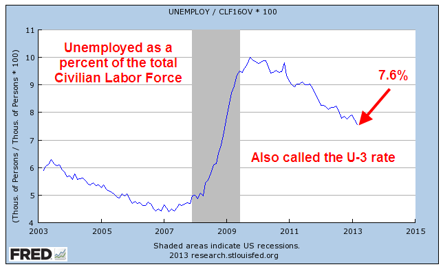
First I will look at a rather disappointing March Labor Report, released this past Friday. Then I will zoom up and look at the big picture and some disturbing trends. The net job gains this past month were 88,000, about half of the 169,000 average gains of the past year. Remember that it takes about 150,000 job gains each month just to keep up with population growth. Although the headline unemployment rate dropped .1% to 7.6%, it was because almost half a million people dropped out of the work force, meaning that they had stopped looking for a job in the past month.
Mitigating the meager job gains were revisions to previous months gains as more survey data was returned by employers. January’s job gains were revised from +119,000 to +148,000, and February’s gains were bumped upward from +236,000 to +268,000. The two revisions added up to an additional 61,000 jobs; adding that to March’s gain of 88,000 gets close to the minimum gains needed of 150,000. The initial reaction of the market was a swift loss at Friday’s market opening of almost 200 points on the Dow. By the end of the day, the market had regained much of the ground it lost, ending down about 40 points.
The average hours worked increased again to 34.6, a hopeful sign, but earnings saw no change.
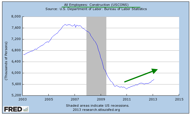
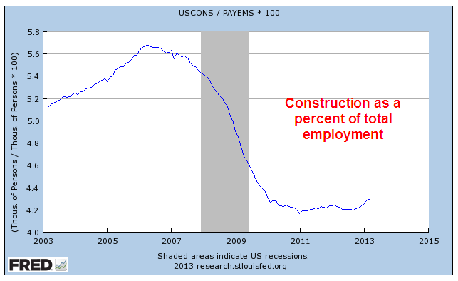
Construction continued to show gains; the media’s attention to this area of employment probably gives the casual reader the impression that contruction jobs are a larger part of the work force than they actually are.
Compare that to Professional and Business Services, which has showed consistently strong gains and low unemployment.

Employment in the health care field continues to grow. As a percent of total employment, health care continues to reach new heights, although its growth has moderated. Taking care of the sick may be a sign of a compassionate society, but it consumes resources, prompting the question: what is the upper limit? One in nine workers now work in health care. Twenty years ago, the ratio was one in twelve.

Over the past twenty years, the employment market has shifted markedly away from producing goods. As a share of total employment, about 1 in 7 workers produces goods. Just ten years ago, the ratio was 1 in 6.

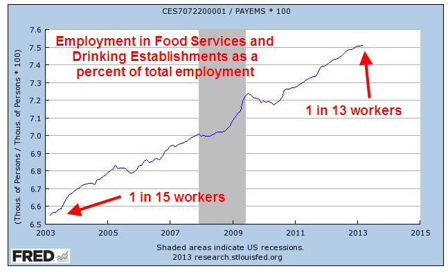
What jobs did those workers find? Serving food and drink to the ever growing share of people in Professional and Business Services.
The core work force, those aged 25 – 54, shows no growth over the past year. I use the words “work force” to include only the employed. “Labor force” includes both the employed and unemployed. More on that in a bit.

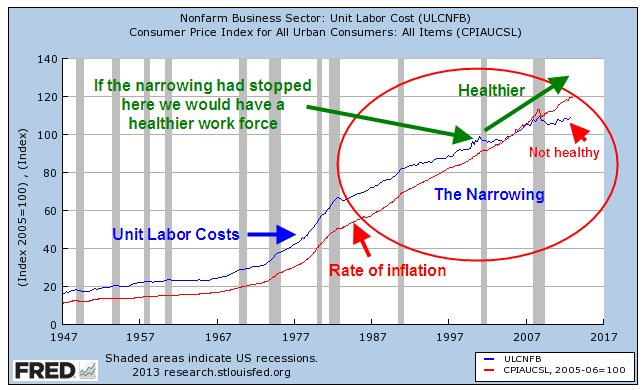
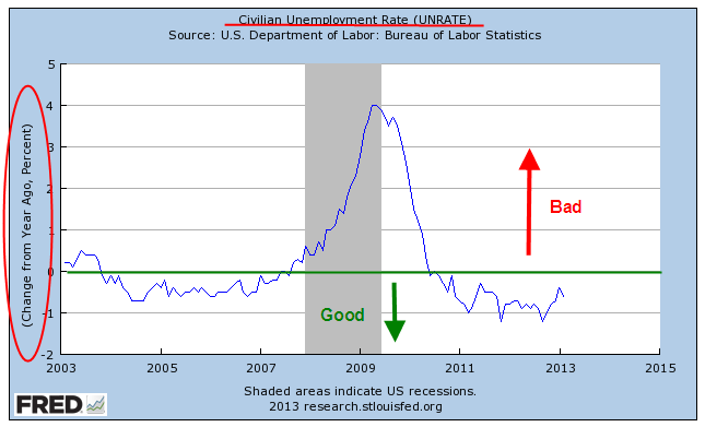
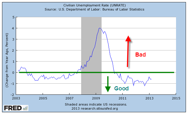
I have written before about the year over year (y-o-y) percent change in the headline unemployment rate, or U-3 rate, and that past recessions usually follow when this change goes above 0. The unemployment rate has benefitted remarkably from the number of people who continue to drop out and are no longer counted as unemployed. Because of the drop outs the percent change in the unemployment rate is still in good territory.
A secondary indicator may be the y-o-y percent gain in the employed. The long term average is 1.5%. When the percent gain falls below that, recession soon follows. The percent gain just fell below the long term 1.5% average.
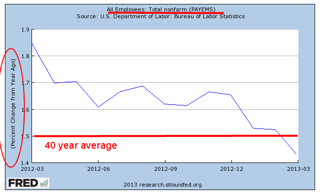
Let’s zoom out to the past forty years to see how this percent gain in employment has preceded past recessions. The exception was in 1973-74 when the Arab oil embargo created a sudden and deep recession in the country.

There was a decline in the number of people who dropped out but had been searching for work (but not in the past month) and were available to work.

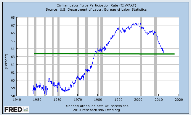
The long term trend of those not in the labor force continues to reach new heights. As a percent of the population, it keeps climbing at an alarming rate.

Older workers are retiring, either voluntarily or involuntarily, at the rate of 800,000 a year.

Which brings us to several sometimes confusing concepts, the Civilian Labor Force (CLF), the Participation Rate, and other metrics. The Civilian Labor Force is those people aged 16 and over who are either employed or unemployed. To be counted as unemployed, a person is not working but has searched for work in the past month. The unemployment rate is simply the percentage of unemployed in the Civilian Labor Force, which now totals about 155 million. An unemployment rate of 7.6% means that about 12 million people are counted as unemployed.
Then there is the Civilian Labor Force Participation Rate, or simply the Participation Rate, which is the percentage of the Labor Force to what the BLS calls the Civilian Non-Institutional Population (CNP). Don’t go to sleep on me. The CNP is those people who are aged 16 or more and who are not in prison or the military.
So, the Participation Rate (PR) is the number of people who ARE working as a percent of people who CAN legally work; i.e. who are over 16 and not in some institutional setting that prevents them from working or finding work.

Let me give you some numbers and a pie chart.
The total population of the U.S. is estimated at 313 million; the CNP is estimated at 245 million. The difference between those two figures are mostly children under 16 and people in prison and the military. Here’s how the Labor Force compares with those not in the labor force and children under 16.

Why does the the Participation Rate (PR) matter? As it declines, workers have to support more of those who are not working. Many seniors feel that they “paid into the system” but the “system” – yes, your elected representatives in Congress – spent the additional money paid into the system over the past thirty years. Social Security is a “Pay as you Go” system meaning that existing workers must somehow pay back into the system to pay benefits for those who retire. Pay back = higher taxes. As the percentage of the population who works declines, taxes must rise or benefits decrease regardless of who paid into the system.
This past month the BLS estimated a further decline of .2% to a level of 63.3%. For comparison, Canada has a PR of 66.6%.
Part of the decline is a natural demographic change as the population ages. So how much has the aging of the population contributed to the decline in the PR? What is the PR for those of working age 16 – 64? Oddly enough, the time series figures are not easy to come by. But before we get to that, let’s get to the surprises.
Since 2010, the older labor force, those aged 65+, has grown by 1.2 million.
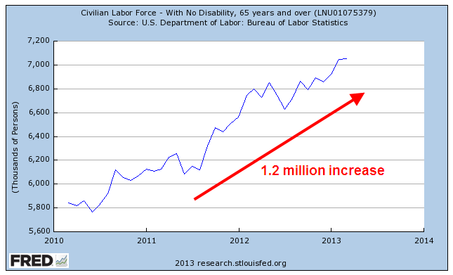
In 20 years, the participation rate among seniors has risen 50%, from 11.8% in 1990 to 17.4% in 2010. The BLS projects that it will rise to 22.6% by 2020, a doubling in thirty years. Seniors will continue to compete for jobs with the working age population.
Meanwhile, the participation rate of the core work force, those aged 25 – 54, is on a steady decline.

Now comes the biggest surprise, the decline in the working age Participation Rate. To get the time series, I had to add a number of series together and take some population estimates by the Census Bureau. Changing demographic shifts and 2010 census revisions make the series not entirely accurate but does give a good representation of the approximate 6% decline.
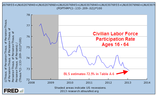
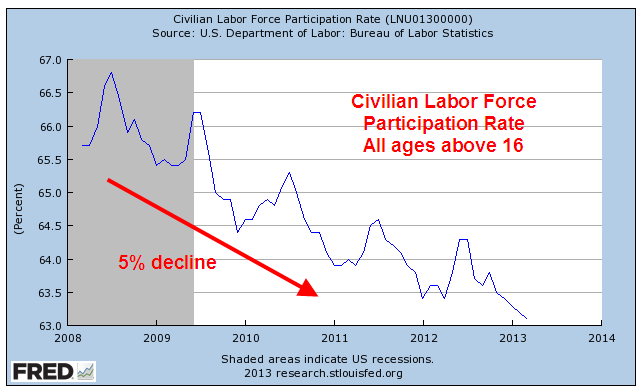
Let’s look at the last five years for the overall Participation Rate, which has declined about 5%.
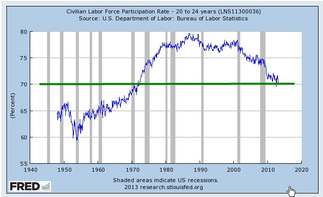
The aging of the population is contributing maybe 20% to the overall decline. The bulk of the decline is a deterioration of the working age labor force. Some are going back to school, some have given up looking for a job recently. Many younger workers are finding it difficult to find a job. The Consumer Credit report released Friday shows another surge in student loans. The FinAid student debt clock shows that student loans now exceed a trillion dollars. I have the sinking feeling that this will end badly. The participation rate for those aged 20 – 24 has declined about 7% and is now slightly less than the rate for all working ages.
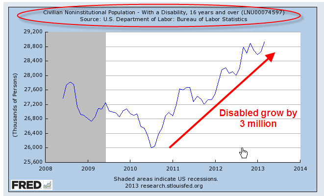
Payments under the Social Security Disability program, or SSDI, took about 10% of Social Security taxes in 1984. They now consume 20% of SS taxes and are becoming an increasing burden on the Social Security program even as the boomers begin to retire. The ranks of the disabled have grown more than 10% in the past three years.
A declining percentage of the population working to pay for an increasing number of benefits – this economic tension is sure to produce social and political conflict. Many of us probably hold the vague hope that it will all work out somehow. Some think that politicians in Washington will figure it out despite the fact that the solutions that Congress comes up with to most problems only exacerbate the problem or shift the problem to another area.
On the other hand, the baseball season is still young and anything is possible, right?