Wages and Services

December 4, 2022

by Stephen Stofka

This week’s letter is about the effect of wages on inflation. In an address this week, Fed (2022) chair Jerome Powell explained the Fed’s view of the latest trends and signaled that the Fed might ease up slightly on a rate increase at its December 13-14th meeting. Friday’s jobs report had stronger than expected gains so that may temper the Fed’s willingness to ease up on the “rate brake.” In his speech, Powell cautioned that “nominal wages have been growing at a pace well above what would be consistent with 2 percent inflation over time.”

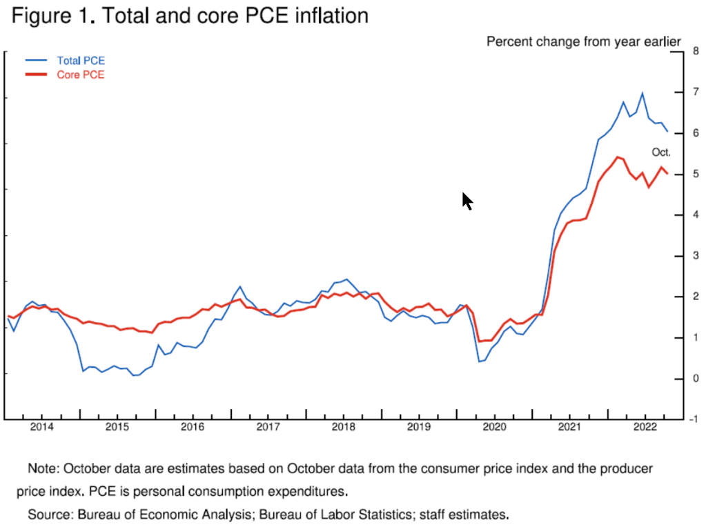
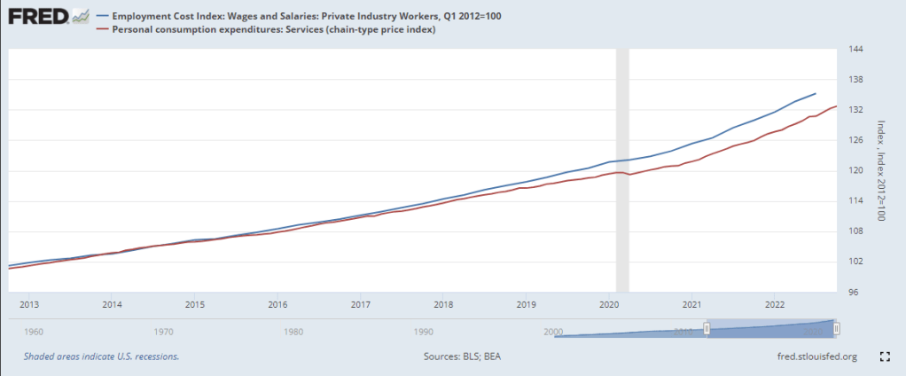
The services portion of the economy consists of mostly labor so the Fed focuses on just that sector to gauge the underlying demand for labor. In the graph below are total wages and salaries (blue line) and the services sector (red line). Both series bent upward from their pre-pandemic trends but the Fed is focused on the upward momentum of wage increases (blue line) as an underlying driver of “core” inflation.

Core inflation does not include volatile food and energy prices. Those matter a great deal to consumers but the variance makes it more difficult to predict a future price path. Imagine walking a dog on a leash down a park path. The dog might dart from side to side to sample the smells along the path but the walker stays more centered on the path. An observer who could not see the path would likely watch the person rather than the dog to predict the direction they were taking. Below is a chart from Powell’s presentation.

On a long-term basis there are two trends that are likely to produce upward wage pressures. Growth in the working age population has slowed and the participation rate has declined. Since the beginning of 2021, wages have increased 11%. The labor force has increased only 3%, partly due to demographics and partly due to a participation rate that is 1% less than the pre-pandemic level. Should the trend continue, it will affect the supply of workers, causing employers to compete by paying higher wages or give up and abandon expansion plans. The first leads to persistent inflation. The second leads to a recession.  

While the Fed might moderate their rate increases, history has warned not to ease up on rate increases at the first sign of slowing inflation. In the early and late 1970s, the Fed eased and inflation resumed its upward climb. It’s like relaxing the tension on a leash and the dog immediately rushes ahead. The Fed’s tools are blunt instruments, relatively easy to deploy, but lack any surgical precision. Increasing rates dampen inflation, but both have the hardest impact on low income families who will welcome the relief of lower inflation. They can expect little help from a divided Congress as it struggles to enact any fiscal policy.

I worry about the next two years. Republicans have been out of power for a century. By that I mean that voters rarely given them the full reins of power, a trifecta where the same party controls the Presidency, the Senate and the House. They held power in the 83rd Congress from 1953-1955 and again in the two years of the 115th Congress, from 2017-2019. Their longest stint was the four years 2003-2007, a time of repeated failure and scandal – the mismanagement of the Iraq war, Hurricane Katrina, the accounting and energy scandals. They are not a party that governs well because they do not respect governing, only the political power that accompanies governing. They have become a reactionary party whose strategy is a “Lost Cause” narrative familiar to the southern Democrats they absorbed into the party over the past five decades. Party leaders and conservative talk show hosts echo a constant refrain that Republicans are the last standing guardians of traditional American values. I worry because Republicans are a party who breaks things and people are more breakable in the aftermath of the pandemic.

/////////////////

Photo by Justin Lawrence on Unsplash

Federal Reserve. (2022, November 30). Speech by chair Powell on inflation and the labor market. Board of Governors of the Federal Reserve System. Retrieved December 3, 2022, from https://www.federalreserve.gov/newsevents/speech/powell20221130a.htm

U.S. Bureau of Labor Statistics, Employment Cost Index: Wages and Salaries: Private Industry Workers [ECIWAG], retrieved from FRED, Federal Reserve Bank of St. Louis; https://fred.stlouisfed.org/series/ECIWAG, December 2, 2022.

U.S. Bureau of Economic Analysis, Personal consumption expenditures: Services (chain-type price index) [DSERRG3M086SBEA], retrieved from FRED, Federal Reserve Bank of St. Louis; https://fred.stlouisfed.org/series/DSERRG3M086SBEA, December 2, 2022.

///////////////////////

Small Hope Amid Tragedy

July 10, 2016

The horrific news from Dallas on Thursday night and Friday morning understandably drowned out this month’s extraordinary employment report. No one anticipated job gains of 287,000 that were far above the consensus average estimate of 170,000.  Like last month, the BLS numbers are way off from those from the private payroll processor ADP, which reported gains of 172,000.

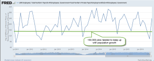
The strike at Verizon that started in May and ended in June involved 38,000 workers and skewed the BLS numbers down in May, then reversed back up again in June.  BLS methodology does not adjust for a strike involving so many workers, leading some to criticize such a widely followed methodology.  Because these estimates are prone to error, I think we get a more reliable picture by averaging the two estimates from the BLS and ADP.  As we can see in the graph below, economic growth during the past five years has been strong enough to stay ahead of the 150,000 monthly gains needed to keep up with population growth.

Those working part time because they couldn’t find full time work have dropped by 1.4 million in the past year – a positive sign. Although the supposed recovery is seven years old, it is only since the spring of 2014 that the ranks of involuntary part timers have consistently decreased.  Today’s level is almost 7 million less than it was two years ago but is still 2/3rds more than pre-Crisis levels.

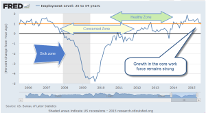
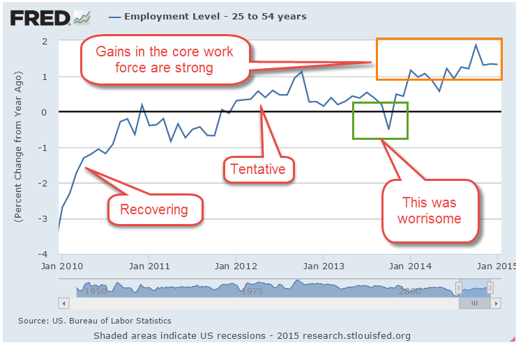
This month’s 1/10th uptick in the participation rate was a welcome sign that more people are coming back into the workforce.  Although the unemployment rate ticked up two notches to 4.9% this was probably due to more people actively looking for work. An important component of the economy is the core work force aged 25 – 54, which continued to show annual growth in excess of 1%, a healthy sign.

////////////////////////////

CWPI (Constant Weighted Purchasing Index)

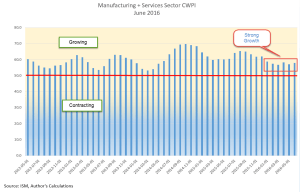
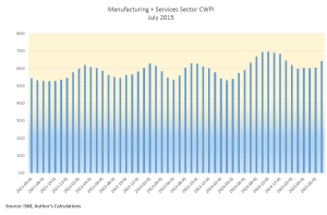
Earlier in the week, the monthly survey of Purchasing Managers (PMI) foreshadowed a positive employment report. A surge in new orders in the services sector and some healthy growth in employment helped lift up the non-manufacturing PMI to strong growth.  The Manufacturing index grew as well.  The CWPI composite of both surveys has a reading of almost 58, indicating strong growth.  The familiar peak and trough pattern that has continued during the recovery has changed to a steadier level.  New Export Orders in both manufacturing and services reversed direction this month.  The strong dollar makes American made products more expensive to buyers in other countries and presents a significant obstacle to companies who rely on exports.

Last month’s survey of purchasing managers in the services sector indicated some worrying weakness in employment.  This month’s reading suggests that a surge in new orders has reversed the decline in employment, a trend confirmed by the BLS report later released at the end of the week.

A few months ago I was concerned that the familiar trough that had developed in the spring might continue to weaken.  This month’s survey put those fears to rest.

//////////////////////////

Housing Bubble?

Soaring home prices in some cities has led to speculation that, ten years after the last peak in the housing market, we are again approaching unaffordable price levels.  Heavy migration into the Denver metro area has made it the third hottest housing market in the U.S., just behind San Francisco and Vallejo (northeast of SF) in California (Source). Despite bubble indications in these hot markets, the Case Shiller composite of the twenty largest metropolitan areas does not indicate that we are at excessive levels.

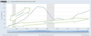
In the period 2000 through mid-2006 when housing prices peaked, annual growth was more than 10%.  Ten years have passed since then.  In the 16.5 years since the start of 2000, annual growth has averaged 4%.  While this is almost twice the 2% rate of inflation, it is approximately the same as the rate of growth during the past century.

//////////////////////////////

In the past two weeks following the Brexit vote in the U.K. the S&P500 has rebounded 6%, recovering all the ground lost and then some. It is near all time highs BUT so are Treasuries.  When both “risk on” (stocks) and “risk off” (Treasuries) both rise to new highs, it creates a tension that usually resolves in a rather ugly fashion as the market chooses one or the other.

Holding Pattern

September 20, 2015

The big news this week was the decision by the Fed to not raise interest rates this month.  Big mistake.  The Fed’s decision signaled a lack of confidence in the global economy.  Are we to believe that the continuing strength of the American economy is so weak that it can not weather even a 1/4% interest rate increase?

Message received.  When the news was announced on Thursday, the initial reaction was good.  Yaay!  no rate increase.  Then, the reality sunk in.  Does the Fed know something that the rest of us don’t? The buyers went to the back of the bus.  The sellers started driving the bus.  Pessimism wiped out the gains in the early part of the week and ended the week down 7/10%.  When in doubt, traders get out.

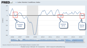
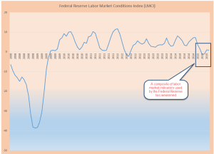
There are many aspects of the labor market.  The Fed crafts a composite of over 20 factors, called the Labor Market Conditions Index (LMCI).  The latest reading was released on September 9th, a week before this month’s Fed meeting.  This may have contributed to the caution in the Fed’s decision making.  The overall labor market has still not fully recovered from the downturn this past spring.

****************************
Automation

Will your job become automated?  In this fast morphing economy, the demand for a particular skill set can change quickly.  Younger people, whether working or still in school, need to focus on developing transferable skills.   Here’s a list of the nine criteria that some researchers determined were important to keeping a job from being automated: “social perceptiveness, negotiation, persuasion, assisting and caring for others, originality, fine arts, finger dexterity, manual dexterity and the need to work in a cramped work space.”

When the first Boomers were born at the end of World War II, 16% of the workforce was employed in agriculture.  Millions of agricultural jobs have been lost in the past 70 years. Now it is less than 2%. (USDA source)

Computerization has led to the loss of millions of clerical and accounting jobs in the back offices of businesses throughout this country. Despite those job losses of the past 25 years, there are almost twice as many professional and business employees now as there were in 1990 (Source )

In contrast, construction employment is about the same as it was 20 years ago – an example of an industry that boomed and busted in the past two decades.  Despite that lack of growth, construction employment is still almost twice what it was in the go-go years of the 1960s. (Source)

Despite all these job losses due to automation and more efficient production methods, there are 350% more people working now (140 million) than there were at the end of WW2 (40 million). (Source)

Those who get left behind are those who have a narrow set of skills.

*************************
Labor Market Analysis

Each August the Federal Reserve hosts an economic summit for central bankers, economists and academics.  In 2014, Fed chair woman Janet Yellen commented on several aspects of the labor market:

Labor force participation peaked in early 2000, so its decline began well before the Great Recession. A portion of that decline clearly relates to the aging of the baby boom generation. But the pace of decline accelerated with the recession. As an accounting matter, the drop in the participation rate since 2008 can be attributed to increases in four factors: retirement, disability, school enrollment, and other reasons, including worker discouragement.

As Yellen noted, some changes were structural, some cyclical:
Over the past several years, wage inflation, as measured by several different indexes, has averaged about 2 percent, and there has been little evidence of any broad-based acceleration in either wages or compensation. Indeed, in real terms, wages have been about flat, growing less than labor productivity.

Ms. Yellen agrees that the headline unemployment rate, the U-3 rate, does not reflect current labor market conditions:  “the recent behavior of both nominal and real wages point to weaker labor market conditions than would be indicated by the current unemployment rate.

Since unemployment peaked at 25% during the Great Depression in the 1930s there has been an ongoing debate about unemployment during recessions.  Why don’t employees simply offer to work for less when the economy starts slowing down? Yellen offered some insights [my comments in brackets below]:

the sluggish pace of nominal [current dollars] and real [inflation-adjusted] wage growth in recent years may reflect the phenomenon of ‘pent-up wage deflation.’ The evidence suggests that many firms faced significant constraints in lowering compensation during the recession and the earlier part of the recovery because of ‘downward nominal wage rigidity’–namely, an inability or unwillingness on the part of firms to cut nominal wages. To the extent that firms faced limits in reducing real and nominal wages when the labor market was exceptionally weak, they may find that now they do not need to raise wages to attract qualified workers. As a result, wages might rise relatively slowly as the labor market strengthens. If pent-up wage deflation is holding down wage growth, the current very moderate wage growth could be a misleading signal of the degree of remaining slack. Further, wages could begin to rise at a noticeably more rapid pace once pent-up wage deflation has been absorbed.”

Which Way Sideways?

August 9, 2015

As we all sat around the Thanksgiving table last November, the SP500 was about the same level as it closed this week.  Investors have pulled off the road and are checking their maps to the future.  After forming a base of good growth in the past few months, July’s CWPI reading surged upwards.

Despite years of purchasing managers (PMI) surveys showing expanding economic activity, GDP growth remains lackluster.  Every summer, in response to more complete information or changes to statistical methodologies, the Bureau of Economic Analysis (BEA) revises GDP figures for the most recent years.  A week ago the BEA revised real annual GDP growth rates for the years 2011 – 2014 from 2.3% to 2.0%.  “From 2011 to 2014, real GDP increased at an average annual rate of 2.0 percent; in the  previously published estimates, real GDP had increased at an average annual rate of 2.3 percent.”

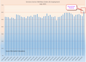
A composite of new orders and rising employment in the service sectors showed its strongest reading since the series began in 1997.  The ISM reading bested the strong survey sentiments of last summer. We can assume that the PMI survey is not capturing some of the weakness in the economy.

This level of robust growth should put upward pressure on prices but inflation is below the Federal Reserve’s benchmark of 2%.  Energy and food prices can be volatile so the Fed uses what is called the “core” rate to get a feel for the underlying inflationary pressures in the economy.

The stronger U.S. dollar helps keep inflation in check.  There is less demand from other countries for our goods and the goods that we import from other countries are less expensive to Americans. .  Because the U.S. imports so much more than it exports, the lower cost of imported goods dampens inflation.  In effect, we “export” our inflation to the rest of the world.

When the economy is really, really good or very, very bad we set certain thresholds and compare the current period to those benchmarks.  When the financial crisis exploded in late 2008, the world fled to the perceived safety of the dollar in the absence of a exchange commodity of value like gold.  Because oil is traded in U.S. dollars and the U.S. is a stable and productive economy and trading partner, the U.S. dollar has become the world’s reserve currency.  The conventional way of measuring the strength of a currency like the dollar has been to compile an index of exchange rates with the currencies of our major trading partners.  This index, known as a trade weighted index, does not show a historically strong U.S. dollar.  In fact, since 2005, the dollar has been extremely weak using this methodology and only recently has the dollar risen up from these particularly weak levels.

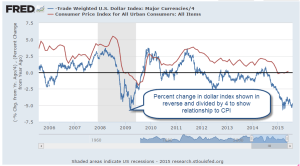
As I mentioned earlier, a strong dollar helps mitigate inflation pressures; i.e. they are negatively correlated. When the dollar moves up, inflation moves down.  To show the loose relationship between the dollar index and a common measure of inflation, the CPI, I have plotted the yearly percent change in the dollar (divided by 4) and the CPI, then reversed the value of the dollar index.  As we can see in the graph below, the strengthening dollar is countering inflation.

What does this mean for investors?  The relatively strong economy allows the Fed to abandon the zero interest rate policy (ZIRP) of the past seven years and move rates upward.  A zero interest rate takes away a powerful tool that the Fed can employ during economic weakness: to stimulate the economy by lowering interest rates.

The strong dollar, however, makes Fed policy makers cautious. Higher interest rates will make the dollar more appealing to foreign investors which will further strengthen the dollar and continue to put deflationary pressures on the economy.  The Fed is more likely to take a slow and measured approach.  Earlier this year, estimates of the Effective Federal Funds Rate at the end of 2015 were about 1%.  Now they are 1/2% – 3/4%.  In anticipation of higher interest rates, the price of long term Treasury bonds (TLT) had fallen about 12% in the spring.  They have regained about 7% since mid-July.

DBC is a large commodity ETF that tracks a variety of commodities but has about half of its holdings in petroleum products.  It has lost about 15% since May and 40% in a year.  It is currently trading way below its low price point during the financial crisis in early 2009.  A few commodity hedge funds have recently closed and given what money they have left back to investors.  Perhaps this is the final capitulation?  As I wrote last week, there is a change in the air.

*************************

Labor Report

Strong job gains again this month but labor participation remains low.  A key indicator of the health of the work force are the job gains in the core work force, those aged 25 – 54.

While showing some decline, there are too many people who are working part time because they can’t find a full time job.  Six years after the official end of the recession in the summer of 2009, this segment of the work force is at about the same level.

In some parts of the country job gains in Construction have been strong.  Overall, not so much.  As a percent of the work force, construction jobs are relatively low.  In the chart below I have shown three distinct phases in this sector since the end of World War 2.  Extremes are most disruptive to an economy whether they be up or down.    Note the relatively narrow bands in the post war building boom and the two decades from 1975 through 1994.  Compare that to the wider “data box” of the past two decades.

For several months the headline job gains have averaged about 225,000 each month.  The employment component in the ISM Purchasing Managers’ Index (on which the CWPI above is based) is particularly robust.  New unemployment claims are low and the number of people confident enough to quit their jobs is healthy.  The Federal Reserve compiles an index of many factors that affect the labor market called the Labor Market Conditions Index (LMCI).  They have not updated the data for July yet but it is curiously low and gives more evidence that the Fed will be cautious in raising rates.

Gobs of Jobs

April 12, 2015

Last week I wrote about the recent flow of investment dollars to markets outside the U.S.  This week emerging markets (EEM, VWO, for example) shot up another 4%.  For the first time since last October, the 30 day average in these two index ETFs just broke above the 100 day average.

******************************

Job Openings (JOLTS)

February’s JOLTS report from the BLS, released this past Tuesday, showed that the number of job openings is nearing the heights of the dot com bubble in 2000.

Last week we saw that new claims for unemployment as a percent of people working were at historically low levels.  I’ll show the graph again so I can lay the groundwork for an explanation of why bad things can happen when things get too good.

Here are job openings as a percent of those working. I’ll call it JOE. In 2007, JOE approached 3.5%.  In 2000 and these past few months, it exceeded that.  As openings fall below a previous low point, recessions follow as the economy “corrects course.”  I have noted these transition points on the chart below.  September’s low of 3.3% marks the current low barrier.  Any decline below that level would be cause for worry.

Let’s look at it from another angle.  Below are job openings as a percent of the unemployed who are actively looking for a job.  This metric would give us a rough idea of the skills and pay mismatch.  This looks a bit more tempered. We are not at the high level of 2007 and not even close to the nosebleed level of 2000.

As openings grow, one would expect that some who have been out of the labor force would come back in but that doesn’t seem to be the case this time.  The participation rate remains low.  The reasons for this trend are partly demographic – aging boomers, small GenX population, end of the female labor “wave” into the labor force during the past few decades – but we should expect to see some uptick in the participation rate, some positive upward response to economic growth.

As jobs become harder to fill or applicants want more money to fill those jobs, employers may decide to cut back expansion plans rather than hire people who are are either too costly to train or who might not meet the company’s work standards. Employees who previously tolerated certain conditions or a level of pay at their job now act on their dissatisfaction.  They may leave the job or ask for more money or a change in conditions.  Little by little investment spending ebbs, then declines a bit more, reaches a threshold which triggers layoffs, and another business cycle falls from its peak.

**********************

Bank of Japan

Recently the NY Post reported  that the Bank of Japan (BOJ) was buying equities and the author implied that BOJ was pumping up the stock market. The central bank in the U.S. buys only government bonds, not equities.   Warnings of doomsday are popular in financial reporting because people pay attention. The truth just doesn’t get much attention because it is not exciting. I want to help the reader understand how misleading these kind of cross country comparisons can be.

Here is a comparison of the holdings of the U.S., Japanese and European central banks.  Look closely at the holdings of insurance and pension funds in the U.S. and Japan.  Notice that U.S. pension funds (which are government funds or private funds guaranteed and regulated by the U.S. government) have 9% equity holdings while Japan’s insurance and pension funds have only 2%.   Combining the holdings of the central bank and insurance and pension funds, we find that Japan has 4% in stock assets while the U.S. has 9% of its assets in stocks.  Contrary to this reporter’s implications, it is the U.S. government that is pumping up the stock market far more than the Bank of Japan.

The author quotes a Wall St. Journal article from March 11, 2015: “The Bank of Japan’s aggressive purchasing of stock funds” but only seven months ago, on August 12, 2014, that same newspaper reported: “As Tokyo shares fall back from their recent highs, the Bank of Japan has been significantly stepping up its purchases of domestic exchange traded funds.” [my emphasis]
Note the difference in wording.  The earlier article notes that BOJ is buying domestic equities, particularly ETFs, which are baskets of stocks.  The later article leaves out these important distinctions, leading a reader to believe that BOJ policy might be pumping up the U.S. equity market or any market, for that matter. The data does not support that contention.

What U.S. investors should be concerned about (I mentioned this in last week’s blog) is that federally guaranteed pension plans and government pension plans are finding it difficult in this low interest rate environment to meet their projected benchmark returns of 7% to 8%.  A more realistic goal is 5% to 6% for a large fund with a balanced risk profile.  Pension plans are having to take on more risk at a time when boomers are retiring and wanting the money promised in those pension plans.  These investment pools can not afford to wait five years for asset values to recover from a severe downturn, making them more likely to adjust their equity or bond positions as quickly as they can in the case of a crisis of confidence in these markets.  Be aware of the underlying environment we are living in.

Growing Signs

February 8, 2015

Employment

Employment gains in January were at the midpoint of expectations but revisions to the gains of November and December were significant, adding about 70,000 jobs in each month.  After a decline in December, average hourly earnings rose to $24.75, for a year-over-year gain of 2.2% and a good 1% above inflation.

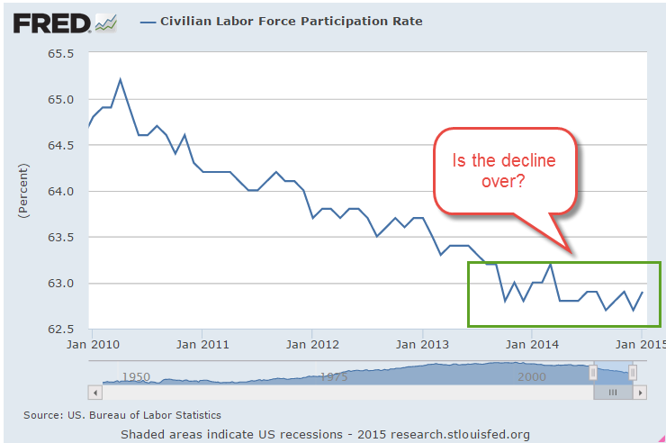
In a sign that people are becoming more optimistic about job prospects, the Participation Rate increased 2/10ths of a percent in January.  After 5 years of decline, this rate may have found a bottom over the past year.

The health or frailty of the core work force aged 25 – 54 years is  a snapshot of the underlying strength of the labor market.  This age band constitutes our primary working years.  In the first half of this thirty year period we build job skills, work and social connections, establish credit, and accumulate relationships and stuff.  Year-over-year growth in the 1 to 2% zone is the preferred “Goldilocks” growth rate.

As the graph below shows, the growth rate has been above 1% for most of the past year.

Monthly gains in construction employment have overtaken professional business services and the health care industry.

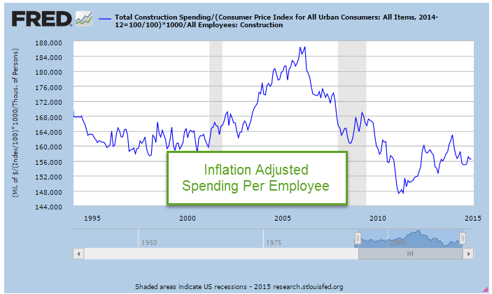
The construction industry accounts for less than 5% of employment but each employee accounts for a total of $160,000 in spending so changes affect other industries.  As you can see in the graph below, real or inflation-adjusted construction spending per employee was relatively stable during the 1990s.  As the housing market boomed, spending per employee rose dramatically in the 3-1/2 years from late 2002 to early 2006.  In the worst throes of the recession when the industry shed almost a quarter of its employees, per employee spending stabilized at the same level as the 1990s.

Stimulus spending and Build America projects helped cushion the decline in construction spending but as those programs concluded, spending fell to a multi-decade low in the spring of 2011.  Despite historically low interest rates and increasing state and municipal tax revenues, both residential and commercial construction are below the benchmark set in the 1990s.  Despite strong gains in the past two years, the industry still has room to run.

As the economy improves, those working part time because they can not get full time work has decreased significantly from the nosebleed heights of five years ago.

That total includes those whose hours have been cut back because of slack business conditions.  A subset of that total are the number of workers who are working part time because they can not find a full time job.  This segment of workers has seen little change during this recovery.

*****************************

Purchasing Manager’s Index

Each month I update a composite index of the ISM Purchasing Manager’s indexes (PMI) first introduced by economist Rolando Pelaez in 2003.  This composite, the Constant Weighted Purchasing Index, or CWPI, reached record highs in October 2014.  It is no surprise that, this month, the BLS revised November’s employment gains upwards by 70,000 to over 420,000.  As expected, the composite has declined but remains robust.

The wave like pattern of present and anticipated industrial activity has quickened since early 2013, the troughs and crests coming closer together.  If this pattern continues, we should expect gradual declines over the next two months before rising up again.  A combination of employment and new orders in the service sectors continues to show healthy growth, although it has also declined from the strong growth of the past few months.

Sales, Savings and Volatility

August 17, 2014

This week I’ll take a look at the latest retail sales figures, a less publicized volatility indicator, a comparison of BLS projections of the Labor Force Participation Rate, and the adding up of personal savings.

**********************

Retail Sales

Two economic reports which have a major influence on the market’s mood are the monthly employment and retail sales reports.  After a disappointing but healthy employment report this month, July’s retail sales numbers were disappointing, showing no growth for the second month in a row.  The year-over-year growth is 3.7%, which, after inflation, is about 1.5% real growth.  Excluding auto sales (blue line in the graph below), sales growth is 3.1, or about 1% real growth, the same as population growth.

As we can see in the graph below, the growth in auto sales has kicked in an additional 1/2% in growth during this recovery period. Total growth has been weakening for the past two years despite strong growth in auto sales, a sign of an underlying lack of consumer power.

Real disposable income rebounded in the first six months of this year after negative growth in the last half of 2013 but there does not seem to be a corresponding surge in sales.

*****************************

Labor Force Projections

While we are on the subject of telling the future…

All we need are 8 million more workers in the next two years to meet Labor Force projections made in 2007 by the Bureau of Labor Statistics (BLS).   8 million / 24 months = 300,000 a month net jobs gained. Hmmm…probably not.  In 2007, the BLS forecast slowing growth in the labor force in the decade 2006 – 2016.  Turned out it was a lot slower. Estimates then for 2016 projected a total of 164 million employed and unemployed.  In July 2014, the BLS put the current figure at 156 million employed.  The Great, or at least Big, Recession caused the BLS to revise their forecast a number of times.  The current estimate has a target date of 2022 to hit the magic 164 million.  In other words, we are 6 years behind schedule.

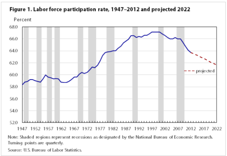
The Participation Rate is the ratio of the Civilian Labor Force to the Civilian Non-Institutional Population aged 16 and above.  The equation might be written:  (E + UI) / A = PR, where E = Employed, UI = Unemployed and Actively Looking for Work, and A = people older than 16 who are not in the military or in prison or in some institution that would prevent them from making a choice whether to work or not.  As people – the A divisor in the equation – live longer, the participation rate gets lower.  It ain’t rocket science, it’s math, as baseball legend Yogi Berra might have said.

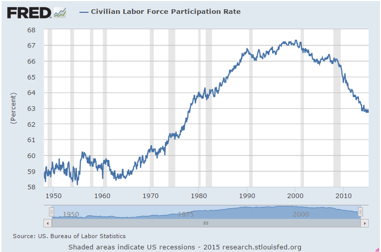
The Participation Rate started rising in the 1970s as more women entered the work force, then peaked in the years 1997 – 2000.  Prior to the recession of 2001, the pattern of the participation rate was predictable, declining during an economic downturn, then rising again as the economy recovered.  The recovery after the recession of 2001 was different.  The rate continued to decline even as the economy strengthened.

In 2007, the BLS expected further declines in the rate from a historically high 67% in 2000 to 65.5% in 2016.  In 2012, the rate stood at 63.7%.  Current projections from the BLS estimate that the rate will drop to 61.6% by 2022.

Much of the decline in the participation rate was attributed to demographic causes in the 2007 BLS projections:

“Age, sex, race, and ethnicity are among the main factors responsible for the changes in the labor force participation rate.” (Pg. 38)

Comparing estimates by some smart and well trained people over a number of years should remind us that it is extremely difficult to predict the future.  We may mislead ourselves into thinking that we are better than average predictors.  Our jobs may seem fairly secure until they are not; a 5 year CD will get about 5 – 6% until it doesn’t; the stock market will sell for about 15x earnings until it doesn’t; bonds are safe until they’re not.

The richest people got rich and stay rich because they know how unpredictable the world really is.  They hire managers to shield them – hopefully – from that unpredictability.  They fund political campaigns to provide additional insurance against the willy-nilly of public policy.  They fight for government subsidies to provide a safety cushion, to offset portfolio losses and mitigate risk.  What do many of us who are not so rich do to insure ourselves against volatility?  Put our money in a safe place like a savings account or CD.  In real purchasing power, that costs us 1 – 2%, the difference between inflation and the paltry interest rate paid on those insured accounts.  In addition, we can pay a hidden “insurance” fee of 4% in foregone returns by being out of the stock and bond markets.  We stay safe – and not-rich.  Rich people manage to stay safe – and rich – by not doing what the not-rich people do to stay safe.  Yogi Berra couldn’t have said it better.

***************************

China

For you China watchers out there, Bloomberg economists have compiled a monetary index from several key factors of monetary policy.  After hovering near decade lows, China’s central bank has considerably loosened lending in the past two months.  The chart shows the huge influx of monetary stimulus that China provided in 2009 and 2010 as the developed world tried to climb up out of the pit of the world wide financial crisis.

The tug of war in China is the same as in many countries.  Politicians want growth.  Central banks worry about inflation.  The rise in this index indicates that the central bank is either 1) bowing to political pressure, or 2) feels that inflationary pressures are low enough that they can afford to loosen the monetary reins.  As is often the case with monetary policy, it is probably some combination of the two.

**************************
Personal Savings Rate

Over the past two decades, economists have noted the low level of savings by American workers.  While economists debate methodologies and implications, politicians crank up their spin machines. More conservative politicians cite the low savings rate as an indication of a lack of personal responsibilty.  As workers become ever more dependent on government programs, they do not feel the need to save.  Over on the left side of the political aisle, liberals cite the low savings rate as a sign of the growing divide between the middle class and the rich.  Many families can not afford to save for a house, or their retirement, or put aside money for their children’s education.  We need more programs to correct the economic inequalities, they say.

While there might be some truth in both viewpoints, the plain fact is that the Personal Savings Rate doesn’t measure savings as most of us understand the term.  A more accurate title for what the government calls a savings rate would be “Delayed Consumption Rate.”  The methodology used by the Dept. of Commerce counts whatever is not spent by consumers as savings.  “To consume now or consume later, that is the question.”

If a worker puts money into a 401K each month, the employer’s matching contribution is not counted.  If a consumer saves up for a down payment for a house, that is included in savings.  When she takes money out of savings to buy the house, that is a negative savings.  The house has no value in the “savings” calculation.  Many investors have a large part of their savings in mutual funds through personal accounts and 401K plans at work.  Capital gains in those funds are not counted as savings.  (Federal Reserve paper) In short, it is a poor metric of the aggregate behavior of consumers.  Some economists will point out that the savings rate indicates a level of demand that consumers have in reserve but because a significant portion of saved income is not counted, it fails to properly account for that either.

************************

Volatility – A section for mid-term traders

No one can accurately predict the future but we can examine the guesses that people make about the future.  In his 2004 book The Wisdom of Crowds (excerpt here) James Surowiecki relates a number of studies in which people are asked to guess answers to intractable problems, like how many jelly beans are in a jar.  As would be expected, respondents rarely get it right.  The surprising find was that the average of guesses was remarkably close to the correct answer.

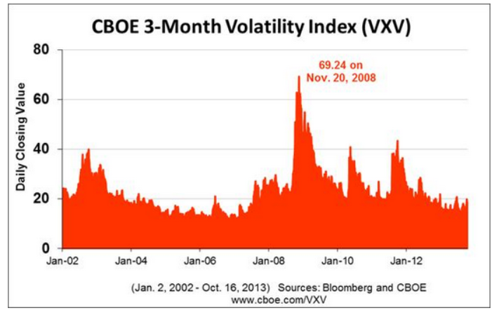
Through the use of option contracts, millions of traders try to guess the market’s direction or insure themselves against a change in price trend.  A popular and often quoted gauge of the fear in the market is the VIX, a statistical measure of the implied volatility of option contracts that expire in the next thirty days.  When this fear index is below 20, it indicates that traders do not anticipate abrupt changes in stock prices.

Less mentioned is the 3 month fear index, VXV (comparison from CBOE). Because of its longer time horizon, it might more properly be called a worry index.  Many casual investors have neither the time, inclination or resources to digest and analyze the many economic and financial conditions that impact the market.  So what could be easier than taking a cue from traders preoccupied with the market?  Below is a historical chart of the 3 month volatility index.

Historically, when this gauge has crossed above the 20 mark for a couple of weeks, it indicates an elevated state of worry among traders.  The 48 month or 4 year average of the index is 19.76.  Currently, we are at a particularly tranquil level of 14.42.

When traders get really spooked, the 10 day average of this anxiety index will climb to nosebleed heights as it did during the financial crisis.  As the market calms down, the average will drift back into the 20s range, an opportunity for a mid-term trader to get cautiously back into the water, alert for any reversal of sentiment.

*********************

Takeaways

Retail sales have flat-lined this summer but y-o-y gains are respectable.  So-so income growth constrains many consumers.  The 3 month volatility index is a quick and dirty summary of the mid-term anxiety level of traders.  A comparison of BLS labor force projections shows the difficulty of making accurate predictions.  The personal savings rate under-counts savings.
Employment, Income and GDP

May 4th, 2014

Employment

Private payroll processor ADP estimated job gains of 220K in April and revised March’s estimate 10% higher, indicating an economy that is picking up some steam.  Of course, we have seen this, done that, as the saying goes.  Good job gains in the early months of 2012 and 2013 sparked hopes of a strong resurgence of economic growth followed by OK growth.

New unemployment claims this week were pushing 350K, a bit surprising.  The weekly numbers are a bit volatile and the 4 week average is still rather low at 320K.  In a period of resurgent growth, that four week average should continue to drift downward, not reverse direction. Given the strong corporate profit growth expectations in the second half of the year, there is a curious wariness in the market.  Conflicting data like this keeps buyers on the sidelines, waiting for some confirmation.  CALPERS, the California Employees Pension Fund with almost $200 billion in assets, expressed some difficulty finding value in U.S. equities and is looking abroad to invest new dollars.

On Friday, the Bureau of Labor Statistics reported job gains of 288K in April, including 15K government jobs.  Most sectors of the economy reported gains but there are several surprises in this report.  The unemployment rate dropped to 6.3% from 6.7% the previous month, but the decline owes much to a huge drop in labor force participation.  After poking through the 156 million mark recently, the labor force shrank more than 800,000 in April, more than wiping out the 500,000 increase in March.

To give recent history some context notice the steady rise in the labor force since the end of World War 2, followed by a flattening of growth in the past six years.

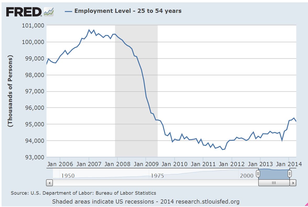
The core work force, those aged 25 – 54 years, finally broke through the 95 million level in January and rose incrementally in February and March.  It was a bit disappointing that employment in this age group dropped slightly this month.

To give this some perspective, look at the employment rate for this age group. Was the strong growth of employment in the core work force largely a Boomer phenomenon unlikely to repeat?  Perhaps this is why the Fed indicated this week that we may have to lower our expectations of growth in the future.

Discouraged job seekers and involuntary part timers saw little change in this latest report.  On the positive side, there was no increase.  On the negative side, these should decline in a growing economy.  There simply isn’t enough growth.  Was the strong pickup in jobs this past month a sign of a resurgent economy?  Was it simply a make up for growth hampered by the exceptional winter?  The answers to these and other questions will become clearer in the future.  My time machine is in the shop.

************************

GDP

Go back with me now to those days of yesteryear – actually, it was last year.  Real GDP growth crossed the 4% line in mid year.  The crowd cheered.  Then the economic engine began to slow down. The initial estimate of fourth quarter growth a few months ago was 3.2%.  The second estimate for that period was revised down to 2.4%, far below a half century’s average of 3%.  This week the final estimate was nudged up a bit to 2.6%, but still below the long term average.

Earlier in the week, the Federal Reserve announced that it will continue its steady tapering of bond buying and that it may have to adjust long term policy to a slower growth model.  The harsh winter makes any analysis rather tentative so we can guess the Fed doesn’t want to get it wrong?

************************

Manufacturing – ISM

ISM reported an upswing in manufacturing activity in April, approaching the level of strong growth.  The focus will be on the service sector which has been expanding at a modest clip.  I’ll update the CWPI when the ISM Service sector report comes out next week.

************************

Income – Spending

Consumer income and spending showed respectable annual gains of 3.4% and 4.0%.  The BLS reported that earnings have increased 1.9% in the past twelve months. CPI annual growth is a bit over 1% so workers are keeping ahead of inflation, but not by much.   Auto sales remain very strong and the percentage of truck sales is rising toward 60%, a sign of growing confidence by those in the construction and service trades.  Construction spending rose in March .2% and is up over 8% year over year but the leveling off of the residential housing market has clearly had an effect on this sector in the past six months.

***********************************

Conservative and Liberals

While this blog focuses mainly on investing and economics, public policy is becoming an ever increasing part of each family’s economic heatlh, both now and particularly in the future.
Some conservatives say that they endorse policies which strengthen the family yet are against rent control, minimum wage and family leave laws, all of which do support families.  How to explain this apparent contradiction?  A feature of philosophies, be they political, social or economic, is that they have a set of rules.  Some rules may be common to competing philosophies but what distinguishes a conceptual framework or viewpoint is the difference in the ordering of those rules.  The prolific author Isaac Asimov, biologist and science fiction writer, proposed a set of three rules programmed into each robot to safeguard humans.  A robot could not obey the second law if it conflicted with the first.  Robots are rigid; humans are not.  Yet we do construct some ordering of our rules.

A conservative, then, might have a rule that policies that protect the family are good.  But conservatives also have two higher priority rules which honor the sanctity of contract and private property: 1) that government should not interfere in voluntary private contracts, and 2) that private property is not to be taken from private individuals or companies without some compensation, either money or an exchange of a good or service. Through rent control policies, governments interfere in a private contract between landlord and tenant and essentially take money from a landlord and give it to a tenant, a violation of both rules 1 and 2.  Minimum wage and mandatory family leave laws enable a government to interfere in a private contract between employer and employee and essentially transfer money from one to the other, another violation of both rules.

In my state, Colorado, there is no rent control.  Instead, landlords receive a prevailing market price and low income tenants receive housing subsidies and energy assistance.  Under rent control, money is taken from a specific subset of the population, landlords, and given to tenants.  Under housing subsidies, money is taken from general tax revenues of one sort or another and given to tenants.  Of the two systems, housing subsidies seems the fairer but many conservatives object to either policy because the government takes from individuals or companies without any exchange, a violation of rule #2.  All policies like housing subsidies which involve transfers of income from one person to another, are mandatory charity, and violate rule #2.

Liberals want to support families as well but they have a different set of rules that prioritizes the sanctity of the social contract: 1) individuals living in a society have an obligation to the well being of other members of that society, and 2) those with greater means have a greater obligation to the well being of the society.  A government which is representative of the individuals of that society has the responsibility to facilitate the movement of wealth and income among those individuals in order to achieve a more equitable balance of happiness within the society.  Flat tax policies espoused by more conservative individuals violate rule #2.  Libertarian proposals for a much smaller regulatory role for government violate rule #1.

For liberals, both of the above rules are subservient to the prime rule: humans have a greater priority than things.  When the preservation of property rights violates the prime rule, property rights are diminished in preference to the preservation of human well-being.  On the other hand, conservatives view property rights as an integral aspect of being human; to diminish property rights is to diminish an individual’s humanity.

In the centuries old dynamic tension between the individual and the group, the liberal view is more tribal, focusing on the well being of the group.  Liberals sometimes ridicule some tax policies espoused by conservatives as “trickle down economics.”  In a touch of irony, it is liberals who truly believe in a trickle down approach in social and economic policies.  The liberal philosophy seeks to protect society from the natural and sometimes reckless self-interest of the individuals within that society. The conservative viewpoint is concerned more with the protection of the individual from the group, believing that the group will achieve a greater degree of well-being if the individuals are secure in their contracts and property. Conservatives then favor what could be called a bottom up approach to organizing society.
Conservatives honor the social contract but give it a lower priority than private contracts.  Liberals honor private contracts but not if they conflict with the social contract. Most people probably fall somewhere on the scale between the two ends of these philosophies and arguments about which approach is “right” will never resolve the fundamental discord between these two philosophies.

In the coming years, we are going to have to learn to negotiate between these two philosophies or public policy will have little direction or effectiveness.  Negotiating between the two will require an understanding of the ordering of priorities of each ideological camp.

Before the 1970s political candidates were picked by the party bosses in each state, who picked those candidates they thought would appeal to the most party voters in the district.   The present system of promoting political candidates by a primary system within each state has favored candidates who are fervent advocates of a strictly conservative or liberal philosophy, chosen by a small group of equally fervent voters in each state.  The middle has mostly deserted each party, leading to a growing polarization.  Survey after survey reveals that the views of most voters are not as polarized as the candidates who are elected to represent them. A graph from the Brookings Institution shows the increasing polarity of the Congress, while repeated surveys indicate that voters are rather evenly divided.

Transfer Payments

February 16th, 2014

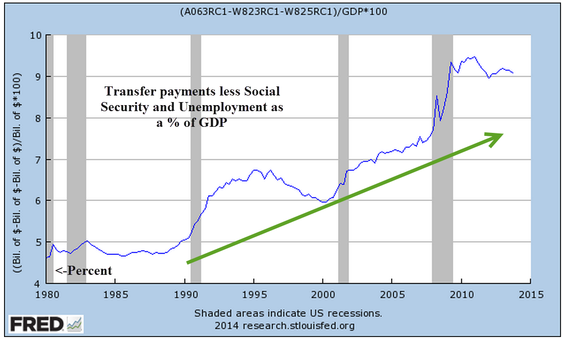
In this election year, as in 2012, the subject of transfer payments will rear its ugly head with greater frequency.  In the mouths and minds of some politicians, “transfer payments” is synonymous with “welfare.”  Don’t be confused – it is not.  As this aspect of the economy grows, politicians in Washington and the states get an increasing say in who wins and who loses.  Below is a graph of transfer payments as a percent of the economy.  I have excluded Social Security and Unemployment because both of those programs have specific taxes that are supposed to fund the programs.

Transfer payments, as treated in the National Income and Product Accounts (see here for a succinct 2 page overview), are an accounting device that the Bureau of Economic Analysis (BEA) uses to separate transfers of money this year for which no goods or services were purchased this year.  The BEA does this because they want to aggregate the income and production of the current year. Because that category includes unemployment compensation, housing and food subsidies, some people mistakenly believe that the category includes only welfare programs.   Here’s a list of payments that the BEA includes:

Current transfer receipts from government, which are called government social benefits in the NIPAs, primarily consist of payments that are received by households from social insurance funds and government programs. These funds and programs include social security, hospital insurance, unemployment insurance, railroad retirement, work­ers’ compensation, food stamps, medical care, family assistance, and education assistance. Current transfer receipts from business consist of liability payments for personal injury that are received by households, net in­surance settlements that are received by households, and charitable contributions that are received by NPISHs.

That settlement you received from your neighbor’s insurance company when his tree fell on your house is a transfer payment.  Didn’t know you were on welfare, did you?  Some politicians then cite data produced by the BEA to make an argument the government needs to curtail welfare programs.  Receiving a Social Security check after paying Social Security taxes for forty plus years?  You’re on welfare.  A payment to a farmer to not grow a bushel of wheat – an agricultural subsidy – is not a transfer payment.  A payment to a worker to not produce an hour of labor – unemployment insurance – is a transfer payment.  Got that?  While there are valid accounting reasons to treat a farmer’s subsidy check and a worker’s unemployment check differently, some politicians prey on the ignorance of that accounting difference to push an ideological agenda.

That agenda is based on a valid question: should a government be in the business of providing selective welfare; that is, to only a small subset of the population?  Some say yes, some say no.  If the answer is no, does that include relief for the victims of Hurricane Katrina, for example?  Even those who do say no would agree that emergencies of that nature warrant an exception to a policy of no directed subsidies or welfare payments.  It was in the middle of a national emergency, the Great Depression, that Social Security and unemployment compensation were enacted.  Government subsidies for banks began at this time as well.  Agricultural subsidies began in response to an earlier emergency – a sharp depression a few years after the end of World War 1.  Health care subsidies were enacted during the emergency of World War 2.  The pattern repeats; a subsidy starts as a response to an immediate and ongoing emergency but soon becomes a permanent fixture of government policy.

Tea Party purists think that the Constitutional role of the federal government is to tax and distribute taxes equally among the citizens.  Before the 16th Amendment was passed a hundred years ago, the taxing authority of the Federal Government was narrowly restricted.  However, the Federal Government has always been selective in distributing  the resources at its disposal.  Land, forests, mining and water rights were either given or sold for pennies on the dollar to a select few businesses or individuals. (American Canopy is an entertaining and informative read of the distribution and use of resources in the U.S.) By 1913, the Federal Government had dispensed with so much land, trees and water that it had little to parlay with – except money, which it didn’t have enough of.  Solution: the income tax.

In principle, I agree with the Tea Party, that the government at the Federal and state level should not play God.  How likely is it that the voters of this country will overturn two centuries of precedent and end transfers?  When I was in eighth grade, I imagined that adults would have more rational and informed discussions.  Sadly, our political conversation is stuck at an eighth grade level on too many issues.

****************************

While most of us pay attention to the unemployment rate, there is another statistic – the separation rate – that measures how many people are unemployed at any one time.  The unemployment can be voluntary or involuntary, and last for a week, a month or a year.  Not surprisingly, younger workers change jobs more frequently and thus have a higher separation rate than older workers.  In the past decade, almost 4% of younger male workers 16 – 24 become unemployed in any one month.  Put another way, in a two year period, all workers in this age group will change jobs.  For prime age workers 25 – 54, the percentage was 1.5%.  In a 2012 publication, Shigeru Fujita, Senior Economist at the Philadelphia Federal Reserve Bank, examined historical demographic trends in the separation rate.

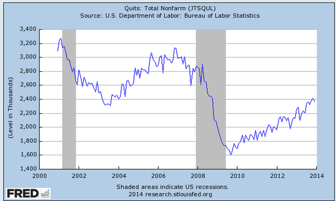
On page five of this paper, Mr. Fujita presents what is called a “labor-matching” model that attempts to explain changes in unemployment and wages, primarily from the employer’s point of view. Central elements of this model, familiar to many business owners, include uncertainty of future demand and the costs of finding and training a new worker.  Mr. Fujita examines an aspect that is not included in this model – the degree of uncertainty that the worker, not the employer, faces.  In the JOLTS report, the BLS attempts to measure the number of employees who voluntarily leave their jobs.  These Quits indicate the confidence among workers in finding another job.  The JOLTS report released this week shows an increasing level of confidence but one which has only recently surpassed the lows of the recession in the early 2000s.

**************************

Labor Participation
In a more recent paper, Mr. Fujita examines the causes of the decline in the labor participation rate, or the number of people working or looking for work as a percentage of the people who are old enough to work.  As people get older, fewer of them work; the aging of the labor force has long been thought to be the main cause of the decline.  That’s the easy part.  The question is how much does demographics contribute to the decline? What Mr. Fujita has done is the hard work – mining the micro data in the Census Bureau’s Current Population Survey.  He found that 65% of the decline of the past twelve years was due to retirement and disability.  More importantly, he discovered that in the past two years, all of the decline is due to retirement.  The first members of the Boomer generation turned 65 in 2011 so this might come as no surprise.  The surprise is the degree of the effect;  this largest  generational segment of the population dominates the labor force characteristics. During the past two years, discouraged workers and disability claims contributed little or nothing to the decline in the participation rate.  Another significant finding is that relatively few people who retire return to the work force.

In this election year, we will be bombarded with political BS: Obamacare or Obama’s policies are to blame for the weak labor market; the anti-worker attitude of Republicans in Congress are responsible.  Politicians play a shell game with facts, using the same techniques that cons employ to pluck a few dollars from the pockets of tourists in New York City’s Times Square.  Few politicians will state the facts because there is no credit to be taken, no opposing party to blame.  Workers are simply getting older.

In 2011, MIT economist David Autor published a study on the growth of disabiliity claims during the past two decades and the accelerating growth of these claims during this Great Recession.  Mr. Fujita’s analysis reveals an ironic twist – at the same time that Mr. Autor published this study, the growth in disability claims flattened.  The ghost of Rod Serling, the creator and host of the Twilight Zone TV series, may be ready to come on camera and deliver his ironic prologue.

*******************************

Lower automobile sales accounted for January’s .4% decline in retail sales. Given the continuing severity of the weather in the eastern half of the U.S., it is remarkable that retail sales excluding autos did not decline.  In the fifth report to come in below even the lowest of estimates, industrial production posted negative growth in January.  By the time the Federal Reserve meets in mid-March, the clarity of the economy’s strength will be less obscured by the severe winter weather.

*******************************

A reader sent me a link to short article on the national debt.  For those of you who need a refresher, the author includes a number of links to common topics and maintains a fairly neutral stance.  I still hear Congresspeople misusing the words “debt,” the accumulation of the deficits of past years, and “deficit,” the current year’s shortfall or the difference between revenues collected and money spent.  Could we have a competency test for all people who wish to serve in Congress?

*******************************

The House and Senate both passed legislation to raise the debt ceiling this week.  The stock market continued to climb from the valley it fell into two weeks ago and has regained all of the ground it lost since the third week of January.

Jobs, Spending and Income

October 27th, 2013

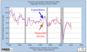
Before I take a short look at the delayed release of the employment report this week, let’s look at the growth in personal income and spending, which move in tandem.  This is the y-o-y percent change in nominal after tax income and spending.

Income growth can be a bit more erratic than spending, bouncing around the more stable trend of spending.

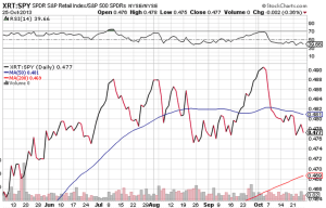
The anemic growth in both income and spending has dampened hopes of a strong rebound of consumer spending.  The ratio of an ETF composite of retail stocks versus the overall SP500 market index shows the recent doubt.  Retail stocks have not participated in the larger market rebound.

A wholesale clothing sales rep I spoke with a week ago has noticed the caution in her buyers since mid-August.  In September, some in the industry laid the blame at the prospect of a government showdown.  For those of us in private business, the political shenanigans only muddy the water and make it difficult to read the consumer mood.  Reports of sales at major retail centers – about 10% of retail sales – showed strength this week after a month of lackluster growth.  Maybe it was the government shutdown.

However, the U. of Michigan Consumer Sentiment Index released this past Friday showed a sizeable drop in sentiment.

Was this decline in confidence due primarily to the shutdown or is this a forewarning of less than cheery holiday shopping season?  The knuckleheads in Washington are like people who stand up at a concert, blocking the view of those seated behind them.  The business community in general must plan around the politicians on both sides of the aisle in Washington who relentlessly pursue an anti-job agenda.  Politicians can puff and posture on their principles – like so many in government service, they are not subject to the constraints and discipline of profit and loss.  Sure, there are some whose intentions are good, who give their best effort but, unlike private business, their efforts and intentions are voluntary – a sense of personal virtue.  Most will not lose their jobs because of a lack of performance.  There are few incentives to improve efficiency.  In fact, it is the reverse.  The incentives are to promote more regulations, more layers of bureaucracy, as a program of job security and job growth in Washington at the expense of the rest of the country. Many of us in the private sector have the same sense of personal virtue but we also have that profit and loss whip.

Since the temporary resolution of the government shutdown and the raising of the debt ceiling, the market has shot up over 6% in twelve trading days.  The late release of September’s labor report showed less than expected net job gains of 148,000, which dashed any further fears that the Fed might ease their bond buying program this year.  The trends of employment growth have been fairly stable, with a few exceptions – health care, for one.

After six months of little growth, employment in construction rose by 20,000 this past month.

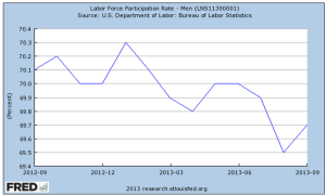
The rise in construction jobs helped the labor force participation rate for men, reversing a decline.

But the participation rate for the core labor force, those aged 25 – 54, shows no signs of reversing the decline of the past four years.

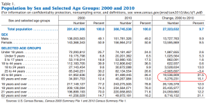
Demographic changes, combined with persistent job weakness among younger workers, is silently eroding the foundations of the Social Security system.  The older half of the population, particularly the Woodstock generation, are growing faster than the younger population, as this table from the Census Bureau shows.

From the Census Bureau report: “the population aged 65 and over also grew at a faster rate (15.1 percent) than the population under age 45.”  At the end of 2012, the Federal Government owed the Social Security trust fund $2.7 trillion (SSA Source)

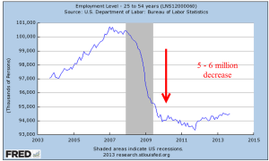
The number of workers in the core labor force has declined by 5 – 6 million.

Let’s do some math.  [5 million fewer workers paying into Social Security each year] x [$8000 guesstimated combined annual contribution] = $45 billion per year not  collected.  This is just the Social Security taxes, not including the income taxes, on a portion of the population that represents two thirds of the work force.  That $45 billion represents the benefits paid to over 3 million people in 2012. (SSA Source) To put that figure in perspective, Congress is arguing over the medical device tax clause of Obamacare which is projected to raise just $29 billion over the next ten years.

It will take five to ten years for the crisis of funding to develop.  In the meantime, the budget debates will grow more contentious, politicians will pontificate at their podiums with more frequency and the clouds of these dusty debates will make it more difficult for business people to plan ahead.