An Economic Nexus

September 8, 2024

by Stephen Stofka

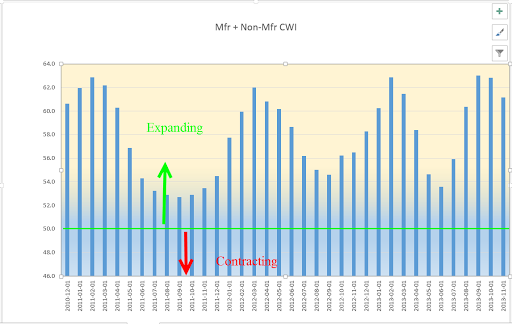
This week’s letter is about the labor market, part of a series on investing. Friday’s monthly labor report indicated a job market that is cooling but still growing. Although the market reacted negatively to the news, the Fed will begin reducing interest rates at its meeting next week. The S&P 500 index, the most widely held basket of stocks, is up 15% for the year but the index has twice risen above 5500 before falling back. An index of business activity in the services sectors continues to expand but manufacturing activity is still contracting slightly. When investors get conflicting economic signals, they are responsive to negative data points more than positive ones. The approach of what may be a contentious election creates an environment where investors are more likely to protect their portfolio value and exit short-term positions. Let’s now turn to long-term trends in the labor market.

Economists at the Bureau of Labor Statistics (BLS) refer to workers aged 25 -54 as the core work force. To save some typing, I will refer to this age demographic as the “core.” During those thirty years we accumulate stuff while we build our careers. We buy cars, furniture, homes and vacations. We build retirement savings for ourselves and college funds for our kids. The core is the nexus of a growing economy.

This coming Wednesday we will remember 9-11 and the 3,000 civilian lives lost in the attack on the World Trade Center in lower Manhattan. Since that time, there has been little investment in those workers who form the core of the labor market. From August 2001 to August 2024, the economy has added less than seven million jobs in that age demographic, an annual growth rate of just 0.28% (See FRED Series LNS12000060).

As you can see in the chart above, most of the growth in the core has occurred during the Biden administration. The surge in employment in this age group led to growing incomes and greater purchasing power in an age group that is in the accumulation phase of its lifetime. That rapid growth in employment, coupled with pandemic recovery payments from the government were strong contributors to the rise in inflation in the 2021 – 2023 period. Voter sentiment in this age group focused on the inflation, not the job growth, demonstrating again that we pay more attention to negative rather than positive news.

Several factors contributed to the plateauing of job growth in the core. Demographics played some part. Population analysts have assigned a span of about 18 years to each generation so that the thirty-year span of the core labor force encompasses two and sometimes three generations. The first of the large post-war Boomer generation turned 54 in 2000. As the Boomers aged out of the core, a smaller Generation X, born 1964 to 1982, became the dominant component of this age group. In 2013, the first Millennials, a generation larger than the Boomers, joined the core, and in 2016, the last of the Boomers aged out of the core.

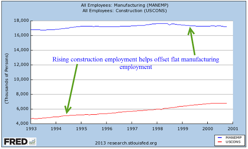
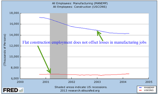
A few months after 9-11, China was admitted to the World Trade Organization, and within a decade became the world’s factory. Investors poured capital into China, taking advantage of low labor rates and a currency whose exchange rate was maintained at a low level by the Chinese central bank. Investors from outside China got more bank for their buck. As investment moved to China, many production facilities in the U.S. shuttered their doors. In the seven-year span between China’s admittance to the WTO and the start of the financial crisis in September 2008, manufacturing employment (see FRED Series MANEMP) fell by a fifth. By January 2010, employment in the manufacturing sector had declined by a third.

During the 2000s, low interest rates fed a frenzy in home financing and produced a bubble in the U.S. real estate market that imploded in 2008. The resulting financial crisis affected assets and financial institutions around the world. Millions of Americans lost their jobs. From the start of 2008 until the end of 2009, the core work force fell by 6%, about six million jobs. In 2018, an interval of ten years, the level of employment in this age group finally rose above its 2008 level.

Instead of vigorously promoting policies that encouraged job growth, the Obama administration offered policies to support families suffering from the lack of job growth. Democratic politicians eagerly passed ambitious social programs but faltered when implementing policy solutions that embodied their legislative goals. In Recoding America, Jennifer Pahlka (p. 125) recounts the efforts to fix healthcare.gov, the bungled rollout of the health exchanges created under the Affordable Care Act known as Obamacare. In The Rise and Fall of the Neoliberal Order, Gary Gerstle (p. 226) notes that the Obama administration focused more effort and political capital on providing healthcare insurance for poor people rather than supporting the 9 million households in danger of losing their homes to foreclosure.

A sense of betrayal soured voter sentiment and helped to support the emergence of the Tea Party in the 2010 election and the MAGA voters who supported Donald Trump’s candidacy in the 2016 election. In 1976, voters punished President Gerald Ford for pardoning Richard Nixon. In the 2016 election, voters punished Hillary Clinton as a symbol of a set of values disloyal to many Americans. Donald Trump promised to bring manufacturing jobs back to America by taxing Chinese imports and cutting corporate taxes. In the first three years after the 2008-2009 recession, manufacturing employment under Obama grew by more than it did in the first three years of the Trump presidency (see notes for details). No amount of political rhetoric can overcome the power of a supply chain now firmly anchored in Asia.

Biden’s infrastructure policies have actively promoted job growth in the core. Can the economy sustain such growth in this acquisitive age group while keeping inflation at a reasonable level? Should the Fed raises its target interest rate from 2% to 3% to accommodate job growth that supports people when they are raising families and building careers? I think so. Should Harris win November’s election, she should adopt Biden’s pro-growth policies. Should Trump regain office in the coming year, he will try to use tariffs to shift the nexus of the global supply network from Asia back to the U.S. That policy will only increase prices and help maintain a higher level of inflation without promoting the economic growth that supports households in their middle years.

 ///////////////

Photo by Tim Mossholder on Unsplash

Manufacturing employment notes: From January 2010 to December 2012 manufacturing gained 500,000 jobs, an increase of 4.4%. From January 2017 to December 2019, the manufacturing sector gained 432,000 jobs, an increase of 3.5%. In January 2010, manufacturing employment was near a low, continuing to fall after the official end of the recession in July 2009.

Keywords: Obamacare, inflation, labor, financial crisis, China, manufacturing, infrastructure

A Labor-Output Ratio

February 19, 2023

by Stephen Stofka

When analyzing the economies of some developing countries, economists refer to a “resource curse,” a commodity like oil or minerals that a country can sell on the global market. In a developing country, that commodity may become the main source of foreign currency, used to pay for imports of other goods. The extraction of that resource requires capital investment which usually comes from outside the country. If the production of that resource is not nationalized, most of the profits leave the country.

There are a few big winners and a lot of losers. This uneven ratio promotes economic and social inequality. Political instability arises as people within the country want to get a hold on those resources. Some politicians promise to use the profits from the resource to benefit everyone but those who seize power benefit the most. Political priorities determine economic decisions and the production of that resource becomes inefficient.

A key factor in the “resource curse” is that its contribution to GDP is usually far above its contribution to employment. If a mining sector accounts for 2% of employment but contributes 10% to GDP, the ratio of employment / GDP % equals 2%/10%, or 0.2. Ratios that are far below 1 do not promote a healthy economy. Industries that are closer to a 1-1 ratio will produce a more well rounded and vibrant economy because employed people spend their earnings in other sectors of the economy – a diffusion effect. Some economists might say that a low ratio means that capital is being used more efficiently and attracts capital investment. However, that efficiency comes at an undesirable social and economic cost.

 Let’s look at some examples in the U.S. The construction industry contributes 3.9% to GDP (blue line in the graph below) but accounts for 5.1% of employment (red line). Notice that this is the opposite of the example I gave above. The 1.31 ratio of employment/GDP is above 1, meaning that the industry employs more people for the direct value that it adds to the economy.  Construction spending includes remodels and building additions but does not include maintenance and repair (Census Bureau, n.d.). In the chart below, look at how closely GDP and employment move together. The divergence in the two series since the pandemic indicates the distortions in the housing market because of rising interest rates. Builders have put projects on hold but employment in the sector is still rising because of the tight labor market.

The finance sector’s share of the economy has grown since the financial crisis yet employment has remained steady – or stuck, depending on one’s perspective. The great financial crisis put stress on banks, big and small, but the government bailed out only the “systemically important” banks, leaving smaller regional banks to fend for themselves. The larger banks absorbed many smaller banks, leading to a consolidation in the industry. That consolidation and investments in technology helped the sector become more efficient. The ratio is about 0.75, above the 0.2 ratio in the example I gave earlier. I labeled the lines because the colors are reversed.

Retail employs a lot of people relative to its contribution to GDP. The ratio is about 1.65. Does that mean retail is an inefficient use of capital? Retail sales taxes pay for many of the city services we enjoy and take for granted. Retail is the glue that holds our communities together.

The manufacturing sector employs fewer people in relation to its GDP contribution. It’s ratio is 0.77, about the same as finance.

As I noted earlier, the mining sector is capital intensive with a high ratio of GDP to employment. This sector includes gas and oil extraction. In the U.S. that ratio averages about 0.33 but it is erratic global demand. Look at the effect during the pandemic. In our diversified economy, the mining sector contributes only a small amount, like 2%. In a developing country like Namibia in southern Africa, mining accounts for 10% of GDP. In the pandemic year, the demand for minerals declined and Namibia’s economy fell 8%.

Lastly, I will include the contribution of health care, education and social services, which contribute 7.5% to GDP but employ almost a quarter of all workers. Since the financial crisis and the passage of Obamacare, this composite sector contributes an additional 1% to GDP. These sectors include many public goods and services that form the backbone of our society. The 3.0 ratio is the inverse of the mining sector.

To summarize, the construction, retail, health care and education sectors have a ratio above 1. They employ more people for each percentage unit of output. The finance, manufacturing, mining, oil and gas sectors have ratios less than 1, employing fewer people per percentage unit of output. For readers interested in the GDP contribution of other industries, the Federal Reserve maintains a list of charts, linked here [https://fred.stlouisfed.org/release?rid=331].

//////////////////

Photo by Camylla Battani on Unsplash

Census Bureau. (2019, April 15). Construction spending – definitions. United States Census Bureau. Retrieved February 16, 2023, from https://www.census.gov/construction/c30/definitions.html

U.S. Bureau of Economic Analysis, Value Added by Industry: Construction as a Percentage of GDP [VAPGDPC], retrieved from FRED, Federal Reserve Bank of St. Louis; https://fred.stlouisfed.org/series/VAPGDPC, February 12, 2023.

U.S. Bureau of Labor Statistics, All Employees, Construction [USCONS], retrieved from FRED, Federal Reserve Bank of St. Louis; https://fred.stlouisfed.org/series/USCONS, February 12, 2023.

U.S. Bureau of Labor Statistics, All Employees, Total Nonfarm [PAYEMS], retrieved from FRED, Federal Reserve Bank of St. Louis; https://fred.stlouisfed.org/series/PAYEMS, February 12, 2023.

I will not do a complete reference for each series. Here’s the identifiers for each series: Finance Value Added – VAPGDPFI. Employment in finance – USFIRE. Construction employees – USCONS. Retail Value Added – VAPGDPR. Retail Employees – USTRADE. Manufacturing Value Added – VAPGDPMA. Manufacturing Employees – MANEMP. Education, Health Care, Social Services Value Added – VAPGDPHCSA. Employment is a composite of 4 series. Mining Value Added – VAPGDPM. Mining Employment – CES1021000001

Growth Periods

July 28, 2019

by Steve Stofka

Did you know that housing costs double every twenty years? The predictability surprised me. Both rents and home prices double. Based on the last forty years of data the average annual increase is about 3-1/2% (Note #1).

House prices can only get ahead of earnings for so long before a correction occurs. Take a look at the chart below. Yes, low interest rates reduce mortgage payments so people can afford more home. That’s what we said in the 2000s. This trend does not look sustainable to me.

I was doing some work on potential GDP and wondered which president since World War 2 has enjoyed the longest and strongest run of real (inflation-adjusted) GDP above potential. Potential GDP is estimated as a nation’s output at full employment.

I won’t start with the #1 award because that would be no fun. Nixon came in fourth place with a run of strong economic growth from 1971 – 1973. The oil embargo that followed the Arab-Israeli War of 1973 sent this country into a hard tailspin that ended that growth spurt.

Ronald Reagan comes in third with a cumulative total of 24.5% growth above potential GDP. The expansion began in the third quarter of 1983 and ran through the second quarter of 1986. These strong growth periods seem to last two to three years.

Second place goes to President Truman with a short (less than two years), sharp 25.2% gain that ended with the beginning of the Korean War.

And the award goes to…the envelope please…Jimmy Carter. Wha!!? Yep, Jimmy Carter. The growth streak began in 1976, the year Carter was elected, and ended in 1979 when Iran overthrew their Shah, oil production sank, and oil prices doubled. At its end, the expansion had totaled 25.5% above potential GDP. In less than two years, the nation soured on Carter and put Reagan in office.

What about other Presidential administrations? We might remember the late 1990s as a heady time of skyrocketing stock prices during the second Clinton administration. The output above potential was only 11.5% but is the longest period of strong growth, lasting almost four years, from the first quarter of 1996 through the last quarter of 1999.

George Bush’s growth streak was only slightly higher at 12.8% but is the second longest growth period, beginning in the third quarter of 2003 and ending in the last quarter of 2006. A year later began the Great Recession that lasted more than 1-1/2 years.

Barack Obama’s presidency began with the nation deep in a financial crisis. By the time he took office fourteen months after the recession began, the economy had shed 5 million jobs, 3.6% of the employed. Employment was more than 6 million jobs below trend. The economy did not start growing above potential until the first quarter of 2010. The growth period ended in the third quarter of 2012, but employment did not regain its 2007 pre-recession level until May of 2014, 6-1/2 years after the recession began. It is the weakest strong growth period of the post-WW2 economy.

President Trump’s streak of strong growth began in the last few months of Obama’s term and is still ongoing with a cumulative gain of 7.5%. Unlike other growth periods, this one is marked by steadily accelerating growth above potential.

I’ve charted the cumulative growth above potential and the period length for each president.

As the economy shifted away from manufacturing in the 1980s, the days of 20-plus percent growth ended. Manufacturing is more cyclic than the whole economy. The manufacturing sector contributes to strong growth in recovery and pronounced weakness at the end of the business cycle each decade. In the 1980s, economists and policy makers in both government and the Federal Reserve welcomed this shift away from manufacturing. They dubbed it the Great Moderation and it ended twenty years later with the Great Recession.

President Trump is on a mission to begin another “Great” period – the resurgence of manufacturing in America. It is a monumental task because manufacturing depends on a supply chain that is presently located in Asia. In 2013, Apple tried to manufacture and assemble its high-end computer, the Mac Pro, in Texas. Production faltered on the availability of a tiny screw (Note #2). Six years later, the Trump administration is levying 25% tariffs on Apple products to encourage them to manufacture computers again in Texas.

The widespread use of tariffs usually leads to fewer imports. As other countries retaliate, exports decrease. Slowing global growth poses additional challenges to repatriating manufacturing to this country. If Trump can realize his passion, we may again return to those days of heady growth and more severe business cycle corrections.

////////////////////

Notes:

  1. The Case-Shiller home price index (HPI) for home prices. The Consumer Price Index’s rent of a primary residence.
  2. A NY Times account of Apple’s last attempt to manufacture in the U.S.A.

The Weathervane of Growth

April 10, 2016

CWPI (Constant Weighted Purchasing Index)

March’s survey of Purchasing Managers showed a big upsurge in new orders for the manufacturing (MFR) sector. Export orders were up 5.5% in both the manufacturing and services (SVC) sectors and overall output increased 2% or more.  After contracting for several months, MFR employment may have found a bottom.  The total of new orders and employment is still growing but below five year averages.

The broader CWPI is still expanding but at a slightly slower pace for the past seven months.  The cyclic pattern of declining growth followed by a renewal of activity has changed. While there is no cause to make any strategic changes to allocation, it does bear watching in the months ahead.

////////////////////////

IRA Standard of Care

Financial agents – investment advisors, stock brokers and insurance agents – have had different standards of care when they deal with their clients.  The first and highest standard is fiduciary: the agent should operate with the best interests of the client in mind.  Registered Investment Advisors (RIA) are registered with the SEC and follow this strict standard. The second and more lax standard is suitability: the agent should not sell the client anything that is not suitable for the client based on what the client has told them about their circumstances.  Here’s a short paper on the difference between the two standards.

This week the Obama administration issued new guidelines for agents servicing IRA account holders, requiring agents to maintain the higher fiduciary standard starting in 2017.  This requirement was left out of the Dodd-Frank finance reform bill because many in the investment industry lobbied against it.  Here is the first rule proposal in February.

Opponents will criticize the Obama administration for this “new” set of regulations but this policy has been recommended by some in the industry, on both sides of the political aisle, for at least 25 years.  During the 1980s Congress made several changes that made IRA accounts available to a wide swath of savers, most of whom were unfamiliar with the marketplace of financial products now available to them.

Some in the insurance and investment industries fought against the imposition of a stricter fudiciary standard because it would require more training and would likely reduce the sales commissions of agents.  The growing volume of tax deferred employee retirement plans has generated a steady stream of fees for those in the financial industry.

Keep in mind that the new policy only applies to retirement accounts.

////////////////////////

Debt

Banks are in the business of loaning money, meaning that they must loan money to stay in business.  Most of the time some part of the economy wants to borrow money.  Borrowers come in three types:  Household, Corporate and Government.  If households cut back on their borrowing, corporations may increase theirs.

A historical look at total debt as a percent of GDP shows several trends.  Keep in mind the leveling of debt since the financial crisis.  We’ll come back to that later.

In the thirty years following World War 2, debt levels remained fairly consistent with the pace of economic activity.  The three types of borrowers offset each other.  Households and corporations increased their borrowing while government, particularly the Federal government, paid down the high debt incurred to fight WW2.

In 1980 the Reagan administration and a Democratic House began running big deficits, contributing to a spike in the the total level of debt.  By 1993, when President Clinton took office, Federal and State Debt as a percent of GDP was about the same as it was at the end of WW2.

A combination of higher tax rates and cost cutting by a Republican House elected in 1994 led to a reduction in government spending as household and corporations increased their spending.  Total debt levels flattened during the late 1990s.

Following the 9/11 tragedy and a recession, government debt levels increased but now there was no offset in household borrowing as mortgage debt climbed.  Helping to curb the pronounced rise in total debt levels, a Democratic House at odds with a Republican president dampened the growth of government borrowing in the two years before the financial crisis.

Arguably the most severe crisis in eighty years, the financial crisis caused both households and corporations to cut back on their borrowing.  Offsetting this negative borrowing, the Federal government assumed an often overlooked role – the Borrower of Last Resort.  We are accustomed to the role of the Federal Reserve Bank as the Lender of Last Resort, but we might not be aware that some part of the economy has to be the Borrower.  That role can only be filled by the Federal government because the states and local governments are prohibited from running budget deficits.

Look again at the second chart showing the huge spike in government borrowing following the financial crisis.  Now remember the leveling off of total debt shown in the first graph.  The Federal government has increased its debt level by more than $10 trillion.  Almost $4 trillion of that has come from the lender of last resort, the Fed, but the rest of that borrowing has offset a significant deleveraging by corporations and households.  Had the Federal government not borrowed as much as it did, many banks would have experienced significant declines in profits to the point of going out of business.

There is a potential bombshell waiting in the $2 trillion in corporate profits that businesses have parked overseas to delay taxes on the income.  If Congress and the President were to lower tax rates so that corporations could “repratriate” these dollars, two things would happen: 1) corporations could lower their debt levels, using the cash to pay back the rolling short term loans they use to fund daily operations; and 2) the Federal government would lower its debt levels as the corporations paid taxes on those repatriated profits.

Great.  Lower debt is good, right?  Unless households were to step up their borrowing, total debt could fall significantly, causing another banking crisis.  Although politicians on both sides like to talk about bringing profits home, such a move will have to be done slowly so that the economy and the banking system can adjust in slow increments.

Partisans cheer when candidates express strong sentiments in rousing words, but cold caution must quench hot spirits. We can only trust that candidates for public office will temper their campaign rhetoric with prudence if entrusted with the office.

Spring is springing

May 10, 2015

CWPI

The dollar’s appreciation against the euro and other currencies in the first quarter of this year caused a natural slowdown in exports, which has hurt manufacturing businesses in this country.  U.S. products are simply more expensive to customers in other countries because dollars are more expensive in other currencies. The PMI manufacturing survey showed a decline in employment for the month.  The non-manufacturing sector, which is most of the economy, rallied in April.  As I noted last month, the CWPI should have bottomed out in March-April, reaching the trough in a wave-like series that has been characteristic of this composite index during the past six years of recovery.  Any change to this pattern – a continuing decline rather than just a trough – would be cause for concern.

April’s resurgence in the non-manufacturing sector more than offset the weakness in manufacturing. In fact, there was a slight gain in the CWPI from March’s reading.

Employment and new orders in the non-manufacturing sector are two key components of the composite index and leading indicators of movement in the index.  They have been on the rise since the beginning of the year.  While the decline in the overall index lasted 5 – 6 months, this leading indicator declined for only 3 months, signalling a probable rebound in the spring. Now we get some confirmation of the rebound.

*************************

Employment

Released at the end of the week a few days after the PMI surveys, the monthly employment report from the BLS confirmed a renewal in job growth after rather poor job gains in March.  April’s estimated job gains were over 200K, spurring a relief rally in the stock market on Friday.  Gains were strong enough to signal that the economy was on a growth track but not so strong that the Fed would be in any rush to raise interest rates before September.

March’s job gains were revised even lower to below 100K, but the story was that the severe winter weather was responsible for most of that dip.  As the chart below shows, there was no dip in year over year growth because the winter of 2014 was bad as well.  Growth has been above 2% since September of last year.

During the 2000s, the economy generated plus 2% employment growth for a short three month stretch in early 2006, just before the peak of the housing boom.  The past eight months of plus 2% growth hearkens back to the strong growth of the good ole ’90s.  Like the 90s, Fed chair Janet Yellen warned this week that asset prices are high, recalling former Fed chair Alan Greenspan’s 1996 comment about “irrational exuberance.” Prices rose for another four years in the late 90s after Greenspan’s warning so clairvoyance and timing are not to be assumed simply because the chair of the Federal Reserve expresses an opinion.  However, history is a teacher of sorts.  When Greenspan made that comment in December 1996, the SP500 was just under 600.  Six years later, in late 2002, after the bursting of the dot-com bubble, a mild recession, the horror of 9-11 and the lead up to the Iraq war, the SP500 almost touched those 1996 levels.  An investor who had pulled all their money out of the stock market in early 1997 and put it in a bond index fund would have earned a handsome return.  Of course, our clairvoyance and timing are perfect when we look backward in time.

For 18 months, growth in the core work force, those aged 25 – 54, has been positive.  This age group is critical to the structural health of an economy because they spend a larger percentage of their employment income than older people do.

Construction employment could be better.  Another 400,000 jobs would bring employment in this sector to the recession levels of the early 2000s before the housing sector got overheated.

In the graph below, we can see that construction jobs as a percent of the total work force are at historically low levels.

Every year more workers drop out of the labor force due to retirement, or other reasons.  The population grows by about 3 million; 2 million drop out of the labor force.

The civilian labor force (CLF) consists of those who are employed or unemployed (and actively looking for work).  The particpation rate is that labor force divided by the number of people who can legally work, those who are 16 and over who are not in some institution that prevents them from working.  (BLS FAQ)  That participation rate remains historically low, dropping from 65% five years ago to under 63% for the past year.

That lowered rate partially reflects an aging population, and fewer women in the work force relative to the surge of women entering the work force during the boomer “swell.”  A simpler way of looking at things shows relatively stable numbers for the past five years:  those who can work but don’t, as a percentage of those who are working.  The population changes much more than the number of employed, and the percentage of those who are not working is rock steady at about 66%.  This percentage is important for money flows, the vitality of economic growth and policy decisions.  Those who are not working must get an income flow from their own resources or the resources of those who are working, or a combination of the two.

The late 90s was more than just a dot-com boom.  It was a working boom where the number of people not working was at historically low levels compared to the number of people working.  The end of the dot-com era and the decline in manufacturing jobs that began in the early 2000s, when China was admitted to the WTO, marked the end of this unusual period in U.S. history.  Former Secretary of Labor Robert Reich (Clinton administration) sometimes uses this unusual period as a benchmark to measure today’s environment.

Not only was this non-working/working ratio low, but GDP growth was rather high in the 1990s, in the range of 3 – 5%.

Let’s look at GDP growth from a slightly different perspective.  Real GDP is the country’s output adjusted for inflation.  Real GDP per capita is real GDP divided by the total population in the country.  Real GDP per employee is output per person working.  As GDP falls during a recession, so too do the number of employees, evening out the data in this series.  A 65 year chart reveals some long term growth trends.  In the chart below, I have identified those periods called secular bear markets when the stock market declines significantly from a previous period of growth.  I have used Doug Short’s graph  to identify these broader market trends.  Ideally, one would like to accumulate savings during secular bear markets when asset prices are falling and tap those savings toward the end of a secular bull market, when asset prices are at their height.

In the chart above note the periods (circled in green) of slower growth during the 1968-82 secular bear market and the last few years of the 2000-2009 secular bear market.  After a brief upsurge at the end of this past recession, we have continued the trend of slower economic growth that started in 2004.  A rising tide raises all boats and the tide in this case is the easy monetary policy of the Federal Reserve which buoys stock prices.  In the long run, however, stock prices rise and fall with the expectations of future profits.  Contrary to previous bull markets, this market is not supported by structural growth in the economy, and that lack of support increases the probability of a secular bear market in the next several years, just at the time when the boomer generation will be selling stocks to generate income in their retirement.

Earthquakes in some regions of the world are inevitable.  In the aftermath of the tragedy in Nepal, we were reminded that risky building practices and regulatory corruption can go on for decades.  There is no doubt that there will be  horrific damage and loss of life when the inevitable happens yet the risky practices continue.  The fault lines in our economy are slower per employee GDP growth and a greater burden on those employees to pay for programs for those who are not working. The worth of each program, who has paid what and who deserves what is immaterial to this particular discussion.  Growth and income flow do matter. Asset prices are rising on shaky growth foundations that will crack when the fault lines slip.  Well, maybe the inevitable won’t happen.

Labor and Purchasing Managers Index

September 7, 2014

Labor Report

The Bureau of Labor Statistics (BLS) reported net job gains of 142K in August, much lower than the 200K+ expected.  The private payroll processor ADP reported 204K net private job gains earlier this week.  Some economists predicted that the number will be revised upwards in the next month.  Some point to the difficulties of the seasonal adjustment factor in August.  Below is the monthly net change in jobs with and without seasonal adjustments.

As usual, I average the private net job gains reported by BLS and the payroll processor ADP to come up with net job gains of 169K, add in the 8K job gains in the government sector to get a total of 177K. Another approach to take out the variability is to use the year-over-year change or percent change in employment.  As you can see in the chart below, the monthly seasonal adjustment (in red, overlayed on the blue non-seasonally adjusted figures) attempt to replicate this year over year change on a monthly basis.

As the year-over-year job gains topped the 2 million mark at the start of 2012, the “Golden Cross” – when the 50 day average of the SP500 crosses above the 200 day average – occurred shortly thereafter.  Zooming in on the past year, we can see that the difference between the two series is relatively slight.  In fact, the economy is nearing the levels of late 2005 to 2006 when the labor market was a bit overheated in some regions of the U.S.  The difference between now and then is that workers have relatively weak pricing power.  The average wage has increased just 2.1% in the past year.

A comparison of the monthly growth in jobs, as reported by the BLS, to the Employment index of the ISM Non-Manufacturing Survey shows that the ISM number charts a less erratic path through the variability of the employment data.  The index has been positive and rising since the hard winter dip.

The unemployment rate ticked down slightly in August, but the more significant trend is the decreasing number of involuntary part timers, those who are working part time because they can’t find full time work.

The widest measure of unemployment, which includes both these part time workers and those who have become discouraged and stopped looking for work, finally touched the 12% mark this month.

In short, this month’s employment report was good enough but not so good that it would shorten the period before the Federal Reserve begins to hike interest rates.

***********************

Constant Weighted Purchasing Index (CWPI)

Each month for the past year, I have been doing a little spreadsheet magic on the Purchasing Managers Index published by ISM to weight the employment and new orders components of this index more heavily.  This has proven to be a reliable and less erratic guide to the economic health of the country.

The manufacturing component of the ISM Purchasing Managers Index was particularly strong in August.  Because the CWPI weights new orders and employment heavily in its composition, the manufacturing component of the CWPI is at levels rarely seen in the past 34 years.  Levels greater than this have occurred only twice before – in November and December 1983 and December 2003.  Both of these previous periods marked the end of a multi-year malaise.

The services sector, which comprises most of the economic activity in the country, is strong and rising as well. New orders declined slightly but are still robust and employment is growing.  The composite of these two components is near robust levels.

This month the CWPI composite of manufacturing and service industries topped the previous high of 66.7 set in December 2003 and is now at an all time high in the 17 years that ISM has been publishing the non-manufacturing index. If the pattern of the past few years continues, this overall composite will probably decline in the next month or two.

Takeaways
Strong economic activity was muted somewhat by a lower than expected monthly labor report.

Labor’s Journey

January 12th, 2014

A dramatic decrease in new orders, mostly for export, for the non-manufacturing sector of the economy offset other positives in the December ISM report.  The composite non-manufacturing index dropped slightly but is still growing.  A blend of the manufacturing and non-manufacturing indexes, what I call the CWI, declined from its peak as expected. A month ago I noted the cyclic pattern in this index, and the shorter time between peaks as the economy has formed a stronger base of growth. Most businesses are reporting expansion, or strong growth.  Some respondents to the survey noted that the severe winter weather in December had an impact on their business.

*****************************

Ringing in the New Year, the private payroll firm ADP issued a strong report of employment growth before the release of the BLS figures on Friday.  The reported gain in jobs was above the best of expectations.  In the past few months,  several reports in production and now in employment have exceeded expectations or come in at the upper bounds of estimates.

*************************

Wells Fargo announced that they will be offering non-conforming mortgages to selected buyers who present a low risk.  Non-conforming mortgages may be interest only, or have loan to values that don’t meet guidelines. Reminiscent of the “old days,” Wells Fargo intends to hold onto the mortgages instead of selling the paper in the secondary market.

************************
The Gallup organization announced their monthy percentage of adults who are working full time, what Gallup calls the P2P.  I call this the “Carry the Load” folks, those people whose taxes are supporting the rest of the population.  At 42.9%, it is down a percentage point or two from previous winters.

************************
The 4 week average of new unemployment claims is still below 350,000 but 20,000 higher than a month ago.  As I mentioned last week, this metric will be watched closely by traders in the coming weeks.  Although there is little statistical significance between a 349,000 average and a 355,000 average, for example, there is a psychological boundary marked in 50,000 increments.

************************
Friday I woke up and found that somebody stole the ‘1’s at the Bureau of Labor Statistics.  The BLS reported net job gains were 74,000 and I thought that there was a smudge on my computer screen blocking the ‘1’ of 174,000 and reached out to wipe it off.  There was no smudge.  It is difficult to interpret the discrepancy between the ADP report and the BLS report.  Some say that the particularly harsh winter weather in the midwest and east caused many people to stop looking for work or that many businesses returned their BLS survey late.  If so, we may see some healthy upward revisions to the employment data when the February report comes out. Here’s a look at total private employment as reported by BLS and ADP.

As you can see there is a growing divergence between the two series.  As a percentage of 120 million or so employed in private industry, the divergence of a few hundred thousand is slight.  The BLS assumes a statistical error estimate of 100,000.  But people closely watch the monthly change in employment as a forecast of developing trends in the overall economy, changes in corporate profits and consequently the price of stocks.  Here is a chart of the difference in private employment as measured by the BLS and that measured by ADP.  A positive number means that the BLS is reporting more employment than ADP.

As with any estimates, I tend to average the estimates to get what I feel is a more accurate estimate.  This averaging works well when bidding construction jobs and some statistical experiments have proven the method reliable.  Averaging the two estimates for private payrolls gives us an estimate of job growth that is still above the replacement threshold of about 150,000 net job gains per month needed to keep up with population growth.

The figures above do not include 22 million government employees, or about 14% of total employment.  Flat or declining employment in this sector has dragged down the headline job gains each month.  Adding in net job gains or losses in the government sector gives us a net job gain of about 150,000 in December.

For those of you interested in more analysis of the employment report, Robert Oak at the Economic Populist presents a number of employment charts similar to the ones I have been doing in past months.

********************************
For the past 5 – 10 years, much has been written about the growth in income inequality during the past 30 to 40 years. I’ll call income inequality “Aye-Aye” because the abbreviation  “II” looks like the Roman numeral for “2” and because Ricky Ricardo used to exclaim “Aye, Aye, Lucy!” on that much loved comedy series.  Those on the left blame former President Reagan,  British Prime Minister Thatcher, and deregulation for Aye-Aye.  Those on the right blame increasing regulation that disincentivises businesses from taking chances, from making capital and people investments to pursue robust growth. The expansion of social welfare programs makes people ever more dependent on government and less likely to take jobs that they don’t want.  Economists cite the aging of the population as a cause of the growth of Aye-Aye.  Few I know of seriously challenge the idea that Aye-Aye has been happening.  The argument is over the causes and the solutions.

Thomas Piketty’s Capital in the 21st Century will add to the debate.  The English translation will be published in March.  A book review in the Economist outlines some of the ideas in the book.  Piketty’s analysis of almost 150 years of data from several countries indicates that the slower an economy grows, the more unequal the distribution of income.  One might think that the U.S. would have the most unequal income distribution, but Piketty reveals that it is France that tops the list.

Piketty’s rule of thumb is that the savings rate divided by a country’s growth rate will approximate the ratio of capital wealth to gross income.  As this ratio increases, more of the national income goes to those with capital wealth. So, if the savings rate is 8% and the growth rate is 2%, then capital wealth will be about four times gross national income.  Furthermore, he finds that population growth accounts for about half of economic growth over the past century and half.  Slowing population growth in the developed nations therefore leads to greater inequality of income.  If this rule of thumb is fairly accurate, stronger economic growth is the only way to lessen the inequality of income that has grown steadily over the past thirty to forty years.

If you are familiar enough with French, you can read a preview here or pre-order the English version here.  The book is sure to spark some lively discussion between those in the economic growth camp and those in the demographic camp.  The topic has long been a topic of discussion in emerging economies.  I will quote from an Asian Pacific policy journal published in 2003, “The most important determinant of inequality is not [emphasis mine] economic growth, however, but rather changes in demographic age structure.”

Winter Wonderland

December 8th, 2013

The Bureau of Labor Statistics rode down like Santy Claus on the arctic front that descended on a large part of the U.S. The monthly labor report showed a net gain of 203,000 jobs in November, below the 215,000 private job gains estimated by ADP earlier in the week, but 10% higher than consensus forecasts.  Thirty eight months of consecutive monthly job growth shows that either:

1) President Obama is an American hero who has steered this country out of the worst recession – wait, let me capitalize that – the worst Recession since the Great Depression, or

2) American businesses and Republican leadership in the House have overcome the policies of the worst President in the history of the United States. 

Hey, we got some Hyperbole served fresh and hot courtesy of our radio and TV!

The unemployment rate dropped to 7.0% for the right reasons, i.e. more people working, rather than the wrong reasons, i.e. job seekers simply giving up.  The combination of continued strong job gains and a big jump in consumer confidence caused the market to go “Wheeee!”

***********

A broader measure of unemployment which includes those who want work but haven’t looked for a job in the past four weeks declined to 7.5%.  This is still above the high marks of the recessions of the early 90s and 2000s.

***********

Construction employment suffered severe declines after the collapse of the housing bubble.  We are concerned not only with the level of employment but the momentum of job growth as the sector heals.  A slowing of momentum in 2012 probably factored into the Fed’s decision to start another round of QE in the fall of last year.

********

Job gains were broad, including many sectors except federal employment, which declined 7,000. Average hours worked per week rose by a tenth to 34.5 hours and average hourly pay rose a few cents to $24.15.

Discouraged job seekers are declining as well.  The number of involuntary part time workers fell by 331,000 to 7.7 million in November.  As shown in graph below, the decline is sure but slow.

***********

There are still some persistent trends  of slow growth.  Job gains in the core work force aged 25 -54 are practically non-existent.

**********

The percentage of the labor force that is working edged up after severe declines this year but the trend is down, down and more down.

*********

The number of people working as a percent of the total population has flatlined.

**********

Let’s turn to two sectors, construction and manufacturing, which primarily employ men.  The ratio of working men to the male population continues to decline.  Look at the pattern over 60 years: a decline followed by a leveling before the next decline, and so on.  Contributing to this decline is the fact that men are living longer due to more advanced medical care and a fall in cigarette smoking.

************

The taxes of working people have to pay for a lot of social programs and benefits that they didn’t have to pay for thirty years ago.  Where will the money come from?  A talk show host has an easy solution: tax the the Koch Brothers, cut farm subsidies to big corporations and defense.  Taking all the income from the Kochs and cutting farm subsidies and defense by half will produce approximately $560 billion, not enough to make up for this year’s budget deficit, the lowest in 4 years.  What else?

***********

In a healing job market, those aged 16 and up who are not in the labor force as a percent of the total population  continues to climb.

********************************

A familiar refrain is the steady decline in manufacturing employment.  Recently the decline has been arrested and there is even slight growth in this sector.  Although construction is regarded as a separate sector, construction is a type of manufacturing.  Both employment sectors appeal to a similar type of person.  Both manufacturing and construction have become more sophisticated, requiring a greater degree of specialized knowledge.  Let’s look at employment trends in these two sectors and how they complement each other.

During the 90s, a rise in construction jobs helped offset moribund growth in manufacturing employment.

In 2001, China became a member of the World Trade Organization (WTO) , enabling many manufacturers to ship many lower skilled jobs to China.  At the same time, a recession and the horrific events of 9/11 halted growth in the construction sector so that there was not any offset to the decline in manufacturing jobs.

As the economy began recovering in late 2003, the rise in construction jobs more than offset the steadily declining employment in the manufacturing sector.  People losing their jobs in manufacturing could transition into the construction trades.

As the housing sector slowed, construction jobs declined and the double whammy of losses in both sectors had a devastating effect on male employment.

In the past three years, both sectors have improved.

Although the Labor Dept separates two sectors, we can get a more accurate picture of a trend by combining sectors.

*********************************

In the debate over the effectiveness of government stimulus, there is a type of straw man example proposed:  what if the government were to pay people to dig holes, then pay other people to fill in the holes?  Proponents of Keynesian economics and government stimulus argue that such a policy would help the economy.  Employed workers would spend that money and boost the economy. Those of the Austrian school argue that it would not.  Digging and filling holes has no productive value.  Ultimately it is tax revenues that must pay for that unproductive work.  Therefore, digging and filling holes would hurt the economy.

So, let’s take a look at unemployment insurance through a different set of glasses.  Politicians and the voters like to attach the words “insurance” and “program” to all sorts of government spending.  Regardless of what we call it, unemployment insurance is essentially paying people to dig and fill holes – except that the holes are imaginary.  IRS regulations state that unemployment benefits are income, that they should be included in gross income just as one would include wages, salaries and many other income.

If unemployment is income, how many workers do the various unemployment programs “hire” each year?  Unemployment benefits  vary by state, ranging from 1/2 to 2/3 of one’s weekly wage. (Example in New Jersey)  As anyone who has been on unemployment insurance can verify, it is tough to live on unemployment benefits. I used the average weekly earnings for people in private industry and multiplied that by 32 weeks to get an average pay, as though governments were hiring part time workers.  I then divided unemployment benefits paid each year by this average.  Note that the divisor, average pay, is higher than the median pay, so this conservatively understates the number of workers that are “hired” each year by state and federal governments.

What is the effect of “hiring” these workers?  I showed the adjusted total (blue) and the unadjusted total of unemployed and involuntary part time workers.  The green circle in the graph below illustrates the effect that extensions of unemployment insurance had on a really large number of unemployed people.

At its worst in the second quarter of 2009, the unemployed plus those involuntary part timers totaled 24 million, almost 16% of those in the labor force.  8 million were effectively “hired” to dig imaginary holes.  In the long run, what will be the net effect of paying people to dig holes and fill them?  First of all, a politician can’t indulge in long run thinking.  In a crisis, most politicians will sacrifice long run growth so that they can appease the voters and keep their own jobs.

In the long run, ten years for example, paying people to do nothing productive will hurt the economy.  The argument is how much?   Keynes himself wrote that his theory of stimulus and demand only worked when there was a short run fall in demand.  At the time Keynes wrote his “General Theory,” the world economy was floundering around in a severe depression.  The severe crisis of the Depression birthed a theory that divided the economists into two groups: the tinkerers and the non-tinkerers.  Keynesian economists believe in tinkering, that adjusting the carburetor of the economic engine will get that baby purring.  Austrian or classical economists keep asking the Keynesians to stop messing with the carburetor; that all these adjustments only make the economy worse in the long run.

***********************************

The November report from the Institute for Supply Management (ISM) showed strong to robust growth in the both the manufacturing and services sectors.  As I noted this past week, I was expecting the composite CWI index of these reports that I have been tracking to follow the pattern it has shown for the past three years.  Within this expansion, there is a wave like formation of surging growth followed by an easing period that has become shorter and shorter, indicating a growing consistency in growth.  The peak to peak time span has decreased from 13 months, to 11 months to 7 months.  The index showed a peak in September and October so the slight decline is following the pattern.   IF – a big if – the pattern continues, we might expect another peak in April to May of 2014.

To get some context, here’s a ten year graph of the CWI vs the SP500 index.

**********************************

As the stock market makes new highs each week, some financial pundits get out of bed each morning, saddle up their horses, load up their latest book in the saddle bags and ride through TV land yelling “The crash is coming, the crash is coming.”  Few people would listen to them if they shouted “Buy my book, buy my book.”  They sell a lot more books yelling about the crash.

How frothy is the market?  I took the log of the SP500 index since January 1980 and adjusted it for inflation using the CPI index.  I then plotted out what the index would be if it grew at a steady annualized rate of 5.2%.   Take 5.2%, add in 3% average inflation and 2% dividends and we get the average 10% growth of the stock market over the past 100 years.  The market doesn’t look too frothy from this perspective.  In fact, the financial crisis brought the market back to reality and since then, we have followed this 100 year growth rate.

Now, let’s crank up the wayback machine.  It’s November 1973.  Despite the signing of the Paris Peace accord and an act of Congress to end the Vietnam war, thousands of young American men are still dying in Vietnam.  The Watergate hearings continue to reveal evidence that President Nixon was involved in the break in of the Democratic National Committee and the subsequent attempts to cover it up.  Rip Van Winkle is disgusted.  “This country is going to the dogs,” he mutters to himself.  He lies down to take a nap in an alleyway of the theater district of New York City.  The SP500 index is just below 100.  Well, Rip doesn’t wake up for 20 years.  In November 1993, he wakes up, walks out on Broadway and grabs a paper out of nearby newspaper machine.  The SP500 index is 462.  Rip doesn’t have a calculator but can see that the index has doubled a bit more than twice in that time.  Using the rule of 72 (look it up), Rip estimates that the stock market has grown about 8% per year.  Which is just about normal.  But normal is what Rip left behind in 1973.  “Normal” is SNAFU.  So he goes back into the alleyway and goes back to sleep for another twenty years, waking up just this past month.  He walks out on Broadway and reads that the index has passed 1800.  “Harumph” Rip snorts.  That’s two doublings in twenty years, a growth rate of a little over 7%.  Rip reasons that eventually he’ll wake up, the country will have mended its ways and Rip will notice a growth rate of 9 – 10% in the market index.  He goes back to sleep.

In the 40 years that Rip has been asleep, we have had three bad recessions in the 70s, 80s and 2000s, a savings and loan crisis in the 80s, an internet bubble, a housing bubble, and the mother of all financial crises.  Yet the market plods along, slowing a bit, speeding up a bit.  Long term investors needs to take a Rip Van Winkle perspective.

***********************************

And now, let’s hop in the wayback machine – well, a little ways back.  Shocks happen.  During periods when the market is relatively well behaved as it has been this year, investors get lulled into a sense of well being.  From July 2006 through February 2007, the stock market rose 20%.  Steadily and surely it climbed.  Housing prices had already reached a peak and the growth of corporate profits was slowing. Some market watchers cautioned that fundamentals did not support market valuations. At the end of February 2007, the Chinese government announced steps to curb excessive speculation in the Shanghai stock market (CNN article).  The stocks of Chinese companies tumbled almost 10%, sending shocks through markets around the world.  The U.S. stock market dropped more than 5% in a week.

“Here comes the crash” was the cry from some. The crash didn’t come.  Over the next six months, the market climbed 16%.  Finally, continuing declines in home sales and prices, growing mortgage defaults and poor company earnings began to eat away at the market in October 2007.  Remember, there is still almost a year to the big crash in September and October of 2008.

**************

Next week I’ll put on a different shade of glasses to look at inflation.  Cold air, go back to the North Pole.

Blossoms and Blight

March 24th, 2013

The Blossoms

There have been a number of encouraging reports these past several months, helping to fuel new highs in the popular SP500 stock index.  After falling off dramatically five years ago, real (inflation adjusted) retail sales finally surpassed 2007 levels.

Housing prices around the country are on the mend.  Although the purchase only home price index is still below the vaulted levels of the bubble years, it is exactly where it would have been if there had been no bubble and housing prices had grown at their customary 3 – 4% per year.

In recent months, the manufacturing sector of the economy has surged upward, rebounding from weakness in the latter part of 2012.  For the past year, the Eurozone has been in or near recession, yet some are hopeful that increased demand in this country and some emerging markets are helping to balance the contractionary influence of decreased demand in the Eurozone.  Let’s hope that this surge in the first part of the year does not fade as it did in 2012.

New claims for unemployment continue to decline. 

The Blight

But a 7.7% unemployment rate and a record 14 million disabled (SSA Source) show that the labor market is still sick.  The percent of working age people who are working, or the participation rate, continues to drift downward.

While the steadily improving retail sales indicate growing consumer confidence, per capita purchases are about where they were in the late 1990s, 15 years ago.

While consumers have been shedding debt, state and local governments continue to hold large levels of debt which does not include promised pension and health care benefits to retirees.

Federal Spending continues to outpace receipts, adding to the debt at a rate of more than 4% per year. At that rate the debt will double in about 18 years, reaching $30 trillion in 2030.  As a percent of the entire economy of the country, the deficit or annual shortfall between spending and revenues is still about 7%.
 

As housing prices recover and households either pay down or shed debt in foreclosure or bankruptcy, household balance sheets are looking better. What has happened in the past five years is a massive shift of household debt to the balance sheets of local, state and federal governments.

The blossoms catch our eye, inspiring hope, causing some to not notice the blight.  But the stock market, the barometer of millions of watching eyes, tells a more complete story.  While the stock market has shown renewed optimism in the past several months, its inflation adjusted value indicates a more tempered enthusiasm for the long term future of the economy and corporate profits.