January 18, 2015
When investors are grumpy, good news is not good enough or it is too good. Confidence among small businesses climbed to levels not seen since late 2006 and the positive sentiment was broadly based, including new hiring and plans for expansion.
On the other hand…December’s 9/10% decline in retail sales was a surprise after a strong November. However, a closer look at the retail figures shows some real positives. The year-over-year gain was 2.6%, above the 1.7% core inflation rate, indicative of modestly growing demand.
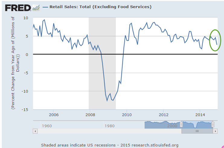
Excluding retail gas sales, retail sales gained 4.8% over last year.

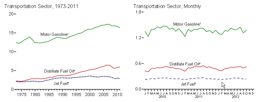
Now, let’s put gas sales in some historical perspective. In January 2007, the price of a gallon of gasoline was $2.10, about the same as it is now. On average, we are driving more fuel efficient vehicles than in 2007, yet total retail gas sales are 25% higher now.
Every six weeks, the Federal Reserve releases their Beige Book survey of economic conditions around the country. They also reported moderate growth in employment and sales. They noted that flat wage growth and low inflation reduces any urgency in raising rates. Friday’s release of the CPI confirmed the low inflation rate. Including gas and food, the yearly increase was only .7%. Core inflation, which excludes gas and food prices, rose 1.7%. Consumer sentiment is nearing the levels of the early to mid-1980s, the beginning of a period of strong growth.
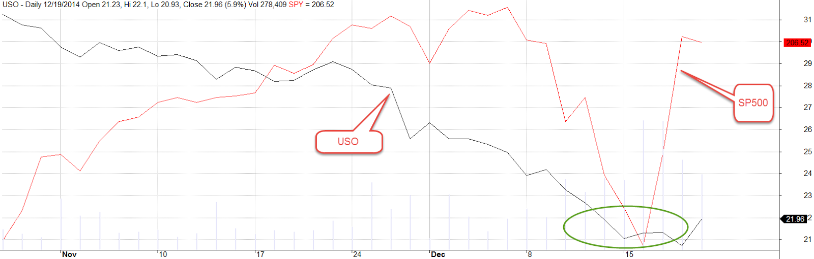
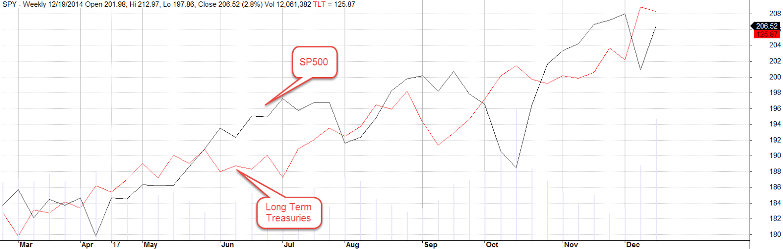
For now, stocks and oil prices are dance partners. In a week of negative sentiment, traders were watching the 1975 level on the SP500. This was mid-December’s bottom, a short-term key level of support. After Thursday’s close near 1990, stocks rallied on the strong consumer sentiment and a report from the International Energy Agency that lower prices are causing some oil production cuts. Fourth quarter earnings season has just begun but if volatility in oil prices remains strong, this may drive market sentiment at least as much as earnings reports.
************************
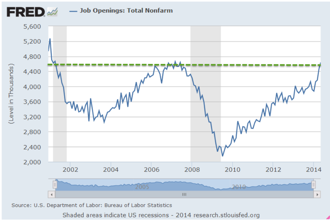
Job Openings (JOLTS)
November’s job openings showed a slight increase, getting ever closer to the 5 million mark and nearing an all time high set in the beginning of 2001 as the dot-com boom was ending. This summer open positions surpassed the mark set in June 2007 at the end of the housing boom.

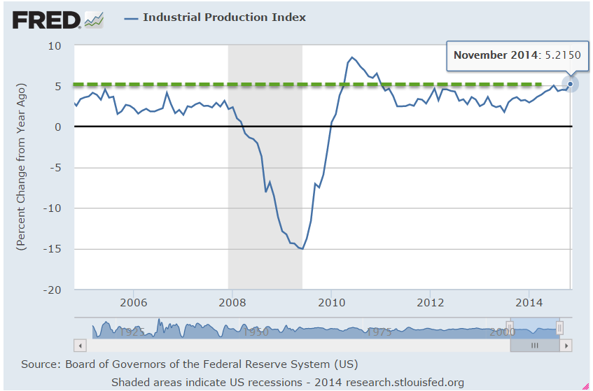
The economy grows stronger on many fronts – labor, retail, housing and industrial production – and is near multi-year high marks without the help of a widespread boom in any one sector of the economy. The surge in oil shale production is confined to a few states.
*************************
Portfolio Allocation
As the market remains somewhat volatile, it’s time to revisit a familiar theme – allocation. Let’s look at a selection of portfolios with moderate allocation. How much difference has there been between a portfolio with 60% stocks and 40% bonds (60/40), and one with 40% stocks, 60% bonds (40/60)?
Earlier in the year, I mentioned a site that can backtest a pretend portfolio. In the free version, the re-balancing rules are fairly simple but it does allow us to make some comparisons of long term trends.
All of the following tests include the years 2000 – 2014, a period which covers two downturns. The first, from 2000 to 2003, was a protracted decline after the dot com bubble. The second, from late 2007 to 2009, was severe.
The test includes an annual re-balancing to get to the target percentages, and assumes a modest investment of $100 each year into a $10,000+ portfolio. Because of the two downturns, it’s no surprise that the portfolio weighted toward bonds did better than the portfolio weighted toward stocks.

The difference between the 60/40 and 40/60 was about 7/10% in annual return. If we were to use intermediate term bonds as a proxy for the bond component of the portfolio, the difference would be even less. In the middle range of allocation models, the differences in returns over a long period of time are probably smaller than what we worry about.
The importance of moderate allocation is illustrated by the following two examples. Let’s consider the period from 1995 – 2014, which includes three market rises and two downturns. Note the ratio: three up to two down. If we compare a portfolio of all stocks to a balanced portfolio of 50% stocks and 50% long term bonds, we see that it is only in the past five years that the all stock portfolio finally meets the return of the balanced portfolio.
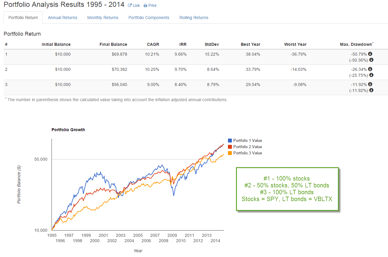
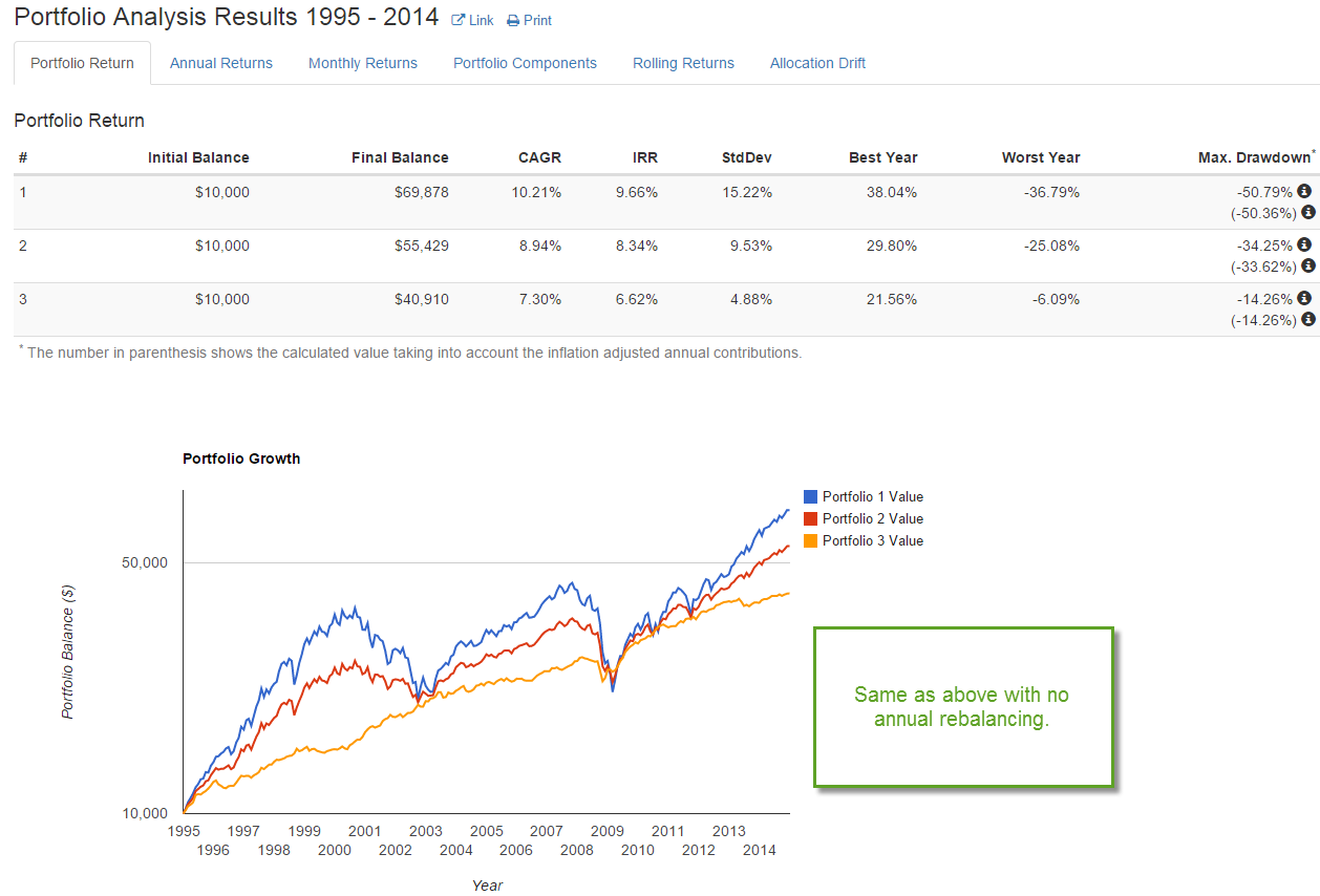
Long term bonds are especially sensitive to changes in interest rates so let’s look at a balanced portfolio of stocks and intermediate term bonds.
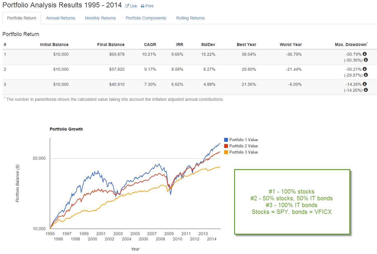
In this case, it is only in the past two years that the total return of the all stock portfolio has outperformed the balanced portfolio. One of the those years included an unusual 30% gain in one year. In short, it is hard to argue against a balanced portfolio over a long period of time.
Lastly, the example below shows a slight advantage to re-balancing a portfolio. However, the additional .2% gain each year should not cause us to lose sleep if we forgot to do this for a few months.
****************************
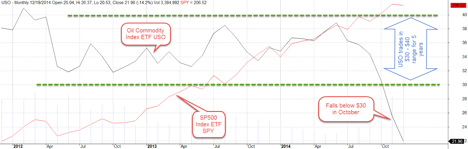
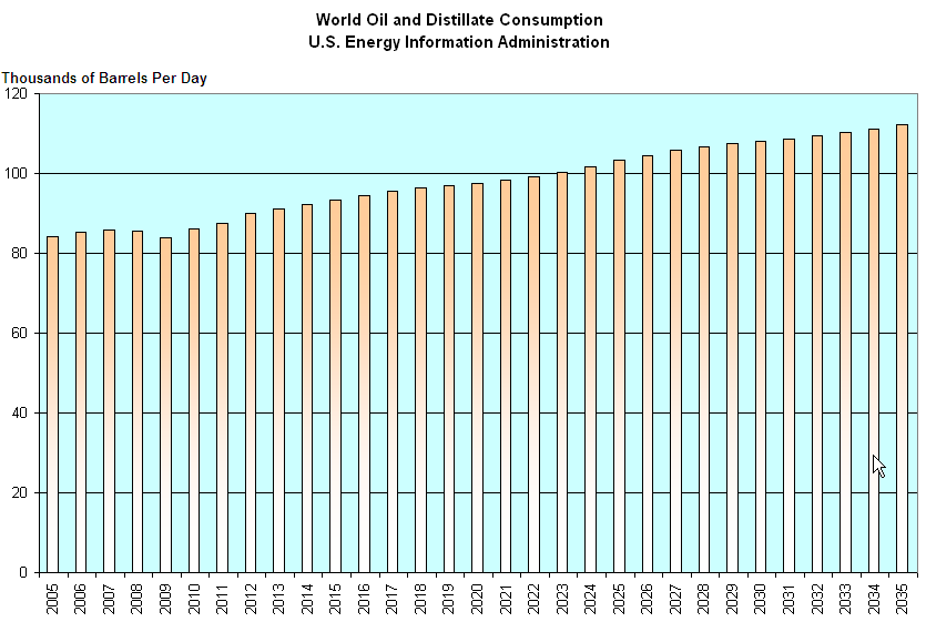
Oil Prices
Oil suppliers are pumping down their inventories as global demand for oil weakens. More product, less demand = lower prices. In a standard economic model, customers want more of a good at a lower price. Suppliers are less willing to supply a good at a lower price. Eventually, suppliers and customers reach an equilibrium at a certain price.
What happens in a price war does not follow this simplified textbook model. Suppliers with deep reserves try to drive out other suppliers by flooding, or at least over supplying, the market, thus driving the price down. More units are bought but at lower prices, so the value of gross sales may be lower even though the units sold is higher than before. The profit on each unit sold, or marginal profit, gets lower and may get negative for a time till the more vulnerable suppliers leave the market.
The governments of Venezuela, Russia and Nigeria depend on oil revenues for much of their income. Should oil prices stay below $50 for half a year or more, these countries will be pressed to curtail social benefit programs and infrastructure projects. The interest rates on their bonds will increase as investors price in a greater risk of default.
Sudden changes produce fractures. Fractures produce frictions. Frictions dissipate in a cascade of minor adjustments or suddenly in a violent upheaval.