Good Times

January 28, 2018

by Steve Stofka

Since the passage of the tax bill about a month ago, the stock market has risen 8%. Some people are convinced that only those at the top own stocks. Any market gains go only to the rich, they say. In the most recent of an annual Gallup survey, 54% of households reported that they directly owned stocks and stock mutual funds (Gallup).  Before the financial crisis, 65% reported direct ownership of stocks.

Private and public pension plans, as well as variable annuity life insurance plans, invest a great deal in stocks. When indirect ownership is added to the mix, a whopping 80% of the stock market is owned by households (Business Insider ). The fortunes of the stock market affect most people, even those on the margins of our economy.

A quarter of companies in the SP500 have reported earnings this month. Annual earnings growth is 12% (FactSet ). In response to the new tax law, companies are bringing home their overseas cash profits and paying Federal taxes on the repatriated profits. Most are predicting strong profit growth for the coming year. Home Depot announced that they are paying bonuses to all their employees.

Since the tax law was signed, the dollar has dropped 5% against the euro. This will make U.S. exports cheaper and more attractive to overseas markets. A euro of profit earned in the Eurozone market was worth $1.07 a year ago when Donald Trump took the oath of office. That same euro is now worth $1.24. Half of the profits of SP500 companies come from overseas, and investors are betting that the dollar will not strengthen substantially in the coming year, despite Trump’s insistence that he likes a strong dollar.

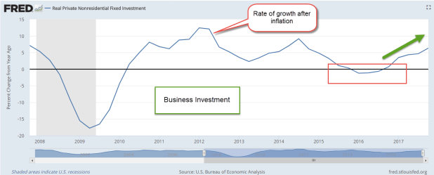
The first estimate of GDP growth, announced Friday, was 2.6%, down from the above 3% performance of the 2nd and 3rd quarters but much better than the 2% and lower rate of growth during 2015 and 2016. The growth of business investment has accelerated over the past four quarters and is nearing 7%.

NonResInvest

Consumer spending grew by 3.8% in the final quarter of 2017, and confidence is near twenty-year highs. Accelerating business investment and a rising stock market help those on the margins of the economy. Unemployment is low. As companies struggle to find employees, they turn to those that they might have turned away a few years ago.

My checker at Target last week had a slight speech defect.  A few years earlier, Target management might have put this person on some duty that did not have such frequent contact with the public, if they hired such a person at all.  Unless there is a specific outreach program, many companies are reluctant to hire those with impediments when there are many able-bodied candidates to choose from.  I was glad to see this twenty-something man employed.

At my local Home Depot a few weeks ago, a guy in a motorized wheelchair helped me locate an item. I got my question answered. Good for him, good for me, good for Home Depot.

A rising tide lifts all boats.  Every day the ever-upward stock market convinces scores of people that they are really smart investors. Many who buy “on the dip” are rewarded as they take advantage of a short term price decline. Some who timidly stayed in cash become convinced that they were too conservative.  They may listen to the market gains enjoyed by their co-workers, family and friends, and feel left out.  How to catch up?  They could take out a home equity loan and use the cash to buy stocks, some leveraged ETFs, or maybe some bitcoin.  Some of those have been on a tear lately.  Hmmmm…

Here’s the thing about a rising tide. A lot of ideas make sense while riding a good tide.


The Bubble of Average

November 26, 2017

by Steve Stofka

December is the 10-year anniversary of the start of the recession that culminated in the Financial Crisis of 2008. Four years later, an investor finally broke even.

Since that breakeven point in early 2012, the total return of the SP500 has more than doubled.  The rising market and historically low volatility sparks predictions of a bubble and a crash. The Shiller CAPE ratio, an inflation adjusted measure of price-earnings, is not as high as the ratio of the dot-com boom but it is very high.  Stocks are expensive.

Let’s turn to some long-term returns for a different perspective. The 10-year annual return is only 8.13%, almost 2% less than the average for the past 90 years. The 20-year return is even worse – just 7%.

From July 2000 to August 2006 an investor made nothing. As a rule of thumb, savings needed in the next five years should not be invested in the stock market. Both downturns are good examples. The 2000-2006 downturn lasted six years. The 2007-2012 lasted more than four years.

Let’s turn to a 30-year period, 1988 to 2017. The period begins just after the October 1987 meltdown. All the froth has been taken out of the market. The 1990s included the historic run up of the dot-com boom. The 30-year return is above average but not by much – .6%.

The most disturbing truth about these averages is the average or below average returns of these periods.  Investor surveys regularly show that people disregard averages and overestimate future returns.  That fantasy is the true bubble.

//////////////////////////

Corporate Taxes

Next week the Senate will attempt to pass a tax cut bill. As I noted last week, both the Senate and House bills cut the corporate income tax to 20%. The administration and Republican lawmakers state that this tax cut will help working families the most. They must be too busy to read the analysis of their own Treasury department.

The Department periodically analyzes the distribution of the tax burden on various types of taxpayers. In their latest analysis, they estimate that labor income bears only 19% of the costs of corporate income taxes. Steve Mnuchin, the head of the department, claims that workers bear 2/3rds of the cost of the corporate tax. He uses this fantasy number to support a corporate tax cut.

Who will benefit most from a cut in the corporate income tax? The report states “the top 10 percent of families bears 72.5 percent of the burden” and will be the winners.

Over the decades, through Republican and Democratic administrations, the cost burden of labor has changed only slightly. Economists might argue the finer points, but the distribution is well understood. Mnuchin’s job is to sell the boss’s tax cuts. Facts be damned and full steam ahead.

The Eclipse of Optimism

August 20, 2017

We are coming up on an anniversary of sorts. Two years ago, the stock market had a series of sell offs in the last week of August. China devalued the yuan, commodity prices around the world swooned, and Greece was in imminent default on its loans. Pictures of empty cities in China prompted speculation that the building boom in China was coming to an end and would bring down the global economy. Over the course of 6 days, the SP500 shed 11%.

By year’s end the SP500 was still slightly below its level at the end of August and did not rise above its mid-2015 price till the summer of 2016. Long term assets at the end of 2015 declined slightly for the first time since the financial crisis (ICI 316 page pdf). There wasn’t a rush for the exits but clearly some investors were spooked. Should I get spooked when the next 10% drop comes?

In the past five years there were 73 daily declines of more than 2% in the SP500 index.  That’s more than one in twenty trading days or about one per month.  2% is more than 400 points on the Dow at current levels.  One bad day per month was relatively mild compared to the previous five-year period from August 2007 to August 2012. Bad days with greater than 2% declines occurred more than once a week!

I wondered if a bad week telegraphed a long term severe decline in stock market prices. Let’s say that within five trading days, the stock market fell 10%, averaging more than a 2% decline on each of those five days. I started my search twenty years ago and each bad week had its own story.

The list:
the LTCM financial crisis of October 1998,
the end of the dot com boom in April 2000,
the week following the attack on 9-11,
the bankruptcy of giant WorldCom and other accounting scandals in July 2002,
the winter months of 2008-2009 during the financial crisis,
the budget battle and fears of the U.S. government defaulting on its debt in August 2011, and the devaluation of the Chinese yuan in August 2015.

In each case investors were jolted by a surprise or some ongoing concern deepened into despair and a rush for safety. In some cases, the crisis ended or a solution was found and the dip was a good buying opportunity. In other cases, the fears signaled a severe and sustained repricing as in 2000–2003 and in 2008-2009.

Let’s say I interpreted a 10% dip as a good time to increase my equities. Imagine the sinking in my belly when stocks continued falling another 20, 30, or 40% as in the two repricing periods above. How could I have been so stupid?

Just as losses of 10% in a week are not reliable predictors of doom, gains of 10% in a week are inconsistent predictors of a market recovery. When bad weeks happen, financial pundits seem so sure that a 50% drop in the market is imminent. The data shows that this is not the case.

Now I’ll turn up the dial and see if I can find any consistency. A drop of 15% in a week is rare. In sixty years, the only instances of this are in October 1987, and October and November of 2008. In each case, there was more pain to come after that initial fall. So, if I happen to be alive when the next 15% weekly drop comes, the market has probably not finished correcting. The only 15% gain in a week was in November 2008, following an almost 20% fall the previous week. Boy, those were the good old days – not.

Since historical data does not give a clear guide for short to mid-term outcomes, my best strategy in reaction to a bout of market darkness may be – gulp! – do nothing. That can be so difficult when I am bombarded with forecasts of catastrophe at those times.  The sun will shine again.  It’s only an eclipse.

Reading the Signs

July 23, 2017

This week I begin with market volatility, or VIX, an index that reflects the price range of short term options on the SP500 index. As I wrote last week, the market has been on a wonderful ride down the river. The waters are strong but calm. No nasty rocks that might upset my raft. As Alfred E. Neuman of Mad Magazine asked, “What, me worry?”

How low can volatility go? The VIX is below 10, a level not seen since a brief moment in November 1993. The market makes new highs while volatility makes historic lows. Some warn of impending doom as though the market were the Titanic. Others predict Dow 30,000.

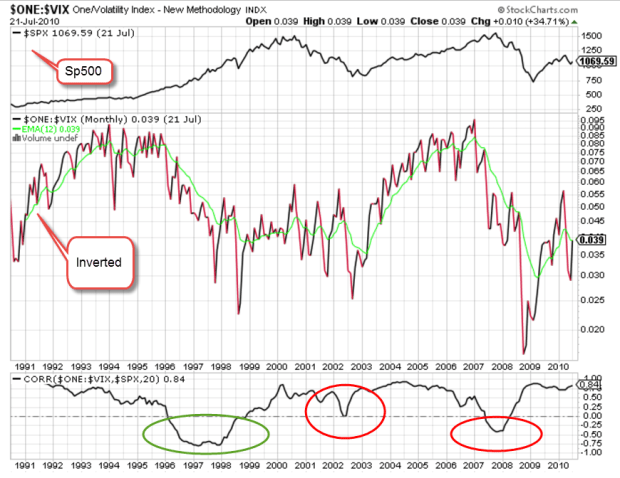
I’ll look at a 20 year period of both the VIX and the SP500 index, from 1990 to 2010. (If you are reading this on a cell phone, the few charts below will be more easily viewed by turning the phone sideways.) The period is marked by 3 strong price trends: 1) the extraordinary price rise in the late 1990s during the dot-com boom; 2) the 50% fall in prices from 2000 – 2003 as the bubble punctured and investment declined; and 3) the recession and financial crisis that began in 2008.

According to models, volatility should move inversely to stocks.  When one zigs, the other zags. By inverting a chart of volatility, I should see a volatility pattern that is somewhat similar to the pattern of SP500 index prices. I’ve added a chart of correlation between the two. I should expect to see a correlation of greater than 50 if things go according to the model.

For most of the twenty years, I do see what we expect. It’s those periods of unusual moves in the SP500 that the relationship breaks down. There is no consistency when the correlation breaks the model.

SPYVIXCorrelation
The green circle highlights the run up in prices of the dot-com boom. If I were to try to form a rule based solely on this mid-1990s behavior, I might say that when the VIX doesn’t behave inversely to prices, I should anticipate a run up in prices.

I’ll now take a look at the financial crisis years 2007 – 2009, the second red circle above. Just as in the late 1990s, the correlation veered away from expectations but this time prices moved in the opposite direction, falling 50%.  So much for my rule making.

The behavior is more complicated still when I look at the correlation pattern in the early 2000s.  The correlation wandered away from what I expected but never fell into the negative, yet prices also fell 50%.

Short-term options on the direction of the SP500 may offer no consistent clues to the long-term casual investor. But then again….maybe I should go long – averages, that is.

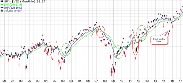
Below is a chart of SPY, a popular ETF that mimics the SP500.  Visual presentations can help me digest a lot of information and relationships. I have divided SPY by the VIX to get a ratio. If the top part of the fraction is supposed to go up when the bottom part of the fraction goes down, the resulting ratio should emphasize any price moves. Here I see a bit more predictability if I concentrate on the 12 and 24 month averages and disregard the noise. There is a lot of noise.

SPY-VIX1995-2017

The 12 month average (blue) runs higher than the 24 month average (green) in upturns and lower during downturns. The transitions may not always be as evident until I turn to the noise. When the current ratio runs below the 12 month average for several months, a downturn is likely. The opposite is true for an upturn. Here’s a chart with these turning points highlighted.

SPY-VIXTurnPoints

Some readers may occasionally want to check this pattern on their own. Without an account at stockcharts.com, someone can still call up weekly charts for free. Type in SPY:$VIX and call up the default daily chart. Above the chart, select the weekly button, then click the Update button to the right. Below the graph, change the default 200 day average to 100 and click Update. You should get a chart similar to the one below.

SPY-VIXWeeklyTurnPts

I have highlighted the turning points. Notice that there is a fairly consistent pattern. For the not so casual investors, you can bring up a daily chart and see similar turning points.

We have not had a 5% price correction in stocks for the past year. Here’s a chart showing twenty years of average performance during the year. We should not be surprised if we see a correction in the next few months but this market continues to befuddle even the most experienced investors.

Across the plains of Africa, the annual migration of wildebeest has crossed into Kenya. To tourists riding in jeeps through the grasslands, the movements of these animals may seem quite random and fragmented.  Tourists riding in hot air balloons above the plains can see the relationship between geography and the animals.  They can see the patterns of movement as the wildebeest follow the valleys and cross the rivers through the grasslands.  Likewise, a few charts of price and volatility can help us visually understand some part of investor behavior.

Price Plateau

October 30, 2016

Market watchers use several indicators to gauge the valuation of the broader stock market.  The P/E ratio (Price/Earnings), P/D ratio (Price/Dividend) and Shiller CAPE ratio (Cyclically Adusted Price/Earnings) are quite common and I will look at a fourth indicator, the percentage gain in the SP500 index over a six year period.  As we will see, when gains reach a certain height, there are two alternatives that follow:  1) a crash or other steep decline in price, and 2) a flattening of price for approximately 18 months.

Use of any of these indicators – PE, PD, CAPE or this one – would not have helped an investor avoid the 2008 crisis.  Why?  Because they gauge valuation.  The 2008 crisis was a financial crisis based on bad judgment and fraud.  At the time of the crisis, the index had  gained 40% in the past six year period, about the average six year gain over the past 140 years.

Average annual gain – 6%

The average annual gain is a bit under 6%.  The median gain is 29% over a six year period, or a 4.2% annual rate.  Add in the current 2% dividend rate and the median expectation is 6.2% annual gains in the stock market based on the past 140 years. Some public pension funds are still using 7.5% expected annual gains and that will probably be the next crisis in the coming decade.

Five Year Rule

Methodology. Why did I choose a six year period?  Did I run a bunch of simulations to get the most dramatic period?  No.  It’s the first number I picked and the reason I picked it is simple:  it is one year more than the five year rule.  Financial advisors will usually recommend that their clients do NOT keep money in the stock market that they will need in the next five years.  Why? The volatility in the market could cause an investor to sell at precisely the wrong time in order to access funds.  Even at the worst depths of the 2008 crisis, after more than 50% losses, the SP500 index was only 11% less than it had been six years earlier.  This is why advisors use the five year rule.

SP500 Data

Below is a chart of the percent gains in the SP500 index after a 6 year period.  I’ll call the six year gains “6Gain” to save some typing.  The data is courtesy of Robert Shiller who wrote the book “Irrational Exuberance” which first introduced the concept of the Shiller CAPE ratio, an inflation adjusted P/E ratio.

1929 Peak

Let’s look at examples of steep price declines when the percent gains have just gotten too high. The 1929 crash was truly historic.  That’s the highest spike in the chart above.  In November 1928, the 6Gain first crossed above the 150% mark that signals an strong overvaluation.  The market should have started to flounder but lax lending rules probably helped fuel further price gains.  Many people with acceptable credit could borrow money against stocks and many did, chasing the strong upward trend in the market.  Over the next ten months the market climbed another 20%.  The decline began in mid-September 1929 (Dow chart) but was seen as a well deserved correction to the summer exuberance. At the end of September 1929, the market had gained 284% in six years, the highest 6Gain on record and a percentage gain that may go unbroken.

…and Crash

In October 1929 the market continued to lose ground, forcing the sale of borrowed securities to meet margin calls.  Margin selling contributed to the downward momentum but the sustained selling woke investors up to the fact that the market had climbed too far and too fast.  The selling culminated in a gut wrenching 23% loss on Black Tuesday, October 29th (Account of crash – I disagree with the author on valuation).

Seeking Average

It took 18 months for the market to correct to a 6Gain that was average (39% over 140 years). By that time in May 1931, the market had lost 55% of its value.  From 1931 to 1936 any money invested in the stock market six years earlier had shrunk. In 1934, six year LOSSES, not gains, approached 60%. My parents grew up during the Depression and were taught that the stock market was a reckless gamble made only by rich people who could afford to lose some of their savings.

Black Monday

These overvaluation crashes are rare, thank God.  The next one came more than 50 years later, on “Black Monday” in  October 1987, when the index lost 20% in ONE DAY, almost as much as Black Tuesday in 1929.  At that time, the 6Gain was 169%.  I can still remember where I was when that one went down. Traders could not get some of their orders filled and that began a panic in the market. Some radio pundits warned of another depression.  I had no savings in the market but I was worried that my relatively new business would go belly-up. Most of the 24% lost in two months was done in that one day.  It took a whopping six years for the 6Gain to fall to average.

The Plateau

Those are the only two examples of severe price crashes because of overvaluation.  The more common result of overvaulation is a plateau, a flattening of prices for about 18 months, followed by by a fork – up or down.  The price plateau simply tells us that a fork in the road is coming.  The over-valuation tells us to expect a price plateau.

The dot-com boom

Let’s look at the dot-com boom in the late ’90s. At the end of 1994, the SP500 index closed at 460.  Less than six years later, in the fall of 2000, the index crossed above 1500, more than triple the price in that short six year period. The 6Gain peaked at 227%. At mid-1999 the SP500 started to stall out above 1350.  Promises of huge profits to be made by internet companies were beginning to evaporate as those companies burned through cash at an alarming rate in their effort to capture a segment of the market. It would take another year before the market peaked near 1500.  By the end of 2000, eighteen months on this rounded plateau, prices were about 1350 again.  For almost two years they declined till the index had lost more than 40% of its value.  Coincidentally, this low was reached when the 6Gain finally dropped to the 140 year median of 29%.

The Fabulous Fifties

Let’s look at some older and milder examples to develop some context. In mid-1955, the index had gained almost 190% in six years. It continued to climb for another 6 – 8 months before falling back.  In the spring of 1957, the index stood at the same level as it had eighteen months earlier.

In mid-1959 the index had gained almost 150% in six years.  The index lost 10% over the next 6 months but by early 1961, about 18 months later, the index had gained back its lost ground.

In mid-1938, we see the same price plateau after a six year gain of 150%.

Recent

As we can see on the chart, these 6Gain spikes are infrequent.  Now let’s look at the most recent spike in the 6Gain – March 2015.  The SP500 index was near where it is today.  In fact, this may be the flattest price plateau in history.  The stock market was overvalued but with bond yields so low, where was an investor to go?  Real estate, commodities, gold and other alternative investments have gone up and down the past 18 months as traders tried to take advantage of mis-matches between expectations and reality.  The trend for the average investor?  No trend.

During this 18 month plateau, the 6Gain has fallen to 82% – a good sign – but still twice the average 6Gain.   Wouldn’t it be nice if there was a law that the 6Gain must fall to the average before the stock market takes on a definite trend in either direction?  No such law.  What we do see with ironclad regularity is a price plateau when the 6Gain crosses above 150% and that the plateau lasts about 18 months.  It has been 18 months and we should be nearing the edge of that plateau.

Closing Thoughts

As October draws to a close, we may have three months in a row where the month ending price (Close) is less than the price at the beginning of the month (Open).  Normally, 3 down months in a row would be a sign of more pain to come but the differences each month have been negligible and could be pre-election hesitation.  There is enough to be hesitant about.  The Shiller CAPE ratio is about 26, 10 points above the median of 16.  Due to declining oil prices, profits in the SP500 aggregate of companies have fallen for five quarters in a row and…

The Election

Trump has been losing ground in recent polls, enough so that the Senate seems more likely to turn Democratic.  This Senate cycle favors Democrats who have fewer seats up for re-election than Republicans.  In 2018, the cycle will favor Republicans.  As the gap in the polls widens, some begin to fear that a rout in the Presidential race could cascade into the House where Republicans hold what seemed to be an impregnable lead of 60 seats (Wikipedia article).  If the Democrats should take the House, they will control the Presidency, Senate and House.  Tax increases on those with upper incomes would be a certainty for 2017, as Hillary has promised.  This could cause a rush of selling in 2016 to avoid higher capital gains tax rates.  An unlikely but not impossible scenario may be contributing to the hesitation.

The Long Road

September 25, 2016

Almost daily I read about the coming implosion in the stock market.  There are only two price predictions: up and down.  One of them will be right.  So far, no catastrophe, so why worry?  Should an innocent investor just Ease On Down the Road? (Video from the 1978 movie).

Unfortunately, the stock market road looks like Rt. 120 south of Mono Lake in California. The road is like a ribbon, marked by highs that are many years apart, more years than the majority of us will live in retirement.  In the graph from below from multpl.com I have marked up the decades-long periods before the inflation adjusted SP500 surpassed a previous high.  It is truly humbling.

It took 23 years for the market to finally surpass the high set in 1906.  Happy days!  Well, not quite.  Several months later came the stock market crash of 1929.  In 1932, the market fell near the 1920 lows.  In 1956, 27 years after the ’29 crash, the market finally notched a new high. In more recent decades, the market spent 23 years in a trough from 1969 to 1992.  Lastly, we have this most recent period from the high set in 2000 to a new high set in 2015.

IF – yes, the big IF – a person could call the high in a market, that would sure be nice, as Andy Griffith might say. (Youngsters can Google this.)  Of course, Andy would be suspicious of any city slicker who claimed to have such a crystal ball.  Knowing the high mark in advance is magic.  Knowing a previous high is not magic.

Looking at the chart we can see that the price in each period falls below the high of the period before it.  In the period marked “1” in the graph, the price fell below the high set in 1892. In period marked “2”, the price fell below the high set in 1906.  In the period marked “3”, the price fell below the high set in 1929.  In this last period marked “4” the price – well, it never fell below the high set in 1969.  The run up in the 1990s was so extreme that the market still has not truly corrected, according to some. Even the low set in 2008 didn’t come close to falling below the highs of that 1969-1992 period.  An investor who used a price rule that had been good for more than a hundred years found that the rule did not apply this time.

In 2008-2009, why didn’t prices fall below the high of the 1969-1992 period? They would have had to fall below 500 and in March 2009, there were a number of market predictors calling for just that. On March 9th, the SP500 index closed at 676, after touching a low of 666 that day.  The biblical significance was not lost on some. Announcements from major banks that they had actually been profitable in January and February caused a sharp rebound in investor confidence.  The newly installed Obama administration had promised some economic stimulus and the Federal Reserve added their own reassurances of monetary stimulus.

Did these fiscal and monetary relief measures prevent the market from fully purging itself?  Maybe.  Are stock prices wildly inflated because the Federal Reserve has kept interest rates so low for so long.  Could be.  How low are interest rates?  In 2013 the CBO predicted interest rates of 3-4% by this time.  They are still less than 1/2%.

How much are stock prices inflated?  Robert Shiller, the author of “Irrational Exuberance,” devised a price earnings ratio that removes most of the natural swings in earnings and the business cycle. Called the Cyclically Adjusted Price Earnings ratio, or CAPE, it divides the current price of the SP500 index by a ten year period of inflation adjusted earnings.  The current CAPE ratio is just below the high ratio set in 2007 by a market riding a housing boom.  The only times when the CAPE ratio has been higher are the periods during the housing bubble (2008), the dot-com boom (2000), and the go-go 1920s when many adults could buy stocks on credit.  Each of these booms was marked by a price bust that lasted at least a decade.

Price rules require some kind of foresight, and crystal balls are a bit cloudy.  There is a strong argument to be made for allocation, a balance of investments that generally are non-correlated, i.e. one investment goes up in price when another goes down.  An investor does not have to frequently monitor prices as with price rules. A once or twice a year reallocation is usually sufficient.

In an allocation strategy, equities and bonds are the most common investments because they generally counterbalance each other. A portfolio with 60% stocks and 40% bonds, or 60/40, is a common allocation. (Some people write the bond allocation first, as in 40/60.)   Shiller has recommended that an investor shift their allocation balance toward bonds when the CAPE ratio gets this high. For example, an investor would move toward a 60% bond, 40% stock allocation.

To see the effects of a balanced allocation, let’s look at a particularly ugly period in the market, the period from 2000 through 2011.  The stock market went through two downturns.  From 2000-2003, the SP500 lost 43% (using monthly prices). The decline from October 2007 to March 2009 was a nasty 53%.  In  2011 alone, a budget battle between the Obama White House and a Republican Congress prompted a sharp 20% fall in prices. During those 12 years, the SP500 index lost about 10%, excluding dividends.

During that period, a broad bond index mutual fund (VBMFX) more than doubled. Equities down, bonds up.  A rather routine portfolio composed of 60% stocks and 40% bonds had a total return of 3.75% per year.  Considering the stock market losses during that period, that return sounds pretty good. Inflation averaged 2.6% so that balanced portfolio had a real gain of about 1.2%.  Better than negative, we reason.  On the other hand, a portfolio weighted at 40% stocks, 60% bonds had a total annual return of 4.75%, making the case for Shiller’s strategy of shifting allocations.

There is also the nervousness of a portfolio, i.e. how much an investor gets nervous depending on one’s age and the various components of a portfolio.  During the 2000-2003 downturn in which the SP500 lost 43%, an investor with a 60/40 allocation had just 14% less than what they started with in the beginning of 2000. Not bad. 2008 was not pleasant but they still had 11% more than what they started with.  That is a convincing case for a balanced portfolio, then, even in particularly tumultuous times.

Can an investor possibly do any better by reacting to certain price triggers?  We already discussed one price rule that was fairly reliable for a hundred years till it wasn’t. The problem with rules are the exceptions and it only takes one exception to bruise an average 20 year retirement cycle.  Another price rule is a medium term one, the 50 day and 200 day averages.  These are called the Golden Cross and Death Cross.  Rules involve compromises and this rule is no exception.  In some cases, an investor may sell just when the selling pressure has mostly been exhausted.  Such a case was July 2010 when the 50 day average of the SP500 crossed below the 200 average, a Death Cross, and triggered a sell signal.  The market reversed over the following months and when the 50 day average crossed back above the 200 day average, a Golden Cross, an investor bought back in at a price 10% higher than they had sold!

The same scenario happened again in August 2011 – January 2012, buying back into the market in January 2012 at a price 10% higher than the price they sold at in August 2011.  These short term price swings are called whipsaws and they are the bane of strict price rules. In the past year there were two such whipsaws, one of them causing a 5% loss.  Clearly, this traditional trading rule needs a toss into the garbage can!  What works for a few decades may fail in a later decade.

For those investors who want a more active approach to managing a portion of their portfolio, what is needed is a flexible price rule that has been fairly reliable over six decades.  As a bull market tires, the monthly price of a broad market index like the SP500 begins to ride just above the two year average.  The monthly close will dip below that benchmark average for a month as the bull nears exhaustion.  If it continues to decline, that is a good indication that the market has run its course.  The price rule is an attention trigger that may not necessarily prompt action.

Let’s look at a few examples.  President Kennedy’s advisors were certainly aware of this pattern when the market fell below the two year mark in 1962.  They began pushing for tax cuts, particularly for those at the highest levels.  Rumors of a tax cut proposal helped lift the market back above the benchmark by the end of 1962   In early 1963, JFK made a formal proposal to lower personal rates by a third and corporate rates by 10% (At that time, corporations paid a 52% rate). An investor who sold after a two month decline suffered the same whipsaw effect, buying back into the market at about 10% higher than they sold.  However, at that selling point in 1962, rumors of tax cuts were helping the market rebound and might have caused an investor to wait another week before selling. The market had  in fact reached its low.

In mid-1966, the SP500 fell below its 24 month benchmark for seven months.  Escalating defense spending for the Vietnam War helped arrest that decline.

The bull market finally tired in the summer of 1969 and dropped below the 24 month benchmark in July.  The index treaded water just below the benchmark for a few months before starting a serious decline of 25%.  More than a year passed before the monthly price closed above the benchmark in late 1970.

The 1973 Israeli-Arab war and the consequent oil embargo threw the SP500 into a tailspin.  The price dipped below the average a few times starting in May 1973 before crossing firmly below in November 1973.  After falling almost 40%, the price finally crossed back above the benchmark in late 1974.  Remember that this was a particularly difficult fourteen year period marked by war, high unemployment and inflation, and a whopping four recessions.  The SP500 crossed below its ten year – not month, but year – average in 1970, again in 1974-75, and lastly in 1978.  Such crossings happen infrequently in a century and are great buying opportunities when they do happen.  To have it happen three periods in one decade is historic.

I’ll skip some minor events in the late 1970s and early 1980s.  In most episodes an investor can take advantage of these opportunities to step aside as the market swoons, then buy back in at a price that is 5-10% lower when the market recovers.

The most recent episodes were in November 2000 when the SP500 fell below its benchmark at about 1300. When it crossed  back over the benchmark in August 2003, the index was at 1000, a nice bargain.  This was another crossing below the ten year average.  The last one was in 2008 when the monthly price fell below the benchmark in January.  Although it skirted just under the average it didn’t cross back above the 24 month average.  In June it began a decline that steepened in September as the financial crisis exploded. Again the index fell below its ten year average. By the time the price closed back above the benchmark in November 2009, an investor could buy in at a 20% discount from the June 2008 price.

In September 2015 and again in February of this year, the index dropped briefly below its 24 month average. They were short drops but it doesn’t take much of a price correction because the index is riding parallel with the benchmark, above it by only 100 points, or less than 5%.  Corporate profits have declined for five quarters.  The bull is panting but still standing.

As we have seen in past exhaustions, there is a lot of political pressure to do something.  What could refuel the bull market? Monetary policy seems exhausted.  The Federal Reserve has indicated that they will use negative interest rates if they have to but they are very reluctant to do so.  Just this past week, the Bank of Japan (BOJ) indicated that their policy of negative interest rates is not helping their economic growth.  The BOJ had started down a negative interest rate path and has now warned other central banks not to follow.

What about fiscal policy? The upcoming election could usher in some fiscal policy changes but that seems unlikely.  Donald Trump has joined with Democrats advocating for more infrastructure spending but that is unlikely to pass muster with a conservative House holding the purse strings and a federal public debt approaching $20 trillion.  Only sixteen years ago, it was less than $6 trillion.  Democrats keep reminding everyone that the Federal Government can borrow money at very cheap rates.  However, the level of debt matters and Republicans will likely control the money in this next Congress.

Managing an entire portfolio with a price rule is a bit aggressive but might be appropriate for some investors who want to take a more active approach with a portion of their portfolio.  This price rule – or let’s call it guidance – is more a pain avoidance tool than a timing tool.
Midpoints

July 3, 2016

A week after crash-go-boom in the stock market following Brexit, the British vote to leave the European Union, the market recovered most of the 5 – 6% lost in the two days following the vote.  The reaction was a bit too intense, inappropriate to an exogenous shock, the vote, whose consequences would take several years to develop. In last week’s blog I had suggested that the market drop was a good time to put some IRA money to work for 2016.  This was not some kind of magic insight.  Each year’s IRA contribution amount is a small percentage of our accumulated  retirement portfolio.

Buying on market dips can be an alternative strategy to regular dollar cost averaging since the market recovers within a few months after most dips, although the recovery is at a slower pace than the fall.  Fear can cause stampedes out of equities; confidence grows slowly.  As an example of an abrupt price decline, the SP500 index fell almost 7% in five days last August, then took more than two months to regain the price level before the fall.  The 12% price drop at the beginning of this year was more gradual, occurring over six weeks.  The recovery to regain that lost ground also took two months, from mid-February to mid-April. In the latter quarter of 2012, the market also took two months to erase a 7% price decline from mid-October to mid-November.

The price level of the SP500 is near the high mark set in May 2015, more than a year earlier.  Only in the past year has the inflation-adjusted price of the SP500 surpassed its summer 2000 level (Chart and table).  Nope, I’m not making that up. The stock market has just barely kept up with inflation for the past 15 years. The inability of the stock market to move higher indicates that buyers are not attracted to the market at current price levels.  The absurdly low interest yields on bonds makes this caution especially puzzling.  As stock prices recovered this past week, prices on long term Treasury bonds should have fallen as traders moved into more risky assets.  Instead, bond prices have risen.  As the price of long term Treasuries (ETF: TLT) broke through its January 2015 high  on Friday, the last day of June, traders began betting against treasuries (ETF: TBF).

Those who are concerned about the return OF their money, the safety searchers buying bonds, are competing against those seeking a return ON their money.  VIG is a Vanguard ETF that focuses on company stocks with dividend appreciation, and is favored by those seeking some safety while investing in stocks. TLT is an ETF of Treasury bonds for those seeking safety and, as expected, pays more in dividends than VIG.  Rarely do we see a broad stock ETF like VIG have a yield, or interest rate, that is close to what a long term Treasury bond ETF like TLT has.  At the end of this week, VIG had a dividend yield of 2.15%, just slightly below TLT.  Why are investors/traders bidding up the price of Treasury bonds?  Some 10 year government bonds in the Eurozone have recently crossed a dividing line and now have negative interest rates.  The low, but positive, interest rates of U.S. Treasury bonds look like big open flowers to the busy bees of institutional investors around the world.

In a large group of investors, buy and sell decisions tend to counterbalance each other.  Occasionally there are periods when such decisions reinforce each other and create a precarious imbalance that all too often rights itself in an abrupt fashion.  Bubbles and – what’s the opposite of a bubble? – are iconic examples of this kind of self-reinforcing behavior.

In another week we will mark the middle of the summer season.  The All-Star game on July 12th occurs near the halfway mark in the baseball season and advises parents in many states that there are still five to six weeks before the kids head back to school.  Our mid-40s is about the midpoint of our working years, a reminder that we need to start saving for retirement if we have not done so already.  It has been seven years since the market trough in March 2009.  Let’s hope that this is the midpoint of a 14 year bull market but I don’t think so.

Next week will be chock full of data before the start of earnings season for the second quarter. We will get the June employment report as well as the Purchasing Managers Index.  In this time of short, sharp reactions to news events, we can expect continued volatility.

/////////////////////////


Earnings


Pew Research just released a comparison of earnings by racial group and sex that is based on Census Bureau surveys, the same data that the BLS compiles into their monthly employment reports.  My initial criticism of the Pew Research comparison was that they used the earnings of full and part time workers.  Women tend to work more part time jobs so that would skew the earnings comparison, I thought. Thinking that a comparison of full time workers only would show different results, I pulled up the BLS report which groups the data by sex, only to find out that the differences between the earnings of men and women was about the same.  At the median, women earn 82% of men.


An even more depressing feature of the BLS report is that median weekly earnings have barely kept ahead of inflation during the past decade.  This wage stagnation provides a base of support for the criticisms voiced by former Presidential contender Bernie Sanders in a recent NY Times editorial.
Like a truck stuck in the mud, households are spinning their wheels without making much progress.  In the coming months, Donald Trump and Hillary Clinton will try to sell themselves as the tow truck that can pull average American families out of the mud. Well, it would be nice if they would conduct their campaigns in such a positive light.  The truth is that each candidate will try to convince voters that voting for the other candidate will get American families stuck deeper in the mud.  The conventions of both parties are later this month.  Expect the mud to start flying soon after they are over.  By election day in November, we will all be buried in mud.

Inequality

April 17, 2016

In a 1996 article in Mother Jones magazine economist Paul Krugman (now a N.Y. Times editorial writer) explored the possible causes for growing income inequality.  Yes, twenty years ago income inequality was a “thing.”  A more recent study using hard granular data contradicts a widely held belief that income inequality has grown substantially in the past four decades.

I’ll look first at the older piece by Krugman.  I should note that Krugman was writing for a popular magazine, not an academic journal.  As with his weekly column for the N. Y. Times, Krugman’s goal is to sell his audience a story, to stir up the pot.  Critics who judge an editorial column with the same rigor as an academic paper should be forced to write “I will be kinder to my fellow human beings” one thousand times with a #2 Ticonderoga pencil till they get little pencil indentations in the pads of their fingertips.

Some, including a few contenders in the current Presidential campaign, sound the alarm.  “We’re shipping jobs overseas!”  Well, Krugman considered imports to be a possible cause for inequality but found that imports of goods from third world countries, where wages are markedly lower than the U.S., were only 2% of national income.  Stopping imports from those countries would have but a small effect on workers’ wages.

What about technology? Krugman asked.  As an example of technology, Krugman noted that the educational level of schoolteachers and corporate CEOs are approximately the same yet there is a wide chasm between the compensation of those in these two professions.  If Krugman were my brother-in-law at a Thanksgiving dinner, I’d have argued with him on this one.  “Hey, Paul, whaddayatawkin?!” I would have said, “CEOs are managing way more employees and capital than any teacher!”  Paul would have agreed with me, of course, and apologized for the error of his ways and I would have passed him the cranberry sauce.

 A 2013 study by Faleye, et. al., published in the Journal of Banking and Finance, used a systematic analysis of a salary and pay database to calculate the ratio of CEO pay to the average pay of an employee in the ranks of the company.  They identified and ranked a number of factors to explain the Pay Ratio, as I’ll call it. They found that three factors, ranked in effect, were most important, and by a wide margin:
1) size of the firm, or market cap;
2) tenure of the CEO;
3) return on assets, or profitability of the firm in a given year (Table 3).
Of those three factors, the first two factors, size and longevity, influenced the Pay Ratio far more – three times – than the third factor, the return on assets.

Let’s look at the first factor: the size of the firm.  We’ll use the stock market capitalization (CAP) as an indicator of size.  In the post war period from 1957 to 1980, 23 years, the CAP in the U.S. increased by 2.5 times.  In the subsequent 35 years since 1980, that CAP shot upwards over 13 times, even after two severe market downturns!!

So, CEOs are being paid to be responsible for the deployment of a lot of capital.  Remember, the return on assets (#3 factor) was much less important, so CEOs are being paid even if they don’t do particularly well with that capital in a given year.  Factor #2 was longevity so we can guess that CEOs who do perform well stay in the post.  Those who don’t get the proverbial boot.

Let’s turn to “Fee for service” financial advisors for a comparison.  Advisors typically charge 1 – 2% to manage money for their clients.  Naturally, an advisor – or CEO – who manages a combined $100 million will make more than one who manages $10 million.  The workers at each firm may earn approximately the same but the CEO of the larger firm should make more money and greatly increase the Pay Ratio.

What else can skew the ratio upward?  Using a mean, or average, rather than the median, the halfway number in a data set. The authors of this study found that average CEO pay was almost twice the median CEO pay, indicating that a relatively small number of very well paid CEOs skewed the average upward.  Krugman and other economists (Robert Reich, for example) touting inequality in the popular press use average, not median, CEO pay simply because the average shows a higher ratio than the median. “Whaddayadoin?!” I’d have to challenge Paul at the dinner table.   “In this case, an average gives a distorted view of the data,” I would protest.  Paul might smirk knowingly and grab the last helping of mashed potatoes while I was protesting his dirty, no good argumentative trick.

This study included 447 firms whose total revenues averaged almost $2 billion.  Apple had $600B in revenue last year so the study included both mega firms and large firms.  They found that the median Pay Ratio was 52, not 331 as the AFL-CIO claims, or 150 times, as Krugman claimed in this 1996 article.  Why are there so many different CEO ratios?  The mega companies like Apple, GE and Microsoft will naturally have the highest CEO ratios.  Organizations like the AFL-CIO who want to promote the idea of inequality might use only the pay data from the SP100, the top companies in the world.  In a popular magazine article, the writer doesn’t have to share the characteristics of the data set as one would do in an academic paper so it is relatively easy to convince readers of a particular point of view by careful selection of the data.

As companies have grown in size over the past three decades, the number of named executive officers (NEOs) in each of these large companies have grown.  As companies get bigger, the duties of these NEOs begins to approach that of the CEOs of yesteryear. To compare apples to apples, then, we would do better to compare the salaries of today’s NEOs with the CEOs of 1970. The 2013 study found that the NEO ratio was 23 times the average worker pay, much less than the Pay Ratio of 35 in 1970.  If we average the Pay Ratio (CEO) of 52 in this study and the NEO ratio of 23, we get an average of 37, just about the same as in 1970.

Regardless of the data, most of us are either convinced or not convinced that the Pay Ratio has increased dramatically in the past fifty years.  Our convictions are similar to our tastes – white meat or dark – in turkey.  We can only agree to disagree and know deep down in our hearts that we are, of course, right.

Re-pricing the Market

January 31, 2016

In the closing moments of one of the “big ape” films, the very large gorilla Mighty Joe Young saves the girl, placing her on a boat as an island in the Pacific, broken by a volcano, falls back into the sea.  The bandaged hand of the big ape reaching out of the roiling waters is the last we see of the movie’s star.

On Friday morning, the Bank of Japan (BOJ) surprised the world by cutting it’s funds rate to a negative .1% from a positive .1%, vowing to fight the deflation and lack of growth that has plagued the Japanese economy for two decades.  As the island’s economy collapses under the weight of its aging population and lack of immigration, the bank thrust its arm above the Pacific waters to save – well, the entire Japanese population.  Could be the script of another big ape movie or a Godzilla sequel.

The first estimate of fourth quarter GDP was released Friday morning and the news was not good, which meant that the news was good, get it?!  GDP growth for the last quarter was positive, not negative, but less than 1%, so traders figured that the Fed will not raise interest rates again in March.

#3 in the combination was positive earnings surprises from Microsoft and Facebook, among others. Thursday was the busiest day of the earnings season.  #4 The price of oil continued to climb above the near rock-bottom benchmark of $30.  All of these factors were the impetus for a stock market surge of 2-1/2% on Friday and helped soften a really bad start to the year.  For the month, the index fell 5%.  During the month, revisions to earnings estimates for 2016 fell about the same amount – 4.7% (Fact Set).  In short, the stock market re-priced itself.

********************

Taxes

As the primary season approaches and millions of Americans receive their W-2 earnings record in the mail, Americans turn their attention to the cheery subjects of incomes and income taxes.  Here’s a Heritage Foundation chart of the effective payroll tax rates and income tax rates for the five quintiles of Americans based on income.

Those in the lowest quintile making less than $25K pay a combined rate of 2.1%.  Those in the next quintile making less than about $47K pay a combined rate of 6.6%.  Those in the next higher quintile making less than $80K pay 12.2%.  The top two quintiles pay 14.7% and 21% respectively.  It is easy to understand why many in the upper quintiles feel that they are already paying their fair share of taxes.

The fault in these calculations is that they neglect the employer’s portion of the payroll tax which is paid indirectly by the employee in the form of a lower wage.  Including that portion would add another 7.5% to 8% to the lower quintiles, a bit less to the top two quintiles.  Here’s a chart showing the total payroll tax burden since the Social Security Act was passed in the 1930s.

Should the rich pay more in taxes?  Yes, says Democratic Presidential contender Bernie Sanders.  Many Americans do not realize that we are in the top 10% of global incomes, the world’s fat cats.  Should Americans pay a global fairness tax of 10% or so?  This money would then be redistributed to poorer people around the world.  That is the world that Mr. Sanders is aiming toward.

**************************

Consumer Problem Survey

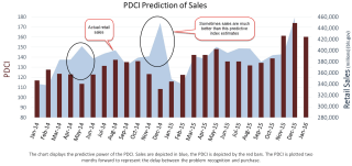
Over the past several thousand years people have developed numerous tools to predict the future.  Reading chicken bones, tea leaves and other forms of augery have given way to mathematical and statistical modeling.  The folks at Georgetown have developed a predictive tool to estimate consumer spending. Using a survey methodology researchers ask consumers what problems they have and which ones they are planning to solve in the coming months. These can be the payment of taxes, needing a new computer, iPad, or cell phone, the purchase of new home, etc.  Based on these responses, the researchers compile a Problem Driven Conumption Index (PDCI).  In the spring and early winter of 2014, the predictive index badly under-estimated retail sales.

However, the approach brings an essential understanding of the challenges American families face.  In a 2013 survey, respondents reported having many problems for which they see no solutions.  We learn that men and women have a few problems in common but confirm the axiom that each sex really does see the world differently.  The researchers are able to chart the shifting patterns of problems as we age.  This problems based approach is another statistical tool in the field of behavioral finance.

The Volatility Scare

January 24, 2016

Last week I wrote that I smelled capitulation.  When the Dow Jones (DJIA) dropped more than 500 points on Wednesday, I smelled burnt barbeque.  Historically, there is a weak correlation between the price of oil and the stock market.  In the past few weeks the 20 day correlation between the oil commodity ETF USO and the SP500 is .97, meaning that they are chained to each other in lockstep.  If that relationship continues throughout the month, investors can expect a continued bumpy ride.

Several factors helped indexes recover in the latter part of the week. After dropping near $26 a barrel, oil rebounded above $30 at the end of the week.  Mario Draghi, head of the European Central Bank (ECB), indicated that the bank was prepared for additional stimulus.  Sales of existing homes climbed in December, indicating a level of confidence among U.S. families.

Since the first of the year, investors have withdrawn $26 billion from equity mutual funds and ETFs (Lipper), offsetting the $10 billion inflow into equities in the last week of 2015.  Fund giants Fidelity and Vanguard report that their customers have been net buyers of equities despite the turbulence.

Volatility (VIX or ^VIX at Yahoo Finance) in the last half of the week dropped to the 8 year average of about 22.  We have enjoyed such low volatility in the past few years (mid-teens) that investors are especially sensitive to price swings.  For a long term perspective, here is a chart showing some multi-year averages of volatility.

A few weeks ago, I noticed an acronym for the 2008 Global Financial Crisis – GFC.  The memory wound is still fresh for many. Older investors with their working years largely behind them may feel even more vulnerable in times of higher market volatility.

*******************************

Fund Fees

Employees in 401K plans may not know how much money they are paying in fees each year.  One of the charges is what is called a 12b-1 fee, and you will need to breathe slowly into a paper bag while you read about this one.  Each fund has an investment advisor to administer the fund’s investments and the fund pays a fee for this service.  In addition, under some plans, the advisor charges the fund holders a separate marketing and distribution fee, the so called 12b-1 charge, to promote the fund through sales materials or broker incentives.  Wait, you might ask.  Shouldn’t marketing expenses be part of the advisor’s fee? Well, you would think so.

The Annual Report that accompanies your 401K statement might list one of the funds you are invested in as “Blah-Blah-Blah Growth Fund, Class R-1,” hoping you are going to sleep.  The R-1 class means the fund is charging you 1% for marketing and distribution fees. Here is a glossary of the classes of mutual funds and the percentages of 12b-1 fees.  In addition, funds have  varying sales or redemption fees which are denoted by a letter class for the fund, i.e. Class A, B, C.  The Securities and Exchange Commission (SEC) explains these here.

The  SEC has a FAQ sheet explaining the various fees.  These charges might seem small but they add up over a working lifetime.  The SEC provides an example  of the 20% difference in value between a fund that charges 1.5% fee each year and one that charges .5%.  FINRA, the industry group that certifies and regulates financial planners, has a mutual fund expense calculator that enables an investor to compare fund expenses by their ticker symbols.

I compared an American Funds Class A Balanced Fund ABALX that might be found in a 401K with a Vangard Admiral Balanced Index Fund VBIAX over a ten year period.  Taking the default assumptions of a 5% return on an initial investment of $10K, I had $1670 more in the Vanguard fund after the ten year period, or an additional 3 years of return.

Some 401K plans make it more difficult to compare performance or fees.  They may list a fund whose ticker symbol is not listed on any exchange but is a “wrapper” for a fund that is listed.  The only way to find out that information would be to look at the prospectus or other materials for the 401K fund or visit the web site of the 401K plan administrator.  How likely are many participants to do that?  That’s the point.