July 23, 2017
This week I begin with market volatility, or VIX, an index that reflects the price range of short term options on the SP500 index. As I wrote last week, the market has been on a wonderful ride down the river. The waters are strong but calm. No nasty rocks that might upset my raft. As Alfred E. Neuman of Mad Magazine asked, “What, me worry?”
How low can volatility go? The VIX is below 10, a level not seen since a brief moment in November 1993. The market makes new highs while volatility makes historic lows. Some warn of impending doom as though the market were the Titanic. Others predict Dow 30,000.
I’ll look at a 20 year period of both the VIX and the SP500 index, from 1990 to 2010. (If you are reading this on a cell phone, the few charts below will be more easily viewed by turning the phone sideways.) The period is marked by 3 strong price trends: 1) the extraordinary price rise in the late 1990s during the dot-com boom; 2) the 50% fall in prices from 2000 – 2003 as the bubble punctured and investment declined; and 3) the recession and financial crisis that began in 2008.
According to models, volatility should move inversely to stocks. When one zigs, the other zags. By inverting a chart of volatility, I should see a volatility pattern that is somewhat similar to the pattern of SP500 index prices. I’ve added a chart of correlation between the two. I should expect to see a correlation of greater than 50 if things go according to the model.
For most of the twenty years, I do see what we expect. It’s those periods of unusual moves in the SP500 that the relationship breaks down. There is no consistency when the correlation breaks the model.
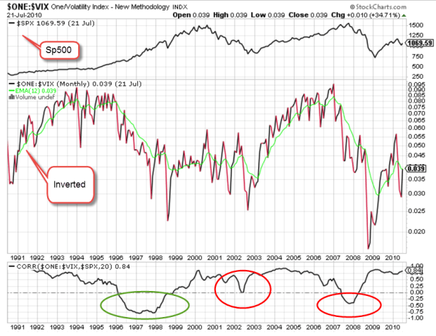
The green circle highlights the run up in prices of the dot-com boom. If I were to try to form a rule based solely on this mid-1990s behavior, I might say that when the VIX doesn’t behave inversely to prices, I should anticipate a run up in prices.
I’ll now take a look at the financial crisis years 2007 – 2009, the second red circle above. Just as in the late 1990s, the correlation veered away from expectations but this time prices moved in the opposite direction, falling 50%. So much for my rule making.
The behavior is more complicated still when I look at the correlation pattern in the early 2000s. The correlation wandered away from what I expected but never fell into the negative, yet prices also fell 50%.
Short-term options on the direction of the SP500 may offer no consistent clues to the long-term casual investor. But then again….maybe I should go long – averages, that is.
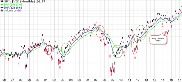
Below is a chart of SPY, a popular ETF that mimics the SP500. Visual presentations can help me digest a lot of information and relationships. I have divided SPY by the VIX to get a ratio. If the top part of the fraction is supposed to go up when the bottom part of the fraction goes down, the resulting ratio should emphasize any price moves. Here I see a bit more predictability if I concentrate on the 12 and 24 month averages and disregard the noise. There is a lot of noise.

The 12 month average (blue) runs higher than the 24 month average (green) in upturns and lower during downturns. The transitions may not always be as evident until I turn to the noise. When the current ratio runs below the 12 month average for several months, a downturn is likely. The opposite is true for an upturn. Here’s a chart with these turning points highlighted.
Some readers may occasionally want to check this pattern on their own. Without an account at stockcharts.com, someone can still call up weekly charts for free. Type in SPY:$VIX and call up the default daily chart. Above the chart, select the weekly button, then click the Update button to the right. Below the graph, change the default 200 day average to 100 and click Update. You should get a chart similar to the one below.

I have highlighted the turning points. Notice that there is a fairly consistent pattern. For the not so casual investors, you can bring up a daily chart and see similar turning points.
We have not had a 5% price correction in stocks for the past year. Here’s a chart showing twenty years of average performance during the year. We should not be surprised if we see a correction in the next few months but this market continues to befuddle even the most experienced investors.
Across the plains of Africa, the annual migration of wildebeest has crossed into Kenya. To tourists riding in jeeps through the grasslands, the movements of these animals may seem quite random and fragmented. Tourists riding in hot air balloons above the plains can see the relationship between geography and the animals. They can see the patterns of movement as the wildebeest follow the valleys and cross the rivers through the grasslands. Likewise, a few charts of price and volatility can help us visually understand some part of investor behavior.
