Price Illusion

January 8, 2023

by Stephen Stofka

This week’s letter is about price illusions. The past two weeks I have written about the need to sort through past events to find the lessons. The past is a teacher, not a goal. Those who idealize and revere the past must eventually be swept down the drain of time. During this week’s struggle to elect Kevin McCarthy as House Speaker, the more conservative members of the Republican Party voiced their desire to return the country to the past of more than a hundred years ago when the population of 112,000,000 was a third the current size. Instead of learning from the past, we often use elements of history to tell a story. We discard events that do not fit our narrative. Historical analysis serves political interests. Asset analysis suffers from similar distorting strategies.

Technical analysis studies price movements with little regard for the circumstances that prompted the supply and demand, the buying and selling that underlie those movements. I will pick a few such variants at random. Elliott Wave theory bases its interpretation of price movement on the Fibonacci sequence of numbers. Beginning with 1, 1 this number series is constructed from the sum of the previous two numbers in the series. Thus 1 + 1 = 2, 2+1 = 3, and so on. This simple rule produces a sequence found in plant growth and the development of nautilus shells, for example.

Elliot Wave analysis claims that price movements come in waves. Understanding the current position within a wave can help an investor predict subsequent price action. The system is famously prolific in its prophecy, indicating several interpretations. It is better suited to a post hoc narrative. An investor can believe that if they just got better at interpreting the waves, they could time their buying and selling. As the physicist Richard Feynman said, “The first principle is that you must not fool yourself, and you are the easiest person to fool.”

Another technical system relies on the recognition of price trends, identifying those to follow and those that signal a likely reversal. These are visual and geometric, full of rising wedges, head and shoulders price patterns, double tops and bottoms. Much human behavior is repetitive, tempting an investor to perceive a pattern then extend it into the future. The repetition hides the recursive or evolutionary nature of human thinking. Inertia, Newton’s First Law of Motion, may apply to inanimate objects but not to human behavior. Biological systems have built-in dampeners that counteract a stimulus. Without repeated stimulus, the formation of any possible pattern decays.

Price behaves like a biological organism, not an inanimate object. We can see beautiful symmetries in graphical chart analysis but each pattern formation has a unique history. Price is the visible point of a response to events, needs and expectations. Price is a story of people. George Soros, a highly successful investor, constructs a predictive story, then watches price only as a confirmation or refutation of the story. If Soros thinks his story is not unfolding as he predicted, he exits his position.

In school we encountered various branches of mathematics where we were given formulas and plotted data points or intersections, the solutions to a set of equations. Statistics is the reverse of that process. We are given data sets and try to derive formulas to explain relationships within the data. A data set might be the test scores of students before and after the initiation of a certain curriculum. We may represent the test scores on a graph, but the scores reflect a complex set of individual behavior and circumstances, institutional policies, cultural background and economic resources. A statistical analysis tries to include some of these aspects in its findings. A student population is likely more homogenous than the companies in the SP500 stock index who represent a variety of industries. Just as test scores cannot fully explain the efficacy of a school policy or curriculum, asset prices do not reflect the complexity of a day’s events. In our longing for predictability and our fondness of patterns, we prefer analysis that explains price action as a rational sequence of responses to economic, political and financial events. Much financial reporting is happy to oblige.

//////////////////

Photo by FLY:D on Unsplash

Ugly January

January 17, 2016

The ever-strengthening dollar and growing inventories of crude led to a plunge in the price of a barrel of West Texas Intermediate (WTI) which fell below $30.  I remember hearing some analyst on Bloomberg about a year ago saying that oil prices could go as low as the $20 range.  HaHaHaHa!  A popular basket of oil stocks, XLE, is about half of it’s July 2014 price, falling 25% in the past two months and almost 10% in the two weeks. Here’s a tidbit from the latest Fact Set earnings brief: “On September 30, the estimated earnings decline for the Energy sector for Q1 2016 was -17.7%. Today, it stands at -56.1%.”  Ouch!

Volume in energy stocks this week was more than double the three month average.  It smells like capitulation, that point when a lot of investors have left the theater.  Investors who do believe that the theater is on fire, as it was in 2008, should probably stay away.

What the heck is going on?  This Business Insider article from June 2015 (yes, six months ago) explains and forecasts the money outflows from China and emerging markets.  Pay particular attention to #4. This Bloomberg article from this week confirms the capital flight from China as investors anticipate a further devaluing of the yuan.

4th quarter earnings reports will begin in earnest in the following week.  If there are disappointments, that will magnify the already negative sentiment.

**********************

Death Cross

No, it’s not the title of a Fellini movie.  The merits of technical analysis can be more controversial than a Republican Presidential debate, but here goes.   The 50 day average of the SP500 crossed above the 200 day average, a Golden Cross, at Christmas, then crossed back below the longer average this week, a Death Cross.  A Golden Cross is a positive sign of investor sentiment.  The Death Cross is self-explanatory.  A crossing above, then below, happens infrequently – very infrequently.  The last two times were in 1960 and 1969 and the following months were negative.  After January 1960, the market stayed relatively flat for a year.  In June 1969, it marked the beginning of an 18 month downturn.  There was an almost Golden Cross followed by a Death Cross in May 2002.  A similar 18 month downturn followed.

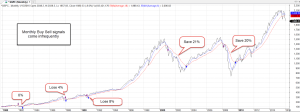
Longer term investors might use a 6 month short term average and an 18 month longer average, selling when the 6 month crosses below the 18 month, buying back in when the one month (or 6 month average in the case of more volatile sector ETFs) crosses back above the longer average. Like any trading system, one takes the risk of losing a small amount sometimes but avoids losing big.

Trading signals are infrequent using monthly average prices.  Note that the sharp downturn of the 1998 Asian financial crisis did not trigger a sell signal.  The six month average of the SP500 as a broad composite of investor sentiment is above the 18 month average but several sectors have been sells for several months: Emerging markets (June and July 2015), Energy stocks (January 2015), and European stocks (August 2015).  Industrials (XLI) have taken a beating this month and will probably give a sell signal at the end of the month.

John Bogle, founder of Vanguard, recommends that long term investors look at their statement once a year and rebalance to meet their target allocation, one that is suitable for their age, needs and tolerance for risk.  In that case, don’t look at your January statement.  As I wrote a few weeks ago, it could look ugly.

********************

CPI

In 1998, the Boskin Commission estimated that the Consumer Price Index (CPI) over-estimates the rate of inflation by an average of 1.1%. In 2000, the NBER (the agency that determines recessions) revised their methodology and their estimate of the over-statement to .65%.  In 2006, Robert Gordon, a member of the original committee, re-examined subsequent CPI data and the methods used by the committee.  His analysis re-asserted that the over-statement was at least 1%.

Although this academic debate might seem arcane, the implications are enormous, particularly in an election year.  Presidential contender Bernie Sanders is gaining momentum on Hillary Clinton (HRC) by repeatedly asserting that the inflation-adjusted incomes of working families have declined since 1973.  Although Mr. Sanders makes no proposals to stimulate economic growth, he has many redistribution plans to achieve economic justice.  If inflation has been overstated for the past few decades, then Mr. Sanders’ argument is logically weak but emotionally strong.  More importantly, neither side of the political aisle can even agree on a common set of facts.  The other side is not evil, or stupid, or disingenuous. The disagreement over methodology is legitimate and ongoing.

China, Oil, Treasuries and Stuff

August 2, 2015

An exciting and unnerving ride this past week as the Chinese market fell 8% on Monday and finished out the week about 10% down (Guardian here  and analysis here).  If trading had not been halted in a number of companies, the damage could have been much worse.  In the past year the Shanghai Composite has shot up 150% as individual investors piled into the market with both their own savings and borrowed money. Despite the loss of 14% for the entire month of July, investors in the Shanghai index are still up 13% for the year.

Let’s turn to the U.S. where the SP500 index has gained 6% since the downturn in October 2014.  Below is a chart of SPY, an ETF that tracks the SP500 index.  MACD is a common technical indicator that follows market trends.  The most common setting is to compare 12-day and 26-day price averages (the MA in MACD) and measure the convergence and divergence (the C and D in MACD)  Comparisons of longer time periods can clarify overall trends in sideways markets like we have experienced this year.  The chart below compares the 30-day and 72-day averages (blue line). The red line is a signal line, a 15-day average of the blue line.  The market seems to be at the end of a mildly positive cycle  that has been in place for nine months.

We may see a renewed move upwards but the near zero reading of the past few weeks indicates the uncertainty in the market.  Earlier this year, the price of long term bonds went down (yields went up) in anticipation of rate increases from the Federal Reserve. Counteracting that trend in the past month, long-term bond yields have gone down (U.S. Treasury) as investors bid up treasuries in the hopes that the Fed will delay raising rates till after September.

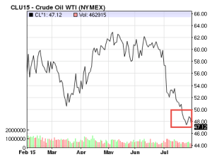
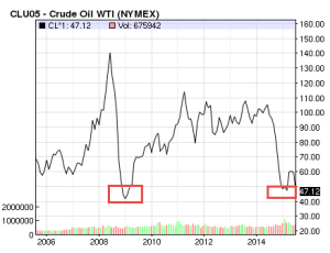
On July 22, the price of of a barrel of West Texas Intermediate (WTI) oil broke below $50 (NYMEX). Two previous times this year the price has come close to the psychologically important $50 mark only to rise back up.  Now traders are concerned that the U.S. Energy Information Administration’s (EIA) short term estimates of oil reserves and rig counts may not be accurate.  “When in doubt, get out” has been a recent refrain.

Let’s  go up in our time balloon to see why the breaking of this price point has some traders worried.  The last time WTI broke $50 was in the 2008 meltdown.

China’s growth is slowing.  Europe is idling in neutral.  Forecasts for global economic growth are subdued = low demand and this is why commodity prices are at ten year lows. Positive economic growth in the U.S.  may be the only bright spot in this global forecast.