In March 2000, I cursed myself as I watched the SP500 cross the 1500 mark for the first time. Almost a year earlier, I had given in to my conservative instincts and paid off the mortgage with some savings. In 1999, my choice had been partially driven by a suspicion that the stock market was a bit overvalued. In 2000, I could see I was wrong; that I just didn’t understand the new economy. Had I invested the money in the stock market, I would have made 15% in less than a year.
When I set the time machine to election day 2016, I see that the index stood at about 2130, 40% higher than the 2000 benchmark. But wait. An asset is only worth what I can trade it for. Year by year, inflation erodes the real value of that asset. When I compare real values (BLS inflation calculator), the SP500 index on election day was almost exactly what it was in March 2000.
As the year 2000 passed into 2001 and the stock market fell from its heights, my decision to invest in real estate exemplified a golden word in investing: diversify.
Since the election, the SP500 has risen about 10%, as investors speculated that Republicans will usher in a new era of de-regulation and lower taxes. By mid-March, banking stocks had shot up over 25%. This past Monday, the 20th, the Freedom Caucus confirmed that they had the “no” votes necessary to block Thursday’s scheduled House vote on the Republican health care bill, AHCA. Banking and financial stocks, thought to be the biggest beneficiaries of less regulation, higher interest rates, and infrastructure spending, lost 5% over several days.
The Freedom Caucus is a group of 30-40 Republican House members who came to office in 2010 on the Tea Party wave. Led by North Carolina Representative Mark Meadows, the Caucus adheres strongly to conservative principles as they define them. They are chiefly responsible for driving out the former House Speaker, John Boehner. While strict adherence to principle – “my way or no way” – worked well as an opposition movement when Obama was President, the Caucus’ unwillingness to compromise is problematic under the current one-party rule. Can Republicans govern?
Paul Ryan, the current Speaker of the House, delayed the vote until Friday. House leadership and the White House tried to come to some compromise that would bring the Freedom Caucus on board without alienating the more moderate Republican members. With no support from Democrats, the additional no votes from the Freedom Caucus meant that Ryan could not muster the majority needed to pass the bill. Shortly before the scheduled vote at 4 PM on Friday, Ryan called off the vote.
The stock market is a herd attempt to predict and price what the world will be like in six months. As events catch up with forecasts, stock prices correct. Passage of the bill was supposed to be a key step toward tax reform if the Republicans want to pass a tax bill using Reconciliation rules, which require only a majority in the Senate.
With more than a half hour left in the trading day, the market had time to sell off 2 – 3%. And? Nothing. Did the bulls and bears cancel each other out in a flurry of trading? Nope. There was no unusual surge of volume in stocks. Either the market had already priced in the defeat of the AHCA, or buyers and sellers were left undecided.
Investors take a “risk off” approach during periods of uncertainty, moving toward gold (GLD) and long dated treasuries (TLT). Both have risen a few percent in the past two weeks but each is short of their January and February highs. Since mid-March, the SP500 (SPY) has lost a few percent. This tells me that investors had already adopted a more cautious stance.
President Trump has indicated that he wants to move on to tax reform and an infrastructure bill as well as the building of some type of defense perimeter on the border with Mexico. Perhaps investors hope that the lack of cohesion among Republicans on the health care bill will not sidetrack them from passage of these other bills.
The defeat of this bill is sure to empower the Freedom Caucus on further legislation. They were a thorn in John Boehner’s side and will no doubt frustrate Paul Ryan as well.
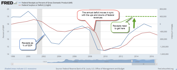
/////////////////////////////////
Existing Home Sales
We had a warm February in most of the country. Realtors reported good foot traffic but, but, but…a lack of affordable housing has turned away many first time home buyers. Home prices have been rising at double the growth in wages. While Feb’s numbers declined from a strong January, YTD existing home sales are more than 5% ahead of last year’s pace.
Regional declines varied: the northeast at -14% and the midwest at -7% led the list. The decline in the west was almost -4% but cities in California and Colorado report the fastest turnaround times from listing to sale. The San Jose region reported an average of 23 days.
Here’s February’s report from the National Assn of Realtors