The Presidential Baton

January 29, 2017

Welcome to the new site, Innocent Investor.  You can easily reach this blog by entering innocentinvestor.com into your browser. Loyal readers can resubscribe by clicking the RSS Feed button at the bottom of this blog.  For a few weeks, I will post up a short entry at LucreTalk.blogspot.com in order to activate existing RSS feed subscriptions.

I think readers will love the presentation of both text and graphics in this WordPress format. I plan to integrate comment balloons so that a reader who is unfamiliar with a term like “GDP” can hover over the word and a quick explanation of the term will appear.

On the menu at the top of each page is an item labeled “Tools.” That page is under construction but will include many of the resources I have mentioned over the course of the past eight years.

/////////////////////////

The Presidential Baton

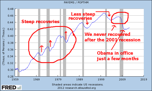
After the Trump inauguration, President Obama and his family boarded a helicopter bound for Andrews Air Force Base. The headline U-3 unemployment rate was less than 5%, half the level when he had taken office eight years earlier. In that time, the SP500 stock index had almost tripled. Consumer Confidence has risen from 61 in January 2009 to almost 100 as he left. GDP has been growing for 30 quarters.

Good job, Mr. Obama. Thanks for your leadership during a very bad economic crisis, and have a good life. Wouldn’t it be nice? History is a messy business. Presidents endure a lot of stress, their families make major compromises and yet half of us focus on their faults.

Let’s revisit another President who took office during very bad economic times, Ronald Reagan. When he assumed the leadership role, we were on the tail end of a recession, and still deep in an energy crisis. Interest rates and inflation were more than 10%, small business loans were about 20%, and the unemployment rate was 7.5%.

Reagan made the difficult decision to let Fed Reserve chief Paul Volker take some monetary measures to bring down interest rates, knowing that those actions would probably send the economy back into recession.  Unemployment rose 3% to 10.8%, GDP fell 2-1/2% and stayed negative for four quarters.  Inflation came down from 10% to less than 5% in that year long recession, providing an environment for businesses to grow and consumers to borrow.  Real GDP started growing at rates greater than 5%, and in 1984, Reagan was re-elected by a landslide over Walter Mondale.

A historic tax reform bill capped Reagan’s second term in office.  Like health care, tax reform is notoriously difficult because there are so many powerful interests involved. Although the Soviet Union did not officially collapse until 1991, the democratization process began in 1987 and conservatives have built a narrative that credits Reagan for the collapse. Like the executive of any large corporation, a President takes the credit and the blame.

A President’s administration rarely escapes scandal, and Reagan’s second term was so riddled with scandal that his own Vice-President, H.W. Bush, had to distance himself from Reagan’s policies in Bush’s 1988 Presidential bid. Iran-Contra and the S&L crisis were the most conspicuous of the scandals, but the Keating 5, and the HUD and EPA Grant Rigging to influence elections indicated an administration with lax ethics.

Let’s turn back to the first few months in former President Obama’s first term.  Almost daily came the announcement of another major American company near bankruptcy. In February 2009, a few weeks after Obama’s inauguration, the credit rating firm Moody’s estimated that 15 large companies were close to bankruptcy in the coming year.

The list included Rite-Aid drugstores with 100,000 employees, Chrysler with 55,000 workers, Blockbuster with 60,000 employees, and Six Flags Amusement Parks with 30,000 workers. One of the companies, Trump Resorts with 9500 workers, went into bankruptcy within a month of Obama’s inauguration.

During Obama’s first two years he was able to get some fiscal stimulus enacted and, like Reagan, took on a historic task – health care reform. The tax bill of 1986 was passed by voice vote (Govtrack) so we don’t know the vote by party.  However, the Democrats held the house at that time so nothing could be done without bipartisan bargaining. On the other hand, the health care reform was passed without a single Republican vote. A hostile voter reaction to Obamacare swept the Republicans into control of the House in 2010. The Republican House stymied attempts at further stimulus or much of any fiscal policy to alleviate the economic suffering.

The policy burden of economic recovery rested on the shoulders of the Federal Reserve, who were forced to be extremely accommodative to avoid another recession. Throughout this long and slow recovery, the Fed’s monetary tools have been stretched thin to the point of ineffectiveness.  For several years, they have wanted to raise interest rates to a more normal range of at least 2%. This past year, Chair Janet Yellen felt confident enough to bump up rates by a mere 1/4% in December.  This left the key interest rate in a range of just .5% – .75%.

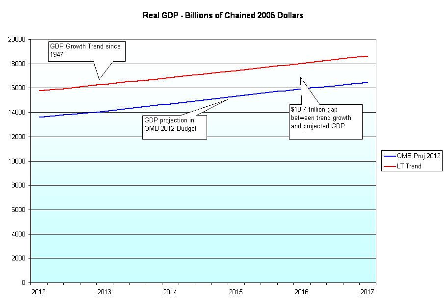
With one party government Donald Trump has promised to get a languidly growing economy into high gear. GDP growth in the 4th quarter slowed to 1.9%, bringing annual growth in 2016 to a disapointing 1.6%. The post-WW2 growth rate is more than 1% higher.

The bond market is estimating that the Fed will raise interest rates three more times this year. This attempt to normalize interest rates may frustrate the Trump administration, since rising interest rates tend to curb economic growth.  President Trump will likely voice his antagonism but Chair Janet Yellen has pledged to serve out her full term, which expires in February 2018.

//////////////////////

Best President for Stock Market

So you were having a friendly conversation with a co-worker about Obama’s legacy and you mentioned that Obama had been the best President ever for the stock market. The conversation turned not so friendly and the issue was left unresolved because neither of you could find the information at the time. Well, here’s the chart

returnsbypres

Coolidge, the President that many of us forgot in history class, ranks top with annual gains of 25%.

The chart ranks the Presidents by Total Return during their term(s) in office.  Because term lengths vary, a truer rank is by annualized return (many times the rankings are the same). Coolidge tops the list in both categories. #2 is Clinton, #3 Obama, #4 Reagan. The worst on the list were #19 Hoover, and #18 G. W. Bush.

Economic Activity Indexes

July 14th, 2013

A few weeks ago I wrote about a constant weighted index (CWI) of the monthly Purchasing Managers survey. Presented by economist Rolando Pelaez in a 2003 paper, the CWI assigned various fixed weights to the separate components of the survey.

The Purchasing Managers Index, or PMI, covers manufacturing industries, now a relatively small part of economy.  In the past thirty years, our economy has become dominated by service industries which are surveyed separately each month.  The composite of the non-manufacturing survey is the Business Activity Index, or BAI.

Two weeks ago, June surveys for both sectors indicated a very slight expansion.  The service sector edged up but is hardly robust.

Wanting to see what a composite Manufacturing, Non-Manufacturing index would look using Mr. Pelaez methodology, I combined the components of each survey, assigning 70% to the service sector and 30% to the manufacturing sector.  Did I get out my R statistics program and run multiple regressions to find the combination of percentages that fit the historical data best?  No.  While the manufacturing sector is less than 20% of the economy, it has powerful influences on the service industries in a community.  How much effect?  Using my gut, I came up with 30%.

The results surprised me.  The graph below starts in 1997 and includes the latest June figures.  It compares this composite index, labelled M+NM (manufacturing and non-manufacturing), with the service sector BAI and the SP500 stock market index.  The composite index loosely follows the  BAI, which is an easily available index that an investor can find by typing in “Fred Business Activity Index” into Dr. Google.

The chart shows a divergence between the recent rise in the stock market and the recent decline in business activity.

Let’s take away the clutter and look at the BAI itself.  Growth has slowed but this may just be a normal dip in the business cycle – nothing to be alarmed about.

For the past month the stock market has been trading on whether the Fed, and China, can keep holding up the world’s economy.  Corporate earnings this past quarter are expected to show lackluster growth, economic activity indexes are showing a somewhat lackluster expansion – and the stock market makes new highs.

It’s a head scratcher.

11 Year Labor Recession

Sitting down?  Good.  Put the kids to bed?  This is not suitable for young minds.  Below is the number of employees per capita during the past fifty years.(Click to enlarge in separate tab)

Job growth after the recessions of the 1960s, 1970s and early 1980s were fairly steep.  The declines in employment were fairly mild in the 1960s and 1970s.  The back to back recessions of 1980 through 1983 led to the first sizeable drop in employment but that became the new normal for employment declines.  In the early nineties, we experienced another equally dismal decline and the employment recovery this time was not so hearty but eventually employment levels exceeded the previous peak before the recession.  In the beginning of the 2000s, we experienced yet another steep decline but this time was different.  China had joined the World Trade Organization (WTO) in 2001 and many manufacturing jobs were shipped off to newly built facilities in China.  Our labor market has never recovered.  The housing bubble during the 2000s led to some growth but we never surpassed the peak before that 2001 recession.  Per capita employment is now at the same depressed level that it was in the early nineties.

During this election season, we are hearing a lot of rhetoric about job growth and job loss but it is mostly focused on the past 4 – 5 years.  We need to step back and understand just how long this sub-standard job growth or job recession has been going on – over a decade.

The swell of the boomer generation is only just beginning to retire.  Some in their early sixties who have lost a job and can’t find another have simply given up and are retiring early, taking an involuntary 25% cut in retirement benefits for the rest of their lives simply because they need the money to pay the rent or mortgage, to buy food and pay the utility bills.  Look at the chart again and understand that job growth policies need to be dramatic to climb up above the employment peak of 2000.  What is dramatic?  Tax incentives for businesses to relocate factories in the U.S. and tariffs on imported goods to protect American manufacturing.  Over the past decades, politicians on both sides of the aisle have chopped away at tariffs until the U.S. has the lowest tariffs of all developed countries.  With each decade have come more tax and employment policy disincentives to hire workers here in the U.S.

Which candidate for President or Congress has discussed or advocated policies that would dramatically spur growth?  None that I have heard.  “More drilling for oil” or “more energy jobs” may add some jobs but the number is insignificant in relation to the problem.  “Infrastructure investments” may likewise promote some jobs in the construction industry but the job gains are tiny fractions of the large scale job growth we need.

Look at the graph again – this time without my scribbling.  Every gray horizontal line is 6 million jobs.

Let’s zoom in on the past 13 years. Each gray line is 3 million jobs.

To reach just the same level of per capita employment at the peak of 2000, we need 12 million jobs!  So here’s the question I have for all members of Congress and for both candidates for President:  what policies do you advocate that will help create 12 million jobs? 

March Labor Repot

This past Friday the Bureau of Labor Statistics (BLS) released the monthly labor report, showing job gains of 120K, far below the 200K expected.  The unemployment rate dropped 1/10th percent to 8.2% as over 100K people quit looking for work.  Contrary to a popular myth, when someone runs out of unemployment benefits they do not drop out of the workforce as long as they are continuing to look for work.

Although this report was a disappointment, the economy has added 247K jobs per month over the past quarter.  As I have done the past few months, I will look beyond the seasonally adjusted headline numbers to the unseasonally adjusted year-on-year job gains of the core work force.  These core figures tempered my enthusiasm in January and February and, as you will see, temper my disappointment in March’s headline numbers.

The core work force, men and women aged 25 – 54 years old, continues to show accelerating job gains.  In February, the year over year (y-o-y) gain was 350K.  In March, the gain was 374K, a modest gain but still gaining. A decline in that gain would be cause for worry.

This core work force metric is a powerful leading indicator of the health of the economy, as I will show below in this monthly chart of y-o-y job gains or losses.  January 2008 was the first month that year over year gains slipped below 0 and proved to be the canary in the coal mine that the economy was weakening.

Let’s expand the picture as I have done the past few months, looking at the larger pool of workers aged 25+. The March y-o-y gain did decline somewhat from 2079K to 2048K.  While job gains are strong, the acceleration has reversed.  Did the record breaking warm winter weather push spring hiring forward into January and February?  Could be. Does the March 34K loss in retail jobs largely account for this slight dip in job gains?  Could be.

There are several long term trends that are cautionary, revealing some structural weaknesses in the economy and the recovery.  The number of people who want work but have not looked in the past four weeks, referred to as discouraged workers, was  essentially unchanged. The number of long term unemployed was unchanged.  The average work week fell .1 hours and the income gains of workers shows an annual increase of only 2.1%.  However, the number of people working part time because they could not find a full time job fell almost 10%, an encouraging sign.

In short, this is a mixed report but one that I see, on balance, as more encouraging than discouraging.

GDP Growth Curve

In the 10 months till the election in November, we are going to hear a lot of rhetoric about economic issues because this election will be mainly about the economy.  Obama will say that his administration inherited a bad situation, which is true.  How did it get so bad?  Obama will blame greed and a lack of regulation.  He and others of his political beliefs will insist that, given the severity of the crisis, the federal government should have done more – more stimulus, more programs.  He will make the case that these programs are working – just not as fast as hoped.

The Republican nominee will assert that the Obama administration simply does not understand how our economy works.  More policies and regulations only dampen growth by making the economic climate even more uncertain. The nominee will assert that his administration will unleash the entrepreneurial growth that is embedded in the American spirit.

You may believe the former or the latter or believe in a mixture of these two points of view. 

To help understand the big picture, let’s climb high on our flying carpet and look at GDP growth these past sixty years.  From 1947 to mid-2007 we have enjoyed a 3.42% annualized growth rate of real GDP.  According to Census Bureau, our population has grown just a smidge more than 1% per year since 1952.

Using data from the Federal Reserve, below is a chart of actual annualized real GDP and the curve of growth since 1947.  During the 60s, robust manufacturing to supply a recovering Europe and government spending on the Vietnam War helped fuel a higher growth rate.  Democrats ushered in a new era of federal social programs, including Medicare, Medicaid and other social welfare programs.  Prosperity and compassion bred promises.

We’ll come down a bit from the heights and zoom in on the past thirty years.  For some of those years, GDP growth ran slightly above the longer term growth trend.  Consumers increased their borrowing as a percentage of their disposal income, contributing to the above the curve GDP growth.

The recession of the early nineties led to lower taxes for states and municipalities in the middle of the decade.  To balance the books, local politicians negotiated with state and local government employee unions, substituting employee health and retirement benefits – future costs – for pay increases.  Thus, penny pinching bred more promises.

Social Security, Medicare, Medicaid, the Food Stamp program (SNAP), WIC and other transfer programs sprang forth from what is one of the best attributes of human  beings – our compassion. 

In the 1930s, many watched in horror as older people lived their last few years in destitution.  Through no fault of their own, many had lost their life savings when banks had gone under at the start of the Depression. At the time, few lived past 70 years.  Why not create a fund that would collect money from all workers so that a small pension would be available to seniors in their last years? Who would have predicted that social security payments would grow from less than 1% to over 20% of federal spending in 70+ years?

Who knew that spending on a health program for seniors, Medicare, would grow a 100-fold from $5B in 1967 to $500B in 2009?(Source)

How are we going to pay for these promises?  Each year, the administration makes projections when it presents its budget to the Congress.  For the 2012 budget, the Office of Management and Budget (OMB) at the White House projected real GDP for the next 10 years. The chart below is based on those figures.

As you can see, these are not rosy or dour predictions.  They simply follow the same growth curve this country has had since WW2.  But the implications are enormous.  In the past four years, we have had a $6.5 trillion gap between where the economy should be at and where we are at.  The gap during the next five years will be over $10.7 trillion so that in the space of almost ten years we will have “lost” over $17 trillion in real GDP.

During the election cycle we will hear promises of policies designed to kick start growth but they will be empty promises.  How is anyone running for election or re-election going to significantly increase a growth curve that has been in place for 70 years?  Such a change would require some structural changes to the economy and politics of this country. 

In the past year, the Congress has proved that they are incapable of even small change – other than name changes to their local Post Office.  Each Congressperson, each Senator is loyal to principles, to their party, to their constituents, to the special interests that help them stay in office and, as a body, are not capable of making big changes very quickly.  Yet in the next ten months we will hear how one man – yes, one man, the next President of the U.S. – will make those changes happen.  Millions of Americans will vote, hoping that somehow, some magic way, it could be true.  Millions of Americans won’t vote, disgusted with our political process and despairing that there is any hope for constructive, sensible change in this country.  For those Americans who do vote, it will be a 2 for 1 special.  As in most elections, only half of eligible voters vote, effectively giving each voter a free extra vote.

We are going to have to find a way to talk constructively about graduated spending cuts on programs of compassion as well as programs of fear (defense).  Secondly, we need to have sensible discussions of policy changes which will help nudge the GDP growth curve up just a tiny bit.  The economy of this country is like the Titanic.  No one man or woman, no one Congress can make a big change in course – although there is a machinery of political pundits whose job is to convince you that it is so – just like in the movies. Long term trends are powerful forces, difficult to overcome.  I vote for the person who acknowledges that fact and is willing to sit down at the table and talk turkey.    

New Year Rising

As we start off the new year, things should start to improve in the U.S. economy.  As I mentioned in my “Year in Review” blog last week, the recession is finally almost over.  Real GDP has finally surpassed the level it was back in 2007.

Another indicator that the recession is almost over – household debt as a percentage of disposable income, or income after taxes.  Household debt includes mortgages, car payments, student loans and credit cards.  As the chart below shows, U.S. households have finally paid down, cut back or defaulted on a lot of debt since 2007.  We started to  reduce our debt load during the recession of 2001 but the 9/11 attacks prompted a wave of patriotic purchasing encourged by the Bush administration and aided by easy home refinancing. (Click to enlarge in separate tab)

We are still short of a healthy 14 million in sales of cars and light trucks but sales continue to increase from the depressed levels of late 2009.

As I noted last week, retail spending is still not back to the levels of 2006 – 2007 but those retail sales were fueled by people charging far more than they could reasonably pay for.  When I look at inflation adjusted, or real, retail sales from 1947 – 2001, the trend line (mine) projects real retail sales in 2011 of about $160B. 

What did we have in 2011?  Over $170B!

Last week I was rather dour in my assessment of this half-assed economy but I was taking a short term view, comparing sales and GDP today to the bloated bubble levels of 2007, an unrealistic comparison.

Construction spending has cratered in the past four years as we wring out the excesses of the past decade.

But when I draw trend lines showing growth we can see just how inflated the construction bubble was from the mid-90s till 2007.

In the past two years we have formed a “bottoming” pattern that indicates that the downward slide in spending has ended.

Well meaning but bad policies, poorly regulated mortgage brokers, consumers eager to get in on the housing gravy train, banks playing 3 card monte with bundled mortgage security products, politicians eager to please and get re-elected – so many factors that led to an overgrown forest.  And then the fire.  Now there are green shoots emerging.

Before you get to singing “Happy Days Are Here Again”, there are some fundamental long term – decades long, long term – concerns and trends that I will look at this weekend after I sharpen my red pencil. 🙂

Health Care Costs Rise

April 30, 2011

Opponents of the Affordable Care Act (ACA), derisively referred to as Obamacare, often cite the individual mandate to buy insurance as the chief objection to the act.  Most Americans do not like to be told what to do, whether it is paying taxes or buying insurance.  Proponents of the Act defend the individual mandate by likening it to the requirement to buy auto insurance.  Opponents say that a person can choose not to drive a car, thus making auto insurance an inherently optional choice.   ACA leaves no option.  If you breathe, ACA says you need to have insurance.  So, how did we get to a point where the government tells us we have to buy health insurance?

In 1986, the COBRA act mandated that any emergency room that took Federal money must take care of anyone coming into the emergency room.  The bill originated in a Democratic House, but was passed in the Republican Senate and signed by a Republican president.  Since almost all emergency rooms received either Medicare or Medicaid dollars, it meant that the Federal government would now start telling private hospitals which patients they should treat.

New York City is at the forefront of most reforms.  One of the world capitals of trade and finance, NYC has a large and diverse population crammed into a relatively small space.  Problems in this urban pressure cooker surface earlier than in other areas of the country.  In the 60s, NYC passed a law mandating that any hospital emergency room that received any kind of city money had to treat people whether or not they could pay.  In the late sixties and early seventies I worked in a large privately owned hospital in NYC.  Working part of that time in the emergency room, I saw that not only did hospitals not have a choice in who they could treat but that the patients no longer had a choice either.  Whether in response to possible litigation or by law, an injured person who refused to be taken by ambulance to a hospital was assumed to be under stress and not in their right mind from the injury.  The ambulance drivers were instructed to bring in the patients whether they wanted treatment or not. The emergency room would routinely get injured homeless and drunk patients who had to be coerced into receiving treatment.  Gunshot victims, sometimes anesthetized by alcohol, heroin or other drugs, fought against care, complaining that it was only a flesh wound.  As you can imagine, some of these protesting patients were not a lot of fun to treat.  Patients used the emergency room for runny noses, gassy stomachs and acne flare-ups.  Parents brought their young daughters in upon their first menstruation.  It was particularly challenging to keep the more gruesome gunshot wound, knife stabbing and car accident victims separated from those with less violent complaints and illnesses. 

Today, that emergency room scene plays out daily in hospitals around this country.  The COBRA act provided no federal funding for this mandate of mercy, forcing hospitals to invent creative accounting and pricing policies to offset the cost of charity care.  In a recent publication, an  American Hospital Association survey reported that charity care has increased 20% since 1980.

The real charity care though is not the relatively small 6.1% of total hospital costs that uncompensated care accounts for.  Rather it is the increasing share of patient visits that are covered by Medicare and Medicaid.  As the chart above shows, M & M care accounted for 44% of hospital costs in 1980.  In 2009, it had grown to 55%, with much of that increase coming from Medicaid, the low income insurance program.  Neither Medicare or Medicaid pay the full cost of care.  The chart below shows the growing shortfall in just the last 12 years.

From almost zero in 1997, underpaid hospital costs have grown to over $35B in 2009.  Where do the hospitals get the difference that they lose in treating Medicare and Medicaid patients?  By jacking up reimbursements from those with private insurance.  The chart below shows a 20 year history of the extra that hospitals charge private insurance companies to make up the shortfall in Medicare and Medicaid payments.

This past week, I received the renewal rates for my company’s health insurance program – a 17% increase.  Double digit rate increases have been normal for the past eight years but this year’s increase is the highest yet, surpassing the 13.4% increase a few years ago.  In the face of rapidly rising health insurance premiums, small companies who want to get and keep quality employees face a formidable challenge in providing health insurance to their employees.  Whether one agrees with all the elements of the ACA, small business owners have known for the past decade that something had to be done.

As the chart above shows private insurance companies pay an additional 34% to hospitals to make up for payment shortfalls from Medicare and Medicaid insured patients.  The insurance company passes on that increase to its customers and the resulting cost shifting means ever rising insurance rates.  As the number of Medicare and Medicaid patients continues to grow, the cost shifting will increase in proportion.  Each states sets the Medicaid reimbursement rate for that state.  With many of them experiencing severe budget shortfalls, reimbursement rates will fall, accelerating the cost shift to private insurance patients.

During the upcoming 2012 election campaigns, we are unlikely to hear about the complexities of cost shifting. Politicians have to convey their summary of the problem in two sentences or less.  Is that the fault of politicians or the voters? Republicans will say rising insurance rates are because of Obamacare.  Was it Obamacare that caused the double digit increases during the Bush years?  Democrats will say that the ACA is the cure for the double digit increases of the Bush years.  That’s what I like about election campaign rhetoric – everything is so simple and easy to understand.

Budget Balloon

I ran across this article at the Motley Fool over the weekend and it is well worth a look because the author, Morgan Housel, has laid out a table comparing the various expenditures of 2007, the current fiscal year 2011, and the recent budget proposal for the coming year 2012.  The comparison with 2007, before the recession began, is an informative baseline.

Back To The Future

President Obama released his 2012 budget proposal yesterday. House Republicans continue to sort through spending cut proposals for this year’s budget before they tackle the fiscal plan for next year. At about 15% of GDP, Federal revenues are the lowest in more than 50 years, prompting calls for higher taxes on the rich or draconian spending cuts. Over the next few weeks and months, the “budget battle” will drag on. You don’t need to wait for the blow by blow description. It has already been written – over 30 years ago.

Change some of the names and the dollar amounts in this 1978 Time article and you will have a fairly accurate description of the fiscal fight. In fact, you won’t need to change some of the names. Alice Rivlin, recently a member of the bipartisan Debt Commission, was then Director of the Congressional Budget Office. In 1978, she said “If you’re really concerned about the growth in Government, then you have to go after the uncontrollables.” That was the word then for entitlement programs and they have proved to be exactly that – uncontrollable. More than 30 years later, have they become any less uncontrollable?

Hell House

If you rent you probably won’t be interested in this post.  If you own a house, even if it’s paid for, this AP article on false foreclosures by some of the biggest banks in America may surprise and anger you.  If your house is paid for and you receive a foreclosure notice, you might think that it is a simple paperwork mistake that can be cleared up with a few phone calls to the mortgage company filing the foreclosure.  You conclude that they have the wrong address on their records or a name that is similar to yours – mistakes that can be easily rectified.  You may find that you have just entered the twilight zone.

As you read the article, pay attention to the dates when these incidents occurred.  In one case, it has been fourteen months since the mistake was brought to the mortgage company’s attention and they are still “resolving” what should be a simple paperwork mistake that should take a few days.

Oh, and if you are out of a job, some law firms have several positions open as Vice-President for Foreclosures.   No experience necessary.