Stormy Seas

December 23, 2018

by Steve Stofka

For the past two months, the stock market’s volatility has doubled from late summer levels. The Fed announced its intent to continue raising interest rates in 2019 at least two times, and the market nosedived in response. It had been expecting a more dovish policy outlook from Chair Jerome Powell.

What does it mean when someone says the Fed is dovish, or hawkish? Congress has given the Fed two mandates: to manage interest rates and the availability of credit to achieve low unemployment and low inflation. That goal should be unattainable. In an economic model called the Phillips curve, unemployment and inflation ride an economic see-saw. One goes up and the other goes down. To rephrase that mandate: the Fed’s job is to keep unemployment as low as possible without causing inflation to rise above a target level, which the Fed has set at 2%.

There are periods when the relationship modeled by the Phillips curve breaks down. During the 1970s, the country experienced both high unemployment and high inflation, a phenomenon called stagflation. During the 2010s, we have experienced the opposite – low inflation and low unemployment, the unattainable goal.

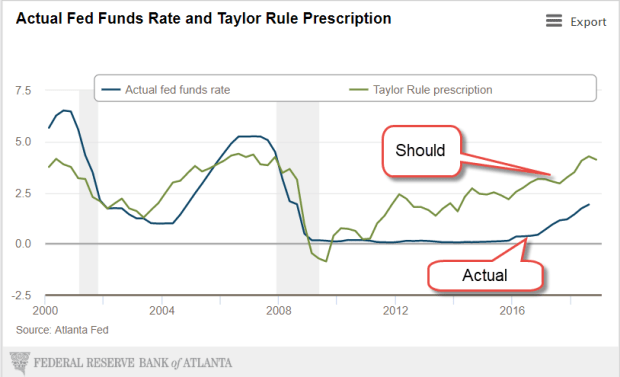
Convinced that low unemployment will inevitably spark higher inflation, the Fed has been raising interest rates for the past two years. The base rate has increased from ¼% to 2-1/2%. The thirty-year average is 3.15%. Using a model called the Taylor Rule, the interest rate should be 4.12% (Note #1).  After being bottle fed low interest rates by the Fed for the past decade, the stock market threw a temper tantrum this past week when the Fed indicated that it might raise interest rates to average over the next year. Average has become unacceptable.

FedFundVsTaylorRule

In weighing the two factors, unemployment and inflation, the Fed is dovish when they give greater importance to unemployment in setting interest rates. They are hawkish when they are more concerned with inflation. The Fed predicts that unemployment will gradually decrease to 3.5% this coming year. Unemployment directly affects a small percentage of the population. Inflation affects everyone. The Fed’s current policy stance is warily watching for rising inflation.

The stock market is a prediction machine that not only guesses future profits, but also other people’s guesses of future profits. As the market twists and turns through this tangle of predictions, should the casual investor hide their savings in their mattress?

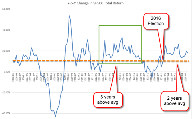
These past five years may be the last of a bull market in stocks; 2008 – 2012 was the five-year period that marked the end of the last bull period that began in 2003 and ran through most of 2007. Here are some comparisons:

From 2014-2018, a mix of stocks returned 7.7% per year (Note #2). A mix of bonds and cash returned 1.96%. A blend of those two mixes returned 4.91% per year.

From 2008-2012, that same stock mix returned just 2.66% per year. The bond and cash mix returned 5.5%, despite very low interest rates. A blend of the stock and bond mixes returned 5.26%.

For the ten-year period 2008 thru 2017, the stock mix earned 7.7%. The bond and cash mix returned 3.54% and the blend of the two gained 6.35% annually. On a $100 invested in 2008, the stock mix returned $13.5 more than the blend of stocks and bonds. However, the maximum draw down was wrenching – more than 50%. The $100 invested in January 2008 was worth only $49 a year later. Whether they needed the money or not, some people could not sleep well with those kinds of paper losses and sold their stock holdings near the lows.

The blend of stock and bond mixes lost only a quarter of its value in that fourteen-month period from the beginning of 2008 to the market low in the beginning of March 2009. The trade-off between risk and reward is an individual decision that weighs a person’s temperament, their outlook, and the need for to tap their savings in the next few years.

A rough ride in stormy seas tests our mettle. During the market’s rise the past eight years, we might have told ourselves that our stock allocation was fine because we didn’t need the money for at least five years.  If we are not sleeping because we worry what the market will do tomorrow, then we might want to lower our stock allocation. Sleeping well is a test of our portfolio balance.

///////////////////

Notes:
1. The Atlanta Fed’s Taylor Rule calculator
2. Calculations from Portfolio Visualizer: 30% SP500, 30% small-cap, 20% mid-cap, 20% emerging markets. Bond mix: 70% intermediate term investment grade bonds, 30% cash. The blend of the two was half of each percentage: 15% SP500, 15% small-cap, 10% mid-cap, 10% emerging markets, 35% bonds, 15% cash.

Income Inequality Up, No Down

December 16, 2018

by Steve Stofka

Up or down?

According to a recently updated analysis of 2015 income data by the Economic Policy Institute (EPI), Jackson, Wyoming leads the list of census statistical areas for income disparity (Note #1). Jackson is a ski resort and a natural wonderland where rich families live in expensive homes. It is a micropolitan, not a metropolitan statistical area (MSA) like Columbus, Denver or New York City. Most of the top statistical areas for income disparity in this study are resort areas. Workers in resort towns are typically low income, skewing measures of income disparity higher.

The Brookings Institute (BI) filtered out these resort data outliers in their analysis (Note #2). Large coastal cities topped the list of MSAs. The EPI study used the ratio of the top 1% of incomes to the bottom 99% to calculate disparity. They found that it was increasing, a common trope of the political left. BI calculated their disparity by using a ratio of the top 5% of incomes to the bottom 20% of incomes. BI found that disparity remained the same overall. They did note that more cities saw a declining disparity. Methodology matters.

Wealthy people are attracted to states with no income tax, and most of the top statistical areas listed by EPI are in such states. Wyoming is one of nine states that do not tax most or all personal income (Note #3). Taxpayers who claim some of their income as earned in that state can save a good deal of money on taxes. Taxpayers can meet the rules of residency used by the Census Bureau and IRS by living the most days in a certain state (Note #4). Individual states may require that a person have that state’s drivers license, voting record or other proof of residency (Note #5).

States with no income tax have high sales and gasoline taxes to help fund local infrastructure and services. Those on the political left claim that these regressive taxes hurt working families. Conservatives reject the progressive definition of “fair” taxation. On principle, tax rates for common goods and services should be equal. In addition, homeowners with expensive homes contribute more to the commonweal in higher property taxes and their employment of service labor for upkeep maintenance, repair and remodel.

The BI study highlights a problem that will continue to divide the country. The states with the highest income inequality are in states that vote Democratic. Representatives in those states are responding to a real problem, but Democrats want higher federal tax rates for taxpayers in all states to fix a problem in a few densely populated coastal states. A consistent feature of Democratic platforms are national solutions to local problems. Republicans counter that states should solve their own problems. However, Democratic politicians have already jacked up tax rates in states with high income disparity.  They are concerned that wealthy taxpayers will flee high tax states and make the problem worse. They are right. Wealthy taxpayers are leaving high tax states like New Jersey.

If you think you have a solution to this political problem, please mail your solution to “Santa Claus, c/o North Pole” and have a wonderful Christmas.

//////////////////////

Notes:
1. EPI analysis of 2015 income data, updated in July 2018 https://www.epi.org/publication/the-new-gilded-age-income-inequality-in-the-u-s-by-state-metropolitan-area-and-county/
2. Brookings Institute analysis of income data https://www.brookings.edu/research/city-and-metropolitan-income-inequality-data-reveal-ups-and-downs-through-2016/
3. Alaska, Florida, Nevada, S. Dakota, Texas, Washington and Wyoming do not tax personal income. New Hampshire and Tennessee tax investment income only. Those states have higher sales and gasoline taxes. Bankrate (https://www.bankrate.com/finance/taxes/state-with-no-income-tax-better-or-worse-1.aspx)
4. Census Bureau residence rules – count people where they live for most of the year. If they have no permanent residence(s), use their residence on April 1st of the census year. Snowbirds and others who split their residence should use the place where they spend the most days. https://www.census.gov/population/www/cen2010/resid_rules/resid_rules.html
5. Colorado residency rules for tax purposes https://www.colorado.gov/pacific/sites/default/files/Income6.pdf. Also, Intuit’s guidelines on multi-state tax filing https://turbotax.intuit.com/tax-tips/state-taxes/multiple-states-figuring-whats-owed-when-you-live-and-work-in-more-than-one-state/L79OKm3jI

Hat Trick

December  9, 2018

by Steve Stofka

For the third time in six weeks, the SP500 fell below its 200-day moving average. This ten-month average of trading activity is a benchmark that indicates mid to long-term sentiment. It is a tug of war between the bulls and the bears, the buyers and sellers, over the developing trade war between the U.S. and China.

Technical market watchers call a crossing below the 200-day a Death Cross, a too dramatic name for something that may occur once or twice a year. Less frequently does it happen twice in a two-month period – a Double (Note #1). Rarely does it occur three times in such a short period of time – a Hat Trick (Note #2).

Hat Tricks signal strong investor worry about one or more structural conditions that will impact future earnings. The situation may resolve, and the market regain its upward trend. If the situation does not resolve, expect further price declines.

What does this mean for the casual investor? Contributions to an IRA at current prices will be priced as though you had dollar-cost averaged (DCA) each month of this year. As I showed in 2011 (Note #3), the DCA strategy has produced the highest long-term returns on the SP500. Look at the monthly bar on the chart below.

5de57-iracontribspy1993-2010sharesmonthly
History is the only guide we have to investor behavior. Previous Doubles occurred in 2015 and 2012. Previous Hat Tricks developed in 2011 and 2010, producing strong price corrections (Note #4) in response to budget duels between Republicans and President Obama (2011), and debt crises in the Eurozone (2010).

In hindsight, the Hat Trick that occurred during four weeks in August 2007 signaled that this was more than a well-deserved correction in the housing market. Don’t we wish we had the clarity of a rearview mirror? Another Hat Trick a few months later in November and December 2007 coincided with the beginning of the recession that lasted 20 months and chopped 60% off the price of the SP500. Another Hat Trick in May and June 2008 came just months before the onset of the Financial Crisis in September 2008.

A Hat Trick accompanied the peak of the housing market in 2006, and the peak of the dot-com market in 2000. It signaled the start and end of the 1990 recession.

Lesson: be cautious.

////////////////

Notes:
1. In technical analysis, this double bottom forms a ‘W’ and indicates a possible exhaustion of selling before a reversal to the upside.
2. Hat Trick is a name I made up for 3 dips below the 200-day in a two-month period.
3. I compared various IRA investing strategies in May 2011
4. Price declines in 2010 and 2011 barely escaped being classified as bear market corrections, defined as a closing price 20% below a previous closing high price.

Deepening Debt

December 2, 2018

by Steve Stofka

Each time the Federal Reserve raises interest rates, the President tweets out his disapproval. This week Fed Chair Jerome Powell indicated that interest rates increases might be slowing and the Dow Jones average jumped up more than 2% in a few hours (Note #1). Presidents don’t like rising interest rates because they contribute to a slump in housing and car sales, two relatively small pieces of the economy that create ripples throughout a community’s economy. Trump’s strategy relies on strong growth.

The passage of the tax law last December reduced Federal tax revenues, which contributed to a rising deficit. The gamble was that the repatriation of corporate profits plus a reduced corporate tax rate would spur higher GDP growth which would offset the falling revenues. It hasn’t so far.

Let’s get away from dollars and use percentages. Economists track the annual budget deficit as a percent of GDP. I’ll call it DGDP. Let’s say a family made $50,000 last year and had to borrow $1000 because they spent more than they made, their DGDP would be $-1,000/$50,000 or -2%. In a growing economy, the DGDP rises, or gets less negative. It falls, or gets more negative, as the economy nears a recession.

DeficitPctGDP

A DGDP below the 60-year average of -2.5% indicates an unhealthy economy and, by this measure, the economy has not been healthy since 2007. The DGDP was the same in the last year of Bush’s presidency as it was in the last year of the Obama presidency. By 2014, it had risen above -3% and rose slightly again in 2015 but fell again the following year.

In 2016, the last year of the Obama presidency, the DGDP was -3.13%. In the first year of the Trump presidency it fell slightly to -3.4%. As I said earlier, the administration and Congressional Republicans hoped the tax law passed at the end of 2017 would spur enough GDP growth to offset declining corporate revenues. So far, that has not happened. The 2018 budget year just ended in September. Preliminary figures indicate that the deficit will be 3.9% of GDP this year (Note #2). Some economists project a DGDP near -5% in 2019.

Japan’s economy for the past two decades strongly suggests that an aging population weakens GDP growth. The U.S. economy must flourish against that demographic headwind. By December this year, Social Security (SS) benefits will surpass the $1 trillion mark, equal to or surpassing SS taxes collected (Note #3). For years, the excess in SS tax collections has lessened the amount that the Federal government had to borrow from the public. Each year, the government has left an I.O.U. in the SS trust fund. The total of those IOUs is almost $3 trillion.

Now the Federal government faces two challenges: interest on the ever-growing Federal debt and the government’s need to borrow more from the public to “pay back” those IOUs. The interest on the debt will soon overtake defense spending. Politicians could reduce cost of living increases in SS benefits by indexing benefits to the chained price index, a flexible measure of inflation that assumes that human beings alter their consumption in response to changing prices. Benefits are currently indexed to the Consumer Price Index (CPI) whose fixed basket of goods never changes. The CPI overstates inflation, but seniors are sure to lobby against any changes that would reduce cost of living increases. Politicians are reluctant to face angry seniors who might boot some of them out of office at the next election.

Trump has a better alternative than strategically lowering benefit increases for the swelling ranks of retiring Boomers – increase SS tax collections. The only way to do that is jobs, jobs, jobs. Jobs that are “on the books,” that take out SS taxes with each paycheck; not the jobs of the underground economy that flourish in immigrant communities. More jobs to draw in the half million discouraged workers who are sitting on the sidelines of the job market (Note #4).

Jobs, jobs and more jobs take care of a lot of budget problems. Campaign strategist James Carville stressed that point to Bill Clinton during the 1992 Presidential campaign. Higher interest rates hurt the construction, auto and retail industries, and blue collar small business service industries. All of these are more likely to reach out and hire marginal workers.

The headwinds are more than demographic. The economy has been stuck in low for a decade. In the eleven years since the 3rd quarter of 2007, just before the 2007-2009 recession, real GDP has averaged only 1.6% annual growth (Note #5). That is barely above population growth. Sectors that were strong, housing and auto sales, have slowed. Housing sales have declined for six months. Auto sales have declined for 18 months. Fed interest rate policy has been very supportive but that is slowly being withdrawn.

The DGDP is one more indicator that we should already be in a recession or approaching one. A recession will add to the demographic headwinds, increase the annual budget deficit and swell the accumulated federal debt. Job growth must counter job loss due to automation. Good policies are those likely to add jobs. Bad policies are those that thwart job growth. It doesn’t matter how well intentioned the policies are. Good or bad for job growth is all that matters in the next decade.

Here’s why. Another credit crisis is building. Low interest rates transferred billions of dollars in interest from the savings accounts of older people to businesses and government, who were able to go on a borrowing binge. Defaults and delinquency on business loans will probably be the source of our next crisis. After that is the coming pension crisis in several cities and states. Let’s hope those two don’t hit simultaneously.

////////////////////
Notes:

  1. Within a day, interest rate futures that had priced in a 1/2% increase in the Fed Funds Rate during 2019 fell to just .3% for next year.
  2. Estimates of 2018 Fed deficit and GDP
  3. Social Security trustees’ summary report for fiscal year 2017.
  4. BLS series LNU05026645 discouraged workers. After ten long years, there are now as many discouraged workers as October 2008, just as the financial crisis sent the economy into shock. Within two years after the onset of the crisis, the number of discouraged workers had exploded 250%, reaching 1.25 million in October 2010.
  5. Real GDP: 3rd quarter 2007 – $15,667B. 3rd quarter 2018 – $18,672B. Constant 2012 dollars.

Saving Simplicity

November 25, 2018

by Steve Stofka

Many individual investors understand the importance of saving something for retirement. In decades past, workers with mid to large companies were covered by defined benefit pension plans. The term “defined benefit” meant that a worker could expect certain income payments in retirement that would supplement Social Security. The “wizard” that made those pension payouts was hidden behind a curtain. Two employees working for the same company at the same job for the same amount of time were entitled to the same pension payout.

In the past thirty years, companies have transitioned to a “defined contribution” plan. The company puts some defined amount in a tax-advantaged retirement account for the worker. Each worker can choose from a menu of investment choices. Two employees working at the same job for the same amount of time will have different amounts in their retirement account.

Workers now have choices, but with choice comes clarity or confusion. There are so many terms to understand. The distinction between an account, a mutual fund, an ETF and a security is unclear. An account at a mutual fund company like Vanguard or Fidelity might contain several types of securities. On the other hand, the same security might be held under two different accounts at Vanguard or Fidelity. No wonder some investors throw up their hands and wish that the wizard would have stayed behind the curtain!

I’ll try to clear up the confusion and create a top down hierarchy. People belong to the group of legal entities. Those entities can be account owners. An account owner has an account with an account holder, a financial trustee or custodian. Vanguard, Fidelity, or Charles Schwab are included in this group. Accounts come in two flavors, tax-advantaged and taxable. Accounts have securities. There are two types of securities, equity and debt, but for simplicity’s sake, let’s deal with that another time.

Let’s go down the hierarchy like a person might do with their family tree, only it’s going to be much simpler. Mary Smith is a legal entity. She is on the top line. Mary Smith is an account owner with Vanguard, Fidelity, and U.S. Bank. That’s the second line.

On the third line or level, Mary Smith has two accounts with Vanguard. One account is tax advantaged – a traditional IRA, Roth IRA, SEP-IRA, 401K, and 403B, for example. The other account is taxable. She has a tax-advantaged 403B account with Fidelity, and a tax-advantaged traditional IRA with U.S. Bank.

Each of those accounts holds one or more securities. That’s the fourth line. Here’s a chart of the hierarchy.

InvestHierarchy
The Vanguard IRA has two securities – a SP500 index fund and a bond index fund. The Fidelity 403B employee retirement account has one security – a balanced fund. The IRA account at U.S. Bank has just one security – the CD.

Each of those securities except the CD holds a basket of securities. That’s the fifth line, but let’s put that off to avoid complications.

There are two type of accounts: tax-advantaged and taxable. Tax-advantaged accounts include traditional IRA, Roth IRA, SEP-IRA, 401K, and 403B. All accounts incur a tax liability for income payments or capital gains – changes in the value, or principal, of the securities in the account. For tax-advantaged accounts, the taxes are deferred or forgiven (Roth IRAs) on the dividend income and capital gains.

Almost anyone can open an IRA, traditional or Roth. If you have not opened one up, think about it. Account custodians often waive a minimum deposit to open an IRA as long as you make an initial commitment to a regular contribution schedule.

A New Minimum Wage

November 20, 2018

by Steve Stofka

Several readers had questions about the minimum wage article a few days ago. Why did I suggest 40% of the average wage? Why not 80%? How much of a difference is there between the average and median wage?

In May 2017, the annual BLS occupational survey found the average wages of all workers was a third higher than the median (Note #1). This survey is conducted only once a year and published six months after completion. I suggested 40% of the average regional wage. That would equal 53% of the median wage. I am not saying that 40% is a livable wage. Only that it might be a practical benchmark that moderates of both parties could support.

In 2015, the BLS estimated that there were 870,000 people making minimum wage. Over one million earned below minimum wage because they were in occupations where tipping is customary, and they have their own lower minimum wage. 870,000 workers out of 150 million is ½ of one percent. So why all the brouhaha about the minimum wage?

Approximately 42% of all workers make less than $15 an hour (Note #2). The percentage is closer to half of workers when adding union workers whose contract wages, particularly starting wages, are pegged to the minimum wage. A 2015 Forbes article quotes the UFCW:
“But the United Food and Commercial Workers International Union says that pegging its wages to the federal minimum is commonplace. On its website, the UFCW notes that ‘oftentimes, union contracts are triggered to implement wage hikes in the case of minimum wage increases.’ ” (Note #3)

I like several aspects of the Raise the Wage Act (Note #4) put forth by Bernie Sanders and Patty Murray. I like the gradual nature of the increases and the indexing of the wage. This is something that economists have been suggesting for decades. The summary published on Bernie’s web site (Note #4) is an embarrassment of errors:

“The Raise the Wage Act is front loaded to provide the biggest impact to workers. Upon enactment, the federal minimum wage would be increased from $7.25 to $9.25. The following increases are: $10.10 (2018); $11 (2019); $12 (2020); $13 (2012); $13.50 (2013); $14.20 (2023); $15.00 (2024).” They can’t even get their date sequence correct. Their calculations of the aggregate raise in wages is half of my estimate using BLS and BEA data (Note #5). Large companies like Wal-Mart are sure to lobby against the 14% cut in profits.

As the Slate op-ed notes, a national minimum wage of $15 is an “economic gamble” in a global economy that beckons business owners with lower cost labor. I am suggesting a compromise between Bernie Sanders’ proposal and the current policy.

///////////////////////
Notes:
1. BLS Occupational Survey
2. Slate article on raising the minimum wage.
3. Forbes article
4. Summary  of the Raise the Wage Act
5. My estimate: The summary of the Raise the Wage Act says “Increasing the federal minimum wage to $15 an hour by 2024 would give workers $144 billion in additional wages by 2024.” The Bureau of Economic Analysis’ current estimate of wages and salaries is almost $9 trillion. Using a low estimate of 2% annual wage growth would equal $10 trillion in 2024. There are currently 150 million workers. Estimating low employment growth of just one million workers a year gives an average of $64,000 per year. Let’s say that the 42% of wage earners who will be affected by a higher minimum wage make only 40% of that average, or $25,600 a year. That averages $12.80 an hour. The total wages that will be affected equals almost $1.7 trillion. The Raise the Wage Act is estimating that the average effect will be 8.5%. Using the estimates above gives us an effect twice that size, or 17.2% – close to $300 billion annually. That only includes the wages. Add in 25% in taxes and mandatory employer insurance costs equals $375 billion. Corporate profits after tax are currently $2 trillion. Estimating that they increase by 5% per year produces an estimate of $2.7 trillion in profits. $370 billion in additional costs is 14% of profits. Large companies like Wal-Mart are sure to lobby against such a bill.

A Real Minimum Wage

November 18, 2018

by Steve Stofka

Near the top of the Democratic agenda in the new Congress is a minimum wage of $15. The bill is unlikely to pass the Senate, but it will signal to the voters that the Democratic House is meeting campaign promises. The states with the most solid Democratic support are those on the west coast and northeast coast where the cost of living is much higher. A single minimum wage for the entire country is not appropriate. Republicans control the Senate and they are from states with much lower costs of living. They will reject an ambitious minimum wage that is one-size fits all.

Housing is the largest monthly expense for most families. Below is a graph of home prices in several western metropolitan areas (MSAs) and the national average of twenty large MSAs. Home prices in Dallas and Phoenix are a 1/3 less than Los Angeles and San Francisco. Housing costs in many smaller cities will be below Dallas and Phoenix.

CaseShillerComps

Why isn’t the minimum wage indexed to inflation? Because politicians of both parties, but particularly Democrats, have used it as a wedge issue to gain voter support. If the House Democrats wanted to pass bi-partisan legislation on a minimum wage, they could use a flexible minimum wage that is indexed to the average wages for each region within the country. These are published regularly by the Bureau of Labor Statistics, the same agency that publishes the monthly report of job gains and the unemployment rate. I’ve charted the annual figures for those same cities.

HourlyEarnComp

A $15 minimum wage is 40% of the average wage in San Francisco, and a bit more than half of the average wage in Los Angeles. It is almost 60% of the national average. The current minimum of $7.25 is 28% of the national average.

If the House passed a minimum wage bill that set the wage to 40% of the average wage for each region, Senate Republicans might at least consider it. In Denver and L.A., the minimum wage would be about $11.50. In Dallas and Phoenix, it would be about $10.60. Democrats could show that they are in Washington to pass legislation for working families, not pound some ideological stump as Republicans did for eight years with the repeal of Obamacare.

//////////////////////

Stocks and Taxes

There is a close correlation between stock prices and corporate tax collections. The tax bill passed last December lowered corporate tax revenues in the hope that businesses would invest more in the U.S. The divergence between prices and collections has to correct. Either tax collections increase because of greater profitability or stock prices come down.

StocksVTaxes
/////////////////////////
Income Growth

The financial crisis severely undercut income growth. Real, or inflation-adjusted, per capita income after taxes decreased for three years from 2008 through 2010, and again in 2014. It is the longest period of negative growth since the 1930s Depression.

IncomeRealPerCapGrowth

Promises Made and Unpaid

November 11, 2018

by Steve Stofka

A tip of the hat to veterans on this holiday.

The Kaiser Family Foundation (KFF) regularly updates their map of the states that have not expanded Medicaid under Obamacare (Note #1). Here’s a screen shot.

KaiserMap
All the non-expansion states except for Wyoming had per capital personal incomes below the national average.

PerCapPersIncByState

Since these states have less per capita income, it is likely that more of the residents in those states qualify for Medicaid. During the initial phase of Obamacare, the Federal government picked up the tab for the additional costs. That share will gradually decrease to 90% in 2020, when the states will have to foot 10% of the expansion costs.

A ten percent share seems light. Why don’t these states expand their Medicaid eligibility? Let’s look beyond accusations of prejudice, which exists in every state.

The populations in most of these states are older. Poor seniors living in nursing homes qualify for traditional Medicaid, which costs each state much more than expansion Medicaid. The national average of state costs is 38%; the Federal government picks up an average of 62% of traditional Medicaid spending. Wyoming pays almost 50%, far above the average. Texas and South Dakota pay 44% and 41%. Oklahoma and Florida pay the average of 38% and the rest of the non-expansion states pay below average (Note #2).

The financial crisis ten years ago crippled state finances for several years and some have still not recovered. Since 2000, average per capita real income in the U.S. has grown only 1.2% per year. Medicaid spending has grown at more than three times that rate (Note #3). Residents in these poorer states have fared worse than the average. Revenues in those state have barely kept up with obligations. Officials in poorer states with older populations anticipate that funding difficulties will continue now that the first of the Boomer generation has turned 70. Given the political pressure to expand, how much longer will some of these states resist expansion?

Thirteen states that have expanded coverage have adopted new revenue sources to fund the additional costs (Note #4). Most states fund their Medicaid spending, original and expansion, out of general revenues which are falling behind state promises. These include infrastructure repairs – roads, bridges, improvements and repairs to schools and other government buildings – as well as pension obligations. Officials of state and local governments made these promises decades ago, when per capita incomes were growing more than 2%. Annualized growth over a twenty-year period has not been above 2% since 2001.

PerCapIncReal

Tax the rich is one solution offered, but that is a short-term solution. In the long-term, higher income growth is the sustainable solution. Until Democratic politicians can craft a coherent policy message that promises to promote stronger economic growth in these states, the voters will reject them.

/////////////////////

Notes:
1. KFF’s map of states that have turned down Medicaid expansion.
2. KFF’s breakdown of Medicaid costs per state.
3. A summary of inflation adjusted Medicaid spending from 2000-2012 showed a 4.1% annual growth rate – pg. 4. A state by state breakdown is on page 35. A 49 page report from Pew Charitable Trust.
4. A recent article showing the various sources of funding that expansion states are using.

Voter’s Guide

November 4, 2018

by Steve Stofka

This week – a break from personal finance and economics to bring you a voting guide for Independent voters who make up more than a third of the electorate. Circle which position you favor in each category below. Add up the choices. Vote for whichever party gets the most circles.

Role of Federal Government
If you believe that the Federal government has too much power over individual lives, Vote Republican.
If you believe that the Federal government should have more power to promote an egalitarian society, Vote Democrat.
////////////////

Political Structure
If you want to change the existing political structure to a democratically elected Parliamentary Republic, Vote Democrat.
If you like the existing system of a Constitutional Republic of democratically elected state legislatures, Vote Republican.
///////////////////

Regulation
If you think that regulation should be primarily left up to state and local agencies who will be more responsive to the people of that district or state, Vote Republican.
If you prefer federal regulation because you distrust the ability of state and local agencies to apply regulations fairly and evenly, Vote Democrat.
/////////////

Family Planning
If you think state and local agencies acting as agents of God’s will should control your family planning decisions, Vote Republican.
If you believe in personal autonomy in family planning decisions, Vote Democrat.
///////////////

Equality of Social Contracts
If you believe that all people should have equal rights to make legal contracts regardless of their social or sexual identity, Vote Democrat.
If you believe that an elected government has a right to restrict access to legal contracts to promote certain moral values and behaviors, Vote Republican.
/////////////////

Defense
If you believe that national defense is the primary legitimate function of a Federal government, Vote Republican.
If you believe that the Federal government should provide a safe environment for all citizens, and that defense is just one part of that safety net, vote Democrat.
/////////////////

Taxes
If you believe that taxes for common benefits should be applied more evenly so that everyone has “skin in the game,” Vote Republican.
If you believe in progressive taxation, that the Federal government has a right to take more from you, so it can give more to someone else, Vote Democrat.
///////////////////

Immigration
If you believe that we are a nation of laws and that foreigners coming into our country should respect our laws, vote Republican.
If you believe that the administration of immigration law must respond to the plight of human beings seeking a secure home for their family, vote Democrat.
////////////////////

Environment
If you believe that there is not yet enough actionable evidence for climate change caused by human activity, Vote Republican.
If you believe that we should pursue policies that limit activities which promote climate change, Vote Democrat.
/////////////////////

Social Welfare
If you believe that government has a responsibility for the welfare of all Americans, Vote Democrat.
If you believe that state and local governments have a responsibility to act with charity toward those who cannot care for themselves through no fault of their own, Vote Republican.
////////////////

There are many particular issues, some of which are sub-genres of these categories, at https://www.isidewith.com/polls.


To Buy Or Not To Buy

October 28, 2018

by Steve Stofka

In ten years, the number of households that own their homes has grown by only 2-1/2%. Renting households have grown by 20%.

Should you buy a home? Home prices are sky high in some cities. Mortgage rates are rising. Is 2018 a repeat of 2006? Many bought homes at high prices only to see the price fall by a third or half over the following years.

Time to discover your inner owner investor who is going to buy the house. You are going to rent the home from your owner investor. Let’s compare the annual Net Operating Income (NOI) to the purchase price of the home. To keep the math simple, let’s say the owner investor can charge the renter $2000 a month in rent for the home. Let’s say that you, the renter, are going to bear the monthly cost of utilities. You, the investor, must pay $2000 in property taxes and other city charges like garbage collection. Your annual net income from the property is $2000 x 12 = $24,000 – $2000 taxes and costs = $22,000. Let’s say that the all-in cost of the home is $360,000. $22,000/$360,000 = 6.1%. That is the cap rate of the property.

Home pricing, like many assets, behaves in a cyclic manner, as the graph below shows. In the past thirty years, the average annual growth of the Case-Shiller home price index in Los Angeles is 5.6%. The rate of the past three years is slightly above that thirty-year average, meaning that prices in the L.A. area have stabilized relative to the long-term growth average.

HPILA

Rents have risen almost 5% so the two growth rates are fairly close. Let’s subtract an inflation rate of 2.6% from that to get a real capital gains rate of 3%. Add the two rates together to get a combined rate of 9.1%. For an average home in the L.A. area, this is a pretty good total rate of return.

Let’s look at another area: Denver. The thirty-year average of annual growth in home prices is 4.9%. During the past five years, population growth in the Denver area has been robust. Home prices have risen more than 7.5% during each of the past five years, topping 10% in 2015. In 2017, rents rose an average of 5.33%, not enough to keep pace with the growth in prices. An investor would be buying at an above average price.

In a hot market like Denver, a family might think “I am saving 8% a year by buying now.” They assume that above average price growth will continue. The law of averages indicates the opposite – that price growth is more likely to fall below average, and even turn negative.

In making a decision, understand where current prices are in the cycle (Note #1).  Understand where current rental growth is in the cycle and compare the two (Note #2). Here is a graph comparing the two series in Denver. Note the large divergence between home prices and rents in the late 1980s, 1990s and again in the 2000s. Rental prices were much more stable.

HPIvsRentDenver

Imagine that the home purchase is a cash investment and estimate a total return on that investment, as I showed above. Some familes pick a home in a price range based on the leverage of their income and down payment. A real estate agent may present home buying choices based on the amount of house a family can qualify for. But – is the house a good deal? These rates of return are an important factor to consider in making a wise decision.

////////////////////////////////

Notes:

  1. You can search for “FRED home prices [large city name here]” to get the Case-Shiller Home Price Index for that city. Click Edit Graph button in upper right and change the units to “Percent Change From Year Ago”. To get an average, click the Download button above the Edit Graph button to download an Excel spreadsheet.
  2. You can search for “FRED cpi rent residence [large city name here]” to get the index of rental prices for that city. As above, click Edit Graph button and change units to “Percent Change From Year Ago

/////////////////////////////////

Stocks

The recent downturn in the market was overdue. Since the election almost two years ago, the year over year total return of the SP500 has been above the 10% historical average.

SP500TRYOY

The longest above average streak under Obama’s Presidency was almost three years. In the dot-com boom under Clinton, the market had above average returns for almost 3-1/2 years. After a two-month stumble in 1998 due to the Asian Financial Crisis, the streak continued for another twenty months. Such a long period of exuberance was sure to fall hard. During the following three years, the market lost half its value. Reagan and Eisenhower enjoyed the next longest streaks of almost 2-1/2 years. The 1987 crash ended the streak under Reagan.