Electoral College

November 20, 2016

Did you know that the U.S. has the highest Presidential voting record in the world?  100%.  No other country comes close.  How do we achieve this extraordinary participation rate?  The Electoral College (EC).

What the heck is the Electoral College and why doesn’t any other democracy use this system?  Firstly, the U.S. is not strictly a Democracy, in which people vote directly for their leader.  It is a democratic (small ‘d’) republic.  Within this republic, the states are semi-autonomous regions in a Federal alliance.  It is the states, not the people, who elect the President.

Each Prez election is a survey conducted by the state asking its citizens: who do you want the state to vote for in the Presidential race?  The survey is voluntary.  Each state has its own rules for participation in the survey.  Federal election law specifies a set of common rules that each state has to follow in conducting their survey.

Each state gets a certain number of Electoral College votes based on population.  The survey in each state simply tells the state what the wishes of the people are for President. There is no requirement in the Constitution that a state must follow the survey results, but each state has, over time, passed state laws that promise to abide by the will of the people in that state.

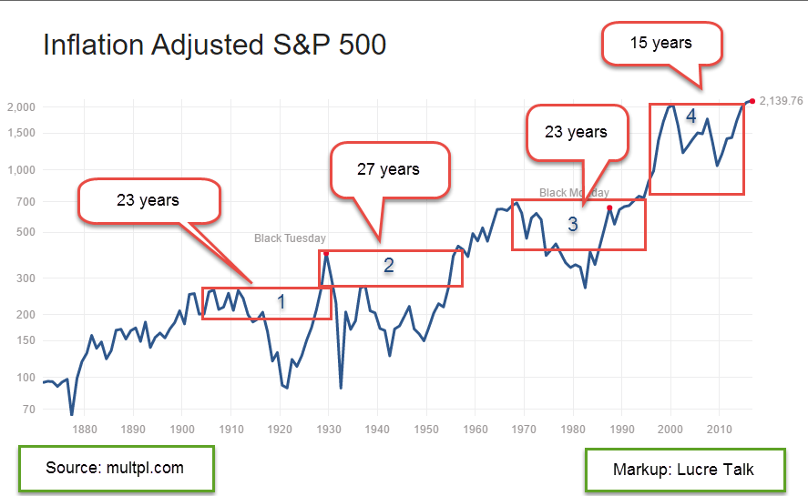
In 2000 and again in 2016, the Democratic candidate won the popular vote of all the states but lost the state by state vote in the Electoral College.  Some people in dense urban areas who vote Democratic would like to abolish the Electoral College.  If there were no college, Presidential  candidates could concentrate their campaign resources and promises to win the vote in the urban areas and largely leave the less populous areas of the country alone.

In the current system, a candidate must mount a campaign that involves and employs people in each state, a difficult if not impossible task.  The appeal and focus of the campaign must be broader than just urban or rural areas.  Resources and time are limited so a candidate must make critical choices regarding the deployment of those limited tools.

A candidate must surround him or herself with smart people who can:

1) organize and  deploy human and media resources within each state,
2)  organize the outreach for financial support,
3)  search for and identify undercurrents of sentiment and concern in each state,
4)  compact a message that will resonate with those sentiments and concerns,
5)  sample and analyze the ongoing responses to a candidate’s message.

There is an algorithmic strategy used in many fields called “win-stay, lose-shift.” The problem is commonly called the multi-handled bandit.  In a casino with many one-armed bandits what is the best strategy to maximize profits and minimize losses?  Mathematically, the problem may be insoluble but a reliable quasi-solution exists that is better than chance.  Stay with a particular bandit as long as it wins, then shift when it loses and start again.

Donald is a casino owner so he may be familiar with the strategy and used it quite successfully to conduct an unusual campaign.  A campaign has a number of characteristics – a saying or slogan (“Si se puede” or “Build the wall”), a policy (foreign trade or national security), an issue (abortion or honesty), or an attitude (impassioned, combative, or calm and reassuring).  A candidate feeds people’s sentiments into each of these characteristics like one would feed coins into a slot machine.  Now pull the handle.  If that theme pays off the majority of the time, then stick with it.  If it doesn’t, then shift.

Now here’s the brilliant part that Donald played whether he was conscious of it or not.  Every political bandit that was a loser for Donald Trump was not only abandoned but moved over to Hillary’s casino.  In many cases, she couldn’t win at them either.

Honesty?  Donald had a problem.  Load up the honesty bandit and move it over to Hillary’s casino. Let her feed people’s sentiments into that bandit and see if it pays off.  The woman issue?  Another non-paying bandit for Donald.  Again, move it over to Hillary’s side and let her see if she can win with the machine.  In both cases, she pulled the handles over and over again with only modest success.

Each Presidential campaign seems to bring some new innovation.  Successes are often incorporated into later campaigns.  Obama’s campaign was noted for its ability to raise money online with many small donations.  The campaign carefully tested the appearance of different web pages, measuring even the appearance of one click button over another.  Obama outraised his opponents in the 2008 and 2012 campaigns.   In the 2016 race, Hillary Clinton and her superPACS outraised Donald Trump almost 2:1, yet he won. (Bloomberg)

We should all wish that a President has a successful term.  Unsuccessful terms are usually accompanied by economic and military events that are not good for ourselves, our families, and our communities.  Whether Donald Trump has a successful term or not, he has certainly made a long lasting impact on future campaigns for President.  Who can be out with the first book?  Already CNN is advertising a comprehensive look at the election. As we put a bit more distance in the hindsight mirror, expect a number of books on the election.  Masters’ theses and doctoral dissertations will explore the many aspects of the campaign.

//////////////////////////////////

Election Autopsy 

After each Presidential election, those in the campaign business do an autopsy of both the losing and winning campaigns.  What worked?  What didn’t?  Dems need to ask themselves if they neglected the needs of everyday working Americans. In 2008, Obama promised that the needs, values and perspective of his grandparents, who raised him, would guide his decisions. Then he and his party started bailing out the banks, car companies and solar industry as many ordinary people struggled and suffered with job loss, home loss and bankruptcy. With majorities in both Houses, he fiddled with decades old Democratic dreams like healthcare and climate change while working class Americans felt discarded.

Some attribute the heavy Demcratic losses in 2010 to Obamacare but that was only a symbol for the larger betrayal that many Obama voters felt. Having control of both the Presidency and Congress is a mandate that a party can abuse.  It is given to that party to get something done fairly quickly.  When a political party uses it for pet projects, people turn away or vote the other way.  Many turned away in the 2010 election.  Six years later, Republicans control the majority of state legistatures, the governerships, the House and Senate.

As Majority House Leader, Nancy Pelosi certainly had a hand in the growing disaffection with the Party yet she insists that she should continue in her role as Minority Leader.  Her strength as a formidable fund-raiser may prove to be the winning card that trumps her past errors.

/////////////////////////////////

Vaccines

A familiar meme on social media is that there is a vaccine conspiracy between pharmaceutical companies and the government who force parents to vaccinate their children and pad the pockets of Big Pharma.  The U.S. has a policy of giving infants and children more vaccines than any other developed country.  Do pharmaceutical companies make millions off vaccines? You be the judge.

The PVC13 vaccine given to older people costs the provider $16 per dose (CDC Price List). In March 2016, the discounted price from Kaiser was $313 for the vaccine alone. The labor to give the vaccine was a separate line item. That is a 2000% markup on the vaccine itself by Kaiser, not the manufacturer.

It is the providers who administer the vaccines who make the money.  Investors who own the stocks of a pharmaceutical company often pressure the company to get out of the vaccine business because most vaccines are low margin products and yet carry partial liability.

If the pharma companies don’t want to bother making many vaccines, should the government simply build their own vaccine manufacturing labs?  Patents and other intellectual property could be a hurdle but Congress could arrange to purchase them or use eminent domain to set a price and seize the intellectual property.

//////////////////////////

Retail Sales

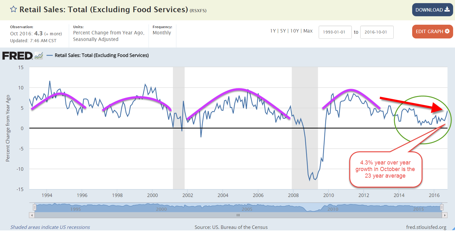
Average = Strong.  When growth is rather anemic, a return to average seems strong.  In October, retail sales rose 4.3% above October sales in 2015, a welcome bump up from the lackluster growth of the past two years.  Last month I showed that recent sales growth less population and inflation growth has been negative or close to 0.

The stock and bond markets have been shifting money around in anticipation of fiscal stimulus and more relaxed regulation from a Republican Party in control of the levers of government.  Small business stocks (VBR) are up more than 10% and financial companies (XLF, VFH) have shot up about 12%.  Consumer discretionary stocks (XLY, VCR) are up about 4% while the more defensive consumer staples stocks (XLP, VDC) are down 2%. Oil stocks (XLE, VDE) are up about 3%.

Will consumers put aside their cautions and spend more?  Active stock managers are certainly hoping so.

/////////////////////////

Ideas for IRA contributions

Emerging market stocks are still up 8% YTD after falling more than 6% in November.  Much of that decline has come on the heels of Trump’s election win.

A broad bond index has fallen almost 4% in the past few months.

Election Volatility

November 13, 2016

Sometimes the hardest thing an investor can do is nothing.  That’s pretty much what a casual investor with a balanced portfolio should do in response to the election results.  With a portfolio of 57% stocks and 43% bonds and cash, my total portfolio has risen 1/2% this week, or much ado about nothing.  Let’s dig into this week’s election results and the market’s reaction.

Donald Trump, the President-elect, has long maintained that his campaign was a movement and was proved right this past Tuesday.  White voters from rural districts around the country rallied in strong numbers to Trump’s promise to straighten up Washington.

Voters generally want a change of direction after one party has occupied the White House for two terms and this election proved to be no different. In the modern era of politics, only H.W. Bush was able to gain a 3rd Presidential term for the Republican party in 1988 after two terms of Ronald Reagan.  Countering the emotion and momentum of the Trump movement on the right were the voters on the left who passionately turned out for Bernie Sanders in the Democratic primaries.  Voters and superdelegates chose the establisment candidate, Hillary Clinton.  Some say that the process and the rules favored Clinton over Sanders.  His supporters are convinced that Sanders could have beat Trump.  Movement against movement.

In the past decade, voters have expressed a preference for rallying cries, for mantras of momentum like “Si se puede!” (Obama), “Build the wall!” (Trump) and “Medicare for all!” (Sanders).  Candidates must learn to condense their message into a short slogan that can be easily waved.  McCain, Romney and Clinton never found a verbal cadence that would act as a catalyst for voters to enthusiastically join the parade.  Sarah Palin, McCain’s Vice-Presidential candidate in 2008, understood the need for slogans.

 Note to future Presidential candidates who would like to actually win:  criticize the candidate, not that candidate’s supporters.  Hillary Clinton made the same mistake that Romney made in the 2012 election – disparaging their opponent’s voters.

Election night.  As a Trump victory became increasingly probable, global markets began to sell risk (stocks) and buy safety (bonds).  In the early morning hours after the polls closed, the networks called the state of Wisconsin for Donald Trump and put him over the threshold of 270 votes in the Electoral College.  Several  minutes later, about 2:45 AM on Nov. 9th, we learned that Hillary Clinton  had called Donald Trump to concede and wish him luck.  Dow Futures were down about 4% at that point.  Japan’s stock market was down 5.5%.  The yield on the 10 year Treasury note was down 7.22%, meaning that the price was up about 8% as investors in world markets were seeking the safety of U.S. debt.  Emerging markets fell in anticipation of protectionist trade policies under a Trump administration.

About 3 A.M.  President-elect Trump began to give a sedate and rational acceptance speech that began with a gracious nod to Hillary Clinton’s fight.  He spoke of unity, healing and more importantly, infrastructure spending and tax cuts.  With control of the Congress and Presidency in Republican hands, there was real hope that Washington could end the years of stalemate and finally implement fiscal policy to rescue a economy that had been kept afloat by an exhausted monetary policy for six years.

The overseas markets began to turn around.  By the time U.S. markets opened more than six hours later, stocks and Treasuries had reversed.  Stocks were now off less than 1/2% and Treasury prices were down severely.  TLT, a popular ETF for long term Treasuries, opened about 2% lower, a price swing of 10%.  EEM, a composite of Emerging Market stocks, opened up almost 3% down and lost ground during the trading session.  By week’s end the SP500 had risen 3.8% for the week, and EEM had fallen by that same percentage.

This week’s action in the bond market was a good example of the mechanics of bond pricing so let’s look at the price action and what it says about the future guesses of the direction and extent of interest rates.  First, bond prices move inversely to interest rates.   The extent that these prices move is measured by a bond’s duration.  Here is a link to the iShares page for the TLT ETF on long term Treasuries.  I have captured a section of the page with the duration highlighted.

If you have a bond fund, the mutual fund company will state the bond duration as well.  What does this tell you?  Leverage.  Duration tells you the approximate change in price for a 1% change in interest rates.  In this case, a 1% increase in interest rates will generate about a 17% decrease in price.  Because TLT is a composite of long term Treasuries, its price is more sensitive to changes in interest rates, or the consensus on interest rates six months to a year in the future.  The price of TLT fell 7.4% this week as traders repriced future interest rates.  With some grade school math, we can calculate what traders are guessing interest rates will be a half year to a year from now.

The Fed last raised rates at the end of 2015, putting them at approximately 1/4% – 1/2%.  In July, the price of this ETF was about $142.  It closed this week at $122, a decline of 14% from the summer high. Now we divide the 14% by the bond’s duration of 17.41% to get a ratio of .80.  This is the new guess of how much interest rates are likely to rise – approximately 3/4% – 1%.  By the fall of 2017, traders are betting that the benchmark Fed interest rate will be about 1.25% to 1.5%.

Let’s look at a more balanced composite bond ETF that financial advisors might recommend for casual investors.  Vanguard has a more conservative composite ETF whose ticker symbol is BND, with a duration of 5.8, about a third of the TLT ETF. (Spec Sheet here)  This week BND lost almost 2% and is down almost 4% from its summer high.  When we divide 4% by 5.8% (the duration in percentage terms) we get a guess of about a .7% raise in interest rates.  Because BND contains shorter term bonds, this guess is slightly below that of TLT.

Why are traders betting on more aggressive interest rate increases after Donald Trump was elected?  He has spoken about infrastructure spending and tax cuts, two fiscal stimulus programs that will likely spur inflation upward.  With a Republican party that has control of the Presidency and both houses of Congress, these measures are likely to be passed in some form.  Some sectors of the economy will likely benefit from more infrastructure spending so they rose this week.  Shares in technology giants like Apple and Google fell as traders switched money among sectors but are still up by healthy margins since February lows.

Let’s say that next March comes and the Trump White House and the House Budget Committee can not come to terms on either of these programs.  Investors would likely reprice interest rate expectations and lower them, causing the price of bond ETFs or mutual funds to rise.

/////////////////////////////////

Miscellaneous Election Notes

I’ll share a distinction that NPR’s David Folkenflik made this week.  Those on the left took Donald Trump literally, but not seriously.  Those who voted for him took him seriously, but not literally.

During Thursday’s trading the Mexican peso fell to 15.83 per dollar, the lowest since 1993 when Mexico reset their currency. Why the big drop?  Trump has repeatedly said that he would cancel the NAFTA agreement that binds Mexico, Canada and the U.S.  The NAFTA agreeement requires only a 6 month notification before termination.  There is some disagreement whether the White House would need Congressional approval to cancel NAFTA which might delay the action.  Some in the Republican party like free trade agreements and are likely to put up a fight.  Some analysts think that the devaluation of the peso could lead to a recession in Mexico, which was already under economic pressure due to falling oil prices.

131 out of 231 million registered voters cast their vote in this election, slightly below the voter total in the 2008 election. (538)  Trump and Clinton each took 26% of registered voters.

The Trump White House can reverse Obama’s executive action on the Keystone pipeline and re-initiate construction.  It will likely amend or repeal tentative proposals to mitigate climate change.

Why did pre-election polls get it so wrong?  According to Pew Research, more than a third of households would respond to a survey a few decades ago.  Now it is only 9%.  Statisticians must tweak this rather small sample to make it more representative of the population as a whole.  A particular demographic constituent in the sample – say white working class men – might be underrepresented in the survey.  Survey methodology then gives the opinion of relatively few sample respondents more weight than it actually has in the general voter population.

Some statisticians recommend using economic and demographic algorithms to gauge future election results based on actual past voting records.

Of the 700 counties that voted for Obama in 2012, a third of those voted for Trump in 2016.  Polls indicated that Hillary Clinton would capture the majority of the white college-educated vote for the first time in decades but she failed to do so.  More white voters voted for Obama than Hillary.

A third of Democrats in the House come from just three states:  California, New York and Massachusetts.  This concentration may answer to the concerns of those states but indicates that the party has become out of touch with the voters in many states.

Each time a Democratic candidate is elected President, unfounded rumors circulate that the new President will take away people’s guns.  People rush out to buy guns.  Trump’s surprise win caused the stock of gun maker Smith and Wesson to decline 22% in a couple of days.

On the other hand, many women feared that Trump and a Republican Congress would restrict birth control and stocked up in the days after the election. Here is a map of abortion regulations in the states before the 1972 Supreme Court’s decision in Roe v. Wade.  Abortion was more permitted in the southern states than the northeast states.

Here‘s a state-by-state breakdown of the vote from NPR.

Small Business Uncertainty

November 6, 2016

Small Business Survey

The uncertainty index in the recent NFIB (National Federation of Independent Businesses) surveys has been at its highest in the past forty years.  Except for one high point in 2012, every high in this reading has been followed by a recession.

This index is compiled from responses of “I don’t know” to six questions about future sales, employment, economic conditions, and business expansion. Small businesses typically pause in the face of uncertainty, holding off on hiring and capital outlays. They must be alert to the underlying climate of their particular market or go out of business.

The previous highs in uncertainty were set in late 2006 and early 2007 as the housing bubble was cooling off.  A recession followed in late 2007 that lasted till June 2009. In the late part of 2000, near the end of the dot com bubble, a high in this uncertainty index preceded a recession in the early part of 2001, and a two year downturn in the market.

A high uncertainty reading in late 2012 was a combination of concerns about slow growth. Starting in September 2012, the Federal Reserve responded with QE3, a monthly program of bond buying to spur growth and avoid recession.

When the canary sings, pay attention.

////////////////////

Retail Sales

Weak sales growth underlies current business concerns.  September’s year over year (y-o-y) growth was 2.2%.  After adjusting for inflation and population growth, sales growth was negative and has been less than 1% for two years.  As I noted last week we are at the edge of a plateau.  We either fly or fall from here.

The chart below shows retail sales less food services like bars and restaurants, and is adjusted for inflation and population growth.  In 2015, analysts attributed the y-o-y growth to the decline in gasoline prices, which began in the middle of 2014. Economists were asking why people were not spending the money they were saving on gas. This year’s y-o-y growth rate has little influence from gas prices, which have been higher for part of this year.  People are not confident enough to increase their spending.

/////////////////////

Individual Stocks

Casual investors are encouraged to invest in broad categories of stocks rather than individual stocks, in order to minimize the effect, good or bad, of any one stock.  We are in the middle of earnings season for the 3rd quarter and I thought I would point to an example of the price volatility that an earnings announcement can generate.

We expect volatility from smaller companies so I will look at a “hyuge” (as Donald would say) company like Microsoft, the third largest company in the world.  During the past year or so, owners of Microsoft shares have seen some gut wrenching price moves on the day when Microsoft announces its quarterly results.  On April 24, 2015 the stock jumped 10% in reaction to first quarter results.  Disappointing second quarter results led to a price drop of almost 4% on July 22, 2015. Another 10% jump in response to third quarter results on October 23, 2015.  April 22, 2016 saw a 7% drop, July 20th a 5% gain, and a 4% gain on October 21st.

The tech sector can be more volatile than the Consumer Staples (Proctor and Gamble) sector, for example. An investor who owns shares in a company should be prepared for occasional volatility.  A good rule of thumb is that the value of one company’s stock should be no more than 5% of an investor’s portfolio. A safer rule might be 5% of one’s stock allotment.  If stocks were 50% of an investor’s portfolio, then 5% of that would be 2.5% of the total portfolio.

A broader view

Here’s an interesting viewpoint by someone who argues that the stock market has plenty of room to run.  However, the SP500 index has gained an average of 11% annually for the past seven years. This is far above the 6.5% annual price gains of the past twenty years, and the 7.4% yearly gains of the past thirty years.  Reaching back even further, a forty year time span shows 7.85% yearly gains. However, we should take into account the much higher inflation rates of those earlier decades.  Adjusted for inflation those annual gains would be much lower, making the comparison with the past seven years even more dramatic.

We like to think that “this time is different,” that the rules have changed.  After a sobering decline in equities, we resolve not to be fooled again and then…we forget once again.  We tell ourselves yet again that it really is different this time.  Shakespeare made his living reminding us of our follies.  We read his tragedies, his comedies and we think yes, but that was so long ago and so much has changed since then.  What hasn’t changed, what remains persistent is the nature of human beings and the eternal constant, the Law of Averages.

Constant Weighted Purchasing Average (CWPI)

October’s surveys of Purchasing Managers across the country, the PMI, edged down slightly from last September’s upward surge.  The CWPI composite of the manufacturing and non-manufacturing PMI surveys remains at the bottom end of healthy expansion and barely below the index’s five year average. This index has had a cyclic peak and trough pattern for most of the recovery, peaking at a strong growth level, then falling to a trough that was still above the neutral line between expansion and contraction.  Since February, the index had drifted in a plateau of healthy growth.  We wait and see.

Price Plateau

October 30, 2016

Market watchers use several indicators to gauge the valuation of the broader stock market.  The P/E ratio (Price/Earnings), P/D ratio (Price/Dividend) and Shiller CAPE ratio (Cyclically Adusted Price/Earnings) are quite common and I will look at a fourth indicator, the percentage gain in the SP500 index over a six year period.  As we will see, when gains reach a certain height, there are two alternatives that follow:  1) a crash or other steep decline in price, and 2) a flattening of price for approximately 18 months.

Use of any of these indicators – PE, PD, CAPE or this one – would not have helped an investor avoid the 2008 crisis.  Why?  Because they gauge valuation.  The 2008 crisis was a financial crisis based on bad judgment and fraud.  At the time of the crisis, the index had  gained 40% in the past six year period, about the average six year gain over the past 140 years.

Average annual gain – 6%

The average annual gain is a bit under 6%.  The median gain is 29% over a six year period, or a 4.2% annual rate.  Add in the current 2% dividend rate and the median expectation is 6.2% annual gains in the stock market based on the past 140 years. Some public pension funds are still using 7.5% expected annual gains and that will probably be the next crisis in the coming decade.

Five Year Rule

Methodology. Why did I choose a six year period?  Did I run a bunch of simulations to get the most dramatic period?  No.  It’s the first number I picked and the reason I picked it is simple:  it is one year more than the five year rule.  Financial advisors will usually recommend that their clients do NOT keep money in the stock market that they will need in the next five years.  Why? The volatility in the market could cause an investor to sell at precisely the wrong time in order to access funds.  Even at the worst depths of the 2008 crisis, after more than 50% losses, the SP500 index was only 11% less than it had been six years earlier.  This is why advisors use the five year rule.

SP500 Data

Below is a chart of the percent gains in the SP500 index after a 6 year period.  I’ll call the six year gains “6Gain” to save some typing.  The data is courtesy of Robert Shiller who wrote the book “Irrational Exuberance” which first introduced the concept of the Shiller CAPE ratio, an inflation adjusted P/E ratio.

1929 Peak

Let’s look at examples of steep price declines when the percent gains have just gotten too high. The 1929 crash was truly historic.  That’s the highest spike in the chart above.  In November 1928, the 6Gain first crossed above the 150% mark that signals an strong overvaluation.  The market should have started to flounder but lax lending rules probably helped fuel further price gains.  Many people with acceptable credit could borrow money against stocks and many did, chasing the strong upward trend in the market.  Over the next ten months the market climbed another 20%.  The decline began in mid-September 1929 (Dow chart) but was seen as a well deserved correction to the summer exuberance. At the end of September 1929, the market had gained 284% in six years, the highest 6Gain on record and a percentage gain that may go unbroken.

…and Crash

In October 1929 the market continued to lose ground, forcing the sale of borrowed securities to meet margin calls.  Margin selling contributed to the downward momentum but the sustained selling woke investors up to the fact that the market had climbed too far and too fast.  The selling culminated in a gut wrenching 23% loss on Black Tuesday, October 29th (Account of crash – I disagree with the author on valuation).

Seeking Average

It took 18 months for the market to correct to a 6Gain that was average (39% over 140 years). By that time in May 1931, the market had lost 55% of its value.  From 1931 to 1936 any money invested in the stock market six years earlier had shrunk. In 1934, six year LOSSES, not gains, approached 60%. My parents grew up during the Depression and were taught that the stock market was a reckless gamble made only by rich people who could afford to lose some of their savings.

Black Monday

These overvaluation crashes are rare, thank God.  The next one came more than 50 years later, on “Black Monday” in  October 1987, when the index lost 20% in ONE DAY, almost as much as Black Tuesday in 1929.  At that time, the 6Gain was 169%.  I can still remember where I was when that one went down. Traders could not get some of their orders filled and that began a panic in the market. Some radio pundits warned of another depression.  I had no savings in the market but I was worried that my relatively new business would go belly-up. Most of the 24% lost in two months was done in that one day.  It took a whopping six years for the 6Gain to fall to average.

The Plateau

Those are the only two examples of severe price crashes because of overvaluation.  The more common result of overvaulation is a plateau, a flattening of prices for about 18 months, followed by by a fork – up or down.  The price plateau simply tells us that a fork in the road is coming.  The over-valuation tells us to expect a price plateau.

The dot-com boom

Let’s look at the dot-com boom in the late ’90s. At the end of 1994, the SP500 index closed at 460.  Less than six years later, in the fall of 2000, the index crossed above 1500, more than triple the price in that short six year period. The 6Gain peaked at 227%. At mid-1999 the SP500 started to stall out above 1350.  Promises of huge profits to be made by internet companies were beginning to evaporate as those companies burned through cash at an alarming rate in their effort to capture a segment of the market. It would take another year before the market peaked near 1500.  By the end of 2000, eighteen months on this rounded plateau, prices were about 1350 again.  For almost two years they declined till the index had lost more than 40% of its value.  Coincidentally, this low was reached when the 6Gain finally dropped to the 140 year median of 29%.

The Fabulous Fifties

Let’s look at some older and milder examples to develop some context. In mid-1955, the index had gained almost 190% in six years. It continued to climb for another 6 – 8 months before falling back.  In the spring of 1957, the index stood at the same level as it had eighteen months earlier.

In mid-1959 the index had gained almost 150% in six years.  The index lost 10% over the next 6 months but by early 1961, about 18 months later, the index had gained back its lost ground.

In mid-1938, we see the same price plateau after a six year gain of 150%.

Recent

As we can see on the chart, these 6Gain spikes are infrequent.  Now let’s look at the most recent spike in the 6Gain – March 2015.  The SP500 index was near where it is today.  In fact, this may be the flattest price plateau in history.  The stock market was overvalued but with bond yields so low, where was an investor to go?  Real estate, commodities, gold and other alternative investments have gone up and down the past 18 months as traders tried to take advantage of mis-matches between expectations and reality.  The trend for the average investor?  No trend.

During this 18 month plateau, the 6Gain has fallen to 82% – a good sign – but still twice the average 6Gain.   Wouldn’t it be nice if there was a law that the 6Gain must fall to the average before the stock market takes on a definite trend in either direction?  No such law.  What we do see with ironclad regularity is a price plateau when the 6Gain crosses above 150% and that the plateau lasts about 18 months.  It has been 18 months and we should be nearing the edge of that plateau.

Closing Thoughts

As October draws to a close, we may have three months in a row where the month ending price (Close) is less than the price at the beginning of the month (Open).  Normally, 3 down months in a row would be a sign of more pain to come but the differences each month have been negligible and could be pre-election hesitation.  There is enough to be hesitant about.  The Shiller CAPE ratio is about 26, 10 points above the median of 16.  Due to declining oil prices, profits in the SP500 aggregate of companies have fallen for five quarters in a row and…

The Election

Trump has been losing ground in recent polls, enough so that the Senate seems more likely to turn Democratic.  This Senate cycle favors Democrats who have fewer seats up for re-election than Republicans.  In 2018, the cycle will favor Republicans.  As the gap in the polls widens, some begin to fear that a rout in the Presidential race could cascade into the House where Republicans hold what seemed to be an impregnable lead of 60 seats (Wikipedia article).  If the Democrats should take the House, they will control the Presidency, Senate and House.  Tax increases on those with upper incomes would be a certainty for 2017, as Hillary has promised.  This could cause a rush of selling in 2016 to avoid higher capital gains tax rates.  An unlikely but not impossible scenario may be contributing to the hesitation.

Portfolio Mix

October 23, 2016

About 30 years ago, after a series of social security and income tax increases in the early ’80s, I had a spirited discussion with my dad about what I thought was a transfer of money from my generation to his.  Extremely low interest rates for the past eight years have reversed that process.  Millions of older Americans who have saved throughout their working years are getting paid almost nothing on that part of their savings held in safe accounts.  Older Americans take less risk with their savings and it is precisely these safer investments that have suffered under the ZIRP, or Zero Interest Rate Policy, of the Federal Reserve.  That money is implicitly transferred to younger generations who pay less interest for their auto loans, for their mortgages, for funds to start a business.

The chairwoman of the Fed, Janet Yellen, is at the leading edge of the Boomer generation born just after WW2.  No doubt she and other members of the FOMC are well aware of the difficulties ZIRP  has had on other members of her generation. Because the Boomers have been a third of the population as they grew up, they had a consequential effect on the country’s economy and culture.  Their income taxes have funded the socialist policies of the Great Society.  They have funded the recovery from the Great Recession.  Ten years from now politicians will regretfully announce that, in order to save Social Security, they must means test Social Security benefits to reduce payments to retirees with greater assets.  Once again, politicians will tap the Boomers for money to fund the policy mistakes that politicians have made for the past few decades.

//////////////////////////

Portfolio Mix

Each year Warren Buffett writes a letter to shareholders of Berkshire Hathaway, the holding company led by Buffett.  His 2013 letter made news when Buffett recommended that, after this death, his wife should invest their personal savings in a simple manner: 90% in a low-cost SP500 fund, and 10% in a short term bond fund, an aggressive mix usually thought more appropriate for younger investors.  Earlier this year, a reader of CNN Money asked if that would be a practical idea for an older investor approaching or in retirement.

After running several Monte Carlo simulations, the advice was NO, but the reason here is interesting.  The 90-10 mix does quite well but has a lot of volatility, more than many older investors can stomach.  An investor in their late 40s or early 50s who is making some good money might relish a market downturn.  Could be twenty years to retirement so buy, buy, buy while stocks are on sale.  If they go down more, buy more.

The sentiment might be entirely different if the investor is ten years older.  Preservation of principle becomes more of a concern.  Why is this?  Let’s look at a sixty year old woman who plans on working till she is seventy so that she can collect a much bigger Social Security (SS) check.  During her retirement years she will have to sell some of the equities she has in a retirement fund or taxable account to supplement her SS check.  However, the majority of those sales won’t take place for 15 – 20 years.  Why then is she more concerned about a market downturn than she might have been at 50 years old?  Do we simply feel more fragile at 60 than we do at 50?  I suppose it’s different for each person but, in the aggregate, older investors are more cautious even if the probability math says they don’t have to be as careful.

With two weeks to go before the election, the stock market has lost some of its spring/summer fire.  Looking back 18 months, the market has had little direction and is now about the same price it was in January 2015.  Companies in the SP500 have reported five consecutive quarters of losses, and the analytics firm Fact Set estimates that there will be a small loss in this third quarter of the year, making six losses.  Energy companies have been responsible for the bulk of these losses, so there has not been a strong reaction to the losses in the index as a whole.

BND, a Vanguard ETF that tracks a broad composite of bonds, is just slightly below a summer peak that mimicked peaks set in the summer of 2012 and again in January 2015.  However, this composite has traded within a small percentage range for the past two years.  In fact, the same price peaks near $84 were reached in 2011 and 2012.  Once the price hits that point, buyers lose some of their enthusiasm and the price begins to decline.  Most of us may think that bonds are rather safe, a steadying factor in our portfolio.  Few people are alive that remember the last bear market in bonds because this current bull market is about thirty years old.

Oil has been gaining strength this year.  An ETF of long-dated oil contracts, USL, is up about 15% this year.  Because it has a longer time frame, it mitigates the effects of contango, a situation where the future price of a commodity like oil is less than the current price.  As the ETF rolls over the monthly contracts, there is a steady drip-drip-drip loss of money. Short term ETFs like USO suffer from this problem.  Of course, long term bets on the direction of oil prices have been big losers.  In 2009, USL sold for about $85.  Today it sells at about $20. Here is a monthly chart from FINVIZ, a site with an abundance of fundamental information on stocks, as well as charting and screening tools. The site gives away a lot of information for free and there is a premium version for those who want it.

These periods of low volatility may entice investors into taking more chances than they are comfortable with so each of us should re-assess our tolerance for volatility.  In early 2015 there was a 10% correction in the market over two months.  How did we feel then?  The last big drop was almost 20% in the summer of 2011, more than five years ago.  The really big one was more than eight years ago and memories of those times may have dimmed.  If you do have easy access to some of your old statements, a quick look might be enough to remind you of those bad old days when it seemed like years of savings just melted away from one monthly statement to the next.

Yes, we are due for a correction but we can never be really sure what will trigger it and these things don’t run on schedule.  On a final, dark note – price corrections are like our next illness. We know it’s coming.  We just don’t know when.

The Political Battle

October 16, 2016

State and local governments provide the infrastructure of our daily lives, from the streets we drive on to the legal and judicial institutions that maintain a sense of order within our communities, yet we pay far more of our paychecks to a distant capital in Washington.  Why?  To understand we must look at a two century long battle of  opposing ideas, two ideological forces fighting for power.

We can judge the pervasive impact of state and local government by the amount of taxes that they collect to provide that infrastructure.  I’ll count the primary taxes –  sales, corporate and peronal income and property tax.  In the past four quarters, state and local governments collected $1.2 trillion, about 6.5% of the nation’s GDP.

On the other hand, Washington has a much reduced impact in our lives and, we might hope, an accordingly smaller tax bite.  Unfortunately, that is not the case.  In the past four quarters, the Federal Government collected almost three times the state and local amount, close to $3.6 trillion. (Chart link).  For the past eighty years, the Federal Government has assumed an ever larger role as a national insurance company. In the past year, the Federal Government collected $1.2 trillion – the same amount as primary state and local government taxes – in pension and medical insurance receipts alone. (Graph link)

The two major political parties in this country have different ideological approaches.  Democrats prefer to have the bulk of tax collections come into a central authority like the Federal Government, where a number of central committees decide on the allocation of those funds.  Republicans favor a system where the majority of tax collections come into the states.  Decisions over the allocation of those tax funds should be more responsive to the voters in that state.
 
In the Democratic system representatives from each state in both the Congress and Senate must vie with each other for access to tax funds under an ever growing number of programs that the Federal Government oversees.  States are administrative and geographical branches of the Federal Government and have limited autonomy. In the House, this competition exists within a system of seniority so that junior members must compete for favors from senior members who control committee assignments and access to discretionary funds.

The Republican system recognizes state borders and autonomy to a greater degree that promotes competition among states for the hearts, minds and pocketbooks of businesses and individuals.  Within each state, elected members of both parties should compete with each other for tax funds.  Because each state must adhere to a balanced budget by law, spending has more constraints than the Democratic system.

The responsibilities and powers of the Federal Government are more constrained under the Republican system.  When Article 1, Section 8 of the Constitution gives Congress the power to provide for the “general Welfare of the United States,” Republican politicians and conservative justices read the clause literally, that this provision applies to the states, not the people in the states.

Democratic politicians and liberal justices interpret the clause as meaning that the Federal Government has a direct responsibility for the welfare of each citizen within each state and gives the Federal government greater oversight of state and local communities, which are more easily influenced by local economic interests and disciminations. These two competing interpretations were hotly debated at the drafting and ratification of the Constitution so it is likely that the argument may never be resolved as long as this country exists.

Again let’s come back to that pot of money that makes our cities and counties go.  In the current system we take that same amount and give it to the Federal Government, which spends most of it on older people.  This massive transfer of resources from younger generations to an older generation is likely to permanently hobble our economic growth. Under a broader scope of social insurance programs, the people in European nations have reluctantly accepted the tradeoff of economic growth for increased sense of security in their personal lives – more health, job, educational and child rearing protections.  French people have become accustomed to a 10 – 12% unemployment rate.  In the U.S. such a high rate provokes political upheaval.

Do Americans want to follow the European model?  Half of the citizens of this country say yes, half say no.  What we do know from the European and Japanese models is that, as social insurance programs get larger, the transfer of money from the productive element of society to the less productive segment of society hampers growth.  This in turn makes it more difficult to fund those  insurance programs. There is a tried and true maxim that applies here – what can’t last forever, won’t.

Older Americans should understand that there is no social contract other than the informal contract of the ballot box.  Each generation pays into “the system” and waits until it is their time to collect.  Each generation relies on earlier generations to honor the promise but, just in case, the older generations vote far more than younger generations because they want to insure that pension (Social Security) and health (Medicare) benefit laws are protected.

Insurance companies must keep assets in order to pay future claims.  The Federal Government is not an insurance company and keeps no assets to pay future benefits.  Instead, it collects taxes under the Social Security system and puts those funds in the general pot of money, leaving a little slip of paper in the Social Security fund that says “We owe you.”  Really, it is little more than this – an accounting entry. From that big pot of money, benefits are paid.  This is a cash based system called “Pay Go” or “Pay As You Go.”  The lack of an asset base for future benefits means that it is extremely difficult to convert the current system to another type.  Former President George Bush learned this harsh lesson ten years ago when his political talk of privatizing Social Security ran into the harsh realities of actually making the transition. Oops.  Bush dropped the idea.

This election season is another episode in a continuing series, a battle between the forces who want the Federal Government to take an ever greater role in our individual lives, and those who want to roll back national control in favor of state, local and private solutions.  The election will take place shortly before the debut of the next Star Wars movie.  Some Republican voters see the Democratic vision of the political system as the Empire of rigid Federal oversight and conformity, where everyone must come under the authority of a central command.  Some Democratic voters may see themselves as part of the Rebel Alliance, fighters for the vision of the Old Republic, a constitutional democracy of worlds that is similar to the European Union, and, like the EU, was bogged down in bureaucracy.

On November 8th, 130 million people will unsheath their political swords and continue the battle. (Presidential election stats http://www.presidency.ucsb.edu/data/turnout.php).  Starting December 15th, more than 80 million people will fire up their light sabres at the coming Start Wars movie. (Star Wars box office stats).  En garde!

Third Quarter Rebound

October 9, 2016

Last month I reviewed the background and history of the CWPI index based on the monthly survey of purchasing managers.  I was a bit concerned that this index might continue to decline.  Instead it showed a big upsurge in new orders and employment in the service sectors, sending an index of these two components above its five year average. This may be a sign of a third quarter rebound after a lackluster first half of the year.

September’s stronger manufacturing survey lifted its index from the contractionary reading of the previous month. The CWPI composite of the manufacturing and non-manufacturing surveys is a smoothed average to dampen any month-to-month erraticness and give a truer picture of trend. Although the CWPI indicates strong growth, this is the longest period of time since 2011 that the CWPI has registered below 60, a mark of fairly robust expansion.

The height of this last wave was over a year ago, in August 2015.  The downward trend is stil in place but this month’s survey gives some hope of a turnaround.

////////////////////////////

Households

A Pew analysis of Census Bureau data shows that 18-34 year olds are living with their parents in even greater numbers – 32% – than during the Great Recession. This bests the previous record set in 1940, between the Great Depression and World War 2. In the EU, almost half of 18-34 year olds are living with their parents. In a consumer driven economy, growth depends on children moving out of their parents’ home to form new households, to buy furniture and home furnishings, to consume electricity and water, to pay property taxes and all the many expenses involved in running a household.  Here is a recent paper published by the Federal Reserve.

////////////////////////////

Infrastructure
There is not much that Hillary Clinton and Donald Trump agree on.  However, both candidates are calling for a big infrastructure spending program to repair roads, bridges, airports, dams, water pipes, schools, etc.  The American Society of Civil Engineers has given a D+ grade to this country’s  infrastructure and has estimated that $3.6 trillion of repairs are needed by 2020.  $3.6 trillion is the entire Federal budget, or about $12,000 per person.

A Liberal Idea Adopted by A Republican Candidate

It is unlikely that either candidate can get a bill through a Republican Congress.  In 2011, Robert Frank, Paul Krugman and several liberal economists called for a $2 trillion infrastructure spending bill.  The goverment could borrow at rock bottom interest rates, the repairs were needed and the spending would have been good for employees and businesses at a time when unemployment was 9% and real GDP had finally reached the same pre-recession level four years earlier.  Citing large budget deficits and a Federal debt that had increased 50% in three years, Republicans squelched any infrastructure bill.

The Current Distribution of Highway Trust Fund Dollars

Included in the price of each gallon of gas is a Federal excise tax that is paid into the Highway Trust Fund (HTF) to pay for repairs to the interstate highway system. The allocation of tax revenue is currently based on the amount of gallons of gasoline that each state sells but that presents another set of complications.  Exclusions to the allocation computation are jet fuel, fuel used by tribal lands and a host of other exceptions that are peculiar to each state.  This results in a spider’s web of adjustments to the gallons reported by each state. As you can imagine, the instructions for the adjustments are complicated.

Alternative Distribution Models

 An easy formula for distributing the tax revenues to the states could be a simple one: allocate the money based on the number of miles of interstate highway in each state.  But that would treat a low traffic route like U.S. 90 through Montana the same as the heavily traveled U.S. 495 running through part of New York City.  One suggestion has been to count only the interstate highways that pass through more than one state, and to exclude secondary highway routes designated by a three digit number.  For instance, US 495 is a route from US95 through New York City.  US 635 is a highway that goes around Dallas, Texas and connects with the primary north-south highway US 35.

An allocation scheme based on actual mileage driven has been proposed but would require the reporting of one’s travels to a government agency via a transponder, a step too far for many.  While newer cars and many trucks already have a GPS locator in the vehicle, the logistics and cost  of upgrading older commercial and passenger vehicles are daunting.

Twenty Years Without An Increase in the Highway Tax

The last increase in the Federal exice tax occurred in 1993 and efforts to rate the rate have met fierce resistance from Republicans, most of whom have taken an oath not to raise taxes of any sort.  Even though gas prices have come down in recent years, there seems to be little enthusiasm for bringing this subject back from the dead. (More info on the gas tax)

Every four years we have a Presidential election, a contest to choose the next Peter Pan who will magically overcome an entrenched bureaucracy, a recalcitrant Congress and a horde of fat cat lobbyists feasting on the power and money flowing into Washington.

Pool and Flow

October 2, 2016

A few weeks ago, I introduced two concepts: stock and flow. I’ll develop that a bit to help the reader analyze their portfolio with a bit more clarity.  To avoid confusion between stocks, as a type of investment, and the concept of a stock as in a reservoir or pool of something, I’ll refer to the concept as a pool and stocks as a type of investment.

Leverage

Each month we might check our investment and bank statements to find that the value has gone up or down.  In any one day only a tiny portion of stocks and bonds trade, yet these transactions determine the value of all the unsold assets, including the ones on our statement.  As I mentioned a few weeks ago, the flow from a reservoir of water determines the value of all the water in the reservoir.  It is like the butterfly effect, the idea that the fluttering of a butterfly’s wings in Mexico can cause a typhoon in southeast Asia.  In financial terms, when a small event has a large influence it is called leverage. A flow, a transaction, is the  catalyst for a transfer of value from one asset to another.

Let’s look at an example.  We buy a 1000 shares of the XYZ biotech firm for $10 a share, for a total investment of $10,000.  The next day the FDA announces that, contrary to expectations, they will allow a drug trial to proceed to Phase 3.  XYZ’s stock price rises 10% in response to the news.  The market price of our investment is now worth $11,000.  Where did the other $1000 come from?

Transfer of Value 

An asset value rose, so the value of another asset pool fell as the value is transferred from one asset to pool to another. Yesterday $10,000 of cash was worth 1000 shares of XYZ.  Today, that $10,000 of cash is worth only 909 shares of XYZ.  This is a different way of looking at cash – not as a liquid medium with  a stable value – but as an asset with an erratic value.

Cash = Investment 

What is cash?  It is an investment of faith in the United States.  We might give it a stock symbol like CASH and I’ll use that stock symbol to distinguish cash when it acts as an asset.  Stockcharts.com allows users to track the relationship between two stocks, or to price one stock in terms of another. We do by typing in the a stock symbol ‘A’ followed by a colon and a second stock symbol ‘B’.  Stockcharts will then show us the value of A priced in B units.  Below is the chart of Google (GOOG) priced in Apple (AAPL) units, or GOOG:AAPL.

On the left side of the chart in early 2014, Google’s stock was worth about 6.25 “Apples.”  By mid-2015, Google’s stock had fallen to 4.25 Apples.  Did Google’s value fall or Apple’s value rise?  Let’s imagine that we live in a world without money, as though we had taken the red pill as in the movie “The Matrix.”  Without a fairly constant measure like cash, we simply don’t know the answer to that question.  Imagine that each investor gets to choose which asset they want their monthly statement priced in and that our choice is Apple.  Over a year and a half, we see that we have lost about a third of the value of our portfolio of Google (6.25 / 4.25 = about 2/3).  We can’t stand the continuing losses anymore and sell our Google stock and get 4.25 units of Apple. It is now September 2016 and we still have 4.25 units of Apple because Apple is our measure of value.  Had we continued to hold the Google stock, we would have 7.29 Apple units.

What is CASH worth?

Now let’s turn to a slightly different example.  We are going to price CASH in Apple units, the inverse or reciprocal of how we normally do things.  When we say that Apple’s stock is $100, for example, we are pricing Apple stock in CASH units, or AAPL:CASH.  Instead we are going to look at the inverse of that relationship: pricing CASH in Apple units.  Remember, we are no longer in the matrix.

We begin with the same portfolio, 6.25 Apple units in early 2014.  We think that this CASH asset is going to do better than Apple, so we sell our Apple units for CASH and get 68 cash units for each Apple unit, a total of 425 cash units.  In mid-2015, we find that our CASH units are now worth only 3.5 Apple units.  We have lost about 45% in a year and a half!  We sell our CASH units and get 3.5 Apple units which is what we still have in this latest statement 15 months later.

Our losses are even worse than that.  Each year, Apple gives the owners of its shares another 2/100ths of a share as a dividend.  The owners of CASH get only 1/100th of a cash share each year.  Apple pays those dividends from its profits.  For owners of CASH, a financial institution pays the dividends from its profits. While the Federal Reserve, a creation of the Federal Government, doesn’t directly “set” interest rates it effectively does so through the purchase of bank securities.  Each dollar bill is equivalent to a share in an entity called the United States and it is ultimately the U.S. government that largely determines the dividend rate that is paid on safe investments like savings accounts.

Stock dividends compete with cash dividends

To remain competitive with safe investments, Apple only has to pay a little more than the very low dividend rate that savings accounts are currently paying.  If interest rates were 5% instead of the current 1%, Apple would have to devote more of its profits to dividends to appeal to income oriented investors.  By keeping interest rates low, the Federal government effectively allows Apple to retain more of its profits.  Where does Apple keep that extra money?  Overseas and out of the reach of the IRS.  That’s only part of the irony.  If Apple had to pay more of its dividends to the share owners, the share owners would pay taxes on the income. So the U.S. government loses twice by keeping rates low (See footnote at end of blog).

So CASH is effectively owning the stock of an entity called the United States, which doesn’t make a profit.  In the long run, owning the stocks of companies that do make a profit generates much more return to the owner.  Let’s look again at the leverage aspect of stocks and cash.  Earlier I noted the huge leverage involved in stock and other non-CASH asset transactions.  A tiny number of transactions affects the value of a large pool of assets.  On the other hand, millions of CASH transactions take place each day and have little effect on the nominal value of CASH.  So we price highly leveraged assets – stocks, bonds, etc. – in terms of an unleveraged asset – cash.

The functions of cash  

Cash plays several roles. First, as a medium of exchange, it acts as a measuring stick of economic flow in a society. This first role has a symbol – $.  Secondly, as an asset pool, CASH acts as a holding pond, a reserve in the waiting, the first in the asset reservoir to be tapped. Lastly, it acts as an insurance on the principal of other assets, like stocks and bonds.  Let’s call that INS.

Insurance

As an insurance, let’s consider a portfolio of $900 in stocks, $100 INS.  A 10% fall in stocks is reduced to a 9% fall because of the INS position.  Let’s consider the exact same portfolio, except that the investor’s intention is that the $100 is a CASH investment, a reservoir of asset buying power.  The same 10% fall in stocks is now a trigger for additional purchases.  In the first case the $100 is an anxiety reduction fee; in the second, a prediction of a market correction.

An investor might blur the distinction between the functions. Retired people who want to preserve the nominal value of their savings may tend to keep the majority of their nest egg in cash without distinguishing the different functions.  Cash = safety and liquidity. Because cash is used as a yardstick, its nominal value is kept constant.  But what that cash can buy, its purchasing power, changes.  When they need some of that CASH ten years from now, the purchasing power of that asset may have fallen by 30% but the nominal value is the same as it was ten years earlier.

Cash Analysis

As noted before, companies must make a profit or go out of business. Not so the U.S. government. Over time, the rate of a company’s profit growth must exceed the inflation rate, so that stocks give the best investment return in the long run.  Investors would benefit by separating their cash position into its functions, $ and CASH and INS, to understand more clearly what their intentions and needs are for the coming year.  This can be as simple as a piece of paper that we review each year.

Analysis Example 

An example – Cash needs:
1) income for the next year including emergency fund – $50K – $ function.
2) stock market seems awfully high and it has been a while since there has been a 10% correction – $100K CASH function.
3) $30K INS function to help me sleep at night in case there is more than a 10% correction.
Total: $180K.

Why write it down?  Believe it or not, we forget things.

////////////////////////

As a footnote:

Offsetting the tax losses to the government is the fact that some of Apple’s cash consists of cash-like equivalents like Treasury bonds which pay a very low dividend.  Apple loses income because of the low dividend and the U.S. government gains by being able to borrow money from Apple at low rates.

The Long Road

September 25, 2016

Almost daily I read about the coming implosion in the stock market.  There are only two price predictions: up and down.  One of them will be right.  So far, no catastrophe, so why worry?  Should an innocent investor just Ease On Down the Road? (Video from the 1978 movie).

Unfortunately, the stock market road looks like Rt. 120 south of Mono Lake in California. The road is like a ribbon, marked by highs that are many years apart, more years than the majority of us will live in retirement.  In the graph from below from multpl.com I have marked up the decades-long periods before the inflation adjusted SP500 surpassed a previous high.  It is truly humbling.

It took 23 years for the market to finally surpass the high set in 1906.  Happy days!  Well, not quite.  Several months later came the stock market crash of 1929.  In 1932, the market fell near the 1920 lows.  In 1956, 27 years after the ’29 crash, the market finally notched a new high. In more recent decades, the market spent 23 years in a trough from 1969 to 1992.  Lastly, we have this most recent period from the high set in 2000 to a new high set in 2015.

IF – yes, the big IF – a person could call the high in a market, that would sure be nice, as Andy Griffith might say. (Youngsters can Google this.)  Of course, Andy would be suspicious of any city slicker who claimed to have such a crystal ball.  Knowing the high mark in advance is magic.  Knowing a previous high is not magic.

Looking at the chart we can see that the price in each period falls below the high of the period before it.  In the period marked “1” in the graph, the price fell below the high set in 1892. In period marked “2”, the price fell below the high set in 1906.  In the period marked “3”, the price fell below the high set in 1929.  In this last period marked “4” the price – well, it never fell below the high set in 1969.  The run up in the 1990s was so extreme that the market still has not truly corrected, according to some. Even the low set in 2008 didn’t come close to falling below the highs of that 1969-1992 period.  An investor who used a price rule that had been good for more than a hundred years found that the rule did not apply this time.

In 2008-2009, why didn’t prices fall below the high of the 1969-1992 period? They would have had to fall below 500 and in March 2009, there were a number of market predictors calling for just that. On March 9th, the SP500 index closed at 676, after touching a low of 666 that day.  The biblical significance was not lost on some. Announcements from major banks that they had actually been profitable in January and February caused a sharp rebound in investor confidence.  The newly installed Obama administration had promised some economic stimulus and the Federal Reserve added their own reassurances of monetary stimulus.

Did these fiscal and monetary relief measures prevent the market from fully purging itself?  Maybe.  Are stock prices wildly inflated because the Federal Reserve has kept interest rates so low for so long.  Could be.  How low are interest rates?  In 2013 the CBO predicted interest rates of 3-4% by this time.  They are still less than 1/2%.

How much are stock prices inflated?  Robert Shiller, the author of “Irrational Exuberance,” devised a price earnings ratio that removes most of the natural swings in earnings and the business cycle. Called the Cyclically Adjusted Price Earnings ratio, or CAPE, it divides the current price of the SP500 index by a ten year period of inflation adjusted earnings.  The current CAPE ratio is just below the high ratio set in 2007 by a market riding a housing boom.  The only times when the CAPE ratio has been higher are the periods during the housing bubble (2008), the dot-com boom (2000), and the go-go 1920s when many adults could buy stocks on credit.  Each of these booms was marked by a price bust that lasted at least a decade.

Price rules require some kind of foresight, and crystal balls are a bit cloudy.  There is a strong argument to be made for allocation, a balance of investments that generally are non-correlated, i.e. one investment goes up in price when another goes down.  An investor does not have to frequently monitor prices as with price rules. A once or twice a year reallocation is usually sufficient.

In an allocation strategy, equities and bonds are the most common investments because they generally counterbalance each other. A portfolio with 60% stocks and 40% bonds, or 60/40, is a common allocation. (Some people write the bond allocation first, as in 40/60.)   Shiller has recommended that an investor shift their allocation balance toward bonds when the CAPE ratio gets this high. For example, an investor would move toward a 60% bond, 40% stock allocation.

To see the effects of a balanced allocation, let’s look at a particularly ugly period in the market, the period from 2000 through 2011.  The stock market went through two downturns.  From 2000-2003, the SP500 lost 43% (using monthly prices). The decline from October 2007 to March 2009 was a nasty 53%.  In  2011 alone, a budget battle between the Obama White House and a Republican Congress prompted a sharp 20% fall in prices. During those 12 years, the SP500 index lost about 10%, excluding dividends.

During that period, a broad bond index mutual fund (VBMFX) more than doubled. Equities down, bonds up.  A rather routine portfolio composed of 60% stocks and 40% bonds had a total return of 3.75% per year.  Considering the stock market losses during that period, that return sounds pretty good. Inflation averaged 2.6% so that balanced portfolio had a real gain of about 1.2%.  Better than negative, we reason.  On the other hand, a portfolio weighted at 40% stocks, 60% bonds had a total annual return of 4.75%, making the case for Shiller’s strategy of shifting allocations.

There is also the nervousness of a portfolio, i.e. how much an investor gets nervous depending on one’s age and the various components of a portfolio.  During the 2000-2003 downturn in which the SP500 lost 43%, an investor with a 60/40 allocation had just 14% less than what they started with in the beginning of 2000. Not bad. 2008 was not pleasant but they still had 11% more than what they started with.  That is a convincing case for a balanced portfolio, then, even in particularly tumultuous times.

Can an investor possibly do any better by reacting to certain price triggers?  We already discussed one price rule that was fairly reliable for a hundred years till it wasn’t. The problem with rules are the exceptions and it only takes one exception to bruise an average 20 year retirement cycle.  Another price rule is a medium term one, the 50 day and 200 day averages.  These are called the Golden Cross and Death Cross.  Rules involve compromises and this rule is no exception.  In some cases, an investor may sell just when the selling pressure has mostly been exhausted.  Such a case was July 2010 when the 50 day average of the SP500 crossed below the 200 average, a Death Cross, and triggered a sell signal.  The market reversed over the following months and when the 50 day average crossed back above the 200 day average, a Golden Cross, an investor bought back in at a price 10% higher than they had sold!

The same scenario happened again in August 2011 – January 2012, buying back into the market in January 2012 at a price 10% higher than the price they sold at in August 2011.  These short term price swings are called whipsaws and they are the bane of strict price rules. In the past year there were two such whipsaws, one of them causing a 5% loss.  Clearly, this traditional trading rule needs a toss into the garbage can!  What works for a few decades may fail in a later decade.

For those investors who want a more active approach to managing a portion of their portfolio, what is needed is a flexible price rule that has been fairly reliable over six decades.  As a bull market tires, the monthly price of a broad market index like the SP500 begins to ride just above the two year average.  The monthly close will dip below that benchmark average for a month as the bull nears exhaustion.  If it continues to decline, that is a good indication that the market has run its course.  The price rule is an attention trigger that may not necessarily prompt action.

Let’s look at a few examples.  President Kennedy’s advisors were certainly aware of this pattern when the market fell below the two year mark in 1962.  They began pushing for tax cuts, particularly for those at the highest levels.  Rumors of a tax cut proposal helped lift the market back above the benchmark by the end of 1962   In early 1963, JFK made a formal proposal to lower personal rates by a third and corporate rates by 10% (At that time, corporations paid a 52% rate). An investor who sold after a two month decline suffered the same whipsaw effect, buying back into the market at about 10% higher than they sold.  However, at that selling point in 1962, rumors of tax cuts were helping the market rebound and might have caused an investor to wait another week before selling. The market had  in fact reached its low.

In mid-1966, the SP500 fell below its 24 month benchmark for seven months.  Escalating defense spending for the Vietnam War helped arrest that decline.

The bull market finally tired in the summer of 1969 and dropped below the 24 month benchmark in July.  The index treaded water just below the benchmark for a few months before starting a serious decline of 25%.  More than a year passed before the monthly price closed above the benchmark in late 1970.

The 1973 Israeli-Arab war and the consequent oil embargo threw the SP500 into a tailspin.  The price dipped below the average a few times starting in May 1973 before crossing firmly below in November 1973.  After falling almost 40%, the price finally crossed back above the benchmark in late 1974.  Remember that this was a particularly difficult fourteen year period marked by war, high unemployment and inflation, and a whopping four recessions.  The SP500 crossed below its ten year – not month, but year – average in 1970, again in 1974-75, and lastly in 1978.  Such crossings happen infrequently in a century and are great buying opportunities when they do happen.  To have it happen three periods in one decade is historic.

I’ll skip some minor events in the late 1970s and early 1980s.  In most episodes an investor can take advantage of these opportunities to step aside as the market swoons, then buy back in at a price that is 5-10% lower when the market recovers.

The most recent episodes were in November 2000 when the SP500 fell below its benchmark at about 1300. When it crossed  back over the benchmark in August 2003, the index was at 1000, a nice bargain.  This was another crossing below the ten year average.  The last one was in 2008 when the monthly price fell below the benchmark in January.  Although it skirted just under the average it didn’t cross back above the 24 month average.  In June it began a decline that steepened in September as the financial crisis exploded. Again the index fell below its ten year average. By the time the price closed back above the benchmark in November 2009, an investor could buy in at a 20% discount from the June 2008 price.

In September 2015 and again in February of this year, the index dropped briefly below its 24 month average. They were short drops but it doesn’t take much of a price correction because the index is riding parallel with the benchmark, above it by only 100 points, or less than 5%.  Corporate profits have declined for five quarters.  The bull is panting but still standing.

As we have seen in past exhaustions, there is a lot of political pressure to do something.  What could refuel the bull market? Monetary policy seems exhausted.  The Federal Reserve has indicated that they will use negative interest rates if they have to but they are very reluctant to do so.  Just this past week, the Bank of Japan (BOJ) indicated that their policy of negative interest rates is not helping their economic growth.  The BOJ had started down a negative interest rate path and has now warned other central banks not to follow.

What about fiscal policy? The upcoming election could usher in some fiscal policy changes but that seems unlikely.  Donald Trump has joined with Democrats advocating for more infrastructure spending but that is unlikely to pass muster with a conservative House holding the purse strings and a federal public debt approaching $20 trillion.  Only sixteen years ago, it was less than $6 trillion.  Democrats keep reminding everyone that the Federal Government can borrow money at very cheap rates.  However, the level of debt matters and Republicans will likely control the money in this next Congress.

Managing an entire portfolio with a price rule is a bit aggressive but might be appropriate for some investors who want to take a more active approach with a portion of their portfolio.  This price rule – or let’s call it guidance – is more a pain avoidance tool than a timing tool.

The Fed Feints

September 18, 2016

This week I’ll cover several topics, most of them concerning personal finances.

Social Security and COLA

 Sometime in mid-October the Social Security Administration (SSA) will announce the cost-of-living adjustment (COLA) for social security benefits in 2017 and it will probably be less than 1% (History of previous COLA adjustments).  The COLA is based on the year-over-year increase in the Consumer Price Index (CPI).  In 1982, Congress specified that the SSA use the CPI version for urban workers, called CPI-W. (Info from SSA).  Each month the BLS releases their estimate of inflation, and this week they published their calculation for August – a yearly increase of just .66%.  September’s inflation number may be slightly different but the reality for the average SS recipient is a monthly increase of less than $10 in the average benefit of $1340.

Gas prices fall

For years senior advocacy groups like AARP have argued that a different CPI measure should be used to calculate the COLA.  The alternative measure, the CPI-E, puts more weight on health care expenses and less weight on gasoline and transportation costs because seniors don’t drive as much. So far, Congress has not adopted any changes to the methodology of calculating inflation for retirees.

In late 2014 gasoline prices began to fall and this had a significant impact on measured inflation in 2015, as we can see in the chart below. Although gas prices remain low, they have stabilized so that they will have less of an impact on yearly inflation growth in the future.

Reaching For Yield

Investors who are reliant on the income from their investments, including giant pension and endowment funds, typically desire fairly safe investments that will give them a decent return while preserving their principle.  These include high grade corporate bonds (Johnson and Johnson, for example), Treasury bonds, CDs and savings accounts. Abnormally low interest rates have made those traditional investment choices less desirable.

Like a stream diverted, investors have wandered to riskier assets, bidding up the prices of stocks which are considered more likely to retain their value because they pay dividends.

Dividend ETFs 

 As one example, Vanguard’s VIG is a Dividend Appeciation ETF containing of stocks that  have a consistent record of dividend growth of almost 5% per year.  The growth rate is 5%, not the dividend yield. The companies in this basket are household names: Johnson and Johnson, Microsoft, Pepsi, McDonald’s, and Walgreens, to name a few.  Vanguard has an added benefit: a very low expense ratio.  At the end of August, the Price-Earnings (P/E) ratio on this basket of stocks was 24.5 (see here). In the first two weeks of September, the prospect of an interest rate hike in the next few months has put a small dent in the price, and lowered the PE ratio slightly.  Clearly, investors are willing to pay extra for income, and extra for reliability.  The yield on this basket of reliability is 2.1%, just .4% more than a 10 year Treasury.

DVY

iShares’ DVY is a popular dividend ETF that has a less selective basket of stocks.  This basket also includes oil and energy companies that have a 5 year record of paying dividends but may not have a consistent record of dividend growth because of declining oil prices.  Because the criteria is less restrictive, this ETF is cheaper – it has a higher yield of 3.2% and a lower PE ratio of 20.8.

The Fed

After eight years of near zero interest rates, the Federal Reserve has put itself in a corner. Whatever actions or adjustments it takes must be in small increments to avoid causing a sudden repricing of the very asset prices it has helped lift by maintaining a low interest rate environment.

The financial crisis was so severe that the Fed thought it must lower rates to near zero, which choked income flows from savings.  Such a policy could be justified as an emergency measure. The economy had suffered the equivalent of a heart attack and the Fed need to shock it alive.  However, the recovery that followed was so weak that the Fed thought it must continue to keep rates low.  After eight years of ZIRP (Zero Interest Rate Policy), the Fed finds that it has effectively been picking winners and losers. Debtors win, savers lose. The Fed was forced into the role by the inability of a bitterly divided and ineffective Congress to pass fiscal policy solutions.

To fully grasp the effects of Fed policy, let’s take a trip up into the mountains.  Imagine a high mountain lake reservoir with a dam at one end to contain the water.  On the mountains surrounding the lake falls snow and rain that drains into the reservoir.  The dam is opened enough so that it releases a measured stream of water for users downstream.  The lake is a stock. The release of water is a flow.

Now let’s say that there is a drought for a year or two.  The water level in the reservoir begins to fall.  The dam operators reduce the amount of water released and this has a negative impact on downstream farms and businesses who depend on the water. The price for water rises as farms and businesses bid to get more water, a simple case of supply and demand. Land, another store of value, decreases in value because the lack of adequate water has made the land less productive. Assuming the same demand, prices for produce from the land rises.  This is the flow from the land, So the flow from the land rises while the stock value of the land falls.  Water is a different kind of asset, a consumable.  In the case of water, both the flow and the stock value rise during a drought.

Eventually the rainfall increases and the reservoir refills with water.  Now the dam operators release more water and the price per unit of water naturally declines. Now the stock value and the flow value of the water have declined. A greater supply of produce leads to price declines in the flow of produce from the land, while the price of the land itself, the store of land’s value, increases in anticipation of more productivity from the land.

After the crisis is over, flows from both types of assets declines.  The extra stock value of the water is transferred back to the land. The flow of water from the reservoir has been the catalyst for this transfer of value.

Let’s take this simplified situation and use it as an analogy to understand the Fed.  When the Fed adjusts interest rates, it transfers a store of value from one asset class to another. (It involves a number of asset classes.  I’ll keep it simple.) That’s the transfer of stock value.  But there is also a raising or lowering of the price of the flows from each of those assets.

Now let’s imagine that the Fed raises interest rates by 1%, effectively opening up the dam’s sluice gates a little more.  The flow of income shifts from debtors, who must pay more for borrowed money, to savers, who receive more for their savings.  Debt is a store of value and this is where the transfer of value happens.  New debt competes with old debt and lowers the price of existing debt, both corporate and government, so that old debt can generate the same income flows as new debt. Assets like bonds, which generate income flows at lower interest rates are now worth less.  Why buy a safe bond paying 2% when I can buy a safe bond paying 3%?  Dividend paying stocks are worth less unless they can realistically increase their dividend to compete with higher interest rate expectations. Buyers and sellers of these instruments adjust the prices to reflect the new expectations.

The change in flows acts as a catalyst for the transfer of the stock values between assets.  When we are younger and working, we don’t pay much attention to income flows from our savings.  We look at our portfolio statements, check our 401K or savings balances to see how much of a stock of assets we have built up.  We measure these assets in dollars, not value and may come to think that dollars and value are the same.  Income flows are measured in dollars.  The stock those flows come from are measured in value.  In the future, I hope to explore the ways that we try to convert value to dollars.