The Cycle

April 30, 2017

This week I’ll look at the savings, retirement and asset cycle, which all have a similar lifetime. Let’s look first at asset pricing.

Long term moving averages can serve as a safety benchmark for asset prices, and a 50 month, or 4 year average, is one such average. If the price falls below that very slow moving average, there has already been a sizeable repricing of that asset and there may be more to come. It should prompt some caution or review.

Here’s a recent example.  In the summer of 2011, a basket of Brazilian stocks (EWZ) crossed below its 4 year average.  Six years later it is just nearing that long term benchmark. Its been a long hard slog for long term holders of Brazilian stocks, and supports the recommendation that an investor keep funds needed in the next five years out of the stock market.

Emerging markets (EEM, VWO, VEIEX) just crossed above their 4 year averages and are now at the same price as they were in August 2008.  This nine year “flatline” period came after a growth spurt from 2003 to 2007 when emerging market prices grew at 36% per year!  Even after nine years of no growth, an emerging market index has returned 10.5% annually in the the past 14 years.

The S&P500 has fallen below its 4 year average twice in the past three decades. Once was during the dot com bust in 2002 and the financial crisis in 2008. Each time, the index stayed below that benchmark for two or more years. During the 1969 – 1982 bear market, the SP500 fell below that benchmark four times! During that downturn, the index gained only 15% in 14 years. After adjusting for inflation, the loss was 40%,  or 3% per year.

Bond prices have been more stable and provide an anchor to a portfolio. Let’s compare the stock market to Vanguard’s total bond market index fund (VBMFX ). In the last three decades, the fund has NEVER fallen below its 4 year average. Dividend paying stock stalwarts like Johnson and Johnson (JNJ) can also serve as anchors since they fall below their benchmark less frequently than the SP500 index.  When these stable stocks do fall, the price rebounds more quickly than broader indexes because investors are attracted to fairly reliable sales and dividends.

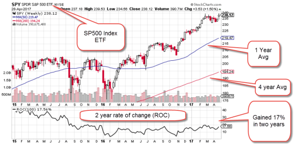
So how does a casual investor without a charting program chart a 4 year average? Stockcharts.com has free charts available. In the example below, I input “SPY,” a popular ETF that tracks the SP500 into the “Enter A Symbol” box on the upper right portion of the screen, then I clicked the Go button. Stockcharts displayed a daily chart for this ETF with default 50 and 200 day averages. Above the chart, I clicked the selection box from Daily to Weekly and pressed the Update button. I left the default 50 and 200 averages alone. The red line is now the 200 week, or approximately 4 year average. The blue line is the 50 week, or one year, average. The chart below is an example.

SP500ROC201704

This particular screen shot includes a Rate of Change indicator in the pane below the chart. Set at 100 weeks, it shows the percentage gain over two years.  Both gold (GLD) and mining stocks (XME) are struggling to get back above their 4 year averages.  You can change the symbol and compare their graphs.

In the earlier example, emerging markets had a five year spurt upwards, then a nine year flatline. Let’s look at a broad index like the SP500 in inflation adjusted dollars and we will see a similar pattern. $100K invested in the SP500 index in January 1997 was worth $183K in real dollars, real buying power, in April 2000. That was almost a doubling in real value in a small time frame. Easy money!

In 2012, twelve bruising years later, that inflation adjusted portfolio value FINALLY rose above $183K. Here is a free chart from PortfolioVisualizer.com

SP500GrowthInflAdj1997-2016

In the past four years, we have had another 62% spurt upwards in real value. The length of these spurts and flat periods are unpredictable, but the flat periods last longer than the spurts.

Let’s go back to the previous twenty year period, from 1977 – 1997.  In the first four years, from 1977 – 1983, the SP500 flatlined. In the following 14 years, the index grew by 570%!  (Exclamation marks for these growth spurts.)

SP500GrowthInflAdj1977-1997
We can see now that the strong asset price growth from 1997 to April 2000 was in addition to the extraordinary price growth from 1983 to 1997.  But doesn’t this example disprove the point I made earlier that flatline periods are longer than the growth spurts?

Let’s look back to those years before 1977 and we will see one of the reasons for that long growth period of the 1980s and 90s.  The six year flatline from 1977 – 83 was the tail end of a much longer period of flat or declining asset prices that lasted for 14 years, from 1969 through 1982. The introduction of tax deferred IRA accounts brought many individuals into the stock market during the 80s and 90s and helped to lift stock prices.  The introduction of the internet in the early 90s helped fuel a boom in asset prices much like the development of radio did in the 1920s.

Let’s turn from the long term 15+ year cycle of the stock market to the savings and retirement cycles. We spend at least forty years working. We may have just the last twenty years of our working career to save up for retirement. We hope to spend fifteen to twenty years in some stage of retirement.

We do not control when we are born nor the timing of these long term asset pricing cycles.  An awareness of these cycles may help guide us to wiser allocation choices.

The Nobel economist Robert Shiller builds an inflation adjusted ten year P/E ratio (CAPE) that is meant to smooth the ups and downs of company earnings. If I get some time next week, I may construct a 20 year ratio that corresponds to the 20 year cycle of 1) saving for retirement, 2) spending in retirement, and 3) the long term ebb and flow in the stock market.

////////////////////

Margin Debt

Investors meeting certain liquidity requirements can borrow money from their broker to buy assets, including stocks.  When stock prices start falling, investors without sufficient collateral in their brokerage accounts to cover the paper losses from falling stock prices may be subject to what is called a margin call.  The broker simply sells some of the client’s stock to replenish collateral.

Here’s an example and I will make the figures simple to avoid some of the complex rules involved.  An investor has $80,000 in stocks that she has bought and paid for.  She applies for a margin account with her broker who agrees to loan her $100,000 to buy other assets.  Thinking that the coming tax cuts will boost stock prices in the coming months, she buys $100,000 on margin in SPY, an ETF that replicates the SP500 index. Two weeks later, the European Union moves to disband in the coming months which makes investors very nervous and the stock market drops 20% in one day.  Yes, I told you I would make it simple.  The $80,000 in stocks that the investor owns outright is now worth $64,000 and the $100,000 of stocks she just bought on margin are worth $80,000.  The brokerage automatically sells $20,000 of the stock at the lower price to cover the shortfall in collateral. This is known as a margin call. One margin call does not create a selling wave.  Thousands of margin calls puts more downward pressure on stock prices and they continue to fall.  This again requires more selling to meet margin calls.

Because margin debt can ignite a selling frenzy in a crisis, the amount of margin debt is monitored.  Two years ago, the level of margin debt surpassed an earlier peak in 2000 at the height of the dot com bubble.  A graph from Doug Short at Advisor Perspectives shows the tight correlation between stock prices and margin debt.  After a brief decline, debt levels have again hit an all time high in real dollars.

There are a number of volatile situations around the world that could start a selling wave.  The level of debt will naturally accelerate that selling.  Now comes the news that there is a pool of margin debt that is not even reported and may add another 20 – 40% onto the reported total.  Here’s an article from Business Insider.

Guessing the Future

April 23, 2017

Human beings have an ability to foretell the future, or at least some people think so.  A more accurate description is that we predict the likelihood of future events based on past patterns.  Index funds average the predictions of buyers and sellers in a particular market.

During the recovery most active fund managers have underperformed their benchmark indexes. Standard & Poors, the creator and publisher of many indexes, provides a quick summary in their SPIVA spotlight. In the past five years, 88% of active fund managers have underperformed the SP500.  In a random world, I would expect that 50% of active fund managers would beat the index, and 50% of managers would underperform the index because the index is an average of all those buy sell decisions.

The 1% higher fees charged by active fund managers contribute mightily to this underperformance. Using long term averages, we expect that a third of active fund managers would beat their benchmark index.  The current percentage is only 12%. It is likely that the law of averages will eventually exert its pull.

Index funds mechanically rebalance regularly. Let’s look at a real life example.  The pharmaceutical giant Johnson and Johnson is a member of both the SP500 and the smaller group of core stocks that make up the Dow Jones index.  This week the company  reported first quarter revenues that were below expectations, and sellers promptly knocked 3% off the stock price.  Because most SP500 index funds are market weighted, index funds that mimic the weighting of the stocks in the index would buy and sell stocks in the index to capture these changes.

Because index funds are averaging the decisions of all stock investors, they should underperform. After all, the index funds are buying those companies that everyone else is buying, and selling companies that everyone else is selling.  Index funds are buying high and selling low, creating a drag on performance that is overcome by the lower fees charged by these funds.

In an article last fall in the Kiplinger newsletter, Steven Goldberg makes the case for a mix of both index and active funds.  Research shows that active fund mangers do better when an index does poorly.  It’s worth a read.

The index fund giant Vanguard is featured in a NY times article. John Bogle founded Vanguard based on his thesis that a passive approach to investing and low fees would reward most investors over the long term.

///////////////////////

Correlation, not Causation

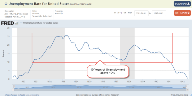
When the stock market crashed in 1929, the unemployment rate was less than 3%.  A booming economy during the 1920s lifted demand for labor, while severe immigration restrictions enacted in 1924 reduced the supply of workers.

Unemploy1929-1942

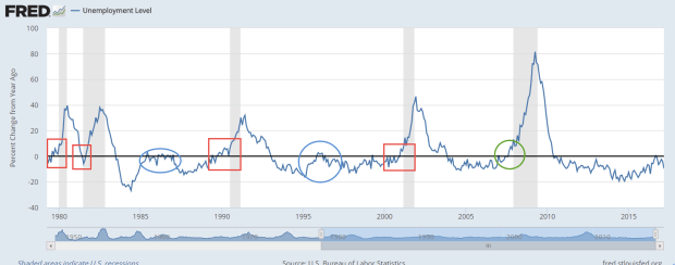
The unemployment rate was 6% when the market crashed in October 1987 and again in September 2008. There seems to be a weak connection between unemployment and severe market crashes.  However, there is a consistent correlation between the change in number of unemployed and the start of recessions.

UnemployChange

A yearly increase in the number of unemployed on a percentage basis indicates a fundamental weakness in the economy.  Sometimes, the change reverses as it did in early 1996, at the start of the dot com boom, or in the mid-eighties after a downturn in oil and housing exposed a banking scandal. These two periods are circled in blue in the graph above.

Often the economy continues to weaken, more people lose their jobs, GDP falters and the economy slides into depression.

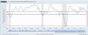
Because we cannot rely on just one indicator as a warning signal, we can chart the amount of production generated by each person in the labor force.  The civilian labor force includes both those who are working and those who are actively looking for work.  A growth rate below 1% indicates some weakness.  Using both the change in unemployment and the change in production helps filter out some of the noise.

While production growth may be faltering, the current unemployment level is not worrying.

///////////////////////

Pay Attention to the Pros

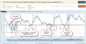
Institutional buyers and sellers of Treasury bonds will usually let the rest of us know when they are worried about a recession.  In a middling to healthy economy, Treasury buyers will demand a higher interest rate for a longer dated bond.  Subtracting the interest rate on a shorter term two year bond from a long term ten year bond should be positive.  In a “normal” environment, a 10 year bond might have an interest rate of 3% and a two year bond an interest rate of 1%.  The difference of 2% would be expected.  However, a negative result indicates that buyers want more interest from short term bonds because they are more concerned about short term risks.  As we can see in the chart below, a negative result precedes a recession by 12 to 18 months.  The current difference shows no indication of concern.

Guessing the future is not divination, nor is it perfect.  Retail investors may not have the time or expertise to estimate future risk, but we can study those who make it their business to manage risk.

The Long Game

April 16, 2017

Happy Easter!

Successful investing requires a far sighted vision. At the end of each year Vanguard sends its customers their long term outlook. This last one contained a few caveats: “the investment environment for the next five years may prove more challenging than the previous five, underscoring the need for discipline, reasonable expectations, and low-cost strategies.”

Vanguard’s ten year estimate of annualized returns is about 8% for non-US equities, 6.5 – 7% for the US stock market, 5% for REITs (real estate) and commodities, and 2% for bonds.

Vanguard’s team projects that a diversified portfolio of 60% stocks/ 40% bonds will return 5.6% annually over the next ten years. An agressive 80/20 mix they estimate at a 6.6% return, and a very conservative 20/80 mix at about 3.3%. Insurance companies typically adopt this safe approach. (Source)

/////////////////////////

ANNUITIES vs. MANAGED PAYOUT?

Investors near or in retirement must often turn to their investments for supplemental income. Annuities are sold as a safe “set it and forget it” solution, but they come with upfront fees and currently pay low interest.

In early 2008, before the fianncial crisis, a 65 year old man could get an average annuity (the average of a 10 year and life) for 5.5% a year. That provided a guaranteed income that was more than the classic 4% “safe” withdrawal rate for retirees. That 4% withdrawal rule would normally ensure that a retiree did not run out of money before they died.

The average annuity rate for that same age is now half that interest rate (Source). For an investment of $100K, a 67 year old male living in Colorado can get a lifetime annuity of $7212 per year (CNN Annuity Calculator) For 14 years, the insurance company providing the annuity is essentially returning the investor’s money to them. If that male investor lived for 20 years till age 87, they would receive a total of $144K, an annual return of only 1.84%. If the retiree lived to 97, their annualized return would increase to 2.5% over the thirty year period. Clearly, an investor is paying for safety.

Wade Pfau is a CFP whom I have cited in previous blogs. Here he compares the advantages and disadvantages of investments vs. insurance. He makes an argument that an annuity that covers one’s essential needs allows a person to take more risk with the rest of their portfolio. The potentially higher return from the investment side of the portfolio can thus make up for the lower returns of the annuity, an insurance product. He does caution, however, that most annuities do not protect against inflatiion. A investor who needed $1000 extra dollars in monthly income in 2017, would need more than $2000 in 30 years at a 2.5% inflation rate.

Managed Payout?

One alternative is a managed payout fund. The Vanguard Managed Payout Fund VPGDX lists the fund’s holdings as 60% stocks with an almost 20% allocation to alternative strategies. Alternatives vary in volatility depending on the intent of the investment but let’s treat them as though they were mostly a stock, giving the fund a simple effective allocation of 75% stock, 25% bonds. This fund lost 43% from April 2008 through March 2009, less than the 50% loss of the SP500 index but not by much. A broad composite of bonds (BND) actually gained 3% in price during that time. Here is some info from the investing giant Black Rock on alternative investments.

The return of the fund since its inception in April 2008 is 4.28%. Vanguard’s broad bond composite fund VBMFX, with far less risk, had a ten year return of 4.12% and gained value during the financial crisis. Although some mutual funds have trade restrictions, the prospectus on this fund lists no such restrictions, so that one could set up a monthly withdrawal from the fund.

A Vanguard target date 2030 fund (VTHRX), which has an allocation of 70% stocks, 30% bonds, had a ten year return of 5.31%. That fund lost 45% during the eleven month downturn in 2008-2009, slightly more than the Managed Payout Fund.  The additional 1% annual return is the reward for that slightly greater drawdown. A 1/4 of that additional 1% return can be attributed to lower fees.

The advantage of a Managed Payout Fund – simplicity and regularity of income flows – does not outweigh the disadvantages of volatility and some tax inefficiency. An investor could conveniently set up a monthly withdrawal from a broad based bond fund and enjoy the same return with much greater safety of principal, lower fees, and control over the withdrawal amount, if needed.

When it comes to retirement income, most investors would prefer the simple arithmetic of our grade school years.  Both Social Security and traditional defined benefit pension programs use that kind of math.  Each year, a retiree gets ‘X’ amount that is adjusted for inflation.  No choices needed.  However, most employees today have defined contribution, not benefit, plans. A retiree owns their savings, the capital base used to generate that monthly income, and it is up to the retiree to  navigate the winding channel between risk and return.

Dance of Debt

April 9th, 2017

Last week I wrote about the dance of household, corporate and government debt. When the growth of one member of this trinity is flat, the other two increase. Since the financial crisis the federal debt has increased by $10 trillion. Let’s look at the annual interest rate that the Federal government has paid on its marketable debt of Treasuries. This doesn’t include what is called interagency debt where one part of the government borrows from another. Social Security funds is the major example.

In 2016, the Federal government paid $240 billion in interest, an average rate of 1.7% on $14 trillion in publicly held debt. Only during WW2 has the Federal government paid an effective interest rate that is as low as it today. World War 2 was an extraordinary circumstance that justified an enormous debt. Following the war, politicians increased taxes on households and businesses to reduce the debt. Here is a graph of the net interest rate paid by the Federal government since 1940.

InterestRate

In 2008, before the run up in debt, the interest rate on the debt was 4.8%. If we were to pay that rate in 2017, the interest would total $672 billion, more than the defense budget. Even at a measly 3%, the interest would be $420 billion.  That is $180 billion greater than the interest paid in 2016.  That money can’t be spent on households, or highways, or education or scientific research.

The early 1990s were filled with political arguments about the debt because the interest paid each year was crippling so many other programs. Presidential candidate Ross Perot made the debt his central platform and took 20% of the vote, more than any independent candidate since Teddy Roosevelt eighty years earlier. Debt matters. In 1994, Republicans took over Congress after 40 years of Democratic rule on the promise that Republicans would be more fiscally responsible. In the chart below, we can see the interest expense each year as a percent of federal expenses.

PctFedExp

Let’s turn again to corporate debt. As I showed last week, corporate debt has doubled in the past ten years.

CorpDebt2016

In December, the analytics company FactSet reported (PDF) that the net debt to earnings ratio of the SP500 (ex-financials) had set another all time high of 1.88. Debt is almost twice the amount of earnings before interest, taxes, debt and amortization (EBITDA). Some financial reporters (here, for example ) use the debt-to-earnings ratio for the entire SP500, including financial companies. Financial companies were highly leveraged with debt before the crisis. In the aftermath and bailout, deleveraging in the financial industry effectively hides the growth of debt by non-financial companies.

What does that tell us? Unable to grow profits at a rate that will satisfy stockholders, corporations have borrowed money to buy back shares. Profits are divided among fewer shares so that the earnings per share increases and the price to earnings (profit), or P/E ratio, looks lower. Corporations have traded stockholder equity for debt, one of the many incidental results of the Fed’s zero interest rate policy for the past eight years.

Encouraged by low interest rates, corporations have gorged on debt. In 2010, the pharmaceutical giant Johnson and Johnson was able to borrow money at a cheaper rate than the Federal government, a sign of the greater trust that investors had in Johnson and Johnson at that time.

Other financial leverage ratios are flashing caution signals, prompting a subdued comment in the latest Federal Reserve minutes ( PDF ) “some standard measures of valuations [are] above historical norms.” Doesn’t sound too concerning, does it?

Each period of optimistic valuation is marked by a belief in some idea. When the bedrock of that idea cracks, doubts grow then form a chasm which swallows trillions of dollars of marketable value.

The belief could be this: passively managed index funds inevitably outperform actively managed funds. What is the difference? Here’s  a one-page comparison table. In 1991, William Sharpe, creator of the Sharpe ratio used to evaluate stocks, made a simple, short case for the assertion that passive will outperform active.

During the post-crisis recovery, passive funds have clearly outperformed active funds. Investors continue to transfer money from active funds and ETFs into index funds and ETFs. What happens when a smaller pool of active managers make buy and sell decisions on stocks, and an ever larger pool of index funds simply copy those decisions? The decisions of those active managers are leveraged by the index funds. Will this be the bedrock belief that implodes? I have no idea.

Market tensions are a normal state of affairs. What is a market tension? A conflict in pricing and risk that makes investors hesitate as though the market had posed a riddle. Perhaps the easiest way to explain these tensions is to give a few examples.

1. Stocks are overvalued but bond prices are likely to go down as interest rates rise. The latest minutes from the Fed indicated that they will start winding down their portfolio of bonds. What this means is that when a Treasury bond matures, they will no longer buy another bond to replace the maturing bond. That lack of bond purchasing will dampen bond prices. Stocks, bonds or cash? Tension.

2. Are there other alternatives? Gold (GLD) is down 50% from its highs several years ago. Inflation in most of the developing world looks rather tame so there is unlikely to be an upsurge in demand for gold. However, a lot of political unrest in the Eurozone could drive investors into gold as a protection against a decline in the euro. Tension.

3. What about real estate? After a run up in 2014, prices in a broad basket (VNQ) of real estate companies has been flat for two years. A consolidation before another surge? However, there is a lot of debt which will put pressure on profits as interest rates go up. Tension.

In the aftermath of the financial crisis, we discovered that financial companies, banks, mortgage brokers and ordinary people resolved market tensions through fraud, a lack of caution, and magical thinking. Investors can only hope that there is enough oversight now, that the memories of the crisis are still fresh enough that plain old good sense will prevail.

During the present seven year recovery there have been four price corrections in the Sp500 (Yardeni PDF). A correction is a drop in price of 10 – 20%. The last one was in the beginning of 2016. Contrast this current bull market with the one in the 2000s, when there was only one correction. That one occurred almost immediately after the bear market ended in the fall of 2002. It was really just a part of the bear market. From early 2003 till the fall of 2007, a period of 4-1/2 years, there was no correction, no relief valve for market tensions.

Despite the four corrections and six mini-corrections (5 – 10%) during this recovery, the inflation adjusted price of the SP500 is 50% higher than the index in the beginning of 2007, near the height of the market.  Inflation adjusted sales per share have stayed rather stable and that can be a key metric in the late stages of a bull market. The current price to sales (P/S) ratio is almost as high as at the peak of the dot com boom in 2000 and that ratio may prove to be the better guide. In a December 2007 report, Hussman Funds sounded a warning based on P/S ratios.  Nine years later, this report will help a reader wanting to understand the valuation cycles of the past sixty years.

Confidence Up

April 2nd, 2017

The Conference Board’s survey of Consumer Confidence shot up to 125, a 16 year high. Unfortunately, that previous high was set as the dot-com frenzy was nearing its end and just before the start of the 2001 recession. History could not possibly repeat itself, could it?

Confidence201703

There have been other frenzies in the past decades: the dot-com boom of the late ’90s, the housing and consumer debt boom of the ’00s, the run up in gold prices in the ’10s, the spike in interest rates in the late ’70s – eary ’80s. In the rear view mirror, the correction seems predictable.

From 1995 – 2000, the SP500 index tripled on the giddy expectations of a new global internet economy. Here was the plan: global supply chains spread among developing countries would assemble products which would be shipped to markets around the world. The U.S. and other developed countries could steer the global economy to new heights, and rid themselves of the nasty pollution that comes from manufacturing stuff.

Then, the new global digital economy went oops…

After falling back about 40%, the index then doubled from early 2003 through 2007. During that five year period, the house price index grew 40%, more than double its annual growth rate for the past century. In the old mortgage model, a lender would take a risk on the fortunes and reliability of a single family to repay a mortgage. Now, through the power of computerized algorithms, that risk could be sliced and diced so thin and spread among so many synthetic mortgages that the risk virtually disappeared. The smart people in the financial industry had finally figured out the secret to securitized debt. Every family could now build wealth by owning a home. Oh, happy days!

Then, housing went oops….

As the financial crisis gripped most of the developed world, central banks took on vast quantities of debt and expanded the money supply to counteract a slide into a global depression. Expanding the money supply usually brings an increase in inflation, and to protect against that coming inflation, investors around the world turned to gold. From the depths of the financial crisis in early 2009 toward the latter part of 2011, a period of less than 3 years, the price of gold doubled. But inflation did not rise as expected. The central banks had simply been fighting a strong undercurrent of deflation, stronger than even they had realized.

As inflation remained low, gold went oops….

The trick is to figure out beforehand what will go oops next. The pattern is this: an increasing number of people become convinced of “X” idea and begin to take it for granted. Then some series of events undermines a belief in “X” and the stampede begins. The massive increase in sovereign debt looks like a prime candidate for default and debacle but the central banks of developed countries have many legal and financial tools at their disposal to stem any panics.

For a dominant economic power like the U.S., the “X” has traditionally been based on private debt whose value can not be easily controlled by government dictate. In the late 90s, it was technology. Most of us associate that period with wildly inflated stock prices and IPOs that jumped in price on opening day. What may have escaped our attention is that corporate debt increased by almost 60% from the beginning of 1995 to the end of 2000. When the towers came down on 9-11, corporate debt had grown 75%. From early 2002 through 2005, there was no growth in corporate debt.

As corporate debt grew in the late 90s, government debt decreased. As corporate debt growth stopped in the early ’00s, household debt and government debt surged upwards. So let’s keep our eyes on this dance of corporate, household and government debt.

DanceOfDebt2016

Since the financial and housing crisis that began in 2008, federal govt debt has doubled, while household debt declined. It has taken eight years for household debt to finally surpass its 2008 high water mark, and is now approaching $15 trillion.

Since 2006, corporate debt has almost doubled. It is my guess that this is where the next crisis lies.

CorpDebt2016

After the next crisis, we will look back and see that there was such an obvious over-confidence in that “X.”  Analysts will help us understand the details and unfolding of the crisis till we think that we can avoid it next time.  Like whack-a-mole, the next crisis will pop up from another hidey hole.  The trick is to have several smaller hammers instead of one big hammer.

U.S.S. Obamacare Sails On

In March 2000, I cursed myself as I watched the SP500 cross the 1500 mark for the first time. Almost a year earlier, I had given in to my conservative instincts and paid off the mortgage with some savings. In 1999, my choice had been partially driven by a suspicion that the stock market was a bit overvalued. In 2000, I could see I was wrong; that I just didn’t understand the new economy. Had I invested the money in the stock market, I would have made 15% in less than a year.

When I set the time machine to election day 2016, I see that the index stood at about 2130, 40% higher than the 2000 benchmark. But wait. An asset is only worth what I can trade it for. Year by year, inflation erodes the real value of that asset. When I compare real values (BLS inflation calculator), the SP500 index on election day was almost exactly what it was in March 2000.

As the year 2000 passed into 2001 and the stock market fell from its heights, my decision to invest in real estate exemplified a golden word in investing: diversify.

Since the election, the SP500 has risen about 10%, as investors speculated that Republicans will usher in a new era of de-regulation and lower taxes. By mid-March, banking stocks had shot up over 25%. This past Monday, the 20th, the Freedom Caucus confirmed that they had the “no” votes necessary to block Thursday’s scheduled House vote on the Republican health care bill, AHCA. Banking and financial stocks, thought to be the biggest beneficiaries of less regulation, higher interest rates, and infrastructure spending, lost 5% over several days.

The Freedom Caucus is a group of 30-40 Republican House members who came to office in 2010 on the Tea Party wave. Led by North Carolina Representative Mark Meadows, the Caucus adheres strongly to conservative principles as they define them. They are chiefly responsible for driving out the former House Speaker, John Boehner. While strict adherence to principle – “my way or no way” – worked well as an opposition movement when Obama was President, the Caucus’ unwillingness to compromise is problematic under the current one-party rule. Can Republicans govern?

Paul Ryan, the current Speaker of the House, delayed the vote until Friday. House leadership and the White House tried to come to some compromise that would bring the Freedom Caucus on board without alienating the more moderate Republican members. With no support from Democrats, the additional no votes from the Freedom Caucus meant that Ryan could not muster the majority needed to pass the bill. Shortly before the scheduled vote at 4 PM on Friday, Ryan called off the vote.

The stock market is a herd attempt to predict and price what the world will be like in six months. As events catch up with forecasts, stock prices correct. Passage of the bill was supposed to be a key step toward tax reform if the Republicans want to pass a tax bill using Reconciliation rules, which require only a majority in the Senate.

With more than a half hour left in the trading day, the market had time to sell off 2 – 3%. And? Nothing. Did the bulls and bears cancel each other out in a flurry of trading? Nope. There was no unusual surge of volume in stocks. Either the market had already priced in the defeat of the AHCA, or buyers and sellers were left undecided.

Investors take a “risk off” approach during periods of uncertainty, moving toward gold (GLD) and long dated treasuries (TLT). Both have risen a few percent in the past two weeks but each is short of their January and February highs. Since mid-March, the SP500 (SPY) has lost a few percent. This tells me that investors had already adopted a more cautious stance.

President Trump has indicated that he wants to move on to tax reform and an infrastructure bill as well as the building of some type of defense perimeter on the border with Mexico. Perhaps investors hope that the lack of cohesion among Republicans on the health care bill will not sidetrack them from passage of these other bills.
The defeat of this bill is sure to empower the Freedom Caucus on further legislation. They were a thorn in John Boehner’s side and will no doubt frustrate Paul Ryan as well.

/////////////////////////////////

Existing Home Sales

We had a warm February in most of the country. Realtors reported good foot traffic but, but, but…a lack of affordable housing has turned away many first time home buyers. Home prices have been rising at double the growth in wages. While Feb’s numbers declined from a strong January, YTD existing home sales are more than 5% ahead of last year’s pace.

Regional declines varied: the northeast at -14% and the midwest at -7% led the list. The decline in the west was almost -4% but cities in California and Colorado report the fastest turnaround times from listing to sale. The San Jose region reported an average of 23 days.

Here’s February’s report from the National Assn of Realtors

Caution: Strong Growth Ahead

This week, the Congressional Budget Office (CBO) released their estimate of the fiscal impact of the AHCA, the draft version of the Republican health care reform plan. I’ll take a look at the CBO methodology later in this post. For those who may be tiring of the almost constant focus on the AHCA, let’s turn our attention to some economic indicators.

/////////////////////

CWPI (Constant Weighted Purchasing Index)

February’s survey of purchasing managers (PMI) indicated a broad base of confidence among purchasing managers in most industries. New orders in manufacturing are surging, an expansion more typical in the early stages of recovery after recession. Regardless of how one feels about Trump, there is a sense of renewal in the business community. Consumer Confidence is at record highs. Confident of finding another job, the number of employees who are quitting their jobs is at a 16 year high.

The CWPI is a composite of both the manufacturing and non-manufacturing PMI surveys and is weighted toward the two strongest indicators of future growth, employment and new orders. Since October, the composite has been rising from mild to strong growth.

CWPI201702

For most of 2016, new orders and employment were below their five year average.  Since October, they have been above that average.

EmpNewOrders201702

//////////////////////

Housing

The Housing Market Index released by the National Assn of Homebuilders just set a multi-year record. Housing starts are strong and single family homes under construction are the best in ten years. A popular ETF of homebuilders, XHB, is nearing a recovery high set in August 2015. 58,000 construction employees found work during a particularly warm February. Now the big picture. As a percent of the working age population, housing starts are still at multi-decade lows.

HouseStartsPctWorkPop201702

There has been an upshift toward multi-family units in some cities but, in a broad historical context, these are also near all time lows as a percent of the working age population.

MultiFamPctWorkPop201702

A primary driver of new housing construction, both single and multi-family, is the growth in new households, which is still soft. In 2016, households grew by 1%, below the 30 year average of 1.2%, and far below the 70 year average of 1.7%.

//////////////////////////////

Consumer Credit

Here’s an interesting data series from the FRED database at the Federal Reserve: the percent of people with subprime credit in each county. Click on the link and zoom in to see the data for a particular county. In New York City, Manhattan has a 16% subprime rate, less than half the 35% rate of the nearby Bronx. Give the link a few seconds to load the data and display the map.

Subprime

On July 1st, the credit rating agencies will remove tax liens and judgments from their records if liens do not include the full name, address, SSN or date of birth of the debtor. This will raise the credit scores of hundreds of thousands of subprime consumers.

//////////////////////

Real Estate Pricing Tool

Trulia has a heat map, by zip code, of the median home price per square foot. I will include this handy tool on the tool page.

//////////////////////

IRS Data

Of the 145 million returns filed, 46 million itemized deductions. Under the Republican draft of tax reform (PDF), almost all deductions would be eliminated in favor of a standard deduction that is almost twice as large as current law, $12,000 vs. $6300. (Deductions, Child Credits ). Half of capital gains, interest and dividends would not be taxed. For most filers, the dreaded 1040 tax form is only 14 lines. Publishers of tax software like Intuit are sure to lobby against such simplicity.

BetterWayTaxForm.png
Health insurance reform is the prerequisite to tax reform.  If House Speaker Paul Ryan encounters strong resistance in his own party to health insurance reform, his tax reform plan will be stymied as well.

/////////////////////////

AHCA

This past Monday, the Congressional Budget Office released their “score” (summary report and full PDF report) of the American Health Care Act, or AHCA. Score is a euphemism for the 10 year cost estimate that the CBO customarily gives on proposed legislation.

The CBO was careful to stress the uncertainty of their estimate. A critical component is the human response to changing incentives and the tentativeness of future state legislation. With most major legislation, the CBO estimates the macroeconomic effects. They did not include such an analysis in this report and note that fact. In short, the CBO is saying “take this estimate with a grain of salt.”

The headline number was the amount of people estimated to lose their health insurance over the next ten years – a whopping 24 million. Democrats used this ballpark estimate as a defining fact as they bludgeoned the plan. How did the CBO come up with their numbers?

Medicaid is the health insurance program for low income families and individuals.  When the program was introduced in 1965, enrollment was 1/4 million.  Today, 74 million are on the program.  The federal government and states share the costs of the program; the federal share averages 57%. Under the ACA’s Medicaid expansion, low income individuals younger than 65 without children could enroll.  An increase in the income threshold enabled more people to qualify for the program.  The federal share was guaranteed to not fall below 90% of those individuals enrolled under the expansion guidelines.

Medicaid (CMS) reports that 16.3 million people were added to Medicaid under the ACA expansion program and represent almost 75% of all enrollment under ACA. California has 12% of the U.S. population, but accounts for more than 25% of additional enrollees under Medicaid expansion. (State-by-state Medicaid enrollment ) Only 31 states adopted Medicaid expansion. The CBO estimates that those 16.3 million are 50% of the total pool of individuals that would be eligible if all states adopted the expansion program. So the CBO estimate of the total pool is almost 33 million.

Undere current law, the CBO estimates that additional states will adopt expansion so that 80% of the estimated total pool, or 26.4 million, will be enrolled under Medicaid expansion by 2026.  Under the AHCA, the CBO estimates that only 30% of that eligible population of 33 million, about 10 million, will be enrolled as of 2026. 26.4 million (under ACA) – 10 million (under AHCA) equals 16 million whom the CBO estimates will lose coverage under Medicaid. Note that this is a lot of blue sky math.

To summarize the ten year loss estimate under the rollback of Medicaid expansion: 6 million current enrollees and 10 million anticipated enrollees.

Medicaid expansion accounts for 16 million fewer enrollees. Where are the remaining 8 million missing? In the non-group private market. Currently, there are 11.5 – 12 million enrolled in these individual plans, an increase of about 5 million over the 6.6 million enrollees in 2007 (Health and Human Services brief) . The CBO estimates that, in 2018 and 2019, 2 million additional enrollees would take advantage of the ACA subsidies to buy policies. That results in a potential pool of about 14 million. Under the AHCA, the CBO estimates that the non-group private insurance market will return to its former level of 6 – 7 million, a loss of about 8 million.

Voila! 16 million under Medicaid expansion + 8 million in non-group private insurance = 24 million loss.

/////////////////////

Side Note

How do people get their health insurance?
74 million people, about 25% of the population, are enrolled in Medicaid. Half of Medicaid enrollees are children.
55 million, about 16% of the population, are on Medicare.
Over 150 million, or 50% of the population, are enrolled in an employer group plan (Kaiser Family Foundation).
Approximately 27 million, or 9% of the population, are uninsured.

Before the ACA, almost 50 million, or 16% of the population, were classified as uninsured. About 6 million of these uninsured had high deductible insurance plans called catastrophic plans. Offered by large insurance companies, they contained exclusions for pre-existing conditions, did not cover pregnancy, or mental disease, but were adequate for many self-employed tradespeople, contractors, consultants and farmers. (Info) In late 2013, the ACA redefined catastrophic plans by specifying the minimum benefits that a catastrophic plan must offer and, in 2014, began offering these plans through the state health care exchanges.

Replace, Beta Version

This week Republicans released their preliminary version of the replacement for the Affordable Care Act, aka Obamacare. Preliminary is the key word. The debate has started. The bill still needs to be scored by the Congressional Budget Office, which will estimate the total cost over the next decade. If the CBO estimate is high, we can expect major revisions in an attempt to rein in the costs.

Democrats and conservative Republicans have both criticized the bill, which is emerging from two committees in the House of Representatives.  The bill will pass through several steps of bargaining before it is voted on in the House. The Senate will have a different version of the bill but will contain some of the same elements. The Republicans have only a three vote majority in the Senate so the bill is likely to undergo revisions if it is to make it through the higher body.

If it does pass the Senate, that po’ little bill will be exhausted, but it will then have to pass through a committee that will reconcile differences in the House and Senate versions. Finally, it will head to the White House for President Trump’s signature.

The Republican version is AHCA.  Obamacare was ACA. We’ll hear these abbreviations a lot in the coming weeks.   People with employer group insurance will see few changes.  About 11 million people pay for their own insurance under a non-group private plan. Lower income enrollees receive subsidies under Obamacare. Many complained of rapidly escalating premiums, and insurance companies have been dropping out of the market, particularly in rural areas. 14.5 million people with really low incomes were added to the insurance rolls via Medicaid expansion under Obamacare (Politifact).

Here is a brief synopsis of what is proposed so far.  Popular provisions of Obamacare will remain. Parents can keep a child on their health care policy till the child is 26. Insurers can not refuse a policy because of a pre-existing condition.

Gone are the penalties for not buying insurance. Gone is the employer mandate to provide insurance and the individual mandate to have insurance. Gone are the formulas that employers must use to determine the number of full-time employees.  Gone are the subsidies for lower income working people, gone is the tax on tanning beds and medical equipment.

Instead of government subsidies based primarily on income, tax credits will be based on age first, and will phase out slowly for individuals with incomes above $75K. The credits are refundable, so that they are available to everyone whether they pay any Federal tax or not. This is similar to the Earned Income Tax Credit (EITC) for low income working families. (This provision has raised objections from the Freedom Caucus, a coalition of conservative Republicans.)

The proposed bill blocks any federal funding for Planned Parenthood, whose revenues consists mostly of Medicaid claims for non-controversial medical procedures. This provision will generate a number of discrimination lawsuits should it remain in the bill.

Medicaid funding will be based on each state’s at risk population – the elderly, the poor, the disabled. Each state can decide how to administer the funds. Several governors, including Republicans, are concerned about this provision. Under the ACA’s Medicaid expansion, hundreds of thousands of people were added onto the program. Governors worry that they will be stuck with some hard decisions in the case of a recession, when many more people lose their jobs, including their employer insurance, and qualify for Medicaid. The federal government can legally borrow money to fund promises when tax revenues are insufficient. States must run balanced budgets.

We can be sure that there will be a flurry of unsubstantiated assertions from politicians and surrogates on both sides of the aisle. We will be bombarded with catch phrases. Each politician hopes that their pithy phrase will make it into the 24 hours news cycle.

Here are just two examples from the floor of the Senate this past Tuesday. Each Senator has some good points but they drown those points in partisan drivel.  Both of these Senators are regarded as moderate voices within their party.

From John Cornyn, Texas Senator and Majority Whip, comes a phrase that all Republicans are required to use to describe Obamacare: “unmitigated disaster.”  Republicans didn’t feel that invading Iraq was an unmitigated disaster. Only Obamacare qualifies for that epithet. Republicans have learned that repeating a phrase over and over and over and over again makes it so. Politics reduced to a slogan, like the Wendy’s commercial “Where’s the beef?” (Here are a few excerpts of the speech. Cornyn’s staff doesn’t provide a full transcript.)

How much of an unmitigated disaster is Obamacare?  The Republican version keeps a number of key features of Obamacare so we can be reasonably certain that this is radical rhetoric, typical of what we hear from either party.

Cornyn uses the phrase “broken promise” to describe Obamacare. Over on the other side of the aisle, Washington Senator Patty Murray uses the same phrase to describe the Republican replacement. Maybe they both share the same speech writers.

Murray declared that millions of people will lose health care under the proposed legislation, which returns control of health care to the states. Here’s what passes for math in the Democratic Party, whose estimates of Obamacare enrollment have been  way above actual enrollment. The big  increase in enrollees have come from the Medicaid expansion, not the appeal of private market Obamacare plans.  Democrats could have passed a 100 page Medicaid expansion Act and have achieved the same results.

So, how does Murray justify the statement that millions will lose health care?    It’s not current enrollees, but future enrollees who will lose health care.  Got that?  These are invisible millions. Based on wildly optimistic estimates of future enrollments if Obamacare was left in place, Democrats then estimated that those exuberant estimates will not be met under the new proposal.  In past years, when enrollment figures did not meet projections, Democrats did not lament the fact that “millions” lost health care.  Democratic politicians only use their special math on programs from the other side.  And yes, Republicans do this as well.  (Murray’s staff made a transcript of the whole speech available.)

Like Cornyn, Murray reaches into her box of assertions, pulls out a few and repeats them. Only Obamacare can protect women’s health. 62% of white women, and 42% of all women, voted for Trump and his promise to repeal Obamacare because they wanted to damage their health? Does Murray think those women are stupid, or suicidal?  Maybe a lot of these women are the deplorables, as Hillary Clinton called them.

Like most Democrats, Murray can not understand that people resent the dictates of the Washington crowd and want more local control of their lives, even if it is only an opportunity to make their own mistakes. Politicians in Washington, those of both parties, have made a lot of mistakes. Voters in many states think that their legislatures and governors can’t do any worse.

Whenever we talk health care reform in the U.S., the discussion inevitably turns toward the single payer option, similar to the Canadian and British systems. One of the arguments against single payer systems is that the government rations care with long waiting times for appointments, particularly those for specialists, operations and hospital beds. Proponents of the U.S. system argue that the U.S. is far more responsive to the needs of patients.

Is that true? Several researchers studied {PDF} the waiting time statistics provided by governments in developed countries and found that comparisons of wait times are largely invalid. Why? Because different countries use different start times. From the paper:

“Current national waiting time statistics are of limited use for comparing health care availability among the various countries due to the differences in measurements and data collection.”

In some countries, the wait time to see a specialist might not start till the specialist makes an appointment with the patient. In other countries, the clock starts when the primary care physician writes the referral order that the patient needs to see a specialist. Some start the clock when the specialist receives the referral. Some countries distinguish between ongoing and completed care, while others don’t. The lack of consistency explains the contradictory results when comparisons of wait times are taken at face value.

After six years of stamping their feet and saying “No, no, no, no, no” like a four year old, Republicans have finally put some ideas on the table. We hope for some rational discussion of principles and likely outcomes, but, as each party has drifted to the extremes in the last two to three decades, the voices of moderation have been drowned out by impassioned pleas and slogans.  Moderation is a difficult political position to defend because it requires more than a catch phrase and a belligerent tone.

In the 24 hour media circus, politicians must posture and polemicize for the camera, for their constituents, and most importantly, for their contributors. Have your shovels ready for we shall soon be buried in the muck of debate!

Border Adjustment Tax

March 5, 2017

Gary Cohn,  President Trump’s Chief Economic Advisor, says that the Border Adjustment Tax (BAT) is off the table. This is a key revenue raiser, a hidden tax, in the Republican scheme to lower corporate taxes. We will continue to hear about BAT as the fight over tax reform heats up. What is it and how will it affect American families?

First, a bit of context. Most other developed countries have a VAT, or Value Added Tax, on purchased goods and services. In the EU most VAT taxes range from 20-25%. In America, we have state and local sales taxes that might add as much as 8 – 10% to the cost of a good. A VAT is like a Federal sales tax of 20%.

Unlike a VAT tax that affects most goods and services, the BAT will affect only imported goods. Here’s an example of the BAT tax using Big-Box as an example of a large merchandiser similar to Wal-Mart.

Big-Box imports a DVD Player for $80 (Cost of Goods Sold) and sells it for $100, making $20 gross profit. It has $5 other costs which are deducted from gross profit to reach a taxable profit of $15. Let’s say that Big-Box’s effective Federal tax rate is 30% (27.1% per Congressional Research Service). $15 taxable profit x 30% = $5 (rounded) Federal Tax.  Big-Box has a net after-tax profit of $10, or 10% of the retail price.  Remember that.  Current law = 10%.

Under the BAT proposal, Big-Box could not deduct the $80 it paid for the good because it is an import. Big-Box’s gross profit is now $100. Subtracting the $5 other costs, the taxable profit is $95. Multiply that by a lower 20% corporate tax rate and the Federal tax is now  about $19, far more than the $5 using the current tax system. Big-Box paid $80 cost + $19 in tax = $99, leaving them a gain of $1, or 1%.  Current law = 10% profit.  Proposed law = 1% profit.

For Big-Box to make the $10 after-tax profit it has under the current tax system, it would  need to raise the price of the DVD player about $15.  After paying a 20% tax ($3) on the additional revenue, it will net an additional $12. So the customer now pays $115 for a DVD player that used to be $100.  No change in quality.  Just an extra $15 out of the consumer’s pocket for an imported CD player.

What if Big-Box buys the DVD player from an American supplier for $100?  Under BAT, the $100 direct cost of the DVD player would be deducted from the sale amount, giving Big-Box a tax CREDIT of $20 ($20%).  The after-tax cost of the player is now $80 direct and the same $5 indirect cost = $85. To make a $12 net profit as under the current system, Big-Box could sell the DVD player for $97 and undercut another vendor selling the same DVD player for $115.

In theory, customers would rush to the vendor selling American DVD players. BUT, there is only one DVD manufacturer in the U.S. (Ayre Acoustics) and we don’t know how many parts of their product are imported.  The transition could take years and consumers will pay more for many household goods during that time.

Some products can only be imported.  Most of the lumber used to build homes is imported from Canada.  This hidden tax will be added onto the prices of homes and remodels.  Most diamonds are imported and will bear this hidden tax.  Businesses will lobby to have their product excluded where there is no alternative to an import.  This will be a boon for lobbying firms.

Businesses, particularly durable goods manufacturers, anticipate a complexity in this new tax. Planes, cars, boats, sporting goods and appliances are made with parts from a variety of countries, including the United States. Assessing the component value of imports and exports may require a judgment call by the company, and that is subject to dispute with the IRS. This is sure to become a headache.

Should the BAT become law, customers who have benefitted from the lower prices of imported goods are sure to complain loudly at the higher prices. Retailers have opposed the scheme. Republicans are promising tax cuts for middle class households but the tax reduction won’t offset the extra cost of many household goods.

Republicans have long resisted tax increases in their effort to shrink the size of the government yoke on American families. Many have signed a pledge not to raise taxes. To avoid any appearance of raising taxes, Republican lawmakers had to hide the tax and this was the best they could do.

Side Note: Why not just add the extra $20 as an import tax, or duty? Import taxes are paid to the government by the importing company of record when the goods are received in the country. Even if an item sits in a warehouse as inventory, the import duty has been paid, creating a cash flow problem for companies. With both VAT and BAT taxes, the tax is not charged until the good or service is sold.

//////////////////////////

IRA Contributions

Did you put off making your IRA contribution for 2016? In May 2011, I compared several “timing” scenarios of investing in an IRA for the years 1993-2009.The choices were making a contribution on:
1) July 1st, the middle of the tax year;
2) January 31st following the tax year;
3) April 15th following the tax year

The 1st option had a 2.5% advantage over the 2nd option because of the longer time frame invested. An even greater advantage was an option not on this list. Contributing an equal amount every month produced a 4% greater gain over the first option.

//////////////////////////

Stand up or Sit Down

The Bureau of Labor Statistics published a study  of  the time workers spend standing/walking or sitting. The average worker spends 3/5th of their time standing or walking.

timestudy
//////////////////////////

Education in the 21st Century

“Education technology is like teenage sex: everyone talks about it, nobody really knows how to do it, everyone thinks everyone else is doing it, so everyone claims they are doing it…”

That’s just one quote from this TechCrunch article on the investments needed in K-12 and higher education. The author feels that the appointment of Betsy DeVos as Secretary of Education will break up a coalition of interests that has stymied the adoption of technology in classrooms.

Readers who do not support Ms. DeVos may still find themselves in agreement with the author’s comment that “in both K-12 and higher education, technology remains supplemental to chalk-and-talk practices as old as the hills, and not much more effective from a pedagogical standpoint.”

Those who are sympathetic to teacher’s unions will bristle at this comment: “In K-12, the most promising applications of technology have been found most consistently in private and charter schools — freed from the strictures of teachers unions.”

The author discusses a new “10/90” proposal to give higher education institutions some “skin in the game.” Under an Income Share Agreement (ISA), higher education schools would contribute 10% of the amount of every federal loan. After graduation, students would make loan payments based on a fixed percentage of their income for a fixed number of years, with a clear cap on the total amount paid. The schools would recap their money ONLY if students graduated and would thus be more invested in the future of their students.

Returns and the Law of Averages

February 26, 2017

Value.  How do we gauge it?  What if we know that we are probably not getting the best value at the time?  What should we do?  A common metric used to value stocks – the Shiller CAPE ratio – indicates that we can expect lower returns in the future.  Should we change our behavior?

We calculate a Price/Earnings (P/E) ratio by dividing the current price of a stock by the last 12 months of the stock’s earnings. The Shiller Cyclically Adjusted P/E ratio (CAPE) searches for the signal amid the noisy static of quarterly earnings, the divisor in the P/E formula. Seasonal variations and the normal fluctuations in the business cycle give some erraticness to quarterly earnings. To uncover the signal, we divide the inflation-adjusted average of the past ten years of earnings. With that more stable figure as the divisor, we can more easily understand the variations in price relative to that stable base.

pevscape
As I wrote last week, the CAPE is at the third highest peak of the past century, just below the peak at the 1929 market crash.

Conclusion: stocks are seriously overvalued.

Argument: The past ten years of earnings include the financial crisis, the 2nd most severe downturn of the past century. That skews the CAPE ratio higher, so stocks aren’t overvalued.

CounterArgument: OK fine. Let’s use a 5 year CAPE ratio which excludes the financial crisis and the following two years. In the chart below, both ratios are shown. We are missing firm figures for last quarter’s earnings from S&P, but 82% of companies have reported earnings for the 4th quarter. Based on that known data, FactSet projects 4.6% earnings growth for the index as a whole. I have used that as a reasonably close estimate.

shillercape510comp
The 40 year average of the conventional 10 year CAPE, or CAPE10, is 20.8. The current CAPE10 is about 29 based on earnings estimates. The 40 year average of the 5 year CAPE, or CAPE5, is 19.6. The current CAPE5 is 24.8. Even the 5 year average indicates that the market is priced to perfection, about 26% more than the 40 year history.

Revised Conclusion: Based on the past 40 years of historical data, the market is over-priced, using both a short and long term approach.

There’s one more metric: ROI, or Return on Investment, a simple guideline that we can compute by excluding dividends and dividing today’s stock price by a previous price. For example, if I bought a stock at $100 on January 1, 2000 and sold it at $120 on January 1, 2005, I have made 20% / 5 years = 4% per year.

Over the past 40 years, the average of this simple 5 year ROI is 10.46%. The current 5 year ROI is 14%, 3.5% above the average. The 7% correction of last winter, from early January to early March, brought us to within range of the 40 year average.

Revised and Confirmed Conclusion: Mr. Market is over-priced.

There is a data tidbit that makes future returns a little bit more predictable, and it involves the law of averages. As I noted, the current 5 year ROI is computed by dividing today’s price by the price 5 years ago. Future ROI is a stock price 5 years in the future divided by the current price. In the 35 years from 1977 through early 2012, the average of the future ROI + current ROI is 10.9%, just slightly above the 40 year average of current ROI.

What this means is that if the current 5 year ROI is 14%, or 3.5% above average, there is a tendency toward a lower than average  return for the next 5 years. However, returns can be far above average and below average for an extended period of time. The dot-com boom from 1995 to 2001 had a series of extremely high 5 year ROI values, and might have convinced some investors that they were stock-picking geniuses.

roi95-01

Returns were astronomically high.  Unfortunately, the following 6 years from late 2001 to 2007 had low returns.

roi01-07
After several months of above average 5 year ROI returns, another 6 year depression on the heels of the financial crisis.

roi08-13
Conclusion with Reflection: For the long term investor (more than 5 years), a broad based index of stocks like the SP500 provides consistent returns that beat most passive investments. The cyclic ups and downs should not distract us from this central fact.  The law of averages can help us develop reasonable expectations of future returns.  By understanding the balance of above and below average, we do not become overly optimistic or pessimistic.