Price Illusion

January 8, 2023

by Stephen Stofka

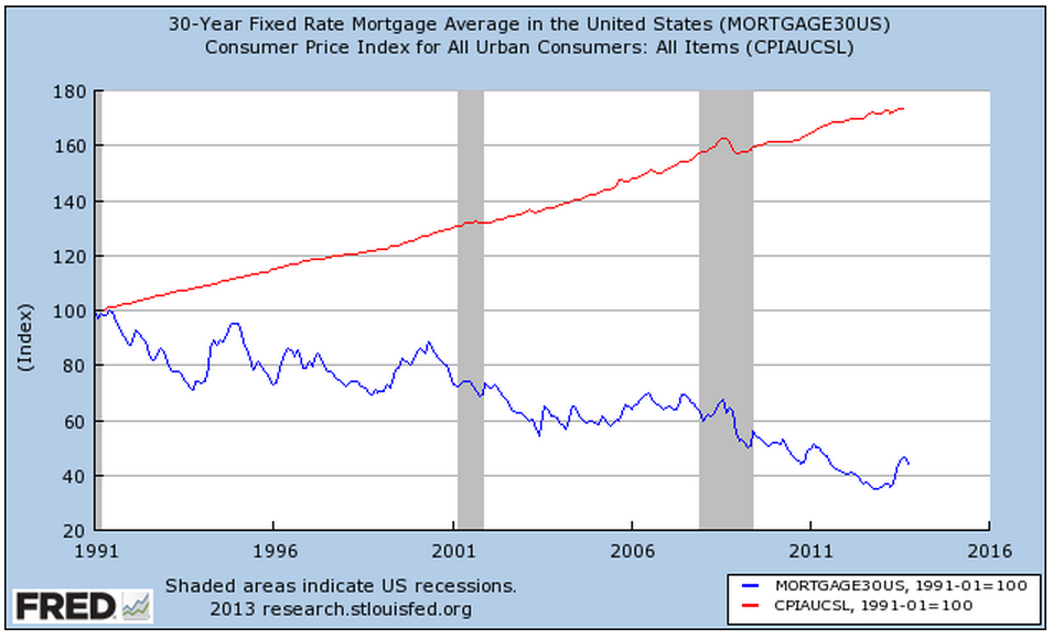
This week’s letter is about price illusions. The past two weeks I have written about the need to sort through past events to find the lessons. The past is a teacher, not a goal. Those who idealize and revere the past must eventually be swept down the drain of time. During this week’s struggle to elect Kevin McCarthy as House Speaker, the more conservative members of the Republican Party voiced their desire to return the country to the past of more than a hundred years ago when the population of 112,000,000 was a third the current size. Instead of learning from the past, we often use elements of history to tell a story. We discard events that do not fit our narrative. Historical analysis serves political interests. Asset analysis suffers from similar distorting strategies.

Technical analysis studies price movements with little regard for the circumstances that prompted the supply and demand, the buying and selling that underlie those movements. I will pick a few such variants at random. Elliott Wave theory bases its interpretation of price movement on the Fibonacci sequence of numbers. Beginning with 1, 1 this number series is constructed from the sum of the previous two numbers in the series. Thus 1 + 1 = 2, 2+1 = 3, and so on. This simple rule produces a sequence found in plant growth and the development of nautilus shells, for example.

Elliot Wave analysis claims that price movements come in waves. Understanding the current position within a wave can help an investor predict subsequent price action. The system is famously prolific in its prophecy, indicating several interpretations. It is better suited to a post hoc narrative. An investor can believe that if they just got better at interpreting the waves, they could time their buying and selling. As the physicist Richard Feynman said, “The first principle is that you must not fool yourself, and you are the easiest person to fool.”

Another technical system relies on the recognition of price trends, identifying those to follow and those that signal a likely reversal. These are visual and geometric, full of rising wedges, head and shoulders price patterns, double tops and bottoms. Much human behavior is repetitive, tempting an investor to perceive a pattern then extend it into the future. The repetition hides the recursive or evolutionary nature of human thinking. Inertia, Newton’s First Law of Motion, may apply to inanimate objects but not to human behavior. Biological systems have built-in dampeners that counteract a stimulus. Without repeated stimulus, the formation of any possible pattern decays.

Price behaves like a biological organism, not an inanimate object. We can see beautiful symmetries in graphical chart analysis but each pattern formation has a unique history. Price is the visible point of a response to events, needs and expectations. Price is a story of people. George Soros, a highly successful investor, constructs a predictive story, then watches price only as a confirmation or refutation of the story. If Soros thinks his story is not unfolding as he predicted, he exits his position.

In school we encountered various branches of mathematics where we were given formulas and plotted data points or intersections, the solutions to a set of equations. Statistics is the reverse of that process. We are given data sets and try to derive formulas to explain relationships within the data. A data set might be the test scores of students before and after the initiation of a certain curriculum. We may represent the test scores on a graph, but the scores reflect a complex set of individual behavior and circumstances, institutional policies, cultural background and economic resources. A statistical analysis tries to include some of these aspects in its findings. A student population is likely more homogenous than the companies in the SP500 stock index who represent a variety of industries. Just as test scores cannot fully explain the efficacy of a school policy or curriculum, asset prices do not reflect the complexity of a day’s events. In our longing for predictability and our fondness of patterns, we prefer analysis that explains price action as a rational sequence of responses to economic, political and financial events. Much financial reporting is happy to oblige.

//////////////////

Photo by FLY:D on Unsplash

Shoot Out At the OK Corral

October 20th, 2013

This coming Saturday is the 132nd anniversary of the gunfight at the OK corral.  We got our own OK corral in Washington and there was a whuppin’ this week – a Washington style whuppin’, which means that no one got whupped but everyone agreed on an appointment date for a  future whuppin’.

Congress passes a continuing budget resolution with the same frequency that many of us get our teeth and gums cleaned.  Many government reports were not released this past week but the National Assoc of Homebuilders (NAHB) released a very positive monthly report of the national housing market, showing a slight decline over the past few months last month but still a strong index reading of 55.  Two years ago this October, that index stood at 15.  In fact since the latter part of 2007, the index oscillated in the range of 15 – 20, so this has been a strong and sustained growth surge.

Over the past hundred years, house prices have risen at about the same rate as inflation, so that the real price of homes stays about the same.  Most homeowners finance their home purchase and it is this interest cost that determines the total capital cost of the home.  That capital cost and the interest cost is divided over the life of the mortgage into monthly payments.  PITI is a familiar acronym to many home owners and buyers; the initials represent the components of a monthly house payment. The ‘P’ stands for Principal – the monthly capital cost of the home.  The ‘I’ is interest on the amount of the loan.  The ‘T’ represents the local real estate taxes which are included in the monthly house payment sent to the mortgage servicer who forwards them on to the local taxing agency. The ‘I’ represents Insurance.  This can be both house insurance and, for those with an FHA loan, the amount of the loan insurance.  The interest rate on the home loan is a key component and although there has been an increase in mortgage rates since the spring, they are near all time lows.  A 30 year mortgage is a common benchmark.

Let’s index the CPI and the house price index to 1991 and look at the divergence.

Declining interest rates have enabled many more people to qualify for a home purchase, thus driving up home prices. In 1995, Congress made some major revisons to the 1977 Community Reinvestment Act, making home loans more available in distressed urban and rural districts.  This further exacerbated the rise in home prices, creating a large divergence between the CPI and the housing price index.

As every homeowner knows, the cost of a home includes maintenance, repairs, utilities, and improvements.  As I discussed last week , real median household incomes plateaued during the 2000s.  The rise in home values and changes in banking laws enabled homeowners to tap the equity in their homes to meet these additional obligations and to augment stagnant incomes.

In the past dozen years, many people discovered that housing is not a reliable source of income.  At the turn of the century, stock traders who quit their jobs to trade stocks during the tech bubble, discovered the same truth about the stock market, whose price returns are a few percent above inflation.  A nifty calculator at  DQYDJ illustrates the average returns of the SP500 over the past 100 years.


At the heart of the financial follies of past centuries is that a surge in price for some asset, be it tulip bulbs, Florida real estate or tech stocks leads people to conclude that they can hop on the gravy train.  What is the gravy train?  As an asset increases in value, more people invest in the asset bubble, the valuation continues to rise and – for a time – it is possible to convert a stock, a store of value, into a flow of income by either buying and selling the asset or borrowing money against the asset.  There is always some constraint – the rise of inflation, or the rise of personal incomes, or the growth rate of profits – that eventually brings an asset valuation down to earth.  Einstein famously quipped that the most powerful force in the universe was compound interest.  He might have mentioned  what may be the most powerful force – reversion to the mean.

Asset Allocation

A portfolio analysis adds up your investments in various categories to determine your asset allocation, a measure of the anticipated risks and returns of a portfolio.

The historical returns of stocks are higher but so are the risks. Bonds have less risk and less return. More importantly, there is a historical inverse correlation between stocks and bonds so that bond prices usually rise when stock prices fall and vice versa.

These historical trends were broken during the past year as almost all asset classes fell. Since March 2009, both bond and stock prices have risen dramatically. The recent crash and credit crisis has made people more cautious and we can expect that money will continue to flood into the perceived safety of bonds. How long can both stocks and bonds rise? When will the inverse relationship reassert itself? Which is the more powerful emotion? Will fear continue to drive money into bonds or will greed goad investors into the more risky stock market?

Asset allocation can dampen the emotional driving forces behind your investment decisions.

In an October 1999 WSJ article, Jonathan Clements examined the finer points of asset allocation with some investment professors. Most people calculate their asset mix by adding up the value of their stocks, bonds and cash. An old maxim is that the percentage of bonds and cash in your portfolio should approximate your age. The truest maxim may be “Go with your gut.” If you can’t sleep at night worrying about your investment portfolio, then it’s time to ease up on the risk in your investments.

So what about your house? House prices historically rise 3 – 4% per year, a return that approximates the return on a bond. When calculating your asset mix, should you include the equity of your house in with the total of your bond investments? A real estate professor that Clements interviewed maintains that a house is not a conservative investment. Historical data shows that, over a period of three years, housing prices have sometime fallen 40%. Remember, this article was written in 1999. How many people heeded that advice and treated the equity in their house as though it were more like an investment in a stock fund?

An investments professor interviewed by Clements “suggests treating your mortgage as a negative position in bonds”, subtracting the amount of the mortgage from the total bonds in your portfolio.

The point of analyzing a portfolio is to assess the risks that your investments are exposed to and that you personally are comfortable with. In this past year, too many older Americans found out that they were exposed to a lot more risk that they thought.

Mark To Market

You may hear the term “Mark to Market” occasionally. So what the heck is that? This is a long article on the topic but the first two pargraphs summarize the various accounting methods that banks and securities firms use and the issues at stake.

For those of you with short memories, the Enron Scandal (capitalized, as it should be) provoked the controversy of evaluating assets along with a number of lawsuits that brought down Arthur Anderson, one of the big five accounting firms.