Assumptions

May 21, 2023

by Stephen Stofka

This week’s letter is about the role of assumptions in our lives. They play an important part in the claims we make to others so they are implicated in our self-esteem and personal relationships. They become integrated in our decision making process, affecting choices that have a lasting influence in our lives.

An assumption is an unspoken part of claims and assertions. The technical term in the study of rhetoric is an enthymeme. An example of an enthymeme is that people should be encouraged to vote because democracy depends on the full participation of citizens. The unspoken assumption or premise is that democratic government is good for citizens. A syllogism makes a claim based on two clearly stated premises. The enthymeme leaves out one of those premises and it is this mutual understanding of the unspoken premise that binds people together. However, if both parties do not accept this unspoken premise, the issue cannot be resolved. This lack of agreement in an unspoken premise is a key aspect of religious and political debates. Our decision making often consists of enthymemes containing vague assumptions. This rhetorical tactic explains how we can fool ourselves into thinking we are above average investors.

Researchers construct an assumption that becomes a hypothesis when they design an experiment to test that assumption. Most of us don’t follow such a formal process. Our assumptions are tested by our observations, by the natural experiments of unfolding events. All too often, we fool ourselves by paying particular attention to those events which confirm our assumptions. We form a growing conviction that our assumptions are confirmed by the reality we observe around us. We make predictions of the future by converting our assumption into a conviction and we are shocked when events upset that conviction.

An example is the recent bankruptcy of Silicon Valley Bank (SVB). Depositors assumed that Gregory Becker, the company’s CEO and member of the board of directors at the Federal Reserve’s San Francisco branch, would be a prudent manager of depositor funds. They were stunned when they learned that Becker and Daniel Beck, the company’s CFO, did not hedge the bank’s interest rate risk, a management practice finance majors learn in school. Both men resigned but benefitted handsomely from their employment at the bank. At a Senate hearing this week Becker rejected responsibility for the fiasco, blaming regulators and customers for the bank’s downfall. His financial survival depends on minimizing his role in the whole affair and defending himself against accusations of fraud.

Economists assume that people are rational, that they are capable of making choices that will maximize their welfare. They make a further simplifying assumption that each person is both principal and agent, making the decision and realizing the benefits and costs of that decision. In a principal-agent relationship, however, the agent and principal are separate. They have different motivations because the benefits and costs are not the same. As a society becomes more complex, the principal-agent problem grows geometrically. The voices we hear most are those of the agents – Becker, the Senators, the regulators – whose actions must satisfy their own welfare while they serve the principals – teh citizens and depositors.

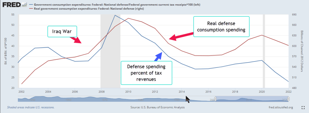
Objections to raising the U.S. debt limit go like this: the country is spending more than it receives in taxes. Like any household, we must cut our spending and live within our budget. The unspoken assumption is that the government’s budget is a scaled up version of a household’s budget. Politicians often court this fallacy of composition because they know that people yearn for simple explanations of complex issues. The U.S. currently spends over 20% of its income on defense, as the chart below shows. This would be equivalent of a family making $80,000 a year and spending $16,000 on a security system.

According to the Treasury Department (n.d.), 38% of tax collections are FICA taxes used to fund Social Security and Medicare. Imagine if a family sent 38% of their income to their parents or grandparents. These are just two examples that might lead us to reject the assumption that a family’s finances are like those of a government. In political debates like these, one side clings to the unspoken assumption because it is the linchpin of their argument.

Investors are cautioned not to put all their eggs in one basket. Diversification spreads the risk among asset classes. When we buy our first house, the down payment may take all of our savings, making us vulnerable to economic changes that impacts our income. We may make this gamble based on the assumption that in a worse-case scenario, we can sell the house for at least the same price we paid for it. During the financial crisis, homeowners were shocked to learn that their home values had declined. Many assumed that rising home prices were a natural law like steam that rises from a pot of boiling water. Ten million families that had gambled their savings on this assumption were wiped out during the crisis.

February’s reading of the 20-City Case-Shiller home price index showed no change in home prices in the past year. Home prices have fallen in some western cities where prices increased strongly in the past five years. From June 2022 to February 2023, Denver’s home prices have declined 6%. While the change in inflation has moderated, there is disagreement within the Fed’s interest setting committee whether to pause interest rate hikes. Continued rate increases could exacerbate price declines in some western states. Home owners may have to reevaluate their assumption that home prices only go up.

///////////////

Photo by israel palacio on Unsplash

Keywords: Defense spending, tax revenue, budget, household debt, debt

S&P Dow Jones Indices LLC, S&P/Case-Shiller 20-City Composite Home Price Index [SPCS20RSA], retrieved from FRED, Federal Reserve Bank of St. Louis; https://fred.stlouisfed.org/series/SPCS20RSA, May 18, 2023

U.S. Bureau of Economic Analysis, Federal government current tax receipts [W006RC1Q027SBEA], retrieved from FRED, Federal Reserve Bank of St. Louis; https://fred.stlouisfed.org/series/W006RC1Q027SBEA, May 18, 2023.

U.S. Bureau of Economic Analysis, Government consumption expenditures: Federal: National defense [A997RC1A027NBEA], retrieved from FRED, Federal Reserve Bank of St. Louis; https://fred.stlouisfed.org/series/A997RC1A027NBEA, May 18, 2023.

U.S. Bureau of Economic Analysis, Real government consumption expenditures: Federal: National defense [A997RX1A020NBEA], retrieved from FRED, Federal Reserve Bank of St. Louis; https://fred.stlouisfed.org/series/A997RX1A020NBEA, May 18, 2023.

U.S. Treasury. (n.d.). Fiscal Data explains federal revenue. Government Revenue | U.S. Treasury Fiscal Data. https://fiscaldata.treasury.gov/americas-finance-guide/government-revenue/#:~:text=So%20far%20in%20FY%202023,U.S.%20Department%20of%20the%20Interior.

Bridge the Gap?

Photo by Ragnar Vorel on Unsplash

September 6, 2020

by Steve Stofka

What issues are your priorities this election? For more than thirty years Pew Research has surveyed people about their priorities. For the first time in 2019 a majority of 765 respondents answered that there is a “great deal” of difference in where each party stands, up from 25% in 1987 (Pew Research, 2020). I’ve included the full list at the end.

In January 2019, soon after the midterm elections Pew surveyed 1500 adults (Jones, 2020). I don’t know why the abortion/free choice debate is not on the issue list since that single issue may decide some voters. I’m particularly interested in the large gaps in those priorities among those who lean Democrat or Republican. I’ll start with gaps of 25%. For instance, terrorism is a concern for 80% of Republicans but only 55% of Democrats. Other Republican priorities are Immigration, the Military and Crime.

As you can see, these are fear issues. Should a person in a town of 2000 be more concerned about terrorism than a resident of NYC? Of course not, but it is what it is. People vote out of fear and hope, but fear probably wins the wrestling match, especially among Republican voters who are not hopey, changey voters, as former VP candidate Sarah Palin noted (Gonyea, 2010).

The issue of crime illustrates the conflicting complexities of these issues. It is a 60% priority for Republicans, who are in suburban and rural areas where there is less crime, and a 40% priority for Democrats, who are in dense urban areas where there is a higher incidence of crime. Because crime is much lower than in past decades, this issue has slipped as a priority for Democrats (FBI, n.d.).  

Two of the highest Democrat priorites – Cimate Change and the Environment – have a huge gap of 50% with Republican voters. Democrat politicians have not been able to make these two fear issues personal for Republicans. If they could, they would draw more voters to their side on this issue. 25% gaps exist on issues of the Poor and Needy, Health Care, Education and Race Relations. Rural Republican voters are more likely to be poor and needy, but this is not a fear issue for them (USDA, n.d.).

What strategy would a politician or political consultant advise? Run toward the base? If so, one would emphasize these issues where there are large gaps between the two primary factions in this country. The President has largely adopted this strategy. Republican voters are more inclined to fall in line and the President is relying on this party loyalty even if they don’t like him personally.

Some issues where there is a smaller gap between factions are the economy, the budget deficit, jobs, global trade, drug addiction, transportation, Social Security and Medicare.

A politician reaching out to voters on the fence in this election would focus on these issues. Joe Biden hits the jobs theme, the budget deficit, and protecting Social Security and Medicare to appeal to voters who have had their fill of the President’s divisiveness.

In the coming two months, candidates may adjust their strategies. In the 2016 election, Hillary Clinton may not have addressed these shared concerns as well and it cost her the election.  Governing comes after winning an election. In politics, winning is packaging the concerns and identities of voters into an appealing, if not attractive, box that will get them to come out and vote.

What are your priorities this election season? Are you a multi-issue voter, a single issue voter, a party voter regardless of the issues? Here’s the Pew survey list of 18 issues: terrorism, immigration, military, crime, climate change, environment, poor and needy, race relations, health care, education, economy, Social Security, Medicare, jobs, drug addiction, transportation, global trade, and the budget deficit.

///////////////

Notes:

FBI. (n.d.). Crime rates in the United States, 2008 – 2018. Retrieved September 05, 2020, from https://crime-data-explorer.fr.cloud.gov/explorer/national/united-states/crime

Gonyea, D. (2010, February 07). ‘How’s That Hopey, Changey Stuff?’ Palin Asks. Retrieved September 05, 2020, from https://www.npr.org/templates/story/story.php?storyId=123462728

Jones, B. (2020, August 26). Republicans and Democrats have grown further apart on what the nation’s top priorities should be. Retrieved September 05, 2020, from https://www.pewresearch.org/fact-tank/2019/02/05/republicans-and-democrats-have-grown-further-apart-on-what-the-nations-top-priorities-should-be/

Pew Research Center. (2020, August 21). Public’s 2019 Priorities: Economy, Health Care, Education and Security All Near Top of List. Retrieved September 05, 2020, from https://www.pewresearch.org/politics/2019/01/24/publics-2019-priorities-economy-health-care-education-and-security-all-near-top-of-list/

U.S.D.A. (n.d.). Rural Poverty & Well-Being. Retrieved September 05, 2020, from https://www.ers.usda.gov/topics/rural-economy-population/rural-poverty-well-being/

Our Fair Share

January 19, 2020

by Steve Stofka

The holidays are over. This week our city picked up Christmas trees set by the curb. The sun set after 5 PM, the first time since the time change in the first week of November. The sun is returning to the Northern Hemisphere. Despite the variations in the amount of sunshine throughout the year, we all get the same amount of sunshine over the course of a year. Not so with our tax bills.

Estimated taxes were due this week. The self-employed, retired people and others who earn income with no taxes withheld must pay estimated taxes every quarter. This past year the IRS audited less than ½% of returns, a lifetime low. That sounds great because none of us wants to endure an audit. The very word strikes fear in the hearts of many taxpayers, but most of us have a small chance of being audited regardless. We don’t pay enough in taxes for the IRS to do much more than a paper audit, a request for supporting documentation.

The IRS is not a popular agency and became less popular when the agency discriminated against Tea Party and progressive groups during the 2010 election (Farhi, 2017). House Republicans repeatedly cut the agency’s budget, but that retribution has had serious budget consequences. The National Bureau of Economic Research estimated that the government could raise an additional $1 trillion in tax revenue – that’s about 20% of total revenue – with stricter enforcement of existing law (Heeb, 2019). In 2019, the Federal deficit, or budget shortfall, was $1.1 trillion (BPC, 2020). Stricter enforcement would have effectively erased that deficit.

The race for the Democratic Party’s nomination for President promises to center around several themes. The first is the horse race against President Trump, whose incumbency gives him a distinct advantage when running for re-election. The press often seems more concerned with the contest than the underlying issues of a campaign. Taxation is a recurring discussion in each election. More or less? What is a fair share? More, more, more social programs, taxation and regulation, or less, less, less social programs and taxation and more defense spending and power for large corporations?

What is fair? As children we have a keen sense of fairness – our “monkey brain.” We are social creatures who feel scorned at what we perceive as unequal treatment. Equal and fair are not the same thing. A fair share is not the same as an equal share. If I can afford to buy $50,000 worth of goods in a year, why should I have to pay more sales tax than someone who only buys $30,000? We make equal use of a city’s public services. Why should we be treated unequally? Well, we have become accustomed to paying an equal percentage of what we buy in the stores as a sales tax.

Why don’t we follow that same approach for income taxes? States like Colorado do charge the same rate of state income tax regardless of income. Is that fair? Some cities like Denver charge a head tax, a flat fee income tax for anyone who works within the district. Should we follow the same approach throughout the nation? Warren Buffett and I would pay the same amount in income taxes. Is that fair?

Should prices for public utilities be adjusted based on income? If my neighbor makes twice what I do, should they pay twice for the same amount of water? Currently, we are charged the same rate. The income and property taxes of those over 65 are often given a discount. In some districts, a person who reaches 65 finds that they can lower their property tax by 50%. Is that fair?

Elizabeth Warren, a candidate for the Democratic Party’s presidential nomination, proposed that all student debt be eliminated. Should students who went to more expensive private schools be rewarded more than students who borrowed less because they went to a state college? Should students who borrowed less because they worked part time while going to school be penalized? Is that fair?

In Matthew 20:1–16, Jesus tells a parable of the workers in the vineyard. Workers who came to work in the morning agreed to an amount of money for a day’s work. Workers who came to work later in the day were also promised the same amount of money for working the rest of the day. Jesus was making a point that each person will be rewarded equally in the kingdom of heaven no matter when in their lifetime they come to God’s love. No matter what your religious orientation, is that fair?

Each election we get to vote on what’s fair. Some people don’t vote because they say that their opinion doesn’t matter. It certainly doesn’t if they don’t vote so they have proved their case. If I vote and my neighbor doesn’t, my vote effectively counts double. In a few weeks, the Democratic primaries will start. The first two are in Iowa and New Hampshire, states with small populations and an even smaller number of people who participate in the caucus system. The votes of a few thousand people can make or break a candidate’s campaign. In a democratic nation of 320 million people, is that fair?

///////////////////////

Notes:

Bipartisan Policy Center (BPC). (2020, January 9). Deficit Tracker. [Web page]. Retrieved from https://bipartisanpolicy.org/report/deficit-tracker/

Farhi, P. (2017, October 5). Four years later, the IRS tea party scandal looks very different. It may not even be a scandal. Washington Post. [Web page]. https://www.washingtonpost.com/lifestyle/style/four-years-later-the-irs-tea-party-scandal-looks-very-different-it-may-not-even-be-a-scandal/2017/10/05/4e90c7ec-a9f7-11e7-850e-2bdd1236be5d_story.html

Heeb, G. (2019, November 19). The US could raise $1 trillion more in taxes through stricter IRS enforcement, according to a new study. Markets Insider. [Web page]. Retrieved from https://markets.businessinsider.com/news/stocks/us-could-raise-1-trillion-more-tighter-irs-enforcement-study-2019-11-1028700145

Photo by Maria Molinero on Unsplash

Budget Perspective

June 2, 2019

by Steve Stofka

How does your spending compare with others in your age group? Working age readers may compare their budgets with widely published averages that are misleading because they include seniors as well as those who are still living at home with their parents or are going to college. Let’s look at spending patterns classified by working age consumers 25-65 and seniors whose spending patterns change once they retire.

The Bureau of Labor Statistics collects data on consumer behavior by conducting regular surveys of household spending (Note #1). These surveys provide the underlying data for the computation of the CPI, the Consumer Price Index. Social Security checks and some labor contracts are indexed to this measure of inflation.

The BLS also provides an analysis of consumer purchasing by household characteristics, including age, race, education, type of family, and location (Note #2). Spending and income patterns by age contained some surprises (Note #3). The average income of 130,000 people surveyed in 2017 was $73K. Seniors averaged $25K in Social Security income. Younger workers aged 25-34, the mid-to-late Millennials, earned $69K, near the average of all who were surveyed. Following the Great Financial Crisis, this age group – what were then the early Millennials in 2010 – earned only $58K, so the growing economy has lifted incomes for this age group by 20% in seven years.

Home ownership is around 62% for the whole population, but far above that average for older consumers. 78-80% of people 55 and older own their own homes. More than 50% of those have no mortgage but too many seniors do not have enough savings. In many states, property taxes are the chief source of K-12 education funding and older consumers have the fewest children in school. Older consumers on fixed budgets resist higher property taxes to fund local schools and they vote in local elections at much higher rates than younger people. Since 2000, per pupil spending has grown more than 20% but most of that gain came in the 2000s.  In the past twelve years, real per pupil spending has barely increased (Note #4). Below is a chart from the Dept. of Education showing per pupil inflation adjusted spending.

Graph link: https://nces.ed.gov/fastfacts/display.asp?id=66

Saving is an expense and working age consumers aged 25-65 are saving 9-12% of their after-tax income, twice as much as the 5.6% average. Wait – isn’t saving the process of not spending money? How can it be an expense?  Call it the imaginary expense, as fundamental to our life cycle as i, the imaginary square root of -1, is to the mathematics of cyclic phenomena. Let’s compare today’s savings percentage with the panic years of 2009-10 just after the financial crisis. Workers in the 25-34 age group – who should have been spending money on furniture and cars and eating out – were saving 20% of their after-tax income (Note #5). That age group will probably carry the lessons – and caution – learned as they began their working career after the financial crisis.

Workers 25-65 spend 28-32% of their after-tax income on housing. Until they are 65, people spend a consistent 12% of their income on food, both at and away from home. Seniors spend less on food but most of that change is because they spend less money eating out at restaurants. Working age consumers spend more on transportation than they do on food – a consistent 15% of after-tax income.

People 65 and older are entitled to Medicare but they spend more on health insurance than working people and the dollar amount of their spending on health care rises by 50%. As a percent of after-tax income, seniors spend 15% while people of working age spend about 6%. Ouch. I’m sure many seniors are not prepared for those additional expenses.

Those of working age should compare their budget averages to other workers, not to the national averages, which include older people and those under 25. Summing up the major expense categories: workers are averaging 30% for housing, 15% for transportation, 12% for food, 11% for personal insurance, pensions and Social Security contributions, 10% for savings and 6% for healthcare.

As Joey on the hit TV show Friends would often say, “So how you doin’?”

///////////////////

Notes:

  1. Explanation of Consumer Expenditure Survey
  2. Consumption patterns – list Table 1300
  3. The most recent detailed analyses available are for 2017.
  4. Dept of Ed data
  5. Spending and income levels for those aged 25-34 2009-2010.

Strong Reactions

December 30, 2018

by Steve Stofka

Happy New Year!

Dramatic trading days signal a down market. In the week prior, the SP500 index lost over 7%. On Monday, Christmas Eve, the stock market fell to a level that would traditionally signal the beginning of a bear market, which is 20% below a recent high closing price. After a huge rally on Wednesday and a lot of volatile trading this week, the index gained 3%.

A disruptive stock market underscores the importance of asset allocation. The SP500 has lost 10% in December. A conservatively balanced fund like Vanguard’s Wellesley Income (VWINX) lost 1.8%. The fund is actively managed and has 40% stocks, 60% bonds/cash. A fund of index funds, VTHRX, lost 7.8%. It has a more aggressive mix of 65% stocks and 35% bonds/cash.

As I noted a few weeks ago (Hat Trick), there have been repeated signs of a struggle between hope and fear, between competing estimates of future earnings. 7% weekly price falls occur at crises or turning points. In the past sixty years, there have been only fifteen such weeks. Let’s take a look at the most recent.

In August 2011, then President Obama walked away from an informal budget deal with House Speaker John Boehner. The market lost almost 20% but fell short from hitting that mark. Once a budget deal was negotiated, the market recovered but it took five months to make up the losses.

SPY4YR2011-2018

Three years earlier, in October 2008, the market lost more than 7% in a week when negotiations for a bank bailout fell apart. This was a month after the bankruptcy of investment firm Lehman Brothers ignited the financial crisis. The market would take 39 months to recover that October price level. On February 17, 2009, President Obama signed the American Recovery and Reinvestment Act (Note #1). Senate Democrats made many concessions to win a few Republican votes for the bill to gain passage. Once it became clear that the stimulus funds would be trickled into the economy over several years, the market tanked, losing 11% during the month of February. In a final week of capitulation, the market lost 7% in the first week of March. This was the turning point.

A 10% weekly price drop in April 2000 heralded the end of the dot-com boom. The market would not recover for 83 months, almost seven years. An even worse fall came after the market opened following the 9-11 attack. The indictment of the international accounting firm Arthur Anderson sparked doubts about the financial statements of other companies and helped fuel an 8% drop in July 2002.

With six weeks of 7% price drops, the 2000s was the most tumultuous decade since the Great Depression. Strong reactions in the market deserve our attention and caution.

//////////////////////
Notes:
1. The American Recovery and Reinvestment Act 

Deepening Debt

December 2, 2018

by Steve Stofka

Each time the Federal Reserve raises interest rates, the President tweets out his disapproval. This week Fed Chair Jerome Powell indicated that interest rates increases might be slowing and the Dow Jones average jumped up more than 2% in a few hours (Note #1). Presidents don’t like rising interest rates because they contribute to a slump in housing and car sales, two relatively small pieces of the economy that create ripples throughout a community’s economy. Trump’s strategy relies on strong growth.

The passage of the tax law last December reduced Federal tax revenues, which contributed to a rising deficit. The gamble was that the repatriation of corporate profits plus a reduced corporate tax rate would spur higher GDP growth which would offset the falling revenues. It hasn’t so far.

Let’s get away from dollars and use percentages. Economists track the annual budget deficit as a percent of GDP. I’ll call it DGDP. Let’s say a family made $50,000 last year and had to borrow $1000 because they spent more than they made, their DGDP would be $-1,000/$50,000 or -2%. In a growing economy, the DGDP rises, or gets less negative. It falls, or gets more negative, as the economy nears a recession.

DeficitPctGDP

A DGDP below the 60-year average of -2.5% indicates an unhealthy economy and, by this measure, the economy has not been healthy since 2007. The DGDP was the same in the last year of Bush’s presidency as it was in the last year of the Obama presidency. By 2014, it had risen above -3% and rose slightly again in 2015 but fell again the following year.

In 2016, the last year of the Obama presidency, the DGDP was -3.13%. In the first year of the Trump presidency it fell slightly to -3.4%. As I said earlier, the administration and Congressional Republicans hoped the tax law passed at the end of 2017 would spur enough GDP growth to offset declining corporate revenues. So far, that has not happened. The 2018 budget year just ended in September. Preliminary figures indicate that the deficit will be 3.9% of GDP this year (Note #2). Some economists project a DGDP near -5% in 2019.

Japan’s economy for the past two decades strongly suggests that an aging population weakens GDP growth. The U.S. economy must flourish against that demographic headwind. By December this year, Social Security (SS) benefits will surpass the $1 trillion mark, equal to or surpassing SS taxes collected (Note #3). For years, the excess in SS tax collections has lessened the amount that the Federal government had to borrow from the public. Each year, the government has left an I.O.U. in the SS trust fund. The total of those IOUs is almost $3 trillion.

Now the Federal government faces two challenges: interest on the ever-growing Federal debt and the government’s need to borrow more from the public to “pay back” those IOUs. The interest on the debt will soon overtake defense spending. Politicians could reduce cost of living increases in SS benefits by indexing benefits to the chained price index, a flexible measure of inflation that assumes that human beings alter their consumption in response to changing prices. Benefits are currently indexed to the Consumer Price Index (CPI) whose fixed basket of goods never changes. The CPI overstates inflation, but seniors are sure to lobby against any changes that would reduce cost of living increases. Politicians are reluctant to face angry seniors who might boot some of them out of office at the next election.

Trump has a better alternative than strategically lowering benefit increases for the swelling ranks of retiring Boomers – increase SS tax collections. The only way to do that is jobs, jobs, jobs. Jobs that are “on the books,” that take out SS taxes with each paycheck; not the jobs of the underground economy that flourish in immigrant communities. More jobs to draw in the half million discouraged workers who are sitting on the sidelines of the job market (Note #4).

Jobs, jobs and more jobs take care of a lot of budget problems. Campaign strategist James Carville stressed that point to Bill Clinton during the 1992 Presidential campaign. Higher interest rates hurt the construction, auto and retail industries, and blue collar small business service industries. All of these are more likely to reach out and hire marginal workers.

The headwinds are more than demographic. The economy has been stuck in low for a decade. In the eleven years since the 3rd quarter of 2007, just before the 2007-2009 recession, real GDP has averaged only 1.6% annual growth (Note #5). That is barely above population growth. Sectors that were strong, housing and auto sales, have slowed. Housing sales have declined for six months. Auto sales have declined for 18 months. Fed interest rate policy has been very supportive but that is slowly being withdrawn.

The DGDP is one more indicator that we should already be in a recession or approaching one. A recession will add to the demographic headwinds, increase the annual budget deficit and swell the accumulated federal debt. Job growth must counter job loss due to automation. Good policies are those likely to add jobs. Bad policies are those that thwart job growth. It doesn’t matter how well intentioned the policies are. Good or bad for job growth is all that matters in the next decade.

Here’s why. Another credit crisis is building. Low interest rates transferred billions of dollars in interest from the savings accounts of older people to businesses and government, who were able to go on a borrowing binge. Defaults and delinquency on business loans will probably be the source of our next crisis. After that is the coming pension crisis in several cities and states. Let’s hope those two don’t hit simultaneously.

////////////////////
Notes:

  1. Within a day, interest rate futures that had priced in a 1/2% increase in the Fed Funds Rate during 2019 fell to just .3% for next year.
  2. Estimates of 2018 Fed deficit and GDP
  3. Social Security trustees’ summary report for fiscal year 2017.
  4. BLS series LNU05026645 discouraged workers. After ten long years, there are now as many discouraged workers as October 2008, just as the financial crisis sent the economy into shock. Within two years after the onset of the crisis, the number of discouraged workers had exploded 250%, reaching 1.25 million in October 2010.
  5. Real GDP: 3rd quarter 2007 – $15,667B. 3rd quarter 2018 – $18,672B. Constant 2012 dollars.

Our Legacies

April 29, 2018

by Steve Stofka

Each generation bequeaths the benefits and costs of legislative programs to the following generations.  In the past one hundred years, Democrats have secured a dominant majority in the Congress three times. A dominant majority is one where one party controls the Presidency and both houses of Congress with a filibuster proof majority of sixty in the Senate (History of Shifting Political Power).

Each time, the Democrats have created an entitlement program, a legacy structured so that it would be difficult to undo when Democrats were out of power.  Under FDR in the 1930s, the Democrats created Social Security. Like all entitlement programs, coverage and benefits were expanded in the first ten years after creation of the program.

In the 1960s, LBJ and the Democrats created Medicare and Medicaid. Before these programs, the Federal government paid 11 cents of every health care dollar. In 2013, that 11 cents had grown to 26 cents (CMS history PDF).  As with Social Security, coverage and benefits were greatly expanded the first decade after creation. In 1960, the U.S. spent 5.1 cents for every $1 of GDP. OECD countries spent only 3.7 cents. By 2013, Americans spent 16.4 cents of each $1 of GDP, twice as much as the 8.7 cents spent by OECD countries.

For fifty years, the annual growth of health care spending was 50% more than the growth rate of the economy.  With a dominant majority after 45 years, Obama and the Democrats tried to pass single payer health care in 2009. Democratic politicians in conservative leaning districts balked at the idea. Obamacare was a compromise solution that has been compared by opponents and advocates alike to a Frankenstein contraption of legislation that needs to be fixed. Expansion was embedded in the legislation from the start through the Medicaid program.

When the BLS and Census Bureau compute the Consumer Price Index (CPI), a measure of inflation, they consider the shifting patterns of consumer spending. Since 2000, the Medical spending component of the CPI has doubled its share of the index to about 17%. Increased medical spending is affecting most American families. Regardless of one’s opinion of the solution, Obamacare was a compromised attempt to deal with this trend.

The American health care system is like the 50-year old cars in Cuba that have been patched together with duct tape and ingenuity. The system runs on policy payoffs to stakeholder groups and it will fail most of us because it cannot adapt to the extraordinary advancements in medical care. As technological changes accelerate in the coming decades, this cobbled together system born of World War 2 wage and price controls will grow ever more unwieldy.

Entitlement programs invariably cost a lot more than the designers calculate. Program benefits are easier to sell to voters than raising the funds to pay for them. Following December’s tax reform bill, the non-partisan Congressional Budget Office revised their ten year budget and deficit estimates.

For the past fifty years, the Federal government has collected an average of $17.40 for every $100 of GDP.  The CBO projects Fed revenue will be over $18.00. Here’s the problem: the Federal government has been spending $20.30, almost $3 more than it collects. That’s how the country has run up a debt of $20 trillion. It’s about to get worse. Because of increased Medicare and Medicaid spending, the CBO projects spending will increase to $22.40 for every $100 of GDP. A $3 shortage will soon turn to a $4 shortage. The interest on that steadily increasing debt? By 2023, almost $3, a sixth of what the government collects and more than the defense budget.

Nations can not declare bankruptcy.  Instead, they become failed states and descend into anarchy.  Venezuela has become a failed state and its people are fleeing the country.  Most of the institutions have failed.  Most of the daily necessities of life are in short supply. The government claims that it doesn’t even have the paper to print exit Visas.  Under the Maduro government, truth was the first to abandon the country.

The economy is strong yet Chapter 11 bankruptcy filings have reached the same level as April 2011 when there was talk of another recession. That year, the unemployment rate was still above 9% and housing starts remained at all-time lows. Then-President Obama and Republican House Majority Leader John Boehner battled over a budget compromise and the stock market dropped nearly 20%. In a strong economy like today, we should have lower levels of bankruptcy.


Productivity And Labor Unions

February 5, 2017

About 10% of all workers, public and private, belong to a union. Today the percentage of private sector employees who are unionized is the same as in 1932, eighty years ago. (Wikipedia) The rise and fall of unon membership looks like the familiar bell curve, with the peak in the 1970s. The causes of the decline are debated but some attribute the erosion of union power as an important factor in wage stagnation.

The major factor is not declining union membership but declining productivity, and that persistent decline has economists and policymakers baffled.  Higher productivity should equal higher wage growth and, in the 30 year post-war period 1948-1977, multi-factor productivity (MFP) annual growth averaged 1.7%. MFP includes both labor and capital inputs. In the 40 year period from 1976-2015, MFP growth averaged about half that rate – .9%.

prodmfp1948-2015

In the debate over the causes of the decline, some contend that all the easy gains were made by 1980.  Productivity is now returning to a centuries long growth trend that is less than 1%. In an October 2016 Bloomberg article, Justin Fox picked apart BLS data to show that growth has been flat in some key manufacturing areas for the past three decades. The ten-fold surge in productivity growth in the tech sector is largely responsible for any growth during the past 30 years. OECD data indicates that other developed countries are experiencing a similar lack of growth (OECD Table) When no one can conclusively demonstrate what the causes are for the decline, policymakers face tough challenges and even tougher debate over the solutions.

//////////////////////////////

LoanGate

LoanGate may the next scandal. A few months ago, the Dept of Education (DoE) revealed that they had seriously undercounted student loan delinqencies because of a programming error. When the Wall St. Journal analyzed the revised data, they found that the majority of students at 25% of all colleges and trade schools in the U.S. had defaulted on their student loan or failed to make any repayment.  (WSJ article)

The Obama administration forced the closure of many private institutions whose students had low repayment rates. In 2015, Corinthian Colleges shuttered the last of its schools and filed for bankruptcy. The revised data show that many more institutions, both public and private, should be shut down.

This latest programming error at the DoE follows other embarrassing episodes during the two Obama terms. In October 2013, the rollout of Obamacare was riddled with programming errors that blocked many applicants from enrolling in a plan with healthcare.gov.

In 2010, the IRS delayed many applications for 501(c)3 tax status from mostly conservative political groups. Lois Lerner, the head of the agency, first claimed that these had been innocent clerical mistakes by an overworked staff, but a series of hearings uncovered the fact that employees at the IRS had acted on their own political feelings and deliberately targeted these groups. (Mother Jones)

In yet another incident, the Office of Personnel and Managment (OPM), the HR dept for thousands of Federal employees, revealed in 2016 a data breach involving 22,000,000 personnel records, including Social Security numbers.  Unchecked programming errors and data breaches erode the public’s faith in public institutions.  That these mistakes happened under a Democratic administration favoring ever bigger public institutions to solve ever bigger social problems is especially embarrassing.

When Obama first took office in 2009, the inflation adjusted total of student debt had quadrupled in the 15 year period (DoE paper – page 1) since 1993. By the time he left office eight years later, student debt had grown ten-fold to $1.3 trillion. The delinquency rate on that debt is 11% but the repayment rate is considered a better predictor of future delinquencies. The revised data reduced the combined repayment rate to a little more than 50% (Inside Higher Ed), far lower than the 75% plus repayment rates of a few decades ago.

The defaults are coming and there will be an inevitable call for a taxpayer bailout.  A popular element of Bernie Sanders’ Presidential platform was that a college education should be free. In the real world, nothing is free, so somebody pays.  Who should pay and how much will further aggravate tensions in an already divided electorate.

///////////////////////////////////

Five Year Rule

A few weeks ago I wrote about the 5-year rule, a backstop to any allocation rule. Any money needed in the next five years should be in stable assets like short to intermediate term bonds, CDs and cash. Why 5 years of income? Why not 2 years or 10 years? Answer: History.

Let’s look back at 80 years in 5 year slices, or what is called 5-year rolling periods. As an example, the years 2000 – 2004 would be a 5-year rolling period. 2001 – 2005 would be the next period, and so on.

Saving me the time and effort of running the data on stock market returns is a blogger at All Financial Matters who put together a table of this very data for the years 1926-2012. The table shows that the SP500 has held or increased its inflation adjusted value (very important that we look at the real value) almost 75% of the time. So the 5-year rule guards against a loss of value the other 25% of the time.

The 5-year rule can apply whenever there are anticipated income needs from our savings: retirement, college expenses, sickness or disability, and even a greater chance of losing our jobs. In a retirement span of 25 years, 6 of those years will fall into that 25% category. The 5-year rule minimum usually kicks in toward the end of retirement when a person’s reserves are lower and prudence is especially important.


Home Sweet Asset

April 3, 2016

Normally we do not include the value of our home in our portfolio.  A few weeks ago I suggested an alternative: including a home value based on it’s imputed cash flows.  Let’s look again at the implied income and expense flows from owning a home as a way of building a budget.  The Bureau of Labor Statistics and the Census Bureau take that flow approach, called Owner Equivalent Rent (OER), when constructing the CPI, and homeowners are well advised to adopt this perspective.  Why?

1) By regarding the house as an asset generating flows, it may provide some emotional detachment from the house, a sometimes difficult chore when a couple has lived in the home a long time, perhaps raised a family, etc.

2) It focuses a homeowner on the monthly income and rent expense connected with their home ownership.  It asks a homeowner to visualize themselves separately as asset owner and home renter. It is easy for homeowners to think of a mortgage free home as an almost free place to live. It’s not.

3) Provides realistic budgeting for older people on fixed incomes.  Some financial planners recommend spending no more than 25% of income on housing in order to leave room for rising medical expenses.  Some use a 33% figure if most of the income is net and not taxed.  For this article, I’ll compromise and use 30% as a recommended housing share of the budget.

A fully paid for home that would rent for $2000 is an investment that generates an implied $1400 in income per month, using a 70% net multiplier as I did in my previous post. Our net expense of $600 a month includes home insurance, property taxes, maintenance and minor repairs, as well as an allowance for periodic repairs like a new roof, and capital improvements.

Using the 30% rule, some people might think that their housing expense was within prudent budget guidelines as long as their income was more than $2000 a month.  $600 / $2000 is 30%.

However, let’s separate the roles involved in home ownership.  The renter pays $2000 a month, implying that this renter needs $6700 a month in income to stay within the recommended 30% share of the budget for housing expense.  The owner receives $1400 in net income a month, leaving a balance of $5300 in income needed to stay within the 30% budget recommendation. $6700 – $1400 = $5300.  Some readers may be scratching their heads.  Using the first method – actual expenses – a homeowner would need only $2000 per month income to stay within recommended guidelines.  Using the second method of separating the owner and renter roles, a homeowner would need $5300 a month income. A huge difference!

Let’s say that a couple is getting $5000 a month from Social Security, pension and other investment income.  Using the second method, this couple is $300 below the prudent budget recommendation of 30% for housing expense.  That couple may make no changes but now they understand that they have chosen to spend a bit more on their housing needs each month.  If – or when – rising medical expenses prompt them to revisit their budget choices, they can do so in the full understanding that their housing expenses have been over the recommended budget share.

This second method may prompt us to look anew at our choices.  Depending on our needs and changing circumstances, do we want to spend $2000 a month for a house to live in?  Perhaps we no longer need as much space.  Perhaps we could get a suitable apartment or townhome for $1400?  Should we move?  Perhaps yes, perhaps no.  Separating the dual roles of owner and renter involved in owning a home, we can make ourselves more aware of the implied cost of our decision to stay in the house.  A house may be a treasure house of memories but it is also an asset.  Assets must generate cash flows which cover living expenses that grow with the passage of time.

/////////////////////

The Thrivers and Strugglers

“Bravo to MacKenzie. When she was born, she chose married, white, well-educated parents who live in an affluent, mostly white neighborhood with great public schools.”

In a recent report published by the Federal Reserve Bank at St. Louis, the authors found that four demographic characteristics were the chief factors for financial wealth and security:  1) age; 2) birth year; 3) education; 4) race/ethnicity.

While it is no surpise that our wealth grows as we age, readers might be puzzled to learn that the year of our birth has an important influence on our accumulation of wealth.  Those who came of age during the depression had a harder time building wealth than those who reached adulthood in the 1980s.

Ingenuity, dedication, persistence and effort are determinants of wealth but we should not forget that the leading causes of wealth accumulation in a large population are mostly accidental.  It is a humbling realization that should make all of us hate statistics!  We want to believe that success is all due to our hard work, genius and determination.

//////////////////////

Employment

March’s job gains of 215K met expectations, while the unemployment rate ticked up a notch, an encouraging sign.  Those on the margins are feeling more confident about finding a job and have started actively searching for work.  The number of discouraged workers has declined 20% in the past 12 months.

Employers continue to add construction jobs, but as a percent of the workforce there is more healing still to be done.

The y-o-y growth in the core workforce, aged 25-54, continues to edge up toward 1.5%, a healthly level it last cleared in  the spring of last year.

The Labor Market Conditions Index (LMCI) maintained by the Federal Reserve is a composite of about 20 employment indicators that the Fed uses to gauge the overall strength and direction of the labor market.  The March reading won’t be available for a couple of weeks, but the February reading was -2.4%.

Inflation is below the Fed’s 2% target, wage gains have been minimal, and although employment gains remain relatively strong, there is little evidence to compel Chairwoman Yellen and the rate setting committee (FOMC) to maintain a hard line on raising interest rates in the coming months.  I’m sure Ms. Yellen would like to get Fed Funds rate to at least a .5% (.62% actual) level so that the Fed has some ability to lower them again if the economy shows signs of weakening.  Earlier this year the goal was to have at least a 1% rate by the end of 2016 but the data has lessened the urgency in reaching that goal.

ISM will release the rest of their Purchasing Manager’s Index next week and I will update the CWPI in my next blog.  I will be looking for an uptick in new orders and employment.  Manufacturing lost almost 30,000 jobs this past month – most of that loss in durable goods.  Let’s see if the services sector can offset that weakness.

///////////////////////////

Company Earnings

Quarterly earnings season is soon upon us and Fact Set reports that earnings for the first quarter are estimated to be down almost 10% from this quarter a year ago.  The ten year chart of forward earnings estimates and the price of the SP500 indicates that prices overestimated earnings growth and has traded in a range for the past year.  March’s closing price was still below the close of February 2015.  Falling oil prices have taken a shark bite out of earnings for the big oil giants like Exxon and Chevron and this has dragged down earnings growth for the entire SP500 index.

Transfer Payments

February 16th, 2014

In this election year, as in 2012, the subject of transfer payments will rear its ugly head with greater frequency.  In the mouths and minds of some politicians, “transfer payments” is synonymous with “welfare.”  Don’t be confused – it is not.  As this aspect of the economy grows, politicians in Washington and the states get an increasing say in who wins and who loses.  Below is a graph of transfer payments as a percent of the economy.  I have excluded Social Security and Unemployment because both of those programs have specific taxes that are supposed to fund the programs.

Transfer payments, as treated in the National Income and Product Accounts (see here for a succinct 2 page overview), are an accounting device that the Bureau of Economic Analysis (BEA) uses to separate transfers of money this year for which no goods or services were purchased this year.  The BEA does this because they want to aggregate the income and production of the current year. Because that category includes unemployment compensation, housing and food subsidies, some people mistakenly believe that the category includes only welfare programs.   Here’s a list of payments that the BEA includes:

Current transfer receipts from government, which are called government social benefits in the NIPAs, primarily consist of payments that are received by households from social insurance funds and government programs. These funds and programs include social security, hospital insurance, unemployment insurance, railroad retirement, work­ers’ compensation, food stamps, medical care, family assistance, and education assistance. Current transfer receipts from business consist of liability payments for personal injury that are received by households, net in­surance settlements that are received by households, and charitable contributions that are received by NPISHs.

That settlement you received from your neighbor’s insurance company when his tree fell on your house is a transfer payment.  Didn’t know you were on welfare, did you?  Some politicians then cite data produced by the BEA to make an argument the government needs to curtail welfare programs.  Receiving a Social Security check after paying Social Security taxes for forty plus years?  You’re on welfare.  A payment to a farmer to not grow a bushel of wheat – an agricultural subsidy – is not a transfer payment.  A payment to a worker to not produce an hour of labor – unemployment insurance – is a transfer payment.  Got that?  While there are valid accounting reasons to treat a farmer’s subsidy check and a worker’s unemployment check differently, some politicians prey on the ignorance of that accounting difference to push an ideological agenda.

That agenda is based on a valid question: should a government be in the business of providing selective welfare; that is, to only a small subset of the population?  Some say yes, some say no.  If the answer is no, does that include relief for the victims of Hurricane Katrina, for example?  Even those who do say no would agree that emergencies of that nature warrant an exception to a policy of no directed subsidies or welfare payments.  It was in the middle of a national emergency, the Great Depression, that Social Security and unemployment compensation were enacted.  Government subsidies for banks began at this time as well.  Agricultural subsidies began in response to an earlier emergency – a sharp depression a few years after the end of World War 1.  Health care subsidies were enacted during the emergency of World War 2.  The pattern repeats; a subsidy starts as a response to an immediate and ongoing emergency but soon becomes a permanent fixture of government policy.

Tea Party purists think that the Constitutional role of the federal government is to tax and distribute taxes equally among the citizens.  Before the 16th Amendment was passed a hundred years ago, the taxing authority of the Federal Government was narrowly restricted.  However, the Federal Government has always been selective in distributing  the resources at its disposal.  Land, forests, mining and water rights were either given or sold for pennies on the dollar to a select few businesses or individuals. (American Canopy is an entertaining and informative read of the distribution and use of resources in the U.S.) By 1913, the Federal Government had dispensed with so much land, trees and water that it had little to parlay with – except money, which it didn’t have enough of.  Solution: the income tax.

In principle, I agree with the Tea Party, that the government at the Federal and state level should not play God.  How likely is it that the voters of this country will overturn two centuries of precedent and end transfers?  When I was in eighth grade, I imagined that adults would have more rational and informed discussions.  Sadly, our political conversation is stuck at an eighth grade level on too many issues.

****************************

While most of us pay attention to the unemployment rate, there is another statistic – the separation rate – that measures how many people are unemployed at any one time.  The unemployment can be voluntary or involuntary, and last for a week, a month or a year.  Not surprisingly, younger workers change jobs more frequently and thus have a higher separation rate than older workers.  In the past decade, almost 4% of younger male workers 16 – 24 become unemployed in any one month.  Put another way, in a two year period, all workers in this age group will change jobs.  For prime age workers 25 – 54, the percentage was 1.5%.  In a 2012 publication, Shigeru Fujita, Senior Economist at the Philadelphia Federal Reserve Bank, examined historical demographic trends in the separation rate.

On page five of this paper, Mr. Fujita presents what is called a “labor-matching” model that attempts to explain changes in unemployment and wages, primarily from the employer’s point of view. Central elements of this model, familiar to many business owners, include uncertainty of future demand and the costs of finding and training a new worker.  Mr. Fujita examines an aspect that is not included in this model – the degree of uncertainty that the worker, not the employer, faces.  In the JOLTS report, the BLS attempts to measure the number of employees who voluntarily leave their jobs.  These Quits indicate the confidence among workers in finding another job.  The JOLTS report released this week shows an increasing level of confidence but one which has only recently surpassed the lows of the recession in the early 2000s.

**************************

Labor Participation
In a more recent paper, Mr. Fujita examines the causes of the decline in the labor participation rate, or the number of people working or looking for work as a percentage of the people who are old enough to work.  As people get older, fewer of them work; the aging of the labor force has long been thought to be the main cause of the decline.  That’s the easy part.  The question is how much does demographics contribute to the decline? What Mr. Fujita has done is the hard work – mining the micro data in the Census Bureau’s Current Population Survey.  He found that 65% of the decline of the past twelve years was due to retirement and disability.  More importantly, he discovered that in the past two years, all of the decline is due to retirement.  The first members of the Boomer generation turned 65 in 2011 so this might come as no surprise.  The surprise is the degree of the effect;  this largest  generational segment of the population dominates the labor force characteristics. During the past two years, discouraged workers and disability claims contributed little or nothing to the decline in the participation rate.  Another significant finding is that relatively few people who retire return to the work force.

In this election year, we will be bombarded with political BS: Obamacare or Obama’s policies are to blame for the weak labor market; the anti-worker attitude of Republicans in Congress are responsible.  Politicians play a shell game with facts, using the same techniques that cons employ to pluck a few dollars from the pockets of tourists in New York City’s Times Square.  Few politicians will state the facts because there is no credit to be taken, no opposing party to blame.  Workers are simply getting older.

In 2011, MIT economist David Autor published a study on the growth of disabiliity claims during the past two decades and the accelerating growth of these claims during this Great Recession.  Mr. Fujita’s analysis reveals an ironic twist – at the same time that Mr. Autor published this study, the growth in disability claims flattened.  The ghost of Rod Serling, the creator and host of the Twilight Zone TV series, may be ready to come on camera and deliver his ironic prologue.

*******************************

Lower automobile sales accounted for January’s .4% decline in retail sales. Given the continuing severity of the weather in the eastern half of the U.S., it is remarkable that retail sales excluding autos did not decline.  In the fifth report to come in below even the lowest of estimates, industrial production posted negative growth in January.  By the time the Federal Reserve meets in mid-March, the clarity of the economy’s strength will be less obscured by the severe winter weather.

*******************************

A reader sent me a link to short article on the national debt.  For those of you who need a refresher, the author includes a number of links to common topics and maintains a fairly neutral stance.  I still hear Congresspeople misusing the words “debt,” the accumulation of the deficits of past years, and “deficit,” the current year’s shortfall or the difference between revenues collected and money spent.  Could we have a competency test for all people who wish to serve in Congress?

*******************************

The House and Senate both passed legislation to raise the debt ceiling this week.  The stock market continued to climb from the valley it fell into two weeks ago and has regained all of the ground it lost since the third week of January.