The Fuel of Fear

by Steve Stofka

January 12, 2020

The Constitution requires that a census be taken every ten years. The first census in 1790 counted almost four million people. The Census Bureau estimates the population at 330 million now, a hundred-fold increase (Census Bureau, 2019). The Constitution was a hard-fought bargain between representatives of regional interests. Politicians in the North and South distrusted each other. Southern states estimated that they would gain the most population growth in future decades because the growing season was longer in those states, and most people depended on agriculture for their existence. Until those population trends developed, the South worried that the more populous North would dominate Federal policy (Klarman, 2016). Our lives are impacted by the fear and distrust of our founders.

Minority and isolated rural communities are at risk of being undercounted because they distrust government. Minorities may have come from a country where there is good reason to distrust government. Indian tribes have several hundred years of reasons to distrust state and federal governments. Response rates to the census questionnaire vary dramatically. In some of the 3000 counties nationwide, responses are only 20%. In some, the response rate is 80-85% (C-Span, 2020). An advocacy group testifying before the House Oversight and Reform Committee hearing this week estimated that 400,000 Latino children aged 0-4 were not counted in the 2010 census (C-Span, 2020). Pre-school programs for at-risk Latino children receive less funding when the government doesn’t know those children exist.

During the Great Depression, President Franklin Roosevelt and a Congress ruled by the Democratic Party made an abrupt shift in the role of the Federal government. Until then, the policies of state governments had a more direct impact on the lives of most Americans. Today, the Federal government is involved in every aspect of our lives. Census counts determine the distribution of hundreds of billions of Federal tax dollars each year.  Political scammers rely on the fact that minority populations are fearful, and they spread disinformation about the census to fuel that fear and help reduce the population counts of those communities. Because so many federal programs are tied to the census, people who are fully counted in one state benefit if those in a neighboring state are under counted. The counting of people has become a political sport.

Politicians are afraid of losing the jobs they worked hard to get in the first place. Their interests become aligned with companies whose campaign contributions help protect a politician’s position. Some fault the private market for overpriced drugs and high housing costs but it is the failure of policy makers to respond to the interests of the constituents who voted them into office. Politicians respond instead to the wishes of pharmaceutical, energy and real estate companies. A dominant company in an industry does not want competition. They lobby politicians to craft policies that make the market less free to protect their market domination. It is not the role of private companies to respond to a broad constituency of voters. That is the role of politicians, who blame the private market instead of their own public policy. Then they call for more public policy failures to fix private industry. Private industry increases their lobbying and campaign contributions in response.

Humans have a proclivity for fear and are more alert for negative experiences. Psychologists calls it a negativity bias (Cherry, 2019). For good and bad, fear infected our Constitution at the outset and drove the founders to craft a Constitution of compromise. Smaller states feared the majority will of the larger states. The founders feared the power of the British Parliament and the king just as minority populations fear the government today. Driven by fear for their own political survival, politicians sought the support of the few at the expense of the people who voted them into office. Then and now, we fuel our public policies with fear of the other, whoever we think that is. Our country becomes ruled by fear.

//////////////////////

Notes:

Cherry, K. (2019, April 11). What is the Negativity Bias? VeryWellMind. [Web page]. Retrieved from https://www.verywellmind.com/negative-bias-4589618

C-Span. (2020, January 9). Hearing on 2020 Census: Response rates. [Video, Transcript]. Retrieved from https://www.c-span.org/video/?467977-1/hearing-2020-census&start=12401

C-Span. (2020, January 9). Hearing on 2020 Census: Latino children. [Video, Transcript]. Retrieved from https://www.c-span.org/video/?467977-1/hearing-2020-census&start=13069

Klarman, M.J. (2016). The Framers’ Coup: The Making of the United States Constitution. New York: Oxford University Press. Pg. 192.

Photo by Drew Graham on Unsplash

U.S. Census Bureau. (2019, July 1). Quick Facts. [Web page]. Retrieved from https://www.census.gov/quickfacts/fact/table/US/PST045219

Dynamic Portfolio Allocation

March 27, 2016

Happy Easter!

Before I take a look at a dynamic allocation model for older readers, I’ll quote from a paper published in the last decade: “adequate savings is the primary driver of retirement success and is approximately 5 times more important than Asset Allocation.”  For readers who are not near retirement, what is called the accumulation phase of life, the one word that sums up a lot of financial advice is “Save.”

A reader sent me an article that recounts several common sense strategies for investors nearing or in retirement.  I was especially interested in a strategy for recent retirees: to have a cautious 30/70 stock/bond allocation in the first years of retirement and transition to a more agressive 60/40 portfolio over 10 – 15 years. Is this madness?  Conventional advice advocates more caution in the later years of life.

The initial conservative approach is designed to minimize the negative effects that a bear market would have on a portfolio in the first years of retirement.  At seven years old, the current bull market is long in the tooth, so to speak. One of the authors of the article is Wade Pfau, whose Retirement Researcher site I include in my blog links in the right column of this blog.  I have a lot of respect for Mr. Pfau’s work and his sensibilities so I was inclined to trust this recommendation.

In order to forecast, one has to backtest, and the authors have more sophisticated portfolio allocation testers than many of us have.  I have recommended before a free allocation tester at Portfolio Visualizer.  Their web site also has a free Monte Carlo simulation tool (MC).  What the heck is that, you ask?

For Dr. Who fans, an MC is like a time trip in the doctor’s Tartus.  First we set the thing jab on the whozee panel, spin the furbee wheel clockwise to go forward in time, then stand one pace to the left – do not stand on the right! – of the big lever as we pull the lever knob.

For those of you without a Tartus, an MC uses historical returns and creates a number of what-if possibilities based on variable parameters like the period of time to run the simulation, the inflation rate, the withdrawal amount or rate, the asset mix, etc.  If I start out with $1M in savings at age 65, for example, and I take out $40,000 each year adjusted for inflation, what are the chances I will have any money left after thirty years, at age 95?  Will the Daleks catch up with my savings and exterminate it?  No, not the Daleks!

The remaining balance, the money a person would have left, is ordered by percentile: 25%, 50%, the median, and 75% are common. Example:  A remaining balance of $500K for a certain allocation at the 75% percentile means that 75% of retirees will have less than that amount.

A success rate is computed; a 75% success rate means that you don’t run out of money in 75% of the simulations.  What about the other 25% of the time?  Care to roll the dice on that one? A 90% success rate is considered a desireable minimum in the industry.  I tend to focus on both the success rate and the median balance.

If using historical asset prices as a basis for computing future possibilities, an important assumption is the time period.  If the past forty years have included some really good returns for a few decades, then the MC results will be optimistic.  What if the next twenty years are not so good?  Move in with your kids?

Using the historical data of the past 20 years or 40 years as a basis for future returns is a bit optimistic, I think.  During this past twenty years, bond prices have been inflated by extraordinarily low interest rates set by the Federal Reserve.  The price of a composite of intermediate corporate bonds, Vanguard’s VFICX mutual fund, has almost quadrupled since 1995.  A 60/40 stock/bond mix has returned 9.5% over the past 20 years.  We are unlikely to see such returns in the future.  My gut instinct is to err on the side of caution and assume a 7.5% return on a 60/40 mix, and a 6% return on a 30/70 mix.

Here’s the assumptions:  $1M initial portfolio; 30 year future period; withdraw an initial $45K adjusted annually using a 3% inflation rate.

.nobrtable br { display: none } td {text-align: center;}

Stock/Bond % Success Rate Median Bal
30/70 57 $278K
60/40 73 $1.6M
30/70 –> 60/40 92 $1.7M

Using a 30/70 mix for the first 5 years and a 60/40 mix for the following 25 years gives a median balance of $1.7M after 30 years, about the same as the 60/40 mix above BUT the success rate shoots up to 92%.   The authors suggest a gradual transition but this simple simulation shows the advantage of a dynamic allocation strategy.

In short, this does look like a good strategy.

Readers who want to use the more optimistic historical returns of the past 20 years would see these simulation results:

Stock/Bond % Success Rate Median Bal
30/70 92 $2.7M 10 times higher!
60/40 88 $4.3M
30/70 –> 60/40 92 $4.3M

Using historical returns for the past 20 years sure pumps up the median balance on the conservative allocation.

///////////////////

Existing Homes

Existing Home sales fell 7% in February.  Mortgage rates are at all time lows.  What’s going on?
Below is a chart of the ratio of Existing Home Sales to New Single Family Homes.  As you can see, the ratio has remained fairly steady over the past several years.  The spike in the ratio in early to mid 2013 coincided with historically low mortgage rates (Money) .   In the last quarter of 2015, this ratio started sinking despite the stimulus of low interest rates.  Are home buyers at all levels being priced out of the market?

////////////////////////

The Immigration Carousel

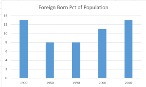
The 1900 census counted a total population of 78 million, of which 13% were foreign born. Responding to a growing hostility toward immigrants, Congress passed strict quota laws for immigrants in 1921 and 1924. Regarded as lazy, shiftless, boorish, stupid, or criminal, southern Europeans were among the undesireable groups.  During the 1920s, the foreign born population began to decline and, beginning with the 1950 census, stayed below 8% for 40 years.

The 2000 census counted 11% of the population as foreign born. The 2010 census counted 13% foreign born, so that our population mix now matches that of the early 20th century.

It is hardly surprising then to see a growing antipathy towards immigrants in the past decade.  Donald Trump’s candidacy is partly fed by the same anti-immigrant sentiment prevalent in the America of one hundred years ago.  We like to think we have put some crude and cruel instincts behind us, but we are again confronted with our “herdness.”  We will tolerate “others” as long as their percentage of the herd remains relatively small. In America, that tolerance limit seems to be 10% foreign born. How does America compare to other countries?

Employment – April 2012

This past friday, the Bureau of Labor Statistics (BLS) released their monthly assessment of labor conditions in this country and the headline figure was a disappointment.  The survey of businesses showed a seasonally adjusted 115,000 net jobs added in April, below the 150,000 expected by economists.  The unemployment rate dropped to 8.1% as almost 350,000 people simply dropped out.  Some of this was due no doubt to early retirees but the Federal Reserve estimates that retirees account for about 25% of the drop out rate.

As I have done in the past, I’ll take a deeper look at some numbers behind the headline numbers.  The core work force of people aged 25 – 54 continues to show gains but the chart below shows the comparative weakness of this segment of the work force.  This age demographic is the “middle”, when people accumulate both earning and buying power and form the primary demand of a consumer economy like the U.S.

The year over year job gains continue to climb upwards.

Late last summer, the larger work force of those aged 25 and older began showing year over year job gains several months before the core work force, revealing an underlying structural weakness of both the workforce and the recovery.

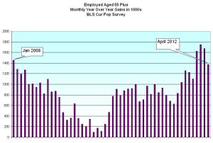
Some of the workforce is graying, moving from the core 25 – 54 age demographic into the older 55+ demographic, where workers are trying to save for retirement or taking jobs because their social security and retirement income is not adequate.  With a natural propensity for saving, older workers do not create the needed demand for the economy to grow strongly.  In the chart below is the year over year job gains for those aged 55+ and this is a key metric for it shows which age group have enjoyed the bulk of job gains in this recovery.

Throughout this recession and the massive loss of jobs, older workers have continued to show gains.  Strengths in the labor force statistics have been in retail, business services and health care.  Experienced older workers can be attractive to employers offering business services.  In retail and health care, it may be that older workers have less family responsibility, show a greater reliability and are thus more attractive to employers who enjoy a “buyers” market.  This past month was the first month that gains slowed while the gains of the core work force continued to climb.

As I have noted before, the demographic bell curve of the past three decades is coming to a close.  The participation rate, the number of workers as a percent of the working age population, has declined to 1981 levels, nearing the closing of an upswell brought on as the post WW2 boomer generation entered their prime working years.

The 1980 Census shows that, there were 25.5 million people 65 and older in 1980 (11.3% of the total population), an increase of 5 million from the 20.0 million count (12.3% of total) in 1970.  While the numbers climbed, the percentage stayed stable in that 10 year period.  Those aged 50 – 64 numbered 33.4 million, or 14.7% of the population.  In 1970, it was 29.7 million or 14.6%.  Again, the numbers were stable.  The median age of the U.S. population was 30.

Fast forward to the 2010 census and the percentage of those aged 65+ is still relatively stable at 40.3 million or 13.0% of the population.  Despite all the medical advances of the past 30 years and the trillions of Medicare dollars spent on the elderly, the percentage of older people is still about the same as it was in 1970 and 1980.

But the juggernaut of Boomers is waiting in the wings.  The 2010 Census shows that those aged 50 – 64, the “meat” of the Boomer generation, numbered 58.8 million, or 19% of the total population.  In thirty years, they have increased from 15% to 19% of the population.  The median age of the population is now 37 years, an increase of seven years.

The 25 – 54 age group funds the social contract that provides health insurance and retirement income for older Americans.   For this core work force, the increasing job gains of the past four months have been a welcome sign but, as the chart above shows, this core has suffered huge job losses in the past 3+ years and are climbing out of a deep hole.  I hope that April is the beginning of new trend, where the job gains increasingly go to the core younger segment of the work force and not to older Americans.  Only then will we see sustainable economic growth.

Immigration

In a 5/14/09 WSJ article, Conor Dougherty reports on several Census Bureau studies.
“Four states, including California, Texas, New Mexico and Hawaii, already are majority minority,” meaning that there are more non-whites than whites in those states. Florida and New York are approaching the halfway point. Arizona and Nevada are not too far behind. In 2000, 40% of Californians and 37% of New Mexicans reported speaking a language other than English in their home.

The 1900 census counted a total population of 78 million, more than 10 million of them foreign born, or approx 13%. Responding to a growing hostility toward immigrants, Congress passed strict quota laws for immigrants in 1921 and 1924. During the 1920s, the foreign born population began to decline and, beginning with the 1950 census, stayed below 8% for 40 years.

However, the 2000 census counted 11% of the population as foreign born. The 2010 census will probably show an increase in foreign born, so that the composition of native born to foreign born becomes similar to that of the early 20th century.

It is hardly surprising then to see a growing antipathy towards immigrants in the past decade. Characterized by some as bigotry, this resentment towards immigrants may be little more than the natural reaction of human beings as herd animals. We will tolerate “others” as long as their percentage of the herd remains relatively small. In America, that tolerance limit seems to be 10% foreign born. What would a study of the immigration tolerance limits in other countries reveal?

For many of us born in this country, our foreign born ancestors were once regarded as lazy, shiftless, boorish, stupid, unpatriotic or criminal. In the 1800s, American Protestants, fearful of a takeover of the United States by the Vatican, tried to pass laws banning Catholics from entering the country.

As Kermit, the frog, once said, “It’s not easy being green.”