Year End Approaches

December 19, 2015

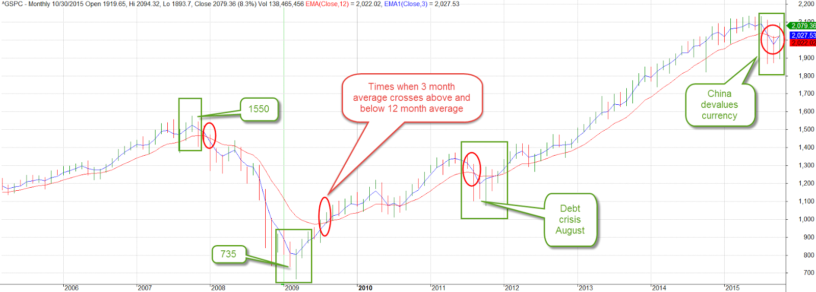
For those of you who pay attention to crossing averages, the 50 day average of the SP500 index just crossed above the 200 day average.  This long term buy signal is often referred to as the Golden Cross.  The Death Cross, when the 50 crossed below the 200 day average in early August, is a sell signal.  Those who sold some of their holdings at that time missed the volatility of the past few months.  The index was at 2100 in early August.  It closed at approximately 2000 on Friday.  The index has lost about 4% in the past two days.

Past buy crosses were June 2009, October 2010, January and August 2012 and this past week.  Recent sell crosses were December 2007, July 2010, August 2011, July 2012, and August 2015.

In buy, sell order they were December 2007 (sell), June 2009 (buy), July 2010 (sell), October 2010 (buy), August 2011 (sell), January 2012 (buy), July 2012 (sell), August 2012 (buy), August 2015 (sell) and December 2015 (buy).  Note the three year period between buy and sell signals from August 2012 to August 2015.  The market gained 55% during that period.

As you can see from the list above, the market usually regains its footing after a few months – except when it doesn’t, as in 2008.  This buy sell rule avoided the protracted market downturns in 2000 and 2008 at the expense of acting on signals that are false positives, or what is known in statistics as Type I errors.

*****************************

Cost Basis

Mutual fund companies typically calculate an investor’s cost basis for their funds.  Some investors mistakenly think that cost basis reflects the performance of their investment.  It doesn’t. Let’s look at an example of a cost basis entry:

At first glance, an investor might think they have lost $186 since they first started investing in the fund.  Usually, that’s not the case.  In this case, the fund has earned more than $5000 in ten years.

Let’s look at some basics.  An investor in a mutual fund has the option of having dividends and capital gains reinvested in the same fund or transferred to another fund like a money market.  To begin our simple example, let’s choose to NOT reinvest.

Let’s say an investor put $1000 in a bond fund BONDX.  Each share sells for $100 so they have bought 10 shares.  Every quarter the fund pays a $1 dividend per share.  A day before the dividend is paid the fund’s share price is $101.  The fund then distributes the $1 dividend.  The market value of each share instantly falls by the amount of the dividend – $1 – so that after the dividend the market value of each share of BONDX is $100.  What is the investor’s cost basis?  $1000.  The market value is 10 shares x $100 = $1000.  Capital gain or loss? $0.  Does this mean the investor has made no money?  No, they have an extra 10 shares x $1 dividend per share = $10 in their money market account.

When opening up a fund the default option may be to reinvest capital gains and dividends.  This is where some investors get confused.  So, let’s change the reinvest option and choose YES. Now, as before, the fund distributes the $1 dividend and the share price of the fund falls to $100, just as before.  Now, however, the money is not transferred to the money market fund.  Instead it is used to buy more shares of BONDX.  The $10 that the investor receives buy a 1/10 share of BONDX.  Now the investor owns 10.1 shares of BONDX at a cost of $100 per share = $1010 cost basis.  The market price of the fund is $100 per share x 10.1 shares = $1010.  Captial gain or loss: $0.  Again, the capital gain or loss does not reflect the total performance, or profit and loss, of the investment.  The profit is $10.

So, the capital gain or loss should be used only to calculate the tax effect of selling a fund, not the performance of the fund.  The fund company will calculate the performance, or the rate of return (IRR) on an investor’s funds on a separate screen.  Choose that option instead of the cost basis screen.

******************************

The Investment Cycle

Investments tend to rise and fall in price over the course of a business cycle.  At the end of an expansionary cycle, commodity prices start falling.  Yardeni Research has some good graphs which illustrate the ongoing plunge in commodity prices.

As the economy begins its contraction phase, the prices of bonds start to fall.  As we enter recession or at least a contraction of growth, stocks fall.  In the recovery, comodities rise first, followed by bonds, then stocks.  Here is more information for readers who are interested in exploring the details and background of this cycle.

***************************
Diabetes

The American Diabetes Assn puts the direct costs of treating diabetes at $150 billion.  That is 25% of the $600 billion spent on Medicare in 2014.  Indirect costs add another $75 billion in costs.  Much of the increased expenditure is for treating late onset Type II diabetes.  Expenses are sure to grow as the population ages and people do not make the life style changes needed to delay or moderate the onset of the disease.
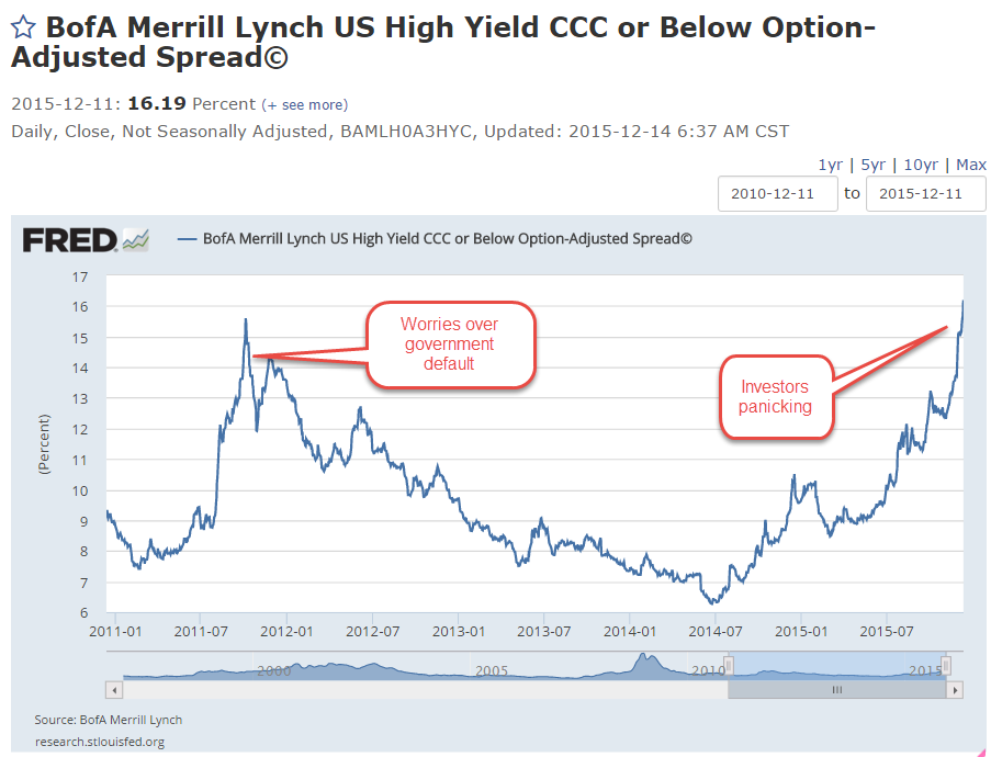
***************************
Credit Spreads

Several weeks ago, I noted the growing “spread” between Treasury bonds and high yield junk bonds.    The graph I showed was the benchmark of junk bonds, the Master II class. Let’s call them Bench Junks. The bottom of the barrel, so to speak, are those company bonds rated CCC and lower.  These are companies that are more likely to default as economic growth slows or contracts. Let’s call them Low Junks. While the Bench Junks’ spread shows investor concern, the Low Junks’ spread shows a stampede out of these riskier bonds.  A rising spread means that the prices for those bonds are falling, effectively giving buyers a higher interest rate. Investors want the higher yield to compensate them for the higher risk of owning the bonds.

Here is an article explaining the composition of some high yield bond ETFs for those readers who are interested. in learning more.

**************************

Income Taxes

Turbo Tax may be the most widely used individual income tax software but there are many providers of tax software.  Each state usually lists the software programs it has approved.  You can Google “approved income tax software” and insert your state name at the beginning of the search term. Here is a link to Colorado‘s list of approved software.  Here is the list for Texas, New York and California.

**************************
Lastly, have a wonderful Christmas!

Still Worried

November 1, 2015

Today is the day that U.S. readers fall back.  Let’s hope it’s the only thing that falls back!

Eight years ago, in October 2007, the SP500 index reached a pre-recession high of 1550. After this month’s 8% recovery the index stands at 2079, more than a third above that long ago high.  A decade long chart of the SP500 shows the inflection points of sentiment.  We can compare two averages to understand the shifts in investor confidence.  A three month average, one quarter of a year, captures short term concerns and hesitations.  A one year average reflects doubts or optimisms that have strengthened over time.  The crossing of one average above or below the other gives us a signal that a change may be coming.  Concerns may be temporary – or not.

After falling below the 12 month average, the 3 month average strained and groaned to pull its chin above that long average, notching five consecutive weekly gains.  Both China and the EU central banks have announced plans for lower interest rates or QE to spur their economies.  Oil prices continued to bounce around under the $50 mark.  OPEC suppliers announced they could not agree on production cuts.  Fearing a continuing oversupply of crude, oil prices fell 4 – 5%.  Then came the news that the number of oil rigs in the U.S. had fallen.  Prices went back up.

Commodities and mining stocks remain under pressure.  After falling over 18% in September, mining stocks gained back most of those losses in the first two weeks of October, then fell back in the last half of this month, closing the month with a 3% gain.  15 to 20% gains and losses in a sector during a month looks like so much scurrying and confusion.

Emerging market indexes lost ground this past week, slipping more than 4%.  Worries of a global recession continue to haunt various markets.  For large and medium U.S. companies, a slowdown in European and Asian markets is sure to have a negative effect on the bottom line.

The first estimate of 3rd quarter GDP growth was a paltry 1.5%, far below the 3.9% annual rate of the 2nd quarter.  Two-thirds of the SP500 companies have reported earnings for the 3rd quarter and FactSet estimates a decline of 2.2% for the quarter, the second consecutive quarter of earnings declines.

***********************

The Causes of Depression

The economic kind, not the emotional and psychological variety.  Economics history buffs will enjoy David Stockman’s critique of the extraordinary amount of monetary easing under former Fed chairman Ben Bernanke.  As President Reagan’s budget director, Stockman was at the forefront of supply side economics, a theory which promised an answer to the stagflation of the 1970s that drove many to question the assumptions and conclusions of Keynesian economics.

At first a champion of this new approach to economic policy making, Stockman grew disillusioned and later coined the term “voodoo economics” to describe the contradictory thinking of his boss and others in the Republican Party who stuck by their beliefs in supply side economics in spite of the evidence that these policies generated large budget deficits and erratic economic cycles.

In 2010, Stockman penned an editorial  that held some in the Republican Party, his party, culpable for the 2008 fiscal crisis.  He understands that politicians and policy makers become welded to their ideological platforms, disregarding any input that might upset their model of the world.

For those who have a bit of time, an Atlantic magazine December 1981 an article acquainted readers with David Stockman in his first year as budget director.  The budget process seems as broken today as it was 35 years ago when Stockman assumed the task of constructing a Federal budget.

 These “internal mysteries” of the budget process were not dwelt upon by either side, for there was no point in confusing the clear lines of political debate with a much deeper and unanswerable question: Does anyone truly understand, much less control, the dynamics of the federal budget intertwined with the mysteries of the national economy?

Stockman understands the political gamesmanship that permeates Washington.  He criticizes Bernanke’s analysis of the 2008 Great Recession as well as the 1930s Great Depression. Faulty analysis produces faulty remedies. Stockman goes still further, finding fault with Milton Friedman’s monetary analysis of the causes of the Great Depression.  In a 1963 study titled A Monetary History of the United States Friedman and co-author Anna Schwartz found that monetary actions by the Federal Reserve deepened and lengthened the 1930s Depression.  Friedman became the leading spokesman of monetarism in the late 20th century, the thinking that governments can more effectively guide a national economy by adjusting the money supply rather than employing an ever changing regime of fiscal policies.

Students of the great debate of the past 100 years – bottom up or top down? – will enjoy Stockman’s take on the matter.

October Surprise

October 11, 2015

A good week for stocks (SPY), up over 3%.  Emerging markets (VWO) were up over 5%, but are still down 18% from spring highs and are on sale, so to speak, at February 2014 prices.

On news that domestic crude oil production had fallen 120,000 barrels per day, about 15%, in September, an oil commodity ETF (USO) rose up 8% this week.  On fears, and confirmations of fears, of an economic slowdown in much of the world, commodities have taken a beating in the past year, falling 50% or more.  A broad basket of commodities (DBC) was up 4% this week but are still at ten year lows.  An August 2010 Market Watch commentary recounted the evils of commodity ETFs as a place where the pros take the suckers’ money.  Not for the casual investor.

The Telegraph carried a brief summary of the latest IMF assessment of credit conditions around the world.  There is an informative graphic of the four stages of the macro credit cycle and which countries are at what stage in the cycle.

**************************

Social welfare

Some people say they dislike redistribution schemes on moral grounds.  The government takes money from some people based on their ability and gives it to other people based on their need, a central tenet of Communism.

In a 2014 paper IMF researchers have found that redistribution is a hallmark of developed economies.  Why?  Because advanced economies have the most income inequality.  Why?  Developed economies have greater income opportunity and opportunity breeds inequality.  A sense of human decency prompts the voters in these developed countries to even the playing field a bit.

In countries with greater equality, living standards and median income are lower.  There is less income to redistribute.  In the real world where the choices are higher income and redistribution vs an equality of poverty, I’ll take the more advanced economies.

****************************

CWPI

Since the beginning of this year the manufacturing component of the Purchasing Managers’ Index has continued to expand.  The strong dollar has made U.S. products more expensive around the world and this has hurt domestic manufacturers.  Growth has slowed from the strong expansion of the last half of 2013 and all of 2014.  September’s survey of manufacturers is right at the edge between expansion and contraction.  The CWPI weights the new orders and employment portions of each index more heavily.  Using this methodology, the manufacturing side of the equation looks stronger than the headline index indicates.

The services sector, most of the economy, is still enjoying robust growth and this strength elevates the combined CWPI.

How much will the substandard growth in the rest of the world affect the U.S. economy?  Industrial production in Germany declined last month.  China’s growth is slowing.  GDP growth in the Eurozone is barely positive.  Emerging markets are struggling with capital outflows.  Developed economies that are dependent on natural resources – Canada and Australia – are struggling.  The GDP growth rate of both countries is very slightly negative. The U.S. is probably the one economic ray of hope.  September’s lackluster labor report and the Fed’s decision to delay a rate increase has attracted capital back into the stock market. This past Monday, volatility in the market (VIX – 17) dropped down below its long term historical average of 20 but is a tiny bit above its 200 day average.  I’d like to see another calm week before I was convinced that the underlying nervousness in the market has abated.  Third quarter earnings season is here and estimates by Fact Set  are for a 5% decline in earnings, the second consecutive quarter of declines since 2009.

Which Way Sideways?

August 9, 2015

As we all sat around the Thanksgiving table last November, the SP500 was about the same level as it closed this week.  Investors have pulled off the road and are checking their maps to the future.  After forming a base of good growth in the past few months, July’s CWPI reading surged upwards.

Despite years of purchasing managers (PMI) surveys showing expanding economic activity, GDP growth remains lackluster.  Every summer, in response to more complete information or changes to statistical methodologies, the Bureau of Economic Analysis (BEA) revises GDP figures for the most recent years.  A week ago the BEA revised real annual GDP growth rates for the years 2011 – 2014 from 2.3% to 2.0%.  “From 2011 to 2014, real GDP increased at an average annual rate of 2.0 percent; in the  previously published estimates, real GDP had increased at an average annual rate of 2.3 percent.”

A composite of new orders and rising employment in the service sectors showed its strongest reading since the series began in 1997.  The ISM reading bested the strong survey sentiments of last summer. We can assume that the PMI survey is not capturing some of the weakness in the economy.

This level of robust growth should put upward pressure on prices but inflation is below the Federal Reserve’s benchmark of 2%.  Energy and food prices can be volatile so the Fed uses what is called the “core” rate to get a feel for the underlying inflationary pressures in the economy.

The stronger U.S. dollar helps keep inflation in check.  There is less demand from other countries for our goods and the goods that we import from other countries are less expensive to Americans. .  Because the U.S. imports so much more than it exports, the lower cost of imported goods dampens inflation.  In effect, we “export” our inflation to the rest of the world.

When the economy is really, really good or very, very bad we set certain thresholds and compare the current period to those benchmarks.  When the financial crisis exploded in late 2008, the world fled to the perceived safety of the dollar in the absence of a exchange commodity of value like gold.  Because oil is traded in U.S. dollars and the U.S. is a stable and productive economy and trading partner, the U.S. dollar has become the world’s reserve currency.  The conventional way of measuring the strength of a currency like the dollar has been to compile an index of exchange rates with the currencies of our major trading partners.  This index, known as a trade weighted index, does not show a historically strong U.S. dollar.  In fact, since 2005, the dollar has been extremely weak using this methodology and only recently has the dollar risen up from these particularly weak levels.

As I mentioned earlier, a strong dollar helps mitigate inflation pressures; i.e. they are negatively correlated. When the dollar moves up, inflation moves down.  To show the loose relationship between the dollar index and a common measure of inflation, the CPI, I have plotted the yearly percent change in the dollar (divided by 4) and the CPI, then reversed the value of the dollar index.  As we can see in the graph below, the strengthening dollar is countering inflation.

What does this mean for investors?  The relatively strong economy allows the Fed to abandon the zero interest rate policy (ZIRP) of the past seven years and move rates upward.  A zero interest rate takes away a powerful tool that the Fed can employ during economic weakness: to stimulate the economy by lowering interest rates.

The strong dollar, however, makes Fed policy makers cautious. Higher interest rates will make the dollar more appealing to foreign investors which will further strengthen the dollar and continue to put deflationary pressures on the economy.  The Fed is more likely to take a slow and measured approach.  Earlier this year, estimates of the Effective Federal Funds Rate at the end of 2015 were about 1%.  Now they are 1/2% – 3/4%.  In anticipation of higher interest rates, the price of long term Treasury bonds (TLT) had fallen about 12% in the spring.  They have regained about 7% since mid-July.

DBC is a large commodity ETF that tracks a variety of commodities but has about half of its holdings in petroleum products.  It has lost about 15% since May and 40% in a year.  It is currently trading way below its low price point during the financial crisis in early 2009.  A few commodity hedge funds have recently closed and given what money they have left back to investors.  Perhaps this is the final capitulation?  As I wrote last week, there is a change in the air.

*************************

Labor Report

Strong job gains again this month but labor participation remains low.  A key indicator of the health of the work force are the job gains in the core work force, those aged 25 – 54.

While showing some decline, there are too many people who are working part time because they can’t find a full time job.  Six years after the official end of the recession in the summer of 2009, this segment of the work force is at about the same level.

In some parts of the country job gains in Construction have been strong.  Overall, not so much.  As a percent of the work force, construction jobs are relatively low.  In the chart below I have shown three distinct phases in this sector since the end of World War 2.  Extremes are most disruptive to an economy whether they be up or down.    Note the relatively narrow bands in the post war building boom and the two decades from 1975 through 1994.  Compare that to the wider “data box” of the past two decades.

For several months the headline job gains have averaged about 225,000 each month.  The employment component in the ISM Purchasing Managers’ Index (on which the CWPI above is based) is particularly robust.  New unemployment claims are low and the number of people confident enough to quit their jobs is healthy.  The Federal Reserve compiles an index of many factors that affect the labor market called the Labor Market Conditions Index (LMCI).  They have not updated the data for July yet but it is curiously low and gives more evidence that the Fed will be cautious in raising rates.

China, Oil, Treasuries and Stuff

August 2, 2015

An exciting and unnerving ride this past week as the Chinese market fell 8% on Monday and finished out the week about 10% down (Guardian here  and analysis here).  If trading had not been halted in a number of companies, the damage could have been much worse.  In the past year the Shanghai Composite has shot up 150% as individual investors piled into the market with both their own savings and borrowed money. Despite the loss of 14% for the entire month of July, investors in the Shanghai index are still up 13% for the year.

Let’s turn to the U.S. where the SP500 index has gained 6% since the downturn in October 2014.  Below is a chart of SPY, an ETF that tracks the SP500 index.  MACD is a common technical indicator that follows market trends.  The most common setting is to compare 12-day and 26-day price averages (the MA in MACD) and measure the convergence and divergence (the C and D in MACD)  Comparisons of longer time periods can clarify overall trends in sideways markets like we have experienced this year.  The chart below compares the 30-day and 72-day averages (blue line). The red line is a signal line, a 15-day average of the blue line.  The market seems to be at the end of a mildly positive cycle  that has been in place for nine months.

We may see a renewed move upwards but the near zero reading of the past few weeks indicates the uncertainty in the market.  Earlier this year, the price of long term bonds went down (yields went up) in anticipation of rate increases from the Federal Reserve. Counteracting that trend in the past month, long-term bond yields have gone down (U.S. Treasury) as investors bid up treasuries in the hopes that the Fed will delay raising rates till after September.

On July 22, the price of of a barrel of West Texas Intermediate (WTI) oil broke below $50 (NYMEX). Two previous times this year the price has come close to the psychologically important $50 mark only to rise back up.  Now traders are concerned that the U.S. Energy Information Administration’s (EIA) short term estimates of oil reserves and rig counts may not be accurate.  “When in doubt, get out” has been a recent refrain.

Let’s  go up in our time balloon to see why the breaking of this price point has some traders worried.  The last time WTI broke $50 was in the 2008 meltdown.

China’s growth is slowing.  Europe is idling in neutral.  Forecasts for global economic growth are subdued = low demand and this is why commodity prices are at ten year lows. Positive economic growth in the U.S.  may be the only bright spot in this global forecast.

The Outcome of Income

October 13th, 2013

“Use words not fists” a parent might say to a child.  For the second weekend during the government show down – I mean shut down, the children – er, representatives – in Washington have taken that to heart.  In a contest of dueling podiums, members of each party in both houses of Congress assure the public that their party is the reasonable one.  On Thursday, the market shot up on the news that – no, not a deal – but the likelihood that the two parties might talk to each other instead of mouthing platitudes and principles at their separate podiums.  About three weeks ago, speculative talk of a government shut down began to surface and where was the market after Friday’s close?  Back where it started three weeks ago and just 1.5% below the high on September 19th.

 In the Washington Irving tale, Rip Van Winkle fell asleep for twenty years only to wake up to a new United States of America.  In this version of the tale, an investor goes to sleep for three weeks, wakes up and there’s a whole new United States of Closed For Remodeling.  In a townhome association I belonged to many years ago, the tenants argued for several months over the choice of roofing contractor, color and style of roof for the townhomes.  A large Federal government may take a while longer.   In fact, it has been years since the Congress passed an actual budget.  The Treasury department used up the debt limit last May and has been running on fumes since then, grateful that the housing loan agencies Fannie Mae and Freddie Mac have been paying back some of the cash they “borrowed” from the taxpayers a few years back.

Because of the shut down there have been few government reports.  Commodities traders have been buying and selling in the dark,  guesstimating what the weekly and monthly government reports on the sales and production of corn and other commodities would have been if there had been an actual report.  We can only hope that traders have been fairly accurate.  If there are some notable surprises, duck.

There have been some private reports, one of them the monthly manufacturing and services reports from the Institute for Supply Management (ISM).  I updated the combined weighted index (CWI) that I have been showing the past few months.  Unlike the environment during the August 2011 budget negotiations, business activity shows strength this year and the resilience of the S&P500 index reflects that underlying strength.  Although 10 of 14 trading days were down, the index lost only about 4% from the recent high.

The CWI has been in expansion territory since the summer of 2009, which coincided with the NBER’s official call of the recession’s end.  You’ll notice that there is a rolling wave like movement to the index since then, an ebb and flow of strong and not so strong growth.  Since this is a coincident indicator of the fundamental strengths in the economy, it might not be a good predictor of short term market swings but has been a reliable predictor for the longer term investor.   Despite the recent highs in the market index, the market has been in a downtrend since the highs of thirteen years ago.  It is approaching the high set in 2007, a sign of renewed optimism.

The Federal Reserve recently posted up Census Bureau median household – not individual – income figures for the past thirty years.  Continuing on our theme from last week – the story we tell depends on how we adjust for inflation.  In this case, neither story is particularly cheerful.  Median household income adjusted for inflation using the Personal Consumption Expenditure measure has fallen  to 1998 levels, declining 7% from 2007 levels.

In 1983, the Bureau of Labor Statistics changed their methodology for computing the cost of owning a home, or owner equivalent rent.  Over the years, some economists and financial writers have made the case that the official measure of inflation, the CPI, overstates inflation.  This tells an even bleaker story: a decline of almost 9% from 2007 levels, an annual growth rate over 28 years  of just 1/4% per year.

Now, let’s compare the two.  Does the CPI overstate income by 5% or does the PCE Deflator understate inflation by the same amount?

The methodology influences many people in this country, from seniors on Social Security to working people who rely on cost of living increases.  Yet there will be more debate about whether the manager of a baseball team should put in a fastball pitcher who sometimes struggles with accuracy or go with a pitcher who throws less hard but has good location and change up.  There are political consultants who spend late night hours trying to figure out how to present the problem to the public so that they can understand it and get passionate about it.

The slow growth in household incomes arises because there is a greater supply of people who want work than employers offering work that people can or want to do.  Slow growth in the economy means less demand for labor, which puts downward pressure on the wages that workers can demand.  Smoothing the quarterly percent change in GDP growth for the past thirty years gives a clear picture of this less than robust growth.

While that may be the chief reason for slow income growth, the negative real interest rate of the past five years has played some role, I think.  When the economy is in a recessionary funk,  the Federal Reserve keeps the interest rate low to spur growth.  In the past two recessions, the Fed kept interest rates low for a considerable period of time after GDP growth began to rise.  Now it is easy to look in the rear view mirror at GDP growth, which is revised several times and may be revised again a year later as more information becomes available.  The Federal Reserve has to guess what the growth is and lately they have been overestimating the growth in the economy.

As long as the Fed keeps interest rates low, banks can make easy, safe profits in the spread between buying Treasury bonds and borrowing from the Fed and other banks.  There is less incentive for banks to take the additional risk of investing in business loans.  Although climbing up from the trough of several years ago, business loans in real dollars are still below the levels of mid 2008.

During the past twenty-five years, the rise and fall of commercial loans has become more pronounced.  Have the banks become that much more cautious at each recession, are businesses circling the wagons at the first hint of a downturn, and what part do low interest rates play?

This past week President Obama confirmed his pick of Janet Yellen as the new chairwoman of the Federal Reserve.  Larry Summers had been Mr. Obama’s first choice but Summers withdrew after learning that he would have a difficult confirmation process.  Although very smart, Summers is not a concensus builder.  Many in Congress and the market preferred Yellen to Summers.  Ms. Yellen takes a dovish stance, meaning that she is likely to further the current policy of low interest rates for the near future.  A cautious investor might want to rethink rolling over that 5 year CD that comes up for renewal in the next few months.  Rates are currently 1.5 – 2%, so that after inflation an investor is losing a little money.