A Triangle of Income, Health and Education

May 18, 2025

By Stephen Stofka

This is part of a series on persistent problems. The conversations are voiced by Abel, a Wilsonian with a faith that government can ameliorate social and economic injustices to improve society’s welfare, and Cain, who believes that individual autonomy, the free market and the price system promote the greatest good.

Abel scooped some egg on his waffle. “We’ve talked about the many responsibilities that schools carry and then I was reading a BBC article about clinics in Britain that treat severely obese kids. Since they started these clinics in 2021, they’ve treated almost 5000 kids (Source).”

Cain interrupted. “How many kids are in school over there?”

Abel replied, “Almost 8 million (Source). So this is a small percentage of the school population, but these are the kids referred by their family or school physician. The problem is probably a lot bigger.”

Cain glanced up from his coffee cup. “I always think of obesity as an American problem. I wonder how Britain compares to the U.S.?”

Abel nodded. “A few years back, New York City estimated that over 6% of K-8 kids were severely obese, but they use a slightly different methodology than Britain to classify kids (Source).”

Cain interrupted. “You mean if I walk into a New York City classroom of 16 students, one of them will be severely or morbidly obese?”

Abel shrugged. “They might not even be there. A lot more absences among those kids. They struggle academically.”

Cain frowned. “I expect more obese kids in towns that are car dependent. I always figured New York kids would walk a lot. Anyhow, how do they determine severely obese?”

Abel replied, “Britain uses a BMI over 40. They’ve been referred by a doctor. Some kids have BMIs over 50, like morbidly obese. Thirty percent of the kids who come to the clinics already showed signs of liver disease.”

Cain raised his eyebrows. “Liver disease at that age? Oh, wow. Did they say what the problem was? Does Britain have a program where poor kids get free lunches? Are the schools feeding these kids too much junk food?”

Abel glanced at his phone. “Hold on. I took notes. So, 40% of them came from poor neighborhoods and the schools in Britain do provide free meals for disadvantaged children. FSM they call it. Free school meals.”

Cain asked, “So how many school kids, fat or not, come from disadvantaged homes?”

Abel glanced at his phone again. “Yeah, what’s the baseline? Twenty-seven percent of all kids qualify for the free meal program (Source), but 40% of the severely obese come from disadvantaged neighborhoods. So, that’s a disproportionate amount of severe obesity among poor kids in Britain. New York City found that the percent of children with severe obesity has stayed about the same among all school kids during the past decade, but it has grown among minority students.”

Cain frowned. “My first instinct is to put some blame on the schools for the crap they serve in the cafeteria.”

Abel laughed. “Well, kids are not terribly fond of fruit and veggies. You can’t blame the cafeteria for that.”

Cain was equivocal. “Yeah, but all the white bread, the corn oil, the hot dogs and other prepared foods.”

Abel shook his head. “The kids who come from higher income homes are eating in the cafeteria as well. The only difference is their parents have to pay for it. If the school cafeteria were the chief culprit, there would a growing effect among the whole school population, not just minorities. Overall, though, that report showed a general decline among the entire student population during that decade. Obesity among disadvantaged students ran counter to the trend. So, what’s your next theory, Mr. Einstein?”

Cain smiled. “Hey, I’m improvising. How do they fatten up cattle? Feed them corn. Since the 1960s, we’ve been eating more processed food, more take-out food. What do those foods use? A lot of corn oil. It’s got a neutral flavor and a high smoke point. Great for deep fat fries. Too many Americans eat like it’s the state fair in July. Pass the grease, please.”

Abel argued, “That explains a growing obesity in the general population, but it doesn’t explain why obesity is growing even faster in disadvantaged communities, particularly among minority populations. A lot of those communities are food deserts. The big grocery store chains have moved out. The independent grocery chains struggle because they cannot get competitive pricing from their distributors. What’s left? Convenience stores. Packaged foods. Fried foods, ready to eat.”

Cain smiled. “Like the school cafeteria. Can families use food stamps for hot dogs at the convenience store?”

Abel shook his head. “Nope. Food stamps, or SNAP benefits, can’t be used for ready-to-eat meals.”

Cain argued, “But families can pay for a ready-to-eat hot dog and get a bottled soda with food stamps. Sugar, salt, and mystery meat with a bunch of chemicals, all in one convenient package, aided by taxpayer dollars.”

Abel frowned. “The amount a person gets on the SNAP program is relatively small, a bit over $6 a day (Source). RFK Jr. and his buddies want to ban the purchases of soda or candy with food stamps (Source).”

Cain scoffed. “Money is fungible. Like I said, they’ll just pay for the candy and use food stamps for something else. As we discussed last week, we’ve got an activist court. Now we’ve got an activist executive branch and an impotent Congress.”

Abel smirked. “This is who you voted for.”

Cain laid his hands in his lap. “What I voted for was what I thought was the better of two bad choices. Gallup reported that Biden and Trump have the two lowest average poll ratings in the modern era (Source).”

Abel asked, “Can I guess who has the lowest? Trump?”

Cain smiled. “Yeah. I was surprised. I thought it would be Bush and Trump. Bush had the worst Presidency, in my opinion. He kicked away a budget surplus, lied to the American people…”

Abel interrupted. “Lied to themselves as well. Johnson lied about Vietnam, but he knew he was lying. He’d only been in office a few months after Kennedy was shot and he thought Vietnam was going to be a boondoggle. He was worried that people would say he was weak, that he was an accidental president (Source).”

Cain nodded. “He lied to Congress about the incident in the Gulf of Tonkin to get authorization for an undeclared war (Source). Did the Democratic House impeach him? No. Nixon lies about Watergate and the Democrats impeach him. Noble principles? That’s the lie they tell themselves and the public to cover up the viciousness, deceit and self-dealing that is at the heart of everyday politics.”  

Abel replied, “I hate when you get so cynical.”

Cain shook his head. “It’s realism, not cynicism. Look, politics brings out the worst in people. We see it at City Council meetings, in state legislatures, in the White House and Congress. Lions and hyenas fight over a kill. It’s visible. People fight over invisible things like power and principles, but the carnage is just as ugly as a carcass on the African plain.”

Abel sighed. “So what’s your solution?”

Cain replied, “Make as few rules as possible. The smaller the carcass, the less incentive for politicians to fight over.”

Abel nodded. “Incentives. I was reading a book this week called “Hell To Pay” by Michael Lind. He writes about all the ways that companies suppress workers’ bargaining power. Non-compete clauses, legal and illegal immigration, salary bands.”

Cain asked, “What are salary bands?”

Abel replied, “It’s a way that companies in a sector can collude on wage levels.”

Cain interjected, “Price fixing, in other words.”

Abel nodded. “Yeah. It’s illegal so companies hire a third party HR consultant that tells them what other companies in that sector and area are paying.”

Cain smiled. “Regulatory compliance is a game of cat and mouse.”

Abel continued, “Lind recommends allowing collective bargaining by sector for some industries. Railroads and airlines do it. For small businesses, he suggests a regional or local wage board that would set wages and working conditions.”

Cain looked doubtful. “Let me make this more concrete. Instead of Amazon workers at one facility bargaining for wage increases, all warehouse workers in the entire country would bargain collectively with all employers in warehousing. So all the pay structures are the same throughout an industry?”

Abel nodded. “I suppose so.”

Cain asked, “But there are both large and small employers in the warehouse sector. Are small businesses and their workers subject to a wage board or are they included in the collective bargaining with Amazon and its employees?”

Abel lifted his shoulders. “I have no idea. Lind didn’t get into those kind of details.”

Cain winced. “And if they can’t agree on wages or benefits? Do all warehouse workers go on strike? This scheme complicates contractual relationships.”

Abel replied, “I don’t know. He suggested an independent commission like the FCC that would oversee the whole process. I suppose it could step in and act as a final arbiter and prevent strikes.”

Cain asked, “Almost like a guild system, don’t you think? The merchant guilds protected the interests of shopkeepers and artisan guilds protected some workers in skilled trades, I think.”

Abel smiled. “I hadn’t made that connection. I thought you would like the idea because it allows private parties to resolve things. Lind suggested eliminating non-compete agreements as well. They disembowel workers as a prerequisite for employment. They should be illegal anyway.”

Cain replied, “You’re basically for any regulation that will give workers more pricing power. Companies markup any increase in wages, so workers might make more money, but everyone will be paying higher prices. In response to rising prices, the Fed will raise interest rates. That will make homes and cars less affordable because of the higher loan payments.”

Abel interrupted, “People will be less dependent on government charity. They will eat better. They will live longer. There is a strong correlation between life expectancy and per capita personal income in each state.”

Cain asked, “Will they? Higher rates means less investment growth, fewer jobs added, maybe some job losses. Some workers are making more money, some people are out of jobs, and everyone is paying higher prices. It’s not so simple.”

Abel argued, “The existing system is demeaning for some people. Wal-Mart employees often don’t make enough to provide for their families. They rely on various government programs to supplement their income (Source). That is an indirect subsidy from the government to Wal-Mart. That subsidy goes into the pockets of the Walton family that owns almost half of the stock (Source). If Wal-Mart employees belonged to a retail union, their representatives would be bargaining with Wal-Mart and Kroger and Target and Home Depot.”

Cain shook his head. “It’s too big, too broad. A person with plumbing knowledge working in Home Depot is going to paid the same amount as someone scanning groceries in a checkout lane?”

Abel argued, “Obviously, there would be different classifications of retail employees. However, a plumbing guy working in Home Depot for a certain number of years would get paid the same as a plumbing guy in Ace Hardware or Lowe’s.”

Cain asked, “Who is going to mandate these classifications?”

Abel replied, “No mandates. The stores and employee union will probably agree on some distinctions. They can resolve that in negotiations, I suppose.”

Cain asked, “What about small businesses? Would employees get the same pay and benefits as large businesses? If so, a company like Home Depot would be able to offer employees health care at a lower cost than small businesses. Would there be a law mandating that a small business get the same insurance rates as a big company? What about different living standards in different states? There would have to be an adjustment for that.”

Abel rolled his eyes. “Questions I can’t answer. I don’t know. The private sector would have to work that out. I thought you liked that.”

Cain nodded. “Benefits complicate any solutions. They introduce factors that are outside of the industrial sector that a company operates in. Health insurance, for one. Retirement plans involve the financial industry, also a different sector. Mandated taxes like Social Security and Unemployment insurance involve other government programs. The politicians will be eager to meddle.”

Abel replied, “Ok, so what if there were no benefit package for employees? Start there.”

Cain said, “In 1960, Ronald Coase wrote The Problem of Social Cost (Source). He pointed out that when government imposes a regulation on a firm, the government acts as a super-firm in the sense that it controls a factor of production for each firm subject to the regulation.”

Abel interrupted, “What? That’s like saying that the umpire is a super-team. The government is just there to make sure everyone plays by the rules.”

Cain smirked. “Umpires don’t write the rules. Coase’s point was that private firms must make production decisions within the constraints of the market. They have to adjust to changing market conditions. A government agency has no such constraints. Laws and regulations do not respond to changing conditions. That’s why I favor as few government rules as possible.”

Abel sighed. “Well, we can’t live in an ideal world. I thought this was a realistic solution. I liked the empowerment of workers. Lind gave a lot of examples of how businesses weaken the power of workers to command a living wage. Temporary work visas, for one.”

Cain nodded. “What a racket that is. People with highly specialized skills and there are no American workers to fill the positions? The software company pays visa holders relatively low wages for all these specialized skills. Why is that? Oh, and that knowledgeable visa holder needs to be trained by the same person they will replace. It’s a scam.”

Abel laughed. “You’re familiar with some of the things that Lind talks about in the book. He also mentions the fact that most of those H-1b visas are given to workers from India. It’s almost three-quarters (Source). No other software engineers or computer scientists in the rest of the world? Only in India?”

Cain smirked. “A scam to cut costs by paying workers less. Another persistent problem in Washington is illegal immigration. It increases the labor supply and lowers wages, which benefits employers.”

Abel interrupted, “More demand for housing which increases housing costs and hurts workers. Lind writes about that too. So, if companies can combine to lobby for policies that enhance their power with workers, why can’t workers do the same?”

Cain shook his head. “I have so little faith in politicians to promote self-reliance. They need the public to depend on them. It gives them a sense of purpose and bargaining power.”

Abel argued, “Well, we need an alternative to the current system. Too many workers cannot earn a living wage and have to rely on government programs to get by. Growing obesity in kids from poor families is an indicator of a diseased system.”

Cain sighed. “Now comes the rant against capitalism?”

Abel smirked. “No, no rant. Lind mentions Adam Smith’s comment that a worker should have enough to maintain himself, and extra to raise his family and deal with emergencies. That’s not a recommendation from some socialist economist, but someone who advocated a minimum of regulations. Implementing sectoral bargaining for workers has the promise of lightening government’s role in the marketplace while correcting some of the abuses that our political system has enabled.”

Cain said, “The promise of a lighter role for government? This commission. Is it composed of political appointees?”

Abel shook his head. “Lind, the author, suggested an independent commission.”

Cain asked, “Like the Fed?”

Abel nodded. “Lind gave the FCC as an example, I think, but the idea is the same. I prefer a model along the lines of the Fed, I think. Staggered terms that are longer than four years, so the members of the commission are less subject to the political whims of one party.”

Cain argued, “That’s too much power concentrated in one commission.”

Abel replied, “Look how much power the Fed has. For more than a hundred years, it has given our economy more stability than in the hundred years before the Fed. That stableness attracts capital from the rest of the world.”

Cain looked doubtful. “Talking about the Fed. As I said before, higher incomes will lead to higher prices, higher interest rates. It’s something we could talk about at another time. You said life expectancy had a strong correlation with income. What’s strong?”

Abel replied, “.85. That was based on 2021 figures.”

Cain looked thoughtful. “I wonder what the correlation is in Canada or Britain. I want to check on that. Maybe read that book. Hey, I need to get going. An interesting discussion this week. ”

Abel nodded. “Yeah. See you next week.”

////////////////////

Image by ChatGPT.

Decline of Income Growth

January 13, 2019

by Steve Stofka

On the week before Christmas, the stock market fell more than 7%. I wrote about the historical trends following previous falls of that magnitude. The week opened on Dec. 17th with the SP500 index. Two months was the shortest recovery period after 7% falls in 1986 and 1989. In a previous budget showdown in 2011, the market recovered after five months, but shutdowns are just one component of a complex economic environment. If the outlook for corporate profits looks positive, the market will pause during a long showdown, as it did in October 2013.

Investors wanting to contribute to their retirement plans can do so in a measured manner. The uncertainties that produce tumultuous markets take some time to resolve. Although the market rose for five straight days in a row this week, it was not able to reach that opening level of 2600 three weeks ago.

/////////////////////////

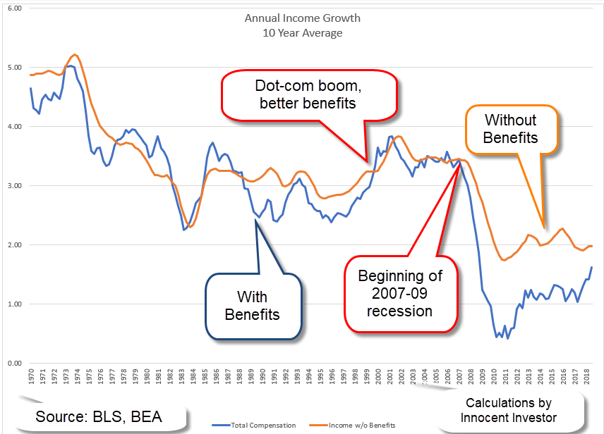
Let’s turn to a persistent problem: the lack of income growth. Beginning in the early 1970s, the annual growth rate in real personal income began to decline (Note #1). I calculated ten-year averages of annual growth to get the chart below. 5% annual inflation-adjusted growth during the 1960s became 3% growth during the 1980s and early 1990s. The dot-com and housing booms of the late 1990s and early 2000s kicked growth higher to 3.5%. In 2008, annual growth (not averaged over ten years) went negative and reached as low as -4.9% in May 2009. Following the Financial Crisis, the ten year average is stuck at 2% growth.

rpigrowth

The Bureau of Labor Statistics (BLS) tracks total employee compensation costs, including benefits and government mandated taxes (Note #2). I compared ten-year averages of both series, income with (blue line) and without (orange line) benefits. The trend over five decades is down, as before. When the labor market is tight, employers have to offer better benefit packages and the growth in total compensation is higher than income without benefits. When there is slack in the market, employees will accept what they can get, and the growth of total compensation is less.

incgrowthcomp

Beginning in early 2008, we see the dramatic effect of the last recession and the financial crisis. Income growth went negative, but income with benefits plunged 19% by January 2009. With unemployment stubbornly high, employers could attract employees with rather skimpy benefit packages. The ten-year average growth of income with benefits (blue line) sank to 1%, a full percent below income without benefits. In the last two years, the two series are starting to converge but the trend is below 2% growth.

The data contradicts those who claim that income growth is low because employers are spending more in benefits.

/////////////////////

Notes:
1. Real personal income series at Federal Reserve. An explanation of various types of personal income at Federal Reserve
2. Fed Reserve Series PRS85006062 Less PCEPI Chain Type Inflation Index.

Optical Illusions

May 12, 2018

by Steve Stofka

I have long enjoyed optical illusions. Is that a picture of a rabbit or a duck? Which way is the cube facing, right or left? (Some examples) Is that two people facing each other, or a vase? (Image page) These can be even more fun when shared with a friend or sibling. Can’t you see the rabbit? No, it’s a duck!!!

Moving images present a selective attention deception. When asked to count the number of basketball passes, we may not see the gorilla that walks across our field of view. (Video)

These examples excite our curiosity and fascination as children and carry important lessons for us as adults. We sometimes misinterpret the data our senses receive. Those with a strong ideological bent may focus narrowly on only that data that supports their view of the world, or that makes them feel comfortable.

Let’s look at an example. Real (inflation-adjusted) median (middle of the pack) household income peaked in 1999 at $58,665. In 2016, income climbed to $59,039. However, personal income did not peak till 2007, at $30,821. Like household income, personal income finally rose above that peak in 2016.

PersVsHouseholdIncome

In the household series, the past twenty years have been especially tough. In the personal series, only the past ten years have been that difficult. What accounts for the difference in the two series? Households have grown faster than the population. Population Income / Households will be lower when households increase.

But what is income? Household income is money income received and does not include employer-provided benefits and retirement contributions (Census Bureau Defs). The BLS does track total compensation costs which do include these benefits, and those costs are 67% higher today than they were in 2001.

Benefits

If an employer gave an employee $500 a month for health care expenses and the employee sent the money to the health insurance company, that would be counted as income in the data. But because the employer sends the money directly to the insurance company, that income is not counted. Because of World War 2 wage and price controls, and to avoid being taxed under the income tax system, most employee benefits never touch the employee’s pocket, and are not counted as income. This becomes important when something not counted, benefits, grows much quicker than the income that is counted, or money received.

Since 1970, real hourly wages have grown only 3%. Bernie Sanders and other Democrats use a similar figure to press for more social welfare programs. Total hourly compensation has grown 60% (Fed Reserve blog) and most of that is not included in household income.

HourlyWagesVsTotalComp

Is it a rabbit or a duck?

////////////////////////

Do Millennials have it worse than Boomers did at this age?

I’ll call them the Mills and the Booms, so I don’t wear out my fingers. The Mills were born about 1982-2001 so they are 17 – 36 years old today.  A decade after the worst recession since the Great Depression, home and apartment prices are rising fast in many urban areas.  Mills are now the largest generation alive and are at an age when a majority of  them are independent and increasing the demand for housing.

Some Mills are trying to provide shelter for their families when the competition for housing puts constant upward pressure on prices. Some Mills are paying off student loans, while paying $800 to $1000, or more in California, to share a 3 bedroom house with  two other people. It is stressful.

The Booms were born approximately 1946 – 1964. The youngest are 54; the oldest are 72. When the Booms were 17-36, the year was 1982, and oh, what a year it was. The Booms had just endured a decade of double-digit inflation rates (it is now less than 2%), four recessions, mortgage rates that were considered a “bargain” at 9% (4% today), and high housing and apartment prices because there was so much demand for living space from this post war baby boom.

Oh, and tax increases. Tax rates were not indexed for inflation till 1985, so higher wages each year to keep up with that double-digit inflation meant that many workers were kicked up into a higher tax bracket each year. One of Ronald Reagan’s campaign promises was to stop the sneaky practice of dipping deeper into worker’s pockets every year. He got elected President, beating President Jimmy Carter who had told workers to turn the heat down and put a sweater on.

How do today’s monthly debt payments compare? Household Debt Service Payments as a percent of disposable personal income are 5.8% today compared to 5.6% in 1982. The 37-year average is 5.7% (Federal Reserve).

What are those average debt service payments buying? Better cars, more education, more square footage of housing space per person, and computers and electronics that didn’t exist in the 1980s. People are paying more for housing but are enjoying 30% more square footage per person (Bloomberg). In 1982, 17% of the population 25 years and older had a college degree. Today, it is double that percentage (Census Bureau table A-1), an achievement that the Mills can be proud of.

The Mills do have it better than the Booms, who had it better than the generations before them. That “good old days” talk that we heard from Bernie Sanders on the campaign trail are based on some foggy memories. The reality was way tougher than Sanders remembers or talks about because his perception is clouded by his ideology. He only sees the data that tells him it’s a rabbit. He doesn’t see the duck.

Free Stuff

January 21, 2018

by Steve Stofka

I like the 21st century. I get a lot of free stuff. Opinions, news and information, and directions to anywhere on the planet. Free apps and games for my phone. Free porno and free sermons.

I get so much free stuff that I can afford to pay for fancy coffee and smart phones, television and internet access. I can now afford a personal guru to align my chakras. My personal assistant, Alexa, listens to me and answers my questions.

Goodbye and good riddance to the 20th century with its clunky records, cassettes and DVDs. I say “Alexa, play me blankety-blank song,” and millions of tiny electrons do my bidding, and out comes my song!

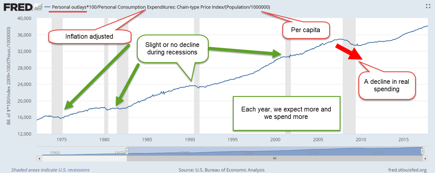
My real personal income has doubled since 1973 (Average per capita income ) so I got all this extra free money. I’m getting paid more at work than 45 years ago. My total compensation has gone up 44% (Total real compensation per employee ). My employer provided benefits have doubled (Real employee benefits ). My employer kicks in more free money into my retirement program, and into my health care insurance. That’s real dollars, after inflation.

I got so much extra free money coming in that I’m living like royalty. My income has gone up 100% in 45 years, but my spending has increased 137% because I’m a first class 21st century person that banks want to loan money to.

Outlays1973-2017

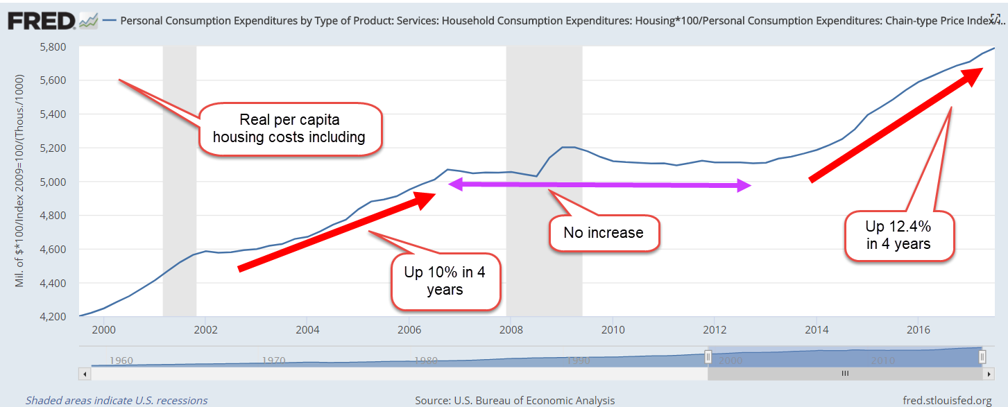
Since 2000, I eat out a lot more – like 75% more (Real restaurant sales ). I deserve it cause I’m making all this extra money and I’m too busy to cook. In 2000, I was spending $11.50 a day for shelter but I needed more personal room and modern conveniences. Now I got more room but I’m spending $16 a day.

HousingCostRealPerCap2000-2017

Living first class means that I’m saving a lot less of my free extra money.  45 years ago, I was saving 12% of my income.  Now it’s 3%. But there’s an easy fix to that. More free stuff!
//////////////////////////////

Farming Communities

This past summer, my wife and I joined the many thousands of solar eclipse watchers who visited western Nebraska, where the totality and length of the eclipse was near its peak.  At hotels, shops and restaurants we were greeted with a cordiality that is typical of Nebraskans.  They worked extra hours to accommodate the influx of visitors. At one restaurant, our waitress remarked that the extra business would make up for the slack earlier in the year.  The reason?  Not the food and service, which were both excellent. The locals weren’t eating out as much. And why was that?

Last week, I wrote about the seven-year downturn in commodity prices that has affected many rural communities.  Although agriculture contributes about 6% to GDP (USDA) the changing fortunes of the people who produce our food gets little attention in urban areas.

A few hundred miles away, Denver is booming.  Gentrification and rising housing costs have stressed the pocketbooks of some families.  In Nebraska, it is declining prices that have caused stress fractures in the community (Denver Post ). Land values declined 4% in 2015, and another 9% in 2016 (U. of Nebraska-Lincoln report).

Despite a strong export market for corn, soybeans and other agricultural products, Iowa has had falling land prices for three years. In a recent survey, 40% of responding Iowa farmers reported lower sales in 2017.  However, there was a slight uptick in land values this past year and the hope is that the Iowa agricultural community may be turning a corner.

As land values decline, banks lower lending limits, refinancing terms become more strict.  Families sit at the kitchen table and try to pay higher bills with less money.  Property taxes decline so that there is less money for schools and other public infrastructure.  Seeing the stress that their parents face, younger folks are attracted to urban areas where there is more economic opportunity.  Farms that have been in the family for several generations get sold to large farm management companies.

The governors of western states must understand that they serve all the people of their state.  As people concentrate in the urban centers, they demand more resources from the state.  Those in rural areas feel as though they are being left out.  They will form elective coalitions within state legislatures to offset the growing urban power.

To those in the dense population centers of the coastal states, the shifting political and economic alliances in the fly-over states might earn a shrug.  Our federalist system of voting was a grand bargain to offset the dominance of high population states.  The 2016 election was a good lesson in the power of electoral federalism.  State and federal politicians must build a bridge that crosses the divide between the fortunes of those in urban and rural areas.

Global Portfolio

May 15, 2016

Picture the poor investor who leaves a meeting with their financial advisor followed by a Pig-Pen tangle of scribbled terms. Allocation, diversification, small cap, large cap, foreign and emerging markets, Treasuries, corporate bonds, real estate, and commodities. What happened to simplicity, they wonder?  Paper route or babysitting money went into a savings account which earned interest and the account balance grew while they slept.

For those in retirement, it’s even worse. The savings, or accumulation, phase may be largely over but now the withdrawal phase begins and, of course, there needs to be a withdrawal strategy.  Now there’s a gazillion more terms about withdrawal rates,  maximum drawdowns and recovery rates, life expectancy, inflation and other mumbo jumbo that is more complicated than Donald Trump’s changing interpretations of his proposed tax plans.

Seeking simplicity, an investor might be tempted to put their money in a low cost life strategy fund or a target date fund, both of which put investing on automatic pilot.  These are “fund of funds,” a single fund that invests in different funds in various allocations depending on one’s risk tolerance. There are income funds and growth funds and moderate growth funds within these categories.  For a target date fund, what date should an investor use?  It is starting to get complicated again.

Well, strap yourself into the mind drone because we are about to go global.  Hewitt EnnisKnupp is an institutional consulting group within Aon, the giant financial services company.  In 2014, they estimated the total global investable capital at a little over $100 trillion as of the middle of 2013. Let’s forget the trillion and call it $100.

Could an innocent investor take their cues from the rest of the world and invest their capital in the same percentages?  Let’s look again at the categories presented by the Hewitt group.  The four main categories, ranked in percentages, that jump off the page are:

Developed market bonds (23%),
U.S. Equities (18%),
U.S. Corporate Bonds (15%),
and Developed Market equities (14%).

The world keeps a cushion of investable cash at about 5% so let’s throw that into the mix for a total of 75%.   Notice how many categories of investment there are that make up the other 25% of investable capital!

In the interest of simplification let’s consider only those four primary categories and the cash. Adjusting those percentages so that they total 100% (and a bit of rounding) gives us:

Developed Market bonds 30%,
U.S. Corporate Bonds 20%,
U.S. Equities 25%
Developed Market equities 19%,
Cash 6%.
Notice that this is a stock/bond mix of 44/56, a bit on the conservative side of a neutral 50/50 mix.  Equities make up 44%, bonds and cash make up 56%.

I’ll call this the “World” portfolio and give some Vanguard ETF and Mutual Fund examples.  Symbols that end in ‘X’, except BNDX, are mutual funds. Fidelity and other mutual fund groups will have similar products.

International bonds 30% –  BNDX, and VTABX, VTIBX
U.S. Corporate Bonds 20% – BND and VBTLX, VBMFX
U.S. Equities 25% – VTI and VTSAX, VTSMX
Developed Market equities 19% – VEA and VTMGX, VDVIX

According to Portfolio Visualizer’s free backtesting tool this mix would have produced a total return of 5.41% over the past ten years, and had a maximum drawdown (loss of portfolio value) of about 22% during this period.  For a comparison, an aggressive mix of 94% U.S. equities and 6% cash would have generated 7.06% during the same period, but the drawdown was almost 50% during the financial upheaval of 2007 – 2009.

There have been two financial crises in the past century:  the Great Depression of the 1930s and this latest Great Recession.  If the balanced portfolio above could generate almost 5-1/2% during such a severe crisis, an investor could feel sure that her inital portfolio balance would probably remain intact during a thirty year period of retirement.  During a horrid five year period, from 2006-2010, with an annual withdrawal rate of 5%, the original portfolio balance was preserved, a hallmark of a steady ship in what some might call the perfect storm.

Finally, let’s look at a terrible ten year period, from January 2000 to December 2009, from the peak of the dot com bubble in 2000 to the beaten down prices of late 2009, shortly after the official end of the recession.  This period included two prolonged slumps in stock prices, in which they lost about 50% of their value.  A World portfolio with an initial balance of $100K enabled a 5% withdrawal each year, or $48K over a ten year period, and had a remaining balance of $90K. Using this strategy, one could have withdrawn a moderate to aggressive 5% of the portfolio each year, and survived the worst decade in recent market history with 90% of one’s portfolio balance still intact.

Advisors often recommend a 4% annual withdrawal rate as a conservative or safe rate that preserves one’s savings during the worst of times and this strategy would have done just that during this worst ten year period.  Retirees who need more income than 4% may find the World portfolio a conservative compromise.

{ For those who are interested in a more granular breakdown of sectors within asset classes, check out this 2008 estimate of global investable capital.}

////////////////////////////

Productivity

In a recent article, Jim Zarroli with NPR compared productivity growth with the weak growth of only the wages component of employee compensation.  He did leave out an increasingly big chunk of total employee compensation: Federal and State mandated taxes, insurances and benefits.  Since these are mandated costs, the income is not disposable. A term I have never liked for this package of additional costs and benefits is “employer burden.”  The burden is really on the employee as we will see.

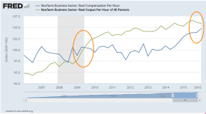
In the graph below are two indexes: total compensation per hour and output per hour.  At the end of the last recession in the middle of 2009, the two indexes were the same.  Seven years later, output is slightly higher than total compensation but the discrepancy is rather small compared to the dramatic graph difference shown in the NPR article. As output continues to level and compensation rises more rapidly, we can expect that compensation will again overtake output.

Over the past several decades, employees have voted in the politicians who promised more tax-free insurances and benefits.  While the tax-free aspect of these benefits is an advantage, some employees may think they are freebies.  Payroll stubs produced by more recent software programs enable employers to show the costs of these benefits to employees, who are often surprised at the amount of dollars that are spent on their behalf.  While these benefits are welcome, they don’t pay school tuition, the rising costs of housing or repairs to the family car.

Many voters thought they could have it all because some politicians promised it all: more tax-free insurances and benefits, and higher disposable income.  Total employee compensation, though, must be constrained by productivity growth. In the coming decade, legislators will put forth alternative baskets of total compensation.  More benefits and insurances means less disposable income but a politician can not just say that outright and get re-elected. More disposable income means less insurances and benefits, which will anger other voters.  In short, the political discourse in this country promises to only get more contentious.

Winter Wanders

March 8, 2015

Labor Market

If you are reading this and have not set your clock forward, that’s OK.  March to your own drummer!

On Wednesday, payroll processor ADP released their data for February, showing private payroll gains of 212,000.  This confirmed estimates that total job gains from the BLS would be about 230,000.  The bothersome data point in the ADP report was the huge upward revision of job gains in January, bringing it close to the BLS estimate.  ADP is working with a lot of hard data – actual paychecks – so was this revision a discrepancy in seasonal adjustments?

On Thursday, the BLS issued revised figures for labor productivity in the 4th quarter of 2014. The report includes this: “The 4.9 percent increase in hours worked remains the largest increase in this series since a gain of 5.7 percent in the fourth quarter of 1998.” 4th quarter productivity sagged 2.2% from the 3rd quarter,  and was essentially unchanged from the 4th quarter of 2013.  Labor productivity is often a lagging indicator but it narrowed Thursday’s trading range as investors crossed bets on the Fed’s plans for raising interest rates later in the year.

The BLS report of 295,000 job gains in Febuary was so over the top that many traders punched the sell button.  Government employment increased 7,000, meaning that private job gains as reported by the BLS was almost 290,000, a difference of almost 70,000 between the BLS and ADP reports.  When in doubt, traders get out.

For mid to long-term investors, the continuing strength in the labor market is an optimistic sign.  Employees add to costs and commitments.  If businesses are adding jobs, it is because they anticipate higher revenues in the near future.  Some analysts pointed to the high number of jobs gained in the leisure and hospitality sectors as a sign of weakness in the labor market.  These are jobs that pay on average about 25% less than the average of all production and non-supervisory employees and a third less than the average for all employees.  However, higher paying jobs in professional services and construction also showed strong gains.

As I have mentioned before, the Federal Reserve compiles a Labor Market Conditions Index (LMCI) which summarizes 24 employment trends and one which chair Janet Yellen uses as her gauge for the fundamental strength or weakness of the labor market.  Next Wednesday, the Fed will release the LMCI updated for February but a chart of the past twenty years shows longer term trends.

While the index itself is still in negative territory, the momentum (red line) of the index is strong and consistent.  We can understand Yellen’s cautious optimism when recently testifying before the Senate Banking Committee.  This index was only developed a few years ago so this chart includes revised data and methodology that is backward looking.  If history is any guide, a long term investor would be ill advised to bet against the momentum of this index when it is positive.

A key indicator for Ms. Yellen is the Quit rate, the number of employees who quit their jobs to go to another job or who feel confident that they can find another job without much difficulty.  That confidence measure continues to rise and is currently in a sweet spot.  It is not overly confident as it was at the height of the housing boom in 2006 and the dot com boom of the late 1990s.  It is neither pessimistic as it was in the early 2000s or darkly apocalyptic as in the period from 2008 – 2012.

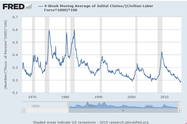
The number of new claims for unemployment as a percentage of the Civilian Labor Force is at historic lows.  One could argue that new claims are too low.

Wage growth in this month’s report was minimal.  However, wage growth since 2006 has not done too badly, growing more than 25% and outpacing the 16% growth in inflation during the period.

Benefits have grown more than 20% in the same period and showed no decline during this past recession.  Many employees are simply not aware of the costs of their benefits.  They may think that vacations and holidays and health care are the only benefits they get.  There are several mandated taxes and insurance that an employer is required to pay.

Because some benefit costs are “sticky,” and not responsive to changing business conditions, the continued strength in the labor market shows an increasing commitment on the part of employers, a growing confidence that economic conditions are fundamentally improving.  Several years ago, many employers were reluctant to take on new employees because positive news was regarded with a healthy skepticism.  “We won’t get fooled again,” as the Who song lyric goes.  Despite improving fundamentals, the market is likely to be somewhat volatile this year as investors and traders speculate on the timing and aggressiveness of any interest rate moves from the Fed.

**************************

Purchasing Managers Index

Based on the monthly survey of purchasing managers, the Constant Weighted Purchasing Index (CWPI) declined slightly again this month as expected.  The manufacturing sector slid a bit this past month but employment in the service sectors popped up, keeping the composite index up above the benchmark of strong growth.  If the post-recession trend continues, we might see one more month of softening within this growth period.

New orders and employment in the service sectors are the key indicators that I highlight to get a more focused analysis of growth trends.  When this blend of the two factors stays above 55, the benchmark of strong growth, the economy is strong.  Except for a slight dip below that mark (54.4) last month, this blend has been above 55 for ten months now.

We can also see the brief periods of steady decline in these two components in 2011, 2012 and the beginning of 2013, causing the Federal Reserve to worry about a further decline into recession. The Federal Reserve enacted a series of bond buying programs called QE.  Continued economic strength may prompt a slow series of interest rate hikes.  The key word is “slow.”  Under former chairman Alan Greenspan, the Federal Reserve adjusted interest rates up and down too quickly, which produced small shock waves in the financial system.  Banks, businesses and investors may make unwise choices in response to rapid rate changes.  Live and learn is the lesson.

Follow The Money

June 14th, 2014

This week I’ll take a look at some near-term trends in small business, labor, oil and housing and a few long-term trends in income and debt.

***********************
Small Business

Huzzah, huzzah!  The monthly survey of small business owners by the National Federation of Independent Businesses (NFIB) broke through the 96 level after cracking the 95 level last month.  Sentiment has not been this good since mid-2007.  Hiring plans have been on the rise for the past several months and owners are reporting rising sales.

**********************

JOLTS (Job Openings and Labor Turnover Survey)

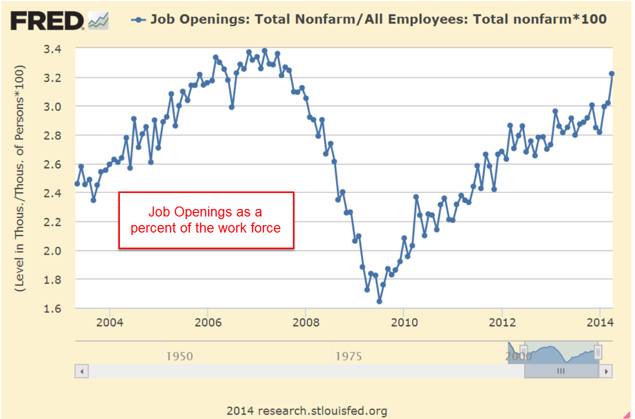
The Job Openings report from the Bureau of Labor Statistics (BLS) has a one month delay so the data released this past week was for April.  The number of job openings was 40,000 higher than expected, coming in close to 4.5 million.  As a percent of the workforce, job openings are approaching pre-recession highs.

The decline in construction job openings is a disappointment.  We are near the same level as 2003, a weak year of economic growth.  We should expect to see an uptick in job openings in next month’s report, confirming that projects put on hold during the severe winter in the eastern part of the country are again on track.  Further declines would indicate a spreading malaise.

************************

Gross Domestic Income

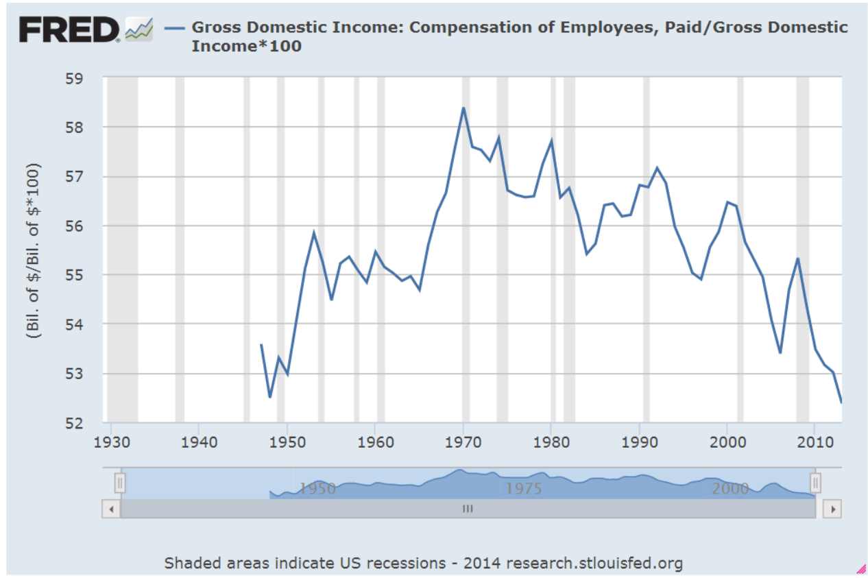
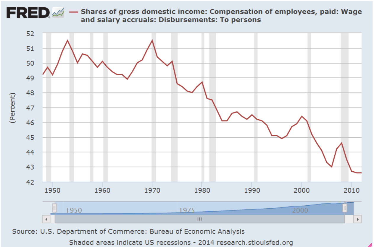
On a quarterly basis Gross Domestic Income, GDI, and Gross Domestic Product, GDP, differ somewhat but over the long run closely track each other.  Following up on two previous posts on Thomas Piketty’s book Capital in the 21st Century, I wondered what percent of GDI goes to pay employee compensation.  As we can see in the chart below, total compensation for human labor has been dwindling to post WW2 levels.

This is total compensation, including benefits.  Wage and salary income as a percent of total national income has declined steadily.

As a percent of total income, employee benefits have more than tripled since the end of World War 2 and now comprise more than 10% of the country’s income.

Demographic shifts have contributed to the decline of labor income.  The post war boomer generation, 80 million strong and 25% of the population, contributes to the trend as they save for retirement. As capital gains, interest and dividend income increase, this reduces the share of wage and salary income.

Economic changes have been a major factor in the decline of labor income.  Capital investments in technology, both in hardware and software, have reduced the need for labor for a given level of production.  Capital investment demands income to pay back the investment. For most of the 20th Century, machines replaced human muscle in farming, manufacturing and construction.  In the past two decades, machines are increasingly replacing mental muscle.

How we count labor income has changed.  Tax law changes in 1986 and 1993 reduced the amounts that are included as compensation but the overall effect of these changes is relatively minor.

If we divide the country’s total employee compensation by the number of employees, we might ask “What recession?”  Average annual compensation has climbed from $38-54K in a dozen years.  That’s almost a 50% raise for every employee!

Of course, everyone has not had a 50% increase in income over the past 12 years.  Human capital, the educational and technical training that an employee has to offer, has earned an increasing premium in the past three decades. Those with more of this capital have captured more benefit from the dwindling pool of labor needed for the nation’s production.

Average disposable income tells a more accurate story of the majority of people in this country.  Disposable income is what’s left over after taxes.  The trend is downward.

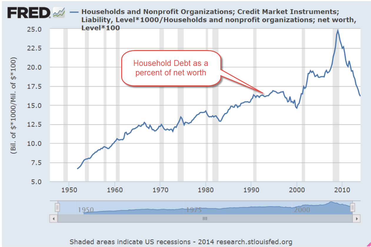
How do we cope with flat income growth?  Charge it!  It’s the Amurikin way! Per capita Household Debt has increased 75% in the past 13 years.  After a decline from the rather high levels before the recession began in late 2007, per capita debt has leveled off in the past two years.

Rising house prices and stock market values have increased net worth.  As a percent of net worth, household debt has declined to the more sustainable levels of the 1990s.

The percentage of disposable income needed to service that debt is at thirty year lows, meaning that there is room for growth.

In response to the hostilities in Iraq, oil prices have been on the rise.  Historically, a rise in oil prices leads to a rise in prices at the pump which takes an extra bite out of disposable income and puts a damper on consumer spending growth.

***********************

Oil Prices

A blog by Greg McIsaac at the Washington Monthly in May 2012 presents an interesting historical summary of oil prices and production.  The American love of simplicity leads many to credit one man, the President, for the rise and fall in gasoline prices, although the President has little, if any, influence on oil pricing. McIsaac notes The combination of lower energy prices and increased energy efficiency in the 1980s reduced US expenditures on energy by nearly 6 percent of GDP.  Deregulation of energy prices begun under the Carter Administration were largely credited to the Reagan administration.   He writes “crediting Reagan with falling energy prices of the 1980s exaggerates the roles of both Reagan and deregulation and obscures the larger influence of conservation and increased production outside the US.”  Production actually fell for several years after regulatory controls were lifted.

Further increases in oil prices will no doubt be blamed on this President.  The one thing that each outgoing President bequeaths to the newcomer before the inauguration is the Presidential donkey suit.

***********************

Housing

Redfin Research Center reports a sharp decline in the number of houses sold through May. After a 7.6% year-over-year decline in April, home sales slid 10% from May 2013 levels.  Real estate agents are reporting a shift from a seller’s market to a buyer’s market.

***********************

Takeaways

Small business accounts for approximately 60% of new jobs and optimistic sentiment among small business owners is growing.  The labor market continues to show continuing strength in the number of job openings and a decline in new unemployment claims.  Disposable income growth is flat but the portion of income needed to service debt is very low.  Rising oil prices and a slowing housing market will crimp economic growth.
Next week I’ll look at a complex topic – is the stock market fairly valued?