Growth Periods

July 28, 2019

by Steve Stofka

Did you know that housing costs double every twenty years? The predictability surprised me. Both rents and home prices double. Based on the last forty years of data the average annual increase is about 3-1/2% (Note #1).

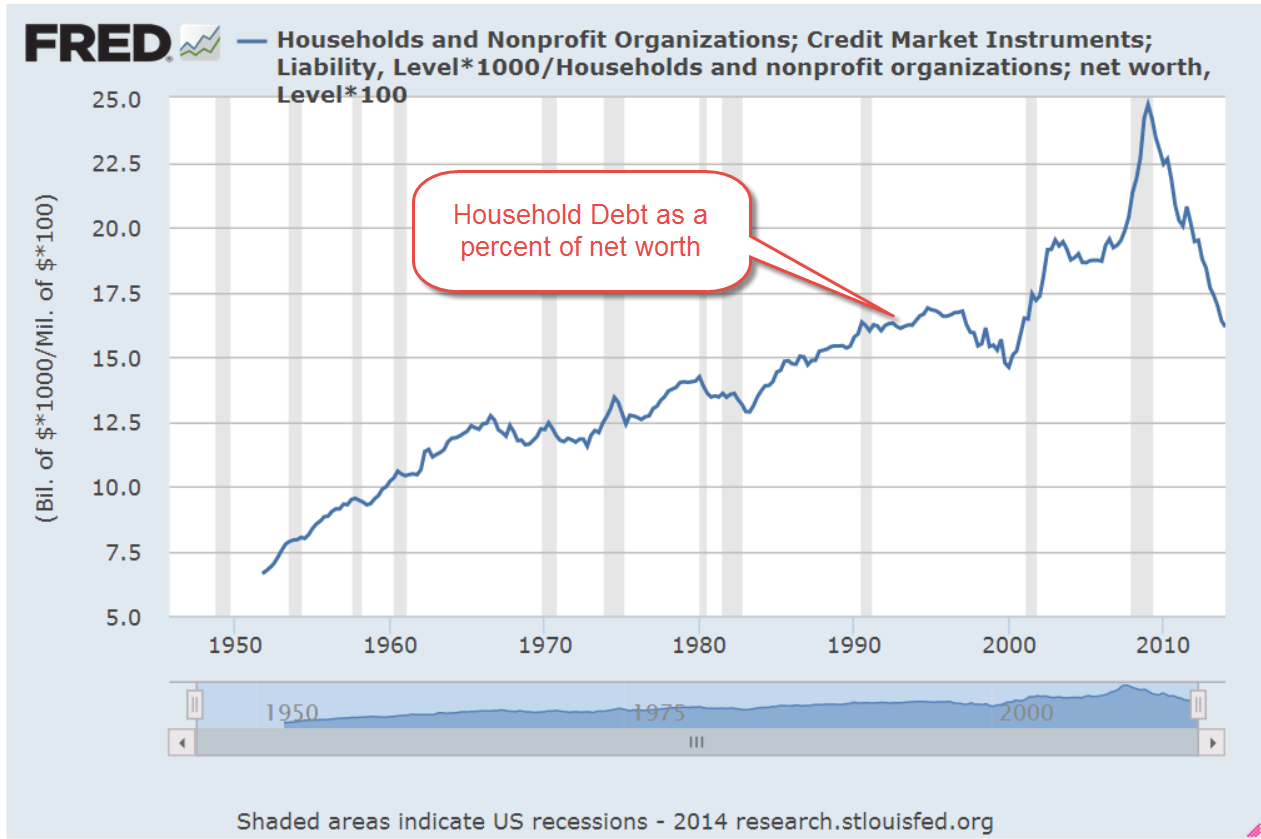
House prices can only get ahead of earnings for so long before a correction occurs. Take a look at the chart below. Yes, low interest rates reduce mortgage payments so people can afford more home. That’s what we said in the 2000s. This trend does not look sustainable to me.

I was doing some work on potential GDP and wondered which president since World War 2 has enjoyed the longest and strongest run of real (inflation-adjusted) GDP above potential. Potential GDP is estimated as a nation’s output at full employment.

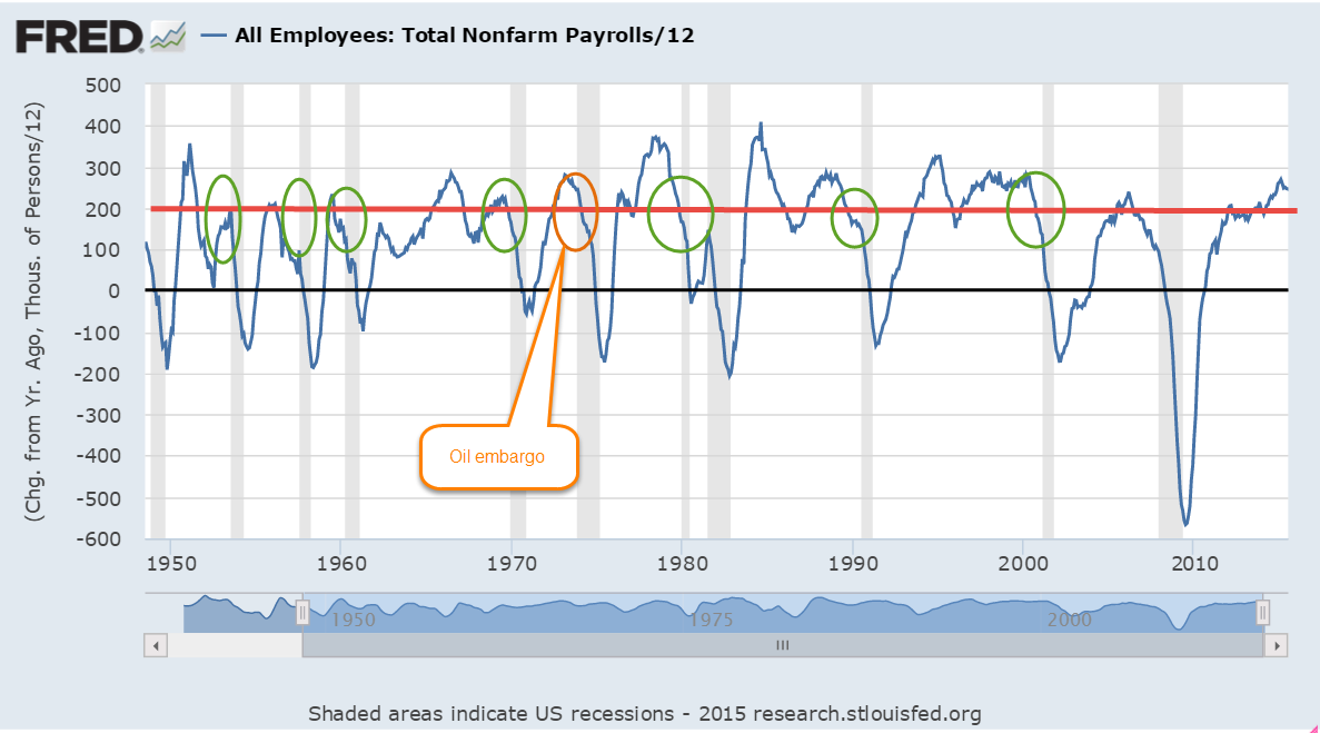
I won’t start with the #1 award because that would be no fun. Nixon came in fourth place with a run of strong economic growth from 1971 – 1973. The oil embargo that followed the Arab-Israeli War of 1973 sent this country into a hard tailspin that ended that growth spurt.

Ronald Reagan comes in third with a cumulative total of 24.5% growth above potential GDP. The expansion began in the third quarter of 1983 and ran through the second quarter of 1986. These strong growth periods seem to last two to three years.

Second place goes to President Truman with a short (less than two years), sharp 25.2% gain that ended with the beginning of the Korean War.

And the award goes to…the envelope please…Jimmy Carter. Wha!!? Yep, Jimmy Carter. The growth streak began in 1976, the year Carter was elected, and ended in 1979 when Iran overthrew their Shah, oil production sank, and oil prices doubled. At its end, the expansion had totaled 25.5% above potential GDP. In less than two years, the nation soured on Carter and put Reagan in office.

What about other Presidential administrations? We might remember the late 1990s as a heady time of skyrocketing stock prices during the second Clinton administration. The output above potential was only 11.5% but is the longest period of strong growth, lasting almost four years, from the first quarter of 1996 through the last quarter of 1999.

George Bush’s growth streak was only slightly higher at 12.8% but is the second longest growth period, beginning in the third quarter of 2003 and ending in the last quarter of 2006. A year later began the Great Recession that lasted more than 1-1/2 years.

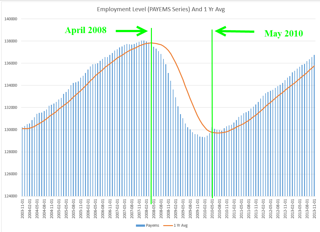
Barack Obama’s presidency began with the nation deep in a financial crisis. By the time he took office fourteen months after the recession began, the economy had shed 5 million jobs, 3.6% of the employed. Employment was more than 6 million jobs below trend. The economy did not start growing above potential until the first quarter of 2010. The growth period ended in the third quarter of 2012, but employment did not regain its 2007 pre-recession level until May of 2014, 6-1/2 years after the recession began. It is the weakest strong growth period of the post-WW2 economy.

President Trump’s streak of strong growth began in the last few months of Obama’s term and is still ongoing with a cumulative gain of 7.5%. Unlike other growth periods, this one is marked by steadily accelerating growth above potential.

I’ve charted the cumulative growth above potential and the period length for each president.

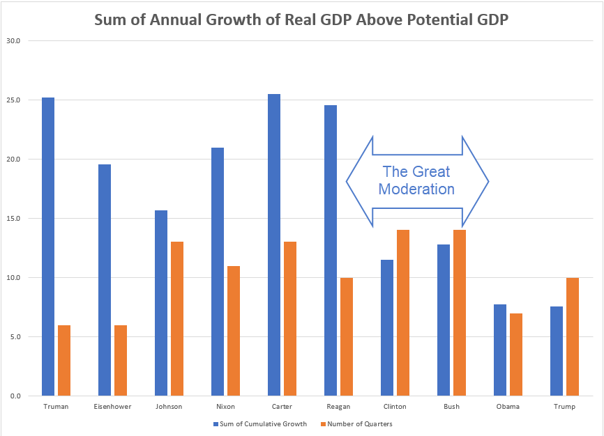
As the economy shifted away from manufacturing in the 1980s, the days of 20-plus percent growth ended. Manufacturing is more cyclic than the whole economy. The manufacturing sector contributes to strong growth in recovery and pronounced weakness at the end of the business cycle each decade. In the 1980s, economists and policy makers in both government and the Federal Reserve welcomed this shift away from manufacturing. They dubbed it the Great Moderation and it ended twenty years later with the Great Recession.

President Trump is on a mission to begin another “Great” period – the resurgence of manufacturing in America. It is a monumental task because manufacturing depends on a supply chain that is presently located in Asia. In 2013, Apple tried to manufacture and assemble its high-end computer, the Mac Pro, in Texas. Production faltered on the availability of a tiny screw (Note #2). Six years later, the Trump administration is levying 25% tariffs on Apple products to encourage them to manufacture computers again in Texas.

The widespread use of tariffs usually leads to fewer imports. As other countries retaliate, exports decrease. Slowing global growth poses additional challenges to repatriating manufacturing to this country. If Trump can realize his passion, we may again return to those days of heady growth and more severe business cycle corrections.

////////////////////

Notes:

  1. The Case-Shiller home price index (HPI) for home prices. The Consumer Price Index’s rent of a primary residence.
  2. A NY Times account of Apple’s last attempt to manufacture in the U.S.A.

Marching Forward

April 28, 2019

by Steve Stofka

When former President Obama took the oath of office, the economy was in the worst shape since the Great Depression 75 years earlier. Tax receipts plunged and benefit claims soared. Millions of homes and thousands of businesses fell into the black hole created by the Financial Crisis. In sixteen years of the Bush and Obama presidencies, the country added $16 trillion to the public federal debt, more than tripling the sum at the time Clinton left office in early 2001.

Although growth has remained slow since the financial crisis (see my blog last week), the economy has not gone into recession. Despite the fears of some, a recession in the next year does not look likely. The chart below charts the annual percent change in real GDP (green) against a ratio called the M1 money multiplier, the red line (Note #1). Notice that when the change in GDP dips below the money multiplier for two quarters we have been in recession.

The money multiplier seems to act like a growth boundary. While some economy watchers have warned of an impending recession, GDP growth has been above 2.5% for more than a year and is rising. In 2018, real disposable personal income grew nearly 3%. This is not the weak economic growth of 2011 or the winter of 2015/16 when concerns of recession were well founded.

The number of people voluntarily quitting their job is near the 1999 and 2006 highs. Employees are either transferring to other jobs or they feel confident that they can quickly get another job. An even more important sign is that this metric has shown no decline since the low point in August 2009.

In 2013, the Social Security disability fund was in crisis and predicted to run out of money within a decade. As the economy has improved, disability claims have plunged to all-time lows and the Social Security administration recently extended the life of the fund until 2052 (Note #2).

Approximately 1 in 6 (62 million) Americans receive Social Security benefits and that number is expected to grow to 78 million in a decade. However, the ratio of workers to the entire population is near all time highs. The number of Millennials (1982-1996) has surpassed the number of Boomers. This year the population of iGen, those born after 1996, will surpass the Millennial generation (Note #3). Just as a lot of seniors are leaving the work force, a lot of younger workers are entering. The ratio of worker to non-worker may reach 1 to 1. 45 years ago, one worker supported two non-workers.

As the presidential cycle gets into gear, we will hear claims that there are not enough workers to pay promised benefits. Those claims are based on the Civilian Employment Participation Rate, which is the ratio of workers to adults. While the number of seniors is growing, the number of children has been declining. To grasp the total public burden on each worker, we want to look at the ratio of workers to the total population. As I noted before, that is at an all time high and that is a positive.

Raising a child is expensive. The average cost of public education per child is almost $12K (Note #4).  Public costs for housing, food and medical care can push average per child public cost to over $20K annually.

Let’s compare to public costs for seniors. The average person on Social Security receives $15,600 in benefits (Note #5). In 2018, the Medicare program cost an average of $10,000 per retiree (Note #6). The public cost for seniors is not a great deal more than those for children.

As a society, we can do this.

/////////////////

Notes:

  1. The M1 money multiplier is the ratio of cash and checking accounts to the amount of reserves held at the Federal Reserve.
  2. SSDI solvency now extended to 2052. Here’s a highlight presentation of the trustee’s report.
  3. Generation Z will surpass the numbers of Millennials in 2019. Report
  4. Public education costs per pupil
  5. Social Security costs
  6. Medicare program cost $583 billion. There are approximately 60 million on the program. CMS

Phillips Curve

November 12, 2017

For the past 16 decades, there has been a least one recession per decade. Given that this bull market is eight years old without a recession, some investors may be concerned that their portfolio mix is a bit on the risky side. Here’s something that can help investors map the road ahead.

For several decades, the Federal Reserve has used the Phillips Curve to help guide monetary policy. The curve is an inverse relationship between inflation and unemployment. Picture a see saw. When unemployment is low, demand for labor and inflation are high. When unemployment is high, demand for labor and inflation are low (See wonky notes at end).

The monetary economist Milton Friedman said the relationship of the Phillips curve was weak, and economists continue to debate the validity of the curve. As we’ll see, the curve is valid until it’s not. The breakdown of the relationship between employment and inflation signals the onset of a recession.

Let’s compare the annual change in employment, the inverse of unemployment, and inflation. We should see these two series move in lockstep. As these series diverge, the onset of a recession draws near.

In a divergence, one series goes up while one series goes down.  The difference, or spread, between the two grows larger. Spread is a term usually associated with interest rates, so I’ll call this difference the GAP.

In the chart below, I have marked fully developed divergences with an arrow marked “PC”. Each is a recession. I’ll show both series first, so you can see the divergences develop. I’ll show a graph of the GAP at the end.

PhillipsCurveRecession

As you can see to the right of the graph, no divergences have formed since the financial crisis.

Shown in the chart below are the beginnings of divergences, marked with an orange square. I’ve also included a few convergences, when the series move toward each other. These usually precede a drop in the stock market but no recession.

PhillipsCurveDiverge

Here’s a graph of the difference, or GAP, between the two series in the last 11 years.

PhillipsGap

Fundamental economic indicators like this one can help an investor avoid longer term meltdowns. Can investors avoid all the bear markets? No. Financial, not economic, causes lay behind the sharp downturns of the 1987 October meltdown and 1998 Asian financial crisis.

What about the 2008 financial crisis? A year earlier, in October 2007, this indicator had already signaled trouble ahead based on the high and steadily growing GAP.

What about the dot com crash? In February 2001, several months after the market’s height, the growing GAP warned of a rocky road ahead. A recession began a month later. The downturn in the market would last another two years.

Readers who want to check on this indicator themselves can follow this link.

//////////////////

Wonky Stuff

In Econ101, students become familiar with a graph of this curve. Readers who want to dive deeper can see this article from Dr. Econ at the Federal Reserve. There is also a Khan Academy video .

Crossings

September 6, 2015

I am not going to say a lot about the August employment numbers, reported at 173,000,   since August’s numbers are routinely revised.  The BLS survey was 20,000 less than the ADP survey of private payrolls.  The revised figure will probably be closer to 210,000 jobs gained in August.  We can see the more important trends when we look at the annual job gains averaged over 12 months.

The slowdown in China and other markets and the selloff in markets around the world inevitably prompts talk of recession.  Since WW2 there has been only one recession – the one that followed the 1973 oil embargo –  that occurred when monthly job gains were above 200,000.   There have been 12 recessions since WW2. The work force was very much smaller fifty years ago.  There has been only one exception to this “rule” and when we look at this exception in closer detail we see that it was very much like the prelude to other recessions. Averaged monthly job gains were declining sharply as they do before every recession.  Job gains are NOT declining sharply today.

******************************

Resource Countries On Sale

Monday came the news that the Canadian economy was officially in recession.  California, the most populous of fifty U.S. states, has two million more people than all of Canada, whose economic vitality relies on its vast stores of timber, oil, gas and minerals.  Australia, Russia, Norway and New Zealand also ride the roller coaster of commodity prices. (WSJ article )  An ETF that captures a composite of Canadian stocks, EWC, is down almost 30% from its high of August 2014.  The 50 week (not day, but week) average is about to cross below the 200 week average.

These long term downward crossings are often bullish, indicating that prices are near a low point in the multi-year cycle.  An ETF composite of Australian stocks, EWA, is down a bit more than 30% and its 50 week average just crossed below the 200 week average.

A Vanguard ETF composite of energy stocks is near the lows of 2011.

********************
Subprime Mortgages

Conventional wisdom: subprime mortgages started the recent financial crisis in 2008.  A recent National Bureau of Economic Research (NBER) analysis (A short summary ) of home foreclosures overturns that misconception.  The authors found that twice as many prime borrowers lost their homes to foreclosure as subprime borrowers.

********************
Inflation

In 2007, the Social Security Administration estimated that prices would be 20% higher in 2015. Then came the severe recession of 2008-09 and persistently low inflation.  Prices this year are only 15% higher than those in 2007.  Social Security payments will total almost $900 billion this fiscal year (FRED series), more than 20% of Federal spending, and are indexed to inflation.  Low inflation “saves” the Federal government about $40 billion each year when compared with earlier projections.  Sounds good?  Life is a trade-off.  The 60 million (SSA) people who receive social security spend most of it.  That savings of $40 billion is money not spent.  In addition, low interest rates have reduced income for many retirees, who depend on safer investments for an income stream.  These safer accounts, which include savings, CDs, short and mid-term bond funds, have paid historically low interest rates since the Federal Reserve lowered its target interest rate to near-zero (ZIRP) in 2008.

Follow The Money

June 14th, 2014

This week I’ll take a look at some near-term trends in small business, labor, oil and housing and a few long-term trends in income and debt.

***********************
Small Business

Huzzah, huzzah!  The monthly survey of small business owners by the National Federation of Independent Businesses (NFIB) broke through the 96 level after cracking the 95 level last month.  Sentiment has not been this good since mid-2007.  Hiring plans have been on the rise for the past several months and owners are reporting rising sales.

**********************

JOLTS (Job Openings and Labor Turnover Survey)

The Job Openings report from the Bureau of Labor Statistics (BLS) has a one month delay so the data released this past week was for April.  The number of job openings was 40,000 higher than expected, coming in close to 4.5 million.  As a percent of the workforce, job openings are approaching pre-recession highs.

The decline in construction job openings is a disappointment.  We are near the same level as 2003, a weak year of economic growth.  We should expect to see an uptick in job openings in next month’s report, confirming that projects put on hold during the severe winter in the eastern part of the country are again on track.  Further declines would indicate a spreading malaise.

************************

Gross Domestic Income

On a quarterly basis Gross Domestic Income, GDI, and Gross Domestic Product, GDP, differ somewhat but over the long run closely track each other.  Following up on two previous posts on Thomas Piketty’s book Capital in the 21st Century, I wondered what percent of GDI goes to pay employee compensation.  As we can see in the chart below, total compensation for human labor has been dwindling to post WW2 levels.

This is total compensation, including benefits.  Wage and salary income as a percent of total national income has declined steadily.

As a percent of total income, employee benefits have more than tripled since the end of World War 2 and now comprise more than 10% of the country’s income.

Demographic shifts have contributed to the decline of labor income.  The post war boomer generation, 80 million strong and 25% of the population, contributes to the trend as they save for retirement. As capital gains, interest and dividend income increase, this reduces the share of wage and salary income.

Economic changes have been a major factor in the decline of labor income.  Capital investments in technology, both in hardware and software, have reduced the need for labor for a given level of production.  Capital investment demands income to pay back the investment. For most of the 20th Century, machines replaced human muscle in farming, manufacturing and construction.  In the past two decades, machines are increasingly replacing mental muscle.

How we count labor income has changed.  Tax law changes in 1986 and 1993 reduced the amounts that are included as compensation but the overall effect of these changes is relatively minor.

If we divide the country’s total employee compensation by the number of employees, we might ask “What recession?”  Average annual compensation has climbed from $38-54K in a dozen years.  That’s almost a 50% raise for every employee!

Of course, everyone has not had a 50% increase in income over the past 12 years.  Human capital, the educational and technical training that an employee has to offer, has earned an increasing premium in the past three decades. Those with more of this capital have captured more benefit from the dwindling pool of labor needed for the nation’s production.

Average disposable income tells a more accurate story of the majority of people in this country.  Disposable income is what’s left over after taxes.  The trend is downward.

How do we cope with flat income growth?  Charge it!  It’s the Amurikin way! Per capita Household Debt has increased 75% in the past 13 years.  After a decline from the rather high levels before the recession began in late 2007, per capita debt has leveled off in the past two years.

Rising house prices and stock market values have increased net worth.  As a percent of net worth, household debt has declined to the more sustainable levels of the 1990s.

The percentage of disposable income needed to service that debt is at thirty year lows, meaning that there is room for growth.

In response to the hostilities in Iraq, oil prices have been on the rise.  Historically, a rise in oil prices leads to a rise in prices at the pump which takes an extra bite out of disposable income and puts a damper on consumer spending growth.

***********************

Oil Prices

A blog by Greg McIsaac at the Washington Monthly in May 2012 presents an interesting historical summary of oil prices and production.  The American love of simplicity leads many to credit one man, the President, for the rise and fall in gasoline prices, although the President has little, if any, influence on oil pricing. McIsaac notes The combination of lower energy prices and increased energy efficiency in the 1980s reduced US expenditures on energy by nearly 6 percent of GDP.  Deregulation of energy prices begun under the Carter Administration were largely credited to the Reagan administration.   He writes “crediting Reagan with falling energy prices of the 1980s exaggerates the roles of both Reagan and deregulation and obscures the larger influence of conservation and increased production outside the US.”  Production actually fell for several years after regulatory controls were lifted.

Further increases in oil prices will no doubt be blamed on this President.  The one thing that each outgoing President bequeaths to the newcomer before the inauguration is the Presidential donkey suit.

***********************

Housing

Redfin Research Center reports a sharp decline in the number of houses sold through May. After a 7.6% year-over-year decline in April, home sales slid 10% from May 2013 levels.  Real estate agents are reporting a shift from a seller’s market to a buyer’s market.

***********************

Takeaways

Small business accounts for approximately 60% of new jobs and optimistic sentiment among small business owners is growing.  The labor market continues to show continuing strength in the number of job openings and a decline in new unemployment claims.  Disposable income growth is flat but the portion of income needed to service debt is very low.  Rising oil prices and a slowing housing market will crimp economic growth.
Next week I’ll look at a complex topic – is the stock market fairly valued?  

Employment Growth

December 29th, 2013

In several past blogs here and here, I have noted a “rule of thumb” guide to recessions based on the unemployment rate.  When the year over year percentage change in the unemployment rate goes above 0, recession smoke alarms go off.  Sorry, no phone app for this alarm. This metric sometimes indicates a recession that doesn’t quite materialize in the economic data, a false positive, although the market may react to the possibility of a recession.  Employment is but one factor in a complex economy and no one indicator can stand as a fail safe predictor of a serious enough decline in the economy that it gets labelled “recession” by the NBER.

Another related measure is the total employment level.  This employee count comes from the Establishment Survey conducted by the BLS and is the source for the monthly headline job gains or losses. To show the correlation between payroll and economic activity, I took a measure of GDP – I’ll call it active GDP – that excludes changes in business inventories and net exports.  From this I subtracted the change in real household debt in each quarter.  This measure of economic activity reflects what consumers can actually pay for.  Below is a chart of the yearly change in this adjusted measure of GDP and the number of people working.  There is a remarkable correlation.

As I will show below, the employment market has not fallen into an unsafe zone but the decline in growth of domestic demand indicates a fragility that should not be overlooked.  Comparing the number of people working to the 12 month average reveals trends and weaknesses in the economy.  Historically, when the number of workers falls below its 12 month average we are almost certainly in a recession.  As of now employment is maintaining a healthy but not robust growth rate.

When the difference between the monthly count of people working and its 12 month average (I’ll call it DIFF) falls below 1% (I’l call it WEAK), it shows a pre-recession weakness in the economy. In past decades, this DIFF might fall to .75% before recovering, a temporary weakness.  Since June 2000, employment growth has been in a WEAK state, never recovering above 1%.  Following the dot com bust in 2000, 2001 included an 8 month recession, the admittance of  China to the World Trade Organization and the sucking up of low skilled manufacturing jobs, and the horrific events of 9-11.  For two years the country endured a painfully slow and fitful recovery, prompting a Republican Congress to pass  what are called the Bush tax cuts.  Neither tax cuts or the overheated housing market of the mid 2000s could kick the DIFF above 1% although it got very close for a number of months in late 2005 and early 2006 as the housing market peaked.

When the DIFF falls below 500, we can mark fairly closely the beginnings and ends of recessions as they are called by the NBER many months later.

It is important to note that historical data is already revised data.  We must make investment decisions with the data available at the time. (See an earlier blog for some examples of revisions to payroll data.)

**************************
This week’s reports were generally better than expected.  These included durable goods orders, sales of new homes, personal income and spending.  Housing prices, as shown by the FHFA purchase only index, are maintaining an 8% year over year change.  Over the past quarter century, housing prices have followed a 3.2% annualized growth rate.

**************************
In previous blogs, I have examined the PCE inflation measure that routinely produces the lowest rate of inflation.  This is not the headline CPI index but is used to produce what is called a chain type price index.  Inflation estimates based on this indicator showed 0% inflation in November and less than 1% for an entire year.  Isn’t that great?  Rents, food, utility bills, insurances have barely increased over the past year.  Yes, I know you are ROFL until you realize that the joke is on you, on all of us.

***************************

Let’s get in the wayback machine and go back to early 2007 when the Bush administration released their estimate of GDP for the years 2007 – 2013.  Every Presidential budget indulges in the folly of predicting the future economic growth of the largest economy in the world.  When we dig into the figures, the process is rather simple.  These estimates simply take actual figures from 2006 and calculate 5% annual growth in nominal GDP.  Any of us could do this with an Excel spreadsheet.   An unemployment rate below 5% is rather infrequent and unlikely to continue for very long but the Bush Administration projected that this sub-5%level would continue for another six years.  If your 12 year old came to you with these calculations, you would probably praise them for their effort and smile inwardly at the innocence of the projections.  You wouldn’t tell your twelve year old that things don’t stay rosy indefinitely because they will find that out in due time.  This kind of middle school mentality is what passes for wisdom in Washington.

In the course of our lives, how many times do we come to a carefully calculated answer only to step back and say “Well, that can’t be.  Something’s wrong.”  It seems that there are few in Washington who doubt themselves.  The polarization in Washington means that everyone in any position of responsibility has many critics on the other side of an issue.  Each one then surrounds themselves with others who support their position, their values, their calculations.  There is no stepping back and saying, “Wait, is that right?” The revolving door in Washington ensures that many politicians have little to lose even if they lose their seats.  Many soon find an even more lucrative position in the private lobbying industry.  What they do lose is the ability to wake up in the morning, look in the mirror and say, “I’m important.”  Lose a bit of arrogance, gain a bit of humility.  Not such a bad tradeoff.

The investor who puts his own money at risk, who has skin in the game, as the economist Nassim Taleb calls it, can not afford to NOT step back and take a second look at their investment strategies and allocations.  As we complete another lap, this is a good time to recheck and rebalance.  The 25+% gains in the stock market have probably skewed the allocations of many an individual’s portfolio.  Here’s hoping everyone has a good year!