The Phillips Curve

September 27, 2015

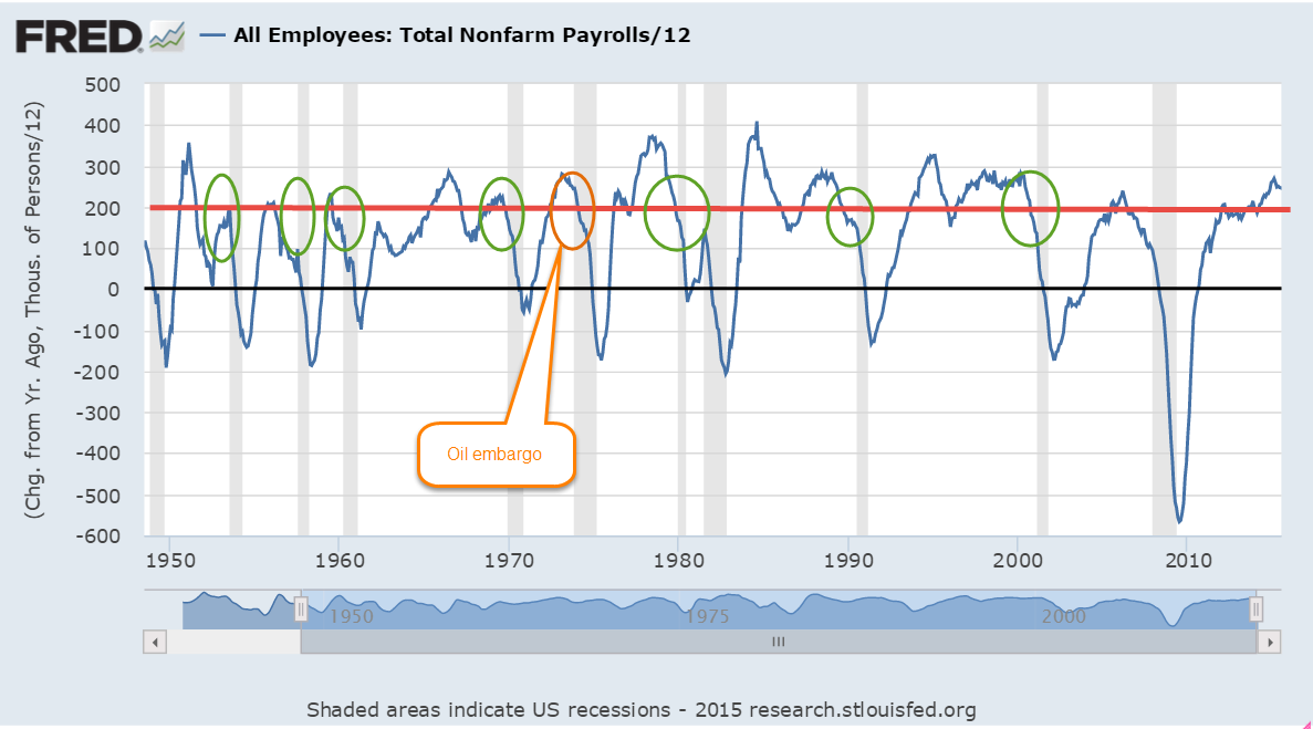
Worries about economic growth in China, in the EuroZone and in emerging markets have prompted fears of a recession in the U.S.  It could happen – it will happen – at some point in the future but not in the near future.  The Fed likes to use a Personal Consumption chain weighted inflation index called the PCE Price Index which more reliably captures underlying inflation trends.  Preceding each recession we see the rate of economic growth fall below the annual growth rate of the PCE index, multiplied by a 1.5 factor.  While GDP growth is not robust, it is far above the growth of the PCE price level.

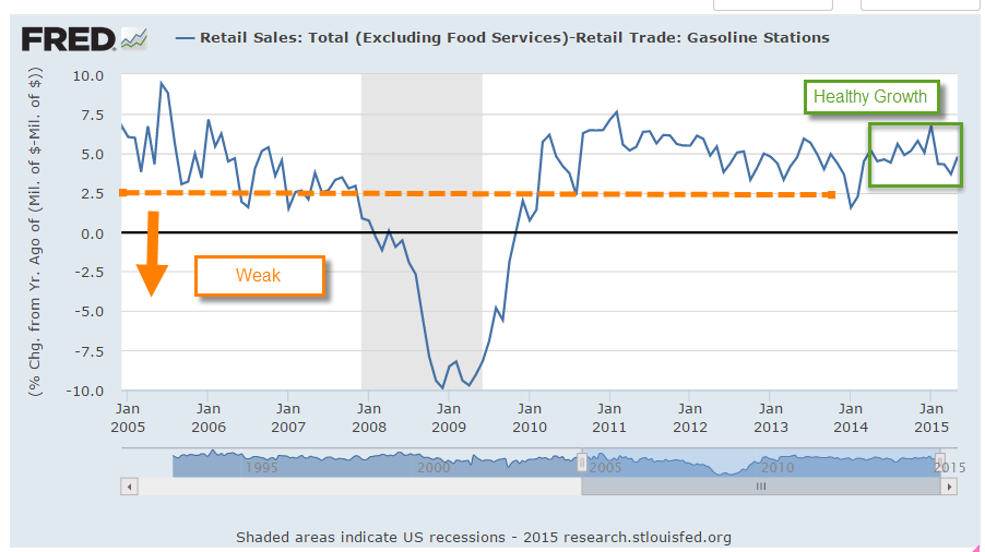
Speaking of growth, inflation-adjusted GDP growth for the second quarter was revised upwards to a 3.9% annual rate.  Consumer spending was revised higher and inventory growth – a bit worrisome, as I noted earlier – was revised lower.

The SP500 index began the year at a price level ($2068) that was just a bit above the inflation adjusted price level ($2018) of 2000 (Graph here).  Oops! we’re back below that year 2000 level. A sense of pessimism since mid-August has led to an 8% decline in the broad stock index, or 6% below the price level at the beginning of 2015.  A broad composite of bonds, Vanguard’s BND ETF, is also down -about 1.5% – since early 2015.

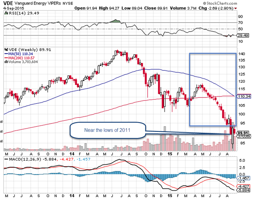
Some sectors of the market can not find a bottom.  XME, a blend of mining stocks, is down 45% for the year.  Brazil’s index, EWZ, is down a similar amount – about 40%.  Emerging Market stocks (VWO) in general have lost about 17% this year, and are at June 2009 prices.  After losing 5% of their value in the first week of September, they appeared to have found a bottom, regaining that lost 5% in the next two weeks.  This past week they gave up those gains, touching the bottom again.  The second time is a charm.  If this market draws in buyers a second time, this might be a good time to put some long term money to work.

*******************************

Phillips – the curve, not the screwdriver

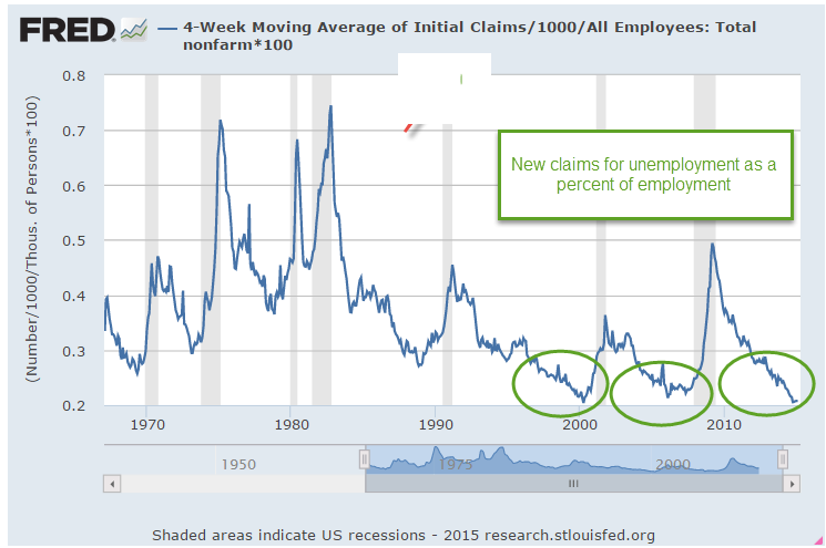
In a speech/lecture at U. of Massachusetts this week, Federal Reserve Chair Janet Yellen voiced her desire to raise interest rates sometime this year.  She included in her remarks some comments on the Phillips curve, a mainstay of economics textbooks during the past 50 years.  In the 1950s Bill Phillips presented one hundred years of unemployment and inflation data in the United Kingdom and showed that there was a trade-off between unemployment and inflation.  Higher inflation = lower unemployment.  Lower inflation = higher unemployment.  When the number of unemployed workers are low, workers can press employers for higher wages.  Higher wages lead to a higher inflation rate.

As you can see in the graph above (included in the Wikipedia article on the Phillips curve), the regression estimate, the red line, shows a tenuous inverse relationship between unemployment and inflation.  The standard error S of the regression estimate is a guide to the reliability of the estimate to predict future relationships in the data. The S in this regression is not shown but looks to be rather large; a lot of the data points are pretty far away from the red estimate line and so the regression model is unreliable.

Within fifteen years after the Phillips curve became an accepted tenet of economics, the stagflation of the 1970s disproved the central thesis of the Phillips curve.  During that decade, there was both high inflation and high unemployment.  This led economists to revise their thinking; the relationship described by the Phillips curve may have some validity in the short run but not in the long run.

For those of you who might like to go down the rabbit hole on this issue, there are several fascinating but challenging perspectives on the relationship between unemployment, the labor market, and inflation, the price level of goods in an economy.  One is Jason Smith’s Information Transfer model version of the Phillips curve.  Jason is a physicist by education and training who uses the tools of information theory to bring fresh insights to economic data, trends and models.

Roger Farmer (whose blog I link to in my blog links on the right hand side) has developed another perspective based on a sometimes overlooked insight in Keynes’ General Theory published in 1936. Roger is the Department Chair at UCLA’s Dept of Economics.  For the general reader, I heartily recommend his book “How the Economy Works”, a small book which presents his ideas in clear, simple terms. His history of the development of central economic theories weaves a concise narrative of ideas and people that may be the best I have read.

For those of you with the background and math chops, his paper “Expectations, Employment and Prices” (also a book) contains a well-developed mathematical model of longer term economical and business cycles that find an equilibrium at various levels of unemployment. Roger undermines an idea predominant in economics and monetary policy: the so called natural rate of unemployment, or NAIRU, that guides policy decisions at the Fed and is often mentioned by Yellen and others at the Fed.

Crossings

September 6, 2015

I am not going to say a lot about the August employment numbers, reported at 173,000,   since August’s numbers are routinely revised.  The BLS survey was 20,000 less than the ADP survey of private payrolls.  The revised figure will probably be closer to 210,000 jobs gained in August.  We can see the more important trends when we look at the annual job gains averaged over 12 months.

The slowdown in China and other markets and the selloff in markets around the world inevitably prompts talk of recession.  Since WW2 there has been only one recession – the one that followed the 1973 oil embargo –  that occurred when monthly job gains were above 200,000.   There have been 12 recessions since WW2. The work force was very much smaller fifty years ago.  There has been only one exception to this “rule” and when we look at this exception in closer detail we see that it was very much like the prelude to other recessions. Averaged monthly job gains were declining sharply as they do before every recession.  Job gains are NOT declining sharply today.

******************************

Resource Countries On Sale

Monday came the news that the Canadian economy was officially in recession.  California, the most populous of fifty U.S. states, has two million more people than all of Canada, whose economic vitality relies on its vast stores of timber, oil, gas and minerals.  Australia, Russia, Norway and New Zealand also ride the roller coaster of commodity prices. (WSJ article )  An ETF that captures a composite of Canadian stocks, EWC, is down almost 30% from its high of August 2014.  The 50 week (not day, but week) average is about to cross below the 200 week average.

These long term downward crossings are often bullish, indicating that prices are near a low point in the multi-year cycle.  An ETF composite of Australian stocks, EWA, is down a bit more than 30% and its 50 week average just crossed below the 200 week average.

A Vanguard ETF composite of energy stocks is near the lows of 2011.

********************
Subprime Mortgages

Conventional wisdom: subprime mortgages started the recent financial crisis in 2008.  A recent National Bureau of Economic Research (NBER) analysis (A short summary ) of home foreclosures overturns that misconception.  The authors found that twice as many prime borrowers lost their homes to foreclosure as subprime borrowers.

********************
Inflation

In 2007, the Social Security Administration estimated that prices would be 20% higher in 2015. Then came the severe recession of 2008-09 and persistently low inflation.  Prices this year are only 15% higher than those in 2007.  Social Security payments will total almost $900 billion this fiscal year (FRED series), more than 20% of Federal spending, and are indexed to inflation.  Low inflation “saves” the Federal government about $40 billion each year when compared with earlier projections.  Sounds good?  Life is a trade-off.  The 60 million (SSA) people who receive social security spend most of it.  That savings of $40 billion is money not spent.  In addition, low interest rates have reduced income for many retirees, who depend on safer investments for an income stream.  These safer accounts, which include savings, CDs, short and mid-term bond funds, have paid historically low interest rates since the Federal Reserve lowered its target interest rate to near-zero (ZIRP) in 2008.

A Pause On the Road

August 30, 2015

For the past few weeks, the volatility in the stock market has been front and center.  I finished last week’s blog with a note that the market would be conducting a vote of confidence in the coming weeks.  In the opening minutes last Monday morning, the Dow Jones index dropped a 1000 points, almost 6%.  No doubt many investors had spent the weekend worrying and put their sell orders in the night before.  By Friday’s close, however, the SP500 had gained almost 1% for the week.

A few weeks ago the Dow Jones index, composed of just 30 large company stocks, marked a death cross. The death cross is the crossing of the 50 day price average below the 200 day average.  See last week’s blog if you are unfamiliar with this.  This week the broader SP500 index, composed of the largest 500 U.S. companies, marked it’s own death cross.

Two weeks ago, I noted the attitude of one Wall St. Journal reporter to the dreaded death cross. In one word: blarney.  In two words: hocus-pocus.  So why do some investors and the press give this any attention?  Used as a trading system in the broader SP500 the death cross (sell) and it’s companion golden cross (buy) signal have produced a winning trade 4 out of 5 times.  Where do I sign up?, you might be thinking.  In an almost sixty year period of the SP500, however, the extra annual return is slight – about  8/100ths of a percent, or 8 basis points  – over no timing strategy, i.e. buy and hold.  To the average small investor, taxes and other fees more than offset this negligible advantage.

In contrast to any technical stock market price indicators, the fundamentals of the U.S. economy are mostly strong or expanding. Consumer Confidence rose above 100 this past month, surpassing the optimism of the benchmark set in 1985.  The second estimate of GDP growth released this past week was above some of the high estimates.  After inflation, real GDP growth continues at 2.65%.

Corporate profits are growing at 7.3%, home prices are up 5%.  Real, or inflation-adjusted, consumption spending and income is  growing at more than 3%, equaling the heights of pre-recession spending and income growth in early 2007.

Housing prices are increasing for a good reason.  Inventory of homes for sales is relatively low.  In the middle of the 2000s, prices rose even though inventory of homes for sale were going up, a sign of a speculative bubble.  Ah, things look so clear in the rear view mirror.

New jobless claims remain at historically low levels and job growth has been consistently solid.  There are more involuntary part-timers than we would like to see and the participation rate is low.  Gloom and doomers will tend to focus on the relatively few negative points in an otherwise optimistic economic panorama.  Gloom and doomers think that those who disregard  negative signs are Pollyannas.  Eventually, years later, the gloom and doomers are right.  “My timing was off but, see, I was right!” they exclaim. The lesson of the death cross and the golden cross are this: a person can be right most of the time.  The secret to successful investing is knowing when we are wrong and acting on it.

For the individual investor, signals like the death cross can be calls to check our assets and needs.  Older investors may depend on some stability in their portfolio’s equity value for income, selling some equities every quarter to generate some cash.   Financial advisors will often recommend that these investors keep two to five years of income in liquid, low volatility investments.  These include cash, savings accounts, and short to medium term corporate bonds and Treasuries.  Younger investors may see this price correction as an opportunity to put some cash to work.

Which Way Sideways?

August 9, 2015

As we all sat around the Thanksgiving table last November, the SP500 was about the same level as it closed this week.  Investors have pulled off the road and are checking their maps to the future.  After forming a base of good growth in the past few months, July’s CWPI reading surged upwards.

Despite years of purchasing managers (PMI) surveys showing expanding economic activity, GDP growth remains lackluster.  Every summer, in response to more complete information or changes to statistical methodologies, the Bureau of Economic Analysis (BEA) revises GDP figures for the most recent years.  A week ago the BEA revised real annual GDP growth rates for the years 2011 – 2014 from 2.3% to 2.0%.  “From 2011 to 2014, real GDP increased at an average annual rate of 2.0 percent; in the  previously published estimates, real GDP had increased at an average annual rate of 2.3 percent.”

A composite of new orders and rising employment in the service sectors showed its strongest reading since the series began in 1997.  The ISM reading bested the strong survey sentiments of last summer. We can assume that the PMI survey is not capturing some of the weakness in the economy.

This level of robust growth should put upward pressure on prices but inflation is below the Federal Reserve’s benchmark of 2%.  Energy and food prices can be volatile so the Fed uses what is called the “core” rate to get a feel for the underlying inflationary pressures in the economy.

The stronger U.S. dollar helps keep inflation in check.  There is less demand from other countries for our goods and the goods that we import from other countries are less expensive to Americans. .  Because the U.S. imports so much more than it exports, the lower cost of imported goods dampens inflation.  In effect, we “export” our inflation to the rest of the world.

When the economy is really, really good or very, very bad we set certain thresholds and compare the current period to those benchmarks.  When the financial crisis exploded in late 2008, the world fled to the perceived safety of the dollar in the absence of a exchange commodity of value like gold.  Because oil is traded in U.S. dollars and the U.S. is a stable and productive economy and trading partner, the U.S. dollar has become the world’s reserve currency.  The conventional way of measuring the strength of a currency like the dollar has been to compile an index of exchange rates with the currencies of our major trading partners.  This index, known as a trade weighted index, does not show a historically strong U.S. dollar.  In fact, since 2005, the dollar has been extremely weak using this methodology and only recently has the dollar risen up from these particularly weak levels.

As I mentioned earlier, a strong dollar helps mitigate inflation pressures; i.e. they are negatively correlated. When the dollar moves up, inflation moves down.  To show the loose relationship between the dollar index and a common measure of inflation, the CPI, I have plotted the yearly percent change in the dollar (divided by 4) and the CPI, then reversed the value of the dollar index.  As we can see in the graph below, the strengthening dollar is countering inflation.

What does this mean for investors?  The relatively strong economy allows the Fed to abandon the zero interest rate policy (ZIRP) of the past seven years and move rates upward.  A zero interest rate takes away a powerful tool that the Fed can employ during economic weakness: to stimulate the economy by lowering interest rates.

The strong dollar, however, makes Fed policy makers cautious. Higher interest rates will make the dollar more appealing to foreign investors which will further strengthen the dollar and continue to put deflationary pressures on the economy.  The Fed is more likely to take a slow and measured approach.  Earlier this year, estimates of the Effective Federal Funds Rate at the end of 2015 were about 1%.  Now they are 1/2% – 3/4%.  In anticipation of higher interest rates, the price of long term Treasury bonds (TLT) had fallen about 12% in the spring.  They have regained about 7% since mid-July.

DBC is a large commodity ETF that tracks a variety of commodities but has about half of its holdings in petroleum products.  It has lost about 15% since May and 40% in a year.  It is currently trading way below its low price point during the financial crisis in early 2009.  A few commodity hedge funds have recently closed and given what money they have left back to investors.  Perhaps this is the final capitulation?  As I wrote last week, there is a change in the air.

*************************

Labor Report

Strong job gains again this month but labor participation remains low.  A key indicator of the health of the work force are the job gains in the core work force, those aged 25 – 54.

While showing some decline, there are too many people who are working part time because they can’t find a full time job.  Six years after the official end of the recession in the summer of 2009, this segment of the work force is at about the same level.

In some parts of the country job gains in Construction have been strong.  Overall, not so much.  As a percent of the work force, construction jobs are relatively low.  In the chart below I have shown three distinct phases in this sector since the end of World War 2.  Extremes are most disruptive to an economy whether they be up or down.    Note the relatively narrow bands in the post war building boom and the two decades from 1975 through 1994.  Compare that to the wider “data box” of the past two decades.

For several months the headline job gains have averaged about 225,000 each month.  The employment component in the ISM Purchasing Managers’ Index (on which the CWPI above is based) is particularly robust.  New unemployment claims are low and the number of people confident enough to quit their jobs is healthy.  The Federal Reserve compiles an index of many factors that affect the labor market called the Labor Market Conditions Index (LMCI).  They have not updated the data for July yet but it is curiously low and gives more evidence that the Fed will be cautious in raising rates.

Wage Growth Rings

June 14, 2015

The broader stock market has been on a continuous upswing since November 2012 when the weekly close of the SP500 index briefly broke below the 48 week average.  The past six months is one of those periods when investors seem undecided.  Even though the market is above its 24 week average, a positive sign, it closed at the same level that it was just before Christmas.  Earlier this week came the news that Greece might avoid default on its June payment to the ECB and the market surged upwards. At the end of the week, news that talks had broken down caused a small wave of selling on Friday morning. Investor reaction to what, in perspective, is a relatively small event, indicates an underlying nervousness in the market.

As the SP500 began a broad upswing in late 2012, the bond market began a downswing.  A broad aggregate of bonds, AGG, fell about 5% over the following ten months before rising up again to those late 2012 levels this January.  In the past five months, this bond index has declined almost 4% as investors anticipate higher rates. A writer at Bloomberg notes a worrisome trend of concentrated ownership of corporate bonds.

Retail sales in May showed strong gains across many sectors in the economy. As the chart shows, growth below 2.5% is weak, indicating some pressures in household budgets that could be a precursor to recession.  Current year-over-year growth in retail sales excluding food and gas is up almost 5% – a healthy sign of a growing economy.

*************************

Wage Growth

“Since 2009, when the great monetary experiment began, global bond markets have increased in value by about $17 trillion. Global equity markets have increased by about $40 trillion. The average worker has seen wages increase by about $722 billion, which means about 2% of the benefit of QE (quantitative easing) went to workers. The rest went to asset prices.” (Source)

A cross section of a tree shows a historical pattern of rainfall, temperature and volcanic activity.  Wage and salary income across a population can provide a similar historical picture of the economic climate of a people.  The recovery from the recent recession has been marked by slow growth in wage and salary income relative to the growth rates of previous recoveries.

Economists find it difficult to reach a consensus to explain the muted growth.  A WSJ blog summarized a number of explanations.  I have noted several of these in past blogs.  They include:

Slack in the job market.  However, the labor dept reports that the number of job openings is at a 15 year high. (BLS Report)

Some economists point to the large number of involuntary part timers, those who want a full time job but can’t find one, as an indication of slack in the labor market.

The number of people quitting their jobs for another job is improving but is still weak by historical standards.

Sluggish productivity growth. Multi-factorial productivity growth estimates by the labor dept show that productivity gains in the past 15 years are chiefly from capital investment, not labor productivity.  Capital productivity during the recovery has been slow but labor productivity has been terrible, according to multi-factorial productivity assessments by the BLS.  As the century turned, we applauded the transition toward a more service oriented economy.  Less pollution from manufacturing industries, we told ourselves.  “The service sector is less cyclic,” economists reminded us.  It is much more difficult to wrest productivity gains from many service sector jobs. The cutting of a lawn, the making of a latte – there is a minimum threshold of time to do these things.

The sticky wages theory: namely, that companies withhold raises during the recovery because they couldn’t cut wages during the recession.

Let’s compare income growth to retail sales growth, using the data for retail sales less  food and gas whose prices are more volatile.  Periods when both growth rates decline set the stage for recessions.  Periods when both rates increase mark recoveries.

Simultaneous declines in 2011 and 2012 prompted stock market corrections.  The upswing of the past two years has contributed to the rising stock market.

Sugar Daddy

June 7, 2015

Older readers may remember Bizarro Superman, the mirror image of Superman, who did things backwards, or in reverse.  That’s the world we live in today; good news is bad, and vice versa.  The employment news was doubly good.  Job gains were stronger than expected at 280,000 but more importantly the unemployment rate went up a smidge, and for the right reasons.  As people become more confident in the job market, they re-enter the labor force, actively looking for work.  Discouraged job applicants have fallen 20% in the past twelve months.  The civilian labor force, the sum of employed and the unemployed, has grown.

Is good news good or bad?  If only the news would wear a hat, white or black, so we could tell. In Friday’s trading, investors bet on the timing of the Fed’s first interest rate increase.  September of this year or the beginning of 2016? When will Sugar Daddy, the Fed, take away the punch bowl of easy money?

The core work force, those aged 25 – 54 who drive the economy, continues to show growth greater than 1%.

Although hourly wage growth for all private employees has been modest at 2.3% annual growth, weekly earnings for production and non-supervisory employees have risen 30%, or 2.7% per year in the past decade, a period which has included the worst downturn since the 1930s depression.  This more positive outlook on wage growth does not fit well with some political narratives.

The decade from 1995 – 2005 had 36% gains, or 3.1% annual growth, only slightly above the gains of the past decade and yet this period included the go-go years of the dot-com bubble and the housing boom. Inflation was higher in that decade, and in inflation adjusted dollars, the earlier period was only slightly stronger than this past decade.  In short, we are doing suprisingly well considering the negative impacts of the financial crisis.

************************

CWPI

Every month I update the Constant Weighted Purchasing Index, a composite of the Purchasing Manager’s monthly index published by the Institute for Supply Management.  This month’s reading was similar to last month’s, continuing a trough in the strong growth region of this index.

**************************

Heaven On Earth

Last week I asked the question: Why can’t a government with a fiat money system simply give everyone a lot of money and create a heaven on earth?  The standard answer is that it would cause inflation.  For several millennia, when a government injects money into an economy, inflation soon follows as the supply of purchasing power increases without a concurrent increase in the supply of goods and services.  In the 18th century philosophers David Hume (On Money) and Adam Smith (Wealth of Nations) noted the phenomenon.  Peter Bernstein’s Power of Gold recounts ancient examples of kings and governments debasing metal monies and the inflation that ensued.

In the seven years since the recession began in late 2007, the government has borrowed and spent $27,000 per person and there has not been the slightest hint of inflation. Why? There are several reasons.  If a government borrows money from the private sector, there is no net injection of money into the system, no printing of money. A Federal Reserve FAQ on printing money is careful to note that “printing money” is the permanent financing of a government’s debt by a central bank.  Whatever people want to call it, when the Federal Reserve buys government debt, new money is injected into the system.  Since 2007, the Fed has injected almost $4 trillion (Balance Sheet), or about $12,000 per person, of new money without an uptick in inflation.  How is this possible?

There are two types of spending – today and tomorrow.  Spending for today is consumption.  Spending for tomorrow is investment.  Both types of spending drive demand for goods and services.  The paucity of private investment since 2007 is at levels not seen since the years immediately following World War 2.

Although government investment is a relatively small percentage of GDP, that has also fallen to historically low levels.

The sum of private and government investment as a percentage of GDP is shockingly low.

If we use 2007 investment levels as a base, the accumulated lack of investment is far more than the $4 trillion that the Fed has pumped into the economy.

The Fed’s injection of money into the system is primarily spent on government consumption, or today spending, which is helping to offset the lack of investment spending.  As investment spending rises, the Fed has been able to stop adding to its portfolio, although this “tomorrow” spending is still so low that the Fed can not begin to lighten its portfolio of government debt.

Advocates – economist Paul Krugman for one – of greater government investment spending, even if it borrowed money, hope to offset the lack of private confidence in the future.  Previous government stimulus spending did have little effect on overall economic growth simply because it did little more than offset the lack of long term confidence by those in the private sector.

Spring is springing

May 10, 2015

CWPI

The dollar’s appreciation against the euro and other currencies in the first quarter of this year caused a natural slowdown in exports, which has hurt manufacturing businesses in this country.  U.S. products are simply more expensive to customers in other countries because dollars are more expensive in other currencies. The PMI manufacturing survey showed a decline in employment for the month.  The non-manufacturing sector, which is most of the economy, rallied in April.  As I noted last month, the CWPI should have bottomed out in March-April, reaching the trough in a wave-like series that has been characteristic of this composite index during the past six years of recovery.  Any change to this pattern – a continuing decline rather than just a trough – would be cause for concern.

April’s resurgence in the non-manufacturing sector more than offset the weakness in manufacturing. In fact, there was a slight gain in the CWPI from March’s reading.

Employment and new orders in the non-manufacturing sector are two key components of the composite index and leading indicators of movement in the index.  They have been on the rise since the beginning of the year.  While the decline in the overall index lasted 5 – 6 months, this leading indicator declined for only 3 months, signalling a probable rebound in the spring. Now we get some confirmation of the rebound.

*************************

Employment

Released at the end of the week a few days after the PMI surveys, the monthly employment report from the BLS confirmed a renewal in job growth after rather poor job gains in March.  April’s estimated job gains were over 200K, spurring a relief rally in the stock market on Friday.  Gains were strong enough to signal that the economy was on a growth track but not so strong that the Fed would be in any rush to raise interest rates before September.

March’s job gains were revised even lower to below 100K, but the story was that the severe winter weather was responsible for most of that dip.  As the chart below shows, there was no dip in year over year growth because the winter of 2014 was bad as well.  Growth has been above 2% since September of last year.

During the 2000s, the economy generated plus 2% employment growth for a short three month stretch in early 2006, just before the peak of the housing boom.  The past eight months of plus 2% growth hearkens back to the strong growth of the good ole ’90s.  Like the 90s, Fed chair Janet Yellen warned this week that asset prices are high, recalling former Fed chair Alan Greenspan’s 1996 comment about “irrational exuberance.” Prices rose for another four years in the late 90s after Greenspan’s warning so clairvoyance and timing are not to be assumed simply because the chair of the Federal Reserve expresses an opinion.  However, history is a teacher of sorts.  When Greenspan made that comment in December 1996, the SP500 was just under 600.  Six years later, in late 2002, after the bursting of the dot-com bubble, a mild recession, the horror of 9-11 and the lead up to the Iraq war, the SP500 almost touched those 1996 levels.  An investor who had pulled all their money out of the stock market in early 1997 and put it in a bond index fund would have earned a handsome return.  Of course, our clairvoyance and timing are perfect when we look backward in time.

For 18 months, growth in the core work force, those aged 25 – 54, has been positive.  This age group is critical to the structural health of an economy because they spend a larger percentage of their employment income than older people do.

Construction employment could be better.  Another 400,000 jobs would bring employment in this sector to the recession levels of the early 2000s before the housing sector got overheated.

In the graph below, we can see that construction jobs as a percent of the total work force are at historically low levels.

Every year more workers drop out of the labor force due to retirement, or other reasons.  The population grows by about 3 million; 2 million drop out of the labor force.

The civilian labor force (CLF) consists of those who are employed or unemployed (and actively looking for work).  The particpation rate is that labor force divided by the number of people who can legally work, those who are 16 and over who are not in some institution that prevents them from working.  (BLS FAQ)  That participation rate remains historically low, dropping from 65% five years ago to under 63% for the past year.

That lowered rate partially reflects an aging population, and fewer women in the work force relative to the surge of women entering the work force during the boomer “swell.”  A simpler way of looking at things shows relatively stable numbers for the past five years:  those who can work but don’t, as a percentage of those who are working.  The population changes much more than the number of employed, and the percentage of those who are not working is rock steady at about 66%.  This percentage is important for money flows, the vitality of economic growth and policy decisions.  Those who are not working must get an income flow from their own resources or the resources of those who are working, or a combination of the two.

The late 90s was more than just a dot-com boom.  It was a working boom where the number of people not working was at historically low levels compared to the number of people working.  The end of the dot-com era and the decline in manufacturing jobs that began in the early 2000s, when China was admitted to the WTO, marked the end of this unusual period in U.S. history.  Former Secretary of Labor Robert Reich (Clinton administration) sometimes uses this unusual period as a benchmark to measure today’s environment.

Not only was this non-working/working ratio low, but GDP growth was rather high in the 1990s, in the range of 3 – 5%.

Let’s look at GDP growth from a slightly different perspective.  Real GDP is the country’s output adjusted for inflation.  Real GDP per capita is real GDP divided by the total population in the country.  Real GDP per employee is output per person working.  As GDP falls during a recession, so too do the number of employees, evening out the data in this series.  A 65 year chart reveals some long term growth trends.  In the chart below, I have identified those periods called secular bear markets when the stock market declines significantly from a previous period of growth.  I have used Doug Short’s graph  to identify these broader market trends.  Ideally, one would like to accumulate savings during secular bear markets when asset prices are falling and tap those savings toward the end of a secular bull market, when asset prices are at their height.

In the chart above note the periods (circled in green) of slower growth during the 1968-82 secular bear market and the last few years of the 2000-2009 secular bear market.  After a brief upsurge at the end of this past recession, we have continued the trend of slower economic growth that started in 2004.  A rising tide raises all boats and the tide in this case is the easy monetary policy of the Federal Reserve which buoys stock prices.  In the long run, however, stock prices rise and fall with the expectations of future profits.  Contrary to previous bull markets, this market is not supported by structural growth in the economy, and that lack of support increases the probability of a secular bear market in the next several years, just at the time when the boomer generation will be selling stocks to generate income in their retirement.

Earthquakes in some regions of the world are inevitable.  In the aftermath of the tragedy in Nepal, we were reminded that risky building practices and regulatory corruption can go on for decades.  There is no doubt that there will be  horrific damage and loss of life when the inevitable happens yet the risky practices continue.  The fault lines in our economy are slower per employee GDP growth and a greater burden on those employees to pay for programs for those who are not working. The worth of each program, who has paid what and who deserves what is immaterial to this particular discussion.  Growth and income flow do matter. Asset prices are rising on shaky growth foundations that will crack when the fault lines slip.  Well, maybe the inevitable won’t happen.

Easter Egg

April 5, 2015

On this Easter Sunday, Christians celebrate the Resurrection of Jesus, Jews observe Passover, basketball fans await the final contest of the Final Four and baseball fans look forward to the start of the new season.  After Friday’s disappointing report of job gains in March, investors might be wondering what will happen Monday when markets in the U.S. reopen following Good Friday.  In overseas markets, yields on the 10 year Treasury bond fell on the employment news.  Job gains that were about half of expectations helped allay fears of a June rate increase.  We may see a positive response from both the bond and equity markets on Monday as the time table for rate increases might start in September.  On the other hand, the weekend might allow more rational judgment to prevail. One month’s disappointment does not a trend make.  Year over year gains in employment are especially strong.

April is usually a good month in the stock   market.  Since breaking the 2000 mark in August, the index has neither gained or lost much ground.  Gains in the technology companies that are included in the SP500 (Apple, for example) have been offset by losses in the oil sector of the SP500 (Exxon, Chevron, for example).  Long term Treasuries (TLT) have risen 10% in the past six months, despite the prospect of rising interest rates in 2015.

ICI reports that domestic long term equity mutual funds had an outflow of about $8 billion in March. Investors have not abandoned equity funds by any means but have changed focus. During this past month, $14 billion flowed into world equity funds.   Bond funds continue to post strong inflows – $10 billion in March.

The boomer generation amassed a lot of pension promises through their working years.  Pension funds must balance both equity and bond risk in their investment portfolios  and yet try to meet their assumed growth rates of 7% – 8%.  Caught on the horns of this dilemma, pension funds straddle both the equity and bond markets.  During the past ten years, many have become underfunded because they have not been able to match their projected growth rates.   This delicate balance of risk and reward sets the stage for a catastrophic decline in response to even a relatively small monetary shock because pension funds can not afford to wait out another three or four year decline.  Too many boomers will start cashing in those promises accumulated during the past decades.

The relatively low number of new jobs created in March was probably due to the severe winter in the eastern part of the country.  The BLS revised downward their previous estimates of employment gains in January and February.  Even with the downward revisions and this past month’s relatively anemic 126,000 gains, the average for the quarter is still about 200,000 per month, a particularly strong figure when one considers the impact that plummeting oil prices have had. In the first 3 months of this year, companies in oil and gas exploration have shed 3/4 of the jobs added during all of last year.  The strong dollar makes U.S. exports more expensive and hurts manufacturing.  The employment diffusion index in manufacturing industries dropped below 50, a sign that there is some contraction in the 83 industries included in this index.  However, March’s Manufacturing Purchasing Managers Index showed some slight expansion still and employment in manufacturing is still strong.  Across all private industries, the diffusion index remains strong at 61.4.

Fed chair Janet Yellen has repeatedly said that interest rate decisions will be based on data.  If the data of subsequent months show a resumption of strong growth, an interest rate increase at the FOMC meeting in late July could still be in the cards.  The CWPI composite built on the PMI anticipated a declining trend in growth this winter and spring before resuming an upward climb.  When the non-manufacturing  PMI is released this coming Monday, I’ll update that and show the results in next week’s blog.  Based on the numbers already released, I do anticipate a further decline in March then an evening out in April.  The particularly strong dollar  has cast some doubt on growth predictions, particularly in manufacturing. Both oil and the dollar have made sharp moves in the previous months and it is the rate of change which can be disruptive in an economy.

**********************

Unemployment

New claims for unemployment were the lowest since the spring of 2000, just as the bubble of the dot-com boom began to deflate.  As a percent of those working, this is the third time since WW2 that new claims have reached these very low levels.  The last two times did not turn out well for the economy or the stock market.

**********************

Oil

Going back through some old notes.  Here’s an October 2009 article where Deutsche Bank estimates the price of oil at $175 in 2016.  2009 was just about the time that newer techniques in horizontal drilling were being developed.  The fracking boom was just about to get underway.  Whether you are an investor or a second baseman, the future is tough to figure out so stay balanced, stay prepared and keep your knees bent.

Winter Wanders

March 8, 2015

Labor Market

If you are reading this and have not set your clock forward, that’s OK.  March to your own drummer!

On Wednesday, payroll processor ADP released their data for February, showing private payroll gains of 212,000.  This confirmed estimates that total job gains from the BLS would be about 230,000.  The bothersome data point in the ADP report was the huge upward revision of job gains in January, bringing it close to the BLS estimate.  ADP is working with a lot of hard data – actual paychecks – so was this revision a discrepancy in seasonal adjustments?

On Thursday, the BLS issued revised figures for labor productivity in the 4th quarter of 2014. The report includes this: “The 4.9 percent increase in hours worked remains the largest increase in this series since a gain of 5.7 percent in the fourth quarter of 1998.” 4th quarter productivity sagged 2.2% from the 3rd quarter,  and was essentially unchanged from the 4th quarter of 2013.  Labor productivity is often a lagging indicator but it narrowed Thursday’s trading range as investors crossed bets on the Fed’s plans for raising interest rates later in the year.

The BLS report of 295,000 job gains in Febuary was so over the top that many traders punched the sell button.  Government employment increased 7,000, meaning that private job gains as reported by the BLS was almost 290,000, a difference of almost 70,000 between the BLS and ADP reports.  When in doubt, traders get out.

For mid to long-term investors, the continuing strength in the labor market is an optimistic sign.  Employees add to costs and commitments.  If businesses are adding jobs, it is because they anticipate higher revenues in the near future.  Some analysts pointed to the high number of jobs gained in the leisure and hospitality sectors as a sign of weakness in the labor market.  These are jobs that pay on average about 25% less than the average of all production and non-supervisory employees and a third less than the average for all employees.  However, higher paying jobs in professional services and construction also showed strong gains.

As I have mentioned before, the Federal Reserve compiles a Labor Market Conditions Index (LMCI) which summarizes 24 employment trends and one which chair Janet Yellen uses as her gauge for the fundamental strength or weakness of the labor market.  Next Wednesday, the Fed will release the LMCI updated for February but a chart of the past twenty years shows longer term trends.

While the index itself is still in negative territory, the momentum (red line) of the index is strong and consistent.  We can understand Yellen’s cautious optimism when recently testifying before the Senate Banking Committee.  This index was only developed a few years ago so this chart includes revised data and methodology that is backward looking.  If history is any guide, a long term investor would be ill advised to bet against the momentum of this index when it is positive.

A key indicator for Ms. Yellen is the Quit rate, the number of employees who quit their jobs to go to another job or who feel confident that they can find another job without much difficulty.  That confidence measure continues to rise and is currently in a sweet spot.  It is not overly confident as it was at the height of the housing boom in 2006 and the dot com boom of the late 1990s.  It is neither pessimistic as it was in the early 2000s or darkly apocalyptic as in the period from 2008 – 2012.

The number of new claims for unemployment as a percentage of the Civilian Labor Force is at historic lows.  One could argue that new claims are too low.

Wage growth in this month’s report was minimal.  However, wage growth since 2006 has not done too badly, growing more than 25% and outpacing the 16% growth in inflation during the period.

Benefits have grown more than 20% in the same period and showed no decline during this past recession.  Many employees are simply not aware of the costs of their benefits.  They may think that vacations and holidays and health care are the only benefits they get.  There are several mandated taxes and insurance that an employer is required to pay.

Because some benefit costs are “sticky,” and not responsive to changing business conditions, the continued strength in the labor market shows an increasing commitment on the part of employers, a growing confidence that economic conditions are fundamentally improving.  Several years ago, many employers were reluctant to take on new employees because positive news was regarded with a healthy skepticism.  “We won’t get fooled again,” as the Who song lyric goes.  Despite improving fundamentals, the market is likely to be somewhat volatile this year as investors and traders speculate on the timing and aggressiveness of any interest rate moves from the Fed.

**************************

Purchasing Managers Index

Based on the monthly survey of purchasing managers, the Constant Weighted Purchasing Index (CWPI) declined slightly again this month as expected.  The manufacturing sector slid a bit this past month but employment in the service sectors popped up, keeping the composite index up above the benchmark of strong growth.  If the post-recession trend continues, we might see one more month of softening within this growth period.

New orders and employment in the service sectors are the key indicators that I highlight to get a more focused analysis of growth trends.  When this blend of the two factors stays above 55, the benchmark of strong growth, the economy is strong.  Except for a slight dip below that mark (54.4) last month, this blend has been above 55 for ten months now.

We can also see the brief periods of steady decline in these two components in 2011, 2012 and the beginning of 2013, causing the Federal Reserve to worry about a further decline into recession. The Federal Reserve enacted a series of bond buying programs called QE.  Continued economic strength may prompt a slow series of interest rate hikes.  The key word is “slow.”  Under former chairman Alan Greenspan, the Federal Reserve adjusted interest rates up and down too quickly, which produced small shock waves in the financial system.  Banks, businesses and investors may make unwise choices in response to rapid rate changes.  Live and learn is the lesson.

Growing Signs

February 8, 2015

Employment

Employment gains in January were at the midpoint of expectations but revisions to the gains of November and December were significant, adding about 70,000 jobs in each month.  After a decline in December, average hourly earnings rose to $24.75, for a year-over-year gain of 2.2% and a good 1% above inflation.

In a sign that people are becoming more optimistic about job prospects, the Participation Rate increased 2/10ths of a percent in January.  After 5 years of decline, this rate may have found a bottom over the past year.

The health or frailty of the core work force aged 25 – 54 years is  a snapshot of the underlying strength of the labor market.  This age band constitutes our primary working years.  In the first half of this thirty year period we build job skills, work and social connections, establish credit, and accumulate relationships and stuff.  Year-over-year growth in the 1 to 2% zone is the preferred “Goldilocks” growth rate.

As the graph below shows, the growth rate has been above 1% for most of the past year.

Monthly gains in construction employment have overtaken professional business services and the health care industry.

The construction industry accounts for less than 5% of employment but each employee accounts for a total of $160,000 in spending so changes affect other industries.  As you can see in the graph below, real or inflation-adjusted construction spending per employee was relatively stable during the 1990s.  As the housing market boomed, spending per employee rose dramatically in the 3-1/2 years from late 2002 to early 2006.  In the worst throes of the recession when the industry shed almost a quarter of its employees, per employee spending stabilized at the same level as the 1990s.

Stimulus spending and Build America projects helped cushion the decline in construction spending but as those programs concluded, spending fell to a multi-decade low in the spring of 2011.  Despite historically low interest rates and increasing state and municipal tax revenues, both residential and commercial construction are below the benchmark set in the 1990s.  Despite strong gains in the past two years, the industry still has room to run.

As the economy improves, those working part time because they can not get full time work has decreased significantly from the nosebleed heights of five years ago.

That total includes those whose hours have been cut back because of slack business conditions.  A subset of that total are the number of workers who are working part time because they can not find a full time job.  This segment of workers has seen little change during this recovery.

*****************************

Purchasing Manager’s Index

Each month I update a composite index of the ISM Purchasing Manager’s indexes (PMI) first introduced by economist Rolando Pelaez in 2003.  This composite, the Constant Weighted Purchasing Index, or CWPI, reached record highs in October 2014.  It is no surprise that, this month, the BLS revised November’s employment gains upwards by 70,000 to over 420,000.  As expected, the composite has declined but remains robust.

The wave like pattern of present and anticipated industrial activity has quickened since early 2013, the troughs and crests coming closer together.  If this pattern continues, we should expect gradual declines over the next two months before rising up again.  A combination of employment and new orders in the service sectors continues to show healthy growth, although it has also declined from the strong growth of the past few months.