Winter Wonderland

December 8th, 2013

The Bureau of Labor Statistics rode down like Santy Claus on the arctic front that descended on a large part of the U.S. The monthly labor report showed a net gain of 203,000 jobs in November, below the 215,000 private job gains estimated by ADP earlier in the week, but 10% higher than consensus forecasts.  Thirty eight months of consecutive monthly job growth shows that either:

1) President Obama is an American hero who has steered this country out of the worst recession – wait, let me capitalize that – the worst Recession since the Great Depression, or

2) American businesses and Republican leadership in the House have overcome the policies of the worst President in the history of the United States. 

Hey, we got some Hyperbole served fresh and hot courtesy of our radio and TV!

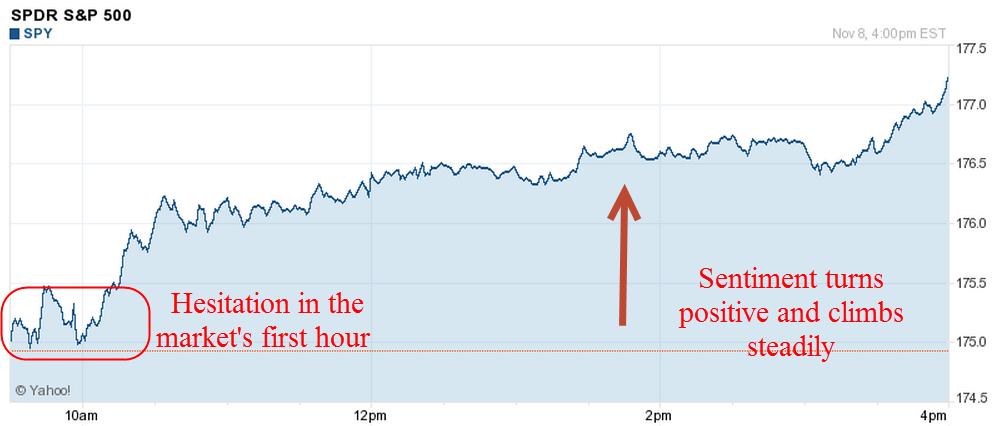
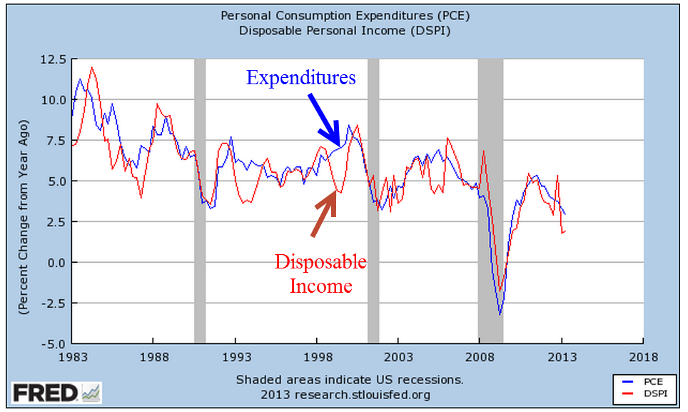
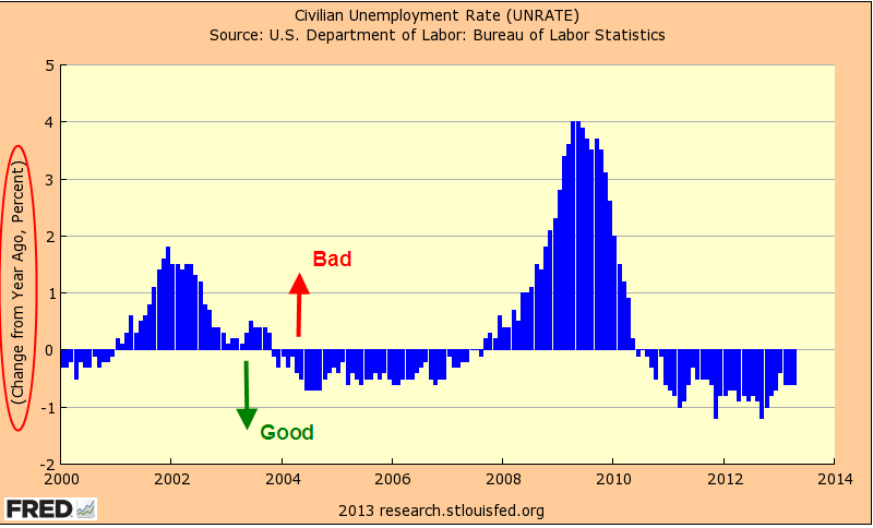
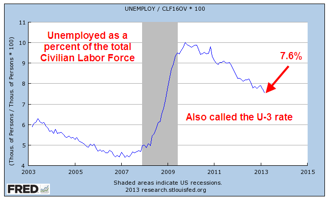
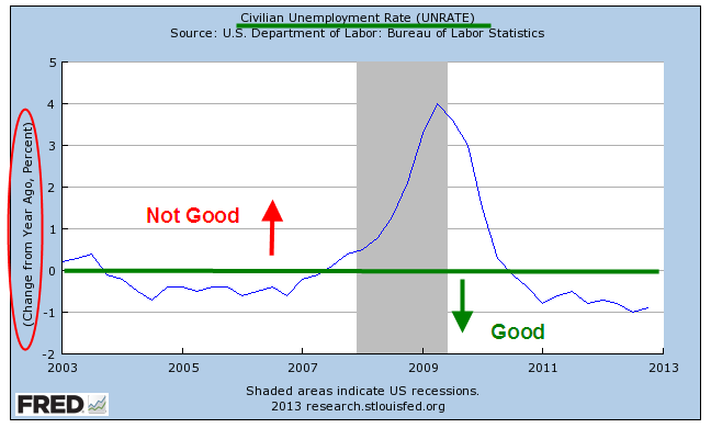
The unemployment rate dropped to 7.0% for the right reasons, i.e. more people working, rather than the wrong reasons, i.e. job seekers simply giving up.  The combination of continued strong job gains and a big jump in consumer confidence caused the market to go “Wheeee!”

***********

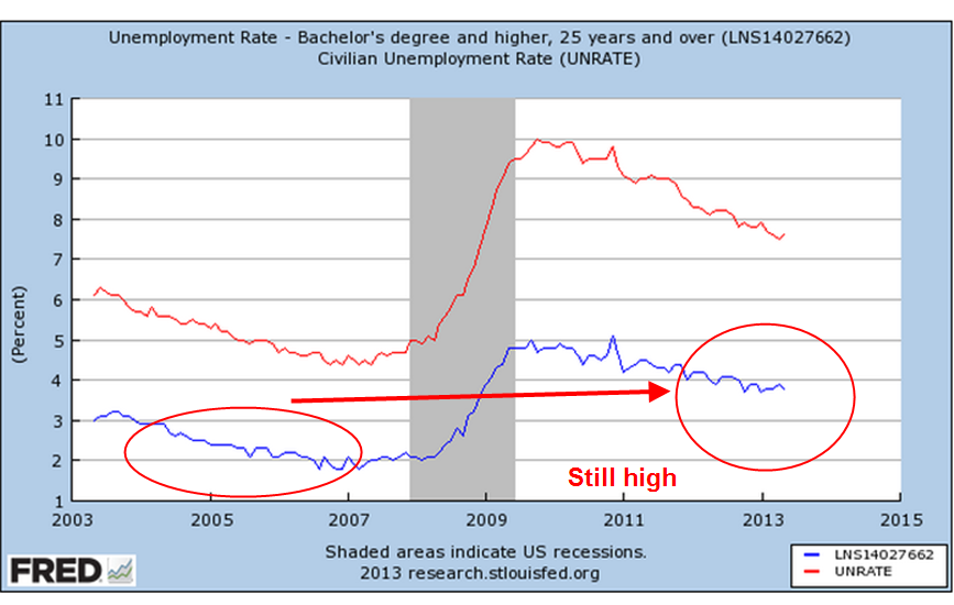
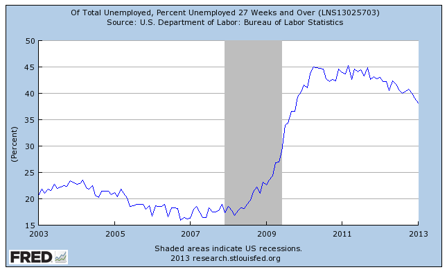
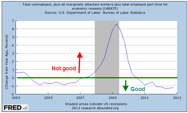
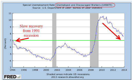
A broader measure of unemployment which includes those who want work but haven’t looked for a job in the past four weeks declined to 7.5%.  This is still above the high marks of the recessions of the early 90s and 2000s.

***********

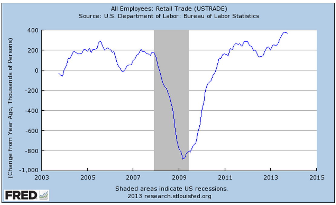
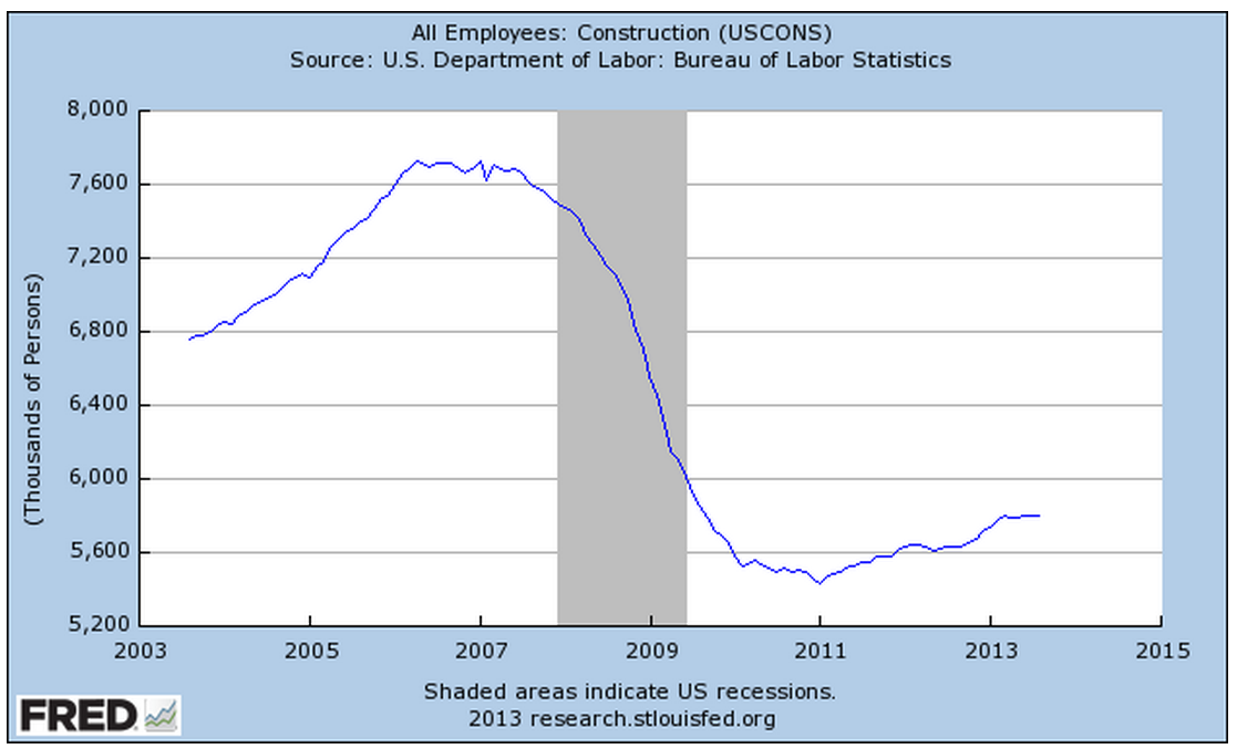
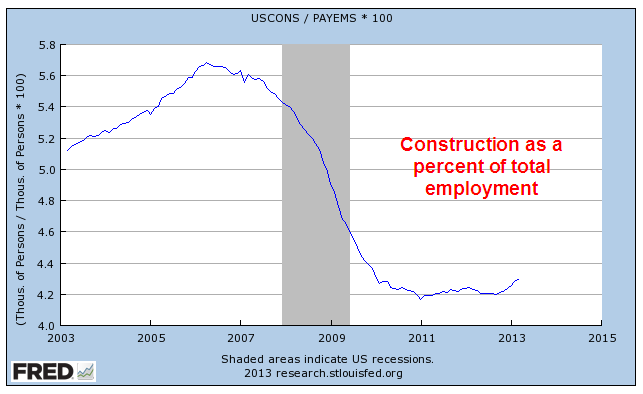
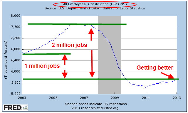
Construction employment suffered severe declines after the collapse of the housing bubble.  We are concerned not only with the level of employment but the momentum of job growth as the sector heals.  A slowing of momentum in 2012 probably factored into the Fed’s decision to start another round of QE in the fall of last year.

********

Job gains were broad, including many sectors except federal employment, which declined 7,000. Average hours worked per week rose by a tenth to 34.5 hours and average hourly pay rose a few cents to $24.15.

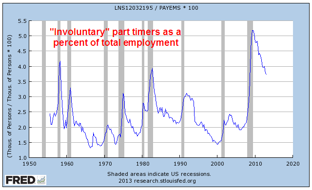
Discouraged job seekers are declining as well.  The number of involuntary part time workers fell by 331,000 to 7.7 million in November.  As shown in graph below, the decline is sure but slow.

***********

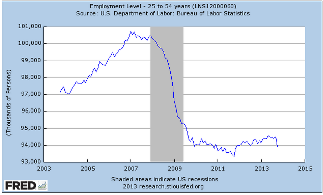
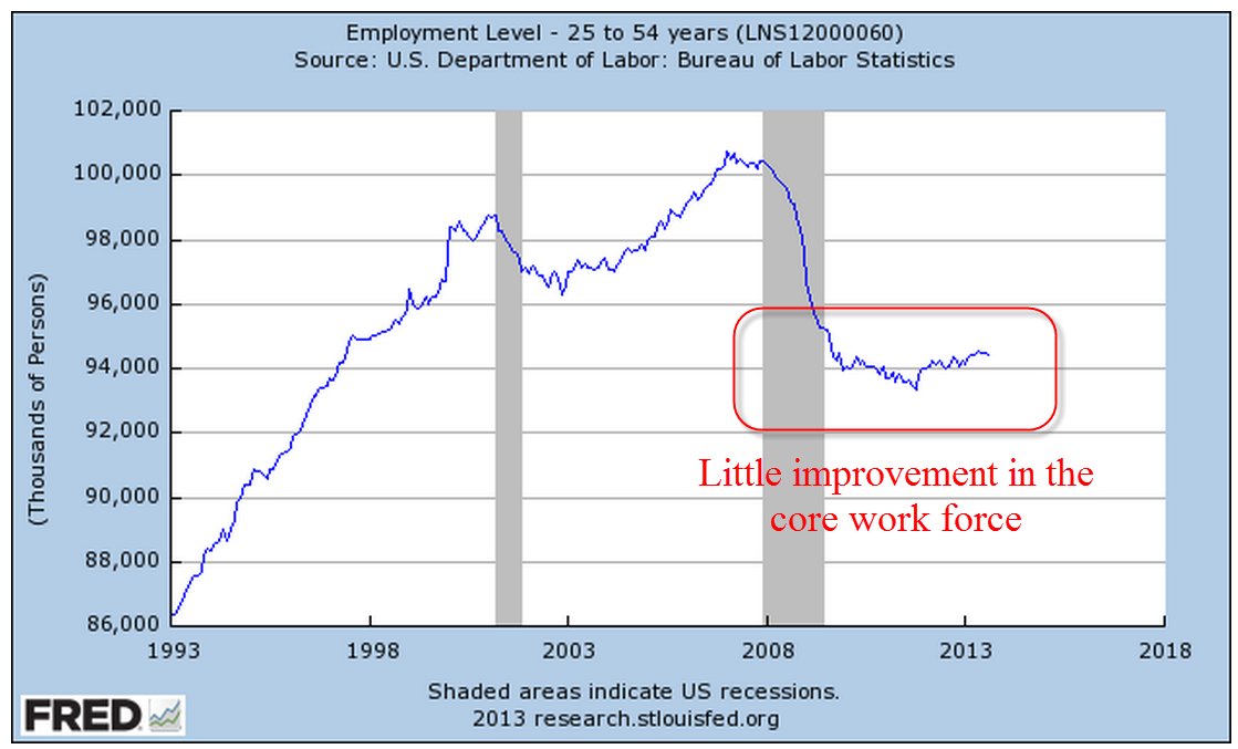
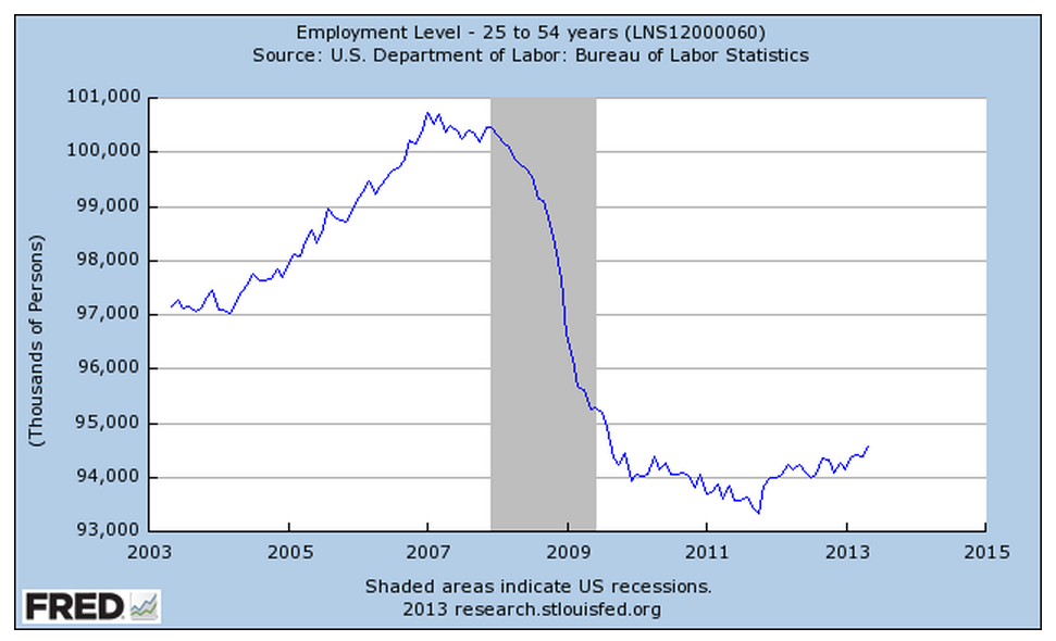
There are still some persistent trends  of slow growth.  Job gains in the core work force aged 25 -54 are practically non-existent.

**********

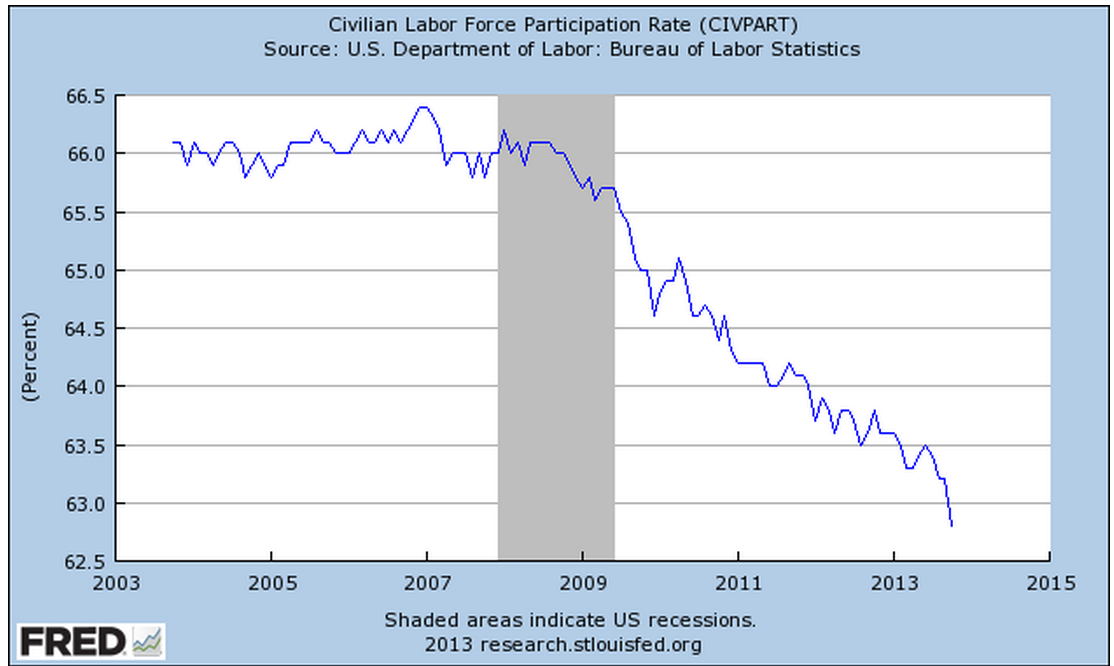
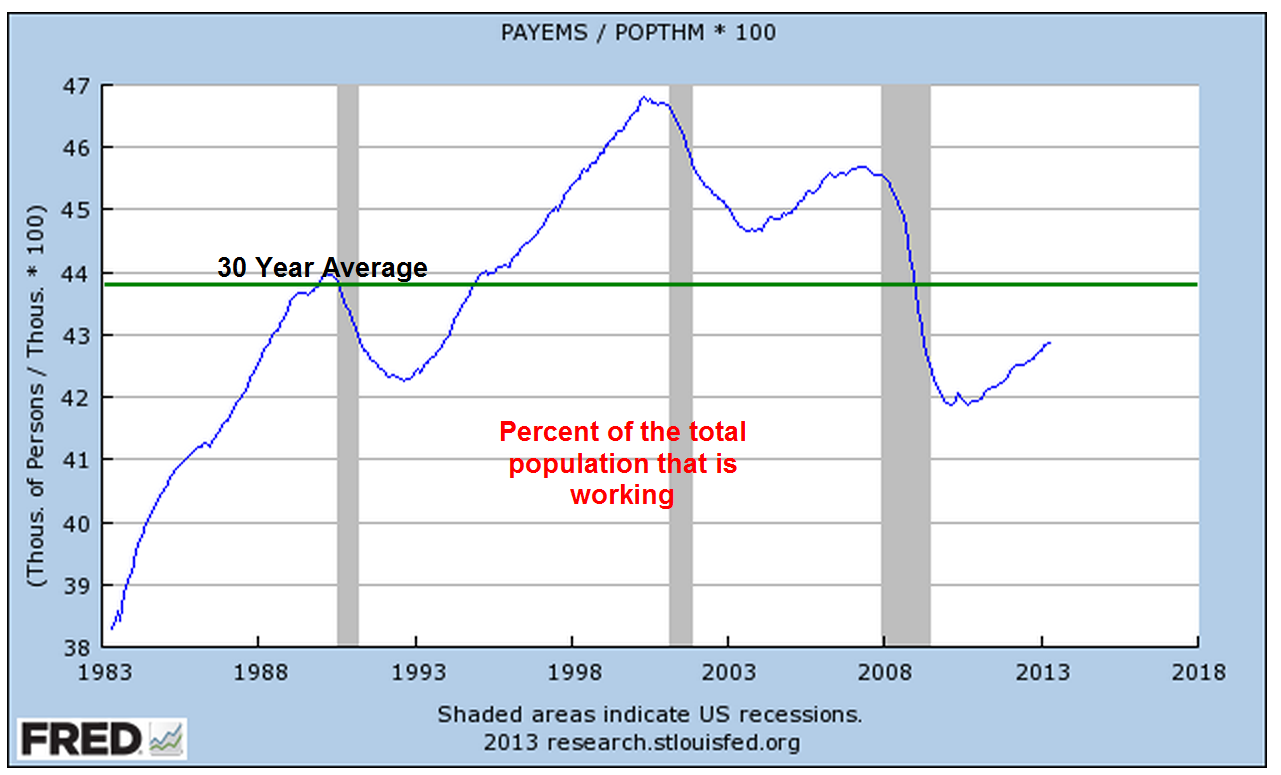
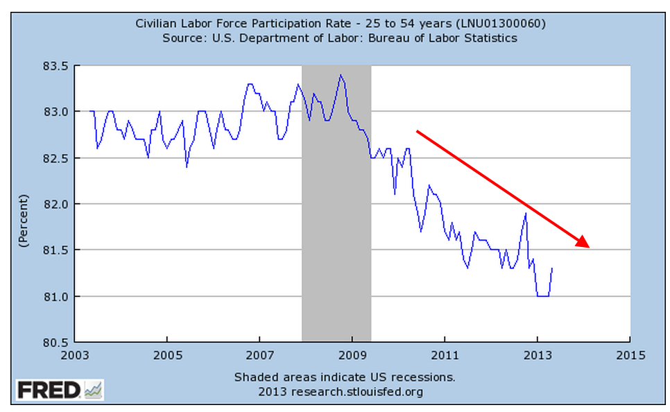
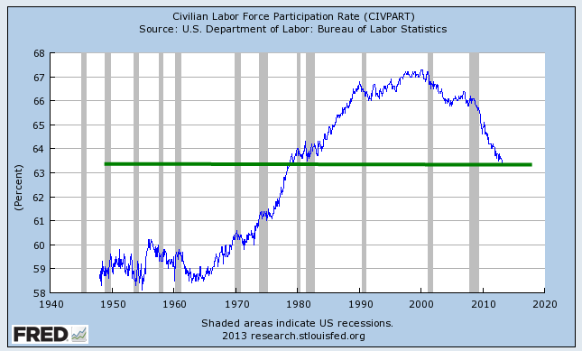
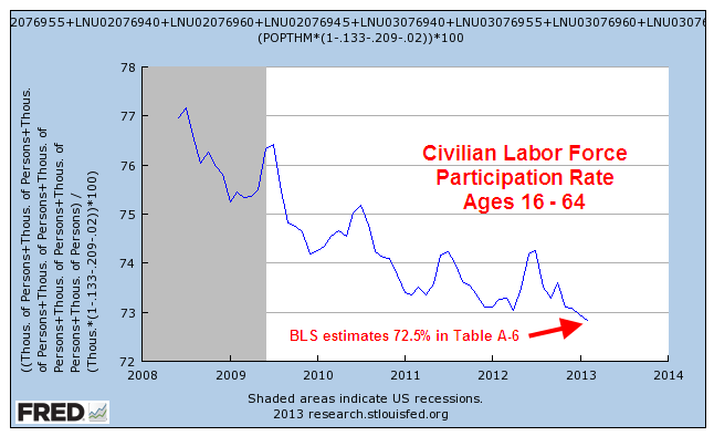
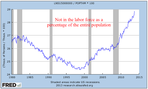
The percentage of the labor force that is working edged up after severe declines this year but the trend is down, down and more down.

*********

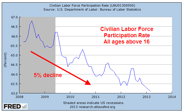
The number of people working as a percent of the total population has flatlined.

**********

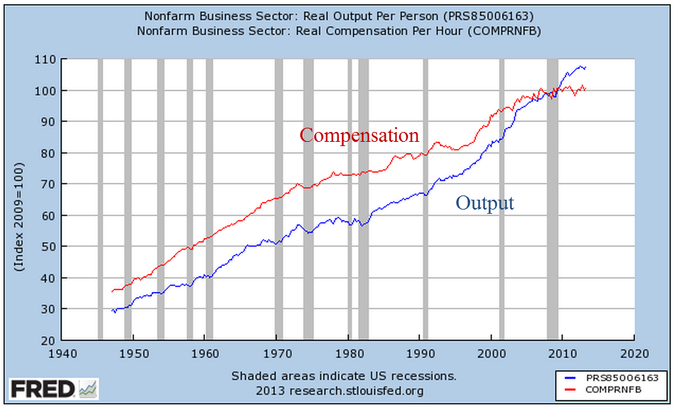
Let’s turn to two sectors, construction and manufacturing, which primarily employ men.  The ratio of working men to the male population continues to decline.  Look at the pattern over 60 years: a decline followed by a leveling before the next decline, and so on.  Contributing to this decline is the fact that men are living longer due to more advanced medical care and a fall in cigarette smoking.

************

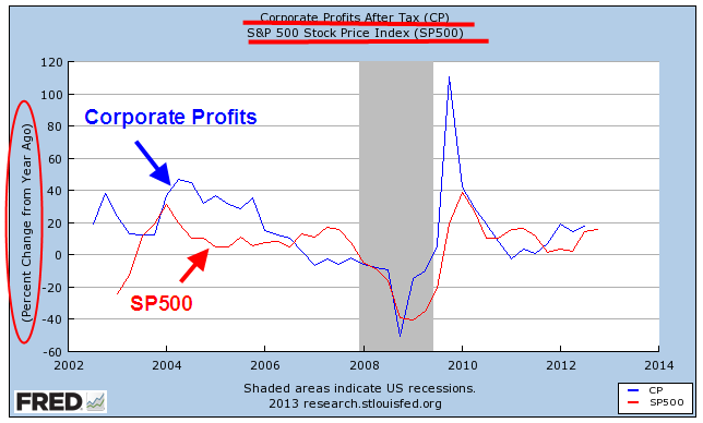
The taxes of working people have to pay for a lot of social programs and benefits that they didn’t have to pay for thirty years ago.  Where will the money come from?  A talk show host has an easy solution: tax the the Koch Brothers, cut farm subsidies to big corporations and defense.  Taking all the income from the Kochs and cutting farm subsidies and defense by half will produce approximately $560 billion, not enough to make up for this year’s budget deficit, the lowest in 4 years.  What else?

***********

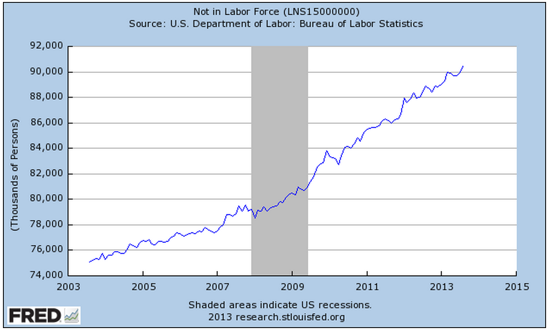
In a healing job market, those aged 16 and up who are not in the labor force as a percent of the total population  continues to climb.

********************************

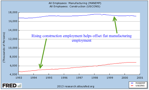
A familiar refrain is the steady decline in manufacturing employment.  Recently the decline has been arrested and there is even slight growth in this sector.  Although construction is regarded as a separate sector, construction is a type of manufacturing.  Both employment sectors appeal to a similar type of person.  Both manufacturing and construction have become more sophisticated, requiring a greater degree of specialized knowledge.  Let’s look at employment trends in these two sectors and how they complement each other.

During the 90s, a rise in construction jobs helped offset moribund growth in manufacturing employment.

In 2001, China became a member of the World Trade Organization (WTO) , enabling many manufacturers to ship many lower skilled jobs to China.  At the same time, a recession and the horrific events of 9/11 halted growth in the construction sector so that there was not any offset to the decline in manufacturing jobs.

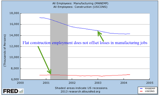
As the economy began recovering in late 2003, the rise in construction jobs more than offset the steadily declining employment in the manufacturing sector.  People losing their jobs in manufacturing could transition into the construction trades.

As the housing sector slowed, construction jobs declined and the double whammy of losses in both sectors had a devastating effect on male employment.

In the past three years, both sectors have improved.

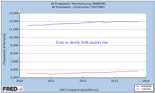
Although the Labor Dept separates two sectors, we can get a more accurate picture of a trend by combining sectors.

*********************************

In the debate over the effectiveness of government stimulus, there is a type of straw man example proposed:  what if the government were to pay people to dig holes, then pay other people to fill in the holes?  Proponents of Keynesian economics and government stimulus argue that such a policy would help the economy.  Employed workers would spend that money and boost the economy. Those of the Austrian school argue that it would not.  Digging and filling holes has no productive value.  Ultimately it is tax revenues that must pay for that unproductive work.  Therefore, digging and filling holes would hurt the economy.

So, let’s take a look at unemployment insurance through a different set of glasses.  Politicians and the voters like to attach the words “insurance” and “program” to all sorts of government spending.  Regardless of what we call it, unemployment insurance is essentially paying people to dig and fill holes – except that the holes are imaginary.  IRS regulations state that unemployment benefits are income, that they should be included in gross income just as one would include wages, salaries and many other income.

If unemployment is income, how many workers do the various unemployment programs “hire” each year?  Unemployment benefits  vary by state, ranging from 1/2 to 2/3 of one’s weekly wage. (Example in New Jersey)  As anyone who has been on unemployment insurance can verify, it is tough to live on unemployment benefits. I used the average weekly earnings for people in private industry and multiplied that by 32 weeks to get an average pay, as though governments were hiring part time workers.  I then divided unemployment benefits paid each year by this average.  Note that the divisor, average pay, is higher than the median pay, so this conservatively understates the number of workers that are “hired” each year by state and federal governments.

What is the effect of “hiring” these workers?  I showed the adjusted total (blue) and the unadjusted total of unemployed and involuntary part time workers.  The green circle in the graph below illustrates the effect that extensions of unemployment insurance had on a really large number of unemployed people.

At its worst in the second quarter of 2009, the unemployed plus those involuntary part timers totaled 24 million, almost 16% of those in the labor force.  8 million were effectively “hired” to dig imaginary holes.  In the long run, what will be the net effect of paying people to dig holes and fill them?  First of all, a politician can’t indulge in long run thinking.  In a crisis, most politicians will sacrifice long run growth so that they can appease the voters and keep their own jobs.

In the long run, ten years for example, paying people to do nothing productive will hurt the economy.  The argument is how much?   Keynes himself wrote that his theory of stimulus and demand only worked when there was a short run fall in demand.  At the time Keynes wrote his “General Theory,” the world economy was floundering around in a severe depression.  The severe crisis of the Depression birthed a theory that divided the economists into two groups: the tinkerers and the non-tinkerers.  Keynesian economists believe in tinkering, that adjusting the carburetor of the economic engine will get that baby purring.  Austrian or classical economists keep asking the Keynesians to stop messing with the carburetor; that all these adjustments only make the economy worse in the long run.

***********************************

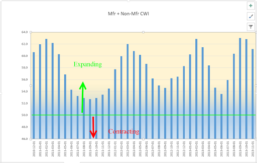
The November report from the Institute for Supply Management (ISM) showed strong to robust growth in the both the manufacturing and services sectors.  As I noted this past week, I was expecting the composite CWI index of these reports that I have been tracking to follow the pattern it has shown for the past three years.  Within this expansion, there is a wave like formation of surging growth followed by an easing period that has become shorter and shorter, indicating a growing consistency in growth.  The peak to peak time span has decreased from 13 months, to 11 months to 7 months.  The index showed a peak in September and October so the slight decline is following the pattern.   IF – a big if – the pattern continues, we might expect another peak in April to May of 2014.

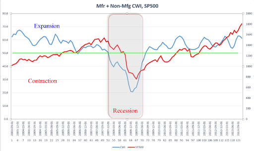
To get some context, here’s a ten year graph of the CWI vs the SP500 index.

**********************************

As the stock market makes new highs each week, some financial pundits get out of bed each morning, saddle up their horses, load up their latest book in the saddle bags and ride through TV land yelling “The crash is coming, the crash is coming.”  Few people would listen to them if they shouted “Buy my book, buy my book.”  They sell a lot more books yelling about the crash.

How frothy is the market?  I took the log of the SP500 index since January 1980 and adjusted it for inflation using the CPI index.  I then plotted out what the index would be if it grew at a steady annualized rate of 5.2%.   Take 5.2%, add in 3% average inflation and 2% dividends and we get the average 10% growth of the stock market over the past 100 years.  The market doesn’t look too frothy from this perspective.  In fact, the financial crisis brought the market back to reality and since then, we have followed this 100 year growth rate.

Now, let’s crank up the wayback machine.  It’s November 1973.  Despite the signing of the Paris Peace accord and an act of Congress to end the Vietnam war, thousands of young American men are still dying in Vietnam.  The Watergate hearings continue to reveal evidence that President Nixon was involved in the break in of the Democratic National Committee and the subsequent attempts to cover it up.  Rip Van Winkle is disgusted.  “This country is going to the dogs,” he mutters to himself.  He lies down to take a nap in an alleyway of the theater district of New York City.  The SP500 index is just below 100.  Well, Rip doesn’t wake up for 20 years.  In November 1993, he wakes up, walks out on Broadway and grabs a paper out of nearby newspaper machine.  The SP500 index is 462.  Rip doesn’t have a calculator but can see that the index has doubled a bit more than twice in that time.  Using the rule of 72 (look it up), Rip estimates that the stock market has grown about 8% per year.  Which is just about normal.  But normal is what Rip left behind in 1973.  “Normal” is SNAFU.  So he goes back into the alleyway and goes back to sleep for another twenty years, waking up just this past month.  He walks out on Broadway and reads that the index has passed 1800.  “Harumph” Rip snorts.  That’s two doublings in twenty years, a growth rate of a little over 7%.  Rip reasons that eventually he’ll wake up, the country will have mended its ways and Rip will notice a growth rate of 9 – 10% in the market index.  He goes back to sleep.

In the 40 years that Rip has been asleep, we have had three bad recessions in the 70s, 80s and 2000s, a savings and loan crisis in the 80s, an internet bubble, a housing bubble, and the mother of all financial crises.  Yet the market plods along, slowing a bit, speeding up a bit.  Long term investors needs to take a Rip Van Winkle perspective.

***********************************

And now, let’s hop in the wayback machine – well, a little ways back.  Shocks happen.  During periods when the market is relatively well behaved as it has been this year, investors get lulled into a sense of well being.  From July 2006 through February 2007, the stock market rose 20%.  Steadily and surely it climbed.  Housing prices had already reached a peak and the growth of corporate profits was slowing. Some market watchers cautioned that fundamentals did not support market valuations. At the end of February 2007, the Chinese government announced steps to curb excessive speculation in the Shanghai stock market (CNN article).  The stocks of Chinese companies tumbled almost 10%, sending shocks through markets around the world.  The U.S. stock market dropped more than 5% in a week.

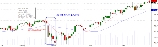
“Here comes the crash” was the cry from some. The crash didn’t come.  Over the next six months, the market climbed 16%.  Finally, continuing declines in home sales and prices, growing mortgage defaults and poor company earnings began to eat away at the market in October 2007.  Remember, there is still almost a year to the big crash in September and October of 2008.

**************

Next week I’ll put on a different shade of glasses to look at inflation.  Cold air, go back to the North Pole.

Up, Down, Round and Round

November 10th, 2013

Friday’s release of the monthly employment situation showed strong net job gains of 204,000 jobs and big upward revisions to the previously reported gains in August and September. The market should have reacted negatively to these positive numbers (yeh, go figure) in anticipation of the Fed tapering their stimulus program of monthly bond purchases.

But first we must go back to Thursday. The first estimate of real GDP growth in the third quarter came in above even the most optimistic forecasts at 2.8%, about a full percentage point above second quarter growth.  The primary reason for the gains though was the continuing build in inventories.  Inventory building is good in anticipation of robust sales but, as I’ll cover later, consumer spending has not been so robust.  The market reacted to the report with it’s largest daily loss in a few months.

On Friday, the employment report was released an hour before the market opened.  Trading began at the same level as Thursday’s close with little response to the strong job gains.  We can imagine that traders were twittering furiously to each other in the opening hour, trying to gauge the sentiment.  Buy in on strength in the employment numbers or sell on the strength in the employment numbers?  After the initial hesitation, the main index gained continuing momemtum throughout the day, with a final spike at the closing bell.

After digesting some of the numbers in the report, I think that traders realized how weak some of its components were, dimming the probability that the Fed will ease up on the gas pedal.  The Consumer Sentiment Survey, released a half hour after the opening bell, showed a continuing decline.  Within minutes, the market started trading higher.

The first number popping in the employment report is the 702,000 people who dropped out of the labor force.  To put that number in perspective, take a look at the chart below which shows the monthly changes in the labor force for the past ten years.  This is the second worst decline after the decline in December 2009, shortly after the official end of the recession.

This month’s .4% steep drop in the Civilian Force Participation Rate ties the record set in December 2009 when the economy was still on its knees.  The rate has now fallen below the 63% mark, far below the 66% rate of several years ago.

Employment in the core work force aged 25 – 54 actually dropped this past month.  Classifications of employment by age, sex, and education come from the survey of households, not employers, and may have been affected somewhat by the goverment shutdown. But the numbers of the past years show that there has been no recovery for this segment of the population.  In each lifetime, there are stages that last approximately twenty years.  This time of life should be  about building careers, building families, building assets and growing income.  I fear that for too many people in this age group, the slowly growing economy has not been kind.  This affects both a person’s current circumstances and dampens prospects for the future.

The headline job gains and classification of the types of jobs come from a separate survey of employers called the Establishment Survey.  Employers report their payroll count as of the 12th of each month.  Because they received paychecks, federal employees furloughed during the government shutdown in the first two weeks of October were still counted as employed in October.

There were some strong positives as well in this report.  Retailers added 44,000 jobs, above the average gains of 31,000.  This year’s gains have been the strongest in fifteen years.

The gains are about half of the eye-popping gains of the past fifty years, but they indicate a confidence among retailers.  Retail jobs are often the first job of many younger workers, who have endured persistently high unemployment during this recession. Here’s a glance at yearly job gains in the retail sector for the past fifty years.

As the holiday shopping season gets underway, all eyes will turn to the retail sector as an indicator of the consumer’s mood.  The U. of Michigan Consumer Sentiment Survey, released Friday, showed a continuation of an erosion in consumer confidence.  After peaking during the early summer at 85, this index has declined to 72, about the same levels as late 2009 when the economy was particularly weak.  The Expectations component of this survey, which reflects confidence in employment and income, has declined to about 63.  Gas prices have been declining, inflation has been near zero, and stock and home prices have been rising but this survey shows a steady decline in confidence.  The government shutdown probably had some effect on the consumer mood but the budget battles are not over.  This is the 7th inning stretch and few are standing up to sing “America The Beautiful.”

Professional Services and Health Care have been consistent leaders in job growth for the past few years but gains in these sectors have declined.  The unemployment rate notched up to 7.3% from 7.2%.

In a catch up effort after the recent government shutdown, the Dept of Commerce released data on factory orders for both August and September.  While the manufacturing sector as a whole has been strong, the weakness in new orders in these two months indicates a tempering of industrial production in the near future.

When adjusted for inflation, the level of new orders is still below the levels of mid-2008.

If we zoom out ten years, we can see that we at about the same levels as late 2005.

ISM released their monthly non-manufacturing survey, showing sustained and rising strong growth at just over 55, up a point for the previous month.  I’ve updated the CWI that I’ve been tracking  since June of this year.  A three year chart shows that even the troughs are part of a sustained growth pattern.  Furthermore, the span of the troughs keeps getting shorter, indicating a structural growth in the economy.

Let’s look back six years and compare this composite index of economic activity with the market.

The monthly report of personal income and spending released Friday showed less than 1% inflation on a year over year basis.  For the second month, incomes increased at an annualized rate of 6%, yet consumer spending remains sluggish.  The chart below shows the year over year growth in spending for the past twenty years.

A longer term graph shows the current fragility in an economy whose primary component is consumer spending.

Both the manufacturing and non-manufacturing portions of the economy continue to expand.  Employment has risen consistently at a level just above population growth.  Inflation is tame but so is consumer spending.  Income is rising.  Budget battles loom.  Expectations for holiday retails sales increases are modest.  Will the Fed ease or not ease?  The medium to long term outlook is positive, but with a watchful eye on any further declines in the momentum of consumer spending growth. The short term outlook is a bit more chaotic.  We can expect further wiggles in the stock market as traders rend their garments, struggling  with Hamlet’s dilemma: To buy or not buy?  To sell or not sell?

Jobs, Spending and Income

October 27th, 2013

Before I take a short look at the delayed release of the employment report this week, let’s look at the growth in personal income and spending, which move in tandem.  This is the y-o-y percent change in nominal after tax income and spending.

Income growth can be a bit more erratic than spending, bouncing around the more stable trend of spending.

The anemic growth in both income and spending has dampened hopes of a strong rebound of consumer spending.  The ratio of an ETF composite of retail stocks versus the overall SP500 market index shows the recent doubt.  Retail stocks have not participated in the larger market rebound.

A wholesale clothing sales rep I spoke with a week ago has noticed the caution in her buyers since mid-August.  In September, some in the industry laid the blame at the prospect of a government showdown.  For those of us in private business, the political shenanigans only muddy the water and make it difficult to read the consumer mood.  Reports of sales at major retail centers – about 10% of retail sales – showed strength this week after a month of lackluster growth.  Maybe it was the government shutdown.

However, the U. of Michigan Consumer Sentiment Index released this past Friday showed a sizeable drop in sentiment.

Was this decline in confidence due primarily to the shutdown or is this a forewarning of less than cheery holiday shopping season?  The knuckleheads in Washington are like people who stand up at a concert, blocking the view of those seated behind them.  The business community in general must plan around the politicians on both sides of the aisle in Washington who relentlessly pursue an anti-job agenda.  Politicians can puff and posture on their principles – like so many in government service, they are not subject to the constraints and discipline of profit and loss.  Sure, there are some whose intentions are good, who give their best effort but, unlike private business, their efforts and intentions are voluntary – a sense of personal virtue.  Most will not lose their jobs because of a lack of performance.  There are few incentives to improve efficiency.  In fact, it is the reverse.  The incentives are to promote more regulations, more layers of bureaucracy, as a program of job security and job growth in Washington at the expense of the rest of the country. Many of us in the private sector have the same sense of personal virtue but we also have that profit and loss whip.

Since the temporary resolution of the government shutdown and the raising of the debt ceiling, the market has shot up over 6% in twelve trading days.  The late release of September’s labor report showed less than expected net job gains of 148,000, which dashed any further fears that the Fed might ease their bond buying program this year.  The trends of employment growth have been fairly stable, with a few exceptions – health care, for one.

After six months of little growth, employment in construction rose by 20,000 this past month.

The rise in construction jobs helped the labor force participation rate for men, reversing a decline.

But the participation rate for the core labor force, those aged 25 – 54, shows no signs of reversing the decline of the past four years.

Demographic changes, combined with persistent job weakness among younger workers, is silently eroding the foundations of the Social Security system.  The older half of the population, particularly the Woodstock generation, are growing faster than the younger population, as this table from the Census Bureau shows.

From the Census Bureau report: “the population aged 65 and over also grew at a faster rate (15.1 percent) than the population under age 45.”  At the end of 2012, the Federal Government owed the Social Security trust fund $2.7 trillion (SSA Source)

The number of workers in the core labor force has declined by 5 – 6 million.

Let’s do some math.  [5 million fewer workers paying into Social Security each year] x [$8000 guesstimated combined annual contribution] = $45 billion per year not  collected.  This is just the Social Security taxes, not including the income taxes, on a portion of the population that represents two thirds of the work force.  That $45 billion represents the benefits paid to over 3 million people in 2012. (SSA Source) To put that figure in perspective, Congress is arguing over the medical device tax clause of Obamacare which is projected to raise just $29 billion over the next ten years.

It will take five to ten years for the crisis of funding to develop.  In the meantime, the budget debates will grow more contentious, politicians will pontificate at their podiums with more frequency and the clouds of these dusty debates will make it more difficult for business people to plan ahead.

Employment and Government Shut Down

Earlier this past week there were rumors that, due to the government shut down,  the Bureau of Labor Statistics (BLS) might not release the monthly employment report on Friday.  The employment report is probably the foremost key indicator that guides stock and bond market action as well as a prime metric used by the Federal Reserve in the determination of future monetary policy. On Thursday, the BLS confirmed that they would not release the report, which prompted a drop in the stock market, followed by an almost equal rise over the next day.

On Wednesday, ADP released a tepid 166,000 estimate of net job gains for September accompanied by a downward revision of their August estimate.  On Thursday, the weekly report of new unemployment claims held no surprise.  Traders probably figured that they had enough information to guesstimate the BLS number of net job gains – tepid growth a bit above the 150,000 needed to keep up with population growth.  In short, there was less likelihood that the Federal Reserve would be tapering their QE program before the end of the year.

So this is a good opportunity to take a look at some historical employment trends.  Measuring wage growth and inflation adjustments to wages is a complex task, far more complex than the gentle reader wants to delve into.  Labor economists crunch a lot of regional employment data gathered by the BLS.  Whenever there is a wealth of data, there is also a wealth of ways to treat that data, which data to focus on, etc.  Some economists focus on median compensation.  The median represents the middle, i.e. 50% of workers make more than the median, 50% make less.

In a 2011 paper published by the Economic Policy Institute (EPI), author Lawrence Mishel states  “Between 1973 and 2011, the median worker’s real hourly compensation (which includes wages and benefits) rose just 10.7 percent.”

“Real” means inflation adjusted but there are different methods used to calculate inflation.  One method, the Consumer Price Index, or CPI, has been changed over the years, making it difficult to make comparisons of data.

For a longer term perspective into the controversy over measurement, let’s turn to a graph of real output and total compensation per hour worked for the business sector.  Here we see a narrowing between compensation and output until output crosses above compensation in the mid-2000s.

The flattening of compensation growth is shown when we focus on the past twenty years.

But the hourly data seemingly contradicts the claim that there has been only an 11% increase in real compensation over the past forty years.  Looks like the total compensation of all workers has risen about 40% or more in the past forty years.  How can the median growth be so far below the total?  To understand that, a reader would have to examine the data sources behind the claim.  We might find that median weekly, not hourly, compensation has risen only 11%.  This could be due to more part time workers, or the rising percentage of women in the labor force who generally work fewer hours than men. What we do know is that a competent economist can find or crunch the data to prove his or her point.

The ability to work empirical magic with data often leads to contradictory claims by noteworthy economists.  The contentiousness of the discussion among economists baffles the intelligent reader.

Let’s return to that bugaboo mentioned earlier: measuring inflation. Twenty years ago, economists Brian Bosworth and George Perry noted the trending gap between output and productivity: “In an economy where real wage growth has paralleled the rise in productivity over the long run, this apparent divergence implies that the benefits of increased productivity have not been distributed in the expected way over the past two decades.”  A chart from their paper illustrates the trend.

A notable trend in the numbers is the steep rise of employee taxes and benefits, or non-wage employer costs.  Economists or politicians sometimes point to the decline in the real hourly wage over the past forty years, without bothering to note the growing non-wage costs of employment, a convenient omission.

Bosworth and Perry document problems and changes in measuring inflation in both consumption and output but noted that “the prices that workers pay as consumers have been rising significantly more rapidly than the prices of the products they produce.”  Further analysis by the authors shows that the wage growth in that twenty year period 1973 – 1993 did not flatten till after 1983.  They conclude that the major reason for the divergence is the difference between how inflation was measured before and after 1983. The authors recommended the use of a Personal Consumption Expenditure (PCE) deflator instead of the CPI, which overstates inflation relative to output.

Let’s look at wage growth over the past twelve years using two methods to see the difference.  The BLS calculates real wage growth using the CPI-U inflation index (Source).  Here is a graph from their data.

Now let’s use the PCE deflator to get a slightly different picture of the same Employment Cost Index.

Now let’s compare the two.

They tell two different stories.  Using the CPI inflation adjustment, the blue line, I could tell a story that wage growth has stagnated over the past ten years.  Using the PCE inflation adjustment, I could tell a story that wage growth has stagnated since the financial crisis.

Now imagine a politician who wants to bash the policies of former President George Bush and exalt the policies of the current administration.  That politician would use the blue line to tell the story of how the Bush Administration undercut the wages of American workers and that this led to the worst recession since the Great Depression.

On the other hand, if a politician wanted to criticize the Obama administration, she would point to the red line.  Worker’s wages grew during the Bush years.  Since Obama took office, wages have stagnated, indicating that Obama’s policies are hurting American workers.

Thus a dense and complicated argument on how to measure inflation becomes a talking point for a politician.  Even worse, noteworthy and popular economists who understand the difficulties of measuring both employment and inflation choose one line or the other to tell a simple story based on their own bias.

During this ongoing government shut down, we will hear a lot of spin and invective.  The profusion of TV, radio and internet media sources ensures that anyone can choose exactly – to a ‘T’ – the version of reality that they want to hear.  Of course, our sources and opinions are unbiased and perfectly reasonable.  But can you believe what the other side is saying?  Boy, are they crazy!

Labor Patterns

September 8th, 2013

On Thursday, the payroll firm ADP released their estimate of monthly growth of private payrolls, showing a net job gain of 178,000.  The weekly report of new unemployment claims was also a positive, a steady decline that indicated that the labor market is healing – but slowly.  On Wednesday, the National Federation of Independent Businesses issued their monthly survey of small businesses. For the fourth month in a row employment growth has been negative.  Slowing layoffs have contributed to the decline in unemployment claims, but new hiring has also slowed.  What to make of that?  The market paused on Thursday in advance of Friday’s release of the BLS employment report.   Caution mixed with confidence – sounds like a weather report.  But there was hope that BLS job gains might approach the 200,000 mark.

The BLS composite picture of employment in August was a both a jaw dropper and a head scratcher, two actions which are difficult to do at the same time.  The headline number of 169,000 net job gains was disappointing, but the revisions to July’s job gains was a huge slash – from 162,000 as reported last month to a meager 104,000.  About a 150,000 net job gains are needed each month to keep up with population growth.

In a tumultuous job market when the flows of people within the labor market are undergoing a lot of change, downward revisions of this size are understandable.  In a supposedly stabilizing labor market, such revisions hint at an underlying fragility.

Is this large downward revision typical of the summer months?  In September 2012 the BLS reported upward revisions of over 80,000 jobs for June and July.  This year, revisions are down almost that amount so these wild swings may be typical.  Businesses may neglect to return the BLS survey on time because they are down at the lake 🙂 In perspective, a revision of 70 – 80,000 jobs is an insignificant percentage of the total working force of over 136 million.  But there is no doubt that it affects the mood of investors.

Once again, the usual industries contributed the most to employment gains:  professional and business services, retail and drinking establishments and health care workers.  I’ll look at some disturbing long term patterns later on in this blog post.

The unemployment rate dropped 1/10th percent to 7.3% but the decline is more a matter of attrition than strength in the labor market. Retirees and others continue to leave the labor force.

A bright note in this month’s report is the decline in the number of involuntary part-timers, those people who are working part time but want and can’t find a full time job.

The core work force aged 25 – 54 shows little improvement.

Gains in construction employment have moderated recently.

Government employment at the local level is providing a slight boost to the employment gains.  Yearly changes in Federal employment continue to show a decline.

As the economy increasingly focuses on services, employees in those industries have become a greater percent of total workers.

Let’s take a look at the labor mix, or the percent of some occupations of workers to the total work force.  During the past thirty years, the ratio of management and professional workers has increased by approximately a third.

In the early decades of the 20th century, agricultural workers made up about 45% of the work force.  In the first decades of the 21st century, they have declined to less than 2% of the work force.

A decline in manufacturing and construction has caused a gear shift in the components of the labor force.  Service occupations as a percent of the work force have risen steadily.

The conventional narrative says that this has been a natural long term shift from manufacturing to service.  But a longer term perspective calls that into question and shows that we are returning and surpassing – this is not new – to a more service oriented labor force.

The BLS does not have data before 1983 for this composite of service occupations but the trend indicates that the labor market is much healthier when service occupations are less than about 16.5% of total workers.  I’ll call this the Service Occupation Ratio, or SOR.  Let’s now look at this thirty year trend and add the unemployment rate.

Until the housing bubble of the early 2000s, the unemployment rate followed increases and declines in the SOR.  Largely fed by robust employment related to housing, the unemployment rate parted company with the trend line of the SOR.  As the recession sparked large job losses, the unemployment rate snapped back into trend with the SOR.  Since the recovery, declines in the unemployment rate have not been accompanied by a decline in the SOR.

The trend patterns are even more closely aligned when we look at the wider unemployment rate that includes those who want full time work but can’t find it and discouraged job seekers – or the U-6 rate.

How long will this imbalance last?  In the early 2000s, the imbalance lasted about five years.  This current imbalance is about three years old, meaning that we may have a few years before the unemployment rate returns to the SOR trend line.  What is particularly worrisome is the degree of imbalance.  As the unemployment rate drops further away from the SOR trend line, as it did in the early 2000s, it signifies greater tension between these two labor “plates.”  Like the movement of land mass tectonic plates, the greater the tension, the more severe the “snap back” to trend.  We see the same pattern developing in these past few years.  A lower participation rate and more people working part time out of necessity have contributed to a decline in the unemployment rate but the SOR has plateaued.

History is a river; history repeats itself; pick your aphorism.  An old Chinese maxim says that a man never crosses the same river twice.  History does not repeat itself exactly so that it is unlikely that the current anomaly will resolve itself in the same way as it did in 2008.  We can hope that the SOR starts to decline, indicating a healthier labor market.  These anomalies can take years to develop but we may find that the correction is as abrupt as 2008.

Each month starts off with a wealth of data. Next week I’ll cover industrial production, retail sales and an update of the CWI composite of manufacturing and non-manufacturing data that I have been charting the past few months.

The Price is Right?

August 4th, 2013

First week of the month and several good monthly reports helped propel the SP500 through the 1700 mark this week, making an all time high.  Last week I wrote that the market would be cautious and the first few trading days of the week was exactly that, drifting sideways.  On Thursday the release of a suprisingly strong ISM Manufacturing report gave an upward jolt to the market.  In several recent blogs on the ISM and an alternative composite called the CWI, we could see that manufacturing has been sliding toward the neutral mark of 50 for the past several months.  On Monday, the ISM non-manufacturing index will be released and next week I hope to update the CWI.

Ultimately, the market rides up or down on the anticipation of future earnings.  However, earnings can be “managed,” to put it politely.  Further confusing the earnings picture for a casual investor are the several different types of earnings: operating, pro-forma and GAAP to mention a few.  There are two types of “future”, or projected, earnings: bottom up and top down.

A simpler approach that some investors use is to calculate the Price Dividend ratio.  There is no fudging of cash dividends to investors.  Robert Shiller, author of  the 2005 book “Irrational Exuberance”, updates the data used in his book.   These include the SP500 index, earnings, dividends, the CPI and a Price Earnings ratio that is based on the past ten years of earnings.  The current ratio of 23.80 is lower than the 2006 ratios which were in the high twenties.

But let’s look at the Price Dividend, or PD, ratio.  For the past ten years that ratio has averaged a bit less than 52, meaning that investors have been willing to pay almost 52 times the amount of the dividend to own the stock.  As of June 30th, the PD ratio stood at a bit more than 48, which means that stocks were a bit cheaper than average at this date.  Since then the market has gone up about 6% so that the PD ratio is now about 51, or just about average.

As the market makes new highs, investors are prone to ask themselves if the price they are paying for stocks is too high.  The long term investor might take a different perspective and ask themselves, “How will I feel in ten years if I continued to put money into the stock market now?”  Ten years from now, in the year 2023, the answer will be “Well, I didn’t get a deal and I didn’t overpay based on the information available at the time.  I paid about average.”

McGraw-Hill, the publisher of the SP500 market index, also keeps an index of dividends.

Dividend growth has plateaued and is about a third of earnings, which means that companies are paying a third of their earnings back to investors in the form of dividends.  This is just slightly more than the median for the past ten years.

There was a lot of data to digest in this past week.  The GDP estimates for the 2nd quarter was a sluggish 1.7%, more than the expectation of 1.1%.  But – always that but – the 1st quarter GDP growth was revised down from 1.7% to 1.1%.

On Thursday, the same day as the ISM manufacturing report, came the monthly report on auto sales.  Total sales of light weight vehicles, which includes cars and pickups, increased about 4% this past month to an annualized amount of 16 million vehicles.

When we look at auto sales on a per capita basis, auto sales are still below 5% of the population, a level that would show me that consumer demand and the construction industry (pickup trucks) is healthy.  As we can see from the chart below, the sale of autos stayed consistently above that 5% level for more than 20 years – until the last recession began.

Employment in the production of motor vehicles and related parts is very  weak.

Although vehicle sales includes both imports and domestics, I wanted to see how many autos are sold per person employed in automotive production.  Advances in manufacturing and the mix of import and domestically made vehicles have impacted employment.

And with that, I’ll look briefly at the Employment Report for July released this past Friday.  On Wednesday, ADP reported 200,000 private jobs gained, giving a brief upward impetus to the market.  As I noted last week, caution would be the watchword of this week and that caution showed in later trading on Wednesday.  The ADP report did give some hope that the BLS employment report would show an approximate gain of that many jobs.  Instead, the employment gains from the BLS were disappointing, at 162,000.   A further disappointment were the small downward revisons in May and June’s employment gains, totalling -26,000.

The unemployment rate declined, from 7.6% to 7.4%, but for the wrong reasons.  For any number of reasons – disappointment, frustration, going back to school, retirement – 240,000 people dropped out of the work force.  This is close to the reduction of 257,000 in the ranks of the unemployed.  After declines or relative stability in the number of “drop outs” in recent months, this month’s surge was particularly disappointing.

Job gains in the core work force aged 25 -54 remains relatively flat.

While older workers continue to add jobs

Business Services and Health Care jobs continued their strong job gains but gains in the health care field have slowed from 27,000 per month in 2012 to only 16,000 in 2013.  Sit down for this one – government workers, mostly at the local level, actually gained 1,000 in July.

Despite the decline in unemployment, the tepid employment and GDP growth reports likely reassured many that the Fed is unlikely to stop or reduce their quantitative easing program in the next few months.

Goldilocks Jobs

June 9th, 2013

In the long running comedy series “Frasier,” Frasier or Niles would often order a latte  in their local neighborhood bar, being careful to note exactly how they wanted the drink made.  Friday’s employment report was made to order – not too strong so as to hasten the end of the Fed’s latest bond buying program and not so weak as to confirm fears of another summer swoon.

Slowly and inexorably the number of employed trudges up the recovery hill.  The unemployment rate ticked up a scosh to 7.6% as more people tried to find work.  The year over year percent change is still in good territory.

On the not so good side, the percent of the total population that is working is still below the 30 year average of almost 44%.

The unemployment rate of those with a college degree is far below that of the general labor force but is still 50% above the average of the early 2000s.

Student aid loans have passed a trillion dollars (source).  To put that figure in perspective,  student loan debt is about 10% of the $11 trillion in outstanding debt of residential mortgages (source)

Changes in the bankruptcy laws in 2005 exempted student loan debt from bankruptcy.  Over the next decade or so, will the investment in education pay off?  Let’s hope so.  100 years, an 8th grade education became a standard used by employers to winnow job applicants in a tough job environment.  70 years ago, the new standard became a high school education.  For the past 30 years, we have moved to a 4 year degree as the new standard.
We now spend more on defense and more on Medicare that the $500 billion total amount spent by the state and the federal government on K-12 education. (source) Community college educators are painfully aware that many students are simply not prepared to take college courses.  Local communities used to fund 70% of K-12 education.  Thirty years ago, homeowners protested ever rising property taxes to fund K-12 education and, since that time, local funding has dropped below 50%.

If we expect our children to develop the skills for a college education, we are going to have to find an alternative model of funding.  The states have relied on an ever increasing share of Federal funding for K-12 education.  Although the percentage of Federal spending on K-12 is small, less than 10%, the aging Boomer generation will command ever more spending of general tax dollars in addition to the Medicare taxes collected.

The core work force aged 25 – 54 struggled upwards

but the participation rate, the percentage of the population in the labor force, is still weak.

The “total” unemployment rate, which includes those working part time for economic reasons, continues to drift down but is still high.

Understand that this represents over 20 million people, a bit more than the entire population of New York State.  Turn on C-Span sometime and tell me how many committee hearings on jobs there are.  Immigration, federal surveillance and the targeting of conservative groups by the IRS are important matters, yes, but why aren’t politicians in Washington talking about jobs?  There are several reasons: no one has a clue; no clear political advantage to be gained; constituents are not writing letters to their representatives and senators about jobs.

Welcome to the “New Abnormal.”

Job Trends

This past Wednesday the payroll firm ADP released their monthly report of private employment with a rather tepid 119,000, prompting an equally tepid sell off in the market, which lost about .7% by the end of Wednesday.  Although the price move was under 1%, the volume of trading was high.  Was this the end of the 6+ month run up in stock prices?  Was the economy slowing down? 

Came Thursday and a very cheery weekly report of new claims for unemployment and moods brightened.  The market regained the ground lost Wednesday and then some, but on rather low volume.  Standing on the sidewalks of Wall Street, traders repeatedly opened up their umbrellas, then closed their umbrellas, put on their sunglasses, then took off their sunglasses. 

[And now a pause from our sponsor.  A trader tells his doctor he’s anxious and asks for a prescription.  The doctor gives him some advice: “stop looking at the market so much.”]

Back to our story. Friday morning dawned, the heavens opened and the sun shone.  The Bureau of Labor Statistics issued its monthly weather – er, labor – report and traders threw down their umbrellas and put on their shades.  Huzzahs rang throughout the canyons of lower Manhattan.  Some slacker dudes cooly tossed their stocking caps in the air, while men dressed in crisp suits wished that they too had hats.

The labor report is released an hour before the market opens at 9:30 AM.  The market opened up 1%, drifted higher but ended the day at about the same price as it opened.  So, huh? We’ll get to the huh part later.

The reported job gains of 165,000 for April were just slightly above the 150,000 jobs consensus estimate and the replacement rate needed to keep up with population growth.  Spurring the initial enthusiasm was relief that job gains were not as weak as some had feared (100,000 or so) and the revisions to previous months job gains, adding 114,000 to February and March’s job gains. But February’s revision from strong to very strong job growth provokes some head scratching.

What good things happened in February to inspire such strong job growth?  Hmmmm….here’s a table of the past 12 months data from the establishment survey. 

There was a lot to like in this month’s report.  The unemployment rate dropped a tenth of a percent to 7.5%.  We just passed employment levels of February 2006 – yep, it’s been a slow recovery.

To get the big picture, let’s look at the last forty years.

From this perspective, we can see just how deep the job losses have been since 2008.  From this rather sobering point of view, let’s look at some of the positives from this month’s report.

Professional and Business services added a whopping 73,000 jobs this month, far above the 49,000 average of the past 12 months.  Restaurant and bar jobs were up 50% above their 12 month average, showing gains of 38,000. Temp help posted strong gains of 31,000, its highest of the past year.

Construction jobs showed little change, a surprise at this time of year.  Construction has been averaging gains of 27,000 a month for the past six months. This past week, I spoke to a woman at a Denver branch of a national temp agency.  This branch focuses on manual labor, mostly for the construction industry.  She confirmed that business has been brisk but most of the calls are for road repair and rebuilding and some commercial construction.  When I asked her about calls for helpers and job site clean up for residential construction, she said it had been sporadic.

Job gains in health care were somewhat below their 12 month average of 24,000 but any slack in health care was made up by strong growth in retail.  Government jobs continue to contract slightly each month.

Underlying the positive aspects of the job market are some anemic indicators.  The average of weekly hours dropped .2 hour to 34.4; the average has lost .1 hr in the past year.  The ranks of the long term unemployed dropped by 258,000 workers but the number of people working part time who would like a full time job jumped 278,000.  The ranks of the “involuntary” part timers – those who would like a full time job but can’t find one – is about 5 million.  Here’s a surprise. Today’s levels of involuntary part timers as a percent of total employment is only the third highest in the past fifty years; the late 1950s and the early 1980s were worse.  But this only means that the ranks of part timers have fallen mercifully from nose bleed levels.

The diffusion index is showing some weakness; this is the share of employers who are reporting job gains vs. job losses, with a value of 50 being neutral.  Manufacturing employers are already reporting more job losses than gains.  Overall, employers are slowly drifting toward neutral in their hiring for the past several months.

The core work force aged 25 – 54 is still limping along.

Even more disturbing is the participation rate of this core work force.

Shortly after the market opened on Friday came the report on factory orders and it muted some of the enthusiasm generated by the labor report.  New orders for durable goods, a barometer of business confidence, fell 5.8%, confirming the slowdown in manufacturing.  Employment in this sector has been flat the past two months.

While the monthly labor report makes headlines, it is not a leading indicator. Professional investors watch the squiggles of daily and weekly economic and news reports, trying to anticipate developing trends.  Many of us have neither the time or inclination.  For the long term “retail” investor, continuing job gains are positive, particularly if they are at or above the replacement level of 150,000. The long term investor is more concerned about significant losses in their retirement portfolio.

What if an investor lightened up on their stock holdings shortly after the BLS reported the first job losses?   I looked back at historical employment releases ; I wanted to use the original releases, not the revised figures of later months, to capture the sentiment at the time.  We must make decisions in the present.  We don’t have the luxury of going into the future, looking at data revisions, then coming back to the present and making our investing decisions.  That would be a good time machine, wouldn’t it?  Here’s an example of how employment data can be reported initially and later revised.  The graph shows the later revisions.

In early August 2000, the BLS reported job losses of 108,000 in July.  But this was due to the layoff of 290,000 temporary Census workers.  Do census workers really count in our strategy?  Let’s say not.  We wait till next month’s report, which shows a loss of 105,000. Should we use our strategy?  Again, those darn census workers.  Without them, there would have been a small gain in jobs.  So we don’t sell in September.  Then, in the beginning of October comes the news of strong job gains in September, followed by more job gains in October, November and December.  Good thing we didn’t sell at that first downturn, we tell ourselves.  Meanwhile the stock market has been slipping and sliding since that first negative job report.  Eventually, it will fall about 40%.

Wow, we should have taken that first signal and avoided all those losses!  But if our strategy is to then buy back in when there are positive job gains reported, then we could be in and out of the market like a yo-yo in years when the economy is struggling to find direction or strength. We were looking for a more even tempered strategy.

To emphasize how the revisions in employment can mean the difference between job gains and job losses,  take a look at the chart below.  These are the revised figures.  I have noted months where the initial monthly labor report showed positive job gains but were later revised to job losses.  Some of these revisions can happen months later.

From the first reported job losses in mid 2000, more than three years passed before job gains would exceed the “replacement” level of 150,000.  That is the number of jobs needed for the growth in the labor force. While many, myself included, have blamed the knucklehead politicans who enacted the Bush tax cuts in 2003, it is understandable that they were beginning to wonder if the labor market would ever turn around.  Three years of job losses is a long time.

Let’s move on to the last decline.  The market had already begun its decline before the first job losses were announced in early February 2008.

In this past recession, the job losses were severe but the first job increases were announced about two years after the first decrease, in early April 2010.  When reviewing the historical BLS releases, this really surprised me that the 2000 – 2003 labor downturn lasted longer than this last one, though it was much less severe.  By the time the first job increases had been announced in 2010, the market had already been on an upswing for a year. 

In short, the headline monthly job gains don’t appear to offer a long term casual investor any particular insight or advantage.  In a work force of 143 million, a hundred thousand jobs can be a slip of the pencil.  But reported job gains of 150,000 or more do offer an investing hint – quit worrying about your retirement portfolio for at least another month.  Go fishin’, play with the kids, hang out with friends.

A labor indicator that seems to be more reliable is the year over year percent change in the unemployment rate, which I have discussed in earlier blogs.

Although the unemployment rate – or percentage – is derived from the count of total employment, the revisions are much smaller.  Secondly, we are using a percentage gain in that percentage, further reducing swings.

The stock market continues to post new highs in anticipation of good corporate profits in the latter part of the year.  What is a bit troublesome is the number of revenue shortfalls reported by companies in the first quarter.  Reducing expenses and boosting productivity can only get a company so far.  Profit growth becomes harder and harder to come by without revenue growth.

Labor Participation Rate

April 6th, 2013

First I will look at a rather disappointing March Labor Report, released this past Friday.  Then I will zoom up and look at the big picture and some disturbing trends.  The net job gains this past month were 88,000, about half of the 169,000 average gains of the past year.  Remember that it takes about 150,000 job gains each month just to keep up with population growth.  Although the headline unemployment rate dropped .1% to 7.6%, it was because almost half a million people dropped out of the work force, meaning that they had stopped looking for a job in the past month.

Mitigating the meager job gains were revisions to previous months gains as more survey data was returned by employers. January’s job gains were revised from +119,000 to +148,000, and February’s gains were bumped upward from +236,000 to +268,000.  The two revisions added up to an additional 61,000 jobs; adding that to March’s gain of 88,000 gets close to the minimum gains needed of 150,000. The initial reaction of the market was a swift loss at Friday’s market opening of almost 200 points on the Dow.  By the end of the day, the market had regained much of the ground it lost, ending down about 40 points.

The average hours worked increased again to 34.6, a hopeful sign, but earnings saw no change.

Construction continued to show gains; the media’s attention to this area of employment probably gives the casual reader the impression that contruction jobs are a larger part of the work force than they actually are.

Compare that to Professional and Business Services, which has showed consistently strong gains and low unemployment.

Employment in the health care field continues to grow.  As a percent of total employment, health care continues to reach new heights, although its growth has moderated.  Taking care of the sick may be a sign of a compassionate society, but it consumes resources, prompting the question: what is the upper limit?  One in nine workers now work in health care.  Twenty years ago, the ratio was one in twelve. 

Over the past twenty years, the employment market has shifted markedly away from producing goods.  As a share of total employment, about 1 in 7 workers produces goods.  Just ten years ago, the ratio was 1 in 6.

What jobs did those workers find?  Serving food and drink to the ever growing share of people in Professional and Business Services.

The core work force, those aged 25 – 54, shows no growth over the past year.  I use the words “work force” to include only the employed.  “Labor force” includes both the employed and unemployed.  More on that in a bit.

I have written before about the year over year (y-o-y) percent change in the headline unemployment rate, or U-3 rate, and that past recessions usually follow when this change goes above 0.  The unemployment rate has benefitted remarkably from the number of people who continue to drop out and are no longer counted as unemployed.  Because of the drop outs the percent change in the unemployment rate is still in good territory.

A secondary indicator may be the y-o-y percent gain in the employed.  The long term average is 1.5%.  When the percent gain falls below that, recession soon follows.  The percent gain just fell below the long term 1.5% average.

Let’s zoom out to the past forty years to see how this percent gain in employment has preceded past recessions.  The exception was in 1973-74 when the Arab oil embargo created a sudden and deep recession in the country.

There was a decline in the number of people who dropped out but had been searching for work (but not in the past month) and were available to work.

The long term trend of those not in the labor force continues to reach new heights.  As a percent of the population, it  keeps climbing at an alarming rate.

Older workers are retiring, either voluntarily or involuntarily, at the rate of 800,000 a year.

Which brings us to several sometimes confusing concepts, the Civilian Labor Force (CLF), the Participation Rate, and other metrics.  The Civilian Labor Force is those people aged 16 and over who are either employed or unemployed.  To be counted as unemployed, a person is not working but has searched for work in the past month.  The unemployment rate is simply the percentage of unemployed in the Civilian Labor Force, which now totals about 155 million.  An unemployment rate of 7.6% means that about 12 million people are counted as unemployed. 

Then there is the Civilian Labor Force Participation Rate, or simply the Participation Rate, which is the percentage of the Labor Force to what the BLS calls the Civilian Non-Institutional Population (CNP).  Don’t go to sleep on me.  The CNP is those people who are aged 16 or more and who are not in prison or the military. 

So, the Participation Rate (PR) is the number of people who ARE working as a percent of people who CAN legally work; i.e. who are over 16 and not in some institutional setting that prevents them from working or finding work.


Let me give you some numbers and a pie chart.

The total population of the U.S. is estimated at 313 million; the CNP is estimated at 245 million.  The difference between those two figures are mostly children under 16 and people in prison and the military.  Here’s how the Labor Force compares with those not in the labor force and children under 16.

Why does the the Participation Rate (PR) matter?  As it declines, workers have to support more of those who are not working.  Many seniors feel that they “paid into the system” but the “system” – yes, your elected representatives in Congress – spent the additional money paid into the system over the past thirty years.  Social Security is a “Pay as you Go” system meaning that existing workers must somehow pay back into the system to pay benefits for those who retire.  Pay back = higher taxes. As the percentage of the population who works declines, taxes must rise or benefits decrease regardless of who paid into the system. 

This past month the BLS estimated a further decline of .2% to a level of 63.3%.  For comparison, Canada has a PR of 66.6%. 

Part of the decline is a natural demographic change as the population ages.   So how much has the aging of the population contributed to the decline in the PR?  What is the PR for those of working age 16 – 64?  Oddly enough, the time series figures are not easy to come by.  But before we get to that, let’s get to the surprises.

Since 2010, the older labor force, those aged 65+, has grown by 1.2 million. 

In 20 years, the participation rate among seniors has risen 50%, from 11.8% in 1990 to 17.4% in 2010.  The BLS projects that it will rise to 22.6% by 2020, a doubling in thirty years.  Seniors will continue to compete for jobs with the working age population.

Meanwhile, the participation rate of the core work force, those aged 25 – 54, is on a steady decline.

Now comes the biggest surprise, the decline in the working age Participation Rate.  To get the time series, I had to add a number of series together and take some population estimates by the Census Bureau.  Changing demographic shifts and 2010 census revisions make the series not entirely accurate but does give a good representation of the approximate 6% decline.

Let’s look at the last five years for the overall Participation Rate, which has declined about 5%. 

The aging of the population is contributing maybe 20% to the overall decline.  The bulk of the decline is a deterioration of the working age labor force.  Some are going back to school, some have given up looking for a job recently.  Many younger workers are finding it difficult to find a job. The Consumer Credit report released Friday shows another surge in student loans.  The FinAid student debt clock shows that student loans now exceed a trillion dollars. I have the sinking feeling that this will end badly. The participation rate for those aged 20 – 24 has declined about 7% and is now slightly less than the rate for all working ages. 

Payments under the Social Security Disability program, or SSDI, took about 10% of Social Security taxes in 1984.  They now consume 20% of SS taxes and are becoming an increasing burden on the Social Security program even as the boomers begin to retire.  The ranks of the disabled have grown more than 10% in the past three years.

A declining percentage of the population working to pay for an increasing number of benefits – this economic tension is sure to produce social and political conflict.  Many of us probably hold the vague hope that it will all work out somehow.  Some think that politicians in Washington will figure it out despite the fact that the solutions that Congress comes up with to most problems only exacerbate the problem or shift the problem to another area.

On the other hand, the baseball season is still young and anything is possible, right? 

GDP, Profits and Labor

Feb. 2nd, 2013

A lot to cover this week – the monthly labor report and the Dow Industrial Average breaks the psychological mark of 14,000.  Let’s cover the stock market rise because that will give us some context for the labor report.

The stock market rises and falls on the prospect for the rise and fall in corporate profits.  For the past year, profits have been healthy, increasing year over year by 15-20%.

The stock market is a compilation of attempts to anticipate these profit changes by six months or so. Sometimes it guesses wrong, sometimes it guesses right but the market loosely follows the trend in profits.

As a percent of GDP, corporate profits have reached a record high and this growing share of the economy is largely responsible for the doubling of the SP500 in the past three years.

There can be too much of  a good thing and this may be it.  An economy becomes unstable as one segment of the economy accumulates a greater share of the pie.

Facts are the nemesis of partisan hacks who simply disregard any information that does not fit with their model of how the universe works.  Data on government spending and investment contradict those who complain that government has too much of a share of the economy; it is now at historic lows.

This includes government at all levels: federal, state and local.  Reductions in government spending continue to act as a drag on both GDP and employment growth. What gives some people the sense that government spending is a larger percentage of the economy are transfer payments, like Social Security.  Neither the calculation of GDP or government spending includes these transfer payments, so the percent of government spending in relation to GDP as shown in the chart above is a truer picture of government’s role in the economy. 

Speaking of GDP – this past week came the first estimate of GDP growth for the fourth quarter of 2012.  The headline number was negative growth of 1/10th of a percent on an annualized basis.

Two quarters of negative growth usually mark the beginning of a recession.  Concern over this negative growth led to small losses in the stock market at mid-week as investors grew concerned about the January labor report, which was released Friday.  The negative growth was largely due to a severe reduction in defense spending and exports.  As a whole, the private economy grew at an annualized rate of 3.6%, a strength that helped moderate any market declines in mid week.

When the Bureau of Labor Statistics released their monthly labor report this past Friday, the headline job increase of 157,000+ and an unemployment rate stuck at 7.9% did not calm investors’ fears.  The year over year percent change in unemployment is still in positive territory.

The numbers of long term unemployed as a percent of total unemployment ticked down but remains stubbornly high at about 38% (seasonally adjusted)

What prompted Friday’s relief rally in the market were the revisions in the previous months’ employment gains.  As more data comes in, the BLS revises previous months’ estimates.  This month also included end of the year population control adjustments.

November’s gains were revised from +161,000 to +247,000; December’s gains were raised from +155,000 to +196,000.  For all of 2012, the revisions added up to additional job gains of 336,000, raising average monthly job gains for 2012 to 181,000 – near the benchmark of 200,000 needed to make a dent in the unemployment rate.  Previous decreases in the unemployment rate have been largely the result of too many people giving up looking for work and simply not being counted as unemployed.

Overall, the labor report put the kibosh on any fears of recession and the stock market responded with a rally of just over 1%.  Construction jobs continued their recent gains but employment levels are one million jobs fewer than the post-recession lows of 2003 and two million jobs less than the 2006 peak of the housing bubble.

The core work force aged 25-54 continues to struggle along.

The older work force has garnered much of the gains in the past year but this month was flat.

The larger group of workers counted as unemployed or underemployed, what is called the U-6 Rate, remained unchanged as did the year over year percent change. 

As the stock market continues to rise, retail investors have reversed course and have started to put more money into the stock market.  Sluggish but steady GDP and employment growth has prompted the Federal Reserve to continue its program of buying bonds every month, which tends to push up stock market values.  The Fed can continue this program as long as the sluggish pace keeps inflation in check and below the Fed’s target rate of 2.5%. 

In the short run, it is a good idea to follow the maxim of “Don’t Fight the Fed.”  What is of some concern is the long term picture.  Below is a 30 year chart of the SP500 index, marked in 10 year periods with two trend lines based on the first decade, one trend line (with the arrow) a bit more positive than the other. 

The market has changed in the past two decades.  The bottoms in 2002, 2003, 2010, 2011 were simply a return to trend, a return to sanity.  The downturn of late 2008 – early 2009 was the only downturn that broke below trend; truly, an overcorrection. Among the changes of the past two decades is a Federal Reserve that, some say, has helped drive these erratic asset bubbles by making aggessive interest rate moves, then keeping interest rates at low levels for a prolonged period of time.  Whether and how much the Fed’s interest rate policies contribute to stock market valuations is a matter of much vigorous discussion.  Whatever the causes are, it is important to recognize that over two decades the market has shifted into a jagged, cyclic investment.  The long term investor who has a ten year time frame before they might need some of the money invested in the stock market can be reasonably certain that they will be able to get most of their money back if not make a healthy profit.  For those with a shorter time horizon like five years, they will need to monitor the financial and economic markets a bit more closely or hire someone to do it for them.  This is especially true when one is buying at current market levels which are above trend.