Credit Patterns

July 28, 2013

Economic growth is hampered when credit growth declines.  In 2008, we experienced a sharp decline in confidence and lending that has only now reached the levels before the decline.

When we look at the big picture, we can see that we are now at more sustainable growth trends.

The amount of outstanding commercial and industrial loans is almost at the level last seen in 2008.

A smiliar slow recovery in business loans occurred during the 2001 recession.

Although housing evaluations have been rising, the amount of revolving equity lines of credit (HELOC) continues to decline.  The total outstanding is still high but approaching a more reasonable trendline of growth.

Recently rising bond yields have contributed to banks’  operating profit margins but the corresponding value of banks’ bond portfolios has fallen quite dramatically.

This decline in asset value affects bank capital ratios, which makes them less likely to increase their lending. which will be an impediment to economic growth.

This Wednesday the first estimate of 2nd quarter GDP will be released.  Real GDP growth is expected to be about 1.1%, less than the meager 1.8% growth of the 1st quarter.  Slowing growth may revive interest in bonds.  The recent sell off in bonds has probably been an over reaction incited by fears that the Federal Reserve will reduce its bond buying program dubbed “Quantitative Easing.”  While there are positive signs in the economy, they do not indicate any impending robust growth.

In addition to Wednesday’s release of GDP figures, the payroll firm ADP will show their monthly report of private employment growth, guesstimated to be slightly below the 188,000 gain predicted for June.  The BLS monthly labor report follows on Friday and will be watched closely.  Unemployment has been stuck in the mid-7% range since March and reductions in unemployment have been largely due to people either leaving the work force or taking part time jobs because they could not find full time work.

The Federal Reserve has said that its target for withdrawing its quantitative easing program is an unemployment target of 6.5%, with a caveat that inflation remains tame. A slow economy will naturally reduce inflationary pressures and improvements in the labor market are slowing as well.  In short, the Fed is likely to continue its monetary support for another year at least.

For a month now, the stock market has risen steadily in small increments, making up the losses that began in the third week of May.  Volume typically declines during summer months but this year’s volume of trading in SPY, the ETF that tracks the SP500 index, is 20% lower than this same time last year.  This week, we may see a market hesitation before the release of both the GDP and labor reports.

The Great Moderation

June 30th, 2013

Economists cite a number of factors to account for the growth during the 1980s and 1990s, a period some call the “Great Moderation” because it is marked by more moderate policies by politicians and central bankers.  Causes or trends include less regulation, lower taxes, lower inflation than the 1970s, the rise of emerging economies,  and a more consistent rules based monetary policy by the Federal Reserve.  Often underappreciated, but significant, was the huge increase in consumer credit. Household spending accounts for 2/3rds of the economy.  A new generation, the boomers, emerging fully into adulthood in the early ’80s, welcomed the broader availability of credit.  Like their parents, the boomers took on the burden and responsibility of owning a home, the largest portion of a household’s debt load, but unlike the previous generation, the boomers sucked up as much credit as they could get for cars, clothes, vacations, home furnishings and the growing array of electronic devices.

When we look at the non-mortgage portion of household debt, the rate of growth is more restrained – a mere 80% increase in per capita real dollars.

The parents of the boomer generation, dubbed by newscaster Tom Brokaw as the “Greatest Generation”,  had been habitual savers.  By 1980, the personal savings rate was about 10% of disposable income.  By the middle of that decade, the Greatest Generation began retiring and withdrawing some of that savings.  Their children, the boomers, did not have a similar sense of frugality.

Rapid advances in technology led to the introduction of new electronic toys for adults.  Credit cards, once reserved for the well to do, became ubiquitous.  Consumers parted with their money more painlessly when charging purchases.  Financing terms for automobiles became more generous,  allowing more people to purchase new cars, which became increasingly expensive as regulators mandated more safety controls.

After thirty years of gorging on credit, households threw up.  The past six years could be called the “Great Diet” or the “Great Purge” to get over the three decade credit binge.

We can expect rather lackluster growth for several more years as households continue to shed those ungainly pounds debts.  Not only are households shedding debt but also certain kinds of assets. In 2009, the Federal Reserve reported that households and non-profit corporations owned $400 billion in mortgage securities like Fannie Mae and Freddie Mac.  In the first quarter of 2013, the total was $10 billion.  (Table of household assets and liabilities)

Households continue to keep ever higher balances in low yielding savings accounts and money market funds, indicating the high degree of caution. The big jump in deposits was probably due to higher dividends and bonuses paid in the last quarter of 2012 to avoid higher taxes in 2013.

For the past two weeks, global markets shuddered at the prospect of the Federal Reserve easing up on their quantitative easing program of buying government bonds.  Some have proclaimed that it is the end of the thirty year bull market in bonds, causing many retail investors to pull money out of bonds.  In several speeches this past week, Reserve Board members have reassured the public that quantitative easing will be here for several years.

As we have seen, households still shoulder a lot of debt weight, making it unlikely that either this economy or interest rates will experience a surge upward in the next several years.  An aging and more cautious population together with a declining participation rate in the work force indicates that another “Great Moderation” is upon us.  The previous moderation was one of political policy.  This moderation is led by consumers.  We can expect – yes, moderate, or lackluster – growth over the coming years.  The positive tradeoff for this subdued growth is the probability that the underlying business cycle of growth surges and corrective declines in economic activity will be subdued as well.

Summer Sale

June 23rd, 2013

It would be a mistake for the casual investor to think that the decline in the market this week was due entirely to Fed chairman Ben Bernanke’s comments regarding future Fed policy.  There was little that was not anticipated.  The Fed will continue to follow a rules based approach to its quantitative easing program, scaling back its purchases of government securities if employment improves or inflation increases above the Fed’s target of 2%.  Bernanke also reiterated that the Fed would increase its purchases if employment does not improve and inflation remains subdued.  So why the drop?

Shortly after the conclusion of each Fed meeting, Bernanke holds a press conference, where he issues a ten minute or so summary of the meeting and issues discussed.  He then takes about twenty questions.  At the start of this past Wednesday’s press conference at 2:30 PM EDT, the market was neutral as it had been all morning.  The Fed chairman was more specific about the anticipated timeline of the wind down of quantitative easing if the economy continued to improve.   Although he was essentially repeating himself, the voicing of a specific and concrete timeline evidently jolted some sleeping bulls who surmised that the party was over; in the final hour of trading the SP500 fell a bit more than 1% in the final hour.  For many traders, it was time to take profits from the eight month run up in prices.  “Quadruple witching”, a quarterly phenomenon that occurs when stock and commodity options and futures expire, was approaching.  The few days before this event usually see a spike in volume as traders resolve their options and futures bets.

With much of the Eurozone in a mild recession and slow growth in emerging markets, the rest of the world perked up their ears as the central banker of the largest economy envisioned an easing of monetary stimulus sometime in 2014.

Overnight (Wednesday/Thursday) came the news that the Shanghai interbank rate had shot up from about 4% to 13%, a rate so high that it threatened to seize up the flow of money between Chinese banks.  This bit of bad news from the second largest economy added additional downward pressure on world markets.  For some time, analysts covering China have been warning about the amount of poorly performing loans at China’s biggest banks.  The spike in interbank rates, prompted by the Chinese government, was an official warning to Chinese banks to be more cautious in their lending practices.

On Thursday morning came the news that jobless claims had increased, adding more downward pressure.  The SP500 opened up another 1% lower that morning and dropped a further 1.5% during the trading day. This classic “one-two” punch knocked the market down about 4%.  European markets fell about 5%, while emerging markets endured a 7.5% drop in two days.

In the past four weeks, there has been a decided shift in market sentiment.  When the market is bullish, it tends to shrug off minor bad news.  As it turns toward a bearish stance, the market reacts negatively to news that just a few months ago it largely ignored.

Over the past two months, long term bonds have declined 10% and more.  Here is a popular Vanguard long term bond ETF that has declined 12% since early May.

For the long term investor, periods of negative sentiment can be an opportunity to put some cash to work.

Grandpa’s Index

May 26th, 2013

Last week I wrote about the various benefits, particularly Social Security, that are based on the Consumer Price Index and the discussions about alternative measures of increases in the cost of living.  The term “CPI” is a general term for a specific index, the CPI-U, a widely used index of prices for urban (hence, the “U”) consumers that the Bureau of Labor Statistics compiles.

Today I’ll look at an alternative measure, the CPI-E, or Elderly index, which weights the expenditures of elderly consumers differently.  Since the sample size of this population is relatively small, the BLS warns that it is more prone to sampling error, i.e. that the sample may not accurately reflect the characteristics of the entire elderly population.  For the past decade or so, seniors have argued for cost of living increases in Social Security payments to be based on such an alternative measure.  Using the latest BLS survey comparison data, I constructed a chart to show the differences in weighting of the larger components of the CPI-U, the commonly used index, and the CPI-E, the Elderly index.

Housing and medical expenses are weighted significantly higher in the Elderly index.  A survey by the Employee Benefit Research Institute (EBRI) found that over 80% of 65 year olds own their own home.  The mortgage component of total housing costs stays relatively steady for the younger group of elderly, yet the CPI-E that the BLS compiles shows a 4% increase in this component.  The EBRI survey found that homeownership declines rapidly after 75, and it is this older group of the Elderly for whom housing costs rise.  The question is whether the CPI-E can be properly sampled and compiled to show a more accurate picture of costs for the elderly.

The medical component of the elderly index is almost twice that of the general urban population.  Although seniors have access to the subsidized Medicare program, the premiums for Medicare and costs not covered by Medicare are now borne by the elderly, rather than being fully or partially supplied as part of an employee benefit package.  In addition, people access more medical care as they age.  The combination of these two factors make it feasible that medical costs would be significantly higher for seniors.

Inaccuracies in measuring the housing component of the elderly index will be brushed aside by seniors receiving SS benefits.  Whatever measure increases benefits – well, that’s the most accurate one, of course.

An interesting note is the change in recent years of housing costs as surveyed by the BLS.  In 2007-2008, housing was 42% of total expenses.  After the housing and financial crises, that component had dropped to about a third of total expenses. (Source)

But the December 2012 CPI-U index does not reflect the results of more recent findings of BLS personal expense surveys because they are using 2009 -2010 weightings. (Data)

The largest part of the discrepancy between the actual changes in cost of living expenses and the published index is probably the “Owners Equivalent Rent” portion of housing costs which don’t reflect actual costs at all.  Instead they are a calculation of what a home owner would have to pay herself to rent her own home from herself.  No doubt, BLS economists would defend this phantom calculation as accurate but this calculation was never designed to allow for the precipitous drop in housing prices that we have experienced in the past few years.

Based on BLS surveys of actual, not the adjusted, cost of housing changes, there is a good case to be made that the economy is experiencing a continuing mild deflation, not mild inflation. Deflation has become an ugly word. Social Security payments, labor contracts and a host of benefits are tied to the CPI and rely on the cost of living to increase, not decrease.  Lawmakers in Washington have, in fact, mandated that Social Security payments can not decline if the CPI turns negative.  Deflation is reviled almost as much as too much inflation.  The Federal Reserve has a target of 2% inflation, meaning that it should start pulling money out of the economy if inflation rises above 2%.  On the other hand, the Federal Reserve should be pumping money like there’s a five alarm fire if inflation has turned negative.  Has the Fed been pumping money?  Yes.  Ben Bernanke, Chairman of the Fed, prefers to look at Real Personal Consumption Expenditures.  Per capita expenditures have just now risen above 2007 levels.

While some inflation watchers are shouting “The sky is falling” as the Fed continues to pump money into the economy, Mr. Bernanke is looking at the big picture and its tepid.  Tepid means fragile.  Here’s the big pic of the last 15 years or so.

Growth has moderated.  Bernanke has to be worried that low interest rates and continued purchases of mortgage securities by the Fed is helping inflate a stock bubble but he is equally concerned at the slower growth of the economy.  Despite the headline CPI numbers of below 2% inflation, the reality is that it may be closer to 0% than the headline index indicates.

What’s behind that slower growth of spending?  Look no further than something I write about each month, the lack of growth in the core work force, those aged 25 – 54.  These are the people who buy stuff and if a smaller percentage of them are working, then they buy less stuff.  Less stuff buying reduces inflationary pressures.

GDP, Profits and Labor

Feb. 2nd, 2013

A lot to cover this week – the monthly labor report and the Dow Industrial Average breaks the psychological mark of 14,000.  Let’s cover the stock market rise because that will give us some context for the labor report.

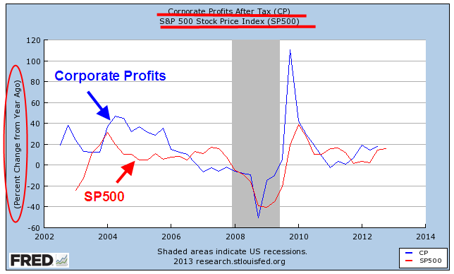
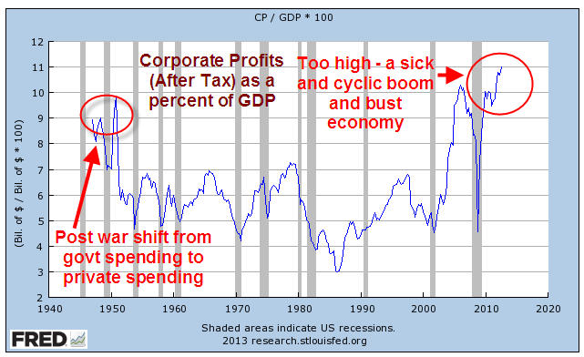
The stock market rises and falls on the prospect for the rise and fall in corporate profits.  For the past year, profits have been healthy, increasing year over year by 15-20%.

The stock market is a compilation of attempts to anticipate these profit changes by six months or so. Sometimes it guesses wrong, sometimes it guesses right but the market loosely follows the trend in profits.

As a percent of GDP, corporate profits have reached a record high and this growing share of the economy is largely responsible for the doubling of the SP500 in the past three years.

There can be too much of  a good thing and this may be it.  An economy becomes unstable as one segment of the economy accumulates a greater share of the pie.

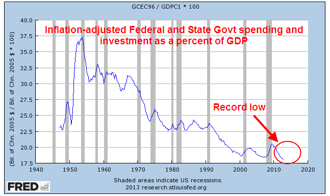
Facts are the nemesis of partisan hacks who simply disregard any information that does not fit with their model of how the universe works.  Data on government spending and investment contradict those who complain that government has too much of a share of the economy; it is now at historic lows.

This includes government at all levels: federal, state and local.  Reductions in government spending continue to act as a drag on both GDP and employment growth. What gives some people the sense that government spending is a larger percentage of the economy are transfer payments, like Social Security.  Neither the calculation of GDP or government spending includes these transfer payments, so the percent of government spending in relation to GDP as shown in the chart above is a truer picture of government’s role in the economy. 

Speaking of GDP – this past week came the first estimate of GDP growth for the fourth quarter of 2012.  The headline number was negative growth of 1/10th of a percent on an annualized basis.

Two quarters of negative growth usually mark the beginning of a recession.  Concern over this negative growth led to small losses in the stock market at mid-week as investors grew concerned about the January labor report, which was released Friday.  The negative growth was largely due to a severe reduction in defense spending and exports.  As a whole, the private economy grew at an annualized rate of 3.6%, a strength that helped moderate any market declines in mid week.

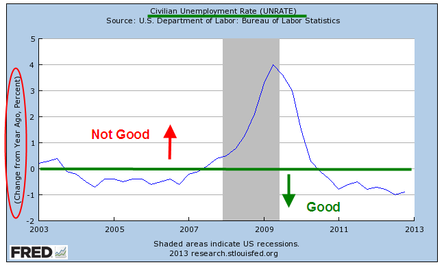
When the Bureau of Labor Statistics released their monthly labor report this past Friday, the headline job increase of 157,000+ and an unemployment rate stuck at 7.9% did not calm investors’ fears.  The year over year percent change in unemployment is still in positive territory.

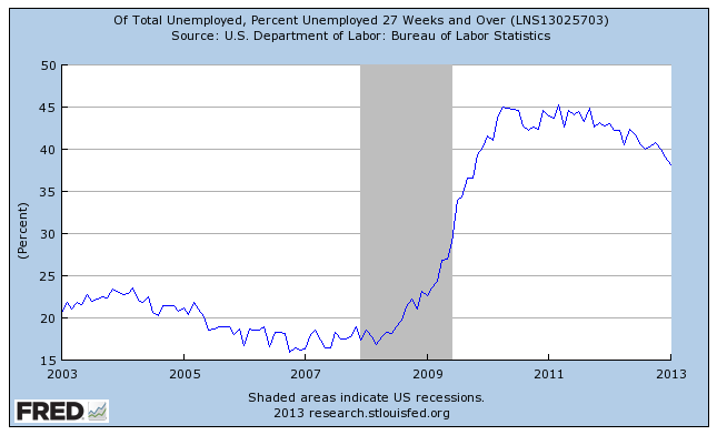
The numbers of long term unemployed as a percent of total unemployment ticked down but remains stubbornly high at about 38% (seasonally adjusted)

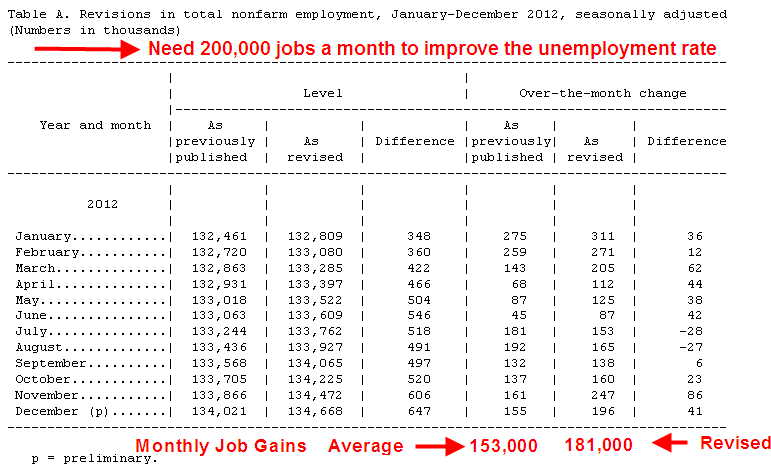
What prompted Friday’s relief rally in the market were the revisions in the previous months’ employment gains.  As more data comes in, the BLS revises previous months’ estimates.  This month also included end of the year population control adjustments.

November’s gains were revised from +161,000 to +247,000; December’s gains were raised from +155,000 to +196,000.  For all of 2012, the revisions added up to additional job gains of 336,000, raising average monthly job gains for 2012 to 181,000 – near the benchmark of 200,000 needed to make a dent in the unemployment rate.  Previous decreases in the unemployment rate have been largely the result of too many people giving up looking for work and simply not being counted as unemployed.

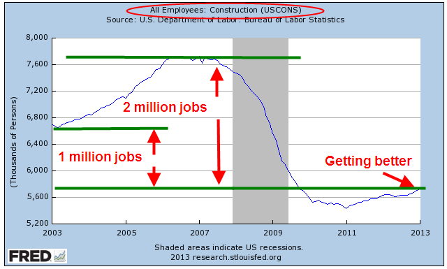
Overall, the labor report put the kibosh on any fears of recession and the stock market responded with a rally of just over 1%.  Construction jobs continued their recent gains but employment levels are one million jobs fewer than the post-recession lows of 2003 and two million jobs less than the 2006 peak of the housing bubble.

The core work force aged 25-54 continues to struggle along.

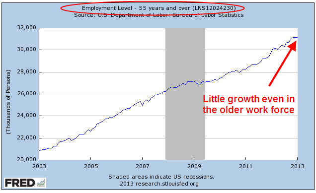
The older work force has garnered much of the gains in the past year but this month was flat.

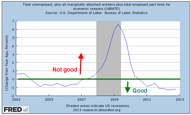
The larger group of workers counted as unemployed or underemployed, what is called the U-6 Rate, remained unchanged as did the year over year percent change. 

As the stock market continues to rise, retail investors have reversed course and have started to put more money into the stock market.  Sluggish but steady GDP and employment growth has prompted the Federal Reserve to continue its program of buying bonds every month, which tends to push up stock market values.  The Fed can continue this program as long as the sluggish pace keeps inflation in check and below the Fed’s target rate of 2.5%. 

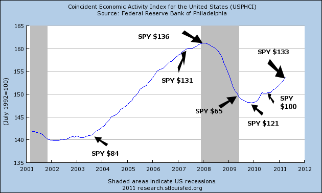
In the short run, it is a good idea to follow the maxim of “Don’t Fight the Fed.”  What is of some concern is the long term picture.  Below is a 30 year chart of the SP500 index, marked in 10 year periods with two trend lines based on the first decade, one trend line (with the arrow) a bit more positive than the other. 

The market has changed in the past two decades.  The bottoms in 2002, 2003, 2010, 2011 were simply a return to trend, a return to sanity.  The downturn of late 2008 – early 2009 was the only downturn that broke below trend; truly, an overcorrection. Among the changes of the past two decades is a Federal Reserve that, some say, has helped drive these erratic asset bubbles by making aggessive interest rate moves, then keeping interest rates at low levels for a prolonged period of time.  Whether and how much the Fed’s interest rate policies contribute to stock market valuations is a matter of much vigorous discussion.  Whatever the causes are, it is important to recognize that over two decades the market has shifted into a jagged, cyclic investment.  The long term investor who has a ten year time frame before they might need some of the money invested in the stock market can be reasonably certain that they will be able to get most of their money back if not make a healthy profit.  For those with a shorter time horizon like five years, they will need to monitor the financial and economic markets a bit more closely or hire someone to do it for them.  This is especially true when one is buying at current market levels which are above trend.

Economic Overview

The U.S. Treasury web site has a good slideshow of various components of the economy.  The first couple of slides detail the net budget impact of TARP, Federal Reserve and other government programs.  Subsequent charts illustrate the depth of the recession, the decades long accumulation of household debt, the headline and long term unemployment rates, and auto and home sales.

Reading Tea Leaves

Each month the Federal Reserve in Philadephia compiles a Coincident Index (CI) for each state, then combines state information to get a picture of the U.S. economy.  The Federal Reserve at St. Louis publishes this composite which provides an overall economic picture for the nation. (Click to view larger graphs in separate tab)

The graph shows clearly why this is the Mother of All Recessions.

These coincident indexes rely primarily on labor and production statistics and a decline in the index correlates pretty closely with the official start of recessions as set forth by the National Bureau of Economic Research (NBER).  The CI gives a more accurate picture of the underlying economic strength of the country.  The NBER calls an end to a recession long before it feels like the end of a recession, leading some economists and market watchers to scoff lightly when the NBER pronounces that a recession is over as it did in the middle of 2009.

When is a recession really over?  In my view, it is when the index reaches the level it was at when the recession began.  Using this criteria as a guide, the relatively shallow recessions of the early 90s and 2000s were longer lived than the official NBER  dates.  Those of us who lived through them can concur that the CI gives the more accurate picture.

Those earlier recessions look like mere wrinkles compared to this last recession and using my criteria, we are still in recession.  The millions of unemployed would confirm that.

Combining some of the same labor and production data, together with fear and greed, the stock market tries to anticpate the earnings of publicly traded companies.  Since earnings are based largely on the strength of economic activity in this country and abroad, the stock market is a divination of sorts.  Like augurers of ancient Rome, sometimes they get it right, sometimes they don’t.

Below is a chart of the CI following the recession of the early 90s to the height of the “dot com” era in the early part of 2000.  The growth of the personal computer and the advent of the internet helped usher in a decade like the 1920s when the telephone and telegraph prompted both investment and speculation.  Below is a chart of the CI with a few price flags of a popular ETF, SPY, that mimics the movement of the S&P500 index.

With the rise in economic activity and the stock market, we began to take on ever more debt during that period, continuing and accelerating a trend that started in the early 1980s.  In anticipation of a continuing boom in economic activity, we borrowed against the rising equity in our homes and in our stocks.  That borrowing fueled ever more economic activity as we remodeled our homes, bought new cars and took more expensive vacations.

As the froth of the dot com era blew away, overall economic activity was still rising and so was household debt.  The stock market may have experienced a correction but the American family was still riding the rocket of rising home prices.  In his campaign, George W. Bush had warned of an impending recession and soon after he took office, the recession began.  The recession officially lasted 8 months, about average, but was exacerbated by the 9/11 disaster.  The true length of that recession is marked more clearly by the CI, which shows how truly weak the recovery was.

On the whole, Republicans believe that government can boost the economy by taking less in taxes out of the private sector.  Democrats believe that government can boost the economy by more government spending.  With a slight majority in both the House and Senate, Republicans and Democrats crafted an elegant solution – tax less and spend more.  Never mind that such a solution is a long term recipe for economic disaster.

By the beginning of 2004, the CI had risen to the level of early 2001, finally ending an almost 3 year recessionary period.  The stock market was beginning a strong upward move.  House prices were still on the rise and accelerating, prompting homeowners to trade up to bigger houses and renters to become homeowners.  It was a period of Buy, buy, buy and Borrow, borrow, borrow.

In a November 2005 research paper by the St. Louis Fed, the authors write,  “Real U.S. house prices, on average, have appreciated by 6 percent annually since 2000, a historically high rate when compared with the 2.7 percent annual rate between 1975 and 1999.” But, the authors concluded, “if bubble conditions do exist, they appear only on the two coasts and in Michigan.”  In the same month this research paper was published, the peak of the housing boom occurred, using the Case Shiller index as an indicator.

Fueled by borrowing and a rising stock market, economic activity continued to climb until it peaked in December 2007 – January 2008.  The stock market had stumbled in August 2007 as the unemployment rate edged up toward 5% (the good old days!) and softness in the housing market became more pronounced.

An investor who simply took a cue from the rise and fall of the CI over the past 20 years would have done very well.   The market anticipates an upturn or downturn in economic activity just as the CI is turning up or down EXCEPT for 2009.  What did the market respond to when it turned up in the spring of 2009?  It was not economic activity because activity was still falling and showed no signs of bottoming.  The market was hoping that massive government spending would spur increased economic activity.  As stimulus spending flowed through the economy throughout 2009, economic activity did pick up but stalled in the spring of 2010 as the greatest part of the stimulus had already been spent and the underlying weakness of the economy became apparent.  Enter the Federal Reserve in September with another round of stimulus via its QE2 program of Treasury bond purchases, which again spurred an uptick in activity and the stock market.

As the CI shows, the recessionary period isn’t over.  Over the past 3 years, we have shifted household debt

and bank debt

to the federal government – that’s you, me, our kids and grandkids.

It is going to be a bumpy ride.  The CI has proven to be a fairly reliable road map.

Lending Latitudes

The horse latitudes often refer to a section of the Atlantic ocean where there was little wind for a period of time, causing sailing ships to get “stuck” in the middle of the ocean.  There are two winds that drive a developed economy like that in the U.S – the demand for loans and the willingness of banks to make those loans.

Every 3 months the Federal Reserve Board (FRB) interviews a number of bank loan officers on their lending practices, risk management of and demand for commercial, industrial, mortgage and consumer loans.  The latest October 2010 survey  shows small increases in demand for commercial and industrial loans.

In questions 11 and 12 of the survey, loan officers were asked about residential mortgages. Demand for prime mortgages remains relatively unchanged.  34 loan officers responded that they do not originate non-traditional mortgages like interest-only or no income verification.  There were so few responses to questions about sub-prime mortgages that the FRB did not list the results.  If you anticipate being in the market for a mortgage in the coming years, you can conclude that it will be difficult to find a non-traditional or sub-prime mortgage.

Loan officers surveyed saw little overall change in demand for home equity lines of credit but a quarter of them said that they had tightened slightly their lending standards for these types of loans and 12% said that they had lowered existing lines of credit.

Consumer credit was largely unchanged but there was a hopeful sign for businesses.  Over 25% of smaller banks reported that they had increased business credit card limits.  The signs were not so hopeful for those in commercial construction as 20% of officers reported that they had decreased lines of credit for their existing customers and half of respondents anticipate that their lending standards for commercial construction will remain tighter for the foreseeable future. 

For consumers and homeowners the future does not look rosy.  The survey includes a category called the “foreseeable future”, not just the next two years, when asking loan officers about their anticipated lending standards.  40% of loan officers anticipate tighter standards for residential construction and 34% foresee tighter standards for prime mortgage homeowners (62% for sub-prime holders) wanting to borrow money against the equity in their house. Over half of loan officers see the same tightening for credit card and other consumer loans. 

Big box stores like Home Depot and Lowe’s that depend on remodeling and construction dollars have seen a 10%+ increase in their stock prices the past month.  Given the current lending environment, it may be difficult for these companies to maintain the sales growth that justifies the expectations implied by such a dramatic stock price increase.  The reluctance to lend will continue to suppress growth in the consumer market which accounts for over 2/3 of this country’s GDP. 

QE2

No, it’s not the Queen Elizabeth, either the person or the ship.  It’s Quantitative Easing, a label for the Federal Reserve’s program to print money.  Matt sent me a link to a funny – and ironically sad – video that explains this phenomenon.

Asset Bubbles

Earlier today, I examined the twin problem of spending and revenue.  What about that “hump” in revenue for the years 2004 to 2008?  Was it the Bush tax cuts?  Politicians drinking the Republican juice often repeat the mantra that tax cuts produce more revenue.  If only it were true.  The revenue hump consists chiefly of the taxes from capital gains that occurs during any asset bubble.  We had a similar spike in capital gains taxes during the stock market bubble of the late nineties.  Below is a chart of IRS data of capital gains reported during the past decade. 

As the Federal Reserve continues its stimulus attempts to revive demand by pumping money into bonds and lowering the value of the dollar, it drives up asset prices like stocks.  When investors sell those assets which are in non-tax sheltered accounts, the sale often generates a capital gain which generates revenue for the Treasury.

Voters have conflicting views of the Obama stimulus program initiated in the spring of 2009.  However, it is the Federal Reserve that has pumped in double the total amount (some of it not spent yet) of Obama’s stimulus program and most of that amount was put in before Obama took office.  Here’s a quick chart of the balance sheet of the Federal Reserve.  Click on the “All” tab on the second chart.  Good thing that the Federal Reserve members do not have to run for Congress.