Guessing the Future

April 23, 2017

Human beings have an ability to foretell the future, or at least some people think so.  A more accurate description is that we predict the likelihood of future events based on past patterns.  Index funds average the predictions of buyers and sellers in a particular market.

During the recovery most active fund managers have underperformed their benchmark indexes. Standard & Poors, the creator and publisher of many indexes, provides a quick summary in their SPIVA spotlight. In the past five years, 88% of active fund managers have underperformed the SP500.  In a random world, I would expect that 50% of active fund managers would beat the index, and 50% of managers would underperform the index because the index is an average of all those buy sell decisions.

The 1% higher fees charged by active fund managers contribute mightily to this underperformance. Using long term averages, we expect that a third of active fund managers would beat their benchmark index.  The current percentage is only 12%. It is likely that the law of averages will eventually exert its pull.

Index funds mechanically rebalance regularly. Let’s look at a real life example.  The pharmaceutical giant Johnson and Johnson is a member of both the SP500 and the smaller group of core stocks that make up the Dow Jones index.  This week the company  reported first quarter revenues that were below expectations, and sellers promptly knocked 3% off the stock price.  Because most SP500 index funds are market weighted, index funds that mimic the weighting of the stocks in the index would buy and sell stocks in the index to capture these changes.

Because index funds are averaging the decisions of all stock investors, they should underperform. After all, the index funds are buying those companies that everyone else is buying, and selling companies that everyone else is selling.  Index funds are buying high and selling low, creating a drag on performance that is overcome by the lower fees charged by these funds.

In an article last fall in the Kiplinger newsletter, Steven Goldberg makes the case for a mix of both index and active funds.  Research shows that active fund mangers do better when an index does poorly.  It’s worth a read.

The index fund giant Vanguard is featured in a NY times article. John Bogle founded Vanguard based on his thesis that a passive approach to investing and low fees would reward most investors over the long term.

///////////////////////

Correlation, not Causation

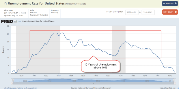
When the stock market crashed in 1929, the unemployment rate was less than 3%.  A booming economy during the 1920s lifted demand for labor, while severe immigration restrictions enacted in 1924 reduced the supply of workers.

Unemploy1929-1942

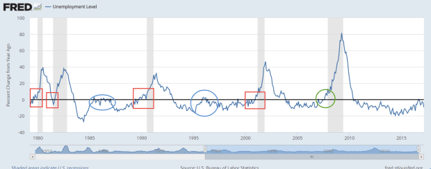
The unemployment rate was 6% when the market crashed in October 1987 and again in September 2008. There seems to be a weak connection between unemployment and severe market crashes.  However, there is a consistent correlation between the change in number of unemployed and the start of recessions.

UnemployChange

A yearly increase in the number of unemployed on a percentage basis indicates a fundamental weakness in the economy.  Sometimes, the change reverses as it did in early 1996, at the start of the dot com boom, or in the mid-eighties after a downturn in oil and housing exposed a banking scandal. These two periods are circled in blue in the graph above.

Often the economy continues to weaken, more people lose their jobs, GDP falters and the economy slides into depression.

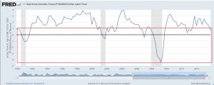
Because we cannot rely on just one indicator as a warning signal, we can chart the amount of production generated by each person in the labor force.  The civilian labor force includes both those who are working and those who are actively looking for work.  A growth rate below 1% indicates some weakness.  Using both the change in unemployment and the change in production helps filter out some of the noise.

While production growth may be faltering, the current unemployment level is not worrying.

///////////////////////

Pay Attention to the Pros

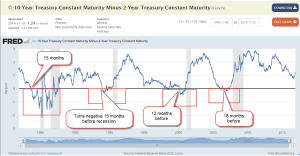
Institutional buyers and sellers of Treasury bonds will usually let the rest of us know when they are worried about a recession.  In a middling to healthy economy, Treasury buyers will demand a higher interest rate for a longer dated bond.  Subtracting the interest rate on a shorter term two year bond from a long term ten year bond should be positive.  In a “normal” environment, a 10 year bond might have an interest rate of 3% and a two year bond an interest rate of 1%.  The difference of 2% would be expected.  However, a negative result indicates that buyers want more interest from short term bonds because they are more concerned about short term risks.  As we can see in the chart below, a negative result precedes a recession by 12 to 18 months.  The current difference shows no indication of concern.

Guessing the future is not divination, nor is it perfect.  Retail investors may not have the time or expertise to estimate future risk, but we can study those who make it their business to manage risk.

Economic Porridge

August 31, 2014

As summer comes to a close and the sun drifts south for the winter, the porridge is not too hot or too cold.

********************

Coincident Index

The index of Leading Indicators came out last week, showing increased strength in the economy.  Despite its name, this  index has been notoriously poor as a predictor of economic activity.  The Philadelphia branch of the Federal Reserve compiles an index of Coincident Activity in the 50 states, then combines that data into an index for the country.

This index is in the healthy zone and rising. When the year-over-year percent change in this index drops below 2.5%, the economy has historically been on the brink of recession.  The index turns up near the end of the recession, and until the index climbs back above the 2.5% level, an investor should be watchful for any subsequent declines in the index.

As with any historical series, we are looking at revised data.  When this index was published in mid-2011, the percent change in the index was -7% at the recession’s end in mid-2009.  Notice that the percent drop in the current chart is a bit less than 5%.  This may be due to revisions in the data or the methodology used to compile the index.

**************************

Disposable Income

The Bureau of Economic Analysis (BEA) produces a number of annual series, which it updates through the year as more complete data from the previous year is received.  2013 per capita real disposable income, or what is left after taxes, was revised upward by .2% at the end of July but still shows a negative drop in income for 2013.  While all recessions are not accompanied by a negative change in disposable income, a negative change has coincided with ALL recessions since the series began at the start of the 1930s Depression.

Many positive economic indicators make it highly unlikely that we are either in or on the brink of recession.  Clearly something has changed.  Something that has routinely not been counted in disposable personal income is having some positive effect on the economy.  In 2004, the BEA published a paper comparing the methodology they use to count personal income and a measure of income, called money income, that the Census Bureau uses.  What both measures don’t count in their income measures are capital gains.

Unlike BEA’s measure of personal income, CPS money income excludes employer contributions to government employee retirement plans and to private health and pension funds, lumps-sum payments except those received as part of earnings, certain in-kind transfer payments—such as Medicare, Medicaid, and food stamps—and imputed income. Money income includes, but personal income excludes, personal contributions for social insurance, income from government employee retirement plans and from private pensions and annuities, and income from interpersonal transfers, such as child support. (Source)

Analysis (Excel file) of 2012 tax forms by the IRS shows $620 billion in capital gains that year, about 5% of the $12,384 billion in disposable personal income counted by the BEA.  An acknowledged flaw in the counting of disposable income is that the total reflects the taxes that individuals pay on the capital gains (deducted from income) but not the capital gains that generated that taxable income.  Although 2013 data is not yet available from the IRS, total personal income taxes collected rose 16%.  We can suppose that the 30% rise in the stock market generated substantial capital gains income.

*************************

Interest

Every year the Federal Government collects taxes and spends money.  Most years, the spending is more than the taxes collected – a deficit.  The public debt is the accumulation of those annual deficits.  It does not include money “borrowed” from the Social Security trust fund as well as other intra-governmental debt, which add another third to the public debt.  (Treasury FAQ)  This larger number is called the gross debt.  At the end of 2012, the public debt was more than GDP for the first time.

The Federal Reserve owns about 15% of the public debt.  But wait, you might say, isn’t the Federal Reserve just part of the government?  Well, yes it is.  Even the so-called public debt is not so public.  How did the Federal Reserve buy that  government debt?  By magic – digital magic.  There is a lot of deliberation, of course, but the actual buying of government debt is done with a few dozen keystrokes.  Back in ye olden days, a government with a spending problem would have to melt down some of its gold reserves, add in some cheaper metal to the mix and make new coins.  It is so much easier now for a government to go to war or to give out goodies to businesses and people.

Despite the high debt level, the percent of federal revenues to pay the interest on that debt is relatively low, slightly above the average percentage in the 1950s and 1960s but far below the nosebleed percentages of the 1980s and 1990s.

As the boomer generation continues to retire, the Federal Government is going to exchange intra-governmental debt, i.e. the money the government owes to the Social Security trust funds, for public debt.  As long as 1) the world continues to buy this debt,  and 2) interest rates stay low, the impact of the interest cost on the annual budget is reasonable.  However, the higher the debt level, the more we depend on these conditions being true.

************************

Watch the Percentages

As the SP500 touched and crossed the 2000 mark this week, some investors wondered whether the herd is about to go over the cliff.  The blue line in the chart below is the 10 month relative strength (RSI) of the SP500.  The red line is the 10 month RSI of a Vanguard fund that invests in long term corporate and government bonds.  Readings above 70 indicate a strong market for the security. A reading of 50 is neutral and 30 indicates a weak market for the security. The longer the RSI stays above 70, the greater the likelihood that the security is getting over-bought.

Long term bonds tend to move in the opposite direction of the stock market.  While they may both muddle along in the zone between 30 and 70, it is unusual for both of them to be particularly strong or weak at the same time.  We see a period in 1998 during the Asian financial crisis when they were both strong.  They were both weak in the fall of 2008 when the global financial crisis hit.  Long term bonds are again about to share the strong zone with the stock market.

Let’s zoom out even further to get a really long perspective.  Since November 2013, the SP500 index has been more than 30% above its 4 year average – a relatively rare occurrence.  It happened in 1954 – 1956 after the end of the Korean War, again in December of 1980, during the summer months of 1983, the beginning of 1986 to the October 1987 crash, and from the beginning of 1996 through September 2000.

In the summer of 2000, the fall from grace was rather severe and extended.  In most cases, including the crash of 1987, losses were minimal a year after the index dropped back below the 30% threshold.  When the market “gets ahead of itself” by this much, it indicates an optimism brought on by some distortion.  It does not mean that an investor should panic but it is likely that returns will be rather flat over the following year.

The index rarely gets 30% below its 4 year average and each time these have proven to be excellent buying opportunities.  The fall of 1974, the winter months of 2002 – 2003, and the big daddy of them all, March 2009, when the index fell almost 40% below its 4 year average.

************************

GDP

The Bureau of Economic Analysis (BEA) released the 2nd estimate of 2nd quarter GDP growth and surprised to the upside, revising the inital 4.0% annual growth rate to 4.2%.  As I noted a month ago, the first estimate of 2nd quarter growth included a 1.7% upward kick because of a build up of inventory, which seemed a bit high.  The BEA did revise inventory growth down to 1.4% but the decrease was more than offset primarily by increases in nonresidential investment. A version of GDP called Final Sales of Domestic Product does not include inventory changes.  As we can see in the graph below, the year-over-year percent gain is in the Goldilocks zone – not strong, but not weak.

New orders for durable goods that exclude the more volatile transportation industries, airlines and automobiles, showed a healthy 6.5% y-o-y increase in July.  Like the Final Sales figures above, this is sustainable growth.

***********************

Takeaways

Economic indicators are positive but market prices may have already anticipated most of the positive, leaving investors with little to gain over the following twelve months.

GDP and Education

June 29, 2014

This week I’ll review some of this week’s headlines in GDP, personal income, spending and debt, housing and unemployment.  Then I’ll take a look at some trends in education, including state and local spending.

**************************
Gross Domestic Product First Quarter 2014

The headline this week was the third and final estimate of GDP growth in the first quarter, revised downward from -1% to -2.9%.  This headline number is the quarterly growth rate, or the growth rate over the preceding quarter.  A year over year comparison, matching 2014 first quarter GDP with 2013 first quarter GDP, shows an annual real growth rate of 1.5%, below the 2.5 to 3.0% growth of the past fifty years.  The largest contributor to the sluggish GDP growth was an almost 5% drop in defense spending.  Simon Kuznets, the economist who developed the GDP concept, did not include defense spending in the GDP calculation.

Contributing to the quarterly drop was the 1.7% decline in inventories.  Businesses had built up inventories a bit much in the latter half of 2013 in anticipation of sales growth only to see those expectations dashed by the severe winter weather.  Final Sales of Domestic Product is a way of calculating current GDP growth and does not include changes in inventory.  Let’s look at a graph of the annual growth in Real (Inflation-Adjusted) GDP and Real Final Sales of Domestic Product to see the differences in the two series.

Note that Real GDP growth (dark red line) leads Final Sales (blue line) as businesses build and reduce their inventory levels in anticipation of future demand and in reaction to current and past demand.
  
The Big Pic: if we look at these two series since WW2, we see that ALL recessions, except one, are marked by a year over year percent decline in real GDP.  The 2001 recession was the exception.

Secondly, note that in half of the recessions, y-o-y growth in Final Sales, the blue line in the graph, does not dip below zero.  We can identify two trends to recession: 1) businesses are too optimistic and overbuild inventories in anticipation of demand, then correct to the downside, causing a reduction in employment and a lagging reduction in consumer spending; 2) consumers are too optimistic and take on too much debt – selling an inventory of future earnings to creditors, so to speak – then correct to the downside and reduce their consumption, causing businesses to cut back their growth plans.  In case #1, a decrease in consumer spending follows the cutbacks by businesses.  In case #2, businesses cut back following a downturn in consumer spending.

In this past quarter, employment was rising as businesses cut back inventory growth, indicating more of a rebalancing of resources by businesses rather than a correction.  Consumer spending may have weakened during the first quarter but, importantly, did not decline.  We have two hunting dogs and neither is pointing at a downturn.

For a succinct description of the various components of GDP, check out this article written for about.com by Kimberly Amadeo.  Probably written in the first quarter of 2014, her concerns about the inventory buildup in 2013 were proved accurate.

**************************

Income and Spending

Personal Income rose almost 5% on an annualized basis in May but consumer spending rose at only half that pace,  2.4%.  The spending growth is only slightly more than the 1.8% inflation rate calculated by the Bureau of Economic Analysis, revealing that consumers are still cautious.

I heard recently a good example of how data can be presented out of context, leading a listener or reader to come to a wrong conclusion.  Data point: the dollar value of consumer loans outstanding has risen 45% since the start of the recession in late 2007. Consumer loans do not include mortgages or most student loan debt. If I were selling a book, physical gold, or a variable annuity with a minimum return guarantee, I could say:

My friends, this shows that many consumers have not learned any lessons from the recession.  They are living beyond their means, running up debts that they will not be able to pay. Soon, very soon, people will start defaulting on their debts and the economy will collapse.  This country will suffer a depression that will make the 1930s depression look tame.  Now is the time to protect yourself and your loved ones before the coming crash.

Data is little more than an opportunity to spread one’s political message.  Data should never lead us to reconsider our message, our point of view.  If I were penning a politically liberal message, I could write:

The families in our country are desperate.  Without enough income to satisfy their basic needs, they are forced to borrow, falling ever deeper into debt while the 1% get richer.  We need policies that will help families, not the financial fat cats on Wall Street.  We need a tax structure that will ensure that the 1% pay their fair share and not have the burden fall on the shoulders of most of the working Americans in this country.


Selling a political persuasion and selling a car brand often employ similar techniques.  Data should never lead us to question our loyalty to the brand.  If I were crafting a conservative message, I could write:


The misuse of credit indicates an immaturity fostered by cradle to grave social programs, which are eroding the very character of the American people, who come to rely less on their own resources and more on some agency in Washington to help them out.  People steadily lose their sense of personal responsibility, becoming more like children than self-reliant adults.

However, the facts behind the data point lead us to a different story. In the spring of 2010, consumer loans spiked, rising $382 billion in just two months.

That surge represents more than a $1000 in additional debt per person. Consumers did not suddenly go crazy.  Banks did not open their bank vaults in a spirit of generosity. Instead, banks implemented accounting rules FAS 166 and 167 that required them to show certain assets and liabilities on their books. $322 billion of the $382 billion increase in consumer loans during those two months in 2010 was the accounting change. If we subtract that accounting change from the current total, we find that real consumer loan debt increased only 5.5% in 6-1/2 years.  And that is the real story.  Never in the history of this series since WW2 have consumers restrained their borrowing habits as much as we have since December 2007.  We had to.  In the eight years before the financial crisis in 2008, real consumer debt rose 33%, an unsustainable pace.

About two years ago, loan balances stopped declining and since then consumers have added $80 billion, much of it to finance car purchases. $25 billion of that $80 billion increase has come only since the beginning of this year.  On a per capita, inflation adjusted basis, consumer loan balances are still rather flat.

**************************

Housing

New home sales in May were up almost 20% over April’s total, and over 6% on an annual basis.  Existing homes rose 5% above April’s pace but are down 5% on an annual basis.  Each year we hope that housing will finally contribute something to economic growth.  Like Cubs fans, we can hope that maybe this year….

**************************

Unemployment Claims

New unemployment claims continue to drift downward and the 4 week moving average is just below 315,000.  Our attention spans are rather short so it is important to keep in mind that the current level of claims is the same as what is was last September.

It has taken this economy six months to recover from the upward spike in claims last October.  The patient is recovering but still not healthy.

**************************

Minimum Wage

The number of workers directly affected by changes in the minimum wage are small.  We sympathize with those minimum wage workers who try to support a family.  The Good Samaritan impulse in many of us prompts us to say hey, come on, give these people a break and raise the minimum wage.  What we may forget are the implications of any minimum wage increase.  Older readers, stretch your imagination and remember those years gone by when you were younger. Workers in their early working years often see the minimum as a benchmark for comparison.  The much larger pool of younger workers who make above minimum wage may push for higher wages in response to increases in the minimum wage.

Fifty years ago, Congress could have made the minimum wage rise with inflation, ensuring that workers in low paid jobs would get at least a subsistence wage and that increases would be incremental.  Of course, there are some good arguments against any nationally set minimum wage.  $10 in Los Angeles buys far less than $10 in Grand Junction, Colorado.  Ikea recently announced that they will begin paying a minimum wage that is based on the livable wage in each area using the MIT living wage calculator .  Several cities have enacted minimum wage increases that will be phased in over several years but none that I know of are indexed to inflation as the MIT model does.

Congress could enact legislation that respects the differences in living costs across the nation.  For too long, Congress has chosen to use the minimum wage as a political football.  Social Security payments are indexed to inflation because older people put pressure on politicians to stop the nonsense.  There are not enough minimum wage workers to exert a similar amount of coordinated pressure on the folks in Washington so workers must rely on the fairness instinct of the larger pool of voters if any national legislation will be passed.

**********************

Education

Demos, a liberal think tank, recently published a report recounting the impact of rising tuition costs on students and families.  Student debt has almost quadrupled from 2004 – 2012.  Wow, I thought.  State spending per student has declined 27%.  More wows.  How much has enrollment increased, I wondered?  Hmmm, not mentioned in the report.  Why not?

The National Center for Education Statistics, a division of the Dept. of Education, reports that full time college enrollment increased a whopping 38% in the decade from 2001-2011.  Part-time enrollment increased 23% during that time.  Together, they average a 32% increase in enrollment. Again, wow!  Ok, I thought, the states have been overwhelmed with the increase in enrollment, declining revenues because of the recession, etc.  Well, that’s part of the story.  Spending on education, including K-12, is at the same levels as it was a decade ago.

From 2002-2012, states have increased their spending on higher ed by 42%.  Some argue that the Federal government should step up and contribute more.  In 2010, total Federal spending on education at all levels was less than 1% ($8.5B out of $879B).  Others argue that the heavily subsidized educational system is bloated and inefficient.  As much cultural as they are educational institutions, colleges and universities have never been examples of efficiency.  Old buildings on college campuses that are expensive to heat and cool are largely empty at 4 P.M.  Legacy pension agreements, generously agreed to in earlier decades, further strain state budgets.  We may need to rethink how we can deliver a quality education but these are particularly thorny issues which ignite passions in state and local budget negotations.

Although state and local governments have increased spending on higher ed by 42% in the decade from 2002-2012, the base year used to calculate that percentage increase was particularly low, coming after 9-11 and the implosion of the dot-com boom.  Nor does it reflect the economic realities that students must get more education to compete for many jobs at the median level and above.

Let’s then go back to what was presumably a good year, 2000, the height of the dot-com boom.  State coffers were full.  In 2000, state and local governments spent 5.14% of GDP (Source).  By 2010, that share had grown to 5.82% of GDP (Source). That represents a 13% gain in resources devoted to education.  But that is barely above population growth, without accounting for the rush of enrollment in higher education during the decade.

Let’s take a broader view of educational spending, comparing the total of all spending on education, including K-12, to all the revenue that Federal, state and local governments bring in.  This includes social security taxes, property taxes, sales taxes, etc.  As a percent of all receipts, spending on education has declined from 30% to under 18%.

Many on the political left paint conservatives as being either against education or not supportive of education.  Census data shows that Republican dominated state legislatures, in general, devote more of their budget to education than Democratic legislatures.  W. Virginia, Mississippi, Michigan, S. Carolina, Alabama and Arkansas devote more than 7% of GDP to education, according to U.S. Census data compiled by U.S.GovernmentSpending.com.  Only two states with predominantly Democrat legislatures, Vermont and New Mexico, join the plus-7% club (Wikipedia Party Strength for party control of state legislatures).

In the early part of the twentieth century, a high school education was higher education.  In the early part of this century, college may be the new high school, a minimum requirement for a job applicant seeking a mid level career.  What are our priorities?  In any discussion of priorities, the subject of taxes arises like Godzilla out of the watery depths.  People scramble in terror as Taxzilla devours the city. Older people on fixed incomes and wealthy house owners resist property tax increases.  Just about everyone resists sales tax increases.  Proposals to raise income taxes are difficult to incorporate in a campaign strategy for state and local politicians running for election.

Let’s disregard for a moment the ideological argument over Federal funding or control of education.  Let’s ask ourselves one question:  does this declining level of total revenues reflect our priorities or acknowledge the geopolitical realities of today’s economy?

***********************

Takeaways

Reductions in defense spending, inventory reductions and a severe winter that curtailed consumer spending accounts for much of the sluggishness in first quarter GDP growth.

A surge in new home sales is a sign of both rising incomes and greater confidence in the future.

Consumer spending growth is about half of healthy income gains.

Spending on education has grown a bit more than population growth and is not keeping up with surging enrollment in higher education.
The Market and Growth

March 2nd, 2014

SP500
Some pundits have made the case that the stock market is due to fall this year because of the almost 30% rise in prices in 2013.  On the face of it, it seems logical.  If the average rise in the SP500 over the past fifty years is about 8-1/2% and there is a 30% rise in one year, then the market has essentially “used up” more than three years of the average – all in one year.  But the stock market is the net result of billions of buy and sell decisions by human beings.  My experience has taught me that the connection between sense and the behavior of human beings is tenuous, at best.  The Red Carpet walk at the Oscars Award Ceremony is a demonstration of the nonsensical choices that human beings make.  I mean, can you believe the dress that actress is wearing?  And who told that actor he could grow a beard?  PUH-LEEZ!

So I looked at past history and wondered: what is the average yearly return of the SP500 index over the three years following a 20% rise in the market?  As an example, if the market rises 20% in Year #1, what is the 3 year average of yearly returns in Year #4?  The results surprised me – 9.5%.

But wait! you say.  The late nineties were an aberration of irrational exuberance that skews the average.  Removing those two outliers from the data set gives a yearly average of 6.2%.  Add in 2% dividends and the total comes to 8.2%, a respectable return.

But wait!, you say again.  What about the year after the 20% rise?  Surely, the index must compensate for the above average rise the previous year.  In the year after a 20% rise in the market, the average gain was 13.5%.  Again, there were those crazy years of the late nineties so I’ll take them out, leaving an average gain of 3.7%.  Add in the 2% dividend and it easily outpaces the current return on long term bonds.

This year the pundits could be right and the stock market falls.  However, a successful long term investor must learn to play the averages.

*********************************

GDP and Savings

GDP is a measure of the economic output of a nation but what the heck is it?  A recent presentation by Gary Evans, an economics professor at Harvey Mudd College in California, has a number of wonderfully illustrated graphs that may help the casual reader understand the components of GDP and recent trends in the economy.

On January 30th, the Bureau of Economic Analysis (BEA) released their advance estimate of real GDP growth of 3.1% in the 4th quarter.  As more information of December’s slowdown became available in late January and early February, the market began anticipating that the BEA would revise their advance estimate down.  Slower growth might mean further declines in stock prices, right? Instead, the market anticipated that a slowing of growth in the fourth quarter would calm the hand of the Fed in tapering their bond purchases. As a result, the market  rebounded in February, more than making up for January’s decline.  On Friday, the BEA revised their second estimate of fourth quarter growth downward to 2.4%, almost exactly what the market consensus had anticipated and the market finished out a strong month with a small gain.  The BEA attributed the slower growth in the fourth quarter to reductions in federal, state and local government spending and a slowdown in residential housing.

As the BEA revises their methodology, they also revise previously published GDP data.  In the 2013 revision the BEA adjusted their data going back to 1929.  In the past few years, revisions have added about 1/2 trillion dollars to GDP.  Adjustments to the personal savings rate were substantially higher but savings in the past decade have been at historically low levels.  Personal savings are the amount of disposable income, or income after taxes, that families save.  The rate or PSR is the the percentage of their disposable income that they don’t spend.

When people charge purchases that decreases the savings rate.  Conversely, when families pay down their credit purchases that increases the savings rate.  Despite the explosive growth of household debt in the past thirty years,

the savings rate has remained positive, meaning that the people who do save are more than offsetting those who don’t or can’t save.

Let’s take an example of three families:  the Jones family makes $60K in disposable, or after tax income, saves nothing, but increases their debt $8,000 by buying a new car.  Their personal savings rate is $-8K/$60K, or -13.3%.  The Smith Family also has $60K in disposable income, but is frugal and pays down a few loans and saves some money for a total savings of $2K, or 3.3%.   The Williams family has a disposable income of $120K and has net savings of $20K, or 16.7%. Families with higher incomes tend to save proportionately more of that income.  Total disposable income for the three families is $240K.  Total savings is $14K, or 5.8% of disposable income, but that hides the fact that it is the Williams family that is making most of the contribution to that savings rate.

There is another subtle element contributing to this disparity in savings: inflation.  The Consumer Price Index charts the increasing prices of goods and services – spending.  A higher income family that spends less of its income is less affected by changes in the CPI than a lower income family and this helps a higher income family save proportionately more than the lower income family.  The difference is slight but the compounded effect over thirty years is significant.

During the past thirty years, the personal savings rate has steadily declined.

This doesn’t mean that families are saving less as a percentage of their income but that the number of families with net savings are becoming fewer while the number of families with little net savings or negative net savings are becoming more numerous.  The period from 1930 to 1980 was one of relatively more income equality than the period 1980 to the present.  Let’s look again at the chart above.  In the late 1970s, as income equality begins a decades long decline, so too does the personal savings rate.  The ratio of high income families with a relatively high savings rate to lower income families with a low savings rate also declines.

Savings drives investment in the future.  The low savings rate means that future U.S. economic growth must rely ever more on the savings from those in other countries.  Typically savings rates increase as a recession progresses and then the economy recovers.

Notice that the savings rate has stayed relatively steady in the past three years, indicating neither an increasing confidence or caution.  As shown in the table, only the three year period from 1988 – 1990 period showed the same lack of direction.  GDP growth in that period was stronger than it is today but the savings and loan crisis and the stock market crash of October 1987 had diluted the confidence of many.

****************************

New Home Sales
Here’s a head scratcher.  New home sales rebounded almost 10% in January, after falling 13% in December.  Even the figures for December were revised a bit higher.  As I noted last week, the rather flat growth in incomes has become an obstacle to the affordability of homes. December’s Case Shiller 20 city home price index reported a 13.4% annual increase in home prices. January’s rise in home sales was partially aided by sellers willing to make price concessions, resulting in a 2.2% decrease in the median sales price.

****************************

Durable Goods
Orders for durable goods, excluding transportation, were up about 1% this past month. A durable good is something which has a life of 3 years or more.  Cars and furniture are common examples. The year over year gain, a bit over 1% as well, indicates rather slow growth over the past year after adjusting for inflation.  However, several current regional reports of industrial activity indicate a quickening growth at the start of this year.  Reports from Chicago, Philadelphia and Kansas City hold promise that next week’s ISM assessment of manufacturing activity nationally will show a rebound.

As I have noted in blogs of the past few months, the pattern of the CWI index that I have been compiling since last summer indicated a rebound in overall activity in the early spring of this year.  This gauge of manufacturing and non-manufacturing activity is based on the Purchasing Managers Index released each month by ISM.  I suppose a better name for the CWI index would be “Composite PMI.”  Readers are welcome to make some suggestions.

****************************

Unemployment
New unemployment claims rose, approaching the 350K mark, but the 4 week average of new claims is holding steady at 338K.  In past winters the 4 week average has been around 360K.  If new claims remain relatively low during this particularly harsh winter in half of the country, it will indicate an underlying resiliency in the labor market.

Janet Yellen, the new chairwoman of the Federal Reserve, appeared before the Senate Finance Committee this week.  In her response to questions about the dual mandate of the Fed – inflation and employment – she noted that the Fed looks at much more than just the unemployment rate in gauging the health of the labor market.  One of the employment indicators they use is new unemployment claims.

When asked what unemployment rate the Fed considers “full employment,” Ms. Yellen stated that it was in the 5 – 6% range.  One of the Republican Senators asked about the “real” unemployment rate, without specifying what he meant by the word “real.”  Without hesitation and in a neutral tone, Ms. Yellen responded that if the Senator meant the “widest” measure of unemployment, the U-6 rate, that it was about 13%.  The U-6 rate includes discouraged workers and part time workers who want but can not find full time work.

When George Bush was President, “real” meant the narrowest measure of unemployment to a Republican because it was the smallest number.  With a Democrat in the White House, the word “real” now means the widest measure of unemployment to a Republican because it is the largest number.  Democrats employed the same strategy when George Bush was President, preferring the higher U-6 unemployment rate as the “real” rate because it was higher.  I thought that it would be a good response for anyone when confronted by a colleague at work about the “real unemployment rate” that we steer the conversation to more precise and politically neutral words like “widest” and “narrowest.”

****************************
Pensions
A reader sent me a link to a Washington Post article on the pension and budget woes of San Jose, a large city in California.  I am afraid that we will see more of these in the coming decade.  Beginning in the 1990s politicians in state and local governments found an easy solution to wage demands from public workers: make promises.  Wages come out of this year’s budget; pension promises and retiree health care benefits come out of some budget in the distant future.  For an increasing number of governments, the distant future has arrived.

In Colorado, a reporter at the Denver Post noted that the Democratic Governor and the Republican Treasurer are hoping that the state’s Supreme Court will force the public employee’s pension fund, PERA, to open its books. It might surprise some that a public institution like PERA is less transparent than a publicly traded company.  Actuarial analysis estimates are that PERA’s asset base is underfunded by $23 billion, or about $46,000 for each retiree. It was only last year that the trustees of the fund reluctantly lowered its expected returns to 7.5% from 8%.  Assumptions on expected returns, what is called the discount rate, is a major component in analyzing the health of any retirement fund and the money that must be set aside today to pay for tomorrow’s promised benefits.  Many analysts contend that even 7.5% is a rather lofty assumption in this low interest rate environment.

Readers who Google their own state or city and the subject of pensions will likely find similar tales of past political promises and lofty assumptions running headlong against the realities of these past several years.

Employment Growth

December 29th, 2013

In several past blogs here and here, I have noted a “rule of thumb” guide to recessions based on the unemployment rate.  When the year over year percentage change in the unemployment rate goes above 0, recession smoke alarms go off.  Sorry, no phone app for this alarm. This metric sometimes indicates a recession that doesn’t quite materialize in the economic data, a false positive, although the market may react to the possibility of a recession.  Employment is but one factor in a complex economy and no one indicator can stand as a fail safe predictor of a serious enough decline in the economy that it gets labelled “recession” by the NBER.

Another related measure is the total employment level.  This employee count comes from the Establishment Survey conducted by the BLS and is the source for the monthly headline job gains or losses. To show the correlation between payroll and economic activity, I took a measure of GDP – I’ll call it active GDP – that excludes changes in business inventories and net exports.  From this I subtracted the change in real household debt in each quarter.  This measure of economic activity reflects what consumers can actually pay for.  Below is a chart of the yearly change in this adjusted measure of GDP and the number of people working.  There is a remarkable correlation.

As I will show below, the employment market has not fallen into an unsafe zone but the decline in growth of domestic demand indicates a fragility that should not be overlooked.  Comparing the number of people working to the 12 month average reveals trends and weaknesses in the economy.  Historically, when the number of workers falls below its 12 month average we are almost certainly in a recession.  As of now employment is maintaining a healthy but not robust growth rate.

When the difference between the monthly count of people working and its 12 month average (I’ll call it DIFF) falls below 1% (I’l call it WEAK), it shows a pre-recession weakness in the economy. In past decades, this DIFF might fall to .75% before recovering, a temporary weakness.  Since June 2000, employment growth has been in a WEAK state, never recovering above 1%.  Following the dot com bust in 2000, 2001 included an 8 month recession, the admittance of  China to the World Trade Organization and the sucking up of low skilled manufacturing jobs, and the horrific events of 9-11.  For two years the country endured a painfully slow and fitful recovery, prompting a Republican Congress to pass  what are called the Bush tax cuts.  Neither tax cuts or the overheated housing market of the mid 2000s could kick the DIFF above 1% although it got very close for a number of months in late 2005 and early 2006 as the housing market peaked.

When the DIFF falls below 500, we can mark fairly closely the beginnings and ends of recessions as they are called by the NBER many months later.

It is important to note that historical data is already revised data.  We must make investment decisions with the data available at the time. (See an earlier blog for some examples of revisions to payroll data.)

**************************
This week’s reports were generally better than expected.  These included durable goods orders, sales of new homes, personal income and spending.  Housing prices, as shown by the FHFA purchase only index, are maintaining an 8% year over year change.  Over the past quarter century, housing prices have followed a 3.2% annualized growth rate.

**************************
In previous blogs, I have examined the PCE inflation measure that routinely produces the lowest rate of inflation.  This is not the headline CPI index but is used to produce what is called a chain type price index.  Inflation estimates based on this indicator showed 0% inflation in November and less than 1% for an entire year.  Isn’t that great?  Rents, food, utility bills, insurances have barely increased over the past year.  Yes, I know you are ROFL until you realize that the joke is on you, on all of us.

***************************

Let’s get in the wayback machine and go back to early 2007 when the Bush administration released their estimate of GDP for the years 2007 – 2013.  Every Presidential budget indulges in the folly of predicting the future economic growth of the largest economy in the world.  When we dig into the figures, the process is rather simple.  These estimates simply take actual figures from 2006 and calculate 5% annual growth in nominal GDP.  Any of us could do this with an Excel spreadsheet.   An unemployment rate below 5% is rather infrequent and unlikely to continue for very long but the Bush Administration projected that this sub-5%level would continue for another six years.  If your 12 year old came to you with these calculations, you would probably praise them for their effort and smile inwardly at the innocence of the projections.  You wouldn’t tell your twelve year old that things don’t stay rosy indefinitely because they will find that out in due time.  This kind of middle school mentality is what passes for wisdom in Washington.

In the course of our lives, how many times do we come to a carefully calculated answer only to step back and say “Well, that can’t be.  Something’s wrong.”  It seems that there are few in Washington who doubt themselves.  The polarization in Washington means that everyone in any position of responsibility has many critics on the other side of an issue.  Each one then surrounds themselves with others who support their position, their values, their calculations.  There is no stepping back and saying, “Wait, is that right?” The revolving door in Washington ensures that many politicians have little to lose even if they lose their seats.  Many soon find an even more lucrative position in the private lobbying industry.  What they do lose is the ability to wake up in the morning, look in the mirror and say, “I’m important.”  Lose a bit of arrogance, gain a bit of humility.  Not such a bad tradeoff.

The investor who puts his own money at risk, who has skin in the game, as the economist Nassim Taleb calls it, can not afford to NOT step back and take a second look at their investment strategies and allocations.  As we complete another lap, this is a good time to recheck and rebalance.  The 25+% gains in the stock market have probably skewed the allocations of many an individual’s portfolio.  Here’s hoping everyone has a good year!

Budget Aneurysm

In mid 2008, the Office of Management and Budget (OMB) under President Bush estimated a $400B total deficit for fiscal year 2008, ending in Sept. 2008, and a deficit of $450B for the 2009 fiscal year.

In Dec. 2008, after the financial implosion of Sept. 2008, the non-partisan Congressional Budget Office (CBO) estimated that the total deficit would be about $1T. In Jan. 2009, before the new President was sworn in, the CBO revised their deficit projections upward to $1.2T, or 8.9% of GDP.

The 2009 fiscal year just ended Sept. 30th and the CBO announced this week that the actual deficit numbers will probably come in at $1.4T, or 9.9% of GDP. For a historical look at the budget numbers since 1968, click on Historical Budget Data at the CBO site. There you will see trends, like the defense spending trend shown in Table F-8. Although President Bush has been vilified by some for his military spending, he has spent less than his Dad did, and about 2/3 as much as President Reagan on defense as a percentage of GDP.

Since this data is in spreadsheet form, you can play with it. In dollars, personal income tax revenues almost doubled and Social Security taxes more than doubled during Reagan’s tenure. What were income tax revenues as a percentage of GDP? Go to the table with GDP figures, copy those figures into the table with income tax revenues and run a column of percentages. Bet you never had this much fun since you and Lindy Lou went to the lake in high school.

Can’t sleep at night because you are wondering what the size of the total public debt is? No problem. The Treasury updates the public debt daily.