June 2nd, 2013
As the market makes new highs this past month, I am reading articles and seeing charts on asset allocation that reminded me of those I saw in 2000. Here is a chart that appeared in the WSJ this weekend.
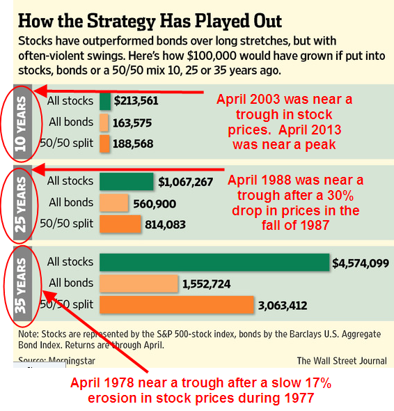
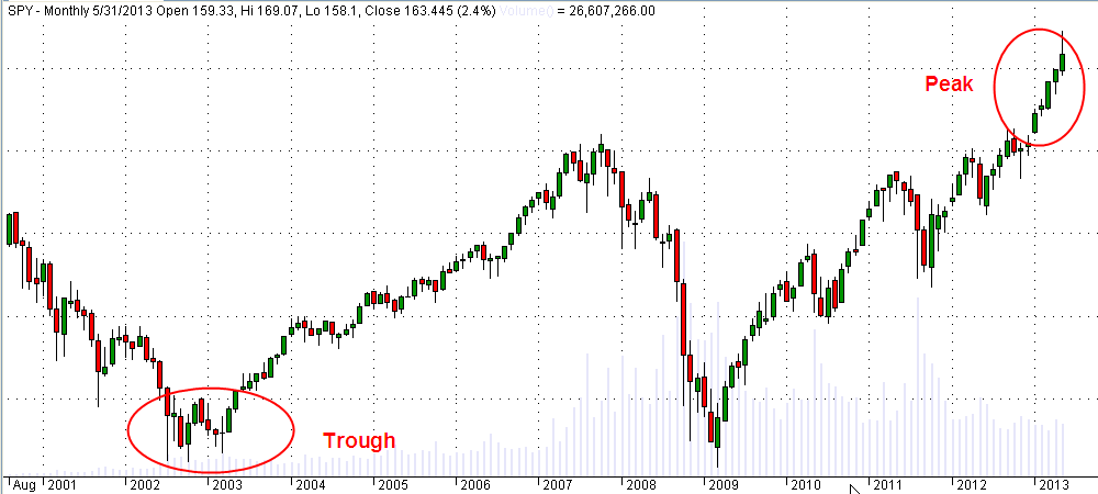
Mutual Funds typically report their performance over several time periods, usually 1, 3, 5, and 10 year periods. This spring, as the SP500 index continue to peak, a ten year lookback window begins near a trough in the index in the spring of 2003.
Why did the WSJ writer pick 25 year and 35 year time periods as a comparison? We can only guess but it just so happens that the starting points of these two lookback periods were also troughs in stock prices. Why not pick 20 and 30 year time periods? Let’s look at the 25 year period which starts in April 1988.
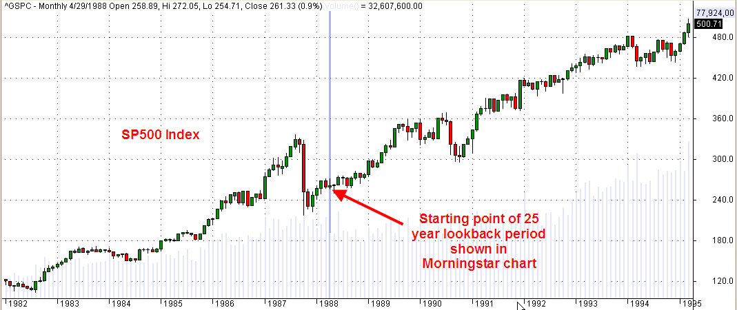
What if the writer had used a 20 year lookback? They would have started in April 1993, when the stock market was 72% higher. I don’t want to take the time to calculate the difference in returns, including dividends, between the different strategies shown in the chart, but the reader can imagine that the difference would be significant.
Why use a 35 year lookback? Why not a 30 year lookback? In 1978, the SP500 index was again pulling out of a trough in prices after a slow slide in values during 1977.

Had the WSJ writer picked a 30 year window starting in April 1983, the stock market index was – again – 72% higher than in April 1978. Again, we can imagine that the comparison of strategies would be significantly different.
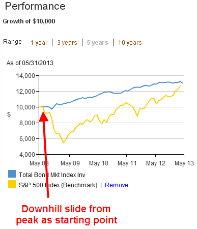
Being aware of these peaks and troughs can help us evaluate past performance of various investment allocations. Consider an example of a 10 year comparison of the SP500 vs a bond index fund like Vanguard’s VBMFX

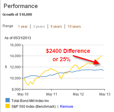
The SP500 index shows the better return but, if we know that spring of 2003 was a trough in this index, we can view such a comparison with some skepticism. A five year comparison tells a different story.
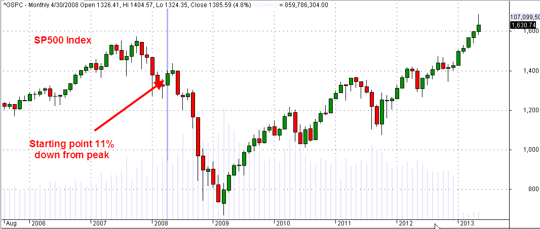
Now we are comparing performance starting with a downslide in the index, when the SP500 had fallen about 11% from its peak. It is also close to the 3 year moving average of the SP500 index.
Based on a five year window and the fact that our starting point was a 3 year average in the SP500, we might conclude that our portfolio should contain mostly bonds. Who needs the aggravation of the volatility in the stock index when we can make the same return with a boring bond index?
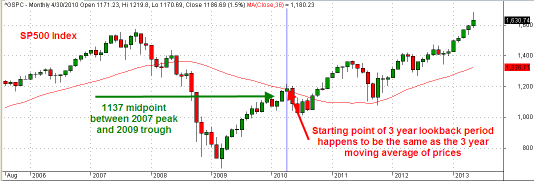
In a 3 year time frame, stocks have clearly outperformed bonds.
Our starting point of this 3 year window also happens to be the 3 year average of the SP500 index. Not only that, it is just a bit above the midpoint between the 2007 index peak and the trough in the spring of 2009. We couldn’t ask for a more reliable starting point to make our comparison.
So we have a second reliable starting point but the conclusion we draw is significantly different from the conclusion we drew in the 5 year comparison. Let’s look closer at this stronger performance of the SP500 vs a bond index.
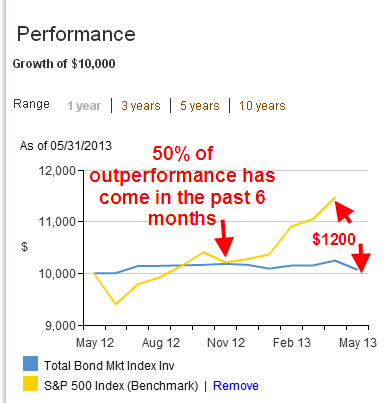
Half of the better 3 year performance of stocks has come in just the last 6 months after the Federal Reserve announced their open QE program of buying government bonds until the unemployment index reaches a target of 6.5%. The recent upsurge in stocks has “goosed” the comparison numbers upwards in favor of stocks.
Our conclusion is that historical performance numbers presented by mutual funds or an investment advisor cannot be taken at face value. It is important to understand the starting point of the historical comparison, which can have a significant effect on the numbers.
