The Power in Our Pockets

September 17, 2023

by Stephen Stofka

This week’s letter is about wages and income and the real purchasing power in our pockets. The auto workers’ union (UAW) went on strike limited to three auto plants while they continued negotiations with the auto companies. Nurses at Kaiser Permanente have voted to go out on strike by September 30th if they cannot resolve outstanding differences with Kaiser’s management. Executive compensation at the auto companies is now more than 300 times the average worker’s pay, the UAW points out, claiming that workers have as much right to share in the profits as executives and shareholders.

Legislation passed after the financial crisis required that publicly held companies report their CEO-to-Worker pay ratios. A recent analysis of companies in the SP500 estimated a pay ratio of 272-1 in 2022. The auto industry is part of the consumer cyclical industry, whose median executive compensation in 2021 was $13.7 million, as reported by Equilar. In 1965, the pay ratio was approximately 20-1. In the 1980s, the Reagan administration adopted a relaxed regulatory stance to corporate mergers and companies have grown much larger in the past decades. The pay ratio, however, has grown out of all proportion to the growth in corporate size.

A combination of factors contribute to high relative CEO pay. Thomas Greckhamer (2015) identified six paths – configurations of various factors – that are present in countries with high CEO pay and those without high CEO pay. He found that the relative pay of CEOs is high in countries where equity markets are well developed and highly liquid. Ownership is widely dispersed so that the CEO enjoys more power relative to stock owners and can negotiate higher compensation packages. CEOs do not have high relative pay in high welfare states where there are strong worker rights. A cultural acceptance of inequality and hierarchical authority, termed “power distance” by Geert Hofstede in 1980, contribute to high relative CEO pay. Here is a quick explainer. As a comparative example, the power distance factor in the American culture is low, half that of Mexico.  

Companies today derive their revenue and profits globally. For that reason it is not accurate to divide corporate profits by the number of employees in the U.S. I am going to do it anyway just to show the profound change that has taken place since the 1970s, a benchmark decade often cited as the beginning of growing inequality in the pay ratio. In the chart below I have adjusted after-tax corporate profits (FRED Series CP) for inflation, then divided that by the number of employees reported by the BLS (FRED Series PAYEMS). The trend is more important than the actual figures. Even though the 2010s were relatively flat the level of profits per employee was about double the level of the 1990s. Let’s compare that to worker incomes.

Since 1992, median household income adjusted for inflation has risen 23%, a level that is far below the rise in profits per worker. The chart below shows the gain on a log scale. Real incomes have gained less than 1% per year.

A few weeks ago I proposed adjusting prices by a broad index of house prices instead of the CPI. Two-thirds of American households own their home and home values reflect the discounted flow of housing services that we get from a home during our lifetimes. Housing costs are already almost half of the CPI and trends in home prices capture the feel of inflation on household budgets more accurately than the many CPI measures economists currently use.

During the 1980s and 1990s, housing prices increased 4% annually. The chart below describes the median household income adjusted by the all-transactions home price index (FRED Series USSTHPI). Notice that household incomes during those two decades stayed on an even keel.

Had the Fed structured their monetary policy to keep home price growth at the same level as the 1980s and 1990s, real incomes would be near the level of the green line, 10% higher today. Instead, workers feel as though they are on the path of the red line, regardless of what official measures of real household income indicate. The red line reflects a sense of discomfort and tension in many American households that plays out in our politics. The trend began with housing and finance policies enacted by both parties in Congress across five Presidential administrations.  

///////////////////

Photo by Charles Chen on Unsplash

Keywords: home prices, labor unions, wages, income, household income

Greckhamer, T. (2015). CEO compensation in relation to worker compensation across countries: The configurational impact of country-level institutions. Strategic Management Journal, 37(4), 793–815. https://doi.org/10.1002/smj.2370

An Alternative Monetary Rule

August 27, 2023

By Stephen Stofka

This week’s letter is a prediction that house price growth will decline to near zero in the coming few years based on historical trends of price growth and the 30-year mortgage rate. The pattern is similar to that in the late 1970s and mid-2000s. In each case the Fed kept its key interest rate below the annual rate of home price appreciation to achieve a broad economic growth. In each case that accommodating monetary policy helped fuel a bubble that led to severe recessions when the economy corrected.

This week the National Association of Realtors (NAR) reported another drop in existing home sales, the fourth drop in the past five months. At the same time, the Commerce Department reported that new single family home sales in July were up 31% over the same month last year. At first glance, that seems excessive but this past quarter was the first positive annual gain in single family home sales since the second quarter of 2021. Existing homeowners are interest rate bound to their homes until mortgage rates come down. New homes are filling the inventory gap.

Residential investment, which includes new homes and remodeling costs, contributes only 3-5% to GDP, according to the National Association of Home Builders. It varies by several factors. Homebuilders rely on the crystal ball predictions of the banking industry for financing. Homeowners’ remodel plans depend on the growth in home equity and interest rates available for financing. The pandemic sparked a shift in consumer preferences for existing homes. During the pandemic, new home sales decreased but remodeling increased. In this recovery period, the opposite has occurred. Home Depot has reported two consecutive quarters of negative sales growth, the first time since the housing crisis 15 years ago.

Let’s look at two previous periods when monetary policy was a major contributing factor to a subsequent decline in home prices and a recession. In the chart below (link to FRED chart is here), the red line is the average 30-year mortgage rate. The green line is the annual change in a broad home price index. As soon as the green line gets above the red line, homebuyers are making more in price appreciation than they are paying in interest, a form of arbitrage. That signals that monetary policy is too accommodating. The dotted line in the graph is the effective federal funds rate (FRED Series FEDFUNDS). Mortgage rates follow the Fed’s lead. In the mid-2000s, home price growth, the green line in the graph, rose up above the red mortgage interest line. As it did in the late 1970s, the Fed was watching other indicators and was slow to raise interest rates.

The period between the mid-1980s and the financial crisis is called the Great Moderation. From the end of the 1982 recession until the late 1990s, the Fed kept its key interest rate (dotted line) higher than home price appreciation and lower than the 30-year mortgage rate, a moderating balance. Since 2014, home price growth has been above the 30-year mortgage rate. When this latest period of arbitrage unwinds, the effects will disturb the rest of the economy. When will that moment come?

Asset bubbles leave an economy vulnerable to shocks. In an interconnected global economy, disturbances from malinvestment can cascade through one prominent economy to test the strength of institutions and businesses in other countries. The U.S. financial crisis demonstrated that process. The foundations of companies like AIG and Goldman Sachs, thought to be financial fortresses, cracked and threatened a collapse that would bring other large companies down with them.

One of the roles of a central bank is to curb the heady expectations that fuel asset bubbles. In a 1993 paper John Taylor introduced a rule, now called the Taylor rule, to guide the Fed’s setting of interest rates. His rule was based on the actual decisions that had guided Fed policy during the decade that followed the severe 1982 recession, part of a period called the “Great Moderation.”

In their textbook on money and banking, Cecchetti & Schoenhoeltz (2021, 498) describe the rule succinctly: Taylor fed funds rate = Natural rate of interest + Current inflation + ½ (Inflation gap) + ½ (Output gap). I’ll leave the equation in the notes at the end. This policy rule was meant as a guideline so the equals sign should probably be read as an approximately equals sign. John Taylor originally used 2% as the natural rate of interest. To simplify the calculation and understand the relationships, the authors present a simple scenario. If the inflation rate is 2% and the target inflation rate is 2%, then there is no inflation gap. If real (i.e. inflation-adjusted) GDP growth is 2% and potential output is also estimated to be 2%, then there is no output gap. I’ll note the calculation in table format below:

The Congressional Budget Office (CBO) estimates potential GDP based on a full utilization of the economy’s resources. Here’s a screenshot of the two series since the financial crisis. Real potential GDP is the red line. Real actual GDP is the blue line. The financial crisis in 2007 – 2009 had profound and persistent effects on our economy. The graph is drawn on a log scale to show the difference in percent. As a guideline, the gap for 2012 is about 3%.

I propose using the inflation in house prices as a substitute for the inflation part of the calculation. I’ve included the equation in the end notes. Presumably, home price growth implicitly includes the neutral rate of interest so I exclude that from this alternative measure. The price of a home includes a decades-long stream of owner equivalent rent priced in current dollars. It incorporates estimates of housing consumption and long-term wealth accumulation. Home prices include evolving community characteristics and public investment like the quality of schools, parks, transportation, employment and personal safety. They are a broad market consensus. This particular series is compiled quarterly but follows the trend of the monthly Case & Shiller National Home Price Index, giving the central bank timely home price trends.

Fifty years ago, Alchian and Klein (1973) proposed that central banks include asset prices in their formulation of monetary policy. They wrote that a composite index of many types of assets would be an ideal measure but difficult to calculate. A broad stock index like the S&P 500 would capture the current price of capital stock but stocks can overreact to interest rate changes by the central bank (p. 180, 183). The S&P500 index is relatively volatile, with a 10-year standard deviation of 14.88%. The 30-year metric is 15%. The home price index is stable, with a 40-year standard deviation of just 4.74%, slightly above the 4.07% deviation of the Federal funds rate itself.

During the early years of the Great Moderation, this alternative policy rule was approximately the interest rate policy that the Fed adopted. In the graph below is the alternative rule in red and the actual Fed funds rate in blue. Notice the sharp divergence just before the 1990 recession. In the aftermath of the Savings and Loan crisis, the annual growth in home prices fell from 7% in 1987 to 2.5% in the fall of 1990. This was below the 4% long-term average of home price growth, signaling a call for a more accommodating monetary policy. The Fed did not recognize the economic weakness until it was too late and the economy went into a mild recession. For several years following the recession, the labor market struggled to regain its footing and this slow recovery contributed to President H.W. Bush’s defeat in his 1992 re-election bid.

The employment slack of the first half of the 1990s might have been lessened by a monetary easing. In the second half of that decade, the alternative rule called for a tighter monetary policy, which would have curbed the enthusiasm in the stock and housing markets. The divergence between the alternative rule and the actual Fed funds rate grew as the housing bubble developed. By the time the Fed started raising interest rates in 2004-2005, it was too late.

I will finish up this analysis with a look at the past decade. The alternative rule and the Taylor rule would have called for a higher policy rate. Persistent low rates helped fuel a growing price bubble in the housing market. The pandemic accentuated that trend. High home prices have contributed to unaffordable housing costs in popular coastal cities, sparking a surge in homelessness.

 Exiting an asset bubble is painful. Expansion plans are put on hold. As investment decreases, hiring growth declines and unemployment rises among those most vulnerable in the labor force. Withholding taxes decline, reducing revenues to state and federal governments who must carry the additional burden of benefit programs that automatically stabilize household incomes.

Housing costs constitute 18% of the core price index that the Fed uses to gauge inflation, but accounts for 40% of core price inflation. Because housing is a major component of household expenditures, home prices can act as a stable measure of inflation. Home prices capitalize the future flows of those expenses. Persistently low interest rates can distort those calculations, promoting malinvestment and an asset bubble. This alternative rule incorporates that signal into policymaking and should help the Fed make more timely course changes before the disturbances spread throughout the economy.

/////////////////

Photo by Tierra Mallorca on Unsplash

Keywords: Savings and Loan Crisis, Financial Crisis, Inflation, Federal Funds Rate, Taylor Rule, Home Price Index

(1) FFR = NRI +πt + α(πt – πt*) + ß(γt – γt*), where
π is the annual change in the Personal Consumption index (FRED Series PCEPI).
NRI is set at 2.0%.
γ is the natural log of real GDP (FRED Series GDPC1) and
γ* is real potential GDP (FRED Series GDPPOT).
α and ß coefficients are the degree of concern and should add up to 1. If inflation is more of a concern then α would be higher than ½. If output is more of a concern ß would be more than ½.

(2) Alternative Taylor Rule: FFR = hpi +  α(hpi – avg30(hpi)) + ß(γt – γt*), where
hpi = the annual percent change in the All-Transactions House Price Index (FRED Series USSTHPI).
avg30(hpi) is the 30 year average of the hpi.

Alchian, A. A., & Klein, B. (1973). On a correct measure of inflation. Journal of Money, Credit and Banking, 5(1), 173. https://doi.org/10.2307/1991070.

Cecchetti, S. G., & Schoenholtz, K. L. (2021). Money, banking, and Financial Markets. McGraw-Hill.

Home Prices and Monetary Policy

July 30, 2023

by Stephen Stofka

This week’s letter is a proposal for an alternative measure to guide the Fed’s monetary policy. In 1978, Congress passed the Full Employment and Balanced Growth Act which gave the Fed a dual mandate – giving equal importance to price stability and full employment. The Canadian central bank has a hierarchical mandate with price stability as a priority. As with most Congressional mandates, the legislation left it up to the agency, the Fed, to determine what price stability and full employment meant. The Fed eventually settled on a 2% inflation target. Full employment varies between 95-97% and is hinged on inflation.

For its measure of inflation, the Fed relies on the Bureau of Labor Statistics (BLS) who conducts monthly surveys of consumer expenditures.  The BLS compiles a CPI based on the its price surveys of hundreds of items. The Fed prefers an alternative measure based on the Consumer Expenditure Survey, but the weakness in both measures is the complexity of the methodology and the inherent inaccuracy of important data points.

According to the BLS, housing costs account for more than a third of the CPI calculation. Twenty-five percent of the CPI is based on an estimate of the imputed rental income that homeowners receive from their home. This estimate is based on a homeowner’s response to the following question:   “If someone were to rent your home today, how much do you think it would rent for monthly, unfurnished and without utilities?” How many owners pay close attention to the rental prices in their area?  The BLS also surveys rental prices but tenants have six to 12 month leases so these rental estimates are lagging data points. The BLS tries to reconcile its survey of rents with homeowners’ estimates of rents using what it admits is a complex adjustment algorithm. 

The BLS regards the purchase of a home as an investment, not an expenditure so it must make these convoluted estimates of housing expense. There is a simpler way. Buyers and sellers capitalize income and expense flows into the price of an asset like a house. The annual growth in home prices would be a more reliable and less complex measure of inflation. Federal agencies already publish monthly price indexes based on mortgage data, not homeowner estimates and complex methodology. An all-transactions index includes refinancing as well as purchases. Bank loan officers have a vested interest in monitoring local real estate prices so their knowledge is an input to the calculation of a home’s value when an owner refinances.

The Federal Housing Finance Agency (FHFA) publishes the All-Transactions House Price Index based on the millions of mortgages that Fannie Mae and Freddie Mac underwrite. From 1990 – 2020, home prices rose by an average of 3.5% per year. A purchase only index that does not include refinances rose almost 3.9% during that period. As an aside, disposable personal income rose an average of 4.6% during that period.

The Fed does not need authorization from the Congress to adopt an alternative measure of inflation to guide monetary policy. As its strategy for price stability, the Fed could set a benchmark of 4% – 5% home price growth, near the 30 year average. If house prices are rising faster than that benchmark, monetary policy is too accommodating and the Fed should raise rates. Since the onset of the pandemic, home prices have risen 11% per year, three times the 40 year average. This same growth marked the peak of the housing boom in 2005-2006 before the financial crisis. The Fed did not begin raising interest rates until the spring of 2022. Had it used a home price index, it would have reacted sooner.

The annual growth in home prices first rose above 4% in the second quarter of 2013. The Fed kept interest rates at near zero until 2016, helping to fuel a boom in both the stock market and housing market. Since 2013, house prices have stayed above 4% annual growth, helping to fuel a surge in homelessness. Let’s look at several earlier periods when using home prices as a target would have indicated a different policy to monetary policymakers at the Fed.

In 1997, the annual growth of home prices rose above 4% and remained elevated until the beginning of 2007 when the housing boom began to unravel. In 2001, home prices had risen almost 8% in the past four quarters but the Fed began lowering its benchmark Federal Funds rate from 5.5% to just 1% at the start of 2004. The Fed was responding to increasing unemployment and a short recession following the dot-com bust. Near the end of that recession came 9-11. By lowering rates the Fed was pushing asset capital that had left the stock market into the housing market where investors took advantage of the spread between low mortgage rates and high home price growth.

In 2004, home price growth was over 8% and accelerating. Had the Fed been targeting home prices, it would have acted sooner. However, the Fed waited until the general price level began rising above its target of 2%. In the 2004-2006 period, the Fed raised rates by 4%, but it was too late to tame the growing bubble in the housing market. In 2005, home prices grew by 12% but began responding to rising interest rates. By the first quarter of 2007, home price growth had declined to just 3.3%.

The Fed models itself as an independent agency crafting a monetary policy that is less subject to political whims. However, the variance in their policy reactions indicates that the Fed is subject to the same faults as fiscal policy. If the Congress is crippled, then the Fed feels a greater pressure to react and is helping to fuel the boom and bust in asset markets. Let’s turn to the issue of full employment.

The condition of the labor market is guided by two surveys. The employer survey measures the change in employment but does not capture a lot of self-employment. The household survey captures demographic trends in employment and measures the unemployment rate. The BLS makes a number of adjustments to reconcile the two series. The collection of large datasets and the complex adjustments needed to reconcile separate surveys naturally introduces error.

The labor market has experienced large structural changes in the past several decades. Despite that, construction employment remains about 4.5 – 5.5% of all employment so it is a descriptive sample of the condition of the overall market. Declines in construction employment coincide with or precede a rise in the unemployment rate. In the past 70 years, the construction market has averaged 1.5% annual growth. During the historic baby boom years of the 1950s and 1960s, the growth rate averaged 2%. The Fed might set a target window of 1.5% – 2.5% annual growth in construction employment. Anything below that would warrant accommodative monetary policy. Anything above that would indicate monetary tightening. In 1999, the growth rate was 7%, confirming the home price indicator and strongly suggesting that fiscal or monetary policy was promoting an unsustainable housing sector boom.  

If the Fed had adopted these targets, what would be its current policy? The FHFA releases their home price data quarterly. The growth in home prices has declined in the past year but was still 8.1% in the first quarter of 2023. However, the S&P National Home Price index tracks the FHFA index closely and it indicates a slight decline in the past 4 quarters. Growth in construction employment has leveled at 2.5%, within the Fed’s hypothetical target range. The combination of these two indicators would signal a pause in interest rate hikes. This week, the Fed continued to compound its policy mistakes and raised interest rates another ¼ percent.  

////////////

Photo by Rowan Heuvel on Unsplash

New Year, No Fear

January 4th, 2015

As the calendar flips from December to January, some favorite activities are predictions for the coming year and reviews of the past year.  Here are a few predictions I’ve heard in the past few weeks:

“We think oil will continue to drift downwards as global demand slackens.”

“We think long term Treasuries will continue to show strong gains in the coming year.”

“Output remains strong, and the labor market continues to strengthen.  We expect further gains in the stock market this year.”

“We expect gold to find a bottom in the $900 to $1000 range and we will be initiating a long position at that time.”

Predictions are foolish, of course.  They are too certain.  An expectation is a bit more sober, a pronouncement of a probability.  Did anyone hear these expectations at the beginning of 2014?

“Oil prices will decline by 40% this year.”

“We expect long term Treasuries to gain 25% in 2014.”

“We expect the euro to fall to a 4-1/2 year low against the dollar.”

I don’t remember any of those predictions at the beginning of 2014.  So here’s my expectation – er, prediction: in 2015, I will be surprised by some of the events that will unfold.

If that doesn’t satisfy your prediction craving, here are several – let’s call them guesstimates – of SP500 earnings and price predictions in 2015.

*********************

Blue Light Specials

As I mentioned a few weeks ago, there are a few stock sectors that are “on sale,” selling below their 200 week, or 4 year average.  Falling gas prices in the last half of 2014 have had a negative impact on energy stocks (XLE, VDE).  Selling below their 200 week averages in December, both ETFs are hovering at their 200 week average.  The 50 week average is above the 200 week average, indicating that this is, so far, a relatively short term trend.

Emerging markets have been in the doldrums for a year and a half.  The 50 week average is just about to cross above the 200 week, signalling that the downturn may have exhausted itself.

The mining sector (XME) is down – way down.  The 50 week average is below the 200 week average and current prices of this ETF are below the 50 week average.  The mining sector can be quite cyclical but could be quite profitable in the next six months.

In the summer of 2011, the oil commodity ETF USO lost a third of its value.  In the melt down of 2008, it lost 75% of its value, falling from $115 down to near $30.  This week USO broke below $20, losing half of its value since July.  Since September 2009, shortly after the official end of the recession, the 50 week average has been trading in a range of $34 to $38, and is currently at the low point of that five year range.  While this may not be appropriate for a casual investor, it might be worth a look for those with some play money.

Other sectors – industrials, materials, finance, health, technology, consumer staples, consumer discretionary, retail and utilities – are above both their 50 and 200 week averages.

*********************

Happiness Is An Open Wallet

The Conference Board’s Consumer Confidence gauge rose still further above 90 in December.  At some time in the distant past, in a year called 1985, all the people were happier than they are today.  That long ago time became the benchmark 100 for this index.  The index number is less important than the trend of confidence – whether it is rising, falling or staying the same.

The Case Shiller 20 City Home Price Index for October showed a 4.5% yearly gain.  The double digit gains of last year and the first six months of 2014 were unsustainable.  However, I would be concerned if this continues to fall toward zero, indicating a serious softening of demand, or a lack of affordability or both.

***************************

The non-SP500 World

The SP500 index, composed of the 500 largest companies in the U.S., was up 11.4% for 2014. An index of mid, small and micro-cap companies was up a more modest 7.1% (Standard Poors) for the year.  An index of REITs was up 25.6% in 2014 after stalling during much of 2011, 2012 and 2013. I was surprised to learn that during the past twenty years, REITs outperformed the SP500.

Conventional wisdom holds that rising interest rates are bad for REIT stocks.  A study of REIT performance shows that the impact is less than most investors think. In addition, the income growth generated by REITs has outpaced inflation in all but one out the past 15 years. VNQ and RWR are two ETFs in this market space.  VNQ has a 10 year return of about 9%, RWR a bit less.

***************************

Social Security

The Social Security program depends on current taxes to pay current beneficiaries.  In per person inflation adjusted dollars, the federal government collects twice the amount of money it did forty years ago.  Per person revenues have almost caught up to the levels of 2006.

The problem is that there are a lot of people starting to retire.  Politicians of both parties have spent the excess social security taxes collected in the past decades.  Last week I asked what you would do if the stock market lost 30% of its value.

This week’s sobering question for those in or near retirement:  what would you do if social security payments were reduced, or means tested?  With the stroke of a pen, Congress could reduce the maximum monthly benefit from $2533 to say $2100.  This would affect a relatively small percentage of voters, those with higher incomes, a favorite target for benefit cuts.  Perhaps you are taking care of an ailing child or parent and need the income.  You might submit a 4 page form listing your pensions, IRAs, the assessed value of your home and any mortgage you had against the house, your mutual funds, stocks and bonds.  Using a complex formula to factor in your age, special circumstances, the cost of living index in your area and the total of your assets, the Social Security Administration would calculate your monthly benefit.  Can’t happen here in the land of the free, home of the brave?

A Busy Week

October 5, 2014

On Monday George and Mabel flew to Portland, Oregon so Mabel could attend a teacher conference in Eugene on the development of strategies and practices for online learning.  “How’d you get invited?  You’re retired,” George had asked a few months earlier.  Mabel had spent many years both as a teacher and high school principal.

“The conference is focused on post-secondary education, but Lorraine thought I would be interested and wangled me a spot.” Her friend Lorraine was a department chair at a local community college. “I might be able to give her some perspective from the high school level as these kids make the transition to college courses.”

They had to get up early to make the morning flight.  Retired people should only get up this early when they are having a colonoscopy, George thought.  After the conference, they planned to spend a few days on the Oregon coast, which they were both looking forward to.  They sat in the Denver airline terminal awaiting the boarding call.  George couldn’t understand most of what they said.  Millions of dollars to build an airport and the contractors seemed to have bought the cheapest speakers through somebody’s Uncle Harry who knows a guy who’s got a connection with some exporter in Malaysia. Airline service had become little more than a subway in the sky.  In fact, the speakers sounded just as bad as the ones used in New York subway cars.  “Gate 23, now pre-boarding …” came out of the speakers as “Ateleeteehoweeornayhinienegetcrispbeergoremekeens.” Passengers, please get in the metal tube, sit down and be quiet.  The metal tube will go up in the air and deposit you at your destination.  Transportation for the masses.  The future has turned out slightly different than the one imagined at the New York World’s Fair in 1964.

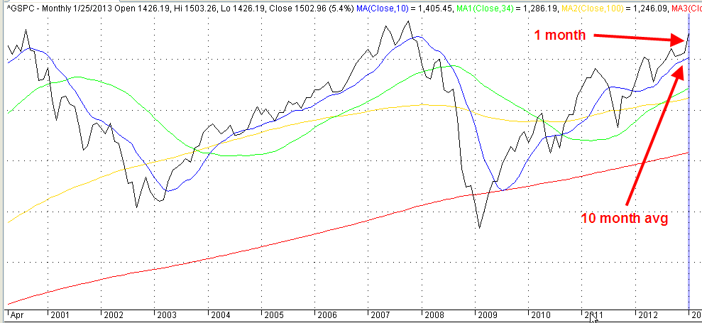
In Portland they rented a car and drove down to Eugene.  Settling down in their hotel room, George was pleasantly surprised to find they had good wi-fi reception.  The market had been up but had closed below Friday’s close, indicating that there was still more negative sentiment to come.  Personal income in August had gained 4.3% above the level of August 2013.

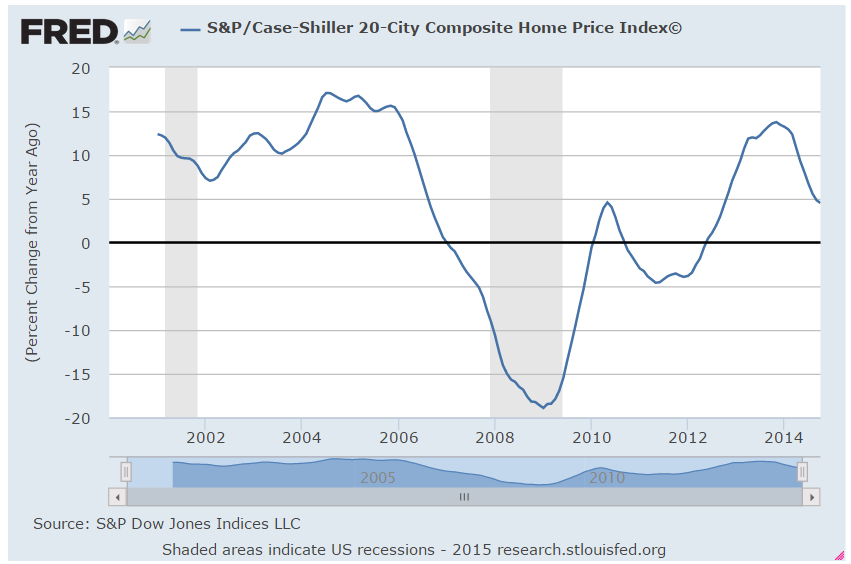
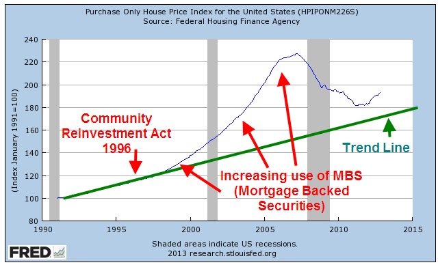
That bit of good news was offset somewhat by a report from the National Assn. of Realtors that year-over-year pending home sales were down a little bit more than 2% in August.  This confirmed last week’s housing reports and made it unlikely that tomorrow’s Case-Shiller report on home sales would have any positive surprises.

Tuesday morning, George slept in while Mabel got up early to go to the nearby conference at the University of Oregon.    He missed the free breakfast at the hotel but the woman at the reception desk pointed him to a nearby coffee shop that served egg croissants and a good cup of coffee. The sun broke out on the short walk to the coffee shop, brightening George’s mood.  Despite the mid-morning hour, a number of people sat in the coffee shop working on their laptops.  West coast time was three hours behind New York so half of the day’s trading had occurred before many Oregonians had started work.

The Case-Shiller home index showed that home prices in 20 metropolitan areas had declined for the third month in a row.  Year over year gains were still positive at 6.7% but the pace of growth was slowing. Last Friday’s Consumer Confidence survey from the U. of Michigan had been positive and rising.  A separate Confidence survey by the Conference Board was positive but showed a declining sentiment on worries about employment and income.

In the afternoon, he drove near the campus to meet Mabel.  The campus was an artist’s rendition of what a college was supposed to look like.  Shade trees dotted the grounds between the grand buildings of gray stone.  Lawns and bushes were clipped but didn’t look overly manicured.  The concrete walkways that led from one building to another were well maintained but showed the typical wear of traffic and a wet climate.  The ghosts of mankind’s great minds and talents would feel comfortable on these grounds and in these halls.

Mabel introduced George to several colleagues attending the conference.  Most attendees were teachers and administrators in their forties and fifties.  For 300 years, teachers and students had gathered in  a classroom in what was called face-to-face education.  Students prepared for class at home at various times outside of the classroom but the daily routine of classes centered the educational activity of the students.  Online learning was a new phase in distance learning, attempting to blend the broader educational training of traditional colleges and universities with the asynchronous methods of the correspondence schools of the past century.

On Wednesday came further confirmation that the growth in housing sales and construction was slowing.  Year-over-year construction spending had increased 5% but the growth had declined for 9 months.  George thought this was a fairly normal cycle but the market reacted negatively, dropping more than 1% by the end of the day.

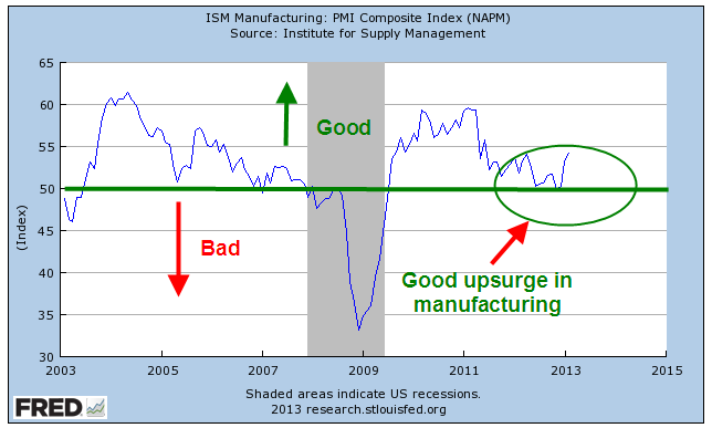
European Central Bank head Mario Draghi announced that they would continue to keep interest rates low to help spur the non-existent growth or decline in many European countries.  The private payroll processor ADP reported job gains of 215,000, slightly above expectations.  The Institute for Supply Management (ISM) showed a slight decline from the robust growth of the previous month but overall a very positive report.

Wednesday evening after the conference had concluded, George and Mabel had dinner at a restaurant with two women who had attended the conference.  The conversation was lively, the food a bit pricey for the quality but George enjoyed the evening.  For the past two days he had encountered many young people, reminding him of his college days decades before.

“I’ve decided I want to be 20 years old again, only not as dumb and inexperienced,” George quipped. He remembered sagely pronouncing that Fitzgerald’s novel, The Great Gatsby, was about social classes that no longer existed in America and was irrelevant. Somehow he had survived his own poor judgment.  He did want to jump high in the air once again, twisting toward the basket and snapping a 3-point shot at the basketball net.  The losses in physical vitality were offset by the gains in sagacity, George hoped.

On Thursday, George and Mabel woke up early (again! two times in one week!) to drive out from Eugene to the Oregon Coast.  At the Oregon Dunes they walked through coastal rain forest, then dunes, then a less dense strip of rain forest, then beach and ocean. “I get smaller the more I walk,” he told Mabel.  “What do you mean?” she asked.  “We walk through places like this, they’re like landscapes, I guess you could call it, shaped by this wind around us, the ocean out there,  and underneath our feet the earth is shifting about.  It’s like we’re teeny tiny bacteria walking on the ridges of paint left by some artist’s brush.”

Mabel smiled, “Well put.”  She paused.  “With the physical classroom, students and teachers can have field trips out to the Oregon dunes.  How do we take that and put it in an online environment?” she wondered.  George glanced at her.  “Someone has brought the conference to the beach, I think.” Later, they stopped off for a coffee in the old town of Florence before ending the day in Yachats where they stayed at the Overleaf Inn.

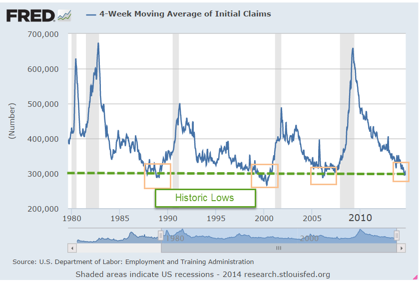
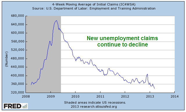
I could get used to this, George thought, checking the market news from his balcony while the last streaks of sunset and orange turned to purple and gray out over the ocean.  The BLS reported that the 4-week average of new unemployment claims had fallen below 295,000.

Levels lower than this had occurred rarely – in early 2006, 2000 and the winter of 1987-88. Yet there was no dancing in the streets.

Instead, investors focused on the 10% drop in factory orders for August.  Most of the decline was due to volatile aircraft orders, which had surged in July followed by an equal drop in August. The market remained flat.

On Friday, George and Mabel walked several miles on the 804 trail, a sometimes dirt, sometimes asphalt path that ran for many miles along the Oregon cliffs.  They ate at the Drift Inn that evening.  Good food.  “You think there’s much work for younger folks around here other than the tourist industry?” he asked Mabel.  “I doubt it,” she replied. “We’ve seen a lot of twenty-somethings working at hotel reception desks, waiters, waitresses, the coffee shop in Florence.  They can’t be making a lot of money.  Still it is lovely here”, she mused.  “Could be more sun, ya know?”  George nodded.  “We’re kinda spoiled in Colorado,” he said.

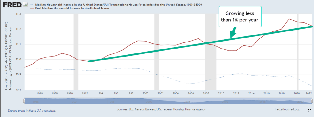
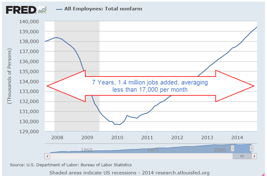
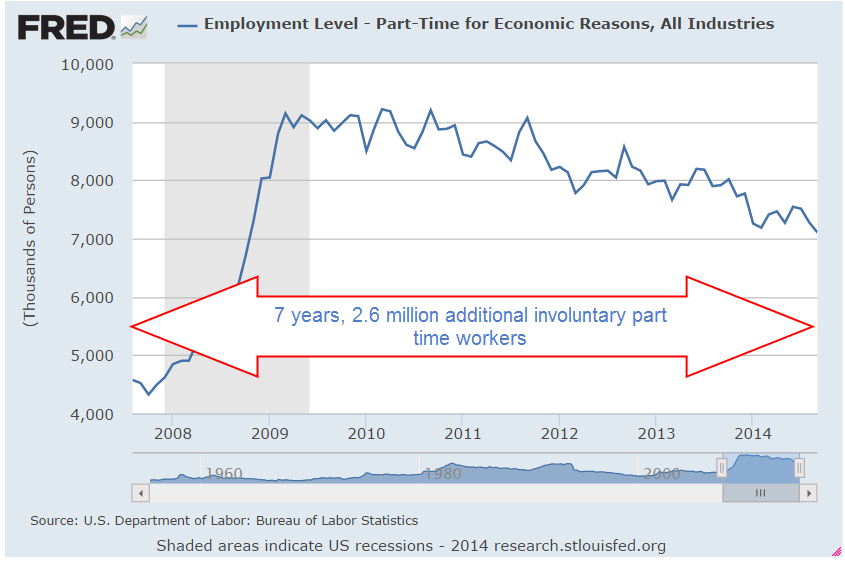
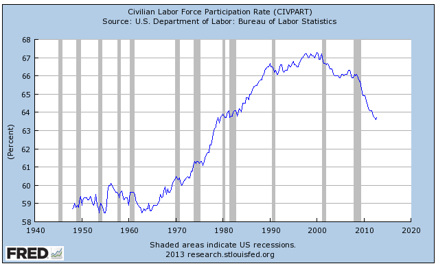
When they returned to their hotel room later that night, a stiff wind blew off the ocean, bringing with it a bit more chill than either of them had packed for on this trip.  George checked the monthly employment data released that morning by the BLS.  Job gains had surprised to the upside at almost 250K but the market had still closed below Wednesday’s opening price and was still below the 10-day average. He pulled up some FRED data to get a snapshot of the relative health of the labor force seven years after the start of the recession.   The results were rather chilling – or maybe it was the dampness of the Oregon coast that he was unaccustomed to.  In seven years the number of employed people had grown just 1% – not 1% annually but 1% total for the entire time.

2.6 million more people were working part time because they could not find full time work. The number of underemployed had grown almost twice the 1.4 million new jobs created in seven years.

The unemployment rate had dropped below 6% in September but even that bit of positive news did not look so good when George pulled up the historical snapshot of unemployment since the recession began.

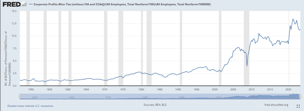
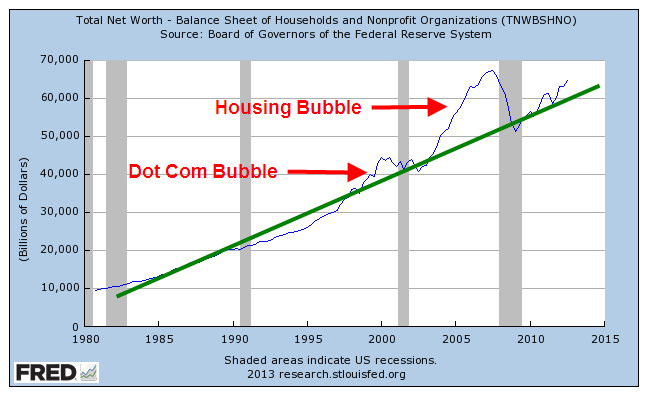
The rate had risen more than 1% in those seven years.  Despite all the talk of recovery, the surge of stock prices from the lows of 2009 and the rise in home values, the labor market was still wounded.

“Why don’t you help me figure out where we’re going to stay tomorrow in Newport?”, Mabel asked.  “One of my friends suggested the Elizabeth St. Inn.”
“Fine with me.  I want to see the Aquarium if it’s open,” George replied.  “Hey, check out the moon.”  Then he put on his windbreaker, pulled a blanket off the bed and went to sit out on the balcony.  Through the shifting clouds, moonlight shone softly on the water below.  Mabel, taking a cue from her husband, tugged a blanket from the second bed, wrapped it around her and sat with him.

Shoot Out At the OK Corral

October 20th, 2013

This coming Saturday is the 132nd anniversary of the gunfight at the OK corral.  We got our own OK corral in Washington and there was a whuppin’ this week – a Washington style whuppin’, which means that no one got whupped but everyone agreed on an appointment date for a  future whuppin’.

Congress passes a continuing budget resolution with the same frequency that many of us get our teeth and gums cleaned.  Many government reports were not released this past week but the National Assoc of Homebuilders (NAHB) released a very positive monthly report of the national housing market, showing a slight decline over the past few months last month but still a strong index reading of 55.  Two years ago this October, that index stood at 15.  In fact since the latter part of 2007, the index oscillated in the range of 15 – 20, so this has been a strong and sustained growth surge.

Over the past hundred years, house prices have risen at about the same rate as inflation, so that the real price of homes stays about the same.  Most homeowners finance their home purchase and it is this interest cost that determines the total capital cost of the home.  That capital cost and the interest cost is divided over the life of the mortgage into monthly payments.  PITI is a familiar acronym to many home owners and buyers; the initials represent the components of a monthly house payment. The ‘P’ stands for Principal – the monthly capital cost of the home.  The ‘I’ is interest on the amount of the loan.  The ‘T’ represents the local real estate taxes which are included in the monthly house payment sent to the mortgage servicer who forwards them on to the local taxing agency. The ‘I’ represents Insurance.  This can be both house insurance and, for those with an FHA loan, the amount of the loan insurance.  The interest rate on the home loan is a key component and although there has been an increase in mortgage rates since the spring, they are near all time lows.  A 30 year mortgage is a common benchmark.

Let’s index the CPI and the house price index to 1991 and look at the divergence.

Declining interest rates have enabled many more people to qualify for a home purchase, thus driving up home prices. In 1995, Congress made some major revisons to the 1977 Community Reinvestment Act, making home loans more available in distressed urban and rural districts.  This further exacerbated the rise in home prices, creating a large divergence between the CPI and the housing price index.

As every homeowner knows, the cost of a home includes maintenance, repairs, utilities, and improvements.  As I discussed last week , real median household incomes plateaued during the 2000s.  The rise in home values and changes in banking laws enabled homeowners to tap the equity in their homes to meet these additional obligations and to augment stagnant incomes.

In the past dozen years, many people discovered that housing is not a reliable source of income.  At the turn of the century, stock traders who quit their jobs to trade stocks during the tech bubble, discovered the same truth about the stock market, whose price returns are a few percent above inflation.  A nifty calculator at  DQYDJ illustrates the average returns of the SP500 over the past 100 years.


At the heart of the financial follies of past centuries is that a surge in price for some asset, be it tulip bulbs, Florida real estate or tech stocks leads people to conclude that they can hop on the gravy train.  What is the gravy train?  As an asset increases in value, more people invest in the asset bubble, the valuation continues to rise and – for a time – it is possible to convert a stock, a store of value, into a flow of income by either buying and selling the asset or borrowing money against the asset.  There is always some constraint – the rise of inflation, or the rise of personal incomes, or the growth rate of profits – that eventually brings an asset valuation down to earth.  Einstein famously quipped that the most powerful force in the universe was compound interest.  He might have mentioned  what may be the most powerful force – reversion to the mean.

Blossoms and Blight

March 24th, 2013

The Blossoms

There have been a number of encouraging reports these past several months, helping to fuel new highs in the popular SP500 stock index.  After falling off dramatically five years ago, real (inflation adjusted) retail sales finally surpassed 2007 levels.

Housing prices around the country are on the mend.  Although the purchase only home price index is still below the vaulted levels of the bubble years, it is exactly where it would have been if there had been no bubble and housing prices had grown at their customary 3 – 4% per year.

In recent months, the manufacturing sector of the economy has surged upward, rebounding from weakness in the latter part of 2012.  For the past year, the Eurozone has been in or near recession, yet some are hopeful that increased demand in this country and some emerging markets are helping to balance the contractionary influence of decreased demand in the Eurozone.  Let’s hope that this surge in the first part of the year does not fade as it did in 2012.

New claims for unemployment continue to decline. 

The Blight

But a 7.7% unemployment rate and a record 14 million disabled (SSA Source) show that the labor market is still sick.  The percent of working age people who are working, or the participation rate, continues to drift downward.

While the steadily improving retail sales indicate growing consumer confidence, per capita purchases are about where they were in the late 1990s, 15 years ago.

While consumers have been shedding debt, state and local governments continue to hold large levels of debt which does not include promised pension and health care benefits to retirees.

Federal Spending continues to outpace receipts, adding to the debt at a rate of more than 4% per year. At that rate the debt will double in about 18 years, reaching $30 trillion in 2030.  As a percent of the entire economy of the country, the deficit or annual shortfall between spending and revenues is still about 7%.
 

As housing prices recover and households either pay down or shed debt in foreclosure or bankruptcy, household balance sheets are looking better. What has happened in the past five years is a massive shift of household debt to the balance sheets of local, state and federal governments.

The blossoms catch our eye, inspiring hope, causing some to not notice the blight.  But the stock market, the barometer of millions of watching eyes, tells a more complete story.  While the stock market has shown renewed optimism in the past several months, its inflation adjusted value indicates a more tempered enthusiasm for the long term future of the economy and corporate profits.

Happy Days

January 27th, 2013

This past week, Republicans in the House passed a bill to delay the raising of the debt ceiling till May.  The S&P500 crossed 1500, nearing the high of 1550 it set in October 2007.  This past week, money flowing into equity mutual funds finally surpassed the flows into bond funds (Lipper Source)

As the saying goes, “The trend is your friend.”  When the current month of the SP500 index is above the ten month average, it’s a good idea to stay in the market.

So, happy days are here again!  Well, not quite.  Household net worth is still climbing but has not reached the 2007 peak.

But when we step back and look at the past thirty years, household net worth is better than trend.

Asset bubbles overly inflate and deflate net worth, which includes the valuation of assets like stocks and homes.  An asset bubble is like a Ponzi scheme in that those who get in toward the end, before the bubble bursts, often suffer the worst.

CredAbility, a non-profit credit counseling service, produces a Consumer Distress score that evaluates five categories that have a significant effect on a consumer’s financial stability: employment, housing, credit, the household budget and Net Worth. It has only just broken out of the unstable range into the bottom of the frail range.

The Federal Housing Finance Administration (FHFA) released their House Price index a few days ago.  This price gauge is indexed so that 1991 prices equal $100. The index, which does not include refinancing, came in at $193, or just about 3% per year.  Although housing prices are still depressed from the heights of the housing bubble they are still above the CPI inflation index since 1991.  Housing prices generally rise about 3% – 4% per year, depending on what part of the country you live. 

When we look back twenty years, we can see that housing prices are, in fact, above a sustainable trend line established before the Community Reinvestment Act and the advent of mortgage securitization, both of which undermined rational underwriting standards.

Nationally, we are close to sustainable price trend but still a bit inside the bubble.  Sensing that home prices may have hit bottom, Home Builder stocks as a group are up about 50% in the past year.  Think that’s good?  They rose almost 100% from the spring of 2009 to the spring of 2010, only to fall back again. 

Tight credit, rigid underwriting standards and a still frail consumer will present challenges to the housing market as it climbs slowly out of the doldrums of the past few years.