Young Beasts of Burden

October 8th, 2017

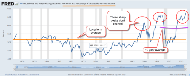
The Federal Reserve recently released their triennial survey of household income, debt and wealth. Rising asset values have lifted the fortunes of many, but younger families are struggling.  I’ll show a reliable indicator of recessions as well as some trends peeking out behind the numbers. The incomes below are denoted in inflation adjusted 2016 dollars.

The good news is that lower income workers have recently seen some income gains, which the Federal Reserve attributes to the enactment of minimum wage laws in 19 states at the start of 2017. However, single parent families have struggled with income gains, as they have for three decades. The decade from the late 1990s to the financial crisis in 2008 lifted the incomes of single parents but they have struggled during the recovery. Median incomes for this group remain below the 2007 level.

RealMedIncSglParent

That this group needed back-to-back historic asset bubbles in order to see some income gains shows just how vulnerable they are.

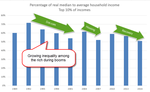
Much has been written about income inequality among households. During booms, there is a growing inequality even among those in the top 10% of incomes. The median in any data set is the halfway point in the numbers, and is usually less than the average of the numbers. If the numbers are evenly distributed the median is closer to the average and the percentage of median to average is high.  When there are a lot of outliers that raise the average far above the median, as in home prices, the percentage is lower.  During boom times there is growing inequality, even among the top 10%  of incomes. (Data from survey)

RealMedMeanIncomeRich

The growth of inequality of income obeys a power law distribution. Think of a 1’x1’ square. The area is 1. Now double the sides to 2’x2’. The area quadruples to 4. Triple the sides to 3’x3’ and the area increases by a factor of 9. Let’s imagine that the area inside of a square is money. How fair is it that the 2’ square has four times the money that the 1’ square has? Politicians may pass tax and social insurance laws to take some of that money from the 2’ square and give it to the 1’ square.  The redistribution of income and wealth can’t change the fundamental characteristics of a power law distribution. Despite the political rhetoric, solutions are bound to be temporary.

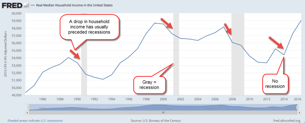
The income figures most cited are for households but this data has only been collected since the mid- 1980s. A fall in real median income usually precedes a recession except for the latest fall in 2014 when oil prices began to slide.

RealMedHHInc

Let’s turn to the data for family household income that has been collected since the mid-1950s. What is the difference between a household and a family? By the Census Bureau definition, a family household consists of at least one person who is related to the householder by blood, marriage or adoption. A fall in family income has preceded every recession except a mild one in the 1960s. Family incomes rose very slightly just before that recession, due in part to a new optimism about the presidency of JFK and the promise of tax cuts.

RealMedinc

Because this family income data is released annually at mid-year, this indicator is usually coincident with the start of a recession. However, it has proven quite reliable in marking the start of recessions.

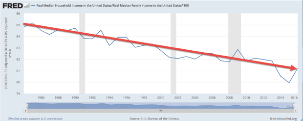
Non-family households are not related. This includes roommates or a childless couple living together but not married. Non-family households are generally younger and their income is less than the income of family households. Over the past three decades, the ratio of the incomes of all households to family households has declined.

RealMedHHIncVsFamilyInc

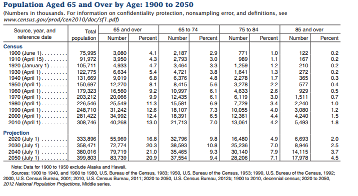
Although younger people are experiencing slower growth in incomes, they will face increasing pressure to meet the demands of older generations expecting social insurance benefits like Social Security and Medicare. As the oldest Americans begin living in nursing homes in increasing numbers, they are expected to put an ever-growing burden on the Medicaid system (CMS report).  It is the Medicaid system, not Medicare, which covers nursing home costs for seniors after they have depleted their resources. Although the number of nursing homes and certified nursing home beds have declined slightly in the past decade (CMS Report page 21), Medicaid spending still increased a whopping 10% in 2015 as enrollment expanded under Obamacare.

Colorado Governor John Hickenlooper has said that many states are expecting an increase in Medicaid spending on nursing home care as the first of the large Boomer generation turns 75 at the beginning of the next decade. CMS expects total health spending to increase 5.6% per year for the next decade. The last time we had nominal GDP growth that high was in 2006, at the peak of the housing boom.

The demands of both low income families and seniors on the Medicaid system will strain both federal and state budgets.  The federal government can borrow money at will; states are constitutionally prevented from doing so.

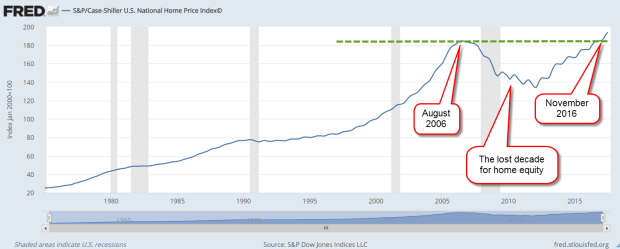
What will drive the high growth needed to sustain the promises of the future?  New business starts are at an all-time low (CNN money). How did we get here? The financial crisis caused the failure of many small businesses, many of which are funded with a home equity loan by an entrepreneur.  Home equity loans are down 33% from their peak in early 2009. At the end of last year, the Case-Shiller home price index finally regained the value it had in 2006. In the past decade there has been no home equity growth to tap into.

CaseShillerHPI201708

Imagine a couple in their late 30s or early 40s who bought a home 10 to 15 years ago. They may have only recently recovered the value of their home when they bought it. One or both may long to start a new venture but how likely are they to take a chance? In some of the bigger metro areas where home prices grew much stronger during the boom, prices are still below their peak ten years ago.

CaseShiller20City201708

The market has priced in a tax cut package that will lower corporate taxes. Investors are expecting a third or more of those extra profits in dividends. Investors are expecting a compromise that will enable companies like Apple to “repatriate” their foreign profits to the U.S. and for that money to be used to buy back stock or pay down debt, both of which are positive for stocks. The IMF projects 3.6% global GDP growth in 2018. There’s good cause for optimism.

Investors have not priced in the long term effects of this year’s hurricanes, the volatility of commodities, the future risk of conflict with North Korea, the risk that the debt bubble in China, particularly in real estate, could escape the careful management by the Chinese government. Add in the several fault lines in household finances that the Federal Reserve survey reveals and there is good cause to season our optimism with caution.

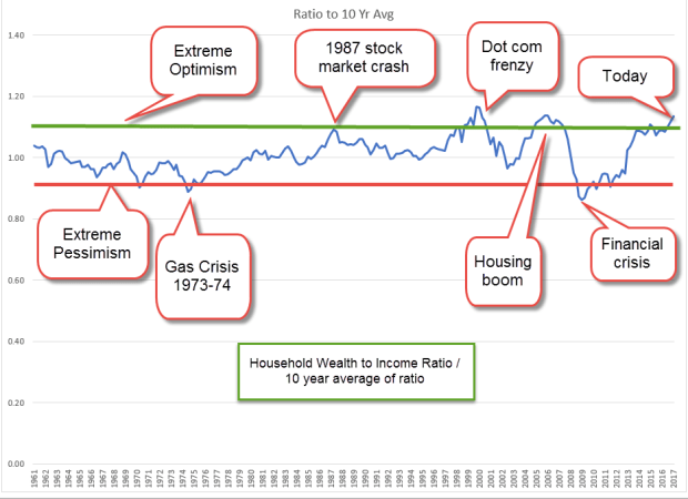
Individual investors surveyed by AAII are cautiously optimistic, a healthy sign, but the sentiment of actual trading by both individuals and professionals shows extreme optimism, a negative sign.  The VIX – a measure of volatility – just hit a 24-year low this past week, lower than the low readings of early 2007.  Sure, there was some froth in the housing market, investors reasoned at that time, but nothing that was really a problem.

Then, oopsy-boopsy, and stocks began a two year slide. So, don’t run with joy, Roy. Don’t go for bust, Gus. Pocket your glee, Lee. Stick with your plan, Stan. There are at least “50 Ways To Leave Your Money,”  and one of them is investing as though the future is predictable.


High Optimism

June 18, 2017

Last week I looked at two simple rules: 1) don’t bet on which chicken will lay the most eggs, and 2) don’t put all your eggs in one basket. This week I will look at index averages and I promise I won’t mention chickens.  Lastly, I will look at a metric that disturbs me.

When I first started investing in Vanguard’s SP500 index mutual fund VFINX, I thought I was buying the average performance of the top 500 companies in America. Like many index funds, VFINX is weighted by market capitalization. With this methodology, a relatively small number of companies have more influence on the movement in the index than their numbers might warrant.

Let’s turn to Vanguard’s breakdown of the top ten stocks in their VFINX fund. These ten stocks are household names, including Apple, Microsoft, Google (Alphabet), Amazon, and Facebook. These five tech stocks are 1% of the 500 companies in the index but make up 13% of the fund. The ten companies make up 20% of the fund.

For investors who want to cast a wider net, there is an alternative: equal weighted funds. Guggenheim’s RSP is an equal weighted ETF first offered in 2003. Using Portfolio Visualizer, I started off in 2004 with $100,000 and invested $500 a month. Despite the higher expense ratio, RSP had a better return, besting a conventional market cap index by 1% annually.

VFINXVsRSP

Why does RSP outperform VFINX?  Funds that mimic the SP500 are heavily weighted to large cap stocks. Equal weight funds have a greater percentage of mid-cap companies which may outperform large caps in a particular decade but that outperformance may come at a price: volatility.

Standard deviation is a statistical measure of the zig and zag of a data series, like measuring how much a drunk veers as he stumbles along his chosen path. The standard deviation (Stdev column above) of RSP is slightly higher than VFINX, and the maximum drawdown of RSP is almost 5% higher during the 2008-2009 financial crisis.  The Sharpe ratio is a measure of risk adjusted return, and the higher the better. As we can see in the Sharpe column, the two strategies are within a few decimal points.  In the past 13 years, an equal weighted strategy produced higher returns with only a slightly higher risk.

If I want to mimic some of the diversity of an equal weight index, I can spread out my investment dollars among large-cap, mid-cap and small-cap funds. As SP500 index products, neither RSP or VFINX includes small cap stocks, but let’s add a small percentage into our mix.

Into my comparison of strategies, I’ve added a portfolio with a 40% allocation to VFINX, 40% to VIMSX, a mid-cap Vanguard index fund, and 20% to VISVX, a Vanguard-small cap value index fund. The performance is almost as good as the equal weight RSP and the Sharpe ratio, or risk adjusted return, is similar.

VFINXVsRSPVsMix

In 2011, Vanguard published an analysis (PDF) of various approaches to indexing that may be of interest to those who want to dive into the topic.

//////////////////////

Household Net Worth

Let’s turn from indexing strategies to stock market valuation. We base our expectations of the future on the recent past. Those expectations are the primary driver of valuation. If we expected an affordable self-driving car in the next few years, the current value of today’s cars would be lower.

I have written before about a store of value compared to a flow of value. Savings are a store of value. Income is a flow. The historical ratio of wealth (store) to income (flow) reveals a trend that should give us caution.  The Federal Reserve charts estimates of  both household wealth and disposable income. The current ratio of wealth to income is now higher than the peaks in 2006 and 2000 when the real estate and dot-com booms inflated wealth valuations.

HouseholdNetWorthPctIncome

The current ratio is far above the 70 year average but a moving ten year average of the ratio may better reflect trends in investment allocation over the past few decades. Using this metric, today’s ratio is still very high. Rarely does the wealth-income ratio vary by more than 10% from its 10 year average.

When the wealth-income ratio dips as low as 90% of its ten year average, extreme pessimism reigns, as in the early 1970s.  A ratio that is 10% more than the ten year average indicates extreme optimism as in the late 1990s, mid-2000s and now. Today’s ratio is 13% above its ten year average.

In early 2000, the ratio was 16% above its ten year average when the enthusiasm of dot-com expectations began to deflate and the price of the SP500 fell from its lofty heights. The ratio reached 14% above its ten year average in 2005 and remained above 10% till mid-2007 when the first cracks in the housing crisis began to surface and the SP500 said goodbye to its peak.

A picture is worth a 1000 words so here’s a chart of the Household Wealth to Income ratio divided by its ten year average. I have highlighted the periods of extreme pessimism and optimism.

HouseholdWealthRatio10Year

If history is any guide, the ratio of wealth to income can stay elevated for a few years. The “haves” keep trading with each other in a game of muscial chairs until people begin to leave the game and move their dollars into other assets, other markets, or bonds and cash. Unfortunately, many slow moving casual investors are left in the game with deteriorated portfolio values.

Economist Robert Shiller, author of Irrational Exuberance and developer of the long term CAPE ratio, recommended a strategy of shifting allocation in response to periods of exuberance and pessimism.  When valuations were historically low or average, an investor might allocate 60% or more of their portfolio to stocks.  As valuations became overextended, an investor might shift their stock allocation to 40%.  The investor is not trying to predict the future. The portfolio remains balanced but the stock and bond weights within the portfolio changes.

Using this wealth-income ratio as a guide, the casual investor might gradually implement an allocation shift toward safety in the coming year.

The Un-Recovery Machine

December 4, 2016

I’ve titled this week’s blog “The Un-Recovery Machine” for a reason I’ll explain toward the end of the blog as I look at the lack of growth in household income for the past 16 years.  Lastly, I will show how easy peasy it is to do a year end portfolio review. First, I’ll look at the latest job figures and a quick five year summary of a few key stats of stewardship under the Obama administration.

The economy added 180,000 jobs in November, close to estimates.  Obama will leave office with an average monthly gain of 206,000 jobs over the past five years, a strong track record. The president has a minor influence on the number of jobs created each month but each president is judged by job growth regardless.  We need to have a donkey to pin the tail on when something goes wrong.

The real surprise this month was the drop of .3% in the unemployment rate to 4.6%.  Some not so smart analysts attributed the drop to discouraged workers who dropped out of the labor force.  However, the number of dropouts in November was the same as October when the unemployment rate declined only .1%.  Seasonal factors, Christmas jobs and variations in survey data may have contributed to the discrepancy.  What is clear is that the greatest number of those who are dropping out of the labor force are the increasing numbers of boomers who are retiring every month. I’ll look further at this in a moment.

The number of involuntary part-timers has dropped from 2.5 million five years ago to 1.9 million, about 1.3% of workers. This is a lower percentage than the 1970s, the 1980s, and the first half of the 1990s.  It is only when the tech boom and housing bubble grew in the late 90s and 2000s that this percentage was lower.

Growth in the core work force is a strong 1.5%, a good sign.  These are the workers aged 25-54 who are building families, careers and businesses.  The change in the Labor Market Conditions Index (LMCI) turned positive again in October.  This is a composite labor index of twenty indicators that the Federal Reserve uses to judge the overall health of the labor market.  They have not released November’s LMCI yet.  This index showed negative growth for the first part of the year and was the chief reason why the Fed did not raise interest rates earlier this year.

The quit rate is back to pre-recession levels at a strong 2.1%.  This is the number of employees who have voluntarily quit their jobs in the past month and is used to gauge the confidence of workers in finding another job quickly. The highest this reading has ever been was 2.6% just as the dot com boom was ending in 2001.  Too much confidence. When the housing boom was frothing in the mid-2000s, the quit rate was typically 2.3%, a level of over-confidence. 2.1% seems strong without being too much.

Another unwelcome surprise this month was a .03 decline in the average hourly wage of private workers.  On the heels of a welcome .11 increase in October, this decline was disappointing. One month’s increase or decrease of a few cents is statistical noise.  The year-over-year increase gives the longer term trend.  For the past five years, the yearly increase in wages has been unable to get above 2.5%, which was the annual growth in November.

The greatest challenge that the incoming president will face is the ever growing ranks of Boomers who are retiring.  In 2007, the number of those Not in the Labor Force was 78 million.  These are adults who can legally work but are not looking for work, and includes retirees, discouraged job applicants, women staying home with the kids, and those going to college.  That number has now grown to 95 million, an increase of 2 million workers per year, and will only keep growing as the 80 million strong boomer generation continues to retire each month.   The millenials, those aged 16 to 34, are a larger generation than the boomers but will not fully offset the number of retirees till the first half of the 2020s.  If any president can explain this in very simple terms, it is Donald Trump, who has mastered the art of communicating a message in short bursts.

//////////////////////////

Construction and Local Employment

Construction employment matters.  When growth in this one relatively small sector drops below the growth of all employment, that signals a weakness in the overall economy that indicates a good probability of recession within the year.  It’s not an ironclad law like the 2nd law of thermodynamics but has proven to be a reliable rule of thumb for the past forty years.  Fortunately, the economy is still showing healthy growth in construction employment that has outpaced broader job gains for the past four years.

The puzzle is why construction spending is an economic weathervane.  It has fallen from 11% of GDP in the 1960s to slightly over 6% of GDP today. (Graph )   Yet when this  relatively small part of the economy stops singing, there’s something amiss.

Real construction spending (in 2016 dollars) is currently at a healthy level of $175K per employee, 16% above the low of $151K in the spring of 2011.  Although we have declined slightly in the past year, the average is about the same level as late 2006 – 2007 and is above the spending of the 1990s.  As a rule of thumb in the construction industry, an employee is going to average 33% in wages and salaries. That doesn’t include the cost of employee benefits, insurance and taxes which will bring the total cost of the employee above 40% of the total cost.   So, if spending is $175K, we can guesstimate that the average worker is making about $58K.  When I check with the BLS, the average weekly earnings in construction is $1120, or almost $58K.  As a side note: that 40% employee cost is used by some contractors as a rule of thumb for a bid total when estimating a job.

During the recession many workers dropped out of the trades.  Older workers with beat up bodies cut back on hours, went on disability or took early retirement.  Younger workers who saw the layoffs and lack of construction employment during the recession turned their sights to other fields.  Workers who do come into the trades find that the physical transition takes some getting used to.  Even workers in their twenties discover that muscles and joints working 8 – 10 hours a day need some time to adapt.

The average workweek hours for construction workers hit at a 70 year high in December 2015 and is still near those highs at 39.8 hrs a week.  In some areas the lack of applicants for construction jobs is constraining growth.  In Denver, construction jobs grew by almost 20% in the past year and that surge is helping to attract  workers from other states.  The unemployment rate in Denver is 2.9%, below the 3.5% in the entire state.  (BLS Denver  Colorado)  This pattern is not confined to Colorado. Very often economic growth may be strong in the cities but weak and faltering in rural communities throughout the state.  For decades this has caused some resentment in rural communities who feel that politicians in the cities dominate policy making in each state.

Local employment

The Civilian Labor Force, those working and actively wanting work, is growing in all states except Alaska, Louisiana, Minnesota, New Jersey, New York, Nebraska, Nevada, Oklahoma and Wyoming (BLS here if you want to look up your city or state stats).  Some of the changes may be demographic.  I suspect that is the case in New York and New Jersey. The decline in some states are those related to resource extraction.  Employment in states with coal mining and oil production has taken a hit in the past two years.  In Colorado, the 11% gain in construction jobs has offset a 12% decrease in mining jobs.

/////////////////////////////

Household Income

On a more sobering note…In 1999 real median household income touched a high $58,000 annually.  Sixteen years later that median was $56,500, a decline of about 3%.  There’s a lot of pain out there.

For readers unfamiliar with the terminology, “real” means inflation adjusted.  “Median” is the halfway point.  Half of all incomes are above the median, half below.  Economists and market analysts prefer to use the median as a measure of both incomes and house prices to avoid having a small number of large incomes or expensive houses give an inaccurate picture of the data.

Both parties can take responsibility for this – two Republican administrations (Bush) and two Democratic (Obama) terms. There have been a number of different party configurations in the Presidency, House and Senate, so neither party can reasonably lay the blame at the other party’s feet.  The “new” more idealogically pure Republicans  in the House regard the “old” Republicans of the two Bush terms as traitors to conservative ideals.  Never mind that a lot of those “old” silly Republicans are still taking up room in the House.

Both parties have borrowed and spent a lot of money but little has flowed down to the American worker.  So much for the imaginativeness of trickle down economic theory.  When George Bush assumed office in January 2001, the Federal Public debt totalled $5.6 trillion.  When he left office in January 2009, the debt had almost doubled to $10.7 trillion.  Under Obama’s two terms, the debt nearly doubled again, crossing the $19.4 trillion mark in June 2016.  $14 trillion dollars of Federal borrowing and spending since early 2001 has not helped lift the incomes of American families.  It is a damning indictment of both major parties who have lost touch with the everyday concerns of many American families.

Can Donald Trump be the catalyst that miraculously turns the Washington whirlpool of money into an effective machine?  Doubtful, but let’s stay hopeful. 535 Congressmen and Senators, each with an outlook, a constituency, and an agenda funded by a coalition of lobbyists, are going to fight against giving up control.  Spend the money on my constituents. they will say.  Republicans throw out the phrase “limited government” to their base voters who whuff, whuff and chow down.  Once elected, many Republican politicians are as controlling as their Democratic counterparts, only in different areas of our lives. A Republican controlled government will push for more regulations on women’s health, regulations on people’s moral and social behaviors, a proposal to reinstitute the draft, and threats to private companies who move jobs out of the U.S.   Donald Trump recently enacted Bernie Sanders’ prescription for keeping jobs in America.  He no doubt threatened Carrier’s parent corporation, United Technologies, that they would lose defense contracts if Carrier moved all those 1000 jobs to Mexico.

So Donald Trump, the leader of the Republican Party, is following a socialist play book.  We are going to see more of this because Trump is the leader of the Trump party, not wedded to any particular ideology.  He is a transactional leader who plays any card in the deck to win, regardless of suit. Chaining oneself to ideals is a good way to drown in the political soup.

Republicans in Washington have consistently betrayed conservative ideals of financial responsibility and a smaller government imprint on the daily lives of the American people.  Democratic politicians cluck, cluck about progressive principles but Democratic voters find that their leaders have left them a pile of chicken poop. Unlike Republican voters, Democrats haven’t developed the organizational skills to make personnel changes in party primaries. Both parties are infected with old ideas, loyalties and prejudices.

Because of this, retail investors – plain old folks saving for their retirement – can expect increased volatility in the next two years.  We may look back with fondness at these last two years, a peaceful time of few accomplishments in Washington, and a sideways market in stocks and bonds.  A balanced portfolio will help weather the volatility.

Mutual fund companies and investment brokers track this information for us and we can access it fairly easily online at the company’s website.  Even if we have several places where we keep our funds, it is a relatively simple paper and pencil process to calculate our total allotment to various investments. We don’t need to be precise.  We are not launching a rocket to Mars.

If I have $198,192.15 at Merry Mutual and they say I have 70% stocks and 30% bonds, I can write down $140 in stocks, $60 in bonds.   Then over to my 401K at the Ready Retirement Company to find out that I have $201,323.39 balance, with 80% stocks and real estate funds and 20% bonds.  I write down $160 for stocks and $40 for bonds.  Then over to my savings account at Safety Savings where I have $39,178.64, which I include with my bonds.  I write down $40.  Finally, over to my CDs at the First Best Bank in my neighborhood where I have $32,378.14 in CDs of various maturities.  I include those with my bonds and write down $32. Maybe I have an insurance policy with some paid up value that I want to include in my bonds.

So, adding it all up, my stocks (more risk) are $140 + $160 = $300.  My bonds/cash (less risk) are $60 + $40 + $40 + $32 = $172.  $300 + $172 = $472 total portfolio value.  $300 stocks / $472 total = .635 which is about 64%.  So I have a 64% / 36% stock / bond split and I have figured this out without expensive software, or an investment advisor.

Depending on my comfort level, knowledge and expertise I may want some software or some advice from a professional but I know where my allocation lies.  I am on the risky side of a perfectly balanced (50% / 50%) portfolio and how do I feel about that?  If I do talk to an advisor or a friend I can tell them up front what my allocation is and we will have a much more informed conversation.

Midpoints

July 3, 2016

A week after crash-go-boom in the stock market following Brexit, the British vote to leave the European Union, the market recovered most of the 5 – 6% lost in the two days following the vote.  The reaction was a bit too intense, inappropriate to an exogenous shock, the vote, whose consequences would take several years to develop. In last week’s blog I had suggested that the market drop was a good time to put some IRA money to work for 2016.  This was not some kind of magic insight.  Each year’s IRA contribution amount is a small percentage of our accumulated  retirement portfolio.

Buying on market dips can be an alternative strategy to regular dollar cost averaging since the market recovers within a few months after most dips, although the recovery is at a slower pace than the fall.  Fear can cause stampedes out of equities; confidence grows slowly.  As an example of an abrupt price decline, the SP500 index fell almost 7% in five days last August, then took more than two months to regain the price level before the fall.  The 12% price drop at the beginning of this year was more gradual, occurring over six weeks.  The recovery to regain that lost ground also took two months, from mid-February to mid-April. In the latter quarter of 2012, the market also took two months to erase a 7% price decline from mid-October to mid-November.

The price level of the SP500 is near the high mark set in May 2015, more than a year earlier.  Only in the past year has the inflation-adjusted price of the SP500 surpassed its summer 2000 level (Chart and table).  Nope, I’m not making that up. The stock market has just barely kept up with inflation for the past 15 years. The inability of the stock market to move higher indicates that buyers are not attracted to the market at current price levels.  The absurdly low interest yields on bonds makes this caution especially puzzling.  As stock prices recovered this past week, prices on long term Treasury bonds should have fallen as traders moved into more risky assets.  Instead, bond prices have risen.  As the price of long term Treasuries (ETF: TLT) broke through its January 2015 high  on Friday, the last day of June, traders began betting against treasuries (ETF: TBF).

Those who are concerned about the return OF their money, the safety searchers buying bonds, are competing against those seeking a return ON their money.  VIG is a Vanguard ETF that focuses on company stocks with dividend appreciation, and is favored by those seeking some safety while investing in stocks. TLT is an ETF of Treasury bonds for those seeking safety and, as expected, pays more in dividends than VIG.  Rarely do we see a broad stock ETF like VIG have a yield, or interest rate, that is close to what a long term Treasury bond ETF like TLT has.  At the end of this week, VIG had a dividend yield of 2.15%, just slightly below TLT.  Why are investors/traders bidding up the price of Treasury bonds?  Some 10 year government bonds in the Eurozone have recently crossed a dividing line and now have negative interest rates.  The low, but positive, interest rates of U.S. Treasury bonds look like big open flowers to the busy bees of institutional investors around the world.

In a large group of investors, buy and sell decisions tend to counterbalance each other.  Occasionally there are periods when such decisions reinforce each other and create a precarious imbalance that all too often rights itself in an abrupt fashion.  Bubbles and – what’s the opposite of a bubble? – are iconic examples of this kind of self-reinforcing behavior.

In another week we will mark the middle of the summer season.  The All-Star game on July 12th occurs near the halfway mark in the baseball season and advises parents in many states that there are still five to six weeks before the kids head back to school.  Our mid-40s is about the midpoint of our working years, a reminder that we need to start saving for retirement if we have not done so already.  It has been seven years since the market trough in March 2009.  Let’s hope that this is the midpoint of a 14 year bull market but I don’t think so.

Next week will be chock full of data before the start of earnings season for the second quarter. We will get the June employment report as well as the Purchasing Managers Index.  In this time of short, sharp reactions to news events, we can expect continued volatility.

/////////////////////////


Earnings


Pew Research just released a comparison of earnings by racial group and sex that is based on Census Bureau surveys, the same data that the BLS compiles into their monthly employment reports.  My initial criticism of the Pew Research comparison was that they used the earnings of full and part time workers.  Women tend to work more part time jobs so that would skew the earnings comparison, I thought. Thinking that a comparison of full time workers only would show different results, I pulled up the BLS report which groups the data by sex, only to find out that the differences between the earnings of men and women was about the same.  At the median, women earn 82% of men.


An even more depressing feature of the BLS report is that median weekly earnings have barely kept ahead of inflation during the past decade.  This wage stagnation provides a base of support for the criticisms voiced by former Presidential contender Bernie Sanders in a recent NY Times editorial.
Like a truck stuck in the mud, households are spinning their wheels without making much progress.  In the coming months, Donald Trump and Hillary Clinton will try to sell themselves as the tow truck that can pull average American families out of the mud. Well, it would be nice if they would conduct their campaigns in such a positive light.  The truth is that each candidate will try to convince voters that voting for the other candidate will get American families stuck deeper in the mud.  The conventions of both parties are later this month.  Expect the mud to start flying soon after they are over.  By election day in November, we will all be buried in mud.

Housing Heats Up

June 5, 2016

In parts of the country, particularly in the west, demand for housing is strong, causing higher housing prices and lower rental vacancy rates.  For the first quarter of 2016, the Census Bureau reports that vacancy rates in the western U.S. are 20% below the national average of 7.1%.  At $1100 per month, the median asking rent in the west is about 25% above the national average of $870 (spreadsheet link).

With a younger and more mobile population, home ownership rates in the west are below the national average (Census Bureau graph). Housing prices in San Francisco have surprassed their 2006 peaks while those in L.A.are near their peak.  Heavy population migration to Denver has spurred 10% annual home price gains and an apartment vacancy rate of 6% (metro area stats).

From 1982 through 2008, the Census Bureau estimates that the number of homeowners under age 35 was about 10 million. These were the “baby bust” Generation X’ers who numbered only 70% of the so-called Boomer generation that preceded them.

Shortly before the financial crisis in 2008, a new generation came of age, the Millenials, born between 1982 and 2000, and now the largest age group alive in the U.S. (Census Bureau). Based on demographics, homeownership should have increased to about 13 million in this younger age group, but the financial crisis was particularly hard on them.  Starting in 2008, homeownership in this younger demographic began to decline, reaching a historic low of 8.8 million in 2015, a 15% decline over seven years, and a gap of almost 33% from expected homeownership based on demographics.

In response to lower homeownership rates, builders cut back and built fewer homes.  I’ll repost a graph I put up last week showing the number of new homes sold each year for the past few decades.

Look at the period of overbuilding during the 2000s, what economists would euphemistically call an overinvestment in residential construction.  Then, financial crisis, Great Recession and kerplooey!, another technical term for the precipitous decline in new homes built and sold. As the economy has improved for the past two years, the demand for housing by the millennial generation, supressed for several years by the recession, has shifted upwards.  More demand, less supply = higher prices.  This younger generation prefers living closer to city amenities, culture and transportation, causing a revitalization of older neighborhoods.  In Denver, developers are buying older homes, scrapping them off, and building two housing units where there was one. Gentrification influences the rental market as well as affordable single family homes and pushes out families of more modest means in some parts of town.

The housing market really overheats when rentals and home prices escalate at the same time. During the housing boom of the 2000s, many tenants left their apartments to buy homes and cash in on the housing bonanza.  Rising vacancies put downward pressure on monthly rents.  Move-in specials abounded, announcing “No Deposit!”, “First Month Free!” or “Free cable!” to attract renters. This time it’s different.

Rising rents and home prices put extraordinary pressure on working families who find they can barely afford to live in central city neighborhoods which offered low rents and affordable transportation.  They consider moving to a satellite city with lower costs but face longer commute times and additonal transportation costs to get to work.  Demographic trends shift more slowly than building trends but neither moves quickly so we can expect that housing pressures will not abate soon until the supply of multi-family rental units and single family homes increases to meet demand.

////////////////////////

Incomes

For the past four decades, household income has declined, as Presidential contender Bernie Sanders is quick to point out.  Some economists also note that household size has declined greatly during that time as well so that comparisons should take into account the smaller household size.  A recent analysis  by Pew Research has made that adjustment and found that middle class incomes had shrunk from 62% of total income in 1970 to 43% in 2015.

But, again, comparisons are made more difficult because some categories of income, which have risen sharply in the past few decades, are not included.  Among the many items not included are “the value of income ‘in kind’ from food stamps, public housing subsidies, medical care, employer contributions for individuals (ACS data sheet).  Generally, any form of non-cash or lump sum income like inheritances or insurance payments are excluded.  There is little dispute with the exclusion of lump sum income but the exclusion of non-cash benefits is suspect.  An employer who spends $1000 a month on an employee health benefit is paying for labor services, whether it is cash to the employee or not.

The lack of valid comparison provokes debate among economists, confusion and contenton among voters.  The political class and the media that live off them thrive on confusion. Those who want the data to show a decline in middle class income cling to the current methodology regardless of its shortcomings.

//////////////////////////

Employment

The BLS reported job gains of only 38,000 in May, far below the gain of 173,000 private jobs reported by the payroll processor ADP and below all – yes, all – the estimates of 82 labor economists. The weak report caused traders to reverse bets on a small rate increase from the Fed later this month.

Almost 40,000 Verizon employees have been on strike since mid-April and just returned to work this past week. On the presumption that a company will hire temporary workers to replace striking workers, the BLS does not adjust their employment numbers for striking workers.  However, most employers of striking employees hire only as many employees as they need to, relying on salaried employees to fill in.  Do strikes contribute to the spikes in the BLS numbers?  A difficult answer to tease out of the data. In the graph below we notice the erratic data set of the BLS private job gains (blue line; spikes circled in red) compared to the ADP numbers (red line; spike circled in blue).

Each month I average the BLS and ADP estimates of job gains to get a less erratic data swing.  The 112,000 average for May follows an average of 140,000 job gains in April – two months of gains below the 150,000 new jobs needed to keep up with population growth.  Let’s put this one in the wait and see column.  If June is weak, then I will start to worry.

Post War Productivity

July 26, 2015

Each year, the Council of Economic Advisors (CEA) submits the Economic Report of the President  to the Congress.  They compile a number of data series to show some long term trends in household income, wages, productivity and labor participation.  Readers should understand that the report, coming from a committee acting under a Democratic President, filters the data to express a political point of view that is skewed to the left.  When the President is from the Republican Party, the filters express a conservative viewpoint.  Has there ever been a neutral economic viewpoint?

In this year’s report the Council identifies three distinct periods since the end of WW2: 1948-1973, 1973-1995, and 1995-2013.  In hindsight, this last period may not be a single bloc, as the report acknowledges (p. 32).

The most common measure of productivity growth is Labor Productivity, which is the increase in output divided by the number of hours to get that increase.  Total Factor Productivity, sometimes called Multi-Factor Productivity (BLS page), measures all inputs to production – labor, material, and capital.  As we can see in the chart below (page source), total factor productivity has declined substantially since the two decade period following WW2.

In the first period 1948-1973, average household income grew at a rate that was 50% greater than total productivity growth, an unsustainable situation.  This post war period, when the factories of Europe had been destroyed and America was the workshop of the world, may have been a singular time never to be repeated.  What can’t go on forever, won’t.  In the period 1973-1995, real median household income that included employer benefits grew by .4% per year, the same growth rate as total productivity.

The decline in the growth rate of productivity hinders income growth which prompts voters to pressure politicians to “fix” the slower wage growth.  If households enjoyed almost 3% income growth in the 1950s and 1960s, they want the same in subsequent decades.  If the rest of the world has become more competitive, voters don’t care.  “Fix it,” they – er, we – tell politicians, who craft social benefit programs and tax programs which shift income gains so that households can once again enjoy an unsustainable situation: income growth that is greater than total productivity growth.

“Where Have All The Flowers Gone?” was a song written by legendary folk singer Pete Seeger in the 1950s. It was  a song about the folly of war but the sentiment applies just as well to politicians who think that they can overcome some of the fundamental forces of economics.  Seeger asked: “When will they ever learn?”

Income and Poverty

September 21, 2014

A steadily rising market supports our theory that we are astute investors.  Fed Chairwoman Janet Yellen reassured investors that the Fed intends to keep interest rates near zero till at least the middle of 2015. The stock market closed out the week at a new high, edging out the high set two weeks ago.  In an economy fueled largely by consumer spending, median household income is down 8% since 2007.  The Japanese yen broke below $90 this week, a seven year low.  At this week’s meeting in Australia, the financial heads of the G-20 countries are seeing increasing economic strains around the globe but particularly in Europe and Asia. (Bloomberg)  Housing starts and building permits are getting erratic, jumping up one month only to fall precipitously the next.  Using either idle cash or borrowing at historically low interest rates, companies are buying back their own stock at a steady clip to juice per share profits for stockholders.

In a candid moment, many researchers will admit the difficulty of overcoming their own biases.  Investors are subject to the same myopia that afflicts politics and compromises research.  Our biases lead us to ignore or discount some facts.  The most damaging bias most of us have is thinking we have made the right decision.  The justifications for our investment decisions are sound and logical – until later events reveal the folly underlying those decisions.  In the late 1990s, some envisioned the internet marketplace much like a chessboard.  The companies who dominated the center of the board, regardless of the cost, reaped hefty stock evaluations.  It made sense – until it didn’t. Costs matter.  Profits matter.

Soros Fund Management, founded in 1969 by George Soros, has a long track record of generating consistently high returns.  The secret to Soros’ success as an investor is not that he is right most of the time because he isn’t.  Several years ago, his firm estimated that his success ratio was only 53%.  George Soros’ success comes from the fact that he knows he is wrong about half of the time, recognizes when he is wrong, abandons his position and minimizes his losses.  While most of us are not active traders like Soros, we can pay a bit more attention to the balance in our portfolios.  Quarter ending statements will arrive in our mailbox or email inbox in the next few weeks.  It would be a good time to assess portfolio allocations and targets.  A composite bond index (BND as a proxy) is down a few percent since April 2013 while the stock market has risen 33%.  Have we adjusted the balances in our portfolios or is that one of the things that has been on the to-do list for several months?

********************

Census Report

The Census Bureau just released their annual estimate of household income and poverty in the U.S.  Measurements of household income must be taken with a grain of salt, so to speak.  Say that a married couple with $70K in household income split up.  The total income remains the same but the number of households is now two and household income is $35K.

Given those caveats, there are some real bummer stats in the report as well as some surprises.  Real or inflation adjusted median household income was little changed in 2013 and is 8% lower than in 2007.  Median income of white households was $58K in 2013 but for black households, the annual figure was $34K.  The ratio of incomes between these two groups has changed little over the past five decades.  Since the mid 1980s, the income of white households has lost ground when compared to Asian households. Since the mid-90s, the ratio of Hispanic to white household income has risen.

One of the strengths of American society has been the income mobility that our economy generates. The Census Bureau groups incomes by quintiles, like steps on a ladder.  Each step is in 20% increments so that households are ranked in the bottom 20%, top 20% or in between. From 2009 – 2011, 30% of those who were on the lowest rung of the income ladder moved up the ladder.  During that same period, 32% of those at the top of the ladder moved down the ladder.

The poverty rate declined slightly but one in seven households, about 45 million people, is below the poverty threshold.  A continuing complaint about the methodology used in computing the poverty level is that non-cash benefits like subsidized housing, medical care, child care and food stamps are not included in the calculations.  In the early 60s, before the introduction of social welfare programs, almost one in five households were below the threshold.   Remember, the 60s were a boom decade. Various estimates of those who were chronically poor at that time ranged from 10% to 16% of households. In 1969,  several years after the introduction of the Great Society programs, the poverty rate was close to 14% (Source), about the same as it now.

Conservative commentators will make the case that, over the past fifty years, the U.S. has spent some $22 trillion (2013 dollars) on social welfare programs with little progress in alleviating poverty. During the three year period from 2009 – 2011, years of severe economic stress and political games of “chicken,” the Census Bureau reports that almost 32% of households had a spell of poverty lasting two months or more.

The Census Bureau also reports that only 3.5% of households were chronically poor, living under the poverty threshold during the entire three year period.  The low percentage of chronically poor is often ignored by those who are antipathetic to social welfare programs.  In the aftermath of this past recession, one of the most severe economic downturns of the past century, social welfare programs have provided a temporary helping hand up, a shelter against the economic storm, and cut the long term poverty rate to a quarter of what it was during the booming 60s.

Liberals will ignore this success, of course.  Instead they will point to the higher figure of temporary poverty to make the case for more welfare spending. More programs and more spending is the liberal brand.  Conservative pundits should point at the rather low 3.5% figure of the chronically poor and make the point that we don’t need more welfare spending.   But they won’t.  Opposed to income transfers as a matter of principle, conservatives don’t want to acknowledge the success of social welfare programs.

For those readers who don’t have the time to read the full report, a NY Times article provides a summary.

***************************

Lasting longer

When the Social Security system was enacted in the mid thirties, life expectancy for a 60 year old worker was 72.  (Bureau of Labor Statistics Monthly Labor Review, pg. 4)  Many of us don’t realize that the largest gains in life expectancy came in the first decades of 20th century with safer sanitation, drinking water and public health facilities. In 2006, the Census Bureau estimated life expectancy for a 60 year old at 82, an additional ten years of life – and retirement benefits and expenses. A 75 year old male today can expect to live to about 87.

In their 2014 survey of the costs of elderly care, Genworth Financial found that a home health aide in Colorado averages about $50K. A private room in a nursing home costs $92K per year.  At a 4% growth rate, that same private room could cost more than $130K in 2025, when the first cohort of baby boomers reaches 75.  How many seniors will be able to afford such an expense?  Many will push for ever more programs to subsidize the costs of living longer.  Seniors vote so politicians listen.  In Japan, the elderly segment of the population has grown from 5% of the population in the 1950s to 25% of the population. (Wikipedia)  This aging cohort commands an ever larger share of the nation’s resources, contributing to the stagnation in the Japanese economy for the past 20 years.

In the U.S. the growth of the elderly population has been less dramatic.  At 9% of the population in 1960, the elderly are expected to almost double to 17% of the population by 2020 (Census Bureau )

****************************
Takeaways

Pay attention to portfolio allocations.  Save money.  You’ll need it one of these days.

The Outcome of Income

October 13th, 2013

“Use words not fists” a parent might say to a child.  For the second weekend during the government show down – I mean shut down, the children – er, representatives – in Washington have taken that to heart.  In a contest of dueling podiums, members of each party in both houses of Congress assure the public that their party is the reasonable one.  On Thursday, the market shot up on the news that – no, not a deal – but the likelihood that the two parties might talk to each other instead of mouthing platitudes and principles at their separate podiums.  About three weeks ago, speculative talk of a government shut down began to surface and where was the market after Friday’s close?  Back where it started three weeks ago and just 1.5% below the high on September 19th.

 In the Washington Irving tale, Rip Van Winkle fell asleep for twenty years only to wake up to a new United States of America.  In this version of the tale, an investor goes to sleep for three weeks, wakes up and there’s a whole new United States of Closed For Remodeling.  In a townhome association I belonged to many years ago, the tenants argued for several months over the choice of roofing contractor, color and style of roof for the townhomes.  A large Federal government may take a while longer.   In fact, it has been years since the Congress passed an actual budget.  The Treasury department used up the debt limit last May and has been running on fumes since then, grateful that the housing loan agencies Fannie Mae and Freddie Mac have been paying back some of the cash they “borrowed” from the taxpayers a few years back.

Because of the shut down there have been few government reports.  Commodities traders have been buying and selling in the dark,  guesstimating what the weekly and monthly government reports on the sales and production of corn and other commodities would have been if there had been an actual report.  We can only hope that traders have been fairly accurate.  If there are some notable surprises, duck.

There have been some private reports, one of them the monthly manufacturing and services reports from the Institute for Supply Management (ISM).  I updated the combined weighted index (CWI) that I have been showing the past few months.  Unlike the environment during the August 2011 budget negotiations, business activity shows strength this year and the resilience of the S&P500 index reflects that underlying strength.  Although 10 of 14 trading days were down, the index lost only about 4% from the recent high.

The CWI has been in expansion territory since the summer of 2009, which coincided with the NBER’s official call of the recession’s end.  You’ll notice that there is a rolling wave like movement to the index since then, an ebb and flow of strong and not so strong growth.  Since this is a coincident indicator of the fundamental strengths in the economy, it might not be a good predictor of short term market swings but has been a reliable predictor for the longer term investor.   Despite the recent highs in the market index, the market has been in a downtrend since the highs of thirteen years ago.  It is approaching the high set in 2007, a sign of renewed optimism.

The Federal Reserve recently posted up Census Bureau median household – not individual – income figures for the past thirty years.  Continuing on our theme from last week – the story we tell depends on how we adjust for inflation.  In this case, neither story is particularly cheerful.  Median household income adjusted for inflation using the Personal Consumption Expenditure measure has fallen  to 1998 levels, declining 7% from 2007 levels.

In 1983, the Bureau of Labor Statistics changed their methodology for computing the cost of owning a home, or owner equivalent rent.  Over the years, some economists and financial writers have made the case that the official measure of inflation, the CPI, overstates inflation.  This tells an even bleaker story: a decline of almost 9% from 2007 levels, an annual growth rate over 28 years  of just 1/4% per year.

Now, let’s compare the two.  Does the CPI overstate income by 5% or does the PCE Deflator understate inflation by the same amount?

The methodology influences many people in this country, from seniors on Social Security to working people who rely on cost of living increases.  Yet there will be more debate about whether the manager of a baseball team should put in a fastball pitcher who sometimes struggles with accuracy or go with a pitcher who throws less hard but has good location and change up.  There are political consultants who spend late night hours trying to figure out how to present the problem to the public so that they can understand it and get passionate about it.

The slow growth in household incomes arises because there is a greater supply of people who want work than employers offering work that people can or want to do.  Slow growth in the economy means less demand for labor, which puts downward pressure on the wages that workers can demand.  Smoothing the quarterly percent change in GDP growth for the past thirty years gives a clear picture of this less than robust growth.

While that may be the chief reason for slow income growth, the negative real interest rate of the past five years has played some role, I think.  When the economy is in a recessionary funk,  the Federal Reserve keeps the interest rate low to spur growth.  In the past two recessions, the Fed kept interest rates low for a considerable period of time after GDP growth began to rise.  Now it is easy to look in the rear view mirror at GDP growth, which is revised several times and may be revised again a year later as more information becomes available.  The Federal Reserve has to guess what the growth is and lately they have been overestimating the growth in the economy.

As long as the Fed keeps interest rates low, banks can make easy, safe profits in the spread between buying Treasury bonds and borrowing from the Fed and other banks.  There is less incentive for banks to take the additional risk of investing in business loans.  Although climbing up from the trough of several years ago, business loans in real dollars are still below the levels of mid 2008.

During the past twenty-five years, the rise and fall of commercial loans has become more pronounced.  Have the banks become that much more cautious at each recession, are businesses circling the wagons at the first hint of a downturn, and what part do low interest rates play?

This past week President Obama confirmed his pick of Janet Yellen as the new chairwoman of the Federal Reserve.  Larry Summers had been Mr. Obama’s first choice but Summers withdrew after learning that he would have a difficult confirmation process.  Although very smart, Summers is not a concensus builder.  Many in Congress and the market preferred Yellen to Summers.  Ms. Yellen takes a dovish stance, meaning that she is likely to further the current policy of low interest rates for the near future.  A cautious investor might want to rethink rolling over that 5 year CD that comes up for renewal in the next few months.  Rates are currently 1.5 – 2%, so that after inflation an investor is losing a little money.