June 18, 2017
Last week I looked at two simple rules: 1) don’t bet on which chicken will lay the most eggs, and 2) don’t put all your eggs in one basket. This week I will look at index averages and I promise I won’t mention chickens. Lastly, I will look at a metric that disturbs me.
When I first started investing in Vanguard’s SP500 index mutual fund VFINX, I thought I was buying the average performance of the top 500 companies in America. Like many index funds, VFINX is weighted by market capitalization. With this methodology, a relatively small number of companies have more influence on the movement in the index than their numbers might warrant.
Let’s turn to Vanguard’s breakdown of the top ten stocks in their VFINX fund. These ten stocks are household names, including Apple, Microsoft, Google (Alphabet), Amazon, and Facebook. These five tech stocks are 1% of the 500 companies in the index but make up 13% of the fund. The ten companies make up 20% of the fund.
For investors who want to cast a wider net, there is an alternative: equal weighted funds. Guggenheim’s RSP is an equal weighted ETF first offered in 2003. Using Portfolio Visualizer, I started off in 2004 with $100,000 and invested $500 a month. Despite the higher expense ratio, RSP had a better return, besting a conventional market cap index by 1% annually.
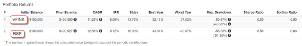
Why does RSP outperform VFINX? Funds that mimic the SP500 are heavily weighted to large cap stocks. Equal weight funds have a greater percentage of mid-cap companies which may outperform large caps in a particular decade but that outperformance may come at a price: volatility.
Standard deviation is a statistical measure of the zig and zag of a data series, like measuring how much a drunk veers as he stumbles along his chosen path. The standard deviation (Stdev column above) of RSP is slightly higher than VFINX, and the maximum drawdown of RSP is almost 5% higher during the 2008-2009 financial crisis. The Sharpe ratio is a measure of risk adjusted return, and the higher the better. As we can see in the Sharpe column, the two strategies are within a few decimal points. In the past 13 years, an equal weighted strategy produced higher returns with only a slightly higher risk.
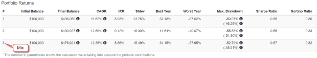
If I want to mimic some of the diversity of an equal weight index, I can spread out my investment dollars among large-cap, mid-cap and small-cap funds. As SP500 index products, neither RSP or VFINX includes small cap stocks, but let’s add a small percentage into our mix.
Into my comparison of strategies, I’ve added a portfolio with a 40% allocation to VFINX, 40% to VIMSX, a mid-cap Vanguard index fund, and 20% to VISVX, a Vanguard-small cap value index fund. The performance is almost as good as the equal weight RSP and the Sharpe ratio, or risk adjusted return, is similar.
In 2011, Vanguard published an analysis (PDF) of various approaches to indexing that may be of interest to those who want to dive into the topic.
//////////////////////
Household Net Worth
Let’s turn from indexing strategies to stock market valuation. We base our expectations of the future on the recent past. Those expectations are the primary driver of valuation. If we expected an affordable self-driving car in the next few years, the current value of today’s cars would be lower.
I have written before about a store of value compared to a flow of value. Savings are a store of value. Income is a flow. The historical ratio of wealth (store) to income (flow) reveals a trend that should give us caution. The Federal Reserve charts estimates of both household wealth and disposable income. The current ratio of wealth to income is now higher than the peaks in 2006 and 2000 when the real estate and dot-com booms inflated wealth valuations.
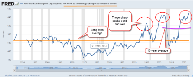
The current ratio is far above the 70 year average but a moving ten year average of the ratio may better reflect trends in investment allocation over the past few decades. Using this metric, today’s ratio is still very high. Rarely does the wealth-income ratio vary by more than 10% from its 10 year average.
When the wealth-income ratio dips as low as 90% of its ten year average, extreme pessimism reigns, as in the early 1970s. A ratio that is 10% more than the ten year average indicates extreme optimism as in the late 1990s, mid-2000s and now. Today’s ratio is 13% above its ten year average.
In early 2000, the ratio was 16% above its ten year average when the enthusiasm of dot-com expectations began to deflate and the price of the SP500 fell from its lofty heights. The ratio reached 14% above its ten year average in 2005 and remained above 10% till mid-2007 when the first cracks in the housing crisis began to surface and the SP500 said goodbye to its peak.
A picture is worth a 1000 words so here’s a chart of the Household Wealth to Income ratio divided by its ten year average. I have highlighted the periods of extreme pessimism and optimism.
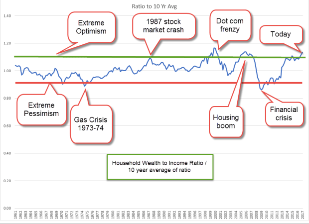
If history is any guide, the ratio of wealth to income can stay elevated for a few years. The “haves” keep trading with each other in a game of muscial chairs until people begin to leave the game and move their dollars into other assets, other markets, or bonds and cash. Unfortunately, many slow moving casual investors are left in the game with deteriorated portfolio values.
Economist Robert Shiller, author of Irrational Exuberance and developer of the long term CAPE ratio, recommended a strategy of shifting allocation in response to periods of exuberance and pessimism. When valuations were historically low or average, an investor might allocate 60% or more of their portfolio to stocks. As valuations became overextended, an investor might shift their stock allocation to 40%. The investor is not trying to predict the future. The portfolio remains balanced but the stock and bond weights within the portfolio changes.
Using this wealth-income ratio as a guide, the casual investor might gradually implement an allocation shift toward safety in the coming year.
