More Sunlight

Every December it seems as though the sun will continue drifting south, never to return to the northern hemisphere.  Then in early January, the sun that used to come up over the neighbor’s chimney for the past week or so is now coming up just a tiny bit north of that chimney.  An economy can act like the winter’s sun, moping about in the doldrums until a few signs appear that things are going to get better.

In the past few months, initial claims for unemployment have fallen slowly but steadily, approaching that magic mark of 400,000, which economists regard as a milepost on the way to a healthy economy.  Another gauge of recovery are tax receipts.

Every month the Congressional Budget Office (CBO) publishes a review of the country’s finances.  In January’s review  the CBO notes that withholding taxes and other income taxes have increased over 20% in the last calendar quarter of 2010 (1st quarter of the U.S. Treasury’s fiscal year 2011 which started in October 2010).  Withholding and social security taxes make up about 80% of overall receipts to the treasury.  Below is a comparison of this past October – December with the same quarter of earlier years.

We can judge the health of local and state economies by the amount of sales tax collected.  The increased amount of witholding taxes in the past quarter is a barometer of a recovering economy.

Picking Our Pockets

As I mentioned in my last post, the CBO presented their analysis of current economic conditions and future projections. The CBO is careful to note that ten year projections should be treated cautiously. While the CBO’s short term forecasts can be fairly accurate, their long term forecasts are sometimes far off the mark.

Below is a graph of the CBO’s assumptions in making their forecast for 2020. (Click to enlarge in separate tab)

Individual income taxes as a percent of total Federal revenues has never risen above 50% in the past forty years. The CBO is therefore projecting historically high income taxes during the next decade. But more disturbing in their 2020 projections is that corporate income taxes are relatively low.  The chart below shows the historical percentages that individual and corporate income taxes have been as a percentage of total revenue.

Over the past 40 years, individual income taxes have averaged 46% of federal revenues. Corporate income taxes have averaged 12%. Why is the CBO projecting such a shift of the tax burden from corporations to individuals in the next decade?

Government Vacuum

Imagine a world where a quart of milk costs the same in 1950 as it does in 2000. That’s the imaginary world of inflation adjusted or constant dollars, which adjusts current dollars by the Consumer Price Index (CPI). Although imperfect, constant dollars gives us a way to compare apples to apples.

Tax cuts and increases have been a hot topic of political discourse leading up to the elections. In my earlier blog, I showed the income taxes (in inflation adjusted dollars) collected over the past half century. As you may have noticed, those taxes kept rising. With a growing population, it is natural that income taxes collected should continue to rise. What may not be so apparent is the rise in taxes collected PER PERSON.

In the table below (click to enlarge in a separate tab), I divided Office of Managment and Budget (OMB) data on individual income taxes by annual population figures from the U.S. Census Bureau to come up with a per person average of income taxes collected.

Per person means everyone! The federal government is collecting triple the amount of real money that they collected 60 years ago. If the cost per person of government was about $1000 in 1950 and it is $3000 now, are we getting triple in services from our government? Or are we getting screwed?

Political Economics

As we approach the upcoming elections we hear some favorite myths of both the left and the right.  Today I’ll look at a favorite myth that is trotted out by supply side believers on the right.

Does lowering income tax rates produce more income tax revenue?  Below is a chart of historical income tax data from the Office of Management and Budget (OMB) – click to view larger image in separate tab.  After the Kennedy era tax cuts, revenue increased.  After the Reagan tax cuts, revenue initially decreased.  The Clinton era tax increases clearly show an increase in revenues.  The Bush era tax cuts clearly show a decrease in revenues.

Does lowering or raising tax rates produce more revenue? Increases or decreases in revenue may have more to do with the economy or rising asset values (capital gains taxes) than tax rates. Still, some conservatives will continue to insist that lower tax rates produce more revenue. The justification for their assertion is to look at TOTAL federal revenue, including social security taxes, to make their point. This is a sleight of hand argument since Social Security tax revenue is not affected by income tax rates but it is the only way that conservative supply side believers can make their point. They can only hope that their audience doesn’t look too closely at the facts – at least not until after the election.

The Tax Divide

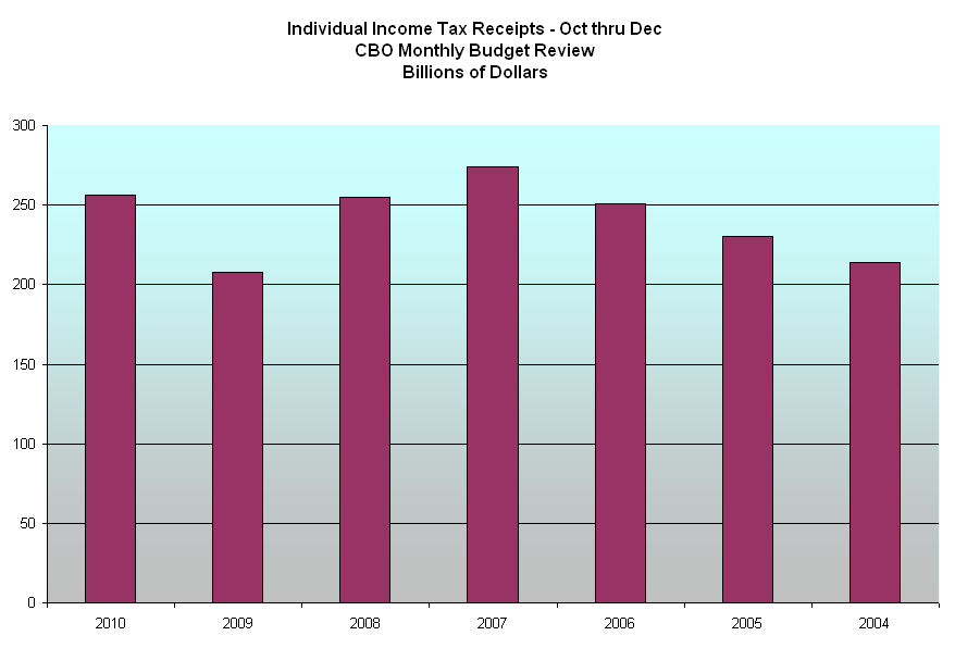
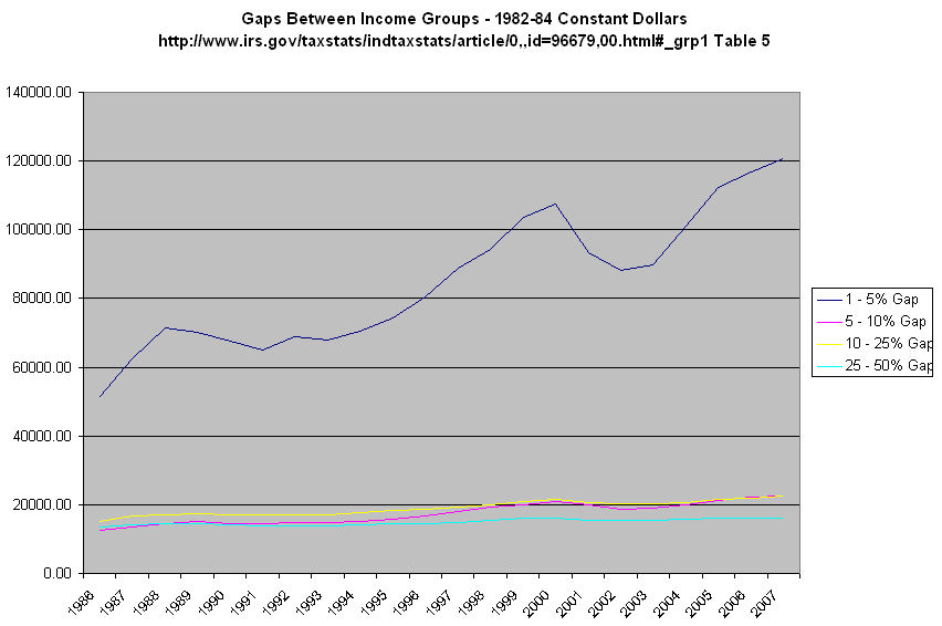
Continuing my review of 20 years of tax data from the IRS, I’ll look at incomes vs income taxes paid.  As the chart below shows, the top half of households in this country pay all the personal income taxes collected. (Click graph to enlarge)

In 2000, net tax rates for the top half of households topped out at about the same level of the mid 80s – just under 20%.  The Bush tax cuts of 2001 and 2003 lowered net tax rates for the top half of household to under 15%.

The top half of households are making 90% of the personal income in this country and paying almost 100% of the personal income tax.  The top 25% of households are making 70% of the income and paying about 83% of personal income taxes.

Half of households pay the bills both for themselves and for the other half. In a democratic society, those on the lower half of the economic ladder will vote for politicians who promise more programs to help them out.  Those on the upper half will vote for politicians that promise to reduce their tax burden.

The core of the problem, however, is not tax rates or taxes paid but the rising gaps between economic groups, particularly those households at the very top of the economic ladder and the rest of the population.  Until that inequity in income is reduced, the top 25% of households will pay an ever increasing share of the tax burden.  Policymakers in Washington have been and continue to create a two tiered society.

What are some solutions to reduce the income gaps?   We have found that we can not have a healthy economy which is based almost entirely on the service sector.

1) Encourage businesses to relocate manufacturing facilities back to the U.S.  This can be done with tax incentives for those businesses that hire American workers.  Where will we get the money to afford these tax incentives?  The only place possible – those in the top 10% of households.  Increase the tax rates on those in the upper income brackets but target the additional money specifically for tax breaks for small manufacturing businesses – those with 100 employees or less – that hire American workers.  In Obama’s 2010 budget, he proposes to let the Bush era tax cuts expire for upper income taxpayers and use the additional tax money to reduce the country’s deficit.  It is a noble goal but it does not address the long term structural defects in this economy.  Right now, deficit reduction is a temporary bandaid on a much larger problem that will make large budget deficits a structural component of our economy in the coming decades.

2)  Relax some of the stringent environmental codes enacted over the past several decades which drove up costs for U.S. based manufacturers and hastened their departure for other countries with cheaper labor costs and less onerous environmental requirements.  This may upset some people who want a perfect world.  We can’t have a perfect world.  We never could. 

3)  Manufacturing requires capital and will absorb some of the excess money reserves that are looking for a return.  Too much U.S. savings is being used to invest in the manufacturing output of other countries.  Too much U.S. savings is being used to buy federal, state and local debt, all of which will continue to increase as the tax base decreases.  Let’s get our savings to work producing.

4)  Have a minimum tax that all but the poorest households pay each year – even if it is only $100 a year.  25% of households in this country have no “skin in the game.”  Target that tax money for those in the helping professions who are generally paid less for the work they do and the education they work hard to achieve.  That includes social workers, LPNs, nurses aides and counselors.

Any other ideas?

Income Gaps

Today, I’ll continue my examination of trends in income based on 20 years of income tax data from the IRS.

Adjusted Gross Income is gross income less selected deductions for the self-employed, students and teachers. In 2007, these were the approximate income “floors” for each percentile of tax returns:
Top 1% – above $410K
Top 5% – above $160K
Top 10% – above $113K
Top 25% – above $66K
Top 50% – above $33K

The graph below shows the percentage of income earned by the top 25% of income earners. Notice the dramatic increase in the past twenty years. (Click graph to enlarge)

The trend of the increase for the top 25% of incomes is steeper than the relatively flat trend of income increases for the top 50% and is mostly due to the steep income increases for the top 5%. Due to the “magic” of compound interest, money has a natural tendency to concentrate. Ever in search of better returns for the risk involved, the concentration of invested money will create bubbles in the economy like the housing bubble of this decade or the technology and internet bubble of the 1990s. If the increasing concentration of wealth in the hands of an ever smaller percentage of the population is not modified, our economy will bounce from one bubble to the next.

The graph below is in constant, or inflation-adjusted, dollars and shows the dramatic increase in incomes for the top earners in this country. The income for the top 50% has remained flat for the past two decades and that includes the large increases of those at the top. Subtracting out the skyrocketing increases in income for the top 5% leaves the other 95% with flat or declining real incomes.

The graph below shows the “gap” between different income groups. In 1986, the gaps between each income group were about the same, excluding the gap between the richest 1% and the richest 5%. In the past two decades, the gap between the upper class and middle class have increased. Top earners have made good gains in the past two decades. Not so for the middle and upper middle class.

Tax Summary – 20 Years

A month ago, the IRS released their preliminary summary of 2008 returns, including tables of incomes and taxes for the past 18 years.

In the first chart below we can see wage and salary income averages per return are returning to trend after catapulting way above trend during the nineties. (Click graph to enlarge)

In the second chart is a comparison of income reported on K1 forms, largely professional and business owner income, with wages and salaries.  Professionals and business owners enjoyed a large increase in income compared to the flat earning of many workers.

In the 3rd chart is the total tax liability reported to the IRS.  Although some claim that reducing tax rates increases tax revenues and vice versa, the IRS data simply doesn’t support a strong correlation between tax rates and total income taxes paid to the IRS.  Tax revenues go up and they go down when tax rates go up.  They go up and they go down when tax rates go down.

In the 4th chart is the average tax liability, with the overall trend of up, up, up.

What accounts for the increase or decrease in tax revenues? It is a general increase in adjusted gross income per tax return, as the following chart shows. Income may go up or down when tax rates increase. They may go up or down when tax rates decrease. Again, there is little correlation between income and tax rates.

There is a lot of talk about the “New Normal” but what the latest downturn shows is a return to Normal, the same old normal trend line of income averages. We got way ahead of the trend during the tech and housing bubbles. We bought big cars and ever bigger houses, and ran up our credit cards using the equity in our homes. “Normal”, that is, the average of the trend, will always pull us back to the trend line.

Capital Gains

A few days ago, I looked at the conservatives’ claim that reducing tax rates produces more revenue.  We saw that the gains in revenue were largely from increased Social Security and Medicare taxes.  A secondary component of that increase was capital gains taxes.

The chart below shows the relationship in the percentage of capital gains taxes to individual income taxes collected as one series and the second series is the amount of corporate and individual dollars collected (in 2000 constant dollars).  We can see the close relationship that an increase in capital gains taxes has on total income tax collections. (Click image to enlarge)

I have long advocated abolishing capital gains taxes for a number of reasons.  The chart above shows just how unpredictable this tax is as a source of income for the federal government, making it difficult for any government to adequately budget for it.  The lost revenue could be made up with a small surcharge on investment transactions, as I have suggested previously.

Taxes And GDP

Yesterday I looked at the increasing share of Federal revenue that comes from Social Security and Medicare taxes.  The chart below shows total Federal revenues broken into two components, Social Security/Medicare taxes and all other taxes, most of which are personal and corporate income taxes. (Click graph for larger image)

Today I’ll look at taxes and GDP, or Gross Domestic Product.  The chart below shows Federal revenues less Social Security and Medicare taxes as a percentage of GDP. (Click graph for larger image)

In 1980, Ronald Reagan led a campaign to reduce the 1980 17% tax bite.  In each year in the late 70s, the Social Security trust fund had run a deficit, which prompted a series of Congressional increases in Social Security taxes.  From 1977 to 1987, the social security tax increased 23% while the Medicare tax increased a whopping 62%. 

In 1986, the first of the baby boomers turned 40, entering their peak earning years.  As the income of boomers grew, so too did Social Security and Medicare revenues.

The chart below shows federal revenues as a percentage of GDP. (Click graph for larger image)

Note again the increasing percentage of taxes that comes from Social Security and Medicare.  Instead of investing Social Security taxes to pay the future benefits of the boomer generation, politicians of both parties used the taxes to offset declining income tax revenues.  Conservative politicians campaigned on lowering taxes while liberal politicians campaigned on offering more programs.

To this day, conservative politicians repeat their mantra that lowering tax rates produces greater tax revenues.  The data simply does not support that contention.

Liberal politicians continue to dream up new programs to fix another of society’s needs.  To this day, liberal politicians avoid the fact that the only way to fund more programs is to increase taxes on some segment of the population.  President Obama ran for office promising to increase taxes on a relatively small segment of the population, the “fat cats” making more than $250K per year.  Eventually he – and we – will find that there aren’t enough fat cats in the country to pay enough additional taxes for his proposed programs.

As the chart above shows, we cannot run a country by collecting only 10% of GDP in income and miscellaneous taxes without running ever larger deficits.  Several weeks ago, the rating agency Moody’s anticipated the possibility of downgrading U.S. Treasury bonds from AAA status by the end of the coming decade unless we make some changes in our deficit.  Such a downgrade would increase the cost of borrowing, adding significantly to the interest we pay each year on our national debt.