A month ago, the IRS released their preliminary summary of 2008 returns, including tables of incomes and taxes for the past 18 years.
In the first chart below we can see wage and salary income averages per return are returning to trend after catapulting way above trend during the nineties. (Click graph to enlarge)

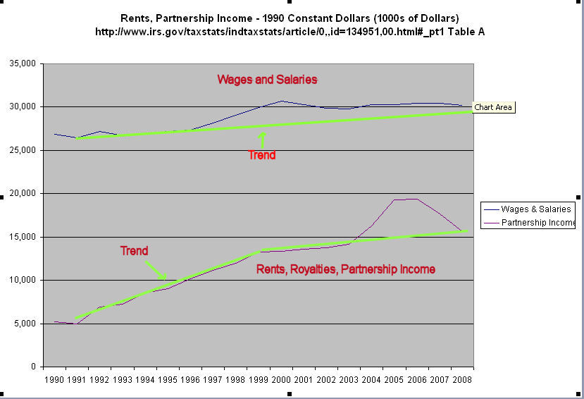
In the second chart is a comparison of income reported on K1 forms, largely professional and business owner income, with wages and salaries. Professionals and business owners enjoyed a large increase in income compared to the flat earning of many workers.
In the 3rd chart is the total tax liability reported to the IRS. Although some claim that reducing tax rates increases tax revenues and vice versa, the IRS data simply doesn’t support a strong correlation between tax rates and total income taxes paid to the IRS. Tax revenues go up and they go down when tax rates go up. They go up and they go down when tax rates go down.

In the 4th chart is the average tax liability, with the overall trend of up, up, up.

What accounts for the increase or decrease in tax revenues? It is a general increase in adjusted gross income per tax return, as the following chart shows. Income may go up or down when tax rates increase. They may go up or down when tax rates decrease. Again, there is little correlation between income and tax rates.

There is a lot of talk about the “New Normal” but what the latest downturn shows is a return to Normal, the same old normal trend line of income averages. We got way ahead of the trend during the tech and housing bubbles. We bought big cars and ever bigger houses, and ran up our credit cards using the equity in our homes. “Normal”, that is, the average of the trend, will always pull us back to the trend line.

So, what is the basic drive behind normal? Am I making sense? I totally get what normal is, after reading this post. But in Normal, income trends upward. In Normal, this is really stable. Tax increases and decreases don't affect it, which is fascinating to know. So it would also be cool to know how Normal works.
LikeLike
Enlarge the last chart, pick a point on the green trend line and calculate the average rise in adjusted gross incomes (AGI)over the trend. To make it easy, pick 2001, which is a 10 year period from 1991. In 2001, the trend is about $28,500 in AGI, or about a $3500 increase in inflation adjusted dollars from the $25,000 in 1991. That is a total of about 14%, or 1.4% per year increase in average AGI after discounting inflation.
We had two periods in the 90s and 00s where increases in incomes were way above the “norm”, or trend, of this gently rising 1.4% increase in incomes. Statistically, we were overdue for a sharp decrease in incomes. We should have gone through the pain in 2003, when it would have been less painful to get back to the norm. Instead the housing bubble propelled incomes up again above the trend line, postponing the inevitable return to trend. When it finally hit in 2008 / 2009, the downturn was even more severe than it would have been in 2003.
LikeLike