Procession, Not Recession

May 24, 2015

Existing home sales of just over 5 million (annualized) in April were a bit disappointing.   Since the recession, there have been only about six months that sales have been above a healthy benchmark of 5.2 million set in the late 1990s to early 2000s.

***********************

Procession, not Recession Indicator

When reporting first quarter results, many of the big multi-national companies in the Dow Jones noted that sales had declined in Europe.  The broader stock market, the SP500, has not had a 5% decline for three years and is due for a correction.  Greece is likely to default on their Euro loans in June.  Combine all of these together and some pundits predict a 30 – 40% market correction this summer and/or a recession this year.  Corrections can be overdue for a long time.  Some treat the stock market as though its patterns were almost as predictable as a pregnancy.  Here’s an early 2014 warning that finds a chilling similarity between the bull market of today and, yes, the one before the 1929 crash.

Bull and bear markets tend to confound the best chart watchers.  The bear market of 2000 – 2003 was not like that of 2007 -2009.  Some argue that market valuations are like a rubber band.  The longer prices become stretched, the harder the snapback.  However, the data doesn’t show any consistent conclusion.

The 2003 – 2007 bull market ran for 4-1/2 years without a 5% correction.  That one didn’t end well, as we all know.   The mid-1990s had a three year stampede from the summer of 1994 to the summer of 1997 before falling more than 5%.  After a brief stumble, the market continued upwards for a few more years.  Turn the dial on the wayback machine to the early 1960s for the previous stampede, from the summer of 1962 to the spring of 1965.  That one ended much like the 1990s, dropping back before pushing higher for a few more years. These long runs occur infrequently so there is not much data to go on but the lack of data has never stopped human beings from predicting the end of the world.

April’s Leading Economic Indicator was up .7%, above expectations, but this increase was helped along by an upsurge in building permits.  This series has been unreliable in predicting recessions and its methodology has been revised a number of  times to better its accuracy.  Doug Short does a good job of tracking the history of this composite and here is his update of April’s reading.

A much more consistent indicator of coming recessions is the difference in the interest rates of two Treasury bonds.  The time to start thinking about recessions is when the 10 year interest rate minus the two year rate drops below zero.  The current reading simply doesn’t support concerns about recession in the mid-term.

The Federal Reserve has made it easy for us to track this flattening of the yield curve.  They even do the subtraction for us.  The series is called T10Y2Y, as in “Treasury 10 year 2 year.”

The Gathering

February 14, 2015

In January of this year, the SP500 finally rose above the inflation adjusted high set in 2000.  Here is a chart from multpl.com that I have overlaid with a few boxes.  Long term market trends are dubbed “secular” to contrast them with the shorter cyclical swings in valuation.  A secular bear market is a prolonged market downturn in which the inflation adjusted price of the SP500 never gets above a certain historical peak.

These long term periods are easier to define in hindsight.  They have begun with some peak and ended at some trough.  Years after the trough when the market has made a new inflation adjusted high price, market watchers get out their crayons and set the end of the bear market just after that trough.  Based on that historical rule, we would then say that the secular bear market that began in 2000 ended in 2009 at a market low six months after the onset of the financial crisis.

If history is any guide, an investor could expect further price increases for another 2 years (as in the late 1920s), or another 10 years (as in the late 1950s to late 1960s), or another 8 years (as in the 1990s).  In other words, history may not be much of a guide.

If the market tanked in 2017, two years after setting a new high, some sages would nod soberly and say it was just like the 1920s and was to be expected.  If the market continued rising another eight years before falling, ah yes, just like the 1990s.  The signs were all there if you knew where to look.

Secular bear markets share characteristics other than long term price swings.  During past prolonged downturns there have been five recessions within each period.  We have had two recessions since 2000.  Price to earnings, or PE, ratios went really low – about 6 – at the lowest trough of past downturns.  This is also the approximate low in the Shiller CAPE ratio.  Since 2000, the PE ratio has fallen to 10; the CAPE ratio to 13.  The current PE ratio based on the trailing twelve months earnings is almost 20, about 25% above the average. The number of years from peak to trough has been 19.  2000-2009 would be only 9 years, the shortest secular bear period on record.  The number of years from peak to peak has been about 26 years, much longer than the current 15 year period.

 This has led some to predict a further final crushing decline in the market to end the secular bear.  If the doomsayers are correct and we are only two-thirds through a secular bear market, we would expect market prices to plateau this year.  Then will come some shock – China’s real estate market implodes, or its regional banks collapse.  The so called PIGS – Portugal, Ireland, Greece, and Spain – could exit the euro.  There could be a major armed conflict with Russia or Iran that causes investors to abandon equities in droves.  The stronger dollar can put strains on countries whose currencies are pegged to the dollar. Such strains can cause a financial crisis similar to the one in Mexico in 1995 and the Asian and Russian crises of 1997 – 1998.  In the summer of 1998, the SP500 fell 15% in one month as fears grew that regional monetary imbalances would infect the economies of the entire world.

Secular bear markets come in types.  The two that started in 1929 and 2000 arose from what I call discovery shocks.  Investors lose conviction in their own hopes of future gains and leave the market.   The bear market that began in the late 1960s was a series of conflict shocks that spurred erratic changes in inflation.   As the country borrowed money to fund the Vietnam war, inflation rose above 3%, peaking at 6% in the spring of 1970.  The 1970s was marked by domestic and international conflict: the Watergate scandal and the oil supply wars with OPEC drove inflation to a high of 12% in late 1974.  As oil prices quadrupled through the 1970s, inflation spiked at almost 15% in the spring of 1980.  Through most of the decade, inflation stayed above 5% – a low that was almost double the historical average.

The SP500 made new records again this week although FactSet notes that the blended earnings growth for the fourth quarter of 2014 was only 3.1%.  The forward P/E of the SP500 is 17.1%, substantially above both the five and ten year averages (see paragraph below for illustration of changes in forward P/E). FactSet reports that nine out of ten sectors have forward P/E ratios that are above their ten year averages.  Only the telecom sector is selling slightly below its ten year average.  The forward P/E of the SP500 is based on projected earnings over the next year and volatile oil prices have made such earnings estimations difficult.  First quarter earnings by energy companies have been revised downwards by 50%, resulting in a 7.4% decrease in earnings estimates for the SP500.

Small changes in earnings estimates are multiplied 10 to 30 times to reach an evaluation of fair market price.  If 2015 earnings for SP500 companies are estimated at $100, an index price of 2000 is a forward P/E of 20.  If estimates are revised upwards to $110, then an index price of 2000 reflects a forward P/E of 18.  If the forward P/E of the SP500 is above the five and ten year averages as it is today, it means that investors and traders are betting that estimates of forward earnings will be revised upwards, resulting in a lower forward P/E ratio.

Long-term Treasuries (TLT) rose up 11.5% in the five weeks from late December to the end of January – too much, too fast.  After falling back in the last two weeks from their peaks, they are priced at the same level as in July 2012.  In 2014, traders who bet against long term bonds in anticipation of rising interest rates got slaughtered as long term Treasuries rose 25%.  Investors who moved out of long term and into shorter term bonds were disappointed as well.

*****************

Retail Sales

Investors regard the monthly employment report and the retail sales report as the most important barometer of a consumer driven economy.  As an example of the correlation, consider a graph of inflation adjusted retail sales and the SP500 index.

Retail sales in January declined slightly from December.  Investors were somewhat heartened by the 2.4% annual gain, at least 1% above inflation, but remember that last January was particularly poor and was an easy benchmark to beat.  On the other hand, lower gasoline prices lowered this year’s total,  offsetting the comparison with a weak benchmark.

Sales at food and drinking establishments rose more than 11% y-o-y in January.

Large y-o-y gains in food and drink usually occur in the winter months.  January 2000, 2001, 2004, 2006, December 2006, January 2012, and these past two months all peaked at more than 8% y-o-y gains.  Eating and drinking out are largely discretionary for most of us.  A change in the pace of growth in this behavior signals  changes in consumer attitudes that are more real than a consumer confidence survey.  Changes in this discretionary budget item is a survey of wallets. In the past year, the growth of food and drink sales has accelerated, indicating a more confident, less fearful consumer.

While the various consumer sentiment surveys indicate what we tell interviewers, the wallet survey indicates what we really think.  In early 2009, the U. of Michigan Consumer Sentiment Survey showed a rebound of confidence.  What the survey indicated was more a rebound of hope, not confidence.  Consumer spending on eating and drinking out was still declining.

2011 is an indication of the opposite – plunging sentiment according to a survey but growing spending at food and drink establishments, indicating that the volatile drop in sentiment might be short lived.  The plunge in confidence was a response to the budget battles between the Republican House and the President.

Low inflation, relatively low gasoline prices, strong employment and retail sales gains all point to steady moderate growth.  Judging by the PE (19.7) and forward PE (17.1) ratios, the market may have already priced in that growth.

Zorro Moon

October 12, 2014

Last Sunday, George and Mabel flew back to Denver from Portland.  They took a bus shuttle from the terminal to long-term parking and discovered that neither of them could find the parking stub which indicated which section they had parked in.  Mabel dutifully looked through her purse.  “I know you kept the stub, George, but I’ll look anyway.”  Mabel remembered details like this so George knew she was probably right. “I should have put it in my wallet and it’s not there,” George replied.  They asked to be let out at the main exit booth.  The attendant told them to go inside the office where they met a nice man with a patient look.  His English was barely accented with the round vowels of Spanish.  “My name is George.  How can I help you?” the attendant announced.  “Hey, that’s my name too,” George replied, as though each of them belonged to a brotherhood.  “Well, we seem to have lost our ticket stub and we can’t remember where we parked our car,” George told him.  “What day did you come in?” the other George asked.  “Last Monday, about 7:30 in the morning.”  The attendant’s face adopted an odd stillness, his eyes looking far away. “That was a busy morning.  We were parking in GG and HH at the far end of the lot.”  Both George and Mabel were amazed at the man’s memory and said so.  The attendant smiled graciously.  He pulled a set of keys from a hook on a key board, picked up two of their bags and led them to an idle shuttle parked near the office.  At the far end of the lot, the attendant drove slowly down one row until they reached the edge of the lot, then drove down the next row.  Mabel was the first to see their car. “There it is!” she exclaimed.  George gave the attendant a $10 bill, thanking him for his help.  The attendant nodded graciously, then drove back toward the office.  “There’s someone with  a remarkable talent working at a parking lot,” Mabel remarked.  “I think our schools do a terrible job of helping students discover their own talents.   The structure of our society, our economy – it could uncover and use these talents better.”

Sitting at his desk Sunday night, George mulled over the same thought that had distracted him on the flight from Portland.  Should he sell some or all of their stock holdings?  Two indicators said yes, another said maybe, one said this was temporary.  While on vacation, he had not compiled his makeshift index based on the monthly Purchasing Managers Index.  ISM, the publishers of the index, had released the services sector figures that past Friday.  He pulled up the latest report, then input the figures into his spreadsheet.  The index seemed to have peaked in September at a very robust reading near 70, rising up a few points from an already robust reading in August.

This composite of economic activity was a “stay out of trouble” indicator, giving buy and sell signals when the index rose above and below 50.  The last signal had been a buy signal in August 2009 when the SP500 was about half its current value.  Before that, the previous cue had been a sell signal in January 2008, a month after the official start of the recession.  Because employment and new orders were the largest components of the index, a chart of just these two components of the services sector reflected the larger composite.

So, the American economy was strong and Friday’s employment report had been a positive surprise. What seemed to be worrying investors was weakness over in Europe.  But Europe had been nearing recession for a few quarters now and that had not worried investors during the past year and a half.  Yes, no, yes, no decisions swirled around in George’s head.  Should he wait till the market opened Monday morning and see what the mood was?  Well, what if it was rather flat?  What would that tell him?  As Yogi Berra said, when you come to a fork in the road, take it.  So George did.  He put in an order to sell half of their stock holdings, essentially taking both forks of the road.

On Monday the market opened up above Friday’s close, indicating that a number of investors had put their buy orders in over the weekend after the positive employment report.  Active traders took the market back down below the level of Friday’s close.  In 1970s lingo, it was “negative vibes,” or negative sentiment in normal speak.

The Federal Reserve announced that they would begin publishing a labor market index that compiled 19 different labor market indicators to give an overall report card on employment.  The index was first proposed in a working paper published in May and the Fed was cautioning that the index was not “official.”

A chart of the various components of the index showed the correlations of each component with overall economic activity in the country.

The Fed provided a permanent link to a spreadsheet that they would update each month.  It was  a zero-based index.  Readings above zero meant overall conditions were improving; below zero, conditions were deteriorating.

The market opened up Tuesday with the news that Germany’s industrial output had dropped 4% in August.  A key leader and consistent performer, Germany was the Derek Jeter of the Eurozone.  As every baseball fan knows, if Derek was not producing, the whole team was in trouble.  The whole team in this analogy was the world.  The IMF revised their global growth rate for 2014 from 3.4% to 3.3%.  Quelle horreur!  Never mind that Tuesday’s JOLTS report showed the most job openings since 2001 when China was admitted to the World Trade Organization and started sucking jobs from the U.S.

Tuesday evening, George and Mabel watched the full moon, the Hunter’s moon, when it was about 30 degrees above the eastern horizon.  Clouds had obscured the moon when it was first rising and really big.  Wisps of clouds still drifted across the pale disk.  “It’s a Zorro moon,” George remarked.  “Zorro would go out on a night like this and undo the oppressive plans of the evil comandante.”  Mabel laughed.  “We’ll rename it the Zorro moon, then.  All those calendars we get each year will have to be changed.”  “Yeh, what’s with that?” George asked.  “No one ever sends a pamphlet of favorite quotes or prominent dates in history.  Just calendars.”

Mabel set her alarm to get up at 4:15 AM so she could watch the lunar eclipse.  She woke up about 7:30 that morning, disappointed that her sleeping self had turned off the alarm without even bothering to notify her lunar eclipse watching self.

On Wednesday afternoon, the Federal Reserve released the minutes of the September meeting of the Open Market Committee, the group within the Fed that that determined interest rate policy.  The sentiment of the Committee was rather dovish, and the stock market rallied up sharply in the last two hours of trading.  Still, the close was not as high as the opening price on Monday, two days earlier.  Volume was the highest it had been since August 1st and should have been confirmation that sentiment had reversed to the positive.  George was still cautious.

The market is essentially an argument over value.  The difference between each day’s high and low price indicates how much investors are arguing. The 5-day average of that difference was now double the 200 day average and rising.  George had learned that bigger arguments usually led to lower prices.  He had enjoyed a nice run up in 20-year Treasuries during the summer but then got out in mid-September.  Now two thirds of his investing stash was sitting on the sidelines in cash.  Treasuries had rallied, proving that it was difficult, if not impossible, to time the market.  Something George didn’t like was the relatively small movement in the price of Treasuries as the stock market rallied.

On Thursday, the market dropped quickly on news that German exports had dropped almost 6% in August. By the end of the day, the SP500 index had lost about 2%.  Bears saw an opportunity to hawk their books warning of the coming collapse of the global economy.  “Is the end near?  Next we go to Doug Munchie of Funchee Crunchie Capital.  Doug, tell our audience some companies that you think will do well as the coming global meltdown approaches.” Doug is looking sharp in a $300 white shirt and a $200 blue and red tie. “Good morning, Megan.  For our cautious clients, we recommend gold Lego blocks.  Our clients can construct many creative projects with their gold while they sit out the collapse.” “Thanks, Doug.  When we come back, we’ll talk to a priest who claims that holy water can cure Ebola.”

By the time he died, George thought, he will have heard at least 1 million hustles.  “Doctor, do you know the cause of Mr. Liscomb’s death?”  “Yes, he suffered from Bullshitis, the accumulation of a lifetime of blather.  A person’s brain becomes clogged and shuts down.”

The decline continued on Friday, bringing the SP500 back to the price levels of late May.  The closing price touched the 200-day average.  For long term investors, the next week might be a good  opportunity to move some idle cash into stocks. If the downturn became a serious decline, the 50 day average would cross below the 200-day average in a few weeks or so.  That crossing was called the Death Cross, a serious shift in sentiment.

Watching the news later that evening, Mabel asked, “We’re fine?”  “We’re fine,” George replied. Then he changed the subject to their recent visit to Oregon.  “I wish could be close to the ocean and yet not have all the dampness.”  “It’s called southern California,” Mabel quipped.

Economic Porridge

August 31, 2014

As summer comes to a close and the sun drifts south for the winter, the porridge is not too hot or too cold.

********************

Coincident Index

The index of Leading Indicators came out last week, showing increased strength in the economy.  Despite its name, this  index has been notoriously poor as a predictor of economic activity.  The Philadelphia branch of the Federal Reserve compiles an index of Coincident Activity in the 50 states, then combines that data into an index for the country.

This index is in the healthy zone and rising. When the year-over-year percent change in this index drops below 2.5%, the economy has historically been on the brink of recession.  The index turns up near the end of the recession, and until the index climbs back above the 2.5% level, an investor should be watchful for any subsequent declines in the index.

As with any historical series, we are looking at revised data.  When this index was published in mid-2011, the percent change in the index was -7% at the recession’s end in mid-2009.  Notice that the percent drop in the current chart is a bit less than 5%.  This may be due to revisions in the data or the methodology used to compile the index.

**************************

Disposable Income

The Bureau of Economic Analysis (BEA) produces a number of annual series, which it updates through the year as more complete data from the previous year is received.  2013 per capita real disposable income, or what is left after taxes, was revised upward by .2% at the end of July but still shows a negative drop in income for 2013.  While all recessions are not accompanied by a negative change in disposable income, a negative change has coincided with ALL recessions since the series began at the start of the 1930s Depression.

Many positive economic indicators make it highly unlikely that we are either in or on the brink of recession.  Clearly something has changed.  Something that has routinely not been counted in disposable personal income is having some positive effect on the economy.  In 2004, the BEA published a paper comparing the methodology they use to count personal income and a measure of income, called money income, that the Census Bureau uses.  What both measures don’t count in their income measures are capital gains.

Unlike BEA’s measure of personal income, CPS money income excludes employer contributions to government employee retirement plans and to private health and pension funds, lumps-sum payments except those received as part of earnings, certain in-kind transfer payments—such as Medicare, Medicaid, and food stamps—and imputed income. Money income includes, but personal income excludes, personal contributions for social insurance, income from government employee retirement plans and from private pensions and annuities, and income from interpersonal transfers, such as child support. (Source)

Analysis (Excel file) of 2012 tax forms by the IRS shows $620 billion in capital gains that year, about 5% of the $12,384 billion in disposable personal income counted by the BEA.  An acknowledged flaw in the counting of disposable income is that the total reflects the taxes that individuals pay on the capital gains (deducted from income) but not the capital gains that generated that taxable income.  Although 2013 data is not yet available from the IRS, total personal income taxes collected rose 16%.  We can suppose that the 30% rise in the stock market generated substantial capital gains income.

*************************

Interest

Every year the Federal Government collects taxes and spends money.  Most years, the spending is more than the taxes collected – a deficit.  The public debt is the accumulation of those annual deficits.  It does not include money “borrowed” from the Social Security trust fund as well as other intra-governmental debt, which add another third to the public debt.  (Treasury FAQ)  This larger number is called the gross debt.  At the end of 2012, the public debt was more than GDP for the first time.

The Federal Reserve owns about 15% of the public debt.  But wait, you might say, isn’t the Federal Reserve just part of the government?  Well, yes it is.  Even the so-called public debt is not so public.  How did the Federal Reserve buy that  government debt?  By magic – digital magic.  There is a lot of deliberation, of course, but the actual buying of government debt is done with a few dozen keystrokes.  Back in ye olden days, a government with a spending problem would have to melt down some of its gold reserves, add in some cheaper metal to the mix and make new coins.  It is so much easier now for a government to go to war or to give out goodies to businesses and people.

Despite the high debt level, the percent of federal revenues to pay the interest on that debt is relatively low, slightly above the average percentage in the 1950s and 1960s but far below the nosebleed percentages of the 1980s and 1990s.

As the boomer generation continues to retire, the Federal Government is going to exchange intra-governmental debt, i.e. the money the government owes to the Social Security trust funds, for public debt.  As long as 1) the world continues to buy this debt,  and 2) interest rates stay low, the impact of the interest cost on the annual budget is reasonable.  However, the higher the debt level, the more we depend on these conditions being true.

************************

Watch the Percentages

As the SP500 touched and crossed the 2000 mark this week, some investors wondered whether the herd is about to go over the cliff.  The blue line in the chart below is the 10 month relative strength (RSI) of the SP500.  The red line is the 10 month RSI of a Vanguard fund that invests in long term corporate and government bonds.  Readings above 70 indicate a strong market for the security. A reading of 50 is neutral and 30 indicates a weak market for the security. The longer the RSI stays above 70, the greater the likelihood that the security is getting over-bought.

Long term bonds tend to move in the opposite direction of the stock market.  While they may both muddle along in the zone between 30 and 70, it is unusual for both of them to be particularly strong or weak at the same time.  We see a period in 1998 during the Asian financial crisis when they were both strong.  They were both weak in the fall of 2008 when the global financial crisis hit.  Long term bonds are again about to share the strong zone with the stock market.

Let’s zoom out even further to get a really long perspective.  Since November 2013, the SP500 index has been more than 30% above its 4 year average – a relatively rare occurrence.  It happened in 1954 – 1956 after the end of the Korean War, again in December of 1980, during the summer months of 1983, the beginning of 1986 to the October 1987 crash, and from the beginning of 1996 through September 2000.

In the summer of 2000, the fall from grace was rather severe and extended.  In most cases, including the crash of 1987, losses were minimal a year after the index dropped back below the 30% threshold.  When the market “gets ahead of itself” by this much, it indicates an optimism brought on by some distortion.  It does not mean that an investor should panic but it is likely that returns will be rather flat over the following year.

The index rarely gets 30% below its 4 year average and each time these have proven to be excellent buying opportunities.  The fall of 1974, the winter months of 2002 – 2003, and the big daddy of them all, March 2009, when the index fell almost 40% below its 4 year average.

************************

GDP

The Bureau of Economic Analysis (BEA) released the 2nd estimate of 2nd quarter GDP growth and surprised to the upside, revising the inital 4.0% annual growth rate to 4.2%.  As I noted a month ago, the first estimate of 2nd quarter growth included a 1.7% upward kick because of a build up of inventory, which seemed a bit high.  The BEA did revise inventory growth down to 1.4% but the decrease was more than offset primarily by increases in nonresidential investment. A version of GDP called Final Sales of Domestic Product does not include inventory changes.  As we can see in the graph below, the year-over-year percent gain is in the Goldilocks zone – not strong, but not weak.

New orders for durable goods that exclude the more volatile transportation industries, airlines and automobiles, showed a healthy 6.5% y-o-y increase in July.  Like the Final Sales figures above, this is sustainable growth.

***********************

Takeaways

Economic indicators are positive but market prices may have already anticipated most of the positive, leaving investors with little to gain over the following twelve months.

Retail Sales and the Stock Market

July 20th, 2014

This week I’ll take a look at the latest retail sales numbers and revisit a familiar valuation metric for the stock market.

*******************

Retail Sales

Retail sales were a bit of a disappointment this week because of a monthly decline in auto sales.  As strong as vehicle sales have been, we can see a pattern that echoes a trend in employment – the best of this post-recession period is near the low of past recessions.  As a percent of the population, the number of cars and light trucks sold is tepid at best.

In total, retail sales gained more than 4% year-over-year but here again we can see a familiar pattern – declining yearly percentage gains.  Periods of rising gains are about half the length of periods of falling gains.  Over the next several months, we would like to see higher highs in the yearly gains.  Further declines, i.e. lower highs, would be a cause for concern.

*************************

Malaysian Airline Disaster

Oil prices had fallen more than 5% over the past three weeks.  The news of an apparent missile strike on a Malaysian passenger jet over a conflict zone in eastern Ukraine sent oil prices up about 2.5% over two days this week before falling back slightly on Friday.  As families mourn the deaths of almost 300 people on the plane, a fusillade of accusations and denials were launched.  Some accuse Russia of launching the missile that struck the passenger jet flying at 33,000 foot altitude, some blame Russian-backed separatists in eastern Ukraine, others hold Ukranian forces accountable.  Economic sanctions already in place against Russia may be broadened.

Unrest in Ukraine, Iraq and Libya puts upward pressure on oil prices but the effect is moderated by a global supply that is able to meet demand with a safety buffer capable of absorbing these geopolitical conflicts.

***************************

Stock Market Valuation

The stock market continues its two year run to try and meet up with the trend channel of the mid-2000s as though the financial crisis never happened.

Last month I wrote about the Shiller CAPE ratio, introduced by economist Robert Shiller in his book Irrational Exuberance. Some writers also refer to the CAPE ratio as PE10 or the Shiller P/E ratio.

Portfolio Visualizer (PV) has a free tool that lets viewers backtest portfolios using various strategies. An optional timing model based on the CAPE ratio flips the allocation of a portfolio from 60% stocks and 40% bonds (60/40) to a 40/60 mix when the CAPE is high, as it is today.  In the model, “high” is a CAPE above 22, but as I wrote last month, the CAPE has averaged 22.91 for the past 30 years.  In the relatively low interest environment of the past thirty years, investors are willing to pay more for stocks.  The 50 year average is 19.57, within the normal range of the timing model. One could make the point that “high” should be set upward about 3 points, which is the spread between the 30 and 50 year averages (22.91 – 19.57).  In that case, the trigger high would be 25.

Below is a chart of the CAPE ratio and the inflation adjusted or real price of the SP500 index.  As you can see we are far below the nosebleed valuation levels of the late 90s and early 2000s.

The current CAPE ratio is about 26, above even the modified high point.  Using this model, an investor with a $500,000 portfolio with $300,000 in stocks and $200,000 in bonds, would sell $100,000 of stocks and buy bonds with the proceeds.  Over the past twelve years, the Shiller model would have generated an 8.44% annual return vs the 7.21% return of a 50/50 balanced portfolio.  I included an additional two years to capture half of the downturn in the early 2000s when stocks lost 43% of their value.  More importantly, the risk adjusted return of the Shiller model is much better than the 50/50 portfolio.

The Shiller model also did better than the 8% annual returns of a crossing strategy. This is a variation of the 50 day/200 day “Golden Cross” strategy, which I wrote about in February 2012, a week or so after the occurrence of the last Golden Cross.  In this monthly variation using the Shiller model, an investor exits the market when the SP500 monthly index drops below its 10 month moving average.

Keep in mind that a backtested portfolio generates higher than actual returns since they often don’t include trading fees, slippage or a real life re-balancing.  In backtest simulations, an investor may re-balance all in one day following the signal day.  While that may be the case sometimes, many investors are not so quick and some financial advisers will recommend making a gradual transition when re-balancing.  Still, backtests can be useful in comparing strategies.

An investor who puts money into the stock market today is – or should be – more concerned about what that money will be worth 5, 10 and 20 years from today when they might need the money for retirement, children’s college, or other events in a person’s lifetime.

There is a definite negative correlation between the CAPE and the 10 year return, without dividends, of an investment in the SP500.  Since World War 2, the correlation is -.70.  Since 1902, the correlation is -.65, reflecting the greater portion of earnings that were paid out as dividends to investors before WW2.  In short, it is likely that an investor will experience lower returns the higher this CAPE ratio.

*****************************

How much can I take each year from the piggy bank?

There is also a Shiller model for sustainable withdrawals from a portfolio based on the CAPE ratio.  You can read about it here.  Keep in mind that this model uses a 30 year horizon for retirement.  The same author, Wade Pfau, has a separate article on the various time horizons used in withdrawal models.

*****************************

Takeaways

Two steps forward, one step back is a familiar trend in this post-recession period.  Retail sales are healthy but below the 5% threshold of a strong upward trend.

Using the Shiller CAPE ratio as a metric of market valuation, stocks are overvalued.

How Much Is That Doggie In the Window?

June 22, 2014

This week I’ll look at interest rates and various models of evaluating both the stock market and housing.

*****************

GDP Growth Revised

This past Monday, the International Monetary Fund (IMF) cut estimates for this year’s economic growth in the U.S. to 2% from 2.8%.  IMF cited a number of headwinds: the severe winter, weakness in housing, some fragility in the labor market.  It recommends that the central bank keep rates low through 2017.  Expectations were that the Federal Reserve would begin raising interest rates in mid 2015.  Some recommendations in the report will be met with antipathy or a polite “thanks for letting us know”: raising the minimum wage and gasoline taxes.

******************

Fed Don’t Fail Me Now

As expected, the Federal Reserve decided to leave the target interest rate at the extremely low range of 0% to .25% that it has held in place since the beginning of 2009.  Congress has given the Fed a dual mandate:  keep inflation reasonable and promote full employment.  It is this second half of the mandate that presents some problems as the FOMC looks into their crystal ball.  The Labor Force Participation Rate is the percentage of those working to those old enough to work.  It has declined from 66% at the beginning of the recession to less than 63% today.

As economic conditions improve and job prospects brighten, how many of those who have dropped out of the labor force will return?  If workers return to the labor force, actively seeking work, that increased supply of labor will naturally curb wage increases and reduce upward pressure on inflation.  However, if the decline in the participation rate is more or less permanent for several years to a decade, then a stronger economy will create more demand for workers, who can demand more money for their labor, which will contribute to inflation.

**********************

401K Retirement Plans

The Financial Times reported projections  of negative cash flows in 401K plans by 2016 as boomers convert their pension plans to IRAs when they retire.  Retirees tend to have a much more conservative stock/bond allocation and may force institutional money managers to liquidate some equities to meet the outgoing cash flows.  An ominous speculation at the end of the article is that regulations could be put in place to slow the conversion of 401Ks to IRAs.  Whenever the finance industry needs a friend in Washington, they can be sure to find one.

*********************

Stock Market Valuation

It has been 32 months without a 10% correction in the SP500 market index.  The post World War 2 average is 18 months. Is the stock market overvalued?  I will review a common metric of value and develop an alternative model of long-term value.

Probably the most widely used metric of stock valuation is the Price/Earnings, or PE, ratio.  If a stock sells for $100 and its annual earnings are $6, then the P/E ratio is 100/6, or a bit above 16.  The average PE ratio is 15.5 (Source).  Companies do not pay all of those earnings in the form of dividends to investors.  That is another metric, called the Price Dividend, or P/D ratio, that I wrote about last year.

Fact Set provides an analysis of the past quarter’s earnings of the SP500 companies, as well as projections of current  and next year’s earnings. Earnings growth estimates for this year range from 30% (yikes!) for the telecom sector to a bit over 3% for utilities. The health care sector tops estimates of revenue growth at about 8%, while the energy sector is projected to have negative growth.  The basic materials sector tops the 2015 list of earnings growth at 18% and the utilities sector again takes the bottom rung on the ladder with almost 4% growth.

The SP500 is priced at 15.6x forward 12 months earnings, which is above the five year and 10 year averages of less than 14x (Fact Set Report page)  but just about the 100 year average of 15.5.

Robert Shiller, a Yale economist and co-developer of the Case-Shiller housing index, uses a smoothing technique for calculating a Price Earnings ratio and makes his data spreadsheet available.  His team calculates the 10 year average of real, or inflation-adjusted, earnings and divides the inflation adjusted price of the SP500 by that average to arrive at a Cyclically Adjusted Price Earnings, or CAPE, ratio.

Using this methodology, the market’s CAPE  ratio is 25, above the 30 year ratio of 22.91 and the 50 year ratio of 19.57.  In 1996, the market was trading at this same ratio, prompting then Fed Chairman Alan Greenspan to make his infamous comment about “irrational exuberance.”  The market continued to climb till it reached a nosebleed CAPE ratio of 43 in early 2000.  It took another 7 months or so before the SP500 began its descent from 1485 to 900, a drop of 40%, over the next two years.  There is no automatic switch that flips when a market becomes overvalued.  People just get up from their seats and start to leave the theater.

In most decades, this methodology works well to arrive at a longer term perspective of the market’s price.  However, some argue that when severe downturns occur, this methodology continues to factor in the downturn’s impact long after it they have passed.  In 2008 and 2009, SP500 index annual earnings crashed from above $80 down to $60, a precipitous decline that is still factored into the ten year framework of the CAPE method.

So I took Mr. Shiller’s earnings figures and did some magic on them.  I took away most of the downturn in earnings during a 3 year period from 2008 – 2010.

Bye, bye earnings dive.  Hello, stagnating earnings.  The chart shows a slight downturn in earnings, then flat-lines in the pretend world of 2008 – 2010, where the steep recession never happened.

Instead of a deep crater formed in the markets by the financial panic in late 2008, the stock market slid downward over several years before rising again in early 2012.  Can you hear the soft sounds of flutes echoing in the mountain meadows of this pretend world?

Using this pretend data, I recalculated today’s CAPE ratio at 22, below the actual 25 CAPE ratio.  What should be the benchmark in this pretend world?  The 100 year average includes the Great Depression of the 1930s and World War 2, which naturally lowered PE ratios.  A 50 year average includes the Vietnam War and high inflation, particularly during the 1970s and early 1980s.  As such, it is less comparable to today’s environment marked by low inflation and the lack of major hostilities.

So, I ran a 30 year average of our pretend world, from 1984-2013, and calculated a 30 year average of 23, close to the real 30 year average of 22.9!  It shows the relatively small effect that even momentous events have on a long term average of the CAPE ratio, which is why Robert Shiller advocates its use to calculate value and establish a comparison benchmark within a longer time frame.  In the real world, the market’s CAPE ratio of 25 is above that 30 year average.

Let’s put aside the world of soft market landings and mountain meadows and look at what I call the time value of the market.  I picked January 1980, a point almost 35 years in the past, as a starting point.  Then I divided the SP500 index by the number of months that have passed since that starting point.  This gives me a ratio of value over time. If an investor buys into the market when its value is above a long-term average of that ratio, we can expect a lower long-term rate of return.

The 20 year average is 3.98, just a shade above the 20 year median of 3.91, meaning that the highs and lows of the average pretty much cancel out.  Note also that it is only in the past year that the market value has risen above the 20 year average of this ratio.

But we cannot look at a time value of any investment without considering inflation, which erodes value over time.  When we add the Time Value Ratio and the Consumer Price Index (CPI), we find that the current market is priced slightly lower than both the 20 year and 30 year averages.

Historically, as this ratio has risen more than 25 – 30% above its long-term average,  the market peaked.  Today’s ratio is just about average.

So, is the market overvalued?  Based on CAPE methodology, yes.  Fairly valued?  Based on expectations of earnings growth this year and next, yes.  Undervalued?  Probably not.

Common Sense recently published the best and worst 10 and 20 year returns on a 50/50 stock/bond portfolio mix.  This balanced approach had a 2 – 3% annualized gain even during the Depression years when the stock market lost 80 – 90% of its value.  It should be a reminder to all investors that trying to assess the true value of the stock market is perhaps less important than staying diversified.

************************

The P/E of Housing

Home builders broke ground on almost 1.1 million private residential units in April, a 13% increase over last year.  Called Housing Starts, the series includes both multi-family units and single family homes. The pace slowed a bit in May but still broke the 1 million mark.  As a percent of the population, we just aren’t building as many homes as we used to.

For most of us, our working years are about 60% of our lifespan.  Hopefully, our parents took care of our income needs for the first 20% of our lifespan. During our working years, we hope to save enough to generate a flow of income for the last 20% of our lifespan.  Those savings, which include private pensions and Social Security, are like a pool of water that we accumulate until we start turning on the spigot to start draining the pool.    We turn a stock or pool of savings into a flow of income.

The Bureau of Labor Statistics uses a metric called Owner Equivalent Rent (OER) in their calculation of the Consumer Price Index.  This concept treats a home as though it were generating a phantom income equivalent to the rents in that local real estate market.  We can use this concept to value a house.  The future flows from a stock can be used to generate an intrinsic current value for the house.

As an example:  a house which would generate a net $12000 a year in income, whether real or phantom, after taxes and other expenses, is worth about 16 times that net income, according to historical trends calculated by the ratings agency Moodys.  In this case, the house would be worth about $200K.

Coincidentally, this is the average P/E ratio of the stock market.  Historically, stocks have been valued so that the price of the company’s stock has been about 16 times the earnings flow from the company’s activities.  If a primary residence generates 6% in tax free income and 3% in appreciation, the total annual return on owning a house free and clear is more than the average annual return of the stock market.  The housing boom and bust may have given many younger people the impression that home ownership is a debt trap.  It may take a decade for the housing industry to recover from this perception.

**************************

Takeaways

The Fed is likely to keep interest rates low past mid-2015 but is watching the Labor Participation Rate for early indications that rising wage pressures will spur rising inflation.
The stock market is slightly overvalued or fairly valued depending on the metric one uses.
On average, a house has a value multipler that is similar to the stock market but generates a higher after tax income.

Next week I’ll take a look at some long term trends in education spending and tuition costs.

Retail Sales, Autos, Sell in May

May 18, 2014

This week I’ll look at sentiment among small business owners, retail and auto sales, and revisit the “Sell in May” idea.

Small Business

Cue the trumpets, clouds part, sun rays stream down upon the green fields.  After almost seven years, sentiment among small business owners broke through the 95 level according to the monthly survey conducted by the National Federation of Independent Businesses (NFIB).  Despite the many positives in this latest survey, hiring plans remain muted.  This unfortunately confirms several other reports – the monthly employment report, JOLTS, disposable income, to mention a few – that indicate a befuddling lack of robust employment gains during this recovery.

********************

Retail Sales

The monthly reports on employment and retail sales probably have the most impact on short term investor sentiment.  Retail sales were flat in April but have rebounded well after the particularly harsh winter.  With a longer term perspective, year over year retail gains are not robust but are still in the healthy zone of 2-1/2%.

Per capita inflation adjusted retail and food service sales are strong.  Rising home prices in the early 2000s drove an upsurge in retail sales, followed by an offsetting plunge as home prices dropped and the financial crisis of 2008 hit consumers hard.  The landslide of employment losses undercut retail sales.

Motor Vehicles sales are particularly strong and are now back to the pre-recession trend line.

However, that recession dip represents millions of vehicles not sold and contributes mightily to the record average age of more than 11 years for vehicles in the U.S. (AutoNews)  As the article noted, better engineering has lengthened the serviceable life of many autos.  There are 247 million registered passenger vehicles and light trucks, more than one for each of the 240 million people in this country over the age of 18 (Census Bureau) According to the industry research firm Motor Intelligence (spreadsheet), April’s year to date passenger car sales have declined 1.8% while sales of light pickups have surged 8.3%.  The particularly harsh winter months probably reduced traffic at car dealerships around the country, but the year-over-year comparison in April was only a 3.6% gain.  The lack of a spring bounce indicates that household income gains are meager.  The rise in sales of light pickups is largely due to a 10% increase in construction spending in the past year.

On an annualized basis, auto sales are approaching 16 million, a level last seen in November 2007 and far above the 10 million vehicle sales in 2009.

The numbers look rather strong but annual sales per capita are at the recession levels of the early 1990s.   Clearly, something has changed.

Better engineering has increased serviceable vehicle life.  Demographic changes may be having an effect. The population is aging and older people who drive less may decide to hang on to their vehicles longer.  A population shift toward urban centers reduces demand for autos.  There is a greater availability of public transportation.  In some areas of the country, an electric scooter or bicycle meets many transportation needs.
Long term shifts in an industry prompt employers to look for opportunities to adjust some part of their strategy or cost structure to meet those changes.  Three weeks ago, Toyota announced that they will move their headquarters from Torrance, CA, in the South Bay area of metro L.A., to Plano, TX.  As the largest employer in Torrance, the city’s economy will surely take a hit. (Daily Breeze)  Toyota joins a list of large employers leaving or reducing their presence in California (article)

************************

Sell in May

The market has flatlined since early March.  Most of the companies in the S&P500 have reported earnings for the first quarter.  68% beat expectations but this has become a highly sophisticated game of managing expectations.  What is notable is that sales growth has slowed.  As I noted a few weeks earlier, labor productivity is poor.  Companies have done a remarkable job of cutting costs to boost profits but it is unclear how much more they can cut.  Last year’s 30% rise in the market has spurred the rise of mergers, or growing profits through economies of scale.

If the market were to decline 10 – 20% from here, some would point to the chart of the S&P500 and say they saw it all along.  “Classic case of a market top,” they would intone.  “Several failed attempts to break through resistance at the 1900 level indicated a major market correction.”  Oh, and they have a newsletter that you can subscribe to.

If the market goes up 10%, a different set of people will proclaim that they saw it all along.  “The market was forming a baseline of support,” they will sagely pronounce.  Each of these people also have a newsletter.

“Sell in May and go away” is an old quip of short term trading.  In 2011, I explored (here and here) the truths and myths behind this old saw. On a long term basis, one earns better returns by disciplined monthly, or quarterly, investing. Still, in a slight majority of the almost 20 years I reviewed, the Sell in May approach had some validity. Let’s look back at the last five years.  Typically an investor would sell the S&P500 and go into long Term Treasuries (TLT).  A more cautious investor might pick a less volatile intermediate bond fund.

In 2013, the SP500 went nowhere from May 1st to September 1st.  Great call by our intrepid investor who took some of her money out of the market and invested in Long Term Treasuries (TLT) in early May.  By early September, however, her investment would have depreciated 13%. Ooops!  Better to have stayed in stocks.

Likewise, in 2012, stocks went nowhere from early May to early September.  Unlike 2013, an investor buying long term Treasuries during that period had a 7% gain BUT if she had waited a week to sell in September, there was no gain.  The gains were a matter of luck.

2011 was the bing-bang year for the Sell in May crowd.  The stock market lost about 12% during the summer while long Treasuries gained 20%.

In 2010, stocks fell 7% during the summer while long Treasuries gained 10%.  During the summer of stocks gained almost 12% while Treasuries changed little.  In short, the strategy worked three summers out of the past five.

Now for a more fundamental approach – investing in companies that are more stable.  Horan Capital Advisors referred to a report from S&P Capital IQ that found that companies in the S&P500 with a low beta offset or reduced any summer market volatility.  Beta is a measure of a stock’s price volatility.  A value of 1 is the volatility of the entire index.  Betas less than 1 mean that a company’s stock price is less volatile than the index.  As volatility of the total market increases, investors tend to seek companies with a more reliable outlook and performance.  The screening criteria produced a mix of companies dominated by those in the consumer discretionary and health care sectors.  Worth a look for investors who buy individual stocks.

Spring Fever

April 27th, 2014

Existing Home Sales

Sales of existing homes in March were disappointing, dropping 7.5% year over year.  Some analysts use the 5 million mark as an indication of a healthy housing market.

As a percent of the population, the change in existing home sales is rather small, yet the change of ownership prompts remodeling projects and home furnishing purchases after the sale, spiff ups before the sale, and commissions and fees for real estate professionals at the time of the sale.

As a percent of the total stock of homes, sales are likewise small yet determine the valuation of everyone’s home.  There are concrete consequences: a lowered evaluation of a home’s value might mean that a person cannot get a home equity loan to help start a new business.  As we discovered in this last recession, lowered valuations of a  home can mean that homeowners are upside down on their mortgages.  Low valuations “box in” a homeowner’s choices so that they may feel that they can not move to a nearby town to be closer to a new job.  These cumulative effects can promote a defeatist attitude among homeowners.  In the past several years, many of us recently found that we were worth less – $50K, $100K, $200K – because the value of our homes had dropped.  Even though many of us had no intention of moving, we felt poorer.

The methodology underlying the calculation of the Consumer Price Index (CPI) involves the concept of Owner Equivalent Rent (OER).  The CPI treats home ownership as though the family who owns the home is renting the home to themselves.  In this sense, owning a home is like a owning a U.S. Treasury bond that pays regular interest payments, or coupons.  Until the recent recession, many regarded home ownership as though it were a Treasury bond, unlikely to ever lose value.  Even better than a Treasury bond, a house was likely to gain in value.

Most of us, however, do not think in  terms of OER.  We feel poorer when the value of our home drops by 20%. Likewise, a stock market drop of 20% has a significant effect on the value of our retirement funds.  Even if we do not need that money for 10 years or more, we are poorer on paper and this affects many other buying decisions.

***********************************

Spring Fever

Other economic reports this week offset the negative news on home sales.  The flash, or preliminary, index of manufacturing activity indicates a positive report next week on the sector.  Durable goods orders were strong, reinforcing the signs that manufacturing is on a spring upswing.  New claims for unemployment were a bit above expectations but nothing significant and the 4 week moving average of claims indicates a much improved labor market.

Although UPS and 3M had disappointing earnings or forecasts, industrial giants GM and Caterpillar surprised to the upside, as did tech giants Microsoft and Apple.  Expectations for this earnings season were rather lukewarm but the aggregate earnings growth of the SP500 may come in below 1%.  Some attribute Friday’s drop in the market to accelerating tensions in Ukraine but the market was essentially flat this past week, reflecting a general lack of enthusiasm or worry.

************************************

Buffet Investing Advice

In mid March Warren Buffet got the attention of many when he made a surprising recommendation:

Put 10% of the cash in short-term government bonds and 90% in a very low-cost S&P 500 index fund. I suggest Vanguard’s. (VFINX) I believe the trust’s long-term results from this policy will be superior to those attained by most investors – whether pension funds, institutions, or individuals – who employ high-fee managers.

Doughroller presented some good observations on Buffet’s recommendation.  Also at the same site Rob Berger offers a fresh perspective on the stock – bond allocation mix.

**********************************

Consumer Price Index and College Tuition

In a recent analysis of trends in the various components of the Consumer Price Index, Doug Short presented several graphs of the annualized growth rates of the different components.  It comes as no surprise that medical care costs have risen 70% in the past 13 years.  The real surprise to me was that college tuition costs have shot up almost twice that – 130% in the same period.  Average tuition and fees for an in state student at a public four year college are currently almost $9K per year.

The growth in costs should worry parents with a son or daughter six years away from entering college.  Perhaps they may have planned on $10K – $12K a year.  However, if these growth trends remain as constant in the coming years as they have in the past, tuition and fees will be more like $15K per year when their child begins college.  By the time they graduate – if they graduate within four years – the cost could be $20K per year.  Remember, this doesn’t include any housing costs.  Higher education receives heavy subsidies from each state and the Federal government. So why the skyrocketing tuition costs?  Heavy lobbying, influence in the state capitols in the nation, inefficient and bloated administrative structures, protectionism – these are just a few of the reasons for the escalation in costs.  A spokesman for higher education won’t give those reasons, of course.  She will cite the need to attract quality teachers, investments in new technologies, aging infrastructure that is costly to maintain, and those certainly do contribute to increasing costs.  Higher education is still largely built on a framework that was suited for the sons of the landed gentry in the 18th and early 19th centuries.  As Obama and voters discovered after the 2008 elections, change comes slowly.  Like the tax system, higher education will continue to receive incremental changes, a hodgepodge of patches to fix this and that, to pad the pockets of this interest group or ameliorate a select slice of voters.

Employment, Obamacare and the Market

April 13, 2014

Nasdaq, Biotech and the Market

The recent declines in the market have come despite positive reports in employment and  manufacturing in the past few weeks.  Nasdaq market is off about 7% from its high on March 6th and some biotech indexes have lost 8% in the past few weeks. A bellwether in the tech industry is Apple whose stock is down about 9% since the beginning of the year, and 4% in the past few weeks.

The larger market, the SP500, has declined about 4% in the past six trading days, prompting the inevitable “the sky is falling” comments on CNBC.  The decline has not even reached the 5% level of what is considered a normal intermediate correction and already the sky is falling. It sells advertising.  The broader market is at about the same level as mid-January.  Ho-hum news like that does not sell advertising.

Both the tech-heavy Nasdaq and the smaller sub-sector of biotech are attractive to momentum investors who ride a wave of sentiment till the wave appears to be turning back out to sea.  In the broader market, expectations for earnings growth are focused on the second half of the year, not this quarter whose results are expected to be rather lackluster.  The 7-1/2% rise in February and early March might have been a bit frothy.

The aluminum company Alcoa kicks off each earnings season.  Because aluminum in used in so many products Alcoa has become a canary in the coal mine, signalling strength or weakness in the global economy.  On Tuesday, Alcoa reported slightly less revenues than forecast but way overshot profit expectations.  This helped stabilize a market that had lost 2.3% in the past two trading days.

On Thursday, the banking giant JPMorgan announced quarterly profit and revenues that were more than 8% below expectations.  Revenues from mortgages dropped a whopping 68% from last year, while interest income from consumer loans and banking fell 25%.  Investors had been expecting declines but not this severe.  JPMorgan’s stock has lost 5% in the past week, giving it a yield of 2.8% but it may need to come down a bit more to entice wary investors.  Johnson and Johnson, which actually makes tangible things that people need, want and buy every week, pays a yield of 2.7%.  Given the choice and assuming a bit of caution, what would you do?

The banking sector makes up about a sixth of the market value of the SP500, competing with the technology sector for first place (Bloomberg) The technology sector has enriched our lives immensely in the past two decades and deserves to have a significant portion of market value.  The financial sector – not so much.  They are like that one in the family that everyone wishes would just settle down and act responsibly.

****************************

Jolts and New Unemployment Claims 

February’s Job Openings report (JOLTS) recorded a milestone, passing the 4 million mark and – finally, after six years – surpassing the number of job openings at the start of the recession.  The number of Quits shows that there still is not much confidence among employees that they can find a better job if they leave their current employment.

New unemployment claims dropped to 300,000 this week; the steadier 4 week average is at 316,000.  As a percent of the workforce, the number of new claims for unemployment is near historic lows, surpassed only by the tech and housing bubbles.

*******************************

Full-time Employee

A 1986 study of Current Population Survey (CPS) data by the Bureau of Labor Statistics (BLS) found that “well over half of employed Americans work the standard [40 hour] schedule.”  The median hours worked by full time employees changed little at just a bit over 40 hours. The average hours worked by full time employees was 42.5.  The study noted that between 1973 and 1985 the number of full time workers who worked 35 to 39 hours actually declined.

A paper published in 2000 by a BLS economist noted that the Current Population Survey (CPS) that the Census Bureau conducts is the more reliable data when compared to the average work week hours that the BLS publishes each month as part of their Establishment Survey of businesses.  The Establishment survey is taken from employment records but does not properly capture the data on people who work more than one job.  In that survey, a person working two part time jobs at 20 hours each is treated as though they were two people working two part time jobs. The CPS treats that person as one person working 40 hours a week.  Writing in 2000, the author noted that the work week had changed little from 1964 – 1999.

Fast forward to 2013 and the BLS reports that full time workers work an average of 42.5 hours, the same as the 1986 study.  More than 68% of workers reported working 40 or more hours a week.

The House recently passed H.R.2575, titled the “Save American Workers Act of 2014” – I’ll bet the people who write the titles for these bills love their jobs.  I always envision several twenty-somethings sitting in a conference room with pizza and some poetic lubricant and having a “Name That Bill” contest.  I digress.  This bill defines a full time employee as one who works on average 40 hours a week, not the 30 hours currently defined under the Affordable Care Act.

When I first started doing research on this I was biased toward a compromise of 35 hours as the definition of a full time employee.  My gut instinct was that fewer full time employees work a 40 hour week than they did 30 years ago.   The data from the BLS doesn’t support my gut instinct.

******************************

Obamacare

A monthly survey of small businesses by NFIB reported an upswing in confidence in March after a fairly severe decline in February.  That’s the good news.  The bad news is that optimism among small business owners can not seem to break the 95 index since 2007.  According to the U.S. Small Business Administration 2/3rds of new jobs come from small businesses. “Since 1990, as big business eliminated 4 million jobs, small businesses added 8 million new jobs.”

This is the first full year that all the provisions of the ACA, aka Obamacare, take effect.  Millions of small businesses around the country who provide health insurance for their employees are getting their annual business health insurance renewal packages.  For twelve years, my small business has provided health care for employees.  When I received the renewal package a few weeks ago, I was disappointed to find several changes that made comparisons with last year’s costs a bit more difficult.  As an aside, this health insurance carrier has always been the most competitive among five prominent health insurance carriers in the state.

Making the comparison difficult was a change in age banding.  What’s that, you ask?  In my state, business health plans were age banded in 5 year increments; e.g. a 50 year old and a 54 year old would pay the same rate for a particular policy.  Now the age banding is in one year increments.  If I compared the cost for a 45 year old employee last year with the rate for a 46 year old employee this year, the rate increase was a modest 5%.  Not bad.  But if I compare a 48 year old employee’s rate last year with a 49 year old employee this year, costs have risen 11%.   The provider for my company no longer offers the same high deductible ($3000) plan we had, offering a choice between an even higher deductible ($4500) plan or one with a much lower deductible ($1200).  Again, this makes the comparison more difficult.   Changes like this make cost planning more difficult and are less likely to encourage small businesses to bother offering health coverage to their employees.

Out of curiosity, I took a look at 2002 prices. The company long ago abandoned the no deductible plan we had in 2002 simply because it became unaffordable – this was while George Bush was President.  A plan similar to the HMO plan we had in 2002 – $20 copay, $50 specialist, $0 routine physical, no deductible, $2000 Max OOP –  now costs 270% what it did 12 years ago, an annual increase of more than 8%.  An HMO plan as generous as the one we had in 2002 is no longer available, so a more accurate comparison is that health insurance has tripled in twelve years.   It is no wonder that many small businesses either offer no health insurance or cap benefits at a certain amount that reduces the affordability and availability of insurance for many employees.

Until the unemployment rate decreases further, employees and job applicants are unlikely to exert much pressure for benefits from small business employers, a far different scenario than the heady days of the mid-2000s when unemployment was low and employers had to bargain to get decent employees.  There is no one single powerful voice for  many small businesses, other than the NFIB,  which makes it unlikely that Congress or state representatives will get their collective heads out of their butts and address the myriad regulatory and cost burdens that are far more onerous on small business owners.  Because of that we can expect incremental employment gains.

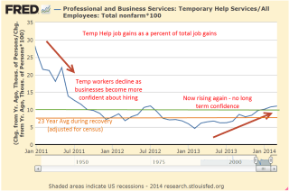
Betraying the lack of long term confidence in the economy and in response to employment burdens, employers increasingly turn to temporary workers, who make up less than 2% of the work force.

As an economy recovers from recession, it is normal for job gains to be distributed unevenly so that the increase in temporary workers is far above their share of the workforce.  Employers are understandably cautious and don’t want to make long term commitments.  Gains in temporary employment as a percent of total job gains should decline below 10%, indicating a stabilizing work force.

For the past two decades of recoveries and relatively healthy growth the average percentage is 7.4% (adjusted for census employment).  The percentage finally fell below this average in early 2012, rose back above it for a few months then stayed under the average till January 2013.  Since February of last year, that percentage has been rising again, crossing above the 10% mark in January, an inexorable evaporation of confidence.

For the past year, repair and maintenance employment has flatlined at 1999 levels, indicating a lack of investment in commercial property and production equipment.

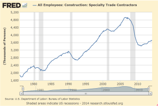
Specialty trade contractors in the construction industries are at 1998 levels despite an increase in population of 40 million.

While not alarming these trends indicate an underlying malaise in the workforce  that will continue to hamper solid growth.  Those ambitious and earnest folks in Washington, eager to make a difference and advance their political careers, continue to create more fixes which make the problem worse.  Imagine a car out of gas.  People out here on Main St. are pushing while the politicians keep hopping in the car to figure out what’s wrong, making the car that much more difficult to push.  At this rate, it is going to be slow going.

The Market and Growth

March 2nd, 2014

SP500
Some pundits have made the case that the stock market is due to fall this year because of the almost 30% rise in prices in 2013.  On the face of it, it seems logical.  If the average rise in the SP500 over the past fifty years is about 8-1/2% and there is a 30% rise in one year, then the market has essentially “used up” more than three years of the average – all in one year.  But the stock market is the net result of billions of buy and sell decisions by human beings.  My experience has taught me that the connection between sense and the behavior of human beings is tenuous, at best.  The Red Carpet walk at the Oscars Award Ceremony is a demonstration of the nonsensical choices that human beings make.  I mean, can you believe the dress that actress is wearing?  And who told that actor he could grow a beard?  PUH-LEEZ!

So I looked at past history and wondered: what is the average yearly return of the SP500 index over the three years following a 20% rise in the market?  As an example, if the market rises 20% in Year #1, what is the 3 year average of yearly returns in Year #4?  The results surprised me – 9.5%.

But wait! you say.  The late nineties were an aberration of irrational exuberance that skews the average.  Removing those two outliers from the data set gives a yearly average of 6.2%.  Add in 2% dividends and the total comes to 8.2%, a respectable return.

But wait!, you say again.  What about the year after the 20% rise?  Surely, the index must compensate for the above average rise the previous year.  In the year after a 20% rise in the market, the average gain was 13.5%.  Again, there were those crazy years of the late nineties so I’ll take them out, leaving an average gain of 3.7%.  Add in the 2% dividend and it easily outpaces the current return on long term bonds.

This year the pundits could be right and the stock market falls.  However, a successful long term investor must learn to play the averages.

*********************************

GDP and Savings

GDP is a measure of the economic output of a nation but what the heck is it?  A recent presentation by Gary Evans, an economics professor at Harvey Mudd College in California, has a number of wonderfully illustrated graphs that may help the casual reader understand the components of GDP and recent trends in the economy.

On January 30th, the Bureau of Economic Analysis (BEA) released their advance estimate of real GDP growth of 3.1% in the 4th quarter.  As more information of December’s slowdown became available in late January and early February, the market began anticipating that the BEA would revise their advance estimate down.  Slower growth might mean further declines in stock prices, right? Instead, the market anticipated that a slowing of growth in the fourth quarter would calm the hand of the Fed in tapering their bond purchases. As a result, the market  rebounded in February, more than making up for January’s decline.  On Friday, the BEA revised their second estimate of fourth quarter growth downward to 2.4%, almost exactly what the market consensus had anticipated and the market finished out a strong month with a small gain.  The BEA attributed the slower growth in the fourth quarter to reductions in federal, state and local government spending and a slowdown in residential housing.

As the BEA revises their methodology, they also revise previously published GDP data.  In the 2013 revision the BEA adjusted their data going back to 1929.  In the past few years, revisions have added about 1/2 trillion dollars to GDP.  Adjustments to the personal savings rate were substantially higher but savings in the past decade have been at historically low levels.  Personal savings are the amount of disposable income, or income after taxes, that families save.  The rate or PSR is the the percentage of their disposable income that they don’t spend.

When people charge purchases that decreases the savings rate.  Conversely, when families pay down their credit purchases that increases the savings rate.  Despite the explosive growth of household debt in the past thirty years,

the savings rate has remained positive, meaning that the people who do save are more than offsetting those who don’t or can’t save.

Let’s take an example of three families:  the Jones family makes $60K in disposable, or after tax income, saves nothing, but increases their debt $8,000 by buying a new car.  Their personal savings rate is $-8K/$60K, or -13.3%.  The Smith Family also has $60K in disposable income, but is frugal and pays down a few loans and saves some money for a total savings of $2K, or 3.3%.   The Williams family has a disposable income of $120K and has net savings of $20K, or 16.7%. Families with higher incomes tend to save proportionately more of that income.  Total disposable income for the three families is $240K.  Total savings is $14K, or 5.8% of disposable income, but that hides the fact that it is the Williams family that is making most of the contribution to that savings rate.

There is another subtle element contributing to this disparity in savings: inflation.  The Consumer Price Index charts the increasing prices of goods and services – spending.  A higher income family that spends less of its income is less affected by changes in the CPI than a lower income family and this helps a higher income family save proportionately more than the lower income family.  The difference is slight but the compounded effect over thirty years is significant.

During the past thirty years, the personal savings rate has steadily declined.

This doesn’t mean that families are saving less as a percentage of their income but that the number of families with net savings are becoming fewer while the number of families with little net savings or negative net savings are becoming more numerous.  The period from 1930 to 1980 was one of relatively more income equality than the period 1980 to the present.  Let’s look again at the chart above.  In the late 1970s, as income equality begins a decades long decline, so too does the personal savings rate.  The ratio of high income families with a relatively high savings rate to lower income families with a low savings rate also declines.

Savings drives investment in the future.  The low savings rate means that future U.S. economic growth must rely ever more on the savings from those in other countries.  Typically savings rates increase as a recession progresses and then the economy recovers.

Notice that the savings rate has stayed relatively steady in the past three years, indicating neither an increasing confidence or caution.  As shown in the table, only the three year period from 1988 – 1990 period showed the same lack of direction.  GDP growth in that period was stronger than it is today but the savings and loan crisis and the stock market crash of October 1987 had diluted the confidence of many.

****************************

New Home Sales
Here’s a head scratcher.  New home sales rebounded almost 10% in January, after falling 13% in December.  Even the figures for December were revised a bit higher.  As I noted last week, the rather flat growth in incomes has become an obstacle to the affordability of homes. December’s Case Shiller 20 city home price index reported a 13.4% annual increase in home prices. January’s rise in home sales was partially aided by sellers willing to make price concessions, resulting in a 2.2% decrease in the median sales price.

****************************

Durable Goods
Orders for durable goods, excluding transportation, were up about 1% this past month. A durable good is something which has a life of 3 years or more.  Cars and furniture are common examples. The year over year gain, a bit over 1% as well, indicates rather slow growth over the past year after adjusting for inflation.  However, several current regional reports of industrial activity indicate a quickening growth at the start of this year.  Reports from Chicago, Philadelphia and Kansas City hold promise that next week’s ISM assessment of manufacturing activity nationally will show a rebound.

As I have noted in blogs of the past few months, the pattern of the CWI index that I have been compiling since last summer indicated a rebound in overall activity in the early spring of this year.  This gauge of manufacturing and non-manufacturing activity is based on the Purchasing Managers Index released each month by ISM.  I suppose a better name for the CWI index would be “Composite PMI.”  Readers are welcome to make some suggestions.

****************************

Unemployment
New unemployment claims rose, approaching the 350K mark, but the 4 week average of new claims is holding steady at 338K.  In past winters the 4 week average has been around 360K.  If new claims remain relatively low during this particularly harsh winter in half of the country, it will indicate an underlying resiliency in the labor market.

Janet Yellen, the new chairwoman of the Federal Reserve, appeared before the Senate Finance Committee this week.  In her response to questions about the dual mandate of the Fed – inflation and employment – she noted that the Fed looks at much more than just the unemployment rate in gauging the health of the labor market.  One of the employment indicators they use is new unemployment claims.

When asked what unemployment rate the Fed considers “full employment,” Ms. Yellen stated that it was in the 5 – 6% range.  One of the Republican Senators asked about the “real” unemployment rate, without specifying what he meant by the word “real.”  Without hesitation and in a neutral tone, Ms. Yellen responded that if the Senator meant the “widest” measure of unemployment, the U-6 rate, that it was about 13%.  The U-6 rate includes discouraged workers and part time workers who want but can not find full time work.

When George Bush was President, “real” meant the narrowest measure of unemployment to a Republican because it was the smallest number.  With a Democrat in the White House, the word “real” now means the widest measure of unemployment to a Republican because it is the largest number.  Democrats employed the same strategy when George Bush was President, preferring the higher U-6 unemployment rate as the “real” rate because it was higher.  I thought that it would be a good response for anyone when confronted by a colleague at work about the “real unemployment rate” that we steer the conversation to more precise and politically neutral words like “widest” and “narrowest.”

****************************
Pensions
A reader sent me a link to a Washington Post article on the pension and budget woes of San Jose, a large city in California.  I am afraid that we will see more of these in the coming decade.  Beginning in the 1990s politicians in state and local governments found an easy solution to wage demands from public workers: make promises.  Wages come out of this year’s budget; pension promises and retiree health care benefits come out of some budget in the distant future.  For an increasing number of governments, the distant future has arrived.

In Colorado, a reporter at the Denver Post noted that the Democratic Governor and the Republican Treasurer are hoping that the state’s Supreme Court will force the public employee’s pension fund, PERA, to open its books. It might surprise some that a public institution like PERA is less transparent than a publicly traded company.  Actuarial analysis estimates are that PERA’s asset base is underfunded by $23 billion, or about $46,000 for each retiree. It was only last year that the trustees of the fund reluctantly lowered its expected returns to 7.5% from 8%.  Assumptions on expected returns, what is called the discount rate, is a major component in analyzing the health of any retirement fund and the money that must be set aside today to pay for tomorrow’s promised benefits.  Many analysts contend that even 7.5% is a rather lofty assumption in this low interest rate environment.

Readers who Google their own state or city and the subject of pensions will likely find similar tales of past political promises and lofty assumptions running headlong against the realities of these past several years.