July 20th, 2014
This week I’ll take a look at the latest retail sales numbers and revisit a familiar valuation metric for the stock market.
*******************
Retail Sales
Retail sales were a bit of a disappointment this week because of a monthly decline in auto sales. As strong as vehicle sales have been, we can see a pattern that echoes a trend in employment – the best of this post-recession period is near the low of past recessions. As a percent of the population, the number of cars and light trucks sold is tepid at best.

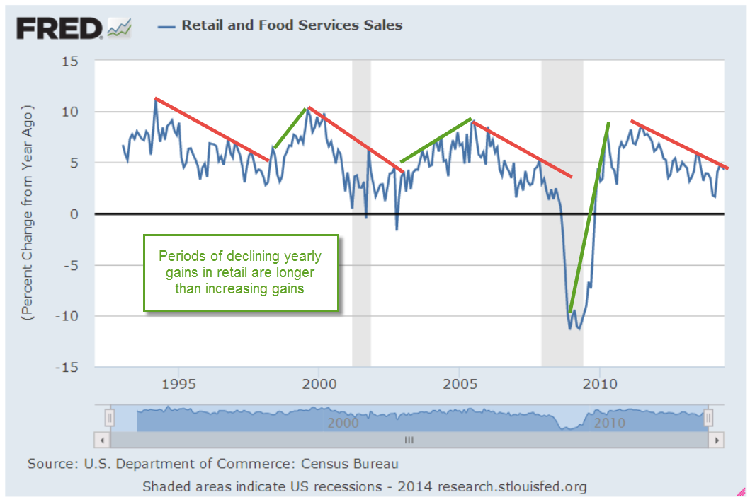
In total, retail sales gained more than 4% year-over-year but here again we can see a familiar pattern – declining yearly percentage gains. Periods of rising gains are about half the length of periods of falling gains. Over the next several months, we would like to see higher highs in the yearly gains. Further declines, i.e. lower highs, would be a cause for concern.
*************************
Malaysian Airline Disaster
Oil prices had fallen more than 5% over the past three weeks. The news of an apparent missile strike on a Malaysian passenger jet over a conflict zone in eastern Ukraine sent oil prices up about 2.5% over two days this week before falling back slightly on Friday. As families mourn the deaths of almost 300 people on the plane, a fusillade of accusations and denials were launched. Some accuse Russia of launching the missile that struck the passenger jet flying at 33,000 foot altitude, some blame Russian-backed separatists in eastern Ukraine, others hold Ukranian forces accountable. Economic sanctions already in place against Russia may be broadened.
Unrest in Ukraine, Iraq and Libya puts upward pressure on oil prices but the effect is moderated by a global supply that is able to meet demand with a safety buffer capable of absorbing these geopolitical conflicts.
***************************
Stock Market Valuation
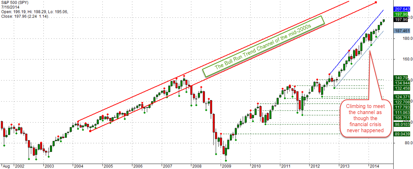
The stock market continues its two year run to try and meet up with the trend channel of the mid-2000s as though the financial crisis never happened.
Last month I wrote about the Shiller CAPE ratio, introduced by economist Robert Shiller in his book Irrational Exuberance. Some writers also refer to the CAPE ratio as PE10 or the Shiller P/E ratio.
Portfolio Visualizer (PV) has a free tool that lets viewers backtest portfolios using various strategies. An optional timing model based on the CAPE ratio flips the allocation of a portfolio from 60% stocks and 40% bonds (60/40) to a 40/60 mix when the CAPE is high, as it is today. In the model, “high” is a CAPE above 22, but as I wrote last month, the CAPE has averaged 22.91 for the past 30 years. In the relatively low interest environment of the past thirty years, investors are willing to pay more for stocks. The 50 year average is 19.57, within the normal range of the timing model. One could make the point that “high” should be set upward about 3 points, which is the spread between the 30 and 50 year averages (22.91 – 19.57). In that case, the trigger high would be 25.
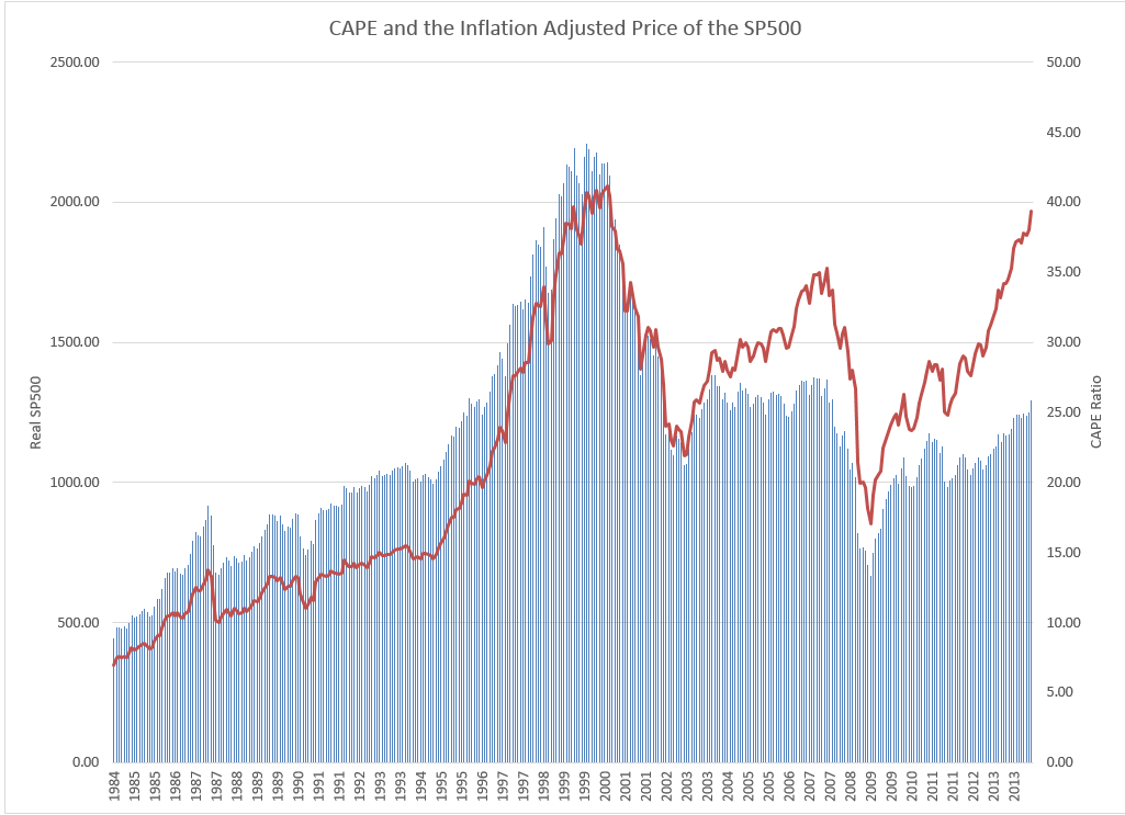
Below is a chart of the CAPE ratio and the inflation adjusted or real price of the SP500 index. As you can see we are far below the nosebleed valuation levels of the late 90s and early 2000s.
The current CAPE ratio is about 26, above even the modified high point. Using this model, an investor with a $500,000 portfolio with $300,000 in stocks and $200,000 in bonds, would sell $100,000 of stocks and buy bonds with the proceeds. Over the past twelve years, the Shiller model would have generated an 8.44% annual return vs the 7.21% return of a 50/50 balanced portfolio. I included an additional two years to capture half of the downturn in the early 2000s when stocks lost 43% of their value. More importantly, the risk adjusted return of the Shiller model is much better than the 50/50 portfolio.
The Shiller model also did better than the 8% annual returns of a crossing strategy. This is a variation of the 50 day/200 day “Golden Cross” strategy, which I wrote about in February 2012, a week or so after the occurrence of the last Golden Cross. In this monthly variation using the Shiller model, an investor exits the market when the SP500 monthly index drops below its 10 month moving average.
Keep in mind that a backtested portfolio generates higher than actual returns since they often don’t include trading fees, slippage or a real life re-balancing. In backtest simulations, an investor may re-balance all in one day following the signal day. While that may be the case sometimes, many investors are not so quick and some financial advisers will recommend making a gradual transition when re-balancing. Still, backtests can be useful in comparing strategies.
An investor who puts money into the stock market today is – or should be – more concerned about what that money will be worth 5, 10 and 20 years from today when they might need the money for retirement, children’s college, or other events in a person’s lifetime.
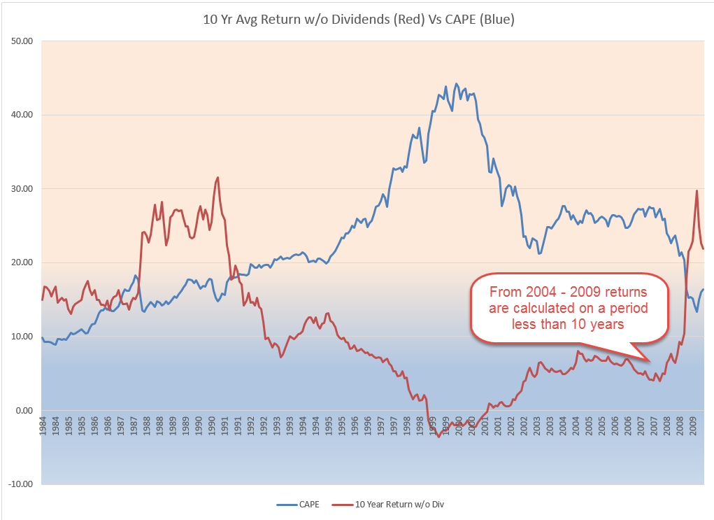
There is a definite negative correlation between the CAPE and the 10 year return, without dividends, of an investment in the SP500. Since World War 2, the correlation is -.70. Since 1902, the correlation is -.65, reflecting the greater portion of earnings that were paid out as dividends to investors before WW2. In short, it is likely that an investor will experience lower returns the higher this CAPE ratio.
*****************************
How much can I take each year from the piggy bank?
There is also a Shiller model for sustainable withdrawals from a portfolio based on the CAPE ratio. You can read about it here. Keep in mind that this model uses a 30 year horizon for retirement. The same author, Wade Pfau, has a separate article on the various time horizons used in withdrawal models.
*****************************
Takeaways
Two steps forward, one step back is a familiar trend in this post-recession period. Retail sales are healthy but below the 5% threshold of a strong upward trend.
Using the Shiller CAPE ratio as a metric of market valuation, stocks are overvalued.
