Housing and Stocks

February 23rd, 2014

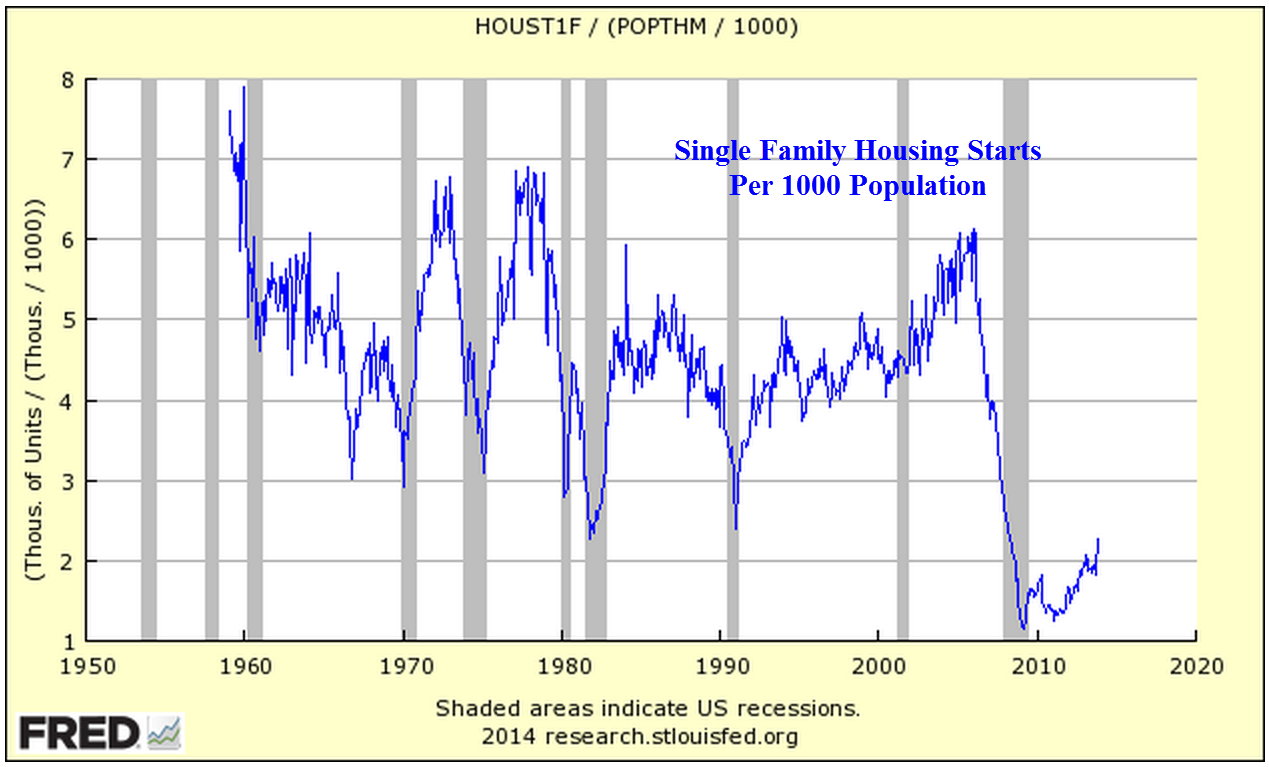
The extreme cold in half of the country had a profound effect on housing starts which fell 16% in January.  Less affected by the weather are permits for new housing which slid 5%.

The Bible prescribes that every 50th year should be a Jubilee year, in which all debts are forgiven.  While this policy of redistribution of property might be a practical solution in a smaller tribal society, it is much less practical, even dangerous, in a complex economy.  By targeting a 2% inflation rate, central banks in the developed world engage in a type of gradual debt forgiveness.  Inflation incrementally shifts the real value of a debt from the debtor to the creditor.  At a 2% inflation rate, a debt is worth half as much in 35 years.

Let’s say Sam borrows $1000 from Jane at 0% interest and doesn’t pay her anything for 35 years, then pays off the debt.  The $1000 that Sam pays back in 35 years is only worth $500 in purchasing power.  Half of Sam’s debt has effectively been forgiven.  So why would Jane loan Sam any money?  She wouldn’t – not at 0% interest.  At that interest rate the loan is actually a gift.  Jane would need Sam to pay her an interest rate that 1) offsets the erosion of the purchasing power of the loan amount, the principal, and 2) compensates Jane for the use of her money over the 35 years.

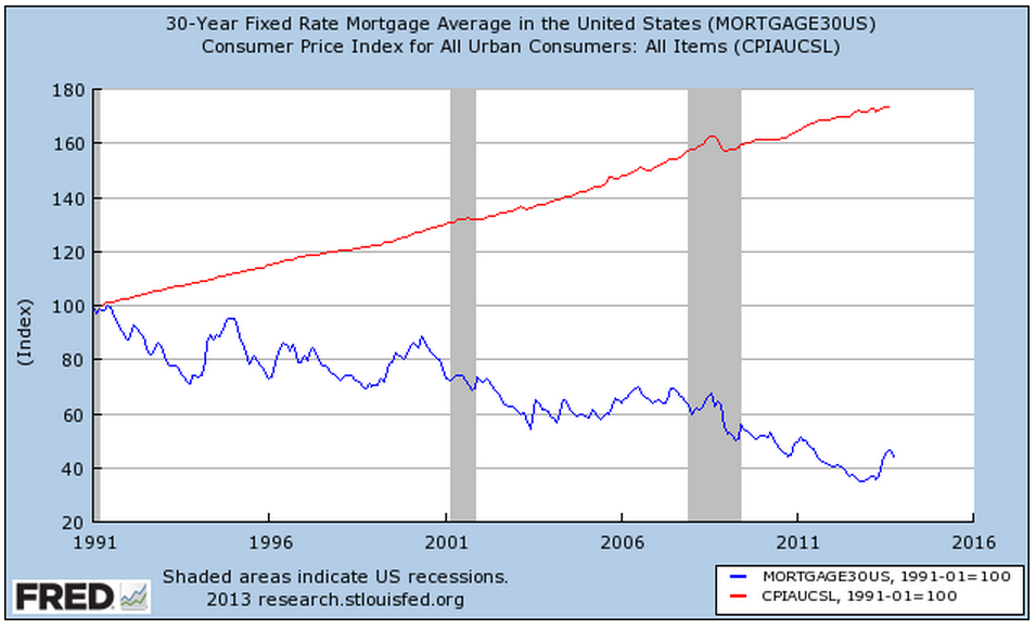
Janes all over the world loan Sam the money and don’t want much interest.  The Sam in this case is Uncle Sam, the U.S. Government.  The loan is called a 30 year Treasury bond.  (Treasury FAQs )

If your name is just plain old Sam though, few people want to loan you money for thirty years, even if it is to buy a hard physical asset like a house.  That is why U.S. government agencies back most of the mortgages in the U.S., essentially funneling the money from around the world to ordinary Sams and Janes to buy housing.  Heck of a system, isn’t it?

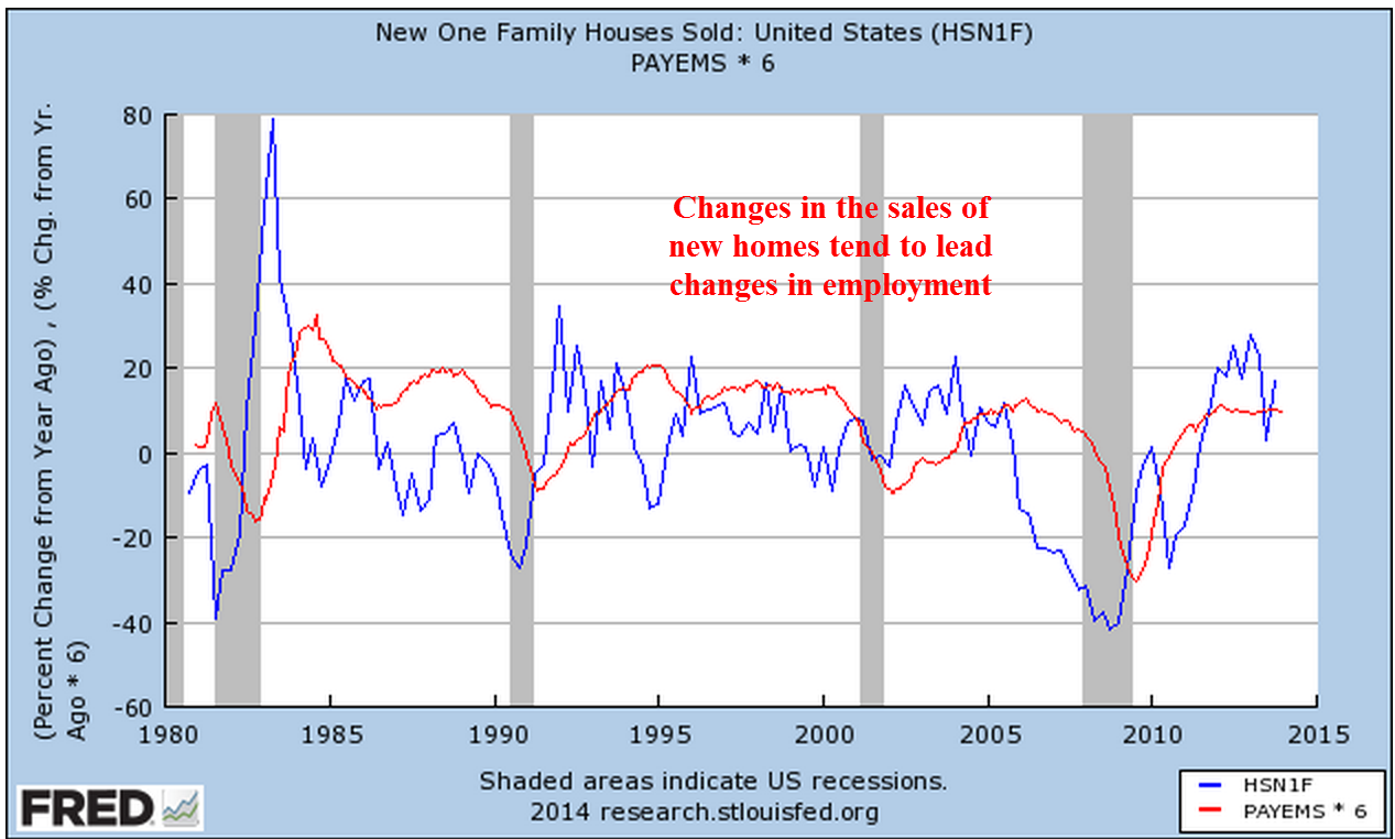
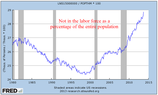
The affordability of housing… 

In the metro Denver area, median household income was $59,230 in 2011, compared to the national median income of $50,054. (Source)  According to Zillow, the median home value in Denver is $253,700, or 4.3 times income.   Although Denver is a large city, it is not a megalopolis like New York City or Los Angeles. In Los Angeles, median home values are $491,000.  Median incomes in 2011 were $46,148, so that home values are more than ten times incomes.  Like other megaregions, Los Angeles has a huge disparity in housing and incomes, resulting in a median income that is skewed downward because of the large number of poor people that inhabit any large metropolitan area.  The L.A. Times ranks incomes by neighborhoods.  This ranking shows a median income in middle class areas at about $85K.  Using this metric, housing is still more than six times income.  Using a conventional bank ratio of .28 of mortgage payment to income, a household income of $85K will qualify for a monthly mortgage payment of almost $2K, which will get a 30 year, 4.5% fixed interest mortgage payment, including property taxes, of about $320K.  A 20% down payment of $80K brings the price of an affordable house to $400K, below the median value of $461K, meaning that many middle class Los Angelenos can not afford to live in a middle class neighborhood.

… acts as a constraint on home sales.
 

This week the National Assoc of Realtors reported a year over year 5% drop in existing home sales.  After rising more than 10% over the past year, prices have outrun increases in income.  While we don’t have median household income figures for 2013, disposable personal income actually declined in 2013 so we can guesstimate that household income was relatively flat as well.

As this year progresses, we may see other effects from the drop in disposable income.  Economists and market watchers will be focusing on auto and retail sales in the coming months.  January’s Consumer Price Index showed a yearly percent gain of 1.6%, indicating little inflationary headwinds.  An obstacle to growth is the difference between inflation and the weak growth in household income.

*********************************

Minimum Wage

On Tuesday, the Congressional Budget Office released their estimate of the net effect of raising the minimum wage to either $9 or $10.10 from the current Federal level of $7.25 an hour.  Their analysis ranged from a minimal loss of jobs to almost a million jobs lost.  The average of this range, 500,000 jobs lost, became the headline number.  The CBO also noted that over 16 million low income workers would see an increase in income, enabling some to rely less on government aid programs.  Their projection was a slight increase in revenues to government.  A half million jobs is relatively small in a workforce of 150 million.  Some economists would concur that there is no clear evidence that raising the minimum wage has any effect on the number of jobs.  The science of economics is the study of complex human behavior in response to changes in our environment and resources.  Many times the data is not as conclusive as one might like, leading researchers to statistically filter or interpret the data according to their professional biases.

A 2013 analysis of minimum wage workers by the Economic Policy Institute indicated that the average age of minimum wage workers was about 35 years old.  Yet, 2012 data from the Bureau of Labor Statistics, the primary aggregator of labor force characteristics, does not support EPI’s conclusions – unless one includes workers who are exempt from minimum wage laws – like waiters – who are paid below the minimum wage law.  The BLS data shows that 55% of minimum wage workers are below 25 years old.

Too frequently, financial reporters who could summarize the caveats of a particular study either don’t bother or their work is left on the editor’s floor.  Many readers digest the headline summary without question and a difficult guesstimate by a government agency like the CBO is re-quoted as though it were gospel truth.

**********************************

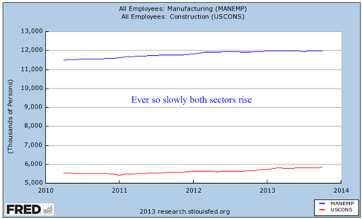
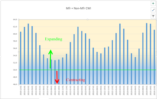
Manufacturing Rebound?
On the bright side, an early indicator of manufacturing activity in February showed a rebound from January’s decline.

********************************

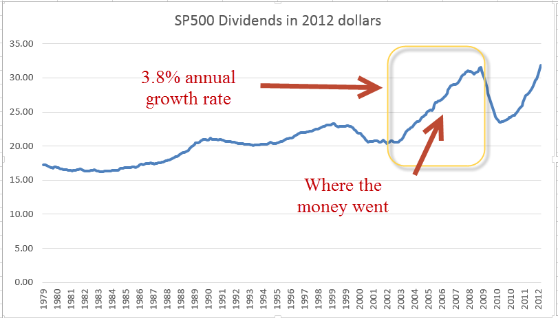
Stock Market Dividends
As the market continues to rise, the voices of caution, if not doom, get louder.  Some analysts are permanent prophets of catastrophe.  Eventually they are right, the market sinks, they proclaim their skills of prognostication and sell more subscriptions to their newsletters.  Subscribers to these newsletters don’t seem to mind that the authors are wrong most of the time.

Last August, I wrote about the dividend yield – or it’s inverse ratio, the price dividend ratio – of the SP500 index using data that economist Robert Shiller compiles from a variety of sources.  The dividend yield of the SP500 index is currently 1.9%, meaning that for every $100 a person invested in the SP500 index, they could expect $1.90 in dividends.  The price dividend ratio is just the inverse of that, or $100 / $1.90 = 52.6. The current dividend yield is at the 20 year average.  I will focus on the dividend yield, or the interest rate that the SP500 index pays an investor.

It might surprise some investors that dividend information is available on a more timely basis than earnings.  In the aggregate,  dividends are more reliable and predictable.  Most companies have several versions of earnings and they massage their earnings to present the company in the best light.  On the other hand, most companies announce their dividend payouts near the end of each quarter so that the aggregate information is available to an investor more quickly than aggregate earnings.

Most portfolios contain a mixture of stocks and bonds so it is instructive to compare the dividend yield of the relatively risky SP500 with the yield on what is considered a perfectly safe bond – the 10 year Treasury.  Many investors think of these two asset classes as complementary – they are – but they are also in competition with each other. If the real dividend yield on stocks is the same as ten year Treasuries, it means investors in stocks want to be compensated for risking their principle on stocks.  If the interest rate on 10 year Treasuries is 4% and the  dividend yield of the SP500 is 2%, then the dividend ratio of stocks to Treasuries is 2% / 4%, or .5.  As investors perceive less risk in the stock market, this “demand for yield” from stocks will fall and the ratio will decline.   In the past, this ratio has reached a low of .19 in July 2000 as the stock market reached its apex of exuberance and investors became convinced that the rise of the internet and just in time inventory control had ushered in a new era in business.  Bill Gates, then CEO, Chairman  and founder of Microsoft, scoffed at dividends as a waste of money that could be better put to use by a company in growing the business. At the other extreme, this demand for yield ratio rose as high as 1.28 in March 2009 as stocks reached their lows of the recession.

More importantly is the movement of this ratio from peaks and troughs, indicating a change in sentiment among investors.  Note that the early 2003 market lows after the tech bubble burst were about the 50 year average of this ratio.  Compare that relative calm to the spikes of fear in this ratio since late 2007 to early 2008.  For the past 18 months, this demand for yield has declined but is still above the 50 year average.  There is still enough skepticism toward the stock market that it continues to curb exuberance.

Diminished Expectations

February 3rd, 2014

The SP500 has been hovering over a support trendline in the 1760-1775 range, with buyers coming in at 1775.  At 1750, the market would have corrected 5%, a fairly normal occurrence.  Market watchers have been concerned that the market has not experienced one of these small “shaking of the tree” corrections since May/June of 2012.  Disappointing earnings and revenue reports from bellweather companies, together with selling pressure on some emerging market currencies, have made traders nervous.

The market is composed of buyers and sellers responding within varying time frames.  In a short to mid term time horizon, one person might pay more attention to turbulence in emerging markets or the latest corporate reports.  A mid to long term investor might pay more attention to rising industrial production, healthy GDP numbers, consumer spending and income, and declining unemployment.

*****************************************

Apple forecast lower than expected revenues for the coming quarter in the China market.  The announcement prompted an 8% decline in the company’s stock.  Facebook reported blow out revenue growth of 63% in the past quarter, causing the stock to rise about 16%.  FB’s active user base has more than doubled in two years.  Despite the robust growth, the sky high valuation of the company reminds me of some internet stocks in the late 1990s.  The stock has a Price to Sales – not Price to Earnings – ratio of about 15 to 1.  Google has a track record of strong revenue and earnings growth and sports a richly valued price to sales ratio of 6.4.  Does Facebook’s short track record deserve a valuation that is more than twice Google’s?  In 2000, Microsoft had a price-sales ratio of 23 to 1. Fourteen years later, Microsoft’s stock sells for 30% less than it did in 2000.  In 2000, Cisco had a price to sales ratio of 30 to 1.  Cisco’s revenues were growing 50% a year.  “The stock is cheap,” some said.  Fourteen years later, Cisco sells for less than a third of what it did in the heady days of rapid growth.  A word of caution to long term investors.

Amazon reported “only” a 20% increase in quarterly revenue during the busy 4th quarter Christmas season. This is five times the sales growth of the overall retail industry so a casual observer might think that the stock enjoyed a healthy bump up in price, right?  Wrong. After rising 50% over the past year, the company’s stock was priced to perfection. The disappointing growth particularly in overseas markets prompted a lot of selling and an 8% decline in price on Friday.

As I noted last week, many retailers will report quarterly earnings in February.  Many companies get a sense of the bottom line that they will report before the official release of quarterly data.  If there are material differences between consensus expectations and forecast results, a company will issue a revised forward guidance.  Wal-Mart did so this past week, revising its revenue and earnings forecast down for the fourth quarter and lowering earnings projections for the coming year.  The company cited a much greater than forecast impact from November’s reduction of the food stamp program.  The severe storms in December also had a material impact on sales.

In the past two months, Wal-Mart’ stock has declined 8%.  Let’s think about that for a moment.  The market value of Apple and Amazon declined 8% in one day.  It takes two months for Wal-Mart’s stock to decline by the same percentage.  Individuals who invest in companies like Apple and Amazon have to be able to take abrupt market gyrations in stride.  Companies are essentially stories.  Some like Apple and Amazon are stories of growth.  There comes a time when the story changes, as it did for Microsoft and Cisco more than a decade ago.  Apple’s story has been “under construction” in the past 18 months. Since the beginning of 2008, Wal-Mart’s stock has risen 56%, Apple’s is up 150%, and Amazon’s market price has soared more than 6 times.  Growth companies offer rich rewards for the investor who has the time to  follow the story, but it can be difficult to know when the story is changing.

During the past 3 weeks, Home Depot has lost about 6% after gaining 35% since the beginning of 2013.  This giant has one foot in the home construction and remodeling sectors, one foot in the retail sector.  The decline reflects lowered near term expectations for both construction and retail.  Consumer spending has risen steadily but incomes are flat.

*****************************************

December’s report of new homes sold was disappointing.  After rising above an annual level of 450,000 in the fall, sales have fallen closer to the 400,000 mark.

 Some blame the particularly harsh December in the east, some blame the weak labor report released in early January, others blame the low supply, still others blame rising mortgage rates. The Case Shiller home price index shows a year over year gain of almost 14% in metro area homes, indicating relatively healthy demand.  However, the latest Consumer Confidence survey reports a decline in the number of people planning to buy a home.  On an ominous note, pending home sales in December declined more than 8%, the worst monthly decline in almost four years.  Without a doubt, the severe winter weather in the eastern U.S. was a big factor but it is difficult to assess how much of a change.  This is the second report – employment was the first – that was far below even the lowest of estimates.

The link between employment and new home sales is counterintuitive; changes in new home sales anticipate changes in employment.

In a 2007 paper presented at a Federal Reserve conference, economist Ed Leamer demonstrated that changes in residential investment, a relatively small component of the economy, indicate coming recessions and recoveries.  The National Assn of Homebuilders estimates that each new home generates a bit more than three full time jobs.

Residential investment includes new homes, remodels, furniture and appliances.  Eventually residential investment reaches a point where it is contributing too much to the economy. As that percentage begins to correct to more normal levels, the contraction tugs on the total of economic growth.

As you can see in the chart above, a sustainable “sweet spot” is in the 4 to 4-1/2% of GDP range but residential investment is still less than 3% of GDP.  In past recessions, residential investment has helped recovery.  This time is different.  Housing’s less than normal contribution to the nation’s GDP has dampened overall growth.

*****************************************

The first estimate of GDP growth for the fourth quarter was a rather remarkable 3.1%.  Although this was in line with estimates, I was concerned that the severe winter weather in the east might have more of a negative impact.  A version of GDP that reflects domestic consumption, Final Sales of Domestic Product, showed a modest 2.1% growth in the 4th quarter, reflecting the impact of the weather, I think. The third quarter growth rate was revised to 4.1%, up substantially from the initial estimate of 2.8%.  The hope is that this is now a 4% growth economy and the first quarter of this year may hold some welcome surprises as delayed economic activity in the 4th quarter is rolled into this year’s first quarter.  As I noted a few weeks ago, the wave like trend of the CWI composite index of manufacturing and non-manufacturing indicated a slight lull in these winter months before another peak in early to mid-spring.

****************************************

Consumer Confidence rose to 80, the lower bound of what I consider healthy.  This index fell below 80 in the early part of 2008 and did not get above that mark till this past summer, then fell back in the fall.  A separate Consumer Sentiment survey from the U. of Michigan showed a similar reading at slightly above 81.

*****************************************

January’s monthly employment numbers will be released next Friday.  I ran a chart of those not in the labor force as a percent of those working.  Thirty years ago, the economy was coming out of the most severe employment recession since the Depression.  It is rather disturbing that this ratio continues to climb to the nose bleed levels of that recession thirty years ago.

******************************************

The harsh winter weather may be affecting consumers more than businesses.  Chicago and the upper Midwest region got creamed with cold snap after cold snap in December yet industrial production figures for the month are still robust, declining somewhat from the incredibly strong readings of the past few months.

Market Bumps

January 26th, 2014

In a holiday shortened week, the market opened higher than the previous Friday but fell a bit more than 3% by week’s end.  On this same week in 2012, the market lost 2.5% in 3 trading days.  As I mentioned last week, there were few economic reports this past week to detract from the focus on corporate earnings.

IBM opened up the week by beating profit estimates but missed revenue estimates by $1 billion, or about 3%, and were about $1.5 billion less than the final quarter of 2012.  The 4th quarter is usually IBM’s strongest quarter each year; lower revenues from this giant indicate a cautious business investment outlook.  IBM is selling for the same price now that it did in mid 2011, a price earnings ratio of 12.

The following day, China announced that the country’s industrial production has fallen just below the neutral mark.   The reaction to the news was exaggerated by sharp declines in some emerging market currencies, which started a cascade of selling. See SoberLook blog for some charts. Similar weakness out of China last summer prompted a much more subdued reaction.

On Thursday, McDonald’s reported weak sales growth, which added to concerns.  After a run up of 30% last year, many traders were on high alert for any negative news.  The U.S. stock market has enjoyed a tail wind from Federal Reserve stimulus policy, but a global economy is largely outside of the Fed’s influence.

A 14 month support trend line that has been in place since November 2012 sets a mark at about 1760.  Dropping below that would signal a short to mid term shift in market sentiment.  The SP500 index closed at 1790 on Friday, 1.7% above that support trend line.  The 10 month average of the index is 1700.  A drop below that mark would signify a change in mid to long term sentiment. A few weeks ago, I noted that the market was close to 10% over its 10 month average.  This week’s decline puts that percentage at a bit over 5%.

******************************

Existing home sales notched up a bit in December but the yearly percent gains were relatively flat.  The 4 week average of new claims for unemployment declined to 331,000.  Several weeks ago it was close to the psychological 350,000 mark.  Mitigating the decline in new claims, continuing claims have been rising lately and are approaching the 3 million mark.

To put that 3 million people in historical perspective, take a look at the chart below.

The number of long term unemployed is ever a concern.

*************************

In early October I noted the relative sluggish performance of retail stocks vs the larger market index of the SP500 ahead of the Christmas buying season.  Below is an updated chart of a retail index ETF vs the larger market.

Shortly after that post, renewed hopes for a strong Christmas season led to higher prices for the group.  Disappointing sales gains announced as the season ended deflated that balloon.  Since the new year began, a composite of retail stocks has lost 8%.

Typically retailers report their earnings in mid to late February.  Traders have already priced in a rather disappointing earnings season for the retailers.  In the context of a longer time frame, retail stocks are still up 25% year over year.  If an investor had bought this composite on this date seven years ago when the economy was strong and retail stocks were at a high, she would still have doubled her money, easily outpacing the 38% gains in the larger market since then.  The resilience of consumer demand, despite an extremely severe downturn when unemployment and falling house prices put a brake on consumer spending, has helped make this sector a sure footed long term winner.  

Housing, Unemployment and CPI

January 19th, 2014

A strong retail report for December and an improvement in sentiment among small business owners buoyed the market at the start of the week.  Both reports continue a trend that indicates a healthy economy:  results are at at the upper bound or above expectations.

The latest report of  jobless claims at 325,000 pulled the 4 week average further down away from the psychological mark of 350,000.  This is sure to reassure short to mid term traders.  The weak BLS employment report released a week ago may have just been an anomaly.  Other employment indicators, as well as retail sales and business production simply do not confirm the headline numbers from the BLS.

The Consumer Price Index for December showed a mild 1.5% year over year increase and will reassure the Fed that its stimulus program poses little danger of igniting inflation.

The National Assn of Homebuilders reported continued strong growth in their Housing Market Index.

******************************
Featured on one of the blogs that I link to is a chart of the annual returns of the SP500.  Double digit gains in the index, like the one we had last year, are rather common, occurring about 40% of the time.  A reassuring takeaway for the longer term investor is that the market goes up in 75% of the years for the past eighty years.

******************************
The number of unfilled job openings in November was the highest since March of 2008, indicating continuing strengthening in the labor market.  Job openings have been above the ten year average for over a year now.

The number of people who voluntarily quit their jobs continues to climb over the past year.  Employees quit when they feel more confident about job prospects. While this metric has been improving, it is only at the lowest levels of the past decade.

******************************
Housing starts declined slightly in December to a million but is still growing from the lows of the bust.

Let’s get a bit of perspective. There is a decided shift downward from the post war building boom.  Below is a graph of  housing starts adjusted for population growth.

Adjusted for population growth, the multi-family component of housing starts has reached the normal levels of the past two decades.  This is the more stable component of housing starts.

Starts of single family homes have not yet reached the lows of past recessions.  The words “improvement” and “recovery” should be viewed in the context of these abysmal lows.

*******************************
The Consumer Price Index (CPI) for December showed a year over year increase of 1.5%.  I believe this understates current inflationary pressures on consumers but it is the official rate, one that the Federal Reserve will use to guide policy.  The low rate will help allay fears that continuing stimulus will spur inflation in the near term.

*******************************
Stock prices will be driven largely by earnings reports at this time.  About 10% of SP500 companies have reported this past week, too few to get a solid feel yet for the past quarter.  62% of companies have beat expectations, a bit less than the more normal 70%.  The market is largely trading sideways as it digests both the past quarter’s results and the forward guidance that companies give when they report.  IBM, Johnson and Johnson, and Verizon kick off this holiday shortened week when they report earnings on Tuesday. McDonald’s, Microsoft, Proctor and Gamble, and Netflix are due to report this week as well.  There don’t appear to be any significant market moving economic reports coming up this week.  Existing Home Sales on Thursday might have some minor impact and traders will be watching the continuing trend in new unemployment claims.

Winter Wonderland

December 8th, 2013

The Bureau of Labor Statistics rode down like Santy Claus on the arctic front that descended on a large part of the U.S. The monthly labor report showed a net gain of 203,000 jobs in November, below the 215,000 private job gains estimated by ADP earlier in the week, but 10% higher than consensus forecasts.  Thirty eight months of consecutive monthly job growth shows that either:

1) President Obama is an American hero who has steered this country out of the worst recession – wait, let me capitalize that – the worst Recession since the Great Depression, or

2) American businesses and Republican leadership in the House have overcome the policies of the worst President in the history of the United States. 

Hey, we got some Hyperbole served fresh and hot courtesy of our radio and TV!

The unemployment rate dropped to 7.0% for the right reasons, i.e. more people working, rather than the wrong reasons, i.e. job seekers simply giving up.  The combination of continued strong job gains and a big jump in consumer confidence caused the market to go “Wheeee!”

***********

A broader measure of unemployment which includes those who want work but haven’t looked for a job in the past four weeks declined to 7.5%.  This is still above the high marks of the recessions of the early 90s and 2000s.

***********

Construction employment suffered severe declines after the collapse of the housing bubble.  We are concerned not only with the level of employment but the momentum of job growth as the sector heals.  A slowing of momentum in 2012 probably factored into the Fed’s decision to start another round of QE in the fall of last year.

********

Job gains were broad, including many sectors except federal employment, which declined 7,000. Average hours worked per week rose by a tenth to 34.5 hours and average hourly pay rose a few cents to $24.15.

Discouraged job seekers are declining as well.  The number of involuntary part time workers fell by 331,000 to 7.7 million in November.  As shown in graph below, the decline is sure but slow.

***********

There are still some persistent trends  of slow growth.  Job gains in the core work force aged 25 -54 are practically non-existent.

**********

The percentage of the labor force that is working edged up after severe declines this year but the trend is down, down and more down.

*********

The number of people working as a percent of the total population has flatlined.

**********

Let’s turn to two sectors, construction and manufacturing, which primarily employ men.  The ratio of working men to the male population continues to decline.  Look at the pattern over 60 years: a decline followed by a leveling before the next decline, and so on.  Contributing to this decline is the fact that men are living longer due to more advanced medical care and a fall in cigarette smoking.

************

The taxes of working people have to pay for a lot of social programs and benefits that they didn’t have to pay for thirty years ago.  Where will the money come from?  A talk show host has an easy solution: tax the the Koch Brothers, cut farm subsidies to big corporations and defense.  Taking all the income from the Kochs and cutting farm subsidies and defense by half will produce approximately $560 billion, not enough to make up for this year’s budget deficit, the lowest in 4 years.  What else?

***********

In a healing job market, those aged 16 and up who are not in the labor force as a percent of the total population  continues to climb.

********************************

A familiar refrain is the steady decline in manufacturing employment.  Recently the decline has been arrested and there is even slight growth in this sector.  Although construction is regarded as a separate sector, construction is a type of manufacturing.  Both employment sectors appeal to a similar type of person.  Both manufacturing and construction have become more sophisticated, requiring a greater degree of specialized knowledge.  Let’s look at employment trends in these two sectors and how they complement each other.

During the 90s, a rise in construction jobs helped offset moribund growth in manufacturing employment.

In 2001, China became a member of the World Trade Organization (WTO) , enabling many manufacturers to ship many lower skilled jobs to China.  At the same time, a recession and the horrific events of 9/11 halted growth in the construction sector so that there was not any offset to the decline in manufacturing jobs.

As the economy began recovering in late 2003, the rise in construction jobs more than offset the steadily declining employment in the manufacturing sector.  People losing their jobs in manufacturing could transition into the construction trades.

As the housing sector slowed, construction jobs declined and the double whammy of losses in both sectors had a devastating effect on male employment.

In the past three years, both sectors have improved.

Although the Labor Dept separates two sectors, we can get a more accurate picture of a trend by combining sectors.

*********************************

In the debate over the effectiveness of government stimulus, there is a type of straw man example proposed:  what if the government were to pay people to dig holes, then pay other people to fill in the holes?  Proponents of Keynesian economics and government stimulus argue that such a policy would help the economy.  Employed workers would spend that money and boost the economy. Those of the Austrian school argue that it would not.  Digging and filling holes has no productive value.  Ultimately it is tax revenues that must pay for that unproductive work.  Therefore, digging and filling holes would hurt the economy.

So, let’s take a look at unemployment insurance through a different set of glasses.  Politicians and the voters like to attach the words “insurance” and “program” to all sorts of government spending.  Regardless of what we call it, unemployment insurance is essentially paying people to dig and fill holes – except that the holes are imaginary.  IRS regulations state that unemployment benefits are income, that they should be included in gross income just as one would include wages, salaries and many other income.

If unemployment is income, how many workers do the various unemployment programs “hire” each year?  Unemployment benefits  vary by state, ranging from 1/2 to 2/3 of one’s weekly wage. (Example in New Jersey)  As anyone who has been on unemployment insurance can verify, it is tough to live on unemployment benefits. I used the average weekly earnings for people in private industry and multiplied that by 32 weeks to get an average pay, as though governments were hiring part time workers.  I then divided unemployment benefits paid each year by this average.  Note that the divisor, average pay, is higher than the median pay, so this conservatively understates the number of workers that are “hired” each year by state and federal governments.

What is the effect of “hiring” these workers?  I showed the adjusted total (blue) and the unadjusted total of unemployed and involuntary part time workers.  The green circle in the graph below illustrates the effect that extensions of unemployment insurance had on a really large number of unemployed people.

At its worst in the second quarter of 2009, the unemployed plus those involuntary part timers totaled 24 million, almost 16% of those in the labor force.  8 million were effectively “hired” to dig imaginary holes.  In the long run, what will be the net effect of paying people to dig holes and fill them?  First of all, a politician can’t indulge in long run thinking.  In a crisis, most politicians will sacrifice long run growth so that they can appease the voters and keep their own jobs.

In the long run, ten years for example, paying people to do nothing productive will hurt the economy.  The argument is how much?   Keynes himself wrote that his theory of stimulus and demand only worked when there was a short run fall in demand.  At the time Keynes wrote his “General Theory,” the world economy was floundering around in a severe depression.  The severe crisis of the Depression birthed a theory that divided the economists into two groups: the tinkerers and the non-tinkerers.  Keynesian economists believe in tinkering, that adjusting the carburetor of the economic engine will get that baby purring.  Austrian or classical economists keep asking the Keynesians to stop messing with the carburetor; that all these adjustments only make the economy worse in the long run.

***********************************

The November report from the Institute for Supply Management (ISM) showed strong to robust growth in the both the manufacturing and services sectors.  As I noted this past week, I was expecting the composite CWI index of these reports that I have been tracking to follow the pattern it has shown for the past three years.  Within this expansion, there is a wave like formation of surging growth followed by an easing period that has become shorter and shorter, indicating a growing consistency in growth.  The peak to peak time span has decreased from 13 months, to 11 months to 7 months.  The index showed a peak in September and October so the slight decline is following the pattern.   IF – a big if – the pattern continues, we might expect another peak in April to May of 2014.

To get some context, here’s a ten year graph of the CWI vs the SP500 index.

**********************************

As the stock market makes new highs each week, some financial pundits get out of bed each morning, saddle up their horses, load up their latest book in the saddle bags and ride through TV land yelling “The crash is coming, the crash is coming.”  Few people would listen to them if they shouted “Buy my book, buy my book.”  They sell a lot more books yelling about the crash.

How frothy is the market?  I took the log of the SP500 index since January 1980 and adjusted it for inflation using the CPI index.  I then plotted out what the index would be if it grew at a steady annualized rate of 5.2%.   Take 5.2%, add in 3% average inflation and 2% dividends and we get the average 10% growth of the stock market over the past 100 years.  The market doesn’t look too frothy from this perspective.  In fact, the financial crisis brought the market back to reality and since then, we have followed this 100 year growth rate.

Now, let’s crank up the wayback machine.  It’s November 1973.  Despite the signing of the Paris Peace accord and an act of Congress to end the Vietnam war, thousands of young American men are still dying in Vietnam.  The Watergate hearings continue to reveal evidence that President Nixon was involved in the break in of the Democratic National Committee and the subsequent attempts to cover it up.  Rip Van Winkle is disgusted.  “This country is going to the dogs,” he mutters to himself.  He lies down to take a nap in an alleyway of the theater district of New York City.  The SP500 index is just below 100.  Well, Rip doesn’t wake up for 20 years.  In November 1993, he wakes up, walks out on Broadway and grabs a paper out of nearby newspaper machine.  The SP500 index is 462.  Rip doesn’t have a calculator but can see that the index has doubled a bit more than twice in that time.  Using the rule of 72 (look it up), Rip estimates that the stock market has grown about 8% per year.  Which is just about normal.  But normal is what Rip left behind in 1973.  “Normal” is SNAFU.  So he goes back into the alleyway and goes back to sleep for another twenty years, waking up just this past month.  He walks out on Broadway and reads that the index has passed 1800.  “Harumph” Rip snorts.  That’s two doublings in twenty years, a growth rate of a little over 7%.  Rip reasons that eventually he’ll wake up, the country will have mended its ways and Rip will notice a growth rate of 9 – 10% in the market index.  He goes back to sleep.

In the 40 years that Rip has been asleep, we have had three bad recessions in the 70s, 80s and 2000s, a savings and loan crisis in the 80s, an internet bubble, a housing bubble, and the mother of all financial crises.  Yet the market plods along, slowing a bit, speeding up a bit.  Long term investors needs to take a Rip Van Winkle perspective.

***********************************

And now, let’s hop in the wayback machine – well, a little ways back.  Shocks happen.  During periods when the market is relatively well behaved as it has been this year, investors get lulled into a sense of well being.  From July 2006 through February 2007, the stock market rose 20%.  Steadily and surely it climbed.  Housing prices had already reached a peak and the growth of corporate profits was slowing. Some market watchers cautioned that fundamentals did not support market valuations. At the end of February 2007, the Chinese government announced steps to curb excessive speculation in the Shanghai stock market (CNN article).  The stocks of Chinese companies tumbled almost 10%, sending shocks through markets around the world.  The U.S. stock market dropped more than 5% in a week.

“Here comes the crash” was the cry from some. The crash didn’t come.  Over the next six months, the market climbed 16%.  Finally, continuing declines in home sales and prices, growing mortgage defaults and poor company earnings began to eat away at the market in October 2007.  Remember, there is still almost a year to the big crash in September and October of 2008.

**************

Next week I’ll put on a different shade of glasses to look at inflation.  Cold air, go back to the North Pole.

Trends and Bubbles

November 17, 2013

This week the department store Macy’s reported sales growth that was above forecast.  Same store sales rose 3.5%, about 50% better growth than expected.  Macy’s attracts a higher income customer than Target, J.C. Penney or Wal-Mart.  On Thursday, Wal-Mart announced that their sales had declined for a third quarter in a row.  The holiday season depends on lower and middle working class folks, the kind who shop at Wal-Mart, to open their pockets.  Investment firm Morgan Stanley expects this retail season to be the worst since 2008 when the country was deep in recession. (Source)
What can we learn from a bird’s eye view of the growth in consumer credit?  At 5.6% year over year, it is stable.

Note the response time lag in this series.  The growth in consumer credit did not decline below 5% till months after the recession started.  Despite the loss of hundreds of thousands of jobs in the beginning of 2008, this net job loss represented less than 1% of the work force in mid-2008.  The job loss would mount into the millions but jobs are “sticky,” meaning that a downturn in the economy has a minor effect on most people most of the time.  After the fact, it is easy for us to point at some chart, arch our eyebrows in a knowing glance, and say “We can see the breakdown of the economy beginning here.”

On a long term chart, we can see a reduction in growth swings over the past thirty years.  Relatively flat income growth for a majority of workers has dampened the swings.  While good for household balance sheets, it means that we can expect less economic volatility but also muted growth for the next decade.

Expectations for the holiday season are not reflected in the price of retail stocks.  A basket of retail companies has grown about 40% this year and is up about 70% over two years.  It may be time to take a bit off the table in this sector.

The Consumer Financial Protection Bureau (CFPB) was created a few years ago to act as a watchdog over the credit practices of the largest banks.  On Tuesday, Richard Cordray, Director of the agency appeared before a Senate committee.  He confirmed that the agency collects a lot of anonymized data on 900 million credit card accounts each month as part of its supervisory role.  Questions should be raised whenever any government agency collects data on us.  How is the data protected?  Who has access to the data?  What about my privacy?

Mr. Cordray noted that several other agencies as well as private industry collect this data.  Because the data is anonymized, we are little more than a number to  the agency, but there are several concerns.  Federal agencies have a great deal of legal power, enabling them to get a warrant to access  the data on anyone.  Cordray repeatedly assured the committee that no one at the agency is interested in our personal data but left off one adverb – “now.”  In the aftermath of 9-11, anti-war protestors found themselves turned away at airports or flagged for additional screening.  How did federal agencies know the travel plans of many protestors?  It does not take a team of FBI agents to trace the activities of any citizen when several federal agencies have our monthly financial activity at their fingertips.  Secondly, there is the matter of security.  How many parties does our data go through on its way to the agency?  Where and at what stage in the process of data aggregation is the anonymizing done?  Is our personal credit card info transmitted first to a separate third party anonymizer before being transmitted to the various agencies?  Is the raw data being transmitted to an agency which then anonymizes the data using a third party program or process?  In any case, it was clear that our monthly card transactions are making the rounds in both private industry and various government agencies.

The stock market continues to rise, prompting talk of a bubble.  If you have access, try to read “Is This A Bubble” by Joe Light in this weekend’s edition of the Wall St. Journal.   It is both informative and measured in its assessment.

 In February 2012, I mentioned the Golden Cross which had occurred in late January.  This long term indicator of market sentiment is a crossing of the 50 day moving average of stock market prices above the 200 day average.

Since then the market has risen about 40%.  Man, if I had only taken my own advice and moved all my investments and money into the stock market!  As the market continues to rise, more and more investors catch the “if only” disease and start moving money from safer investments into stocks.  This is why many of us tend to buy high and sell low.  Instead we should stay with the fundamentals of diversify, diversify, and lastly – diversify.  A long term indicator like the Golden Cross is not a signal to dump all of our savings into stocks – unless we are in our 30s and have lots of time before we need the money.  A more sensible approach is to adjust allocation upwards towards stocks and this depends on a person’s age, needs, and fears.  If a person has a 50% stock allocation, with the remaining 50% in bonds and cash (I’ll leave alternate investments out for right now), that indicates a moderate tolerance for risk.  They might shift the allocation to 55% stocks or 60% when they see a Golden Cross.   A person who has a 70% allocation to stocks, indicating a high tolerance for risk, might start adjusting to an 85% to 90% allocation.  Using this more moderate approach, a person would have lightened up their stock allocation in December 2007 when a reverse Golden Cross happened.

So what if someone has been very scared of the stock market and has only 10% of their savings in stocks?  Should they move some money into the market now?  That depends.  If the thought of making even a slight change leads a person to lose sleep, then no.  Should someone change their allocation of stocks from 10% to 50% now?  That is a major allocation change and should be done using dollar cost averaging.  This is a process where one takes money from one investment basket every month and puts it in another investment basket. There is also a psychological advantage to this approach.  As a person’s allocation percentage becomes a bit riskier, they can adjust to the additional risk in a measured way.

Tolerance for risk is a composite of several components:  psychological or emotional, future liquidity needs, age, and assets as well as income sources.  Too often, people think of tolerance for risk as an emotional response only.  While it is true that our emotions can cloud our measured response to risk, it is important to keep in mind that it is only one of the components.

**************

In answer to calls from his own party members, President Obama announced an administrative change to the Affordable Care Act (ACA) that allows those with policies in the individual health care market to retain their policies even if the policies don’t meet the minimum standards of the ACA.  Politicians, pronouncements and podiums – stir them together and voila!  The President’s pronouncement was little more than political cover at this late stage in the transition to Obamacare.  Only if the states allow it and companies decide to offer the plans will an individual policy holder be able to “keep their plan,”  as the President promised on numerous occasions in the past few years.

On Friday, the Energy and Commerce Committee released emails subpoenaed from CMS, the agency that administers Medicare and the ACA.   The emails contradict previous testimony by both CMS head administrator Marilyn Tavenner and HHS Secretary Kathleen Sibelius that only routine problems with the healthcare.gov web site were anticipated before the launch of the web site.  Ms. Tavenner testified that there were enough problems that they decided to delay the implementation of the small business plans on the web site but it appears that the problems went much further and top officials were alerted.

Henry Chao, the deputy CIO at CMS, was made aware of many major security, transactional and design problems with the web site during the summer but decided – or was pressured to decide – that the site would go live on October 1st regardless.  President Obama’s repeated selling point has been what he calls “smart” government. The rollout of the federal health care website has  revealed – once again – that the government in Washington has become too big and too top down to be smart, or effective.  To keep their campaign coffers filled, too many in Washington must placate those companies which fund those coffers, including special favors and bailouts for the elite on Wall Street.  To get the votes, they must placate the poor with programs and promises.

A conflict of interests and a clash of incentives makes most of the Washington crowd ineffective.  Turn on C-Span and watch the faces of the House and Senate Budget Conference (House and Senate).  These are intelligent, committed people who feel the pull of these different puppet masters, those political interests that keep them in their respective seats.   Each one of them earnestly wants to fix the problem – and that is the problem.  Much of the time, they are fixing the previous fixes they implemented.  This approach makes Congress feel important. I would suggest that they do little more than enact incentives and let their constituents craft the solutions.  Sure, the solutions will not be crafted with the superior technical expertise that Washington promises. Instead, they will emerge in a stumbling, hodge-podge way that will disenchant those who believe in the romantic notion of omniscient experts who engineer elegant solutions to social and economic problems.  I hope that one day the Washington elite will let Main St. try to figure out the solutions to some of these problems. We can do better.

Shoot Out At the OK Corral

October 20th, 2013

This coming Saturday is the 132nd anniversary of the gunfight at the OK corral.  We got our own OK corral in Washington and there was a whuppin’ this week – a Washington style whuppin’, which means that no one got whupped but everyone agreed on an appointment date for a  future whuppin’.

Congress passes a continuing budget resolution with the same frequency that many of us get our teeth and gums cleaned.  Many government reports were not released this past week but the National Assoc of Homebuilders (NAHB) released a very positive monthly report of the national housing market, showing a slight decline over the past few months last month but still a strong index reading of 55.  Two years ago this October, that index stood at 15.  In fact since the latter part of 2007, the index oscillated in the range of 15 – 20, so this has been a strong and sustained growth surge.

Over the past hundred years, house prices have risen at about the same rate as inflation, so that the real price of homes stays about the same.  Most homeowners finance their home purchase and it is this interest cost that determines the total capital cost of the home.  That capital cost and the interest cost is divided over the life of the mortgage into monthly payments.  PITI is a familiar acronym to many home owners and buyers; the initials represent the components of a monthly house payment. The ‘P’ stands for Principal – the monthly capital cost of the home.  The ‘I’ is interest on the amount of the loan.  The ‘T’ represents the local real estate taxes which are included in the monthly house payment sent to the mortgage servicer who forwards them on to the local taxing agency. The ‘I’ represents Insurance.  This can be both house insurance and, for those with an FHA loan, the amount of the loan insurance.  The interest rate on the home loan is a key component and although there has been an increase in mortgage rates since the spring, they are near all time lows.  A 30 year mortgage is a common benchmark.

Let’s index the CPI and the house price index to 1991 and look at the divergence.

Declining interest rates have enabled many more people to qualify for a home purchase, thus driving up home prices. In 1995, Congress made some major revisons to the 1977 Community Reinvestment Act, making home loans more available in distressed urban and rural districts.  This further exacerbated the rise in home prices, creating a large divergence between the CPI and the housing price index.

As every homeowner knows, the cost of a home includes maintenance, repairs, utilities, and improvements.  As I discussed last week , real median household incomes plateaued during the 2000s.  The rise in home values and changes in banking laws enabled homeowners to tap the equity in their homes to meet these additional obligations and to augment stagnant incomes.

In the past dozen years, many people discovered that housing is not a reliable source of income.  At the turn of the century, stock traders who quit their jobs to trade stocks during the tech bubble, discovered the same truth about the stock market, whose price returns are a few percent above inflation.  A nifty calculator at  DQYDJ illustrates the average returns of the SP500 over the past 100 years.


At the heart of the financial follies of past centuries is that a surge in price for some asset, be it tulip bulbs, Florida real estate or tech stocks leads people to conclude that they can hop on the gravy train.  What is the gravy train?  As an asset increases in value, more people invest in the asset bubble, the valuation continues to rise and – for a time – it is possible to convert a stock, a store of value, into a flow of income by either buying and selling the asset or borrowing money against the asset.  There is always some constraint – the rise of inflation, or the rise of personal incomes, or the growth rate of profits – that eventually brings an asset valuation down to earth.  Einstein famously quipped that the most powerful force in the universe was compound interest.  He might have mentioned  what may be the most powerful force – reversion to the mean.

The Outcome of Income

October 13th, 2013

“Use words not fists” a parent might say to a child.  For the second weekend during the government show down – I mean shut down, the children – er, representatives – in Washington have taken that to heart.  In a contest of dueling podiums, members of each party in both houses of Congress assure the public that their party is the reasonable one.  On Thursday, the market shot up on the news that – no, not a deal – but the likelihood that the two parties might talk to each other instead of mouthing platitudes and principles at their separate podiums.  About three weeks ago, speculative talk of a government shut down began to surface and where was the market after Friday’s close?  Back where it started three weeks ago and just 1.5% below the high on September 19th.

 In the Washington Irving tale, Rip Van Winkle fell asleep for twenty years only to wake up to a new United States of America.  In this version of the tale, an investor goes to sleep for three weeks, wakes up and there’s a whole new United States of Closed For Remodeling.  In a townhome association I belonged to many years ago, the tenants argued for several months over the choice of roofing contractor, color and style of roof for the townhomes.  A large Federal government may take a while longer.   In fact, it has been years since the Congress passed an actual budget.  The Treasury department used up the debt limit last May and has been running on fumes since then, grateful that the housing loan agencies Fannie Mae and Freddie Mac have been paying back some of the cash they “borrowed” from the taxpayers a few years back.

Because of the shut down there have been few government reports.  Commodities traders have been buying and selling in the dark,  guesstimating what the weekly and monthly government reports on the sales and production of corn and other commodities would have been if there had been an actual report.  We can only hope that traders have been fairly accurate.  If there are some notable surprises, duck.

There have been some private reports, one of them the monthly manufacturing and services reports from the Institute for Supply Management (ISM).  I updated the combined weighted index (CWI) that I have been showing the past few months.  Unlike the environment during the August 2011 budget negotiations, business activity shows strength this year and the resilience of the S&P500 index reflects that underlying strength.  Although 10 of 14 trading days were down, the index lost only about 4% from the recent high.

The CWI has been in expansion territory since the summer of 2009, which coincided with the NBER’s official call of the recession’s end.  You’ll notice that there is a rolling wave like movement to the index since then, an ebb and flow of strong and not so strong growth.  Since this is a coincident indicator of the fundamental strengths in the economy, it might not be a good predictor of short term market swings but has been a reliable predictor for the longer term investor.   Despite the recent highs in the market index, the market has been in a downtrend since the highs of thirteen years ago.  It is approaching the high set in 2007, a sign of renewed optimism.

The Federal Reserve recently posted up Census Bureau median household – not individual – income figures for the past thirty years.  Continuing on our theme from last week – the story we tell depends on how we adjust for inflation.  In this case, neither story is particularly cheerful.  Median household income adjusted for inflation using the Personal Consumption Expenditure measure has fallen  to 1998 levels, declining 7% from 2007 levels.

In 1983, the Bureau of Labor Statistics changed their methodology for computing the cost of owning a home, or owner equivalent rent.  Over the years, some economists and financial writers have made the case that the official measure of inflation, the CPI, overstates inflation.  This tells an even bleaker story: a decline of almost 9% from 2007 levels, an annual growth rate over 28 years  of just 1/4% per year.

Now, let’s compare the two.  Does the CPI overstate income by 5% or does the PCE Deflator understate inflation by the same amount?

The methodology influences many people in this country, from seniors on Social Security to working people who rely on cost of living increases.  Yet there will be more debate about whether the manager of a baseball team should put in a fastball pitcher who sometimes struggles with accuracy or go with a pitcher who throws less hard but has good location and change up.  There are political consultants who spend late night hours trying to figure out how to present the problem to the public so that they can understand it and get passionate about it.

The slow growth in household incomes arises because there is a greater supply of people who want work than employers offering work that people can or want to do.  Slow growth in the economy means less demand for labor, which puts downward pressure on the wages that workers can demand.  Smoothing the quarterly percent change in GDP growth for the past thirty years gives a clear picture of this less than robust growth.

While that may be the chief reason for slow income growth, the negative real interest rate of the past five years has played some role, I think.  When the economy is in a recessionary funk,  the Federal Reserve keeps the interest rate low to spur growth.  In the past two recessions, the Fed kept interest rates low for a considerable period of time after GDP growth began to rise.  Now it is easy to look in the rear view mirror at GDP growth, which is revised several times and may be revised again a year later as more information becomes available.  The Federal Reserve has to guess what the growth is and lately they have been overestimating the growth in the economy.

As long as the Fed keeps interest rates low, banks can make easy, safe profits in the spread between buying Treasury bonds and borrowing from the Fed and other banks.  There is less incentive for banks to take the additional risk of investing in business loans.  Although climbing up from the trough of several years ago, business loans in real dollars are still below the levels of mid 2008.

During the past twenty-five years, the rise and fall of commercial loans has become more pronounced.  Have the banks become that much more cautious at each recession, are businesses circling the wagons at the first hint of a downturn, and what part do low interest rates play?

This past week President Obama confirmed his pick of Janet Yellen as the new chairwoman of the Federal Reserve.  Larry Summers had been Mr. Obama’s first choice but Summers withdrew after learning that he would have a difficult confirmation process.  Although very smart, Summers is not a concensus builder.  Many in Congress and the market preferred Yellen to Summers.  Ms. Yellen takes a dovish stance, meaning that she is likely to further the current policy of low interest rates for the near future.  A cautious investor might want to rethink rolling over that 5 year CD that comes up for renewal in the next few months.  Rates are currently 1.5 – 2%, so that after inflation an investor is losing a little money.

Corporate Profits and New Orders

Wednesday’s release of durable goods orders showed a rather large downward revision to July’s data and an increase in August’s orders.  The transportation component makes the overall reading of this report quite volatile.  A more consistent read is gained by excluding transportation and defense goods, which showed a less dramatic 3.3% decline in July, followed by a slight increase of 1.5% in August.  The year on year increase is 7.6%.

In nominal dollars, not adjusted for inflation, we have reached the level of new orders before the recession began in late 2007 – early 2008.  Had the economy stayed “on trend” new orders would be over $84 billion this year.

When adjusted for inflation, we are at about 2006 levels – seven years of no net growth.

Second quarter corporate profits are up almost 6% and have tripled in the past ten years.

Despite all the daily and weekly responses to political as well as economic news, the SP500 stock market index essentially rides the horse of of corporate profits.  The market’s fluctuations reflect changing current expectations of future profits.  Except for the “irrational exuberance” of the late 90s, there is a remarkable correlation between the SP500 and corporate profits.

Focusing on the past ten years, we can see these two forces as they dance around each other.   As sales and profit emerge over each quarter, companies guide analysts estimates of profits up and down.  The market renegotiates its value based on these revisions of emerging profit estimates.  As a rule of thumb, an investor with a mid term horizon of 1 – 3 years might grow wary when these trends diverge as they did in the late 90s and 2006 – 7.


As a percent of the total economy, profits have doubled over the past ten years.  At the trough in 2008, when some financial pundits were forecasting the end of capitalism, profits as a percent of GDP were at the 25 year average.  Investors had become used to this lop-sided economy where corporations grab more of the economic pie.

A growing share of profits is earned overseas; that growing globalization and two decades of effective lobbying have enabled corporations to lower the tax bite on those profits.

The taxation of corporations is a two-edged sword.  One effect of more taxes for corporations means less dividends to investors, who probably pay taxes at a higher rate than the effective rate of corporations.  During the 1980s and 90s, dividends averaged around 40 – 50% of earnings after taxes.  In the past decade and especially after the cash crunch of 2008, corporations have retained more of their earnings as an emergency cash cushion, paying investors about 30 cents on each dollar of earnings.  That rush to safety will probably reverse itself in the coming years, prompting corporations to pay out more in dividends as a percent of profits.

There may be volatility in the market in the coming days and weeks as Congress wrestles over the funding and implementation of the health care act, threatening to shut down most non-essential functions of the entire government.  A similar budget battle in late July and August of 2011 was accompanied by an almost 20% drop in the market.  The longer term trend is told by the rise in corporate profits, by the rise in industrial production and by the rise in new orders.  A move downward in the market may be a good time to put some cash to work, or to make that IRA contribution for 2013.

Productivity

August 25th, 2013

(First a little housekeeping: an anonymous reader commented that when they clicked the “back” button after viewing a larger sized graph they were returned to the beginning of the blog post instead of where they had left off when they clicked on the smaller image within the text.  I suggest that, after viewing a graph, try clicking the ‘X’ button on the top right of the graph page to return to where you left off.   This works in the Chrome browser.)

Since the onset of the recession in late 2007, I have read many articles on the lack of wage growth despite big gains in productivity.  Ideas become popular when they have a narrative, one that I took for granted.  Each quarter, the Bureau of Labor Statistics (BLS) issues a report on productivity and labor costs that I have taken at face value.

The 2001 manual of the OECD manual states “Productivity is commonly defined as a ratio of a volume measure of output to a volume measure of input use.”  They frankly admit that “while there is no disagreement on this general notion, a look at the productivity literature and its various applications reveals very quickly that there is neither a unique purpose for, nor a single measure of, productivity.” (Source)

The authors of a recent paper at the Economics Policy Institute cite BLS data showing that productivity has grown “by nearly 25 percent” in the period 2000 – 2012 while the median real, that is inflation adjusted, earnings for all workers has essentially remained flat.   Company profits are at all time highs and workers are struggling.  The narrative is familiar but I wondered: how does the BLS calculate productivity growth?

What the “headline” productivity numbers describe is labor productivity, the output in dollars divided by the number of hours worked.  The BLS Handbook of Methods, page 92, gives a detailed description of its methodology.  As the BLS notes, this often cited productivity figure disregards capital investments in output like machinery and buildings.  For this reason, the BLS also calculates a less publicized multifactor  productivity measure using methodologies which do incorporate capital spending.  How does capital investment influence the productivity of a worker?

Consider the simple case of a man – I’ll call him Sam – with a handsaw who can make 20 cuts in a 2×4 piece of lumber in an hour.  His company charges customers a $1 for each cut, the going rate, so that the company can sell Sam’s labor for $20 per hour. Due to increased demand for wood cutting, the company invests $1000 to buy an electric chop saw.  The company calculates that Sam’s productivity will rise enough that they can undercut their competition and charge 75 cents a cut.  With the chop saw, Sam can now make 60 cuts per hour at .75 per cut = $45 dollars in revenue per hour to the company.  Sam’s labor productivity has now risen 150%.  In our simple case, this would be the headline labor productivity gain – 150%.

A more complete measure of productivity including capital investments is quite complex.  The latest edition of the OECD handbook notes that “there is a central practical problem to capital measurement that raises many empirical issues – how to value stocks and flows of capital in the absence of (observable) economic transactions.”  To illustrate the point further, the asset subgroup listed in the BLS handbook includes “28 types of equipment, 22 types of nonresidential structures, 9 types of residential structures (owner-occupied housing is excluded), 3 types of inventories (by stage of processing), and land.”

You want simple?  Let’s go back to our kindergarten example.  At this rate of production, let’s say that the saw’s useful life is only 10 months.  The company has an investment of $100 per month in the saw, plus additional costs like electricity, a bigger workbench, etc.  To round out the numbers, let’s say that equipment related costs are $150 a month.  If Sam’s output is 8 hours a day x $45 an hour, Sam is producing $360 per day in revenue for the company, or close to $8000 a month. The $150 a month in equipment costs is trivial and multi-factor productivity is very close to labor productivity.

Sam knows he is making much more money from the company and goes to his boss and says he wants a raise.  Not only is he producing more for the company but the electric saw is much more dangerous than a handsaw.  The company gives Sam a raise from $7 an hour to $8 an hour, an almost 15% increase that Sam is happy with.  In addition to the raise, the company has an additional $2 in mandated labor costs, bringing the total costs for Sam’s labor to $10 an hour.  Even with the higher labor costs, the company is raking in huge profits – $35 an hour – from Sam’s labor.

But now an inspector comes in and tells the company that, because an electric saw makes much more dust than a handsaw, the company will have to install a ventilation and filtering system so that the employees and neighbors won’t have to breathe sawdust.  The company gets bids that average $100,000 to install this system and the company estimates that the system will equal $1000 a month in additional capital costs.  Despite the additional costs, the company still continues to make substantial profits from Sam’s labor.  To the company, the capital costs for this new system represents about 60% of an additional worker’s labor costs, yet that additional cost is largely not included in measuring labor productivity because Sam’s hours and the revenue generated by Sam’s labor remain the same.

A multifactor productivity comparison of handsaw vs. chopsaw production would show a percentage growth of 40%, far below the 150% labor productivity growth.

All of us have our biases (except my readers who are perfectly rational beings) which cause us to look no further than the narrative that clearly supports our previous conceptions.  If we generally agree with the narrative of companies taking advantage of workers, we read of 25% productivity gains for companies and 0% gains for workers in the past twelve years, and we look no further – for the data has confirmed what we previously had concluded.  Big companies = bastards; workers = victims.

In June 2013, the BLS released revisions to their productivity figures for 2012 and included historical productivity gains for various periods since 1987.  During the past 25 years, multifactorial productivity, including capital investment, has averaged .9% per year – less than 1%.

While labor productivity has grown 25% since 2000, multifactorial productivity has been half that, at about 12%.   Dragging the 25 year average down is a meager .5% growth rate since 2007.  Even more striking is the growth rate of input into that recent tepid productivity growth; the BLS calculates 0% net input growth since 2007.  For the past 25 years, capital investment has grown at more than 3% but since the recession capital growth has slowed to 1.3% per year.  I wrote last week that there is an underlying caution among business owners and this further confirms that caution; companies have been cutting back on both labor and capital investment.

If multifactorial productivity rose by 12+ percent over the past 12 years, and the profits did not go to workers, where did the money go?  For a part of the puzzle, let’s look to inflation adjusted dividends of the SP500.

From the beginning of 2000 through 2007, when the recession began, inflation adjusted dividends grew at an annual rate of almost 3.8%, eating up most of the profits from productivity growth.  As bond yields continued to decline, I would guess that investors pressured companies for more of a share of the profits from productivity growth.

As workers lost manufacturing jobs during the 2000s, many were able to switch to construction jobs in the overheating real estate market and unemployment stayed low.  This should have pressured management to give into labor demands for an increased share of the productivity growth but it didn’t.  I suspect that the labor mix contributed to the lack of pressure on management.  Fewer manufacturing jobs meant fewer union jobs; a reduced labor union influence meant less demand on management.

Looking past the headline labor productivity gains, overall productivity is slow.  Capital and labor investment is slow, which means that future overall productivity is likely to remain slow.

While walking a trail in the Colorado Rockies years ago, my brothers and I complained about having to dodge moose poop on the trail.  Then we ran into the bull moose that made the poop.