Price Dividend and CWI

August 11th, 2013

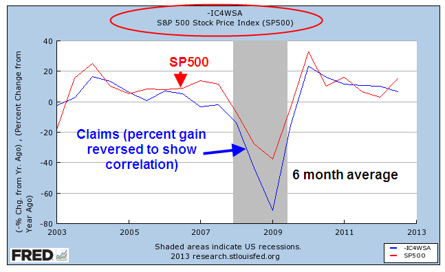
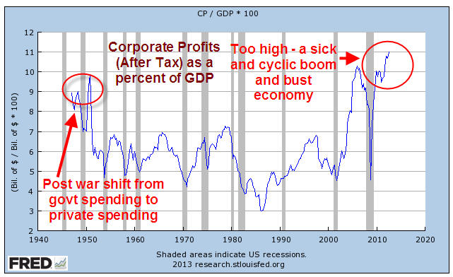
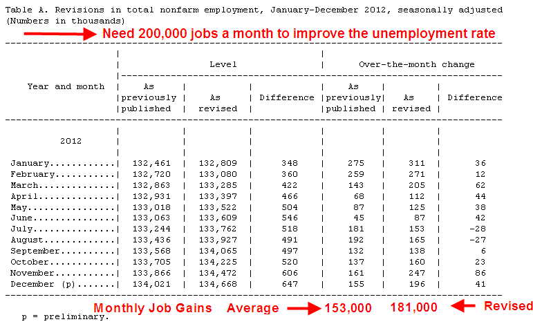
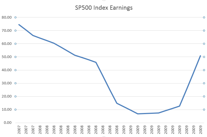
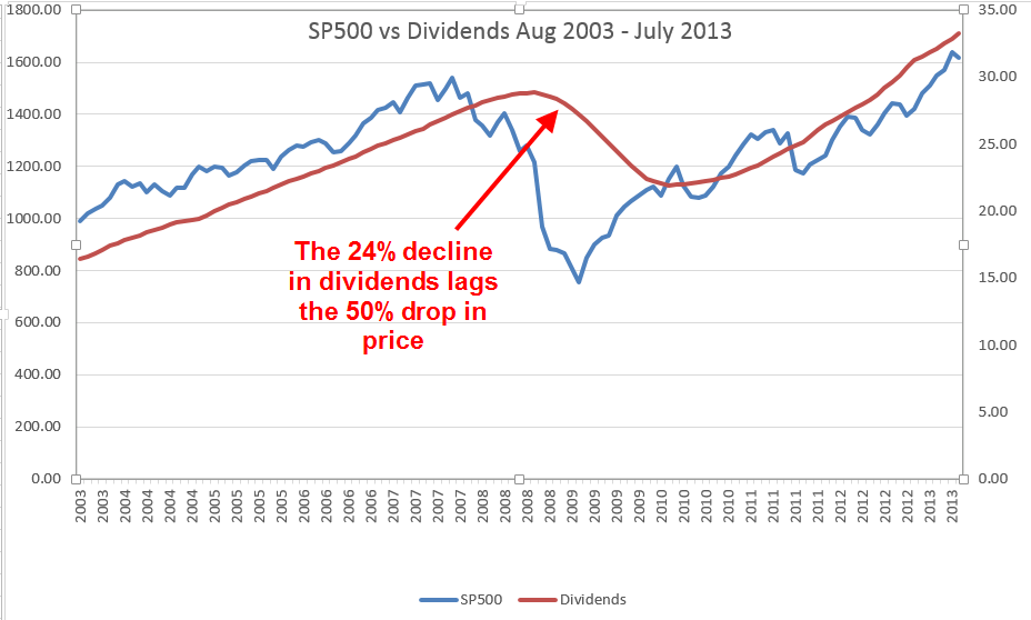
Last week I wrote about viewing trends in the market through the lens of hard cold cash; that is, the dividends paid by the companies in the SP500.  Today, I’ll revisit that subject in a bit more depth.  Beginning in the last quarter of 2008, reported earnings of companies in the SP500 dropped precipitously, plunging about 90% in the first two quarters of 2009.

The portion of those earnings paid as dividends fell 24% from peak to trough, far less than earnings.

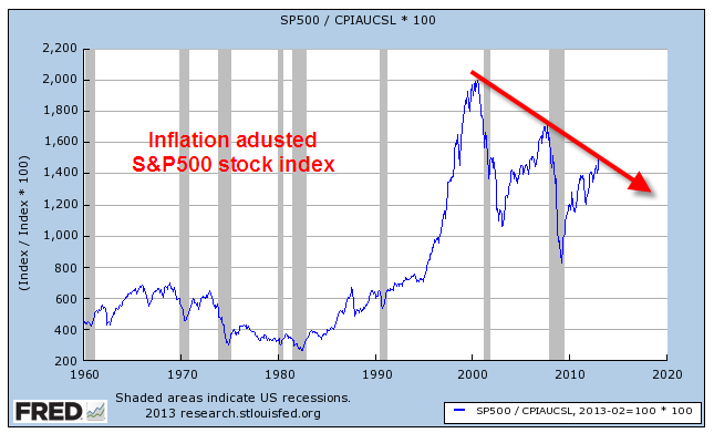
Robert Shiller, a Yale economist and co-developer of the Case-Shiller housing index, uses a smoothing technique for calculating a Price Earnings ratio and graciously makes his data available.  He calculates the 10 year average of real, or inflation-adjusted, earnings and divides the inflation adjusted price of the SP500 by that average.  Because of the low inflation environment for most of the past decade, the difference between the two earnings figures, nominal and real, is slight.

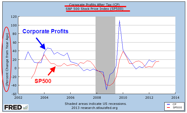
The drop in corporate earnings was extreme, more so than any recession, including the Great Depression of the 1930s.   In the 2001 recession, earnings declined to about half of their prerecession peak.  In the recession of the early nineties, it was about 30%.  In the back to back recessions of the early 1980s, corporate earnings fell about 25%.

While Shiller’s method evens out earnings, it has one drawback, one that no one could have foreseen until 2008 simply because it had never occurred.  The severity of the decline in earnings skewed the ten year average of earnings down over the 2002 – 2012 period.  Since the earnings average is the divisor in the Shiller P/E ratio, it correspondingly makes the ratio of the price of stocks a bit higher than it might otherwise be.

For that reason, I’ll look at a less volatile ten year average of dividends; that is, the inflation adjusted price of the SP500 divided by the ten year average of inflation adjusted dividends.

Today’s market prices are at the twenty year average of the real price dividend ratio, which is about 61.  For a number of factors, market prices as measured by this dividend ratio are higher for the past twenty years than the thirty year average of 51.  The tech and real estate bubbles over-inflated prices but investors have been willing to pay more for stocks as bond yields have declined steadily from their nosebleed levels of thirty years ago.

Let’s crank up the time machine and go back a year.  Here are a few quotes from an October 13, 2012 Reuters article after the market had dropped about 2%:

“Central bank-fueled gains took markets within reach of five year highs in September, but now U.S. stock market participants are shifting their focus back to corporate outlooks, and the picture is not pretty.”

The article quoted the director of investment strategy at E-Trade Financial, Michael Loewengart: “The overall tone is so pessimistic that we may see some upside surprises, but we could still suffer considerable losses if the news is bad.”

“Profits of SP500 companies are seen dropping 3% this quarter from a year ago, the first decline in three years”

It was close to being almost the end of the world.  As you read various comments in the news, keep in mind that these remarks are coming from active traders who see a 5% drop as catastrophic if they have not anticipated it through options and other hedging strategies.  For longer term investors, a 5% drop after a 5% rise over several months is more yawn provoking than cataclysmic.

Through the middle of November 2012, the market would drop another 5%.  Slowing corporate profits and the looming – yes, looming – fiscal cliff spooked investors.  Then, on the hopes that the Fed would do something to offset these negatives, the market regained the 5% lost in the previous month.  In mid-December, the Fed announced that it would double its bond purchasing program and the market has been rising since, gaining 20%.  Has this been a new bubble, one we’ll call the “Fed Bubble?”  Some say yes, some say no.

As we read the daily news, let’s keep in mind that in ten years we will have forgotten most of it.  Some fears will seem silly, some may seem prescient.  Each day there are many predictions, some like this one from December 30, 2001: “By the year 2003, there will be 2 types of businesses, those doing business on the internet and those out of business.” (Sorry, I didn’t write down the attribution).  Some predictions will seem rather silly like the one in March 2009 that the SP500 would be below 500 in a month.

Farmers and businessmen in ancient Rome consulted soothsayers who threw chicken bones and read the pattern in the bones to tell their clients whether there would be rains in the spring and how hot the summer would be.  Sometimes they were right, sometimes they were wrong.

Each day the market goes up – or it goes down.  For the past twenty years it has gone up 54% of the time, down 46% of the time.  Going up seems like an odds on favorite but this is complicated by the fact that the market usually goes down faster than it goes up.  There is also a well documented behavioral phenomenon of risk aversion; people respond more emotionally to loss than we do to gains.

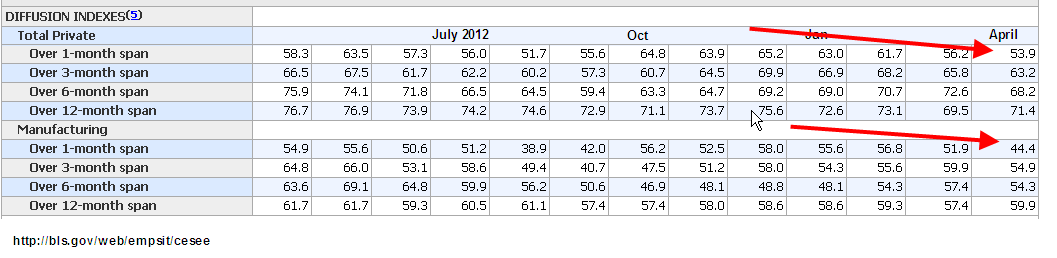
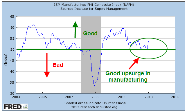
This past Monday came the release of the ISM monthly survey of Non-Manufacturing businesses.  Like the manufacturing survey released a few days earlier, this index also surged upward in July, a welcome relief after the declining numbers in June.  I’ve updated the composite CWI that I introduced a while back and compared it to the SP500 and the Business Activity Index of the Non-Manufacturing Survey.

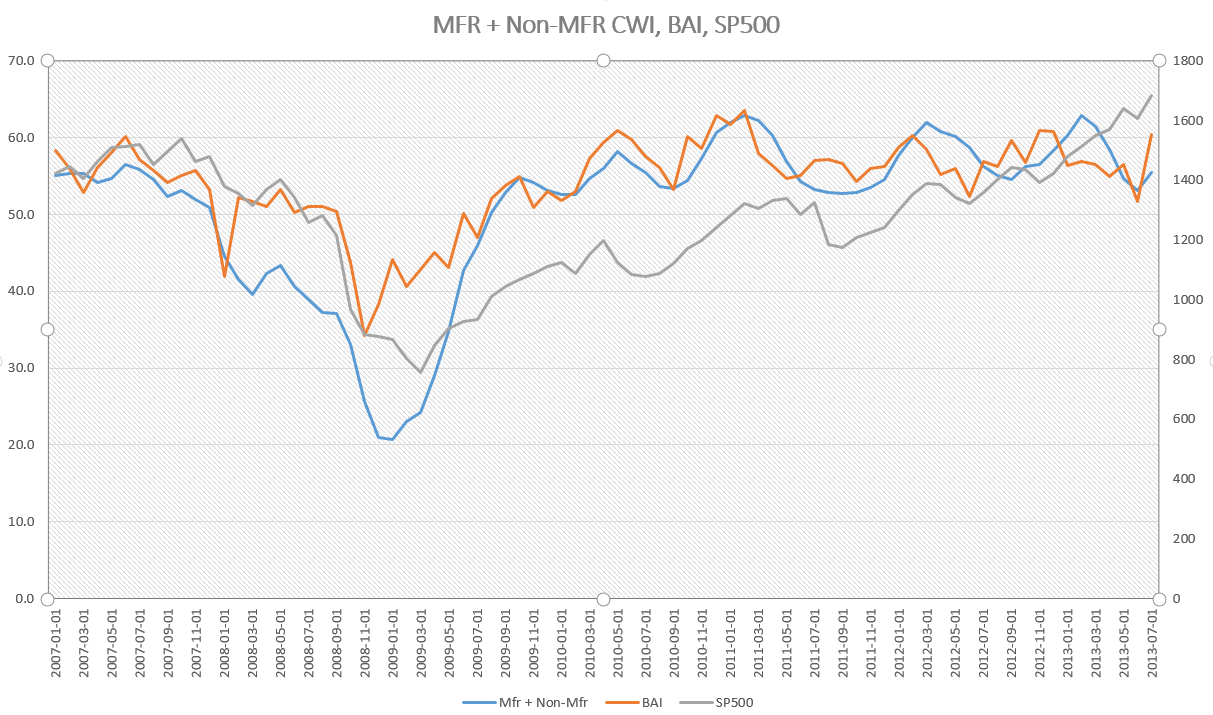
This composite index is weighted 70% to non-manufacturing, 30% to manfacturing.  Because this CWI relies on past months’ activity as a predictor of future conditions, it responds with less volatility to a one month surge in survey data.  As we can see, the tepid growth that began appearing this past spring is still showing in this index, although it is a strong 55.5, indicating sure footed, if not surging, growth.  It has been above the neutral mark of 50 since August 2009.

The Price is Right?

August 4th, 2013

First week of the month and several good monthly reports helped propel the SP500 through the 1700 mark this week, making an all time high.  Last week I wrote that the market would be cautious and the first few trading days of the week was exactly that, drifting sideways.  On Thursday the release of a suprisingly strong ISM Manufacturing report gave an upward jolt to the market.  In several recent blogs on the ISM and an alternative composite called the CWI, we could see that manufacturing has been sliding toward the neutral mark of 50 for the past several months.  On Monday, the ISM non-manufacturing index will be released and next week I hope to update the CWI.

Ultimately, the market rides up or down on the anticipation of future earnings.  However, earnings can be “managed,” to put it politely.  Further confusing the earnings picture for a casual investor are the several different types of earnings: operating, pro-forma and GAAP to mention a few.  There are two types of “future”, or projected, earnings: bottom up and top down.

A simpler approach that some investors use is to calculate the Price Dividend ratio.  There is no fudging of cash dividends to investors.  Robert Shiller, author of  the 2005 book “Irrational Exuberance”, updates the data used in his book.   These include the SP500 index, earnings, dividends, the CPI and a Price Earnings ratio that is based on the past ten years of earnings.  The current ratio of 23.80 is lower than the 2006 ratios which were in the high twenties.

But let’s look at the Price Dividend, or PD, ratio.  For the past ten years that ratio has averaged a bit less than 52, meaning that investors have been willing to pay almost 52 times the amount of the dividend to own the stock.  As of June 30th, the PD ratio stood at a bit more than 48, which means that stocks were a bit cheaper than average at this date.  Since then the market has gone up about 6% so that the PD ratio is now about 51, or just about average.

As the market makes new highs, investors are prone to ask themselves if the price they are paying for stocks is too high.  The long term investor might take a different perspective and ask themselves, “How will I feel in ten years if I continued to put money into the stock market now?”  Ten years from now, in the year 2023, the answer will be “Well, I didn’t get a deal and I didn’t overpay based on the information available at the time.  I paid about average.”

McGraw-Hill, the publisher of the SP500 market index, also keeps an index of dividends.

Dividend growth has plateaued and is about a third of earnings, which means that companies are paying a third of their earnings back to investors in the form of dividends.  This is just slightly more than the median for the past ten years.

There was a lot of data to digest in this past week.  The GDP estimates for the 2nd quarter was a sluggish 1.7%, more than the expectation of 1.1%.  But – always that but – the 1st quarter GDP growth was revised down from 1.7% to 1.1%.

On Thursday, the same day as the ISM manufacturing report, came the monthly report on auto sales.  Total sales of light weight vehicles, which includes cars and pickups, increased about 4% this past month to an annualized amount of 16 million vehicles.

When we look at auto sales on a per capita basis, auto sales are still below 5% of the population, a level that would show me that consumer demand and the construction industry (pickup trucks) is healthy.  As we can see from the chart below, the sale of autos stayed consistently above that 5% level for more than 20 years – until the last recession began.

Employment in the production of motor vehicles and related parts is very  weak.

Although vehicle sales includes both imports and domestics, I wanted to see how many autos are sold per person employed in automotive production.  Advances in manufacturing and the mix of import and domestically made vehicles have impacted employment.

And with that, I’ll look briefly at the Employment Report for July released this past Friday.  On Wednesday, ADP reported 200,000 private jobs gained, giving a brief upward impetus to the market.  As I noted last week, caution would be the watchword of this week and that caution showed in later trading on Wednesday.  The ADP report did give some hope that the BLS employment report would show an approximate gain of that many jobs.  Instead, the employment gains from the BLS were disappointing, at 162,000.   A further disappointment were the small downward revisons in May and June’s employment gains, totalling -26,000.

The unemployment rate declined, from 7.6% to 7.4%, but for the wrong reasons.  For any number of reasons – disappointment, frustration, going back to school, retirement – 240,000 people dropped out of the work force.  This is close to the reduction of 257,000 in the ranks of the unemployed.  After declines or relative stability in the number of “drop outs” in recent months, this month’s surge was particularly disappointing.

Job gains in the core work force aged 25 -54 remains relatively flat.

While older workers continue to add jobs

Business Services and Health Care jobs continued their strong job gains but gains in the health care field have slowed from 27,000 per month in 2012 to only 16,000 in 2013.  Sit down for this one – government workers, mostly at the local level, actually gained 1,000 in July.

Despite the decline in unemployment, the tepid employment and GDP growth reports likely reassured many that the Fed is unlikely to stop or reduce their quantitative easing program in the next few months.

Business Cycles

June 16th, 2013

The manufacturing sector accounts for less than 20% of the economy but is probably the major cause of business cycles in the economy.  In the 1990s, the growing development of technology and business services in the U.S., together with what was called “just in time” inventory management, led some economists to declare an end to the business cycle. Cue the loud guffaws.

May’s monthly report on industrial production released Friday showed no monthly gain, after a decline of .4% in April.  The year over year change in the index was just under 2%.  In a separate report from the Institute for Supply Management (ISM) released a week ago, the Manufacturing Purchasing Managers Index (PMI) index for May fell into contraction, its lowest reading since June 2009, when the recession was ending.


New Orders and Production components of this index saw sizeable decreases.  Computer and electronic businesses reported a slowdown that they attributed to the sequester spending cuts enacted a few months ago.

The latest data for non-defense capital goods excluding aircraft from the U.S. Dept of Commerce showed an uptick after a period of decline in the latter half of 2012; however, there is a month lag in this data set.


The sentiment among small businesses improved somewhat, as shown by the monthly National Federation of Independent Businesses (NFIB) survey.  The overall index of 94 indicates rather tepid expectations of growth by small business owners.  Plans for capital spending to expand business are still at recession levels.

A business builds inventory in anticipation of sales growth.  Since the beginning of this year the net number of small businesses expanding inventory has finally turned positive.

  In a 2003 paper, economist Rolando Pelaez tested an alternative model of the Purchasing Managers Index that would better predict business cycles, specifically the swings in GDP growth.  Assigning varying constant weights to several key components of the overall PMI index, his Constant Weighted Index (CWI) model is more responsive to changes in business conditions and expectations.  In early 2008, the PMI showed mild contraction but Pelaez’ CWI model began a nose dive. It would be many months before the National Bureau of Economic Research (NBER) would mark the start of a recession in December 2007 but the CWI had already given the indication.  In May of 2009, the CWI reversed course, crossing above the PMI to indicate the end of the contractionary phase of the recession.  It would be much later that the BEA would mark the recession’s end as June 2009.


The CWI index is rather erratic.  We lose a bit of its ability to lead the PMI when we smooth it with a three month moving average but the trend and turning points are more apparent in a graph.

Before the 2001 recession the CWI index led the PMI index down.

OK, great, you say but what does this have to do with my portfolio?  Smoothing introduces a small lag in the CWI but it is a leading, or sometimes co-incident indicator of where the stock market is headed over the next few months.

Let’s look at the last six years.  In December 2007, the smoothed CWI crossed below the PMI, which was at a neutral reading of about 50.  The stock market had faltered for a few months but as 2008 began, the CWI indicated just how weak the underlying economy was.  The NBER would eventually call the start of the recession in December 2007.  In June 2009, the CWI crossed back above the PMI.  Coincidentally, the NBER would later call this the end of the recession.

The period 2000 – 2004 was a seesaw of broken expectations, making it a difficult one to predict because it was, well, unpredictable.  I did not show this example first because this period is a difficult one for many indicators.  Before 9-11, we were already in a weak recession.  Although the official end was declared in November 2001, the effects were long lasting, a preview of what this last recession would be. In 2002, we seemed to be pulling out of the doldrums but the prospect of an Iraq invasion and a general climate of caution, if not fear, prompted concerns of a double dip recession.

An investor who bought and sold when the smoothed CWI crossed above or below 50 would have had some whipsaws but would have come out about even instead of losing 15% over the five year period.

The present day reading of both the CWI and PMI are at the neutral reading of 50.  Given the rather lackluster growth of the manufacturing sector, the robust rise of the stock market since last November indicates just how much the market is riding on expectations and predications of the future decisions of the Federal Reserve regarding future bond purchases and interest rates. Over the past thirteen years, when the year over year percent change in the stock market hits about 22%, the percentage of growth in the index declines.

So what is a normal run of the mill investor to do?  The CWI, a predictor of business cycles, is not published anywhere that I could find. This and many other indicators are used by the whiz kids at investment firms, pension funds, by financial advisors and traders, to anticipate business conditions as well as the movements of the markets.  But look again at the SP500 chart above and remember that it is the composite of millions of geniuses and not so geniuses trying to anticipate the market.  As I have mentioned in previous blogs, when that percentage change drops below zero, it is time for the prudent investor to consider some portfolio adjustments.  Since 1980, the average year over year percent change in the SP500 is 9.7%, using a monthly average of the SP500 index. Despite the recent 20% gains, the average year over year percent gain during the past ten years is only 4.9%.  If we look back to the beginning of the year 2000, the average is only 3.1%.  Those rather meager gains look robust when compared to the NASDAQ index, which is still 25% below its January 2000 high.  Think of that – thirteen years and still 25% down. The Japanese market index, the Nikkei 225, is at the same level as it was in early 1985, almost thirty years ago.  Both of these examples remind us that we need to pay some  attention or pay someone to do it for us.

Stocks vs Bonds

June 2nd, 2013

As the market makes new highs this past month, I am reading articles and seeing charts on asset allocation that reminded me of those I saw in 2000.  Here is a chart that appeared in the WSJ this weekend.

Mutual Funds typically report their performance over several time periods, usually 1, 3, 5, and 10 year periods.  This spring, as the SP500 index continue to peak, a ten year lookback window begins near a trough in the index in the spring of 2003.

Why did the WSJ writer pick 25 year and 35 year time periods as a comparison?  We can only guess but it just so happens that the starting points of these two lookback periods were also troughs in stock prices.  Why not pick 20 and 30 year time periods? Let’s look at the 25 year period which starts in April 1988.

What if the writer had used a 20 year lookback?  They would have started in April 1993, when the stock market was 72% higher.  I don’t want to take the time to calculate the difference in returns, including dividends, between the different strategies shown in the chart, but the reader can imagine that the difference would be significant.

Why use a 35 year lookback?  Why not a 30 year lookback?  In 1978, the SP500 index was again pulling out of a trough in prices after a slow slide in values during 1977.

Had the WSJ writer picked a 30 year window starting in April 1983, the stock market index was – again – 72% higher than in April 1978.  Again, we can imagine that the comparison of strategies would be significantly different.

Being aware of these peaks and troughs can help us evaluate past performance of various investment allocations.  Consider an example of a 10 year comparison of the SP500 vs a bond index fund like Vanguard’s VBMFX

The SP500 index shows the better return but, if we know that spring of 2003 was a trough in this index, we can view such a comparison with some skepticism.  A five year comparison tells a different story.

Now we are comparing performance starting with a downslide in the index, when the SP500 had fallen about 11% from its peak.  It is also close to the 3 year moving average of the SP500 index.

Based on a five year window and the fact that our starting point was a 3 year average in the SP500, we might conclude that our portfolio should contain mostly bonds.  Who needs the aggravation of the volatility in the stock index when we can make the same return with a boring bond index?

In a 3 year time frame, stocks have clearly outperformed bonds.

Our starting point of this 3 year window also happens to be the 3 year average of the SP500 index.  Not only that, it is just  a bit above the midpoint between the 2007 index peak and the trough in the spring of 2009.  We couldn’t ask for a more reliable starting point to make our comparison.

So we have a second reliable starting point but the conclusion we draw is significantly different from the conclusion we drew in the 5 year comparison.  Let’s look closer at this stronger performance of the SP500 vs a bond index.

Half of the better 3 year performance of stocks has come in just the last 6 months after the Federal Reserve announced their open QE program of buying government bonds until the unemployment index reaches a target of 6.5%.  The recent upsurge in stocks has “goosed” the comparison numbers upwards in favor of stocks.

Our conclusion is that historical performance numbers presented by mutual funds or an investment advisor cannot be taken at face value.  It is important to understand the starting point of the historical comparison, which can have a significant effect on the numbers.

Job Trends

This past Wednesday the payroll firm ADP released their monthly report of private employment with a rather tepid 119,000, prompting an equally tepid sell off in the market, which lost about .7% by the end of Wednesday.  Although the price move was under 1%, the volume of trading was high.  Was this the end of the 6+ month run up in stock prices?  Was the economy slowing down? 

Came Thursday and a very cheery weekly report of new claims for unemployment and moods brightened.  The market regained the ground lost Wednesday and then some, but on rather low volume.  Standing on the sidewalks of Wall Street, traders repeatedly opened up their umbrellas, then closed their umbrellas, put on their sunglasses, then took off their sunglasses. 

[And now a pause from our sponsor.  A trader tells his doctor he’s anxious and asks for a prescription.  The doctor gives him some advice: “stop looking at the market so much.”]

Back to our story. Friday morning dawned, the heavens opened and the sun shone.  The Bureau of Labor Statistics issued its monthly weather – er, labor – report and traders threw down their umbrellas and put on their shades.  Huzzahs rang throughout the canyons of lower Manhattan.  Some slacker dudes cooly tossed their stocking caps in the air, while men dressed in crisp suits wished that they too had hats.

The labor report is released an hour before the market opens at 9:30 AM.  The market opened up 1%, drifted higher but ended the day at about the same price as it opened.  So, huh? We’ll get to the huh part later.

The reported job gains of 165,000 for April were just slightly above the 150,000 jobs consensus estimate and the replacement rate needed to keep up with population growth.  Spurring the initial enthusiasm was relief that job gains were not as weak as some had feared (100,000 or so) and the revisions to previous months job gains, adding 114,000 to February and March’s job gains. But February’s revision from strong to very strong job growth provokes some head scratching.

What good things happened in February to inspire such strong job growth?  Hmmmm….here’s a table of the past 12 months data from the establishment survey. 

There was a lot to like in this month’s report.  The unemployment rate dropped a tenth of a percent to 7.5%.  We just passed employment levels of February 2006 – yep, it’s been a slow recovery.

To get the big picture, let’s look at the last forty years.

From this perspective, we can see just how deep the job losses have been since 2008.  From this rather sobering point of view, let’s look at some of the positives from this month’s report.

Professional and Business services added a whopping 73,000 jobs this month, far above the 49,000 average of the past 12 months.  Restaurant and bar jobs were up 50% above their 12 month average, showing gains of 38,000. Temp help posted strong gains of 31,000, its highest of the past year.

Construction jobs showed little change, a surprise at this time of year.  Construction has been averaging gains of 27,000 a month for the past six months. This past week, I spoke to a woman at a Denver branch of a national temp agency.  This branch focuses on manual labor, mostly for the construction industry.  She confirmed that business has been brisk but most of the calls are for road repair and rebuilding and some commercial construction.  When I asked her about calls for helpers and job site clean up for residential construction, she said it had been sporadic.

Job gains in health care were somewhat below their 12 month average of 24,000 but any slack in health care was made up by strong growth in retail.  Government jobs continue to contract slightly each month.

Underlying the positive aspects of the job market are some anemic indicators.  The average of weekly hours dropped .2 hour to 34.4; the average has lost .1 hr in the past year.  The ranks of the long term unemployed dropped by 258,000 workers but the number of people working part time who would like a full time job jumped 278,000.  The ranks of the “involuntary” part timers – those who would like a full time job but can’t find one – is about 5 million.  Here’s a surprise. Today’s levels of involuntary part timers as a percent of total employment is only the third highest in the past fifty years; the late 1950s and the early 1980s were worse.  But this only means that the ranks of part timers have fallen mercifully from nose bleed levels.

The diffusion index is showing some weakness; this is the share of employers who are reporting job gains vs. job losses, with a value of 50 being neutral.  Manufacturing employers are already reporting more job losses than gains.  Overall, employers are slowly drifting toward neutral in their hiring for the past several months.

The core work force aged 25 – 54 is still limping along.

Even more disturbing is the participation rate of this core work force.

Shortly after the market opened on Friday came the report on factory orders and it muted some of the enthusiasm generated by the labor report.  New orders for durable goods, a barometer of business confidence, fell 5.8%, confirming the slowdown in manufacturing.  Employment in this sector has been flat the past two months.

While the monthly labor report makes headlines, it is not a leading indicator. Professional investors watch the squiggles of daily and weekly economic and news reports, trying to anticipate developing trends.  Many of us have neither the time or inclination.  For the long term “retail” investor, continuing job gains are positive, particularly if they are at or above the replacement level of 150,000. The long term investor is more concerned about significant losses in their retirement portfolio.

What if an investor lightened up on their stock holdings shortly after the BLS reported the first job losses?   I looked back at historical employment releases ; I wanted to use the original releases, not the revised figures of later months, to capture the sentiment at the time.  We must make decisions in the present.  We don’t have the luxury of going into the future, looking at data revisions, then coming back to the present and making our investing decisions.  That would be a good time machine, wouldn’t it?  Here’s an example of how employment data can be reported initially and later revised.  The graph shows the later revisions.

In early August 2000, the BLS reported job losses of 108,000 in July.  But this was due to the layoff of 290,000 temporary Census workers.  Do census workers really count in our strategy?  Let’s say not.  We wait till next month’s report, which shows a loss of 105,000. Should we use our strategy?  Again, those darn census workers.  Without them, there would have been a small gain in jobs.  So we don’t sell in September.  Then, in the beginning of October comes the news of strong job gains in September, followed by more job gains in October, November and December.  Good thing we didn’t sell at that first downturn, we tell ourselves.  Meanwhile the stock market has been slipping and sliding since that first negative job report.  Eventually, it will fall about 40%.

Wow, we should have taken that first signal and avoided all those losses!  But if our strategy is to then buy back in when there are positive job gains reported, then we could be in and out of the market like a yo-yo in years when the economy is struggling to find direction or strength. We were looking for a more even tempered strategy.

To emphasize how the revisions in employment can mean the difference between job gains and job losses,  take a look at the chart below.  These are the revised figures.  I have noted months where the initial monthly labor report showed positive job gains but were later revised to job losses.  Some of these revisions can happen months later.

From the first reported job losses in mid 2000, more than three years passed before job gains would exceed the “replacement” level of 150,000.  That is the number of jobs needed for the growth in the labor force. While many, myself included, have blamed the knucklehead politicans who enacted the Bush tax cuts in 2003, it is understandable that they were beginning to wonder if the labor market would ever turn around.  Three years of job losses is a long time.

Let’s move on to the last decline.  The market had already begun its decline before the first job losses were announced in early February 2008.

In this past recession, the job losses were severe but the first job increases were announced about two years after the first decrease, in early April 2010.  When reviewing the historical BLS releases, this really surprised me that the 2000 – 2003 labor downturn lasted longer than this last one, though it was much less severe.  By the time the first job increases had been announced in 2010, the market had already been on an upswing for a year. 

In short, the headline monthly job gains don’t appear to offer a long term casual investor any particular insight or advantage.  In a work force of 143 million, a hundred thousand jobs can be a slip of the pencil.  But reported job gains of 150,000 or more do offer an investing hint – quit worrying about your retirement portfolio for at least another month.  Go fishin’, play with the kids, hang out with friends.

A labor indicator that seems to be more reliable is the year over year percent change in the unemployment rate, which I have discussed in earlier blogs.

Although the unemployment rate – or percentage – is derived from the count of total employment, the revisions are much smaller.  Secondly, we are using a percentage gain in that percentage, further reducing swings.

The stock market continues to post new highs in anticipation of good corporate profits in the latter part of the year.  What is a bit troublesome is the number of revenue shortfalls reported by companies in the first quarter.  Reducing expenses and boosting productivity can only get a company so far.  Profit growth becomes harder and harder to come by without revenue growth.

Things That Spring

April 14th, 2013

Across the land, springtime wakens the trees and flowers, birds chirp and squirrels chatter.  From the buildings where the humans live comes the wailing and gnashing of teeth as many procrastinators spend this last weekend before the tax deadline in a spring ritual of angst.  The lost W-2 form is finally found beneath the Netflix DVD that has lain casually on the bookcase, waiting to be watched.  The 1099DIV form is found beneath a birthday card that was never sent.

Lay aside your problems; let’s climb inside the hot air balloon and look at the big picture.  A few weeks ago, economic growth for the fourth quarter of 2012 was revised marginally higher into positive territory, but dropping from the annualized growth rate of 3.1% in the 3rd quarter of 2012.  Let’s look at GDP from a per person basis since WW2.  Until the recession hit in late 2007, economic growth had consistently outpaced population growth.  Then POOF! went the economy and blew away a big gap in GDP.

Let’s zoom in on the past ten years to see the effect.  On a per person basis, the gap is $5,000 of spending that simply didn’t get spent.

Call it the GDP dust bowl of the 2000s, similar to the dust bowl of the 1930s when the wind blew the top soil from the prairie of the Oklahoma panhandle and forced many families from their farms.  In this case, the wind blew away a lot of jobs and chunks of home equity.

Policy makers in Washington want to close that $5000 per person gap.  If they could write a law forcing everyone to spend that $5000, they would.  Instead, they keep giving away money in unemployment benefits, food stamps, disability benefits, crop subsidies – all to keep people from not spending even less and making the problem worse.

Retail sales account for about 1/3rd of the total economy.  Including automobile sales and parts, consumers are still below twenty year averages.

This past Friday, the monthly report on retail sales showed little change from the past month.  When we look at per person real retail and food sales and take out automotive sales we get a feel for core sales, those that we make on a frequent basis.  Once again, we see the same gap that we saw in GDP.  Since mid-2009, this core consumer spending has grown 2.3% annually, above the 1.8% annual growth trend from 1992 through 2006, but it still down $2000 a year from what we would have spent if we had stayed on the same trend line before this past recession hit.

To make it a bit clearer, let’s look again at that chart and compare the 15 year annual growth rate from 1992 to the longer 21 year growth rate.  It has fallen from 1.8% to 1.1% annual growth.

GDP measures spending; let’s look at Gross Domestic Income, or GDI.  A fundamental principles of economics is that it takes money to spend money.  A six year old asks a parent “Why can’t we just go out and get more money?” to which the parent replies “Whaddya think money grows on trees?!”  End of Chapter One in the Parent’s Guide to Economics.

When we compare the country’s income to spending, we find that a dip in income below production precedes recessions.

After the 2008 – 2009 crash and recovery in national income and spending, both are limping along.

A few weeks ago came the monthly New Orders, an indication of business confidence.  As regular readers know, I have been watching this declining trend since September of last year, when the percent change in New Orders was negative.  The recent rise has been a welcome sign of growing confidence but new orders fell 2.7% in February and now hover around the zero growth line. 

On a quarterly basis, the year over year (y-o-y) percent change is still firmly in negative territory, meaning that businesses are not putting up more money to invest in new equipment.  Why?  Because they are still not sure about consumer spending. The six month run up in the SP500 stock index might lead a casual observer to think that the economy and companies are gearing up.  New Orders indicates that there is much more caution out there than the stock index would indicate.

This past Friday, business’ caution to commit to new investment was only reinforced when the latest Consumer Sentiment index was released.  After climbing the past few months, confidence is sinking again.  Maybe it’s the extra 2% coming out of paychecks since January 1st.  Whatever it is, it doesn’t inspire many business owners to put a lot of money into expanding their production.

When the stock market is trading on hope, it looks six months ahead.  The recent run up is hoping for double digit profit growth in the second half of this year.  When the market trades on fear, it looks ahead about 2 seconds, faster than the normal investor can or should react.  Let me get out my broken record for another spin, cue the needle and play that same old song “Diversify.”

P.S. For those of you who are more active investors, check the latest post from Economic Pic in my blog link list on the right.  It shows the past 40 year returns for a strategy of selling the SP500 index in May and buying the long term government / credit index.  The iShares ETF that tracks this index is ITLB.  A comparable ETF from Vanguard is BLV.

Blossoms and Blight

March 24th, 2013

The Blossoms

There have been a number of encouraging reports these past several months, helping to fuel new highs in the popular SP500 stock index.  After falling off dramatically five years ago, real (inflation adjusted) retail sales finally surpassed 2007 levels.

Housing prices around the country are on the mend.  Although the purchase only home price index is still below the vaulted levels of the bubble years, it is exactly where it would have been if there had been no bubble and housing prices had grown at their customary 3 – 4% per year.

In recent months, the manufacturing sector of the economy has surged upward, rebounding from weakness in the latter part of 2012.  For the past year, the Eurozone has been in or near recession, yet some are hopeful that increased demand in this country and some emerging markets are helping to balance the contractionary influence of decreased demand in the Eurozone.  Let’s hope that this surge in the first part of the year does not fade as it did in 2012.

New claims for unemployment continue to decline. 

The Blight

But a 7.7% unemployment rate and a record 14 million disabled (SSA Source) show that the labor market is still sick.  The percent of working age people who are working, or the participation rate, continues to drift downward.

While the steadily improving retail sales indicate growing consumer confidence, per capita purchases are about where they were in the late 1990s, 15 years ago.

While consumers have been shedding debt, state and local governments continue to hold large levels of debt which does not include promised pension and health care benefits to retirees.

Federal Spending continues to outpace receipts, adding to the debt at a rate of more than 4% per year. At that rate the debt will double in about 18 years, reaching $30 trillion in 2030.  As a percent of the entire economy of the country, the deficit or annual shortfall between spending and revenues is still about 7%.
 

As housing prices recover and households either pay down or shed debt in foreclosure or bankruptcy, household balance sheets are looking better. What has happened in the past five years is a massive shift of household debt to the balance sheets of local, state and federal governments.

The blossoms catch our eye, inspiring hope, causing some to not notice the blight.  But the stock market, the barometer of millions of watching eyes, tells a more complete story.  While the stock market has shown renewed optimism in the past several months, its inflation adjusted value indicates a more tempered enthusiasm for the long term future of the economy and corporate profits.

Capital Goods and New Claims

March 3rd, 2013

This past week came a number of positive economic reports.  The first one I will look at is the Durable Goods Orders, which indicate a willingness by consumers and businesses to commit money now to buy stuff that will last for several years.  A critical component of this index is capital goods, durable goods like machinery which produce more goods and services.  As a key indicator of business confidence in the future, it is one of the trends I watch. (See Predictions and Indicators)

Until the past few months, this component has been particularly weak, warning of recession.  Resolution of the “fiscal cliff” issue at the beginning of the year has sparked more optimism and it shows in the new orders for capital goods.  This deep a decline in the year over year percentage change has been followed with an uptick in the past, only to fall into recession.

When we smooth out the monthly data with quarterly averages, the trend is still in negative territory.

Every week the Bureau of Labor Statistics issues a report on the number of New Unemployment Claims.  This past week, the BLS reported a lower than expected number of 341,000, a drop of 22,000 from the week before. Numbers of more than 400,000 are a major concern.  The weekly series can be volatile; most analysts look at the 4 week moving average to get a better gauge of the trend. 

As with many data series, I am interested in the year over year (y-o-y) percentage change in the data.  Because the SP500 index is a volatile series, I’ve smoothed out the data to a 6 month average to show the negative correlation between stock prices and  new unemployment claims. 

In other words, when unemployment claims go up, the stock market goes down.  This particular data series is good when it is low, bad when it is high so I reverse the percentage change to show its correlation with the SP500. 

On a quarterly basis, this negative correlation has proved to be a reliable trading signal for the longer term investor.  When the y-o-y percentage change in new unemployment claims crosses above the SP500 change, sell.  When the claims change crosses below the SP500 change, it’s safe to buy.

Again, this strategy is for the long term investor who is more concerned with major structural changes in the economy that can cause a significant dent in her savings.  Using this strategy she will not maximize her gains but she will avoid major losses and it does not require that she check her stock portfolio more than four times a year.  An investor using this strategy for the past twenty something years would have bought in the first week of Oct. 1990 and been in the market during the 1990s as the index climbed, then stalled in the mid 1990s, then climbed again.  She would have sold in the first week of Jan. 2001, missing most of the market drop for the next several years.  She would have re-entered the market in the first week of October 2003 and sold again in the first week of April 2008, just before the financial meltdown in September of that year.  She would have bought again in the first week of January 2010 and would still be in the market.

For the long term investor who does not want to devote a part of their lives to reading financial news or watching CNBC, it is often difficult to separate the “noise” – the weekly headlines and economic reports – from the real motion or trend.  This indicator is a low maintenance signal for that investor.

P.S.  You can get this report yourself without much trouble. 
Enter “Fred New Claims” into your browser’s search bar. 
The first link should be “Unemployment Insurance Weekly Claims Report – FRED” at the Federal Reserve.

Click the link, then select the first series “4-Week Moving Average of Initial Claims”. 
When the graph displays, click Edit Graph in the lower left below the graph.
Select the 10 Years range radio button. 
In the Frequency field below the graph, select “Quarterly” and leave the Aggregation method at the default setting of “Average”. 
In the Units field below that, select “Percent Change From Year Ago”. 

(Adding the SP500 stock market index)
Below the “Redraw Graph” button, select the blue bar Add Data Series
Leave the New Line button selected.
In the Search field, type SP500 and select the default SP500 index.  The graph will redraw automatically but it will make little sense at this point until we edit the settings for the SP500 index. 
Select the 10 Year range button for the SP500.  Make sure you are editing the SP500 data graph and not the New Claims indicator. 
Change the Frequency field to “Quarterly” just as you did for the New Claims. 
Change the Units field to  “Percent Change From Year Ago” just as you did with New Claims. 
Click the Redraw Graph button and voila!

The Law of Averages

February 17th, 2013

The spending sequester, or sequestration, set to take effect March 1st is a series of automatic and indiscriminate spending cuts that was part of the “Grand Bargain” compromise between President Obama, together with a Democratically led Senate, and the House Republicans in the Budget Control Act of August 2011.  The agreeement was rather like a Sword of Damocles, a chopping of spending programs cherished by one party or the other.  The term “sequester” means that there will be some actual spending cuts, not the usual budget and appropriations gimmicks that Congress is fond of. The unpalatable cuts to both defense spending and social programs were supposed to be an incentive for both parties in Congress to come to an agreement on deficit reduction as a condition of raising the debt limit.  It was hoped that the 2012 election would decide which party’s priorities would take precedence and the dominant party could then pass legislation to avoid or modify the sequester.  Instead, the election left the balance of power unchanged.  Republicans had dismissed the probability of the Democrats winning a majority in the House.  There were just too many seats that the Democrats need to gain to accomplish that.  Hoping to take the Presidency and having a good chance of taking control of the Senate in the 2012 elections, Republican lawmakers agreed to the sequester. The 2010 post-census election had put Republicans in charge of crafting voting districts, which enabled them to retain a majority in the House despite losing the total popular vote for House seats in the 2012 election. Several key Senatorial races imploded when Republican candidates made ill-advised (to be charitable) remarks.  Instead of gaining control of the Senate, Republicans lost two Senate seats.  Despite the high unemployment rate and the poor to middling economy, President Obama won re-election.

After navigating a mind numbing maze of previous law and baseline budget projections to arrive at actual spending reduction goals, the sequester will reduce defense spending by $55 billion and non-defense spending by $38 billion in 2013.  While this sounds like a lot of money, this is just 2.4% of the estimated $3.8 trillion in total federal spending in 2013 or a mere .6% of the estimated $16 trillion of this country’s GDP.  This past week the Democratically controlled Senate revealed a plan that would avoid the sequester for 2013.  The plan achieves deficit reduction goals with spending cuts and revenue increases but the revenue increases will probably be unwelcome to the Republican majority in the House.  Despite the rhetoric of calamity coming from either side of the aisle, both parties are anticipating that the sequester will probably take effect in two weeks.

Since mid November the SP500 has risen 12%; except for a sharp decline in the last week of the year in response to fears of the fiscal cliff, the market has climbed steadily.  The market has been largely ignoring the upcoming sequestration. 

More concerning to some is the slowdown in Europe, where the Eurozone economy has contracted for 4 quarters in a row.  Even Germany, the manufacturing and export stalwart of the Eurozone, saw a .6% contraction in the final quarter of 2012.

For many decades, the two prominent parties have been fighting an ideological battle over the role of the Federal government.  The Democratic Party regards the Federal government as largely beneficial and wants a greater role for the Federal government.  They have ushered in many social programs including Social Security, Medicare and Medicaid, programs that are largely on autopilot, beyond the reach of the Appropriations Committee in the House, where a select few can make the law by deciding which programs and federal agencies receive funding.  The philosophy of the Republican Party is that the Federal government is intrinsically a burden and therefore deserves a smaller role.  The Republican Party was out of power in the House for forty years until 1994; as a result, their role consisted largely of blocking or modifying Democratic Party ambitions.  Except for four years from 2007 – 2011, they have controlled the House since 1994 yet often conduct themselves as the opposition party that they were for much of the latter part of the 20th century.

In the tug of war between these two ideologies, the budget has suffered.  A recent report by the non-partisan Congressional Budget Office (CBO) contains a graph of Federal revenue and outlays and their long term averages which clearly pictures the “scrimmage” of ideologies between two yardlines, marked 18% and the 21%.  Republican politicians, together with conservative talk show hosts and commentators, speak of the “traditional” role of the Federal government at 18% of GDP.  This is simply the average of Federal revenues, not its role, for the past fifty years. Revenues have been, on average, 3% below that of Federal spending, which has averaged 21% of GDP.  The “traditional” role of the federal government, then, is to have an average annual deficit of about 3% of GDP.  In a $16 trillion economy, that average deficit is $500 billion.

Republicans simply can not say “no” to the Defense Dept; at times, they have forced spending programs on the Defense Dept that it doesn’t want.  The Democratic Party has become the champion of a hodge podge of Federal social welfare programs.  Neither party proposes taxes that will actually pay for the spending.  For all the Democratic rhetoric about taxing the rich, there simply aren’t enough rich people to pay for that average $500 billion deficit.  Large corporations continue to dominate both parties.  Campaign laws in most states as well as the federal government permit no fundraising in government buildings.  Almost every day, the members of the House and Senate must leave the government building where they work in order to do the daily drudgery of promising favorable legislation to corporations and associations in return for campaign contributions. 

We are still way above the 3% deficit average of the past fifty years.  The CBO projects that this year’s deficit will be 5.2% of GDP, almost half of the 10% deficit in 2009.

Over the next two decades, that 3% budget deficit average is about to grow larger.  For the past fifty years, the demographic bulge known as the Boomers have been paying into Social Security.  Those taxes have exceeded payments in most years, reducing overall Federal government deficits by .6% of GDP each year (Table 1.2 OMB historical tables, 2013 Budget).  Those surpluses have masked the reality that average annual Federal deficits, excluding Social Security, have been about 3.6% of GDP.  In a $16 trillion economy, that is close to $600 billion.  As the Boomers retire over the next twenty years and are collecting Social Security payments, add in another $100 billion a year as the Boomers draw down the $2.7 trillion dollar Social Security surplus they have built up.

We’re now up to a $700 billion annual deficit based on revenue and spending patterns over the past fifty years.  As the total Federal debt grows, so will the interest costs on that debt.  Over the past seventy years, interest costs have averaged 1.8% of GDP, almost 30% higher than the 1.4% of the past few years (Table 3.1 OMB 2013 Budget)  Ballooning debt levels and rising interest rates could easily add another $100 billion to annual deficits.  We’re now up to $800 billion and growing, based on historical averages.

Republicans will continue to call for spending cuts – it’s their brand.  Democrats will call for more programs and more taxes – but not on the poor and middle class – that’s their brand.  The political and economic tug of war will continue, meaning that uncertainty will be the new normal.  Uncertainty usually leads to lower economic growth which exacerbates social and political tensions which leads to more uncertainty until eventually there will be another crisis. 

In preparation for a cycle of uncertainty and crisis, the prudent investor might ask “What’s my backup plan?”  If you are lucky enough to have a defined benefit pension plan with the company you work for, what is your backup plan if that “defined” benefit is “redefined.”  Well, you might be thinking, my company is so large and dominant in its market that such a possibility is unlikely.  Tell that to the employees of United Airlines, a dominant player in its industry, who lost part, or in some cases, more than half of their benefits when United Airlines shed part of its pension obligations in bankruptcy court.

In the mid nineties, IBM converted its defined benefit plan to a “cash balance” plan, effectively lowering the pension amounts due older workers.  After seven years, a contested lower court decision and a victorious appeal, IBM won their right to do this.  IBM and other large companies have lots of lawyers and accountants trying to figure out legal ways to reduce their liabilities.  How many lawyers and accountants do you have? 

A March 6, 2012 article in the Wall St. Journal reported that “Business groups are urging Congress to let employers put less money into their pension funds, saying that exceptionally low interest rates are forcing them to set aside too much cash.”  I’ll bet your company has more lobbyists in Washington than you do.

These past few years have been a wake up call for those who worked, diligently saved and invested, planning on a certain retirement income based on historical returns of various investments in the stock, bond and CD markets.  Too many people discovered that their backup plan was either to keep working or go back to work, a fact supported by the monthly household survey from the Bureau of Labor Statistics. 

Many retirees built CD “ladders” in federally insured certificates of deposit that paid 4 – 5% interest or more, offering them the safety of their principal and a steady income.  With interest rates for CDs at 1% or less, many retirees have either had to find more risky investments or simply spend less or – there’s that backup plan again – go back to work to make up the difference.

Then there are the folks who planned on selling their home, downsizing and using the difference as an income stream in their retirement years.  Now they wait, hoping that housing values will return to the lofty levels of the mid-2000s or – backup plan again – keep working.

Some people think that the past few years have been an aberration and are waiting for things to get back to normal, or average.  What I’ve tried to show is what those averages have been for the past fifty years and that those averages are better than what we can plan on for the next twenty years.  We certainly can not plan on a vague hope that the folks in Washington will find either a solution or a compromise to a problem that has remained unresolved for the past half century and will continue to worsen in the next two decades.

GDP, Profits and Labor

Feb. 2nd, 2013

A lot to cover this week – the monthly labor report and the Dow Industrial Average breaks the psychological mark of 14,000.  Let’s cover the stock market rise because that will give us some context for the labor report.

The stock market rises and falls on the prospect for the rise and fall in corporate profits.  For the past year, profits have been healthy, increasing year over year by 15-20%.

The stock market is a compilation of attempts to anticipate these profit changes by six months or so. Sometimes it guesses wrong, sometimes it guesses right but the market loosely follows the trend in profits.

As a percent of GDP, corporate profits have reached a record high and this growing share of the economy is largely responsible for the doubling of the SP500 in the past three years.

There can be too much of  a good thing and this may be it.  An economy becomes unstable as one segment of the economy accumulates a greater share of the pie.

Facts are the nemesis of partisan hacks who simply disregard any information that does not fit with their model of how the universe works.  Data on government spending and investment contradict those who complain that government has too much of a share of the economy; it is now at historic lows.

This includes government at all levels: federal, state and local.  Reductions in government spending continue to act as a drag on both GDP and employment growth. What gives some people the sense that government spending is a larger percentage of the economy are transfer payments, like Social Security.  Neither the calculation of GDP or government spending includes these transfer payments, so the percent of government spending in relation to GDP as shown in the chart above is a truer picture of government’s role in the economy. 

Speaking of GDP – this past week came the first estimate of GDP growth for the fourth quarter of 2012.  The headline number was negative growth of 1/10th of a percent on an annualized basis.

Two quarters of negative growth usually mark the beginning of a recession.  Concern over this negative growth led to small losses in the stock market at mid-week as investors grew concerned about the January labor report, which was released Friday.  The negative growth was largely due to a severe reduction in defense spending and exports.  As a whole, the private economy grew at an annualized rate of 3.6%, a strength that helped moderate any market declines in mid week.

When the Bureau of Labor Statistics released their monthly labor report this past Friday, the headline job increase of 157,000+ and an unemployment rate stuck at 7.9% did not calm investors’ fears.  The year over year percent change in unemployment is still in positive territory.

The numbers of long term unemployed as a percent of total unemployment ticked down but remains stubbornly high at about 38% (seasonally adjusted)

What prompted Friday’s relief rally in the market were the revisions in the previous months’ employment gains.  As more data comes in, the BLS revises previous months’ estimates.  This month also included end of the year population control adjustments.

November’s gains were revised from +161,000 to +247,000; December’s gains were raised from +155,000 to +196,000.  For all of 2012, the revisions added up to additional job gains of 336,000, raising average monthly job gains for 2012 to 181,000 – near the benchmark of 200,000 needed to make a dent in the unemployment rate.  Previous decreases in the unemployment rate have been largely the result of too many people giving up looking for work and simply not being counted as unemployed.

Overall, the labor report put the kibosh on any fears of recession and the stock market responded with a rally of just over 1%.  Construction jobs continued their recent gains but employment levels are one million jobs fewer than the post-recession lows of 2003 and two million jobs less than the 2006 peak of the housing bubble.

The core work force aged 25-54 continues to struggle along.

The older work force has garnered much of the gains in the past year but this month was flat.

The larger group of workers counted as unemployed or underemployed, what is called the U-6 Rate, remained unchanged as did the year over year percent change. 

As the stock market continues to rise, retail investors have reversed course and have started to put more money into the stock market.  Sluggish but steady GDP and employment growth has prompted the Federal Reserve to continue its program of buying bonds every month, which tends to push up stock market values.  The Fed can continue this program as long as the sluggish pace keeps inflation in check and below the Fed’s target rate of 2.5%. 

In the short run, it is a good idea to follow the maxim of “Don’t Fight the Fed.”  What is of some concern is the long term picture.  Below is a 30 year chart of the SP500 index, marked in 10 year periods with two trend lines based on the first decade, one trend line (with the arrow) a bit more positive than the other. 

The market has changed in the past two decades.  The bottoms in 2002, 2003, 2010, 2011 were simply a return to trend, a return to sanity.  The downturn of late 2008 – early 2009 was the only downturn that broke below trend; truly, an overcorrection. Among the changes of the past two decades is a Federal Reserve that, some say, has helped drive these erratic asset bubbles by making aggessive interest rate moves, then keeping interest rates at low levels for a prolonged period of time.  Whether and how much the Fed’s interest rate policies contribute to stock market valuations is a matter of much vigorous discussion.  Whatever the causes are, it is important to recognize that over two decades the market has shifted into a jagged, cyclic investment.  The long term investor who has a ten year time frame before they might need some of the money invested in the stock market can be reasonably certain that they will be able to get most of their money back if not make a healthy profit.  For those with a shorter time horizon like five years, they will need to monitor the financial and economic markets a bit more closely or hire someone to do it for them.  This is especially true when one is buying at current market levels which are above trend.