March 3rd, 2013
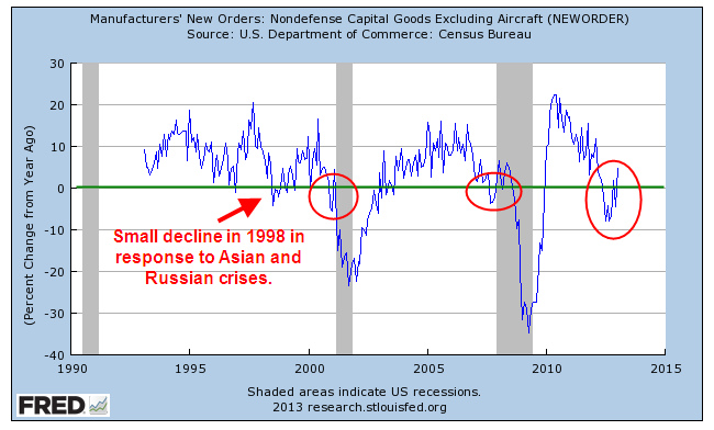
This past week came a number of positive economic reports. The first one I will look at is the Durable Goods Orders, which indicate a willingness by consumers and businesses to commit money now to buy stuff that will last for several years. A critical component of this index is capital goods, durable goods like machinery which produce more goods and services. As a key indicator of business confidence in the future, it is one of the trends I watch. (See Predictions and Indicators)
Until the past few months, this component has been particularly weak, warning of recession. Resolution of the “fiscal cliff” issue at the beginning of the year has sparked more optimism and it shows in the new orders for capital goods. This deep a decline in the year over year percentage change has been followed with an uptick in the past, only to fall into recession.
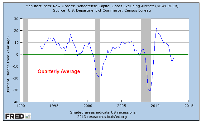
When we smooth out the monthly data with quarterly averages, the trend is still in negative territory.
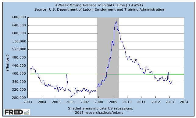
Every week the Bureau of Labor Statistics issues a report on the number of New Unemployment Claims. This past week, the BLS reported a lower than expected number of 341,000, a drop of 22,000 from the week before. Numbers of more than 400,000 are a major concern. The weekly series can be volatile; most analysts look at the 4 week moving average to get a better gauge of the trend.
As with many data series, I am interested in the year over year (y-o-y) percentage change in the data. Because the SP500 index is a volatile series, I’ve smoothed out the data to a 6 month average to show the negative correlation between stock prices and new unemployment claims.

In other words, when unemployment claims go up, the stock market goes down. This particular data series is good when it is low, bad when it is high so I reverse the percentage change to show its correlation with the SP500.
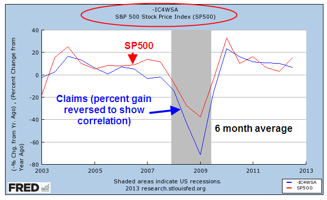
On a quarterly basis, this negative correlation has proved to be a reliable trading signal for the longer term investor. When the y-o-y percentage change in new unemployment claims crosses above the SP500 change, sell. When the claims change crosses below the SP500 change, it’s safe to buy.

Again, this strategy is for the long term investor who is more concerned with major structural changes in the economy that can cause a significant dent in her savings. Using this strategy she will not maximize her gains but she will avoid major losses and it does not require that she check her stock portfolio more than four times a year. An investor using this strategy for the past twenty something years would have bought in the first week of Oct. 1990 and been in the market during the 1990s as the index climbed, then stalled in the mid 1990s, then climbed again. She would have sold in the first week of Jan. 2001, missing most of the market drop for the next several years. She would have re-entered the market in the first week of October 2003 and sold again in the first week of April 2008, just before the financial meltdown in September of that year. She would have bought again in the first week of January 2010 and would still be in the market.
For the long term investor who does not want to devote a part of their lives to reading financial news or watching CNBC, it is often difficult to separate the “noise” – the weekly headlines and economic reports – from the real motion or trend. This indicator is a low maintenance signal for that investor.
P.S. You can get this report yourself without much trouble.
Enter “Fred New Claims” into your browser’s search bar.
The first link should be “Unemployment Insurance Weekly Claims Report – FRED” at the Federal Reserve.
Click the link, then select the first series “4-Week Moving Average of Initial Claims”.
When the graph displays, click Edit Graph in the lower left below the graph.
Select the 10 Years range radio button.
In the Frequency field below the graph, select “Quarterly” and leave the Aggregation method at the default setting of “Average”.
In the Units field below that, select “Percent Change From Year Ago”.
(Adding the SP500 stock market index)
Below the “Redraw Graph” button, select the blue bar Add Data Series.
Leave the New Line button selected.
In the Search field, type SP500 and select the default SP500 index. The graph will redraw automatically but it will make little sense at this point until we edit the settings for the SP500 index.
Select the 10 Year range button for the SP500. Make sure you are editing the SP500 data graph and not the New Claims indicator.
Change the Frequency field to “Quarterly” just as you did for the New Claims.
Change the Units field to “Percent Change From Year Ago” just as you did with New Claims.
Click the Redraw Graph button and voila!
