Which Way Sideways?

August 9, 2015

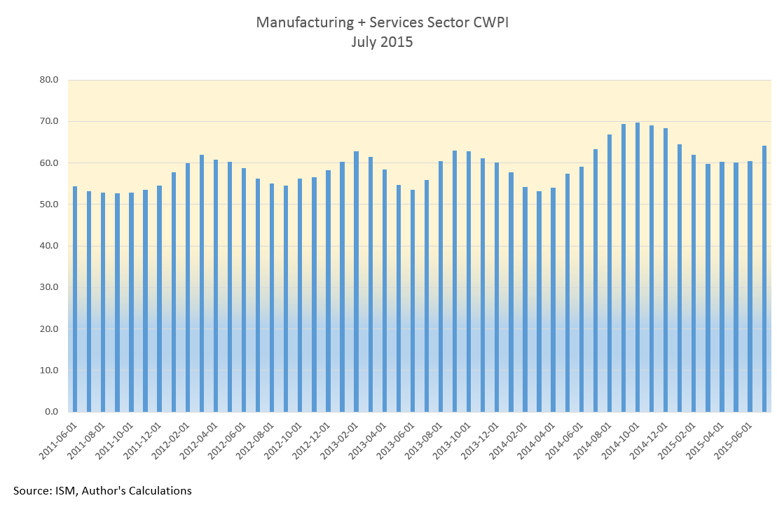
As we all sat around the Thanksgiving table last November, the SP500 was about the same level as it closed this week.  Investors have pulled off the road and are checking their maps to the future.  After forming a base of good growth in the past few months, July’s CWPI reading surged upwards.

Despite years of purchasing managers (PMI) surveys showing expanding economic activity, GDP growth remains lackluster.  Every summer, in response to more complete information or changes to statistical methodologies, the Bureau of Economic Analysis (BEA) revises GDP figures for the most recent years.  A week ago the BEA revised real annual GDP growth rates for the years 2011 – 2014 from 2.3% to 2.0%.  “From 2011 to 2014, real GDP increased at an average annual rate of 2.0 percent; in the  previously published estimates, real GDP had increased at an average annual rate of 2.3 percent.”

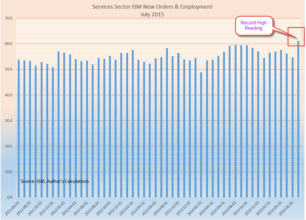
A composite of new orders and rising employment in the service sectors showed its strongest reading since the series began in 1997.  The ISM reading bested the strong survey sentiments of last summer. We can assume that the PMI survey is not capturing some of the weakness in the economy.

This level of robust growth should put upward pressure on prices but inflation is below the Federal Reserve’s benchmark of 2%.  Energy and food prices can be volatile so the Fed uses what is called the “core” rate to get a feel for the underlying inflationary pressures in the economy.

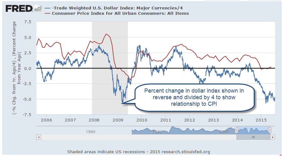
The stronger U.S. dollar helps keep inflation in check.  There is less demand from other countries for our goods and the goods that we import from other countries are less expensive to Americans. .  Because the U.S. imports so much more than it exports, the lower cost of imported goods dampens inflation.  In effect, we “export” our inflation to the rest of the world.

When the economy is really, really good or very, very bad we set certain thresholds and compare the current period to those benchmarks.  When the financial crisis exploded in late 2008, the world fled to the perceived safety of the dollar in the absence of a exchange commodity of value like gold.  Because oil is traded in U.S. dollars and the U.S. is a stable and productive economy and trading partner, the U.S. dollar has become the world’s reserve currency.  The conventional way of measuring the strength of a currency like the dollar has been to compile an index of exchange rates with the currencies of our major trading partners.  This index, known as a trade weighted index, does not show a historically strong U.S. dollar.  In fact, since 2005, the dollar has been extremely weak using this methodology and only recently has the dollar risen up from these particularly weak levels.

As I mentioned earlier, a strong dollar helps mitigate inflation pressures; i.e. they are negatively correlated. When the dollar moves up, inflation moves down.  To show the loose relationship between the dollar index and a common measure of inflation, the CPI, I have plotted the yearly percent change in the dollar (divided by 4) and the CPI, then reversed the value of the dollar index.  As we can see in the graph below, the strengthening dollar is countering inflation.

What does this mean for investors?  The relatively strong economy allows the Fed to abandon the zero interest rate policy (ZIRP) of the past seven years and move rates upward.  A zero interest rate takes away a powerful tool that the Fed can employ during economic weakness: to stimulate the economy by lowering interest rates.

The strong dollar, however, makes Fed policy makers cautious. Higher interest rates will make the dollar more appealing to foreign investors which will further strengthen the dollar and continue to put deflationary pressures on the economy.  The Fed is more likely to take a slow and measured approach.  Earlier this year, estimates of the Effective Federal Funds Rate at the end of 2015 were about 1%.  Now they are 1/2% – 3/4%.  In anticipation of higher interest rates, the price of long term Treasury bonds (TLT) had fallen about 12% in the spring.  They have regained about 7% since mid-July.

DBC is a large commodity ETF that tracks a variety of commodities but has about half of its holdings in petroleum products.  It has lost about 15% since May and 40% in a year.  It is currently trading way below its low price point during the financial crisis in early 2009.  A few commodity hedge funds have recently closed and given what money they have left back to investors.  Perhaps this is the final capitulation?  As I wrote last week, there is a change in the air.

*************************

Labor Report

Strong job gains again this month but labor participation remains low.  A key indicator of the health of the work force are the job gains in the core work force, those aged 25 – 54.

While showing some decline, there are too many people who are working part time because they can’t find a full time job.  Six years after the official end of the recession in the summer of 2009, this segment of the work force is at about the same level.

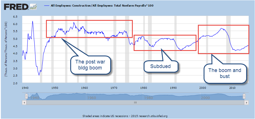
In some parts of the country job gains in Construction have been strong.  Overall, not so much.  As a percent of the work force, construction jobs are relatively low.  In the chart below I have shown three distinct phases in this sector since the end of World War 2.  Extremes are most disruptive to an economy whether they be up or down.    Note the relatively narrow bands in the post war building boom and the two decades from 1975 through 1994.  Compare that to the wider “data box” of the past two decades.

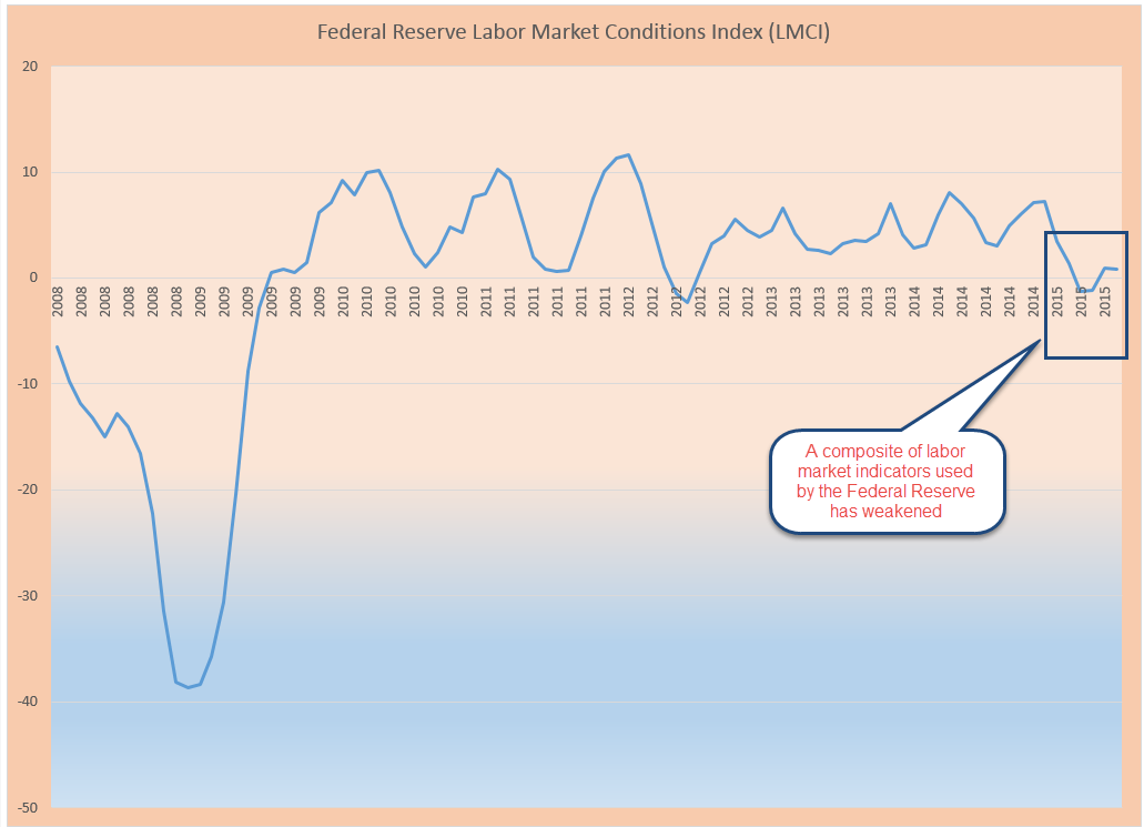
For several months the headline job gains have averaged about 225,000 each month.  The employment component in the ISM Purchasing Managers’ Index (on which the CWPI above is based) is particularly robust.  New unemployment claims are low and the number of people confident enough to quit their jobs is healthy.  The Federal Reserve compiles an index of many factors that affect the labor market called the Labor Market Conditions Index (LMCI).  They have not updated the data for July yet but it is curiously low and gives more evidence that the Fed will be cautious in raising rates.

Procession, Not Recession

May 24, 2015

Existing home sales of just over 5 million (annualized) in April were a bit disappointing.   Since the recession, there have been only about six months that sales have been above a healthy benchmark of 5.2 million set in the late 1990s to early 2000s.

***********************

Procession, not Recession Indicator

When reporting first quarter results, many of the big multi-national companies in the Dow Jones noted that sales had declined in Europe.  The broader stock market, the SP500, has not had a 5% decline for three years and is due for a correction.  Greece is likely to default on their Euro loans in June.  Combine all of these together and some pundits predict a 30 – 40% market correction this summer and/or a recession this year.  Corrections can be overdue for a long time.  Some treat the stock market as though its patterns were almost as predictable as a pregnancy.  Here’s an early 2014 warning that finds a chilling similarity between the bull market of today and, yes, the one before the 1929 crash.

Bull and bear markets tend to confound the best chart watchers.  The bear market of 2000 – 2003 was not like that of 2007 -2009.  Some argue that market valuations are like a rubber band.  The longer prices become stretched, the harder the snapback.  However, the data doesn’t show any consistent conclusion.

The 2003 – 2007 bull market ran for 4-1/2 years without a 5% correction.  That one didn’t end well, as we all know.   The mid-1990s had a three year stampede from the summer of 1994 to the summer of 1997 before falling more than 5%.  After a brief stumble, the market continued upwards for a few more years.  Turn the dial on the wayback machine to the early 1960s for the previous stampede, from the summer of 1962 to the spring of 1965.  That one ended much like the 1990s, dropping back before pushing higher for a few more years. These long runs occur infrequently so there is not much data to go on but the lack of data has never stopped human beings from predicting the end of the world.

April’s Leading Economic Indicator was up .7%, above expectations, but this increase was helped along by an upsurge in building permits.  This series has been unreliable in predicting recessions and its methodology has been revised a number of  times to better its accuracy.  Doug Short does a good job of tracking the history of this composite and here is his update of April’s reading.

A much more consistent indicator of coming recessions is the difference in the interest rates of two Treasury bonds.  The time to start thinking about recessions is when the 10 year interest rate minus the two year rate drops below zero.  The current reading simply doesn’t support concerns about recession in the mid-term.

The Federal Reserve has made it easy for us to track this flattening of the yield curve.  They even do the subtraction for us.  The series is called T10Y2Y, as in “Treasury 10 year 2 year.”

CPI and Wages

Dec. 24th, 2012

Merry Christmas, Everyone!

This is part two of a look at the CPI, comparing the price index to wage growth.  Part 1 is here

In the years 1947-1980, the average hourly earnings of production workers rose 6.08% annually while the CPI grew 4.03% (Source)  In effect, earnings rose 2% higher than prices.   Since 1980, earnings have risen 3.55% annually as the CPI rose 3.29%, giving workers a real growth rate of less that a 1/3rd of 1%.

The rise in worker productivity fueled gains in worker compensation until the past fifteen years.  Below is a chart of real, that is inflation-adjusted, compensation and productivity.

Increased Productivity means more profits.  For several decades in the post-WW2 economy, workers shared in those profits.  After the recession of 1982-1984, workers’ share of the increase in output slowly decreased.  As incomes barely kept up with inflation, workers tapped the equity in their houses.

Low interest rates, poor underwriting standards, lax regulations and a feeding frenzy by both home buyers and banks fueled a binge in home prices, followed by the hangover that started in 2007.  Only now is the housing market struggling up out of a torpor that has lasted for several years.

Before the housing bust, magical thinking led many to believe that the rise in home equity was a sure fire way to riches.  Over a century’s worth of data shows that housing prices tend to rise about the same as the CPI.  Housing prices have finally bottomed out at about the same level as the long term trend line of CPI growth.

The boom and bust upended the lives of a lot of people and the repercussions of that “hump” will continue as banks continue to foreclose on home owners whose incomes have flattened or declined. The recovery in the housing market will help some home owners but the real problem is unemployment, underemployment and the decreasing share of workers’ share of the profits from productivity gains.  Until the labor market heals, the housing market will not fully heal.

Those who do have savings have become cautious.  Since 2006, investors have taken $572 billion out of stocks and put $767 billion in bonds, a move to safety – or so many retail investors think.  For decades, home prices never fell – until they did.  For over thirty years, bond prices have been rising, giving many retail investors the feeling that bonds are safe – until they are not.

Companies have been selling record amounts of corporate bonds into this cheap – for companies – bond market.  As this three decade long upward trend in bond prices begins to turn, bond prices can fall sharply as investors turn from bonds to stocks and other investments.  We are approaching the lows of interest yields on corporate bonds not seen since WW2.  Investors are loaning companies money at record low rates and companies are sucking up all that they can while they can.  Sounds a lot like home buying in the middle of the last decade, doesn’t it?

Y’all be careful out there, ya hear?

Obligations and Entitlements

“Social Security and Medicare are the two largest federal programs, accounting for 36 percent of federal expenditures in fiscal year 2011.”  (Trustee’s annual report)

So how did we get here?

When Social Security was enacted in 1935, President Roosevelt promoted it as an insurance program for the old, widowed and orphaned. The language of the law called the employee portion of the tax an “income tax”, and the employer portion an “excise tax,” not an insurance program. Regardless of the language, Social Security has acted both as an annuity for retired workers and an insurance program for disabled workers and survivors of workers.

Several challenges to the law were brought before the Supreme Court, which issued several decisions in 1937 that confirmed that various components of the Social Security tax were valid. By law, the Social Security reserve fund could invest only in the debt of the U.S., either through marketable Treasury bonds or through special bonds which could not be sold. (A history of the financing of Social Security)  Since 1960, the Social Security funds are “invested” in these special bonds, which are little more than promises that the federal government will pay Social Security benefits. 1960 is also the last year that the federal government ran a budget surplus except for the years 1999 and 2000; in two years out of 52, the federal government has been able to balance its books. In overwhelming numbers, voters send lawyers to Washington; most of them have little if any business experience or education.  We reap what we sow.

The Bureau of Labor Statistics (BLS) estimates the total number of workers at 135 million.  More than 55 million people are currently receiving some form of benefit under the Social Security program, a ratio of about 2.5 workers per beneficiary.  In 2011, 2.6 million applied for retirement benefits while one million applied for disability benefits.  In the past 40 years, the number of retirees receiving benefits has doubled, the number of disabled has more than doubled.  Both disabled and retiree claims have declined since 2010.  (Fast Facts

There is a demonstrated increase in disability applications when the unemployment rate rises.  As one guy with a bad back explained to me, “I’d rather be working scheduling service calls.  I worked in the heating and cooling business for almost 30 years.  After looking for a year, I gave up.  Who’s gonna hire a 60 year old guy with a bad back in this economy?”

(SSA Source)

The number of retirees has doubled but the population has grown only 50%.  The growth of women in the workforce has contributed to the growth in retirees and in disability claims.

Most people receiving Social Security benefits of one type or another feel as though they entered a contract with the federal government.  In return for their Social Security taxes, retirees and the disabled are owed promised benefits from the federal government, just as one would expect from an insurance company. Likewise, veterans also feel that they entered a contract with the federal government when they risked their lives in defense of the country. In exchange for their service, the federal government made promises of benefits to veterans.  Too many Republican politicians are fond of lumping Social Security beneficiaries and veterans under the umbrella term of “entitlement” programs when the more proper term is one of obligation.  When someone buys a Treasury bond, they expect to be paid the value of the bond when it matures.  Is that person part of an “entitlement” program?  No.  The bond is a contractual obligation between the bondholder and the federal government.  Why should a bondholder be treated with any more or less respect than a person who has “lent” the government money throughout their working years through their Social Security taxes?  Neither Paul Ryan or Mitt Romney understand that, to many of us, an obligation is an obligation.  Period.

So I want to distinguish between obligation programs like Social Security, and entitlement programs.

What are more properly called entitlement programs are those programs for the unfortunate and the vulnerable, whose financial circumstances qualify them for some kind of income assistance program.  Many have paid little in income taxes over the years for any number of reasons.  Some are children, some don’t or can’t work, some work but make so little that they owe no taxes.  Some may have paid a good share of income taxes in the past but found themselves in a bad way in recent times.  There are a lot of programs: SNAP(food stamps), SSI (Supplementary Security Income), and TANF (traditionally called welfare), to name but a few.

Let’s look at one program: SSI, an income assistance program for the blind, disabled and aged, whose beneficiaries comprise a mere 2.5% of the population.  The SSI program is paid out of general revenues, not Social Security taxes. In 2011, blind and disabled recipients made up 86% of the total of about 8 million. (Source)  The average monthly benefit is about $500. The cost of the program is about $50 billion, or 1.4% of total Federal expenditures. 2% of the cost of the SSI program includes vocational training and other back to work programs. When some politicians talk about reforms to “entitlement” programs, they know that some of these programs are small but they cite examples of abuse, of someone gaming the system, because they hope that you don’t know that the programs are small.  Vote them into office and what they really want to chop are the big obligation programs, Social Security and Medicare.

However, there are some legitimate concerns in these small programs; the number of SSI recipients has grown 33% in the past 17 years.

The number of disabled, aged 18 – 64, receiving income assistance under the SSI program has tripled in the past forty years, a growth rate six times that of the overall population. 

The SSI program also helps low income retirees, who have declined in real numbers by 15% in the past 16 years.

The percentage decline is explained partially by the explosive growth of the disabled who are younger than 65.  The number of women receiving SSI payments has also increased dramatically. 

Let’s look at another entitlement program that Mitt Romney and Paul Ryan have targeted in their stump speeches: SNAP or Food Stamps.  “45 million people on food stamps!” is the cry of either of these candidates to illustrate the runaway spending in entitlements and the poor economy.  What neither will tell you is that the program cost $78 billion in 2011 (CBO source).  That is 2.2% of Federal spending.  Whatever reforms these guys propose to this program will save a very small percentage of the budget.  In that same report, the CBO summarized the characteristics of those on the program: “three out of four SNAP households included a child, a person age 60 or older, or a disabled person. Most people who received SNAP benefits lived in households with very low income, about $8,800 per year on average in [2010].”  I can excuse Mitt Romney because he may not be aware of the numbers.  There is no excuse for Paul Ryan, who is the “budget-meister” and certainly knows that any savings to a program this small is chump change in a budget of $3600 billion. 

What both of them are counting on it that you don’t know that.  Their ultimate goal is to reform the big guy, Social Security, so that they can short change one type of federal obligation, Social Security recipients, to pay another obligation, the buyers of Treasury bonds.  Many of the large institutions that buy Treasury bonds are not suckers so Mr. Romney and Mr. Ryan turn to those with the least information – suckers who will vote for them.

Treasury Bonds

Einstein famously quipped that the most powerful force in the universe was compound interest.  An equally powerful force is reversion to the mean, or average.  As discussions go on in Washington about raising the debt ceiling, let’s look at the $8+ trillion dollars of Federal Debt held by private investors.

How much more debt can investors buy?  Since the financial crisis of 2008, investors have gobbled up federal debt just as they gorged on mortgage debt in the years previous to the financial crisis.  Below is that same data with a 10 year moving average, showing just how far above the average federal debt has climbed.

As the Euro-Debt crisis continues to unfold, investors keep lining up to buy Treasury bonds that pay little in interest but offer some perceived refuge for their money.

Below is an ETF, SHY, that tracks the Barclays Short Term Treasury Bond index.  It is close to all time highs, leaving little room to move up and plenty of room to move down as demand for the safety of Treasury Bonds eventually returns to its average.

Bubbas get caught up in bubbles.  Eventually – maybe not this month or the next six months – investors will want to sell some – or a lot – of these Treasury Bonds.  When that happens, watch out below.