April 13, 2025
By Stephen Stofka
This is part of a series on centralized power. The debates are voiced by Abel, a Wilsonian with a faith that government can ameliorate social and economic injustices to improve society’s welfare, and Cain, who believes that individual autonomy, the free market and the price system promote the greatest good.
Abel tucked a table napkin into his belt. “Another uneventful week.”
Cain smirked as he cut a bite from his stack of pancakes. “Will the country last four years?”
Abel sighed. “Sometimes I dream that the voting public turns the House and Senate over to the Democrats so they can impeach him.”
Cain laughed. “There would be another January 6th when the new members took their oath of office.”
Abel frowned. “That’s what I worry about. Trump has too many of the same characteristics as other autocrats. Maduro in Venezuela, Erdogan in Türkiye come to mind. They freeze out the opposition party. Laura Gamboa had a piece in Foreign Affairs this month about past incidents (Source). In 2003, Erdogan and his party began a campaign that either crippled or took over parts of the bureaucracy in Türkiye. Although the opposition stopped some legislation, in the first four years, Erdogan was able to totally seize power in 2007.
Cain gave a soft whistle. “Yeah, in any kind of governing, it’s ‘process over substance.’ I remember some Congressman saying something like, ‘I’ll let you write the substance … you let me write the procedure, and I’ll screw you every time.’” (Source)
Abel smiled. “Yeah, that was John Dingell. Served in Congress for fifty years! Anyway, a good example of that. Trump has extended his powers by declaring an emergency. What’s the emergency? Not a pandemic, or a war, an attack from China. No, it’s the trade deficit. Under the National Emergencies Act, Congress can pass a joint resolution declaring an end to the emergency (Source).”
Cain interrupted, “Yeah, but Trump could still veto the resolution.”
Abel nodded. “True. A higher hurdle to formally end an emergency. The House has a Rules Committee that decides on how legislation is brought to the floor. So, Congress can initiate a declaration ending an emergency declared by the President. It would send a word of caution to the White House.”
Cain raised his eyebrows. “You know, there’s no definition of emergency under the IEEPA, the law that Trump is using [Source].”
Abel nodded. “The IEEPA is another of those laws passed in the 1970s with no definitions. Another example is ‘waters of the United States.’ What does that mean? Courts, including the Supreme Court, have been arguing about it for 50 years (Source). Today, all serious legislation contains definitions.”
Cain replied, “So I didn’t know Congress could undo that. Go ahead.”
Abel continued, “So the Rules Committee just wrote a rule a few weeks ago that prevents any member from raising an objection that lead to a vote to declare an end to the emergency (Source). That tweak of the rules gets little attention but curtails any effective opposition in the House to Trump’s expansion of powers. Republicans in the House don’t want to go on the record opposing Trump. It was that kind of stuff that Gamboa was writing about.”
Cain said, “The slim Republican majority in the House weakens any checks and balances. Like I said last week, Trump has gone rogue.”
Abel argued, “He’s put together a team of rogues. Yes men and yes women. Sycophants who suck up to power and those who cower in the corner, hoping not to attract anger from Trump or Musk. The nominee to head the Bureau of Land Management just withdrew her nomination after it was revealed that she had written a memo criticizing Trump after the 2020 election (Source).”
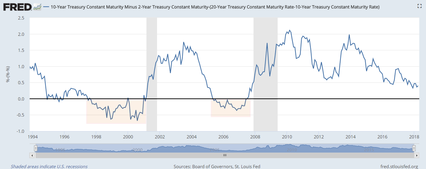
Cain put down his fork. “I think there are some independent voices, but they are reluctant to come forward. Rumor is that Trump paused the reciprocal tariffs, the really high ones, because some people warned him that the bond market was starting to crack. At first, investors started moving into Treasuries as expected but then the rate on 10-year Treasuries started to rise, indicating that the nosebleed tariffs were causing investors to lose confidence in Treasuries (Source). US debt is like the Titanic was thought to be. Unsinkable.”
Abel frowned. “That’s why mortgage rates shot up half a percent, back up to 6.90% (Source). The mortgage market tends to move with the long-term Treasuries.”
Cain asked, “Just yesterday, mortgage rates broke the 7% threshold. Can the President of the United States cause a financial crisis? Maybe.”
Abel put set his coffee cup down. “Trump’s had several bankruptcies. His dad helped to bail him out of his brash bets on the casino industry in Atlantic City (Source). He was having trouble getting financing, so he ran for President to boost his name recognition.”
Cain sighed. “I think a lot of us voted for someone who could get things done, even he was a little bit crazy and impulsive.”
Abel said, “This last election, Trump attracted people outside of his core MAGA supporters. What does ‘great’ mean? Different things to different people. Some thought Trump would bring down prices. He promised to do that on ‘day one’ of his presidency. Some thought he would end the war in Ukraine because he promised to do that. Some thought he would be pro-business and curb the regulatory state.”
Cain replied, “Yeah, Trump’s a promoter. That’s what politicians do. Different people have different levels of gullibility. Even a skeptic can be convinced if the promises confirm their beliefs and desires. I think a lot of pro-business types bought into Trump’s promise to cut back on regulations. These tariffs are just a different type of big government imposing its will on the market. This is as heavy-handed as the Democrats get, only in a different way. It makes for a lot of uncertainty.”
Abel nodded. “Exactly. You know, AOC and Bernie Sanders have been going around the country to build opposition to Trump. They actually got over 30,000 people in Denver a week or so ago. I was thinking that there is a constituency in the Democratic Party that is like MAFA, Make America Fair Again.”
Cain interrupted, “I like that, but what do you mean ‘again.’ Has America ever been fair?”
Abel replied, “Well, some Democrats look back to the post-war period as an example of more fairness. Sure, there was a lot of prejudice. Jim Crow laws in the south, for example. But union membership was strong, wages grew faster than inflation and taxes were like 70% on the top 1%. Kind of a ‘Father Knows Best’ or ‘Leave It To Beaver’ moment. What’s weird about that is that the MAGA crowd on the right also looks back to that time as an ideal as well. The U.S. was the leading manufacturing country in the world and the supply chain helped support businesses in small and medium sized towns. There were good paying jobs and people could afford to buy a home. So, the MAGA crowd on the right and the MAFA crowd on the left are looking to the same post-war period as their ‘Golden Age.’”
Cain replied, “I like that idea. What’s ‘great?’ What’s ‘fair?’ It can be anything. They are promotional, not substantive words. What’s fair to me might not be fair to you. Let’s say you and I pick apples for a living. We both have the same size ladder, but I get assigned a section of trees where the apples are easier to reach than the trees in your section. I think it’s fair because we both have the same tool, the same length ladder. You don’t think it’s fair because picking apples is more of a challenge for you than it is for me. When we are done, I think I am more productive than you and I deserve the extra money I made. You feel cheated. I think you are just lazy. If you don’t know that my apples were easier to pick, you might become convinced that there is something wrong with you. Some character flaw. You might start believing that you are lazy or dumb or something.”
Abel said, “I remember seeing a cartoon about that once. It was trying to show the difference between equality and equity. Two people might have equal means, but not equal opportunity because one person’s environment is more advantageous. They are more likely to succeed.”
Cain frowned. “Fixing that problem only makes the problem worse. That’s what’s wrong with liberal politicians. They focus on outcomes and reason backwards. If outcomes are not equal, then the environment must be different, so they change some aspect of the environment. Outcomes are still unequal. Why? Because people anticipate policy changes. People are not machines or rats in a lab. There is a field of economics where researchers introduce policy changes into a community and test the effect. Some women in a rural farming community in India are given ducks. It’s random so the researchers can publish their study. The women will be able to raise the ducks so they can feed their families (Banerjee & Duflo, 2011). A neighbor, jealous because they didn’t get ducks, poisons the ducks. Social scientists can’t conduct experiments on people the way that researchers in the hard sciences can. We are sentient beings, not dumb guinea pigs.”
Abel nodded. “At least researchers are trying to develop some empirical data. It’s better than the approach that Aristotle and other philosophers used. Make up shit based on my perspective and declare it so.”
Cain laughed. “Hey, I’ll grant you it’s not easy. The beauty of the price system is that prices are the result of thousands of experiments testing the value of something. The magic of the price system is that it involves trade-offs, some opportunity cost. I need to give up ‘x’ dollars to get ‘y’ good or service. I could spend my dollars on something else or nothing else and save it. A gigantic set of experiments in opportunity costs. That needs to be a fundamental characteristic of policy design. Often, it isn’t.”
Abel argued, “Yeah, but that bottom-up approach doesn’t work for collective action problems. Spend more money on national defense or health care? Public education or more police? People can’t agree on the value of each and the opportunity costs.”
Cain interrupted, “Agreed, but a top-down approach doesn’t work either.”
Abel stood up. “So, we are left with irresolvable problems, it seems. Maybe that is something we can talk about next week. Please, God, something other than the latest Trump fiasco.”
Cain waved. “That would be nice. See you next week.”
//////////////////////
Image by ChatGPT in response to the prompt, “draw a blue baseball cap with the words ‘Make America Fair Again’ stenciled in white letters.”
Banerjee, A. V., & Duflo, E. (2011). Poor economics: A radical rethinking of the way to fight global poverty. New York, NY: Public Affairs.