May 26, 2024
by Stephen Stofka
This week’s letter is about the causes of inflation. Inflation can be easily described as a mismatch between supply and demand but that is a tautology that does not explain how the mismatch occurred. For hundreds of years, scholars and academics have identified various components of inflation’s causal web but identifying a primary cause has inspired enthusiastic debate. In the past century, economists have built sophisticated mathematical models which failed to predict a subsequent episode of inflation or predicted an inflation that did not occur. Economic models predicted that large government support during the financial crisis fifteen years ago would lead to higher inflation. It did not. Some economists were surprised at the extent and strength of the inflationary surge following the pandemic. In hindsight, turning off the world’s economic supply engine for even a short time was likely to have a strong effect on prices.
In The Power of Gold, Peter Bernstein (2000) recounts the causes that sixteenth century scholars gave for the persistent inflation in Europe during the 1500s. Those factors included “the decline of agriculture, ruinous taxation, depopulation, market manipulation, high labor costs, vagrancy, luxury and the machination of businessmen” (p. 191). Five hundred years later, most factors are relevant today in an altered form. With more sophisticated analytical tools, economists have developed a better understanding of these causal influences but that understanding has not led to better inflation forecasting. These factors can be grouped into those that affect supply or demand. Missing from that list was war, a common cause of inflation that distorts both supply and demand.
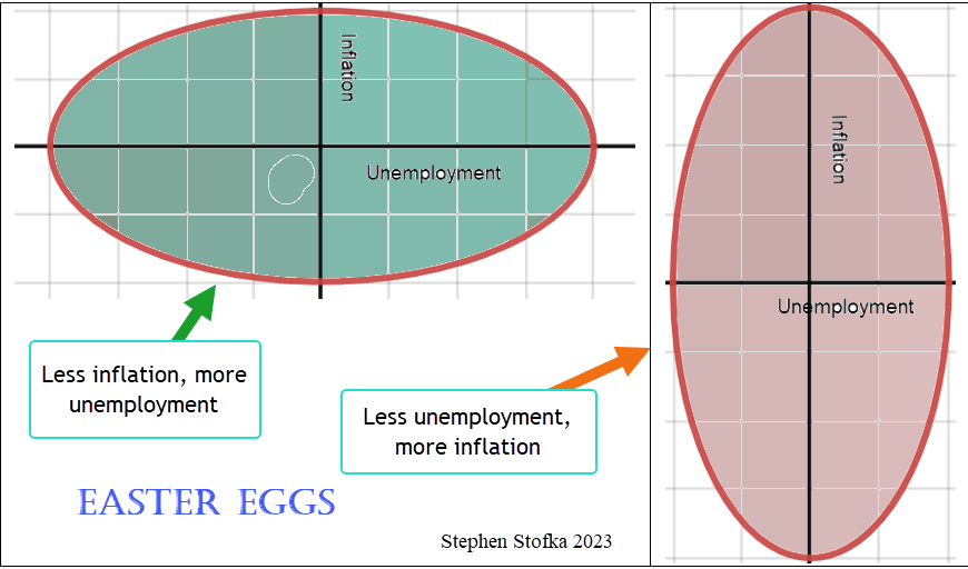
Prior to the severe cooling of the Little Ice Age in the 1600s, England and northwest Europe experienced a cooler climate that affected harvests. In an economy that relied mostly on agriculture, a poor harvest, or decline in agriculture was a supply constraint that pushed up prices. The demand / supply relationship is a fraction that helps explain a change in price. A lower supply, the denominator in that fraction, equals a higher price. Repeated waves of the plague and other general pandemics led to a depopulation that reduced the work force and pushed up the subsistence wages paid to workers. Employment in the U.K. has still not recovered from pre-pandemic levels, contributing to slightly higher inflation in the U.K. compared to the U.S.
High labor costs are the essence of a cost-push theory of inflation. When there is not enough supply of labor, workers are able to command higher wages. In many businesses, labor is an employer’s highest cost. Because employers markup all production costs, that markup increases the rise in prices. If employees get an extra $1 wage and the employer marks it up 50% to cover operating expenses, required taxes, fixed investment and profit, then the price will rise $1.50. The additional wage income will increase demand, resulting in a wage-price spiral that further exacerbates inflation. Any policy that reduces the supply of labor can be included in a cost-push theory of inflation.
Vagrancy, or homelessness, was a new phenomenon in the 16th century as Europe emerged from the feudal system in which workers were bound to the properties they cultivated. Policies that tolerated idleness of any sort reduced the work force and gave workers more bargaining power. Scholars of that century would be puzzled by modern day unemployment insurance which “rewards” workers for idleness. The mathematics of probability and risk that makes any insurance program feasible was barely in its infancy. By the late 17th century, Blaise Pascal and Pierre de Fermat had developed probability analysis, giving pools of underwriters gathered in coffee houses near London’s Royal Exchange the mathematical tools to sell insurance policies on many risky events (Bernstein, 1996, 63, 90).
Ruinous taxation consisted of import taxes and the debasement of hard metal currencies by the sovereign as a substitute for taxation. Import taxes on necessary commodities increased production costs, creating a cost-push effect. To repay debts incurred during war campaigns, rulers debased the currency by mixing base metals with gold or silver. In the 4th century B.C., Dionysius of Syracuse in Sicily had all the coins in his kingdom restamped to double their value so he could pay his debts (Bernstein, 2000, 48). Monetarists claim that an excess supply of money is the root cause of inflation. The economist Milton Friedman, never one to equivocate, stated flatly that inflation was “always and everywhere a monetary phenomenon.” In the Wealth of Nations, Smith (1776; 2009) noted that gold discoveries in the Americas had driven prices higher in England. A higher supply of money of any form will increase demand so this root cause is a subset of demand-pull theories of inflation.
Popular and scholarly opinion often points an accusing finger at the business class, whose conspiratorial machinations are thought to be responsible for rising prices. Historian Barbara Tuchman (1978, 163-165) described the power that merchants had acquired as the Third Estate under feudalism in 14th century France. Because many merchants were free citizens of a town and not subject to the rule of a noble, they enjoyed wealth and privileges like that of nobles, and at the expense of the workers who regarded them with scorn and envy. In Part 1, Chapter 10 of the Wealth of Nations, Smith wrote “People of the same trade seldom meet together, even for merriment and diversion, but the conversation ends in a conspiracy against the public, or in some contrivance to raise prices.” Responding to the global inflation following the Covid-19 pandemic, some op-ed writers and Twitter threads were convinced that collusion by business interests was the primary cause of the inflation.
The reasoning and analysis by thinkers of centuries past did not include the role of expectations in fostering and feeding inflation. Expectations are a key part of some prominent models because supply and demand operate on different time scales. The companies that make up the supply chain must anticipate the level of demand for a product or service before the demand manifests. Each year, the risk of being wrong increases in an economy marked by technological change and rapidly evolving tastes. Inflationary expectations needs a bit more space and will have to wait until next week. Have a good holiday weekend!
//////////////////
Photo by Elias Kauerhof on Unsplash
Keywords: expectations, money, taxation, unemployment, supply, demand, cost-push, demand-pull
Bernstein, P. L. (1998). Against the Gods, the Remarkable Story of Risk. John Wiley & Sons.
Smith, A. (2009). Wealth of Nations. Classic House Books.
Tuchman, B. W. (1978). A Distant Mirror: The calamitous 14th Century. Alfred A. Knopf.