Employment and Government Shut Down

Earlier this past week there were rumors that, due to the government shut down,  the Bureau of Labor Statistics (BLS) might not release the monthly employment report on Friday.  The employment report is probably the foremost key indicator that guides stock and bond market action as well as a prime metric used by the Federal Reserve in the determination of future monetary policy. On Thursday, the BLS confirmed that they would not release the report, which prompted a drop in the stock market, followed by an almost equal rise over the next day.

On Wednesday, ADP released a tepid 166,000 estimate of net job gains for September accompanied by a downward revision of their August estimate.  On Thursday, the weekly report of new unemployment claims held no surprise.  Traders probably figured that they had enough information to guesstimate the BLS number of net job gains – tepid growth a bit above the 150,000 needed to keep up with population growth.  In short, there was less likelihood that the Federal Reserve would be tapering their QE program before the end of the year.

So this is a good opportunity to take a look at some historical employment trends.  Measuring wage growth and inflation adjustments to wages is a complex task, far more complex than the gentle reader wants to delve into.  Labor economists crunch a lot of regional employment data gathered by the BLS.  Whenever there is a wealth of data, there is also a wealth of ways to treat that data, which data to focus on, etc.  Some economists focus on median compensation.  The median represents the middle, i.e. 50% of workers make more than the median, 50% make less.

In a 2011 paper published by the Economic Policy Institute (EPI), author Lawrence Mishel states  “Between 1973 and 2011, the median worker’s real hourly compensation (which includes wages and benefits) rose just 10.7 percent.”

“Real” means inflation adjusted but there are different methods used to calculate inflation.  One method, the Consumer Price Index, or CPI, has been changed over the years, making it difficult to make comparisons of data.

For a longer term perspective into the controversy over measurement, let’s turn to a graph of real output and total compensation per hour worked for the business sector.  Here we see a narrowing between compensation and output until output crosses above compensation in the mid-2000s.

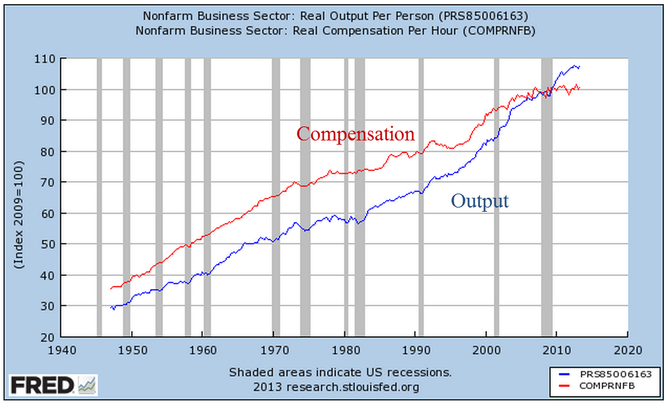
The flattening of compensation growth is shown when we focus on the past twenty years.

But the hourly data seemingly contradicts the claim that there has been only an 11% increase in real compensation over the past forty years.  Looks like the total compensation of all workers has risen about 40% or more in the past forty years.  How can the median growth be so far below the total?  To understand that, a reader would have to examine the data sources behind the claim.  We might find that median weekly, not hourly, compensation has risen only 11%.  This could be due to more part time workers, or the rising percentage of women in the labor force who generally work fewer hours than men. What we do know is that a competent economist can find or crunch the data to prove his or her point.

The ability to work empirical magic with data often leads to contradictory claims by noteworthy economists.  The contentiousness of the discussion among economists baffles the intelligent reader.

Let’s return to that bugaboo mentioned earlier: measuring inflation. Twenty years ago, economists Brian Bosworth and George Perry noted the trending gap between output and productivity: “In an economy where real wage growth has paralleled the rise in productivity over the long run, this apparent divergence implies that the benefits of increased productivity have not been distributed in the expected way over the past two decades.”  A chart from their paper illustrates the trend.

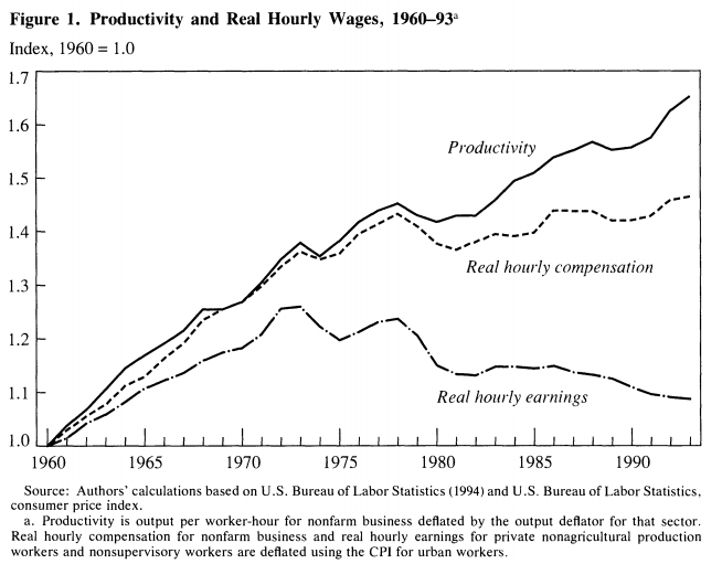
A notable trend in the numbers is the steep rise of employee taxes and benefits, or non-wage employer costs.  Economists or politicians sometimes point to the decline in the real hourly wage over the past forty years, without bothering to note the growing non-wage costs of employment, a convenient omission.

Bosworth and Perry document problems and changes in measuring inflation in both consumption and output but noted that “the prices that workers pay as consumers have been rising significantly more rapidly than the prices of the products they produce.”  Further analysis by the authors shows that the wage growth in that twenty year period 1973 – 1993 did not flatten till after 1983.  They conclude that the major reason for the divergence is the difference between how inflation was measured before and after 1983. The authors recommended the use of a Personal Consumption Expenditure (PCE) deflator instead of the CPI, which overstates inflation relative to output.

Let’s look at wage growth over the past twelve years using two methods to see the difference.  The BLS calculates real wage growth using the CPI-U inflation index (Source).  Here is a graph from their data.

Now let’s use the PCE deflator to get a slightly different picture of the same Employment Cost Index.

Now let’s compare the two.

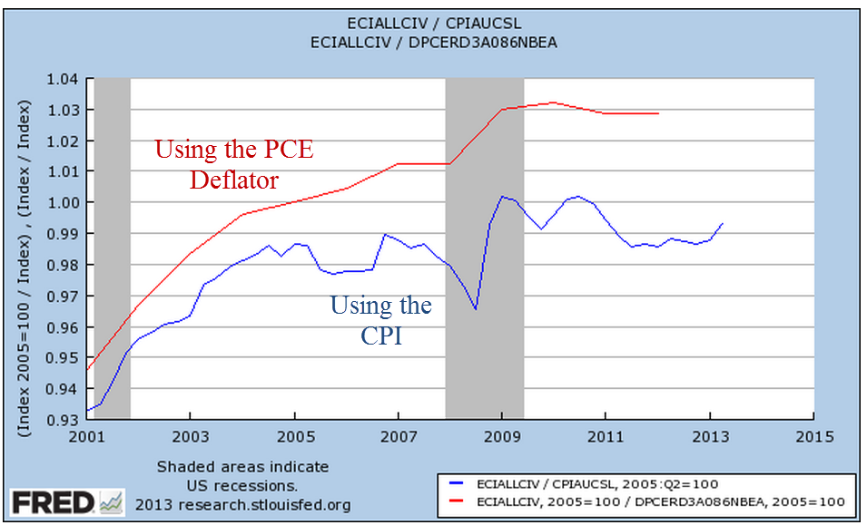
They tell two different stories.  Using the CPI inflation adjustment, the blue line, I could tell a story that wage growth has stagnated over the past ten years.  Using the PCE inflation adjustment, I could tell a story that wage growth has stagnated since the financial crisis.

Now imagine a politician who wants to bash the policies of former President George Bush and exalt the policies of the current administration.  That politician would use the blue line to tell the story of how the Bush Administration undercut the wages of American workers and that this led to the worst recession since the Great Depression.

On the other hand, if a politician wanted to criticize the Obama administration, she would point to the red line.  Worker’s wages grew during the Bush years.  Since Obama took office, wages have stagnated, indicating that Obama’s policies are hurting American workers.

Thus a dense and complicated argument on how to measure inflation becomes a talking point for a politician.  Even worse, noteworthy and popular economists who understand the difficulties of measuring both employment and inflation choose one line or the other to tell a simple story based on their own bias.

During this ongoing government shut down, we will hear a lot of spin and invective.  The profusion of TV, radio and internet media sources ensures that anyone can choose exactly – to a ‘T’ – the version of reality that they want to hear.  Of course, our sources and opinions are unbiased and perfectly reasonable.  But can you believe what the other side is saying?  Boy, are they crazy!

Productivity

August 25th, 2013

(First a little housekeeping: an anonymous reader commented that when they clicked the “back” button after viewing a larger sized graph they were returned to the beginning of the blog post instead of where they had left off when they clicked on the smaller image within the text.  I suggest that, after viewing a graph, try clicking the ‘X’ button on the top right of the graph page to return to where you left off.   This works in the Chrome browser.)

Since the onset of the recession in late 2007, I have read many articles on the lack of wage growth despite big gains in productivity.  Ideas become popular when they have a narrative, one that I took for granted.  Each quarter, the Bureau of Labor Statistics (BLS) issues a report on productivity and labor costs that I have taken at face value.

The 2001 manual of the OECD manual states “Productivity is commonly defined as a ratio of a volume measure of output to a volume measure of input use.”  They frankly admit that “while there is no disagreement on this general notion, a look at the productivity literature and its various applications reveals very quickly that there is neither a unique purpose for, nor a single measure of, productivity.” (Source)

The authors of a recent paper at the Economics Policy Institute cite BLS data showing that productivity has grown “by nearly 25 percent” in the period 2000 – 2012 while the median real, that is inflation adjusted, earnings for all workers has essentially remained flat.   Company profits are at all time highs and workers are struggling.  The narrative is familiar but I wondered: how does the BLS calculate productivity growth?

What the “headline” productivity numbers describe is labor productivity, the output in dollars divided by the number of hours worked.  The BLS Handbook of Methods, page 92, gives a detailed description of its methodology.  As the BLS notes, this often cited productivity figure disregards capital investments in output like machinery and buildings.  For this reason, the BLS also calculates a less publicized multifactor  productivity measure using methodologies which do incorporate capital spending.  How does capital investment influence the productivity of a worker?

Consider the simple case of a man – I’ll call him Sam – with a handsaw who can make 20 cuts in a 2×4 piece of lumber in an hour.  His company charges customers a $1 for each cut, the going rate, so that the company can sell Sam’s labor for $20 per hour. Due to increased demand for wood cutting, the company invests $1000 to buy an electric chop saw.  The company calculates that Sam’s productivity will rise enough that they can undercut their competition and charge 75 cents a cut.  With the chop saw, Sam can now make 60 cuts per hour at .75 per cut = $45 dollars in revenue per hour to the company.  Sam’s labor productivity has now risen 150%.  In our simple case, this would be the headline labor productivity gain – 150%.

A more complete measure of productivity including capital investments is quite complex.  The latest edition of the OECD handbook notes that “there is a central practical problem to capital measurement that raises many empirical issues – how to value stocks and flows of capital in the absence of (observable) economic transactions.”  To illustrate the point further, the asset subgroup listed in the BLS handbook includes “28 types of equipment, 22 types of nonresidential structures, 9 types of residential structures (owner-occupied housing is excluded), 3 types of inventories (by stage of processing), and land.”

You want simple?  Let’s go back to our kindergarten example.  At this rate of production, let’s say that the saw’s useful life is only 10 months.  The company has an investment of $100 per month in the saw, plus additional costs like electricity, a bigger workbench, etc.  To round out the numbers, let’s say that equipment related costs are $150 a month.  If Sam’s output is 8 hours a day x $45 an hour, Sam is producing $360 per day in revenue for the company, or close to $8000 a month. The $150 a month in equipment costs is trivial and multi-factor productivity is very close to labor productivity.

Sam knows he is making much more money from the company and goes to his boss and says he wants a raise.  Not only is he producing more for the company but the electric saw is much more dangerous than a handsaw.  The company gives Sam a raise from $7 an hour to $8 an hour, an almost 15% increase that Sam is happy with.  In addition to the raise, the company has an additional $2 in mandated labor costs, bringing the total costs for Sam’s labor to $10 an hour.  Even with the higher labor costs, the company is raking in huge profits – $35 an hour – from Sam’s labor.

But now an inspector comes in and tells the company that, because an electric saw makes much more dust than a handsaw, the company will have to install a ventilation and filtering system so that the employees and neighbors won’t have to breathe sawdust.  The company gets bids that average $100,000 to install this system and the company estimates that the system will equal $1000 a month in additional capital costs.  Despite the additional costs, the company still continues to make substantial profits from Sam’s labor.  To the company, the capital costs for this new system represents about 60% of an additional worker’s labor costs, yet that additional cost is largely not included in measuring labor productivity because Sam’s hours and the revenue generated by Sam’s labor remain the same.

A multifactor productivity comparison of handsaw vs. chopsaw production would show a percentage growth of 40%, far below the 150% labor productivity growth.

All of us have our biases (except my readers who are perfectly rational beings) which cause us to look no further than the narrative that clearly supports our previous conceptions.  If we generally agree with the narrative of companies taking advantage of workers, we read of 25% productivity gains for companies and 0% gains for workers in the past twelve years, and we look no further – for the data has confirmed what we previously had concluded.  Big companies = bastards; workers = victims.

In June 2013, the BLS released revisions to their productivity figures for 2012 and included historical productivity gains for various periods since 1987.  During the past 25 years, multifactorial productivity, including capital investment, has averaged .9% per year – less than 1%.

While labor productivity has grown 25% since 2000, multifactorial productivity has been half that, at about 12%.   Dragging the 25 year average down is a meager .5% growth rate since 2007.  Even more striking is the growth rate of input into that recent tepid productivity growth; the BLS calculates 0% net input growth since 2007.  For the past 25 years, capital investment has grown at more than 3% but since the recession capital growth has slowed to 1.3% per year.  I wrote last week that there is an underlying caution among business owners and this further confirms that caution; companies have been cutting back on both labor and capital investment.

If multifactorial productivity rose by 12+ percent over the past 12 years, and the profits did not go to workers, where did the money go?  For a part of the puzzle, let’s look to inflation adjusted dividends of the SP500.

From the beginning of 2000 through 2007, when the recession began, inflation adjusted dividends grew at an annual rate of almost 3.8%, eating up most of the profits from productivity growth.  As bond yields continued to decline, I would guess that investors pressured companies for more of a share of the profits from productivity growth.

As workers lost manufacturing jobs during the 2000s, many were able to switch to construction jobs in the overheating real estate market and unemployment stayed low.  This should have pressured management to give into labor demands for an increased share of the productivity growth but it didn’t.  I suspect that the labor mix contributed to the lack of pressure on management.  Fewer manufacturing jobs meant fewer union jobs; a reduced labor union influence meant less demand on management.

Looking past the headline labor productivity gains, overall productivity is slow.  Capital and labor investment is slow, which means that future overall productivity is likely to remain slow.

While walking a trail in the Colorado Rockies years ago, my brothers and I complained about having to dodge moose poop on the trail.  Then we ran into the bull moose that made the poop.

CPI and Wages

Dec. 24th, 2012

Merry Christmas, Everyone!

This is part two of a look at the CPI, comparing the price index to wage growth.  Part 1 is here

In the years 1947-1980, the average hourly earnings of production workers rose 6.08% annually while the CPI grew 4.03% (Source)  In effect, earnings rose 2% higher than prices.   Since 1980, earnings have risen 3.55% annually as the CPI rose 3.29%, giving workers a real growth rate of less that a 1/3rd of 1%.

The rise in worker productivity fueled gains in worker compensation until the past fifteen years.  Below is a chart of real, that is inflation-adjusted, compensation and productivity.

Increased Productivity means more profits.  For several decades in the post-WW2 economy, workers shared in those profits.  After the recession of 1982-1984, workers’ share of the increase in output slowly decreased.  As incomes barely kept up with inflation, workers tapped the equity in their houses.

Low interest rates, poor underwriting standards, lax regulations and a feeding frenzy by both home buyers and banks fueled a binge in home prices, followed by the hangover that started in 2007.  Only now is the housing market struggling up out of a torpor that has lasted for several years.

Before the housing bust, magical thinking led many to believe that the rise in home equity was a sure fire way to riches.  Over a century’s worth of data shows that housing prices tend to rise about the same as the CPI.  Housing prices have finally bottomed out at about the same level as the long term trend line of CPI growth.

The boom and bust upended the lives of a lot of people and the repercussions of that “hump” will continue as banks continue to foreclose on home owners whose incomes have flattened or declined. The recovery in the housing market will help some home owners but the real problem is unemployment, underemployment and the decreasing share of workers’ share of the profits from productivity gains.  Until the labor market heals, the housing market will not fully heal.

Those who do have savings have become cautious.  Since 2006, investors have taken $572 billion out of stocks and put $767 billion in bonds, a move to safety – or so many retail investors think.  For decades, home prices never fell – until they did.  For over thirty years, bond prices have been rising, giving many retail investors the feeling that bonds are safe – until they are not.

Companies have been selling record amounts of corporate bonds into this cheap – for companies – bond market.  As this three decade long upward trend in bond prices begins to turn, bond prices can fall sharply as investors turn from bonds to stocks and other investments.  We are approaching the lows of interest yields on corporate bonds not seen since WW2.  Investors are loaning companies money at record low rates and companies are sucking up all that they can while they can.  Sounds a lot like home buying in the middle of the last decade, doesn’t it?

Y’all be careful out there, ya hear?

The Drifters

Matt brought up some good questions and comments yesterday.  I’ll look at one aspect that he brought up – the stagnation of wages for the past 35 years.

Over the past 3 to 4 decades, the U.S. economy has been transitioning to an almost entirely service based economy.  In 1953, manufacturing was 28% of the economy, a post WW2 high.  By 1995, it was only 16% of the economy, and by 2007 it had sunk to 12%.  How has this decades long shift affected the nation’s GDP?

Below is a graph of U.S. GDP 10 year averages since WW2 and the averages for the periods 1946 – 1972 and 1973 to 2009.  (Click to enlarge)

Source:  Bureau of Economic Analysis

As you can see, average GDP growth has declined in the last 35 years by 12% from the 25 year period after WW2. I have heard Ben Bernanke, chairman of the Federal Reserve, say that they like to see an overall 3.0% average growth of GDP for a healthy economy – not too hot, not too cold. For the past 35 years, we have been just shy of that.

In this next chart, I combined data from the Bureau of Economic Analysis and the Census Bureau to show real GDP per capita growth  in 2009 dollars. 

In this next chart, I’ve drawn trend lines to show the various “speeds” of real GDP per capita growth over the past 60 years.  As you can see, the growth trend of the last 30 years or so has been below the growth trend of the 1960s.  The data also reveals that the 60s was an anomaly – a decade of robust growth that was partially fueled by military spending.  Yet it is this decade that some use as a baseline of comparison – a golden age of increased productivity and increased wages.

Although the growth of the past 3 decades might not be what it was during the 60s, it still averages 2.8%.  Have workers seen any of those gains in growth?  According to the BLS, the 1987 average hourly cost, including benefits, for workers in private business was $13.25, or $26.37 in 2009 dollars.  In March 2010, the BLS reports the average hourly cost at $29.71.  Over the past 24 years, companies have seen their real employee costs rise by only 13%, or about 1/2 percent a year.

During that same period, benefits have risen from 27% of total employee cost to 30%. Despite a 50% increase in inflation adjusted costs for health care in the past decade, businesses have managed to hold their labor costs down.  How have businesses managed this?  By reducing average wages.  In 1973, average hourly earnings for employees in private business was $4.14 ($20.00 in 2009 dollars).  In 2009, average hourly earnings were $18.62.   In real inflation adjusted dollars, workers have gained a tiny bit in benefits and lost about 5% in wages over the past 35 years.  Workers have simply not enjoyed either the gains in GDP growth or the gains in productivity over the past 3 decades or more.

But the pain felt by hourly and salaried workers is aggravated by the decline in work hours.  The BLS reports  that average weekly hours was 36.9 in 1973.  In 2009 weekly hours averaged only 33.1.  The reduced hours has affected the average worker’s weekly total.  In 1973 it was $152.77, or $738 in 2009 dollars.  In 2009, it was $617, a real drop of 16%.

How have business owners been able to keep a lid on worker wages for these past 35 years?  Supply and demand.  As I noted above, GDP growth has lessened over the past three decades, reducing demand.  During that period, the supply of labor has increased. In 1973, the BLS reports that there were 64 million in the civilian workforce, 40 million men and 24 million women.  The civilian workforce was 30% of the population of 212 million.  In 2008,  the total civilian workforce had almost doubled to 125 million, 67 million men and 58 million women.  This workforce was 41% of the total population of 304 million.  Look at the ratio of men to women in the workforce.  In 1973, there were almost two men for each woman.  By 2008, the ratio approached a one-to-one ratio. As more women entered the workforce, they put downward pressure on wages, which induced more women to enter the workforce to make up for lost household income.  This cycle will continue for the next two decades unless this country decides to implement policies that will return some of the lost manufacturing capacity to this country.