As the political machine of both parties gears up for the Presidential election less than seven months away, we will hear a lot of rhetoric about the unemployment rate. Depending on the talk show, TV program or publication we will hear many different unemployment figures and the Bureau of Labor Statistics (BLS) does publish several different figures each month. The headline number published each month is the U3 rate – those people who are not employed but have looked for work in the past four weeks. Other rates include discouraged unemployed (U4), marginally attached workers (U5) and those who are working part time because they could not find a full time job (U6). Wikipedia has a pretty good overview on the rates in this country and countries around the world. The BLS has a detailed explanation of the various categories of unemployment with concrete examples of who they put into each category. Below is a chart of the U3 rate and the U6 rate.

Some will argue that a particular unemployment rate is the “true” rate. On a conservative talk show a few weeks ago, I heard a caller quote a “true” employment rate of close to 11%. Neither I, the host of the show or the caller knew where the caller had come up with that figure. In response to questions from the host of the show, the caller showed that he did not know the various unemployment rates. Like many voters, this caller simply heard or read about this “true” figure.
In the ongoing political debate, Democratic leaning voters will use the lower U3 rate, currently 8.2%. Republican leaning voters may use the U6 rate, the broadest measure of unemployment, currently 14.5%. Here’s someone who figures the “true” unemployment rate at 36%. We tend to believe what we want to believe and our mental squirrels are good at finding the facts that fit our beliefs.
This past month several economic reports, including the monthly unemployment report, indicated that the economy may once again be stalling – as it did in 2010 and 2011. The recent rise in Spanish government bond yields shows yet another sign of an underlying lack of confidence in the ability of the European market to avoid slipping into a deeper recession. In the past six months, China’s growth has slowed as they try to transition from an export economy to a consumer economy. The Bush tax cuts and the debt ceiling are due to expire at the end of the year. We can expect more political turmoil as that deadline and the election approach. Weakening economic data in the coming months could exacerbate fears that the U.S. will fall back into recession, escalating the Republican rhetoric that their party needs to be given the presidential reins to turn the economy around.
Readers of this blog know that I have been especially skeptical of seasonal adjustments to labor figures in the past few years, preferring to use the non seasonally adjusted figures from the monthly Household Survey that the BLS uses to collect employment data. But for the chart I’m about to show you, there is not much difference between the seasonally adjusted figures and the non seasonally adjusted figures. The chart compares the percent change in the data and the seasonally adjusted figures are easy for you to get in the future.
If we begin to hear the economic and political pundits raise worries of recession in the coming months, the data in the chart below is a really reliable predictor of recessions. There was a slight delay in a minor recession in the 1950s and two false signals in 1986 and 1995 when the economy faltered. Here’s the key: when the percentage change in the unemployment rate from a year ago goes above zero, it is highly likely that we have either just started a recession or will start one shortly.
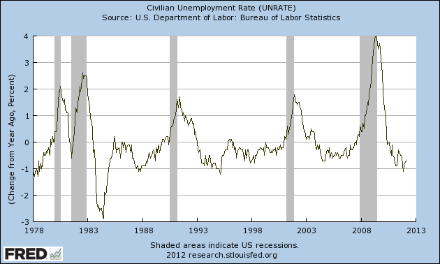
In the coming months you can pull up this same chart by going here at the Federal Reserve or entering “Fred Unemployment” in Google search bar and selecting the top pick. The Federal Reserve does all the work for you. Click “Edit Graph” just below the graph. On the next screen, change the “Observation Date Range” below the graph to start with a more recent year to make the chart easier to read. Go down to the “(a)” section and select “Change from Year Ago, Percent”. Below that, click “Redraw Graph”. Now you too can know the future.
