Post War Productivity

July 26, 2015

Each year, the Council of Economic Advisors (CEA) submits the Economic Report of the President  to the Congress.  They compile a number of data series to show some long term trends in household income, wages, productivity and labor participation.  Readers should understand that the report, coming from a committee acting under a Democratic President, filters the data to express a political point of view that is skewed to the left.  When the President is from the Republican Party, the filters express a conservative viewpoint.  Has there ever been a neutral economic viewpoint?

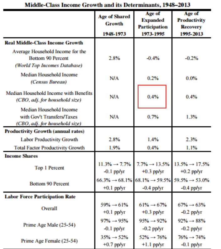
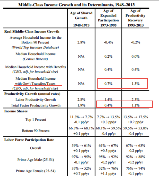
In this year’s report the Council identifies three distinct periods since the end of WW2: 1948-1973, 1973-1995, and 1995-2013.  In hindsight, this last period may not be a single bloc, as the report acknowledges (p. 32).

The most common measure of productivity growth is Labor Productivity, which is the increase in output divided by the number of hours to get that increase.  Total Factor Productivity, sometimes called Multi-Factor Productivity (BLS page), measures all inputs to production – labor, material, and capital.  As we can see in the chart below (page source), total factor productivity has declined substantially since the two decade period following WW2.

In the first period 1948-1973, average household income grew at a rate that was 50% greater than total productivity growth, an unsustainable situation.  This post war period, when the factories of Europe had been destroyed and America was the workshop of the world, may have been a singular time never to be repeated.  What can’t go on forever, won’t.  In the period 1973-1995, real median household income that included employer benefits grew by .4% per year, the same growth rate as total productivity.

The decline in the growth rate of productivity hinders income growth which prompts voters to pressure politicians to “fix” the slower wage growth.  If households enjoyed almost 3% income growth in the 1950s and 1960s, they want the same in subsequent decades.  If the rest of the world has become more competitive, voters don’t care.  “Fix it,” they – er, we – tell politicians, who craft social benefit programs and tax programs which shift income gains so that households can once again enjoy an unsustainable situation: income growth that is greater than total productivity growth.

“Where Have All The Flowers Gone?” was a song written by legendary folk singer Pete Seeger in the 1950s. It was  a song about the folly of war but the sentiment applies just as well to politicians who think that they can overcome some of the fundamental forces of economics.  Seeger asked: “When will they ever learn?”

Spending Flows

July 19, 2015

In the past few weeks I have been unfolding an origami of sorts. In the past 7 years, the Federal Reserve has created almost $4 trillion of new money.  Contrary to centuries of history that this would cause prices to rise dangerously, inflation has been muted during the five years of this recovery.  Core inflation, which excludes more volatile food and energy items, has been below the 2% target inflation rate that helps guide monetary policy decisions at the Federal Reserve.

In a standard expenditures or spending model, personal saving is presumed to flow through the banking system into business investment.  This approach can be helpful in understanding changes in investment spending and the difference between planned and unplanned investment.  However, that model presumes that consumers have little choice in the direction of their personal savings; that these savings flows are controlled entirely by the investment spending decisions made by business owners. I proposed a different way of looking at savings – as a form of spending shifted backwards in time.  We anticipate different rates of return based on the amount of time we shift investment forward or backward in time.

Economist John Maynard Keynes proposed that one person’s income is some else’s spending.  In the private domestic economy then, consumption spending, investment and savings are forms of spending.  We can combine them into one simple accounting identity.

If these components of total spending add up to 1, then

If we subtract yesterday’s and tomorrow’s spending from total spending we get the percentage that is today’s spending.

This concept was proposed by Keynes as the Marginal Propensity to Consume, or MPC.  In the example below the MPC is .9.  If there is an extra $1 of spending in the economy, people will tend to spend 90 cents of that extra $1 on today’s consumption.

Where does that extra $1 of spending come from?  Keynes proposed that the government could step in and spend money when there was a lack of consumption spending in the economy.  Last week I said that I would cover the role that government plays in the economy but I will leave that for next week.

Keynes, Income, Spending

July 12, 2015

In the past few weeks, I have looked at savings and investment as forms of spending shifted in time.  Now let’s examine the idea of income.  We earn money, spend most of it, and hopefully save a little of it.

In the 1930s John Maynard Keynes proposed an income expenditure model to explain business cycles. (More here) Although Keynes’ model was mathematically simple by today’s standards, it showed an interlocking relationship between employment, interest rates and money.  Keynes popularized his ideas in lectures, debates and magazine articles.  Although he died shortly after World War 2, financial institutions and economic policies still bear his mark.  It was he who first proposed and then co-developed the framework for the International Monetary Fund (IMF) and World Bank.

One of Keynes many seminal insights was that one person’s income is another person’s spending.  If I decide to save $5 by not buying a latte at the neighborhood coffee shop, I am in effect putting my $5 in a savings account at my local bank.  But the coffee shop owner has $5 less in income.  $5 less in income is $5 less profit, keeping all else the same.  The owner of the coffee shop must go to the local bank and take $5 out of their savings account to make up for the lost income.  There is no net savings when a person decides to not spend money and we see the relationship between savings and profit; namely, savings = profit.

We are now ready to develop that insight of Keynes, that income = spending.  As we discussed in previous weeks, the amount that we don’t spend on current consumption is savings.  Savings = spending, either yesterday’s spending, i.e. an investment in someone’s debt, or tomorrow’s spending, i.e. an investment in someone’s future profits, or savings.  When we spend for tomorrow, we are effectively moving our savings into the future.  Likewise, when we spend for yesterday, we move our savings into the past to replace the savings that someone else did not have at the time they borrowed the money.

All of these categories – income, spending, saving, investment – are all forms of spending shifted in time.  Next week we’ll look at the GDP accounting identity and the government component of that equation.

*****************************

CWPI

The manufacturing sector stumbled during the harsh winter and strengthening dollar.  The service sectors fell somewhat but remained strong.  In June, the manufacturing sector regained strength, helping offset a slight slackening in the service economy.  The composite index remains strong in a several month growth trough.

Some are of the opinion that the stock market can be overvalued or undervalued.  In my opinion, liquid markets are usually fairly valued.  Expectations of buyers and sellers change, causing a recalculation of future growth and a change in valuations.  Comparing an index like the SP500 to a valuation model can help identify periods of investor optimism and pessimism.

I built a model based on a 930 average price of the SP500 in the 3rd quarter of 1997.  At the end of 2014, the 10 year total return of the SP500 was 7.67% (Source) which I used as a base growth rate modified by the change in growth shown by the CWPI index.  The CWPI measures a number of factors of economic growth but measures profits indirectly as a function of that economic growth.  Profit growth may outpace or lag behind economic growth and investors try to anticipate those varying growth rates when they value a company’s stock.

Until mid-2013, the SP500 lagged behind the model, indicating a degree of pessimism.  In 2013, the SP500 gained 30% and it is in that year that we see the crossover of investor sentiment from pessimism to optimism.  In the first six months of this year, the SP500 has changed little and we see the index drifting back toward the model, which was only 4% less than the closing price of the SP500 index at the end of June.

In hindsight, we can identify periods when investors were too exuberant and miscalculated future growth.  But we can only do so because in that future, profits and growth were not as hoped for.  That is the problem with futures.  We never know which one we are going to get.

Independence is Money

July 5th, 2015

In past weeks I have been digging into a perplexing problem.  Since early 2008, the Federal Reserve has heaped almost $4 trillion of government debt on its books and the supply of money has doubled, yet inflation remains subdued.  Why?

There are several measures of money. For several decades the Federal Reserve branch published Modern Money Mechanics (book or PDF). M1 is a measure of transactional money, and includes cash and money held in checking accounts. This category of money has doubled in the past 7-1/2 years.

Supply of money goes up.  Inflation goes up, right? From the Federal Reserve paper:

Assuming a constant rate of use, if the volume of money grows more rapidly than the rate at which the output of real goods and services increases, prices will rise. This will happen because there will be more money than there will be goods and services to spend it on at prevailing prices. [emphasis added]

If inflation is not going up, then the output of goods and services must be going up as much as the supply of money, right?  It’s not.

Some economists have argued that the various measures of money don’t measure demand for goods and services.  Rather, the money supply measures uncertainty.  Shown in the chart below is the annual percent change in both GDP and the M1 money supply.

The first thing we notice about the M1 chart above – when the growth in the money supply falls below zero, get worried.  People are too confident in the future.  It would be nice if we could craft a long term trading rule like “Buy stocks when the blue line crosses below the red line” but that has not been a successful strategy.  What does stand out is that money growth, the blue line, crossed above GDP growth, the red line, in the summer of 2008 and has not crossed below.  That is the longest period of time since this money measure began. Clearly, there is a lack of confidence among families and businesses.

In the quote from the Federal Reserve paper above, I passed over a key phrase that began the paragraph.  Yes, very sneaky of me to do that. The phrase is “Assuming a constant rate of use.” I wanted to focus separately on the growth in the money supply and the growth in GDP.  Economists often look at the rate of use of money to produce a given level of GDP.  They call it the velocity of money.  In the chart below, I have included the velocity of money, the ratio of GDP/MONEY (red line in the chart), and the amount of money in the system as a percentage of output, MONEY/GDP (blue line) to show how the two are mirror images of each other.

When economists worry that the velocity of money (red line) continues to fall during this recovery, they are worried that there is simply too much money sitting around for the amount of output in the economy (blue line).  Why are people and businesses holding over 17% of output in readily available money today? We are in a low inflation, low growth economy.  In the 1970s we held the same percentage of money but the ’70s was a high inflation, low growth economy.  The similarity of then and now is low growth.

In these past weeks I have looked at two places to put savings – yesterday’s spending, debt, and tomorrow’s spending, equity.  When people and businesses hold onto more money, which kind of spending are they investing in?  They are concerned about tomorrow’s income.  What does tomorrow’s income pay for?  Both tomorrow’s AND yesterday’s spending.

Next week – if saving is just a form of spending, what is income?

***********************

Employment

Good job numbers. Not good labor participation numbers.  Bill McBride at Calculated Risk did a good job this week of putting a long term perspective on the job numbers.  Underscores the theme I just touched on.  Low growth.  For 12 years, from 2000 – 2012, there was almost NO job growth and the effect of that does not pass quickly as things improve.  Caution prompts us to hold onto more money just to be on the safe side.

Debt Equity Ratio

June 28, 2015

Ding, ding, ding!  I was surprised to see that this is my 500th blog article!

As I noted last week, the stock market has traded in a fairly tight range for the past six months.  Some market seers see this as a topping pattern before either a crash or a serious correction.

Money not spent on current consumption can be invested in past spending – debt – or tomorrow’s spending – equity.  Stocks rise when more people shift money toward tomorrow’s spending in the hopes of better corporate profits.

Last week I estimated the equity market at about $25 trillion.  The latest Federal Reserve Flow of Funds report puts the value of corporate equities at $22.5 trillion at the end of March.  A time series graph of the Fed’s valuation of non-financial corporate equity might give an investor some pause as it is 50% above the worst case scenario base trend line.

Using a middle of the road trend line, we see a market valuation that is 20% above trend.

On the chart above, I have outlined the long term bear market from 1968 – 1982.  That 14 year period of negativity might be a poor starting point for a trend line for the following thirty years.  Let’s take government debt out of the picture for a minute and look at the ratio of household and non-financial business debt to corporate equity valuations.  As the graph below shows, climbing stock prices (the divisor in the ratio) lower the ratio of debt to equity and signal a growing confidence in the future- or does it signal an overheated market?

 Let’s add in government credit market debt, which will shift the ratio of debt to equity up.

We can see the stock market peaks in 1968 and 2000 when the market entered a long term decline called a secular bear market.  Notice that the ratio at the start of the financial crisis in 2008 is about the same as today but that neither was at a peak or trough level.  Now let’s add in the credit market debt of the financial sector.

This again raises the percentage of debt to equity and subtly changes the pattern of the ratio.  We see the go-go years of the 1960s as a decade of confidence, perhaps too much confidence fed by an upsurge in defense spending.  Rising inflation, debt and the slog of war began to erode that confidence and lead into the secular bear market that started in 1968.

In the late 1990s we can see the ratio approach the same levels as in the late 1960s.   It is in this chart that we see a revealing characteristic that marked the period before the financial crisis.  Although stock market prices were rising, housing market debt was rising as well so that the ratio of debt to equity stopped falling after the recession of 2001 and the start of the Iraq war.  That halt in the debt-equity ratio signaled an uncertainty in future profits, tugging new investment dollars toward the past.

This trend of accumulated debt attracting new investment dollars is clearer if we reverse the ratio, showing the equity/debt ratio.  In the 1990s, equities climbed and the equity/debt ratio climbed as well.  In the mid-2000s, equities again rallied but the equity/debt ratio stayed relatively flat, indicating that investors were putting dollars into debt instruments as well as the stock market.  Since the financial crisis, equities have climbed far above the market levels of 2007 but the debt/equity ratio has recovered at a much slower rate.  Despite historically low interest rates, high government debt and finance debt continues to attract investors’ money.

Current stock market valuations are moving the ratio toward the future but investment in the spending of the past continues – until the 30+ year bull market in bonds reverses and investors abandon a falling bond market for the equity market.

The Future is Past

June 21, 2015

Returning to our Heaven On Earth scenario: why can’t the government just print up a bunch of money and give it to people?  Centuries of historical data shows that inflation inevitably results when governments do this.  However, the Federal Reserve has pumped in almost $4 trillion dollars in the past seven years and no inflation has resulted.  We saw that the Federal Reserve has been offsetting the lack of private spending, particularly the lack of savings that is devoted to investment.

Whatever we don’t consume is called savings.  Savings can be put to two different uses:

1) Invest in Yesterday’s spending, or debt.  This can be either our own debt or the debt of others.  We might pay down a credit card balance we owe or a mortgage.  We might buy a corporate or government bond.  Savings, checking and money market accounts are an investment in debt.

Household and business non-financial credit market debt is more than $21 trillion.  Included in that amount is $9.3 trillion in home mortgages.  Most of us who buy a home don’t think of it as “yesterday” spending.  To us it is an investment in our future.  However, the purchase of a home consists of two components:
1) the transfer of the replacement cost of the dwelling – yesterday’s spending adjusted for the change in price of the labor and material to build the home.
2) Someone else’s profit, and this is the key component of these two types of spending, yesterday and tomorrow.  Whether buying a new home or existing home, we are buying the costs and profit of the builder or previous owner.

Below is a chart of household and business non-financial credit market debt as a percentage of GDP.  From 1980 through the end of 1994, the SP500 index quadrupled from 110 to 470, an annual gain of a bit over 9.5% per year.   In the mid-1990s, household and business debt started a steep climb to 140% of GDP by 2007 and this probably pulled in more savings to service that debt. In the next 15 years, the SP500 grew by only 233%.

But wait!  That’s not all! – as the late night commercials remind us.  Governments at all levels borrow savings from private households and businesses.  The current total is about $16 trillion.

Adding the $16 trillion government debt to the non-fianncial debt of the private sector totals $37 trillion of yesterday’s spending that needs to be fed with today’s savings..

2) The other option for savings is to invest in equities – Tomorrow spending – and the profits generated from that spending.  We might buy stocks, real estate or some other physical asset which will generate some production, a profit, or a capital gain from an appreciation in the value of that asset.  The World Bank estimated the total market capitalization in the U.S. in 2012 at $18.7 trillion.  Add on 33% or so since then to get an updated total of about $25 trillion.  We could debate the valuation but it is clear that debt – investment in yesterday’s spending – is clearly winning the race against investment in the profits of tomorrow’s spending.

If future growth looks modest it is because we are still in a defensive posture – weight on our back foot, so to speak. Low interest rates encourage investment in Tomorrow spending and the Federal Reserve has kept rates low to encourage us to lean in, to shift the weight, the energy of our investment from the past to the future.

Wage Growth Rings

June 14, 2015

The broader stock market has been on a continuous upswing since November 2012 when the weekly close of the SP500 index briefly broke below the 48 week average.  The past six months is one of those periods when investors seem undecided.  Even though the market is above its 24 week average, a positive sign, it closed at the same level that it was just before Christmas.  Earlier this week came the news that Greece might avoid default on its June payment to the ECB and the market surged upwards. At the end of the week, news that talks had broken down caused a small wave of selling on Friday morning. Investor reaction to what, in perspective, is a relatively small event, indicates an underlying nervousness in the market.

As the SP500 began a broad upswing in late 2012, the bond market began a downswing.  A broad aggregate of bonds, AGG, fell about 5% over the following ten months before rising up again to those late 2012 levels this January.  In the past five months, this bond index has declined almost 4% as investors anticipate higher rates. A writer at Bloomberg notes a worrisome trend of concentrated ownership of corporate bonds.

Retail sales in May showed strong gains across many sectors in the economy. As the chart shows, growth below 2.5% is weak, indicating some pressures in household budgets that could be a precursor to recession.  Current year-over-year growth in retail sales excluding food and gas is up almost 5% – a healthy sign of a growing economy.

*************************

Wage Growth

“Since 2009, when the great monetary experiment began, global bond markets have increased in value by about $17 trillion. Global equity markets have increased by about $40 trillion. The average worker has seen wages increase by about $722 billion, which means about 2% of the benefit of QE (quantitative easing) went to workers. The rest went to asset prices.” (Source)

A cross section of a tree shows a historical pattern of rainfall, temperature and volcanic activity.  Wage and salary income across a population can provide a similar historical picture of the economic climate of a people.  The recovery from the recent recession has been marked by slow growth in wage and salary income relative to the growth rates of previous recoveries.

Economists find it difficult to reach a consensus to explain the muted growth.  A WSJ blog summarized a number of explanations.  I have noted several of these in past blogs.  They include:

Slack in the job market.  However, the labor dept reports that the number of job openings is at a 15 year high. (BLS Report)

Some economists point to the large number of involuntary part timers, those who want a full time job but can’t find one, as an indication of slack in the labor market.

The number of people quitting their jobs for another job is improving but is still weak by historical standards.

Sluggish productivity growth. Multi-factorial productivity growth estimates by the labor dept show that productivity gains in the past 15 years are chiefly from capital investment, not labor productivity.  Capital productivity during the recovery has been slow but labor productivity has been terrible, according to multi-factorial productivity assessments by the BLS.  As the century turned, we applauded the transition toward a more service oriented economy.  Less pollution from manufacturing industries, we told ourselves.  “The service sector is less cyclic,” economists reminded us.  It is much more difficult to wrest productivity gains from many service sector jobs. The cutting of a lawn, the making of a latte – there is a minimum threshold of time to do these things.

The sticky wages theory: namely, that companies withhold raises during the recovery because they couldn’t cut wages during the recession.

Let’s compare income growth to retail sales growth, using the data for retail sales less  food and gas whose prices are more volatile.  Periods when both growth rates decline set the stage for recessions.  Periods when both rates increase mark recoveries.

Simultaneous declines in 2011 and 2012 prompted stock market corrections.  The upswing of the past two years has contributed to the rising stock market.

Sugar Daddy

June 7, 2015

Older readers may remember Bizarro Superman, the mirror image of Superman, who did things backwards, or in reverse.  That’s the world we live in today; good news is bad, and vice versa.  The employment news was doubly good.  Job gains were stronger than expected at 280,000 but more importantly the unemployment rate went up a smidge, and for the right reasons.  As people become more confident in the job market, they re-enter the labor force, actively looking for work.  Discouraged job applicants have fallen 20% in the past twelve months.  The civilian labor force, the sum of employed and the unemployed, has grown.

Is good news good or bad?  If only the news would wear a hat, white or black, so we could tell. In Friday’s trading, investors bet on the timing of the Fed’s first interest rate increase.  September of this year or the beginning of 2016? When will Sugar Daddy, the Fed, take away the punch bowl of easy money?

The core work force, those aged 25 – 54 who drive the economy, continues to show growth greater than 1%.

Although hourly wage growth for all private employees has been modest at 2.3% annual growth, weekly earnings for production and non-supervisory employees have risen 30%, or 2.7% per year in the past decade, a period which has included the worst downturn since the 1930s depression.  This more positive outlook on wage growth does not fit well with some political narratives.

The decade from 1995 – 2005 had 36% gains, or 3.1% annual growth, only slightly above the gains of the past decade and yet this period included the go-go years of the dot-com bubble and the housing boom. Inflation was higher in that decade, and in inflation adjusted dollars, the earlier period was only slightly stronger than this past decade.  In short, we are doing suprisingly well considering the negative impacts of the financial crisis.

************************

CWPI

Every month I update the Constant Weighted Purchasing Index, a composite of the Purchasing Manager’s monthly index published by the Institute for Supply Management.  This month’s reading was similar to last month’s, continuing a trough in the strong growth region of this index.

**************************

Heaven On Earth

Last week I asked the question: Why can’t a government with a fiat money system simply give everyone a lot of money and create a heaven on earth?  The standard answer is that it would cause inflation.  For several millennia, when a government injects money into an economy, inflation soon follows as the supply of purchasing power increases without a concurrent increase in the supply of goods and services.  In the 18th century philosophers David Hume (On Money) and Adam Smith (Wealth of Nations) noted the phenomenon.  Peter Bernstein’s Power of Gold recounts ancient examples of kings and governments debasing metal monies and the inflation that ensued.

In the seven years since the recession began in late 2007, the government has borrowed and spent $27,000 per person and there has not been the slightest hint of inflation. Why? There are several reasons.  If a government borrows money from the private sector, there is no net injection of money into the system, no printing of money. A Federal Reserve FAQ on printing money is careful to note that “printing money” is the permanent financing of a government’s debt by a central bank.  Whatever people want to call it, when the Federal Reserve buys government debt, new money is injected into the system.  Since 2007, the Fed has injected almost $4 trillion (Balance Sheet), or about $12,000 per person, of new money without an uptick in inflation.  How is this possible?

There are two types of spending – today and tomorrow.  Spending for today is consumption.  Spending for tomorrow is investment.  Both types of spending drive demand for goods and services.  The paucity of private investment since 2007 is at levels not seen since the years immediately following World War 2.

Although government investment is a relatively small percentage of GDP, that has also fallen to historically low levels.

The sum of private and government investment as a percentage of GDP is shockingly low.

If we use 2007 investment levels as a base, the accumulated lack of investment is far more than the $4 trillion that the Fed has pumped into the economy.

The Fed’s injection of money into the system is primarily spent on government consumption, or today spending, which is helping to offset the lack of investment spending.  As investment spending rises, the Fed has been able to stop adding to its portfolio, although this “tomorrow” spending is still so low that the Fed can not begin to lighten its portfolio of government debt.

Advocates – economist Paul Krugman for one – of greater government investment spending, even if it borrowed money, hope to offset the lack of private confidence in the future.  Previous government stimulus spending did have little effect on overall economic growth simply because it did little more than offset the lack of long term confidence by those in the private sector.

Heaven On Earth

May 31, 2015

Although the unemployment rate has fallen below 5.5%, the labor participation rate is still rather low and wage growth is slow, prompting renewed calls for government stimulus. A 2010 article laid out the justifications for more government borrowing to spur the economy. Let’s review a few points made by these economists.

“Spending by the federal government always creates new money in the system, while taxation destroys it.”

The nature of money and the government’s relationship to money is certainly beyond the scope of a blog post. In short, money in all its forms is a claim. A central bank (called the Federal Reserve in the U.S.) is a government created institution which regulates and administers the supply of money and credit within a country, and manages the reserves of foreign currencies held within that country.  It acts as the government’s banker and is the lender of last resort both to the public and the government.  If the public will not buy all of the debt issued by the Treasury of a government, the central bank steps in and buys it, a practice known as “printing money” although there is no new money printed.

In a fiat (unbacked by any hard metal or asset) money system, a sovereign government has the power to create and destroy money claims at will.  As the 2010 article notes, all taxation is a destruction of money.  A $100 tax voids a taxpayer’s ability to make a $100 claim for some good or service.   A thief takes money with no promises.  A government takes money with some implied promise or threat but no exchange of value at the time of the taking.  Taxation is not an exchange, but a taking, a destroying, like letting a little bit of air out of a balloon.  As long as the government pumps in the same amount of air that it took out, the size of the balloon changes only in proportion to the change in population.

In 1960, two economists, Gurley and Shaw, coined the terms Inside Money and Outside Money to capture this unique license of government (Federal Reserve paper on this subject). Treasury bills and forms of government debt are claims on government, and termed outside money, as in outside the private marketplace. Money exchanges between people and companies in the private sector are termed inside money. Each dollar of inside money represents a debt by someone else within the private sector.  When government spends more than it taxes, it borrows and pumps outside money into the private sector balloon. Many of us might think inflation is the net change in the size of the balloon but it might be more helpful to imagine that the size of the balloon, or volume, is the size of the population and grows slowly and constantly, about 1% in the U.S.  Inflation, then, is a measure of the pressure inside the balloon. (Boyles’ Law  and other fun facts with gases)

Various economists in this article asserted that the government should pump more outside air into the balloon, which will cause the economy, the molecules inside the balloon, to speed up.  Is there any limit to the amount of outside money that a government can pump into the balloon?

“[A] government cannot become insolvent with respect to obligations in its own currency.”

If a government can make up money out of thin air, why not just give $100K to each of the 300 million citizens in the U.S.?  People who couldn’t afford a newer car could buy one, which would boost the sales of car manufacturers. New homes, new appliances, vacation trips – a shot in the arm for so many industries. Unemployment would practically vanish. Imported goods into the U.S. would soar, helping the workers and businesses in other countries.  People could pay off their credit card and student loan debts but banks might suffer because not as many people would want loans.  Stock prices would soar in value as families searched for a place to invest some of their windfall.  People who had already owned stocks and other assets before the boon would see their net worth increase exponentially.  Housing prices would climb as more people could afford to buy a house.

What about inflation?  Well, the government has already pumped in $8 trillion since the recession started in late 2007.

$8 trillion divided by a 300 million population is almost $27,000 per person.  Contrary to predictions of runaway inflation, it has been moderate or below the 2% target rate.  In fact, if we use the method of calculating inflation used in the Eurozone, we have had deflation in the first quarter of this year.   So any inflationary effect from a one time $100K boon would be less than disastrous.  Even if inflation climbed to a 1990s level, about 4 – 5%, what is the harm?

Most of us instinctively look at this scheme, furrow our brow, and get suspicious.  But why?  Why can’t a government with a fiat money system simply create heaven on earth?

Stay tuned till next week….

Procession, Not Recession

May 24, 2015

Existing home sales of just over 5 million (annualized) in April were a bit disappointing.   Since the recession, there have been only about six months that sales have been above a healthy benchmark of 5.2 million set in the late 1990s to early 2000s.

***********************

Procession, not Recession Indicator

When reporting first quarter results, many of the big multi-national companies in the Dow Jones noted that sales had declined in Europe.  The broader stock market, the SP500, has not had a 5% decline for three years and is due for a correction.  Greece is likely to default on their Euro loans in June.  Combine all of these together and some pundits predict a 30 – 40% market correction this summer and/or a recession this year.  Corrections can be overdue for a long time.  Some treat the stock market as though its patterns were almost as predictable as a pregnancy.  Here’s an early 2014 warning that finds a chilling similarity between the bull market of today and, yes, the one before the 1929 crash.

Bull and bear markets tend to confound the best chart watchers.  The bear market of 2000 – 2003 was not like that of 2007 -2009.  Some argue that market valuations are like a rubber band.  The longer prices become stretched, the harder the snapback.  However, the data doesn’t show any consistent conclusion.

The 2003 – 2007 bull market ran for 4-1/2 years without a 5% correction.  That one didn’t end well, as we all know.   The mid-1990s had a three year stampede from the summer of 1994 to the summer of 1997 before falling more than 5%.  After a brief stumble, the market continued upwards for a few more years.  Turn the dial on the wayback machine to the early 1960s for the previous stampede, from the summer of 1962 to the spring of 1965.  That one ended much like the 1990s, dropping back before pushing higher for a few more years. These long runs occur infrequently so there is not much data to go on but the lack of data has never stopped human beings from predicting the end of the world.

April’s Leading Economic Indicator was up .7%, above expectations, but this increase was helped along by an upsurge in building permits.  This series has been unreliable in predicting recessions and its methodology has been revised a number of  times to better its accuracy.  Doug Short does a good job of tracking the history of this composite and here is his update of April’s reading.

A much more consistent indicator of coming recessions is the difference in the interest rates of two Treasury bonds.  The time to start thinking about recessions is when the 10 year interest rate minus the two year rate drops below zero.  The current reading simply doesn’t support concerns about recession in the mid-term.

The Federal Reserve has made it easy for us to track this flattening of the yield curve.  They even do the subtraction for us.  The series is called T10Y2Y, as in “Treasury 10 year 2 year.”