Up, Down, Round and Round

November 10th, 2013

Friday’s release of the monthly employment situation showed strong net job gains of 204,000 jobs and big upward revisions to the previously reported gains in August and September. The market should have reacted negatively to these positive numbers (yeh, go figure) in anticipation of the Fed tapering their stimulus program of monthly bond purchases.

But first we must go back to Thursday. The first estimate of real GDP growth in the third quarter came in above even the most optimistic forecasts at 2.8%, about a full percentage point above second quarter growth.  The primary reason for the gains though was the continuing build in inventories.  Inventory building is good in anticipation of robust sales but, as I’ll cover later, consumer spending has not been so robust.  The market reacted to the report with it’s largest daily loss in a few months.

On Friday, the employment report was released an hour before the market opened.  Trading began at the same level as Thursday’s close with little response to the strong job gains.  We can imagine that traders were twittering furiously to each other in the opening hour, trying to gauge the sentiment.  Buy in on strength in the employment numbers or sell on the strength in the employment numbers?  After the initial hesitation, the main index gained continuing momemtum throughout the day, with a final spike at the closing bell.

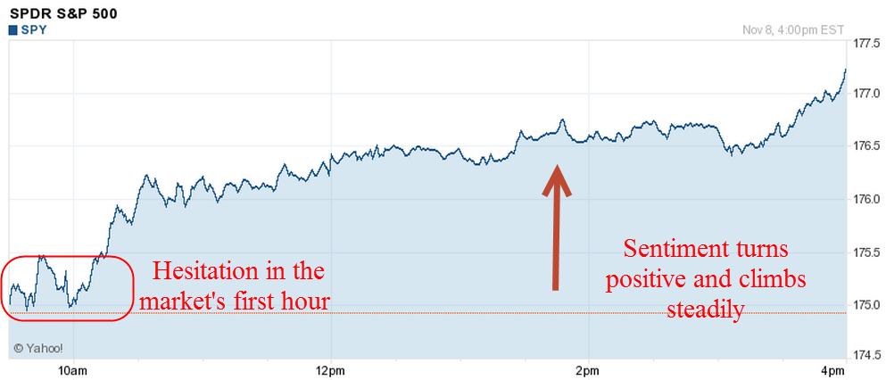
After digesting some of the numbers in the report, I think that traders realized how weak some of its components were, dimming the probability that the Fed will ease up on the gas pedal.  The Consumer Sentiment Survey, released a half hour after the opening bell, showed a continuing decline.  Within minutes, the market started trading higher.

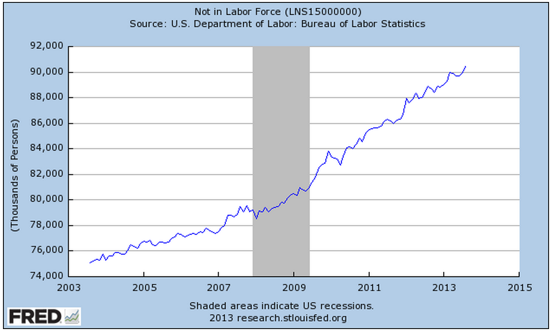
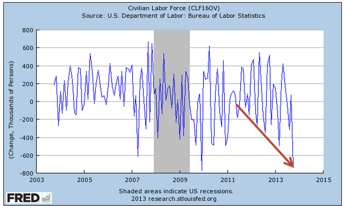
The first number popping in the employment report is the 702,000 people who dropped out of the labor force.  To put that number in perspective, take a look at the chart below which shows the monthly changes in the labor force for the past ten years.  This is the second worst decline after the decline in December 2009, shortly after the official end of the recession.

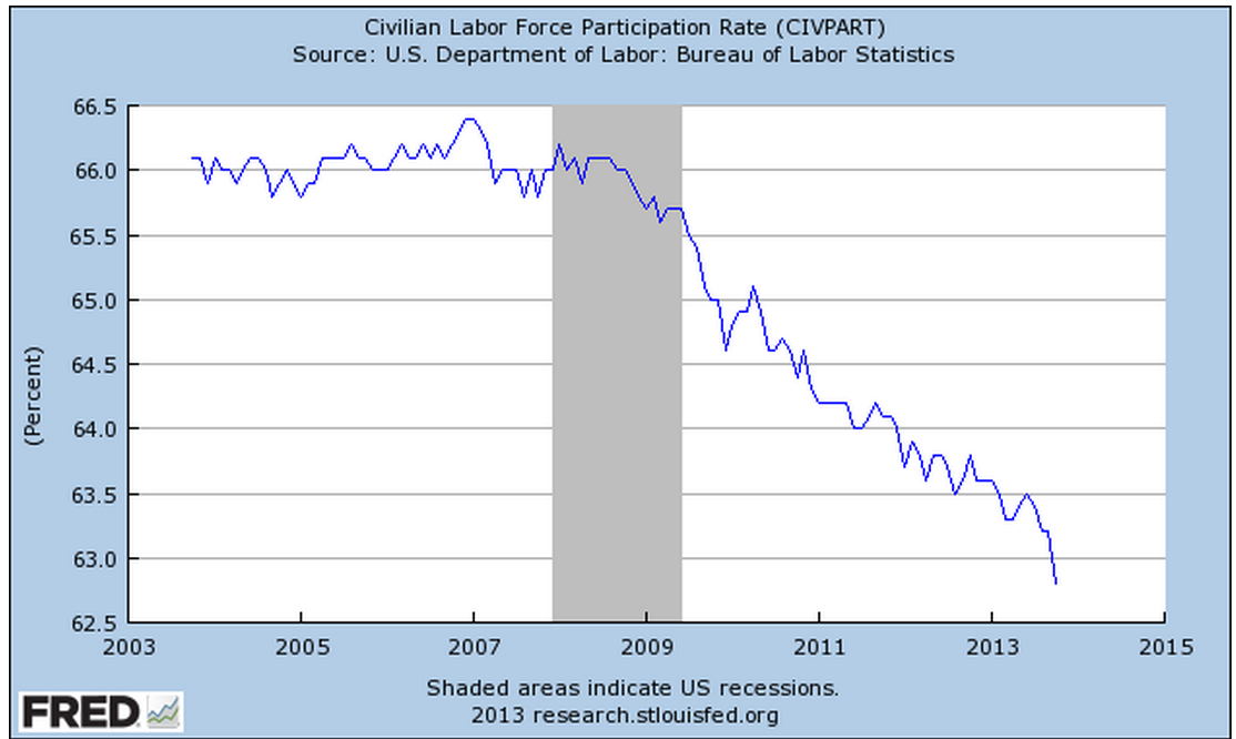
This month’s .4% steep drop in the Civilian Force Participation Rate ties the record set in December 2009 when the economy was still on its knees.  The rate has now fallen below the 63% mark, far below the 66% rate of several years ago.

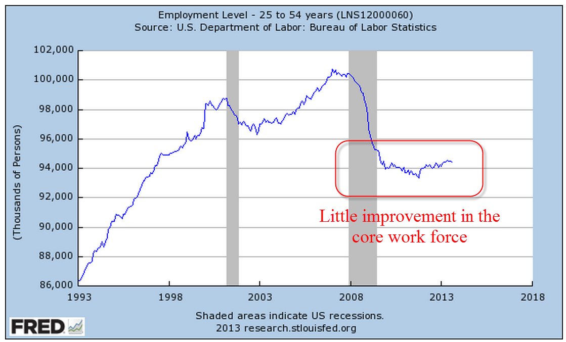
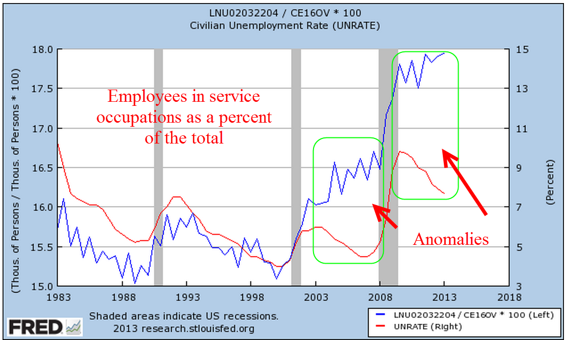
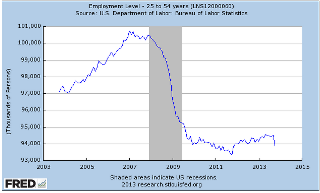
Employment in the core work force aged 25 – 54 actually dropped this past month.  Classifications of employment by age, sex, and education come from the survey of households, not employers, and may have been affected somewhat by the goverment shutdown. But the numbers of the past years show that there has been no recovery for this segment of the population.  In each lifetime, there are stages that last approximately twenty years.  This time of life should be  about building careers, building families, building assets and growing income.  I fear that for too many people in this age group, the slowly growing economy has not been kind.  This affects both a person’s current circumstances and dampens prospects for the future.

The headline job gains and classification of the types of jobs come from a separate survey of employers called the Establishment Survey.  Employers report their payroll count as of the 12th of each month.  Because they received paychecks, federal employees furloughed during the government shutdown in the first two weeks of October were still counted as employed in October.

There were some strong positives as well in this report.  Retailers added 44,000 jobs, above the average gains of 31,000.  This year’s gains have been the strongest in fifteen years.

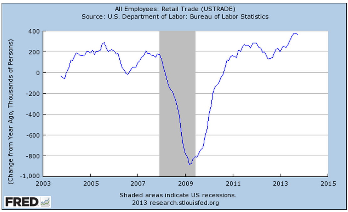
The gains are about half of the eye-popping gains of the past fifty years, but they indicate a confidence among retailers.  Retail jobs are often the first job of many younger workers, who have endured persistently high unemployment during this recession. Here’s a glance at yearly job gains in the retail sector for the past fifty years.

As the holiday shopping season gets underway, all eyes will turn to the retail sector as an indicator of the consumer’s mood.  The U. of Michigan Consumer Sentiment Survey, released Friday, showed a continuation of an erosion in consumer confidence.  After peaking during the early summer at 85, this index has declined to 72, about the same levels as late 2009 when the economy was particularly weak.  The Expectations component of this survey, which reflects confidence in employment and income, has declined to about 63.  Gas prices have been declining, inflation has been near zero, and stock and home prices have been rising but this survey shows a steady decline in confidence.  The government shutdown probably had some effect on the consumer mood but the budget battles are not over.  This is the 7th inning stretch and few are standing up to sing “America The Beautiful.”

Professional Services and Health Care have been consistent leaders in job growth for the past few years but gains in these sectors have declined.  The unemployment rate notched up to 7.3% from 7.2%.

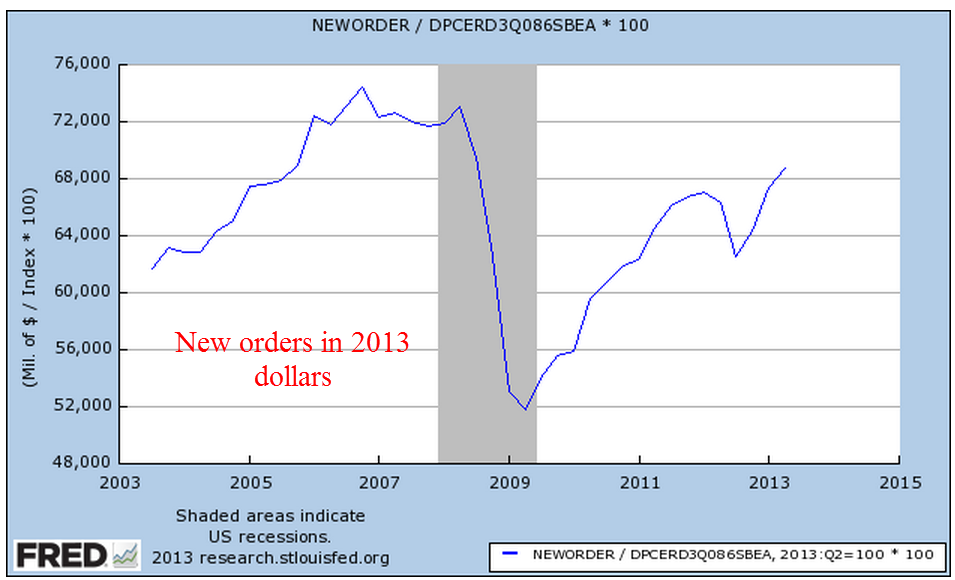
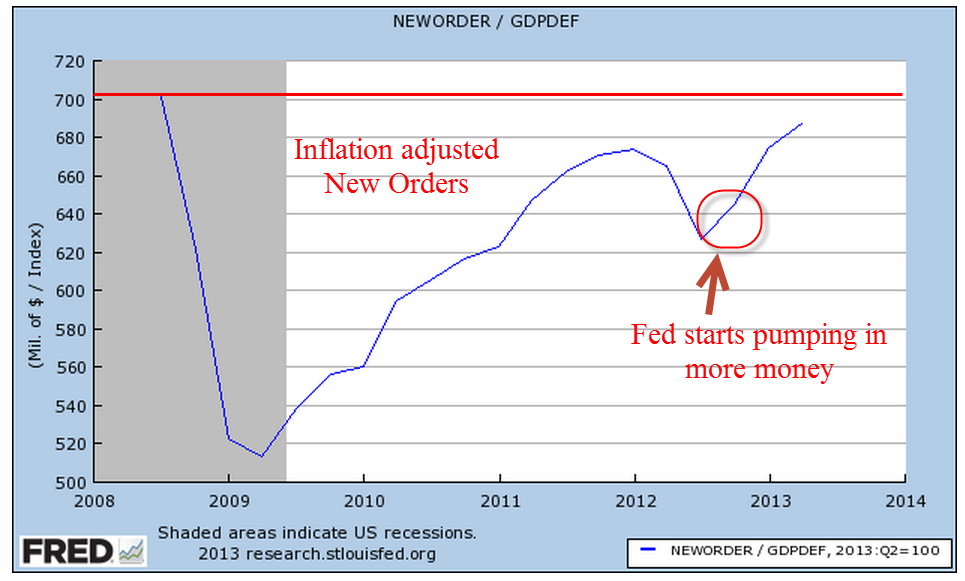
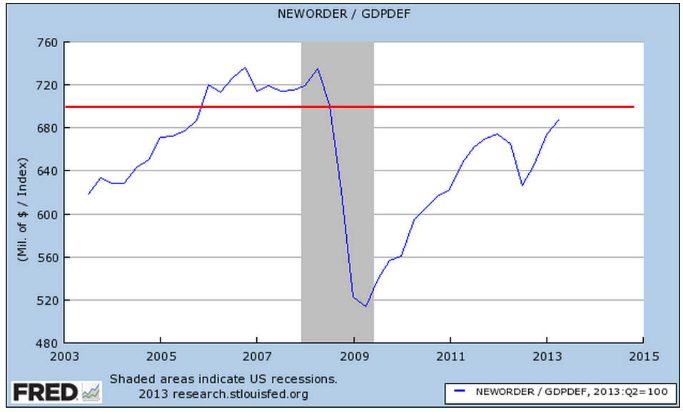
In a catch up effort after the recent government shutdown, the Dept of Commerce released data on factory orders for both August and September.  While the manufacturing sector as a whole has been strong, the weakness in new orders in these two months indicates a tempering of industrial production in the near future.

When adjusted for inflation, the level of new orders is still below the levels of mid-2008.

If we zoom out ten years, we can see that we at about the same levels as late 2005.

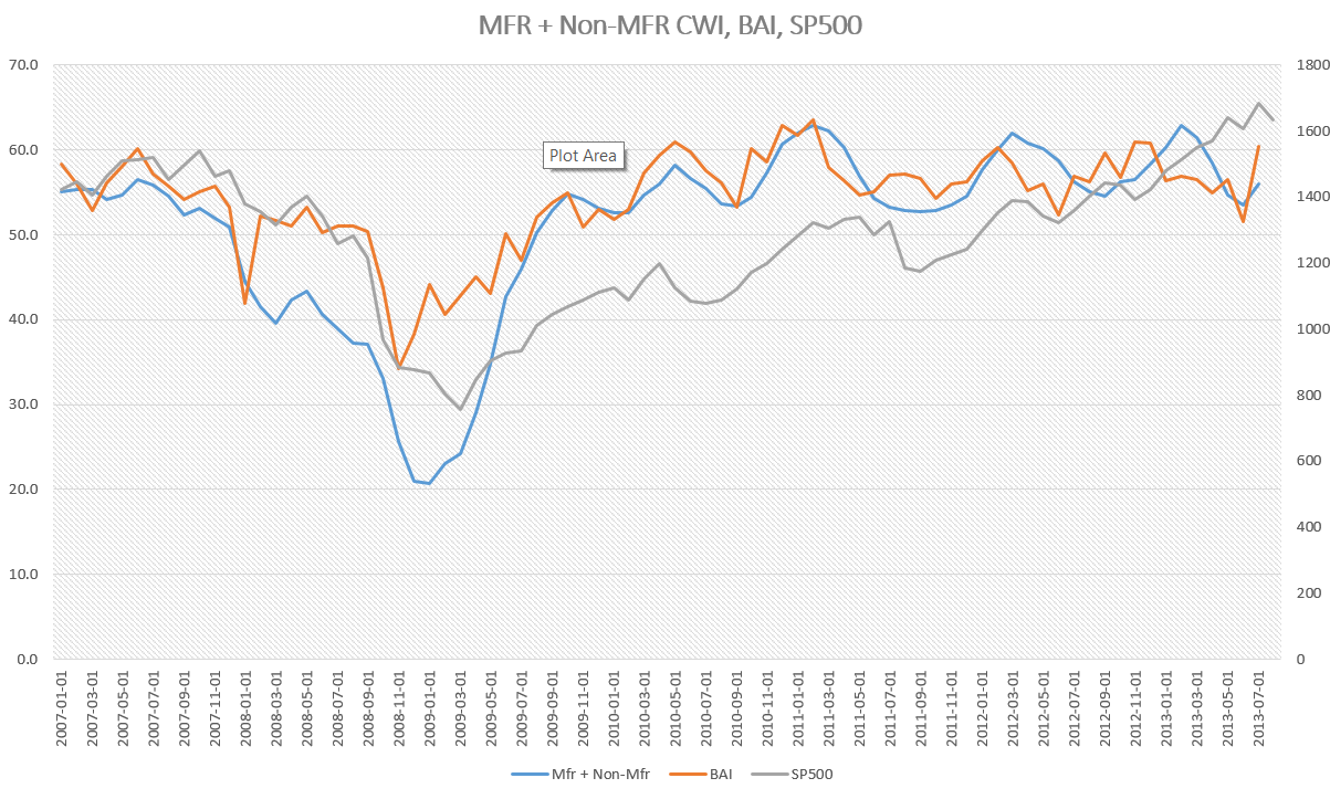
ISM released their monthly non-manufacturing survey, showing sustained and rising strong growth at just over 55, up a point for the previous month.  I’ve updated the CWI that I’ve been tracking  since June of this year.  A three year chart shows that even the troughs are part of a sustained growth pattern.  Furthermore, the span of the troughs keeps getting shorter, indicating a structural growth in the economy.

Let’s look back six years and compare this composite index of economic activity with the market.

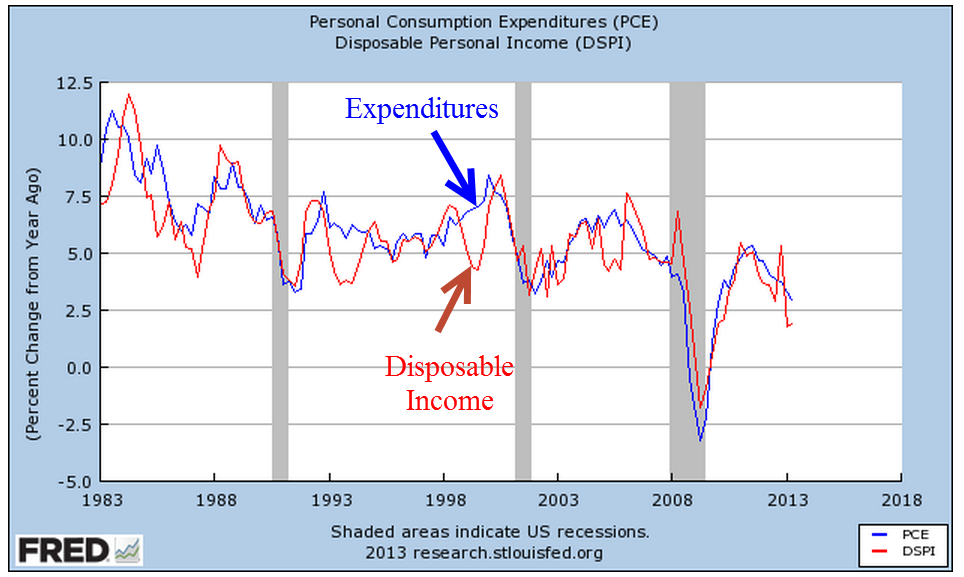
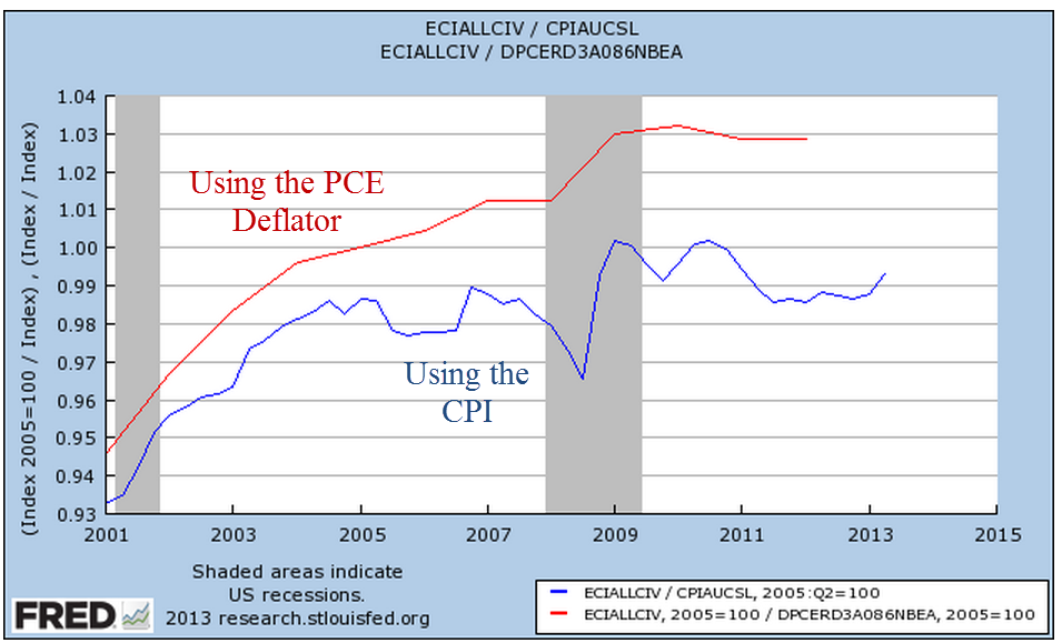
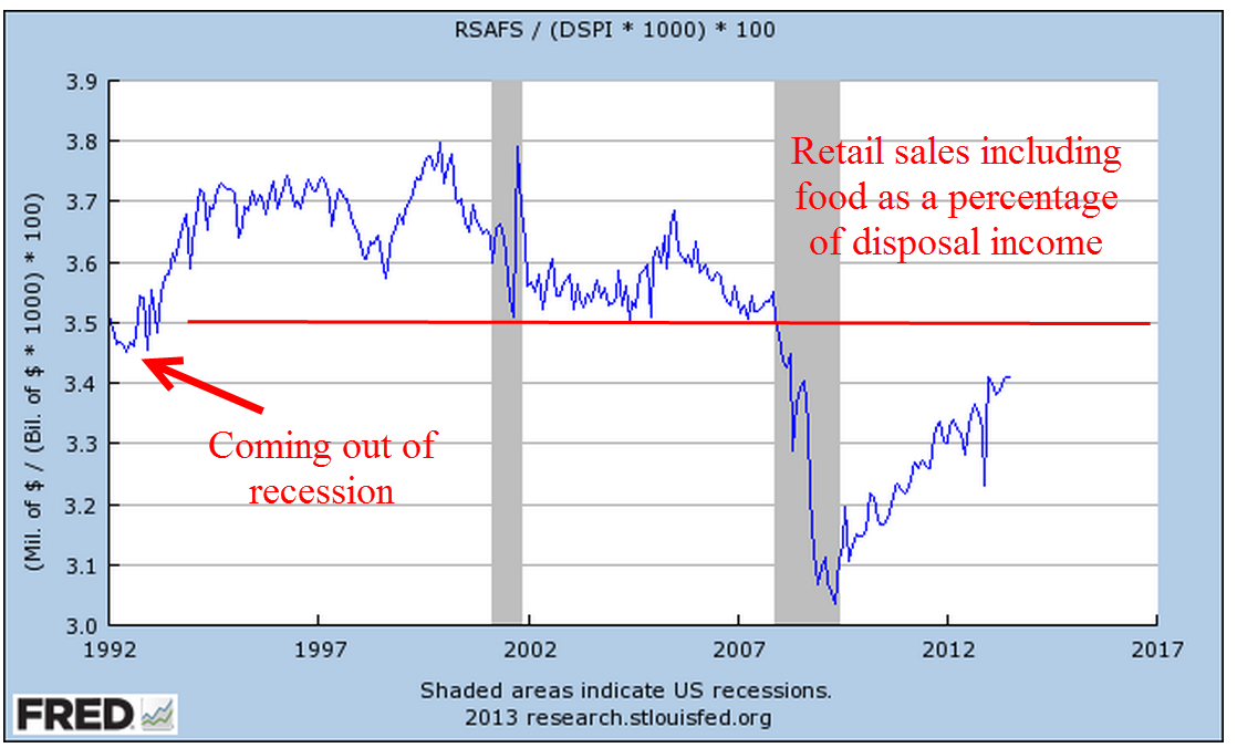
The monthly report of personal income and spending released Friday showed less than 1% inflation on a year over year basis.  For the second month, incomes increased at an annualized rate of 6%, yet consumer spending remains sluggish.  The chart below shows the year over year growth in spending for the past twenty years.

A longer term graph shows the current fragility in an economy whose primary component is consumer spending.

Both the manufacturing and non-manufacturing portions of the economy continue to expand.  Employment has risen consistently at a level just above population growth.  Inflation is tame but so is consumer spending.  Income is rising.  Budget battles loom.  Expectations for holiday retails sales increases are modest.  Will the Fed ease or not ease?  The medium to long term outlook is positive, but with a watchful eye on any further declines in the momentum of consumer spending growth. The short term outlook is a bit more chaotic.  We can expect further wiggles in the stock market as traders rend their garments, struggling  with Hamlet’s dilemma: To buy or not buy?  To sell or not sell?

HealthCare.gum

November 3rd, 2013

In this week’s title is the new government top level domain name: gum for gummint or gummed up.  But before I get into that, a few side notes on the economy.

On Friday, the Institute for Supply Mgmt released October’s ISM manufacturing report, which again showed that the manufacturing sector of the economy is humming along.  The monthly report on Factory Orders will be released this coming Monday, followed by the non-manufacturing ISM report on Tuesday.  The non-manufacturing sector has slowed from robust growth readings during the summer but are expected to still be a strong 54 to 56.  I’ll update the CWI that I have been charting since the spring.

On Wednesday, the payroll firm ADP released their estimate of job growth in the private sector during October.  The 130,000 net job gains came in under expectations and ADP noted a downward revision of about 12% for the previous months employment gains.  Normally, the BLS releases their monthly employment report on the first Friday of each month but because of the government shutdown that report will not be released till this coming Friday. The disappointing growth in the private sector shown in ADP’s report and fallout from the government shutdown in October has diminished expectations of job growth in the coming BLS report.  Previous estimates of 160-180,000 job gains have shrunk to 120-140,000.  The economy has been expanding yet employment gains have been moderate, a puzzlement to a lot of economic models.  The stagflation of the 1970s contradicted several prominent economic models at that time and the current persistent weakness in employment growth has got to be causing some head scratching by labor economists.

The continuing computer dysfunctions at healthcare.gov have commanded the spotlight these past two weeks.  There are about 15 million people, or 5% of the population, who purchase individual health insurance plans. About 50% of individual plans are not renewed each year, either by choice of the insurance company or the insured.  In the industry, this is referred to as the “churn rate.”

The Affordable Health Care Act, a/k/a Obamacare, enacted minimum standards for health insurance plans.  Existing plans were grandfathered in with a few caveats, one of them being that there was no change in rates since the act was signed into law in 2010.  Of course, most plans have annual rate revisions, voiding any grandfathering provisions.  Some estimate that as many as half of all individual policy holders have received cancellation notices from their insurance carriers.

Only 18 states have set up their own health care exchanges and these have functioned fairly well over the past month.  The “hub” portion of healthcare.gov acts in the background to connect these state exchanges to data from various government agencies.  A majority of states, including all states dominated by Republican legislatures, opted not to set up their own exchanges but to use the federal health care exchange at healthcare.gov.  This much more visible portion of the health care IT infrastructure has been a disaster since it opened on October 1st. Many individual plan policy holders in states without an exchange must access this web site to shop for insurance policies and apply for federal insurance subsidies.  For many the web site has been inaccessible or there were long delays in creating accounts on the site or they were constantly dropped off the site.

There was little to no support for Obamacare among Republicans and this dysfunctional web marketplace underscores a lack of faith in the big government that Democrats extol.  Note to Democrats:  a crippled web site is not the way to win friends and influence people.

In control of the House, Republicans control the agendas of the various committees and subcommittees.  Note to Democrats:  don’t screw up when the other party has control.  In congressional hearings, Republican reps presented numerous examples of constituents angry over the largely non-functioning federal health care site.  Democrats were angry as well – less so at agency officials appointed by a Democratic President and more so at Republicans, arguing for everyone to come together to solve these problems.

After failing to make their point by shutting down the government for a few weeks, House Republicans have taken a more moderate stance of letting the Democratic health care insurance apparatus implode.  Had the Republicans – and Democrats – not been posturing at their podiums during the shutdown, Republicans might have paid more attention to the healthcare.gov site problems during the first week of the government shutdown and adopted this more moderate stance sooner.   Note to Republicans: get out of the way when your opponent is falling on his sword.

In the political wrangling over the passage of the Affordable Care Act, President Obama famously repeated, “If you like your insurance, you can keep it.”  What he should have said was “Nothing in the new health care act will force you to change plans,” but that indicates some nuance.  Nuance is the first soldier to fall in political campaigns.  Words are daggers; as kids we learn that lesson well.  To pass the Politician Exam, candidates learn three things about the use of words:  how to conceal, cajole and cut with them.  In Politician School they learn “Keep It Simple, Stupid” and think that the Stupid are the voters.  In sales, the quip is aimed at the salesperson, a “memo to self” reminder that the more one becomes practiced in the art of selling a particular good or service, the more complicated and less effective one’s presentation can become.

Politicians tend to talk to voters at the level of the least intelligent among them, so it comes as no surprise that President Obama kept it beguilingly simple, to the point of an almost falsehood.  Yes, if an insurance company kept a policy exactly as it was three years ago, then it was grandfathered in.  An insurance carrier has little incentive to keep a person or family in the same risk pool when the carrier can cancel the policy, issue them a new policy at higher rates justified by the fact that the person or family is now in an unrated risk pool.  President Obama might have thought that the subject of risk pools was just too complicated for simple minded voters.  Several years ago, politicians in Colorado found that voters were very interested in and could comprehend risk pools when it involved changes to auto insurance.  In response to legislative changes, I have had at least two policy cancellations and reissues by my auto insurance carrier.  Because the market for auto insurance is very competitive, rate changes were small.  Not so in the market for individual health insurance.

My state, Colorado, has set up its own exchange.  In Estes Park, a husband and wife with a family of four kids will save almost $600 a month with a health insurance plan they purchased on the exchange.  Their deductible will drop from $12,500 a year to zero.

For each anecdote illustrating the benefits of Obamacare, there will be at least one example of financial hurt.  For 14 years as a self-employed person I carried an individual health policy, so I am well aware of the benefits and problems of these policies.  To get an initial policy, I answered a lot of questions about myself, my habits, my family’s medical history, and my family’s parent’s medical history.  I peed in a cup and had blood taken to get a policy renewal.  Applications are an average of 23 pages according to testimony in recent hearings.  Contrast that length with the typical two page application for an employer-sponsored health care plan. In short, there were and are a lot of very big and persistent problems in the individual health insurance market.

Many individual plans are sold to small business owners or self-employed professionals, an independent lot who do like being able to pick and choose an affordable plan that meets their needs. Despite the negatives, individual plans did not suffer the onerous burden of government regulation.  Media attention to the problems in individual plans has been scant because almost 90% of people with health insurance get their insurance through an employer or through Medicare or Medicaid.

A week ago, a Congressional oversight committee questioned CGI, the general contractor for the healthcare.gov web site, and OSSI, a contractor for the backbone of the system.  This past week, another Congressional committee questioned Marilyn Tavenner, the head administrator for CMS, the government agency that administers Medicare and Medicaid, and Katherine Sebelius, the Secretary of HHS.  Both have apologized for the fiasco and have promised a tireless effort to get it right, bringing in teams of experts from private industry, including Google and Facebook, to work on the problems.

Ms. Tavenner worked for 25 years in the big hospital chain HCA, then a four year stint in Virginia’s HHS, before becoming a Deputy Administrator, then the head Administrator at CMS.  Congresspeople on both sides of the aisle gave her a lot of respect.  During the hearing with Ms. Tavenner, there were several points raised.  While I took notes, I did not fact  check the claims.

CMS projects an enrollment of 7 million by March 2014.  Of these 7 million, approximately 2.3 million need to be younger to make the policies actuarially sound.
Before the web site launch on October 1st, the CMS conducted small scale tests of the site for two weeks in September that showed no major problems.  In testimony the week before, both CGI and OSSI said that a project this size requires several months of testing before launch.
CMS made the decision not to release initial application or enrollment numbers on healthcare.gov till mid-November, claiming that the numbers were unreliable.  Republican members of the committee claimed that this was a delaying tactic to hide the fact that the numbers of enrollees so far is very low.
Ms. Tavenner insisted that their goal was to have the site running smoothly by the end of November, giving those who have had policies cancelled effective on Jan. 1st ample time to sign up for new plans.
If a person is not concerned about the availability of subsidies, they do not have to sign up, i.e. create an account on the web site, simply to find out what plans are available and at what rates.
Health care costs and coverage over the next twenty-five years are the primary concerns of small businesses.  (Side note: for most of the 2000s, premiums in the Colorado small business market were increasing by 9 – 15% each year.)
In August, CMS decided to delay the “Shop and Browse” rollout of insurance plans for small businesses on healhcare.gov till later in the year.  They also decided to delay the Spanish version of the web site as well as the capability of Medicare and Medicaid transfers.  Even with the delayed implementation of some of these components of the web site, the site has been dysfunctional.
On October 24th, Mother Jones reported that it was possible that social security numbers could be hacked on the healthcare.gov web site.
Charley Rangel, a Democratic Congressman from New York, stressed the need for health care access for children, reminding Republicans that they need a stock of healthy children to fight their wars.  An example of the verbal tennis match that ensues at some Congressional hearings.
Under the medical loss ratio clause of Obamacare, $3.4 billion has been returned to policyholders by insurance carriers.
17 million children with pre-existing conditions can no longer be denied coverage.
Medicare patients have saved $8.3 billion by the closing of the “donut hole” in Part D prescription drug coverage.
Lloyd Doggett, a Democratic rep from Texas (Texas has everything, including Democrats), continues to ask for Navigator progress reports.  Navigators are licensed by CMS to help people sign up for Obamacare and it was not clear how much supervision CMS has over these Navigators.
Ms. Tavenner denied reports that Navigators are not required to undergo criminal background checks.
Current Medicare claims are 18% below CBO projections from a few years ago.  There has been a slowing of medical costs for the past few years.  If someone leans to the left, they attribute that to the enactment of the ACA.  If someone leans to the right, they attribute the reduction to the recession.

I noticed a pattern during the hearings and the distinction has been confirmed in some polling.  Democratic voters and their representatives focus on health care access, while Republicans focus on health care costs.  This difference in focus helps explain why each side often talked past the other during the hearings.

The longer that the web site is not functioning properly, the more that voters will punish Democratic reps in the 2014 elections.  Many districts are rigged – er, engineered – to be no contest for one party or the other.  Democratic reps in contested districts are hoping that the current problems are fixed asap and praying that no more problems emerge before the election.

And finally, a side note on food stamps.  The House reduced food stamp benefits by 5% this week.  Lest you think that Republicans are all about smaller government, think again.  Yahoo reported  that Republicans want to impose restrictions on what foods and drinks a person can buy with food stamps.  Whatever became of the Party of Personal Responsibility?  Although President Obama has said he would veto the plan, it indicates that Republicans as well as Democrats are parties of Big Gummint.  Put your money in the gumball machine and hope your flavor comes out.

Jobs, Spending and Income

October 27th, 2013

Before I take a short look at the delayed release of the employment report this week, let’s look at the growth in personal income and spending, which move in tandem.  This is the y-o-y percent change in nominal after tax income and spending.

Income growth can be a bit more erratic than spending, bouncing around the more stable trend of spending.

The anemic growth in both income and spending has dampened hopes of a strong rebound of consumer spending.  The ratio of an ETF composite of retail stocks versus the overall SP500 market index shows the recent doubt.  Retail stocks have not participated in the larger market rebound.

A wholesale clothing sales rep I spoke with a week ago has noticed the caution in her buyers since mid-August.  In September, some in the industry laid the blame at the prospect of a government showdown.  For those of us in private business, the political shenanigans only muddy the water and make it difficult to read the consumer mood.  Reports of sales at major retail centers – about 10% of retail sales – showed strength this week after a month of lackluster growth.  Maybe it was the government shutdown.

However, the U. of Michigan Consumer Sentiment Index released this past Friday showed a sizeable drop in sentiment.

Was this decline in confidence due primarily to the shutdown or is this a forewarning of less than cheery holiday shopping season?  The knuckleheads in Washington are like people who stand up at a concert, blocking the view of those seated behind them.  The business community in general must plan around the politicians on both sides of the aisle in Washington who relentlessly pursue an anti-job agenda.  Politicians can puff and posture on their principles – like so many in government service, they are not subject to the constraints and discipline of profit and loss.  Sure, there are some whose intentions are good, who give their best effort but, unlike private business, their efforts and intentions are voluntary – a sense of personal virtue.  Most will not lose their jobs because of a lack of performance.  There are few incentives to improve efficiency.  In fact, it is the reverse.  The incentives are to promote more regulations, more layers of bureaucracy, as a program of job security and job growth in Washington at the expense of the rest of the country. Many of us in the private sector have the same sense of personal virtue but we also have that profit and loss whip.

Since the temporary resolution of the government shutdown and the raising of the debt ceiling, the market has shot up over 6% in twelve trading days.  The late release of September’s labor report showed less than expected net job gains of 148,000, which dashed any further fears that the Fed might ease their bond buying program this year.  The trends of employment growth have been fairly stable, with a few exceptions – health care, for one.

After six months of little growth, employment in construction rose by 20,000 this past month.

The rise in construction jobs helped the labor force participation rate for men, reversing a decline.

But the participation rate for the core labor force, those aged 25 – 54, shows no signs of reversing the decline of the past four years.

Demographic changes, combined with persistent job weakness among younger workers, is silently eroding the foundations of the Social Security system.  The older half of the population, particularly the Woodstock generation, are growing faster than the younger population, as this table from the Census Bureau shows.

From the Census Bureau report: “the population aged 65 and over also grew at a faster rate (15.1 percent) than the population under age 45.”  At the end of 2012, the Federal Government owed the Social Security trust fund $2.7 trillion (SSA Source)

The number of workers in the core labor force has declined by 5 – 6 million.

Let’s do some math.  [5 million fewer workers paying into Social Security each year] x [$8000 guesstimated combined annual contribution] = $45 billion per year not  collected.  This is just the Social Security taxes, not including the income taxes, on a portion of the population that represents two thirds of the work force.  That $45 billion represents the benefits paid to over 3 million people in 2012. (SSA Source) To put that figure in perspective, Congress is arguing over the medical device tax clause of Obamacare which is projected to raise just $29 billion over the next ten years.

It will take five to ten years for the crisis of funding to develop.  In the meantime, the budget debates will grow more contentious, politicians will pontificate at their podiums with more frequency and the clouds of these dusty debates will make it more difficult for business people to plan ahead.

Shoot Out At the OK Corral

October 20th, 2013

This coming Saturday is the 132nd anniversary of the gunfight at the OK corral.  We got our own OK corral in Washington and there was a whuppin’ this week – a Washington style whuppin’, which means that no one got whupped but everyone agreed on an appointment date for a  future whuppin’.

Congress passes a continuing budget resolution with the same frequency that many of us get our teeth and gums cleaned.  Many government reports were not released this past week but the National Assoc of Homebuilders (NAHB) released a very positive monthly report of the national housing market, showing a slight decline over the past few months last month but still a strong index reading of 55.  Two years ago this October, that index stood at 15.  In fact since the latter part of 2007, the index oscillated in the range of 15 – 20, so this has been a strong and sustained growth surge.

Over the past hundred years, house prices have risen at about the same rate as inflation, so that the real price of homes stays about the same.  Most homeowners finance their home purchase and it is this interest cost that determines the total capital cost of the home.  That capital cost and the interest cost is divided over the life of the mortgage into monthly payments.  PITI is a familiar acronym to many home owners and buyers; the initials represent the components of a monthly house payment. The ‘P’ stands for Principal – the monthly capital cost of the home.  The ‘I’ is interest on the amount of the loan.  The ‘T’ represents the local real estate taxes which are included in the monthly house payment sent to the mortgage servicer who forwards them on to the local taxing agency. The ‘I’ represents Insurance.  This can be both house insurance and, for those with an FHA loan, the amount of the loan insurance.  The interest rate on the home loan is a key component and although there has been an increase in mortgage rates since the spring, they are near all time lows.  A 30 year mortgage is a common benchmark.

Let’s index the CPI and the house price index to 1991 and look at the divergence.

Declining interest rates have enabled many more people to qualify for a home purchase, thus driving up home prices. In 1995, Congress made some major revisons to the 1977 Community Reinvestment Act, making home loans more available in distressed urban and rural districts.  This further exacerbated the rise in home prices, creating a large divergence between the CPI and the housing price index.

As every homeowner knows, the cost of a home includes maintenance, repairs, utilities, and improvements.  As I discussed last week , real median household incomes plateaued during the 2000s.  The rise in home values and changes in banking laws enabled homeowners to tap the equity in their homes to meet these additional obligations and to augment stagnant incomes.

In the past dozen years, many people discovered that housing is not a reliable source of income.  At the turn of the century, stock traders who quit their jobs to trade stocks during the tech bubble, discovered the same truth about the stock market, whose price returns are a few percent above inflation.  A nifty calculator at  DQYDJ illustrates the average returns of the SP500 over the past 100 years.


At the heart of the financial follies of past centuries is that a surge in price for some asset, be it tulip bulbs, Florida real estate or tech stocks leads people to conclude that they can hop on the gravy train.  What is the gravy train?  As an asset increases in value, more people invest in the asset bubble, the valuation continues to rise and – for a time – it is possible to convert a stock, a store of value, into a flow of income by either buying and selling the asset or borrowing money against the asset.  There is always some constraint – the rise of inflation, or the rise of personal incomes, or the growth rate of profits – that eventually brings an asset valuation down to earth.  Einstein famously quipped that the most powerful force in the universe was compound interest.  He might have mentioned  what may be the most powerful force – reversion to the mean.

The Outcome of Income

October 13th, 2013

“Use words not fists” a parent might say to a child.  For the second weekend during the government show down – I mean shut down, the children – er, representatives – in Washington have taken that to heart.  In a contest of dueling podiums, members of each party in both houses of Congress assure the public that their party is the reasonable one.  On Thursday, the market shot up on the news that – no, not a deal – but the likelihood that the two parties might talk to each other instead of mouthing platitudes and principles at their separate podiums.  About three weeks ago, speculative talk of a government shut down began to surface and where was the market after Friday’s close?  Back where it started three weeks ago and just 1.5% below the high on September 19th.

 In the Washington Irving tale, Rip Van Winkle fell asleep for twenty years only to wake up to a new United States of America.  In this version of the tale, an investor goes to sleep for three weeks, wakes up and there’s a whole new United States of Closed For Remodeling.  In a townhome association I belonged to many years ago, the tenants argued for several months over the choice of roofing contractor, color and style of roof for the townhomes.  A large Federal government may take a while longer.   In fact, it has been years since the Congress passed an actual budget.  The Treasury department used up the debt limit last May and has been running on fumes since then, grateful that the housing loan agencies Fannie Mae and Freddie Mac have been paying back some of the cash they “borrowed” from the taxpayers a few years back.

Because of the shut down there have been few government reports.  Commodities traders have been buying and selling in the dark,  guesstimating what the weekly and monthly government reports on the sales and production of corn and other commodities would have been if there had been an actual report.  We can only hope that traders have been fairly accurate.  If there are some notable surprises, duck.

There have been some private reports, one of them the monthly manufacturing and services reports from the Institute for Supply Management (ISM).  I updated the combined weighted index (CWI) that I have been showing the past few months.  Unlike the environment during the August 2011 budget negotiations, business activity shows strength this year and the resilience of the S&P500 index reflects that underlying strength.  Although 10 of 14 trading days were down, the index lost only about 4% from the recent high.

The CWI has been in expansion territory since the summer of 2009, which coincided with the NBER’s official call of the recession’s end.  You’ll notice that there is a rolling wave like movement to the index since then, an ebb and flow of strong and not so strong growth.  Since this is a coincident indicator of the fundamental strengths in the economy, it might not be a good predictor of short term market swings but has been a reliable predictor for the longer term investor.   Despite the recent highs in the market index, the market has been in a downtrend since the highs of thirteen years ago.  It is approaching the high set in 2007, a sign of renewed optimism.

The Federal Reserve recently posted up Census Bureau median household – not individual – income figures for the past thirty years.  Continuing on our theme from last week – the story we tell depends on how we adjust for inflation.  In this case, neither story is particularly cheerful.  Median household income adjusted for inflation using the Personal Consumption Expenditure measure has fallen  to 1998 levels, declining 7% from 2007 levels.

In 1983, the Bureau of Labor Statistics changed their methodology for computing the cost of owning a home, or owner equivalent rent.  Over the years, some economists and financial writers have made the case that the official measure of inflation, the CPI, overstates inflation.  This tells an even bleaker story: a decline of almost 9% from 2007 levels, an annual growth rate over 28 years  of just 1/4% per year.

Now, let’s compare the two.  Does the CPI overstate income by 5% or does the PCE Deflator understate inflation by the same amount?

The methodology influences many people in this country, from seniors on Social Security to working people who rely on cost of living increases.  Yet there will be more debate about whether the manager of a baseball team should put in a fastball pitcher who sometimes struggles with accuracy or go with a pitcher who throws less hard but has good location and change up.  There are political consultants who spend late night hours trying to figure out how to present the problem to the public so that they can understand it and get passionate about it.

The slow growth in household incomes arises because there is a greater supply of people who want work than employers offering work that people can or want to do.  Slow growth in the economy means less demand for labor, which puts downward pressure on the wages that workers can demand.  Smoothing the quarterly percent change in GDP growth for the past thirty years gives a clear picture of this less than robust growth.

While that may be the chief reason for slow income growth, the negative real interest rate of the past five years has played some role, I think.  When the economy is in a recessionary funk,  the Federal Reserve keeps the interest rate low to spur growth.  In the past two recessions, the Fed kept interest rates low for a considerable period of time after GDP growth began to rise.  Now it is easy to look in the rear view mirror at GDP growth, which is revised several times and may be revised again a year later as more information becomes available.  The Federal Reserve has to guess what the growth is and lately they have been overestimating the growth in the economy.

As long as the Fed keeps interest rates low, banks can make easy, safe profits in the spread between buying Treasury bonds and borrowing from the Fed and other banks.  There is less incentive for banks to take the additional risk of investing in business loans.  Although climbing up from the trough of several years ago, business loans in real dollars are still below the levels of mid 2008.

During the past twenty-five years, the rise and fall of commercial loans has become more pronounced.  Have the banks become that much more cautious at each recession, are businesses circling the wagons at the first hint of a downturn, and what part do low interest rates play?

This past week President Obama confirmed his pick of Janet Yellen as the new chairwoman of the Federal Reserve.  Larry Summers had been Mr. Obama’s first choice but Summers withdrew after learning that he would have a difficult confirmation process.  Although very smart, Summers is not a concensus builder.  Many in Congress and the market preferred Yellen to Summers.  Ms. Yellen takes a dovish stance, meaning that she is likely to further the current policy of low interest rates for the near future.  A cautious investor might want to rethink rolling over that 5 year CD that comes up for renewal in the next few months.  Rates are currently 1.5 – 2%, so that after inflation an investor is losing a little money.

Employment and Government Shut Down

Earlier this past week there were rumors that, due to the government shut down,  the Bureau of Labor Statistics (BLS) might not release the monthly employment report on Friday.  The employment report is probably the foremost key indicator that guides stock and bond market action as well as a prime metric used by the Federal Reserve in the determination of future monetary policy. On Thursday, the BLS confirmed that they would not release the report, which prompted a drop in the stock market, followed by an almost equal rise over the next day.

On Wednesday, ADP released a tepid 166,000 estimate of net job gains for September accompanied by a downward revision of their August estimate.  On Thursday, the weekly report of new unemployment claims held no surprise.  Traders probably figured that they had enough information to guesstimate the BLS number of net job gains – tepid growth a bit above the 150,000 needed to keep up with population growth.  In short, there was less likelihood that the Federal Reserve would be tapering their QE program before the end of the year.

So this is a good opportunity to take a look at some historical employment trends.  Measuring wage growth and inflation adjustments to wages is a complex task, far more complex than the gentle reader wants to delve into.  Labor economists crunch a lot of regional employment data gathered by the BLS.  Whenever there is a wealth of data, there is also a wealth of ways to treat that data, which data to focus on, etc.  Some economists focus on median compensation.  The median represents the middle, i.e. 50% of workers make more than the median, 50% make less.

In a 2011 paper published by the Economic Policy Institute (EPI), author Lawrence Mishel states  “Between 1973 and 2011, the median worker’s real hourly compensation (which includes wages and benefits) rose just 10.7 percent.”

“Real” means inflation adjusted but there are different methods used to calculate inflation.  One method, the Consumer Price Index, or CPI, has been changed over the years, making it difficult to make comparisons of data.

For a longer term perspective into the controversy over measurement, let’s turn to a graph of real output and total compensation per hour worked for the business sector.  Here we see a narrowing between compensation and output until output crosses above compensation in the mid-2000s.

The flattening of compensation growth is shown when we focus on the past twenty years.

But the hourly data seemingly contradicts the claim that there has been only an 11% increase in real compensation over the past forty years.  Looks like the total compensation of all workers has risen about 40% or more in the past forty years.  How can the median growth be so far below the total?  To understand that, a reader would have to examine the data sources behind the claim.  We might find that median weekly, not hourly, compensation has risen only 11%.  This could be due to more part time workers, or the rising percentage of women in the labor force who generally work fewer hours than men. What we do know is that a competent economist can find or crunch the data to prove his or her point.

The ability to work empirical magic with data often leads to contradictory claims by noteworthy economists.  The contentiousness of the discussion among economists baffles the intelligent reader.

Let’s return to that bugaboo mentioned earlier: measuring inflation. Twenty years ago, economists Brian Bosworth and George Perry noted the trending gap between output and productivity: “In an economy where real wage growth has paralleled the rise in productivity over the long run, this apparent divergence implies that the benefits of increased productivity have not been distributed in the expected way over the past two decades.”  A chart from their paper illustrates the trend.

A notable trend in the numbers is the steep rise of employee taxes and benefits, or non-wage employer costs.  Economists or politicians sometimes point to the decline in the real hourly wage over the past forty years, without bothering to note the growing non-wage costs of employment, a convenient omission.

Bosworth and Perry document problems and changes in measuring inflation in both consumption and output but noted that “the prices that workers pay as consumers have been rising significantly more rapidly than the prices of the products they produce.”  Further analysis by the authors shows that the wage growth in that twenty year period 1973 – 1993 did not flatten till after 1983.  They conclude that the major reason for the divergence is the difference between how inflation was measured before and after 1983. The authors recommended the use of a Personal Consumption Expenditure (PCE) deflator instead of the CPI, which overstates inflation relative to output.

Let’s look at wage growth over the past twelve years using two methods to see the difference.  The BLS calculates real wage growth using the CPI-U inflation index (Source).  Here is a graph from their data.

Now let’s use the PCE deflator to get a slightly different picture of the same Employment Cost Index.

Now let’s compare the two.

They tell two different stories.  Using the CPI inflation adjustment, the blue line, I could tell a story that wage growth has stagnated over the past ten years.  Using the PCE inflation adjustment, I could tell a story that wage growth has stagnated since the financial crisis.

Now imagine a politician who wants to bash the policies of former President George Bush and exalt the policies of the current administration.  That politician would use the blue line to tell the story of how the Bush Administration undercut the wages of American workers and that this led to the worst recession since the Great Depression.

On the other hand, if a politician wanted to criticize the Obama administration, she would point to the red line.  Worker’s wages grew during the Bush years.  Since Obama took office, wages have stagnated, indicating that Obama’s policies are hurting American workers.

Thus a dense and complicated argument on how to measure inflation becomes a talking point for a politician.  Even worse, noteworthy and popular economists who understand the difficulties of measuring both employment and inflation choose one line or the other to tell a simple story based on their own bias.

During this ongoing government shut down, we will hear a lot of spin and invective.  The profusion of TV, radio and internet media sources ensures that anyone can choose exactly – to a ‘T’ – the version of reality that they want to hear.  Of course, our sources and opinions are unbiased and perfectly reasonable.  But can you believe what the other side is saying?  Boy, are they crazy!

Corporate Profits and New Orders

Wednesday’s release of durable goods orders showed a rather large downward revision to July’s data and an increase in August’s orders.  The transportation component makes the overall reading of this report quite volatile.  A more consistent read is gained by excluding transportation and defense goods, which showed a less dramatic 3.3% decline in July, followed by a slight increase of 1.5% in August.  The year on year increase is 7.6%.

In nominal dollars, not adjusted for inflation, we have reached the level of new orders before the recession began in late 2007 – early 2008.  Had the economy stayed “on trend” new orders would be over $84 billion this year.

When adjusted for inflation, we are at about 2006 levels – seven years of no net growth.

Second quarter corporate profits are up almost 6% and have tripled in the past ten years.

Despite all the daily and weekly responses to political as well as economic news, the SP500 stock market index essentially rides the horse of of corporate profits.  The market’s fluctuations reflect changing current expectations of future profits.  Except for the “irrational exuberance” of the late 90s, there is a remarkable correlation between the SP500 and corporate profits.

Focusing on the past ten years, we can see these two forces as they dance around each other.   As sales and profit emerge over each quarter, companies guide analysts estimates of profits up and down.  The market renegotiates its value based on these revisions of emerging profit estimates.  As a rule of thumb, an investor with a mid term horizon of 1 – 3 years might grow wary when these trends diverge as they did in the late 90s and 2006 – 7.


As a percent of the total economy, profits have doubled over the past ten years.  At the trough in 2008, when some financial pundits were forecasting the end of capitalism, profits as a percent of GDP were at the 25 year average.  Investors had become used to this lop-sided economy where corporations grab more of the economic pie.

A growing share of profits is earned overseas; that growing globalization and two decades of effective lobbying have enabled corporations to lower the tax bite on those profits.

The taxation of corporations is a two-edged sword.  One effect of more taxes for corporations means less dividends to investors, who probably pay taxes at a higher rate than the effective rate of corporations.  During the 1980s and 90s, dividends averaged around 40 – 50% of earnings after taxes.  In the past decade and especially after the cash crunch of 2008, corporations have retained more of their earnings as an emergency cash cushion, paying investors about 30 cents on each dollar of earnings.  That rush to safety will probably reverse itself in the coming years, prompting corporations to pay out more in dividends as a percent of profits.

There may be volatility in the market in the coming days and weeks as Congress wrestles over the funding and implementation of the health care act, threatening to shut down most non-essential functions of the entire government.  A similar budget battle in late July and August of 2011 was accompanied by an almost 20% drop in the market.  The longer term trend is told by the rise in corporate profits, by the rise in industrial production and by the rise in new orders.  A move downward in the market may be a good time to put some cash to work, or to make that IRA contribution for 2013.

Home Sweet Home

September 22nd, 2013

The monthly report of new housing starts was released Wednesday morning, the second day of a much anticipated meeting by Federal Reserve. On an annualized basis, builders started 891,000 homes, a 19% year over year increase. This figure includes both single family homes and apartment buildings. Starts were below expectations and may cause some Fed officials to postpone or soften their quantitative easing program.  (Note:  later that day, the Federal Reserve announced that they would not start tapering their bond buying program, a surprise that spurred a surge upward in the  stock market)

A 19% increase sounds great until we take a birds eye view of housing starts.

The 5 month average of housing starts has been declining since the spring. A decline in the volume of new homes sold is an early warning of recession.  Builders are motivated sellers and respond to changes in demand.  Because builders borrow money, called “bridge” loans, to manage their cash flow they are motivated sellers and respond more readily to changes in demand.


A common metric heard on the nightly news is the months supply of new homes for sale.  This is the inventory of new homes in a particular area.  More months is bad, less months is good but too little inventory puts upward pressure on prices.  New home inventory is low.

The months supply is a ratio of home sales to starts and can be misleading. The components of housing starts and sales tell another story.  Starts indicate confidence of builders in future home sales in their region. A thirty year graph of new one family homes started less one family homes sold shows a deep underlying caution among builders.  They got burned in this last downturn and are not sticking their necks out.

As the population grows, people need to live somewhere.  Below is the number of new privately owned housing starts per 1000 increase in the population.

This graph tells a different story than the usual “too many houses built” narrative.  The height of the 2000s boom was less than the heights of the 1970s and 1980s.  There were not too many houses being built but too many houses being bought by people who could not afford them.  Mortgage companies sold adjustable financing products designed to earn fees when homeowners refinanced every few years to avoid large interest rate increases.  Buyers were enticed by a hop-on-the-gravy-train mentality as housing prices rose dramatically, particularly in low income areas.

After the 2000 census, the Census Bureau summarized decades long shifts both in the type of housing and the characteristics of homeowners.   While there is a wealth of 2010 census data, I was unable to find a similar table that incorporated data from the recent census.  The Census Bureau notes that privately held housing starts do not include mobile homes, which grew to 7.6% of the housing stock in this country.   So the surge in housing per change in population of the 1970s and 1980s is understated.  This suggests that the new home market is not overbuilt but that people are less able or less willing to commit to owning a home than they were thirty and forty years ago.

Sales of existing homes, released Thursday, showed a recovery high of almost 5.5 million units on an annualized basis.  Realtors reported continuing strong demand in anticipation of rising mortgage rates.  The “churn” of existing homes is not a productive investment in and of itself since the home has already been built.  Sales in this category do generate fees for banks and realtors at the time of sale, and increased sales for Home Depot and remodelers as buyers remodel following the sales or sellers spruce up homes before they put them on the market.

The ratio of new spending per existing home is very small compared to the material and labor involved in building a new home.  The brisk pace of existing home sales does raise the valuation of existing homes, which leads people to feel that they are wealthier, which may induce them to loosen their purse strings.  Rising home values are good for those who own a home but increasing valuations make it that much more difficult for buyers trying to buy their first home.  People in their twenties and early thirties who are most likely to be first home buyers have been hit hard by the recession.

As the economy continues its muddling recovery and home prices rise, does this generation practice a stoic resignation as they look to the future?

Crises

September 16th, 2013

September marks two anniversaries that we wish had not happened.  One of those is the financial crisis and the meltdown of the economy in September 2008.  In the fourth quarter of 2008, GDP fell about $250 billion.  By itself, this was not a disaster.  However, it came on the heels of a decline in the 2nd quarter and flat growth in the 1st quarter.

Almost overnight, consumers cut back on their spending.  Retail sales dropped $40 billion, a bit more than 10%.

There was little drop in food sales – people gotta eat.  All of the drop was in retail sales excluding food.

Retail sales are less than 3% of GDP.  Contributing to the GDP decline was the 33% fall in auto sales, about $20 billion.

Offsetting the decline in retail sales, however, total Government spending increased $40 billion in the 4th quarter.

Disposable Personal Income (income after taxes) fell $100 billion, about 1%, but was still on a healthy upward trajectory during the year preceding the crisis.

We routinely import more goods and services than we export.  In the national accounts of domestic production, imports are naturally treated as a negative number, while exports are positive. The difference, called net exports, is negative and reduces GDP.  For all of 2008, we had about the same net exports as 2007.

Gross Private Domestic Investment declined $200 billion or 9% over the year.  This includes investments in buildings, equipment and housing.  Housing accounted for $150 billion of the change.

The TV news media, a visual medium, focuses on crises because it is not well suited for more thoughtful analysis.  On camera interviews in a crisis do not have to be very detailed or accurate.  Viewers understand that it is a crisis.  But viewers are also an impatient bunch with trigger fingers on their remote controls. Video footage has to be loaded, sequenced and edited.  On air interviews and several short video clips run repeatedly during a news hour will have to do.  The recent flooding in Colorado is a reminder that there is only so much video footage available.  TV stations simply reran the same sequences over and over.  On the 9 PM local news, the station featured an on site reporter in front of a driveway heaped full with damaged belongings and furniture.  At 10 PM, a different local station featured their reporter in front of the same house.

In September 2008, the media focused on the financial crisis and the implosion of stock prices.  When the stock market opens up on a September morning 300 points down, what else is there to cover?  It is important to understand that the economy is a big organism with a lot of moving parts.  The housing decline was already two years old before the financial crisis hit in September 2008.

Fast forward to this September.  A day ahead of the ISM Manufacturing report on September 4th came the news that China’s manufacturing sector has strengthened, a positive note in the Asian region where capital outflows from emerging nations have weakened the economies of other nations.  The prospect of higher interest rates in the U.S. has sparked a change in money flows to the U.S., strengthening the dollar against the currencies of emerging countries.  This change in flows promises to put pressure on companies in developed nations who had earlier borrowed money in U.S. dollars to take advantage of low interest rates.  The stream of capital follows the deepest channel.  The combination of risk and reward in each country can largely determine the depth of the channel.  Countries can, by central bank policy or law, control the flows of foreign investment into and out of their country.  China and India exercise some degree of control in an attempt to maintain some stability in their economies.  Like other developed nations, the U.S. has few controls.  In the run up of the housing bubble, foreign flows into the U.S. provided the impetus for investment banks like Goldman Sachs to initiate and bundle many thousands of mortgages into tradable financial products that met the demand by foreign investors.

Manufacturing data in the Eurozone was a big positive with several countries recording their strongest growth in over two years.  The Purchasing Managers Indexes (PMI) are not strong but are showing some expansion, a turn about from the slight contraction or neutral growth of the past two years.   The fragile economic growth of the Eurozone has been exacerbated by the concentration of growth in France and Germany, particularly Germany.  Recent strong gains in some of the peripheral countries, those in the former Communist bloc and southern Europe, suggest that economic activity is becoming more dispersed.  Dramatic differences in the economies of countries that share the same currency make the setting of monetary policy difficult and it is hoped that more even growth will take pressure off central banks in the Eurozone.

At an overall reading of 55.7, the ISM Manufacturing report released a week ago Tuesday showed even stronger growth than the previous month’s index of 55.4.  50 is the neutral mark that indicates neither expansion or contraction of manufacturing activity.  New orders began a worrisome decline in  the latter part of 2012 that persisted into the spring of this year, and the turnaround of the past few months forecasts a healthy manufacturing sector for the next several months.  Levels above 60 in any of the components of this index indicate robust growth;  both new orders and production are above that mark.

A few days later ISM reported their Non-Manufacturing composite was 58.6, indicating strong expansion in service industries which make up the bulk of the economy.  The Business Activity index came in at a robust 62.2.  ISM also reported that their figures for June had an incorrect seasonal adjustment.  The New Orders Index for June was revised up a significant 2%.  Prices were revised up 4.3%.  Other changes were relatively insignificant.

The constant weighted index I have been tracking smooths the ISM data so that it responds less strongly to one month’s data but it is showing strong upward movement in both manufacturing and non-manufacturing.

The Commerce Dept reported last Friday that Retail Sales continue to grow at a modest pace.  However, let’s look at retail sales as a percent of disposable income.  Consumers are still cautious.

Speaking of disposable income.  As we import more and export less, disposable income as a percent of GDP continues to rise.  This percentage rises sharply at the onset of recessions.  It is a bit troublesome that the 40 year trend is rising.

Labor Patterns

September 8th, 2013

On Thursday, the payroll firm ADP released their estimate of monthly growth of private payrolls, showing a net job gain of 178,000.  The weekly report of new unemployment claims was also a positive, a steady decline that indicated that the labor market is healing – but slowly.  On Wednesday, the National Federation of Independent Businesses issued their monthly survey of small businesses. For the fourth month in a row employment growth has been negative.  Slowing layoffs have contributed to the decline in unemployment claims, but new hiring has also slowed.  What to make of that?  The market paused on Thursday in advance of Friday’s release of the BLS employment report.   Caution mixed with confidence – sounds like a weather report.  But there was hope that BLS job gains might approach the 200,000 mark.

The BLS composite picture of employment in August was a both a jaw dropper and a head scratcher, two actions which are difficult to do at the same time.  The headline number of 169,000 net job gains was disappointing, but the revisions to July’s job gains was a huge slash – from 162,000 as reported last month to a meager 104,000.  About a 150,000 net job gains are needed each month to keep up with population growth.

In a tumultuous job market when the flows of people within the labor market are undergoing a lot of change, downward revisions of this size are understandable.  In a supposedly stabilizing labor market, such revisions hint at an underlying fragility.

Is this large downward revision typical of the summer months?  In September 2012 the BLS reported upward revisions of over 80,000 jobs for June and July.  This year, revisions are down almost that amount so these wild swings may be typical.  Businesses may neglect to return the BLS survey on time because they are down at the lake 🙂 In perspective, a revision of 70 – 80,000 jobs is an insignificant percentage of the total working force of over 136 million.  But there is no doubt that it affects the mood of investors.

Once again, the usual industries contributed the most to employment gains:  professional and business services, retail and drinking establishments and health care workers.  I’ll look at some disturbing long term patterns later on in this blog post.

The unemployment rate dropped 1/10th percent to 7.3% but the decline is more a matter of attrition than strength in the labor market. Retirees and others continue to leave the labor force.

A bright note in this month’s report is the decline in the number of involuntary part-timers, those people who are working part time but want and can’t find a full time job.

The core work force aged 25 – 54 shows little improvement.

Gains in construction employment have moderated recently.

Government employment at the local level is providing a slight boost to the employment gains.  Yearly changes in Federal employment continue to show a decline.

As the economy increasingly focuses on services, employees in those industries have become a greater percent of total workers.

Let’s take a look at the labor mix, or the percent of some occupations of workers to the total work force.  During the past thirty years, the ratio of management and professional workers has increased by approximately a third.

In the early decades of the 20th century, agricultural workers made up about 45% of the work force.  In the first decades of the 21st century, they have declined to less than 2% of the work force.

A decline in manufacturing and construction has caused a gear shift in the components of the labor force.  Service occupations as a percent of the work force have risen steadily.

The conventional narrative says that this has been a natural long term shift from manufacturing to service.  But a longer term perspective calls that into question and shows that we are returning and surpassing – this is not new – to a more service oriented labor force.

The BLS does not have data before 1983 for this composite of service occupations but the trend indicates that the labor market is much healthier when service occupations are less than about 16.5% of total workers.  I’ll call this the Service Occupation Ratio, or SOR.  Let’s now look at this thirty year trend and add the unemployment rate.

Until the housing bubble of the early 2000s, the unemployment rate followed increases and declines in the SOR.  Largely fed by robust employment related to housing, the unemployment rate parted company with the trend line of the SOR.  As the recession sparked large job losses, the unemployment rate snapped back into trend with the SOR.  Since the recovery, declines in the unemployment rate have not been accompanied by a decline in the SOR.

The trend patterns are even more closely aligned when we look at the wider unemployment rate that includes those who want full time work but can’t find it and discouraged job seekers – or the U-6 rate.

How long will this imbalance last?  In the early 2000s, the imbalance lasted about five years.  This current imbalance is about three years old, meaning that we may have a few years before the unemployment rate returns to the SOR trend line.  What is particularly worrisome is the degree of imbalance.  As the unemployment rate drops further away from the SOR trend line, as it did in the early 2000s, it signifies greater tension between these two labor “plates.”  Like the movement of land mass tectonic plates, the greater the tension, the more severe the “snap back” to trend.  We see the same pattern developing in these past few years.  A lower participation rate and more people working part time out of necessity have contributed to a decline in the unemployment rate but the SOR has plateaued.

History is a river; history repeats itself; pick your aphorism.  An old Chinese maxim says that a man never crosses the same river twice.  History does not repeat itself exactly so that it is unlikely that the current anomaly will resolve itself in the same way as it did in 2008.  We can hope that the SOR starts to decline, indicating a healthier labor market.  These anomalies can take years to develop but we may find that the correction is as abrupt as 2008.

Each month starts off with a wealth of data. Next week I’ll cover industrial production, retail sales and an update of the CWI composite of manufacturing and non-manufacturing data that I have been charting the past few months.